Room Colors · Powder Room
6 Best Powder Room Paint Colors for 2026
ideas, combinations, and real rooms
6 curated picks from real powder rooms — with the exact colors, honest reasons why, and the combinations that hold the room together.

Former interior stylist who can spot a green undertone from across a room. Jessica writes the color and mood pieces — what to choose, what pairs, and why your "white" looks pink.
The Fast Answer
Don't want to read 6 picks? These four are the safe answers.

Top Picks for the Powder Room
Pick a color family, tap a shade to see the powder room in it, then try it on your own room.
Powder Room Color Trends 2026 — What's In, What's Out


- Builder Greige Half-Bath — The timid greige powder room of the 2010s is the look every 2026 roundup is written against — it wastes the one room built for a swing.
- The Single Dark Accent Wall — One moody wall with three white ones reads as hesitation now; the current move is committing to the whole envelope or staying light on purpose.
- Sterile All-White Default — Plain bright white as the automatic safe choice feels clinical in a windowless room — if you go light in 2026, it is a warm white or a pale color chosen on purpose.
- Cool Flat Gray — The blue-gray box of the flip era has aged fast; charcoals with warmth in them replaced it, and cold mid-grays now read as dated inventory.
The 6 Best Powder Room Paint Colors
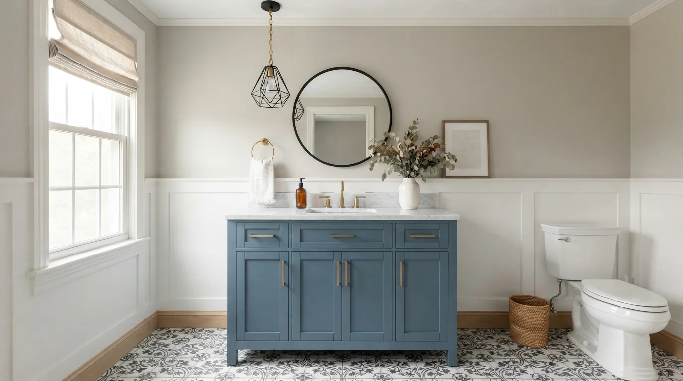
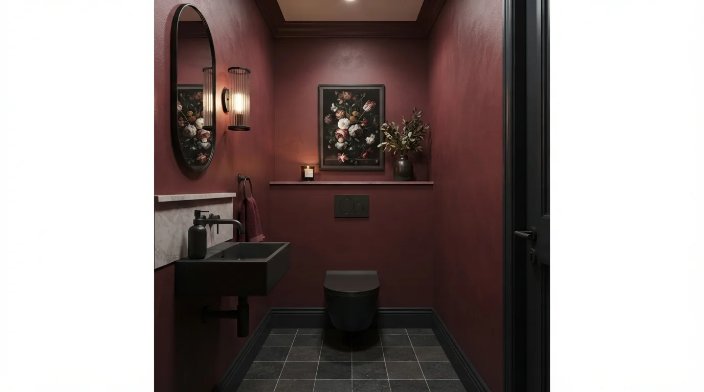
Every pick below is a real rendered powder room, not a chip. The lead color first; the swatches are the full scheme in the photo — walls, furniture, textiles, accent.

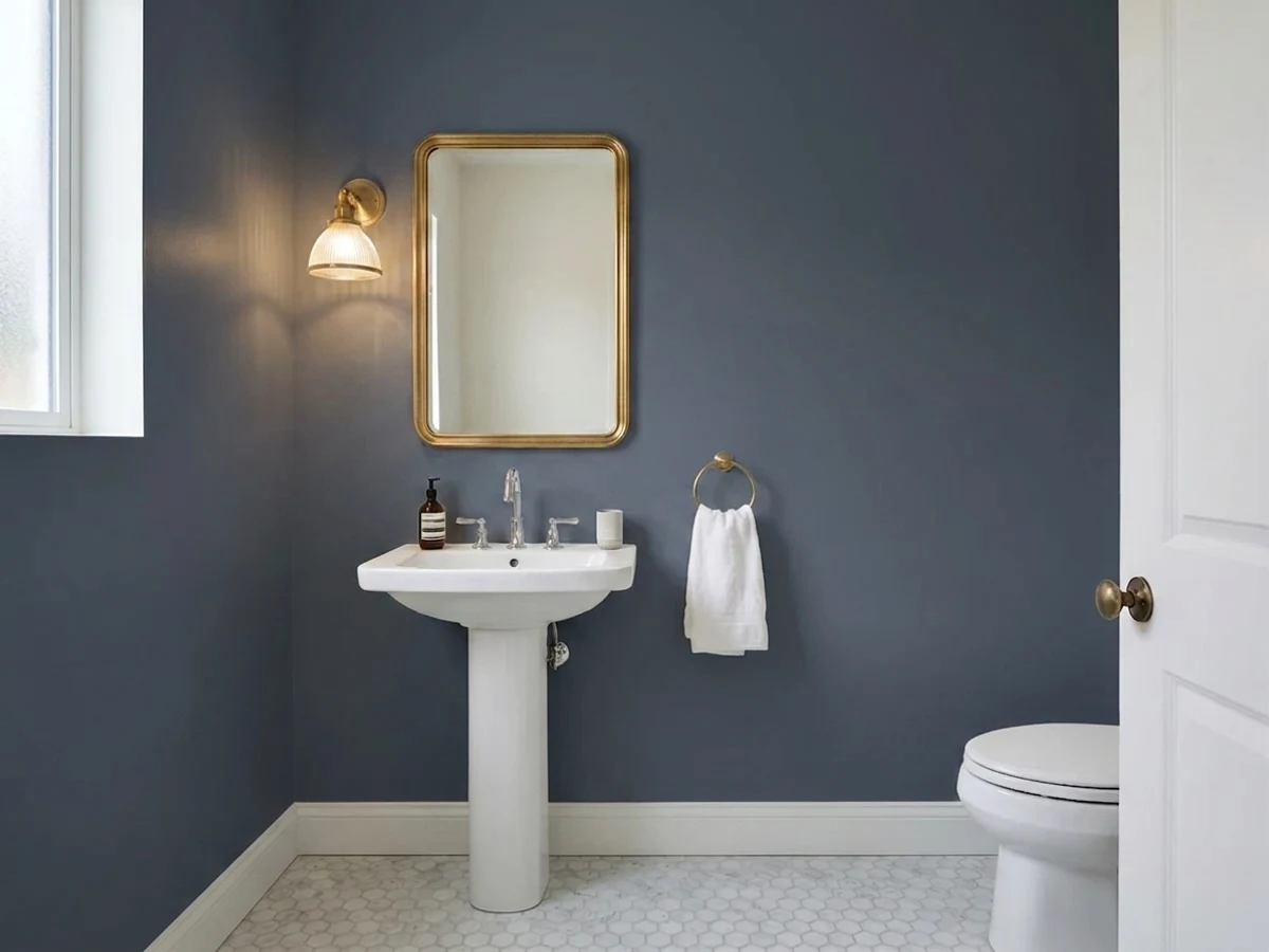
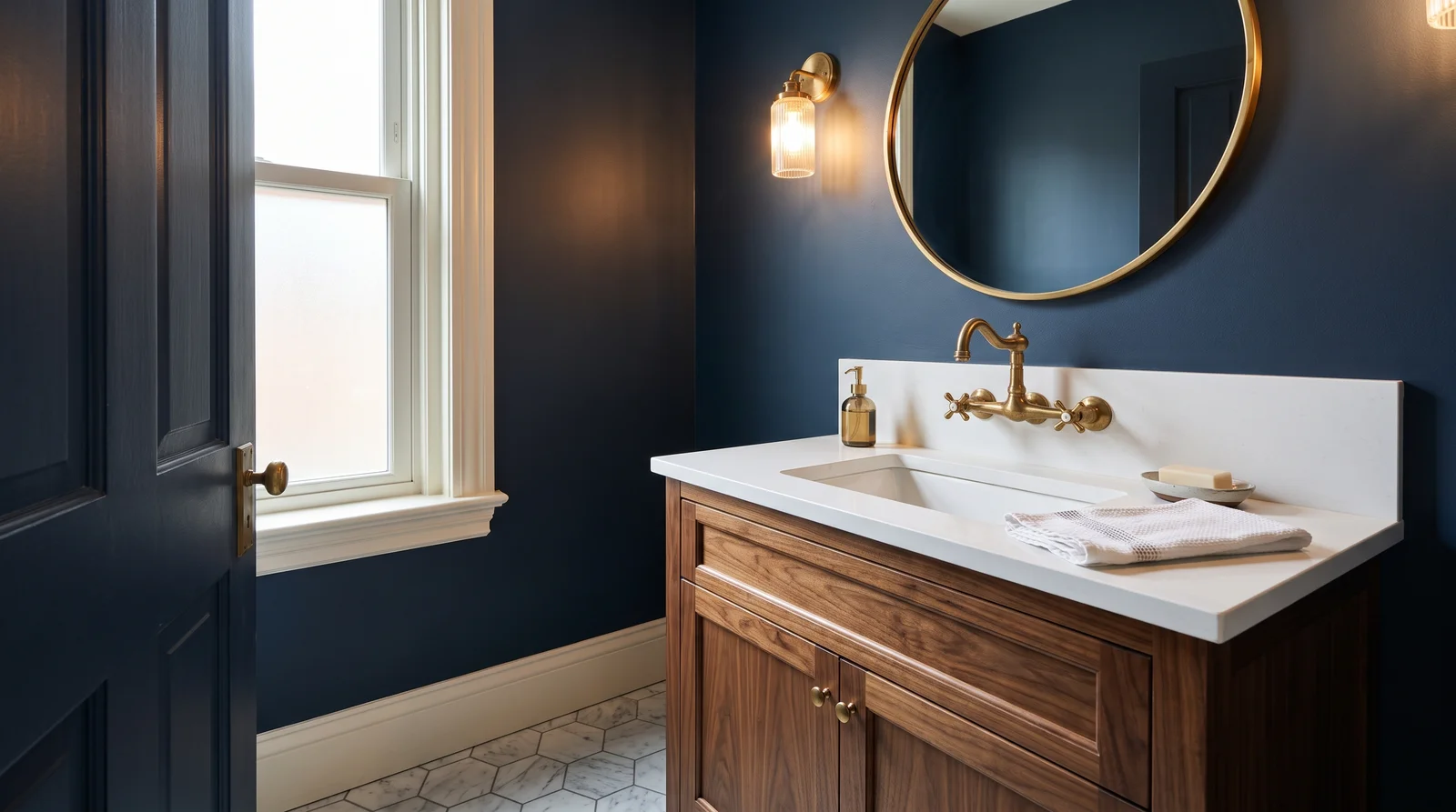
Deep classic navy that turns the smallest room in the house into a candlelit jewel box, richest under warm sconce light.
Hale Navy (HC-154) is the classic powder-room navy for a reason: at LRV 8 it goes fully dark without going black, so brass hardware and a white sink glow against it instead of disappearing. It works in this room precisely because a powder room has no daylight to lose — the color reads the same at 8 a.m. and 8 p.m., and guests only stay five minutes, so drama beats calm. Pair it with a walnut vanity, unlacquered brass, and White Dove trim to keep the doorway crisp. If you want the walls to read almost ink under warm bulbs, step down to Sherwin-Williams Naval (SW 6244, LRV 4) instead — it is deeper and more saturated, and in a windowless room the difference is real.
SEE HALE NAVY ON YOUR WALLS →
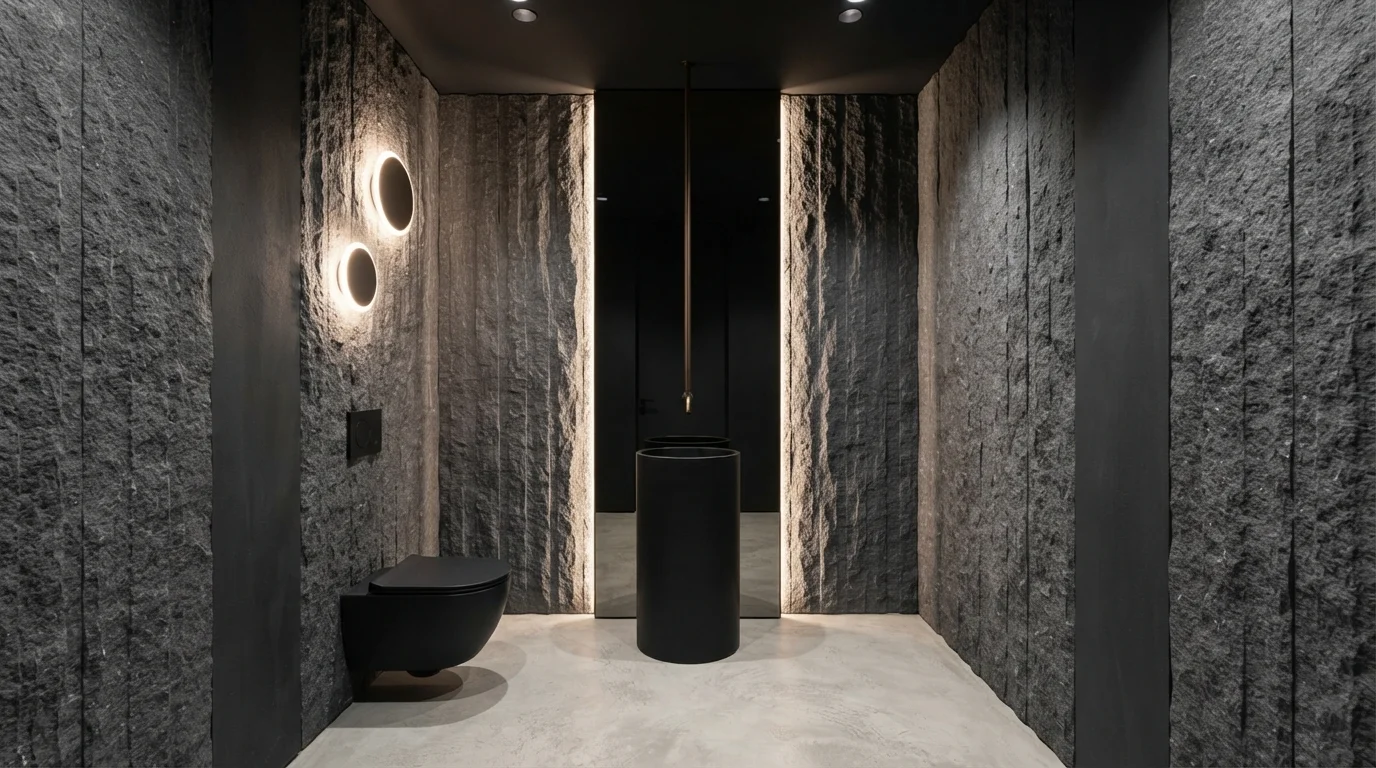
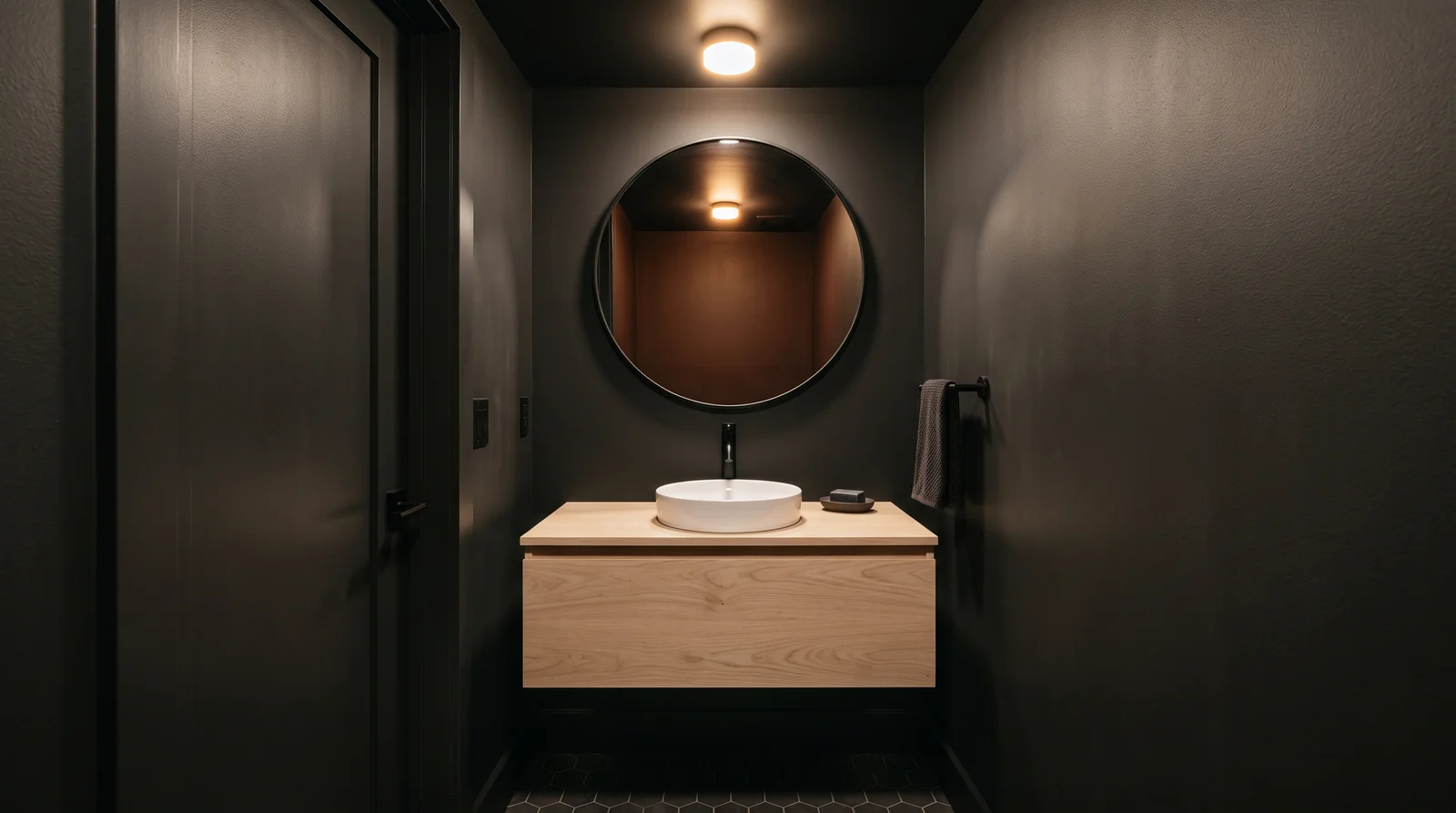
Soft black poured over walls, trim, and ceiling for a cocoon that makes the mirror feel like the only light in the room.
This is the full color-drench: Iron Ore (SW 7069, LRV 6) on walls, trim, and ceiling, so there are no white lines to break the spell and the small footprint stops reading as small at all. It is a soft black with a whisper of green-gray, which keeps it from feeling like a cave the way a true black can. A pale white-oak vanity and a big round mirror do the brightening work — the wood is the warmth, the mirror is the light. If you want the same envelope with a touch more give, Peppercorn (SW 7674, LRV 10) is the warmer charcoal one step up; pick it if your only bulb runs cool.
SEE IRON ORE ON YOUR WALLS →
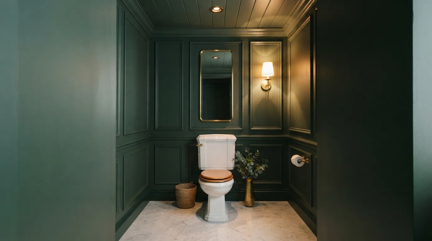
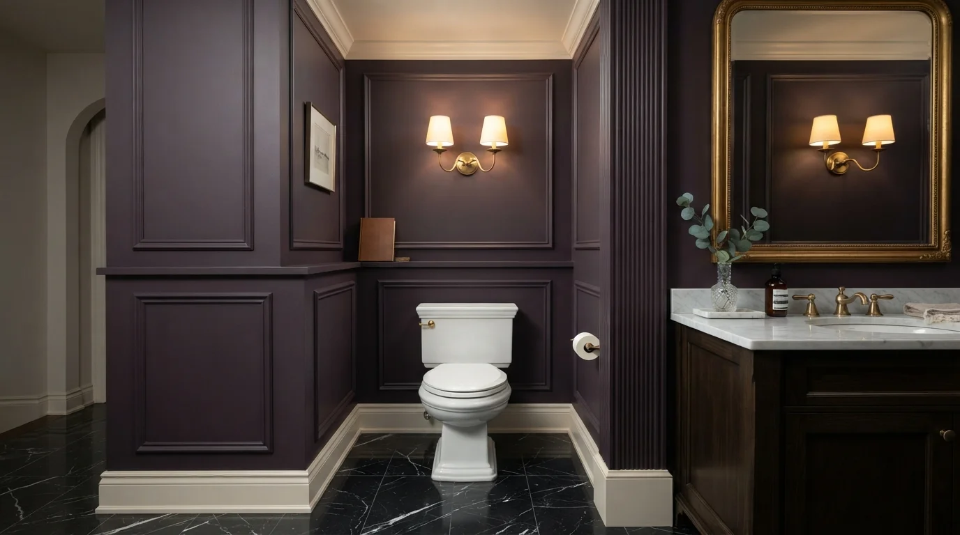
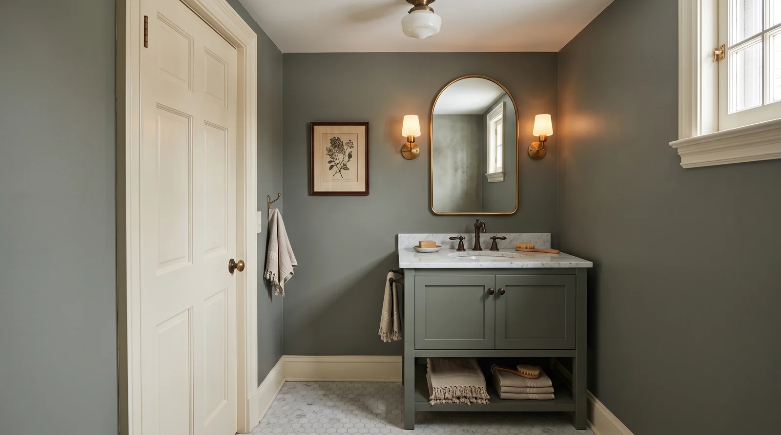
A muted, old-world green with gray in its bones — quiet drama that flatters brass and feels a hundred years settled.
Pewter Green (SW 6208, LRV 12) is the heritage pick — a gray-softened green that reads mossy under warm light and slate under cool, and both versions look expensive. Painting the vanity to match the walls is the move here: in a room this size, one continuous color makes the vanity feel built-in instead of bought. White Dove trim and a brass or bronze faucet give it the traditional finish; a marble or butcher-block top works equally well. If your powder room sits off a hallway painted in warm neutrals, this green connects better than any navy will — green is the bridge color between wood tones and white.
SEE PEWTER GREEN ON YOUR WALLS →
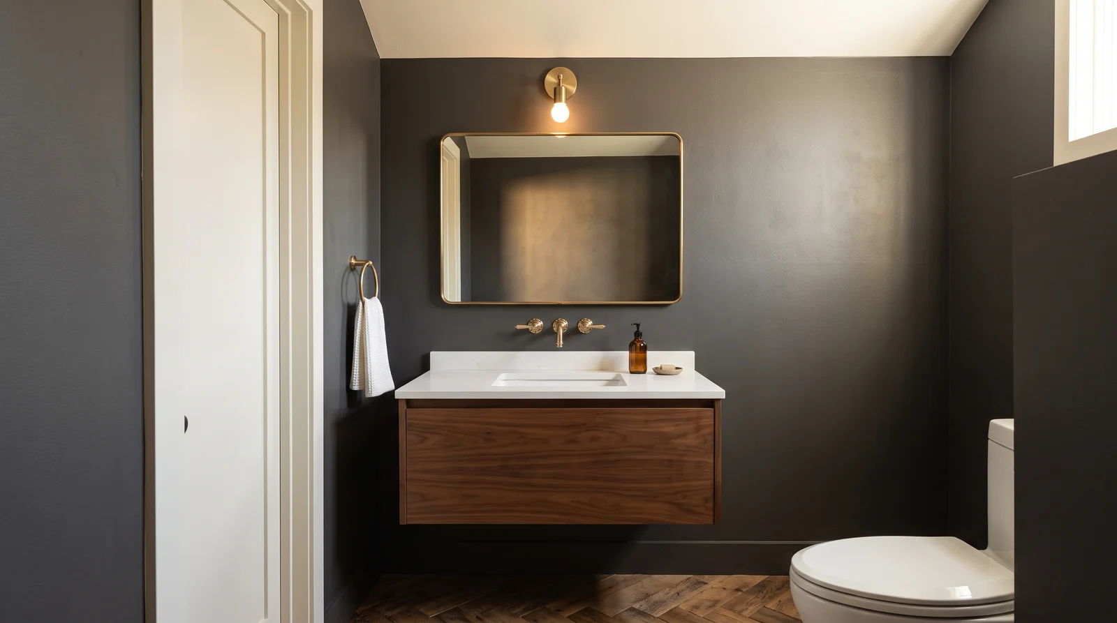
Charcoal with warmth in it, moody without committing to a color — the room feels like the inside of a tailored coat.
Peppercorn (SW 7674, LRV 10) is charcoal for people who find true black severe and navy too decided — it has a touch of warmth that keeps skin tones kind in the mirror, which matters more in a powder room than anywhere else. Against Alabaster trim the gray reads deliberate rather than dark, and a walnut vanity with brushed brass stops the scheme from going cold. It pairs with any tile you already have, which is why it is the safest of the bold picks. If the room gets a sliver of natural light and you want more presence, Iron Ore (SW 7069) is the deeper neighbor; in a fully windowless room, stay with Peppercorn.
SEE PEPPERCORN ON YOUR WALLS →
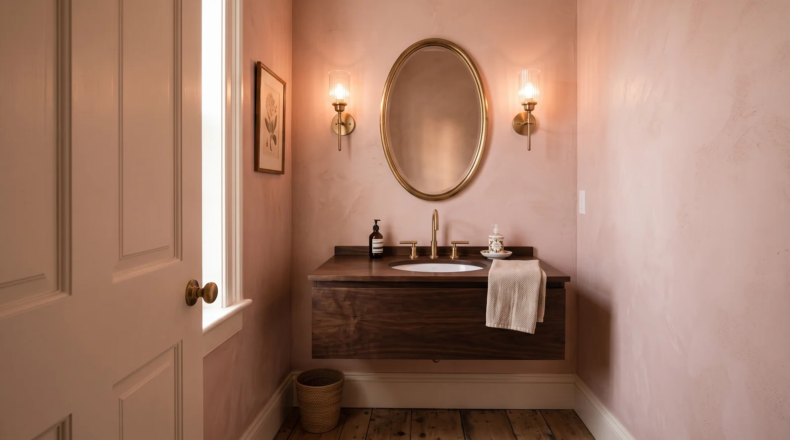
A dusty, earthen pink that throws the most flattering light in the house — everyone looks rested in this mirror.
Setting Plaster (No. 231, LRV 56) is pink the way old lime plaster is pink — dusty, earthen, nothing like a nursery. Its warm cast bounces flattering light onto faces, which is the quiet reason designers keep specifying it for powder rooms: this is the one room where everyone checks the mirror. It wants warm bulbs (2700K) and warm metals; under cool LEDs it can drift beige and lose the blush entirely. A dark walnut or even black-painted vanity gives it the contrast a mid-tone needs so the room doesn't blur into one soft haze. If pink feels like a reach, this is still the gentlest way into a colored powder room — it reads as warm neutral until the light hits it.
SEE IT ON YOUR WALLS →
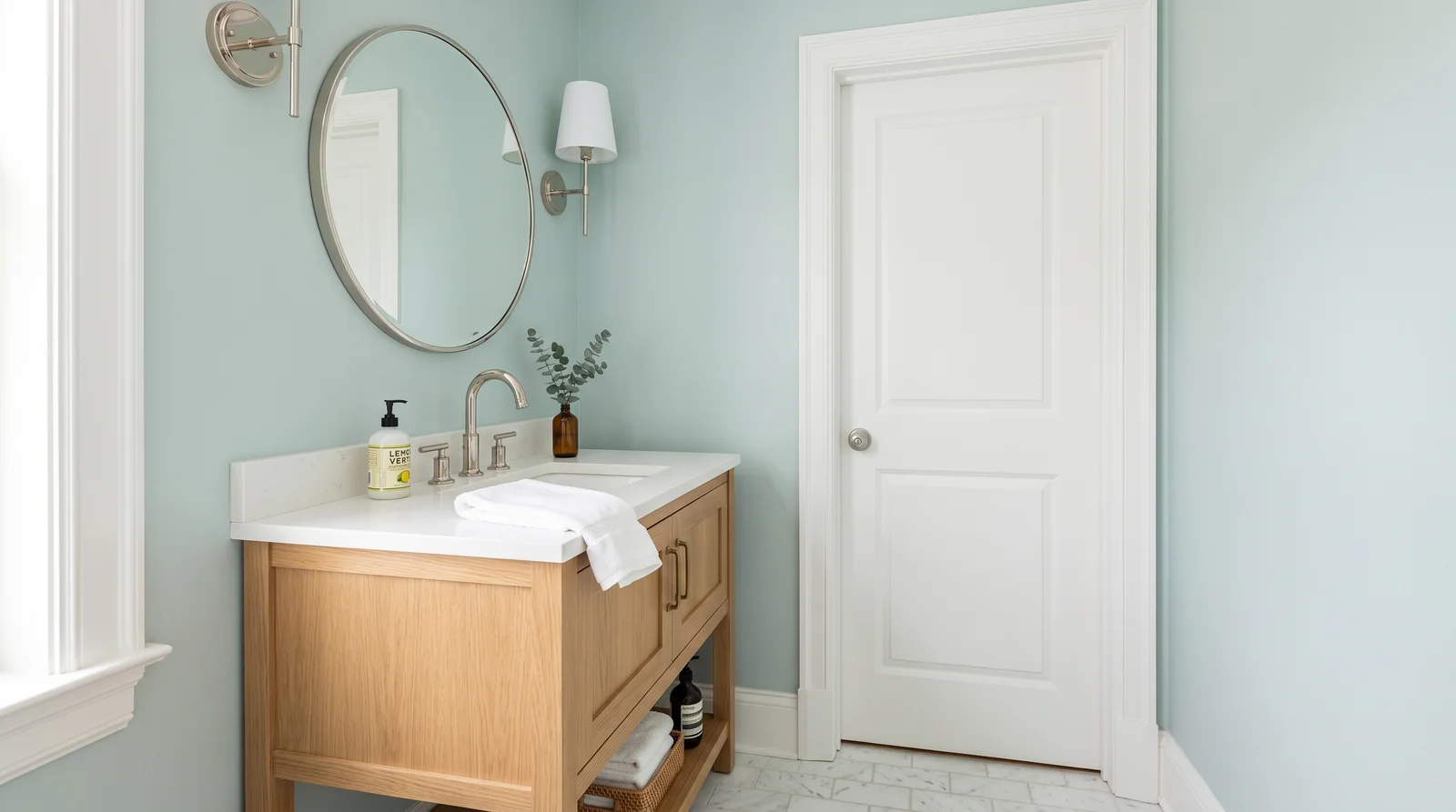
A pale blue-green with gray manners, cool and clean like water — the bright counterpoint to the go-dark crowd.
Not every powder room should go dark, and Palladian Blue (HC-144, LRV 60) is the best argument for staying light: a blue-green-gray chameleon that keeps a windowless room from feeling like a closet. It flips personality with the bulb — greener under warm light, bluer under cool — so test a sample under the exact fixture you own before committing. Crisp Chantilly Lace trim and polished nickel keep it spa-clean; white oak keeps it from going chilly. If your powder room actually has a window and you wanted brighter still, Alabaster (SW 7008, LRV 82) is the warm bright fallback — but in a dim room Palladian Blue gives you color where Alabaster would just go gray.
SEE PALLADIAN BLUE ON YOUR WALLS →Powder Room Wall Color Combinations
A wall color never works alone. These are the full schemes from the rooms above — the lead color first, then the supporting colors that make the photo work.
Deep classic navy that turns the smallest room in the house into a candlelit jewel box, richest under warm sconce light.
TRY THIS PALETTE →Soft black poured over walls, trim, and ceiling for a cocoon that makes the mirror feel like the only light in the room.
TRY THIS PALETTE →A muted, old-world green with gray in its bones — quiet drama that flatters brass and feels a hundred years settled.
TRY THIS PALETTE →Charcoal with warmth in it, moody without committing to a color — the room feels like the inside of a tailored coat.
TRY THIS PALETTE →Dark walls give you two easy trim moves. Crisp white trim and a white ceiling make the color pop and keep things clean. Painting the trim and ceiling the same dark color as the walls erases the edges and makes a small room feel bigger and more dramatic, which works beautifully with Hague Blue or Tricorn Black.
For fixtures, warm metals like brass and gold flatter reds, purples, and greens, while polished chrome or black hardware keeps a blue or black room sharp and modern. If the floor is a patterned tile or warm wood, pull one tone from it into your wall color so the whole room agrees. A vanity in natural wood or a contrasting painted finish reads as a deliberate accent against a deep wall.
Powder Room Color Ideas by Color
Set on a color family already? Each page has its own real rooms and picks.
Light or Dark Powder Room Colors?
Go Light (LRV 60+) If…
The room is small, faces north, or has to work at every hour. Light warm colors make it feel bigger and stay calm in evening light — the light you actually live in.
Go Dark (LRV Under 20) If…
You want the cocoon effect and the room has real daylight. Dark works best on one feature wall — or fully color-drenched in a large room with good windows.
Powder rooms are often interior spaces with no window at all, lit only by a fixture or two. That changes everything. Without daylight to lift it, a dark color stays dark all day, which is exactly what makes a deep room feel intentional and rich instead of gloomy.
If you do have a window, note which way it faces. North light is cool and steady and will make blues and greens look a touch grayer, so a warmer pick like Oxblood or Plum can balance it. South or west light is warm, especially in the evening, and can make a dark color glow. Always test your color at night under the actual bulbs you'll use, since that's when most guests will see it.
LRV, or light reflectance value, tells you how much light a color bounces back on a scale of 0 to 100. Low numbers are dark and absorb light; high numbers are bright and reflect it. A powder room is one of the rare rooms where a low LRV is a feature, not a problem.
If you want that cocooning, jewel-box feel, lean into low-LRV colors like Tricorn Black, Oxblood, or Eggplant and don't fight the darkness. If your powder room is your only guest bathroom and you'd rather keep it airy, a mid-range green or blue will still feel like color without swallowing the light. Either way, a single test swatch on the wall tells you more than any number.
See It. Love It.
Paint It.
Upload one photo of your powder room and try every color on this page on your own walls — in your own light, before you buy a drop of paint.

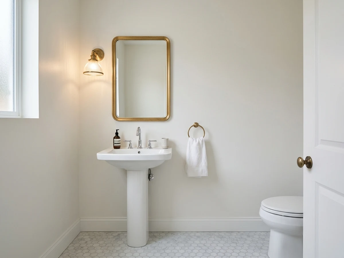
Hale NavyBeforeThe Best Color Directions For A Powder Room
A powder room rewards color you'd be nervous to use anywhere else. Deep blues like Hague Blue feel calm and a little formal. Greens like Hunter Green read fresh and grounded, almost like a small garden room.
Reds and purples push further into mood. Oxblood gives you a warm, leathery richness that flatters skin in the mirror. Plum and Eggplant land somewhere between cozy and glamorous, while Tricorn Black turns the whole room into a jewel box. There are no bad picks here as long as you commit fully and let the color cover all four walls.
Picking The Right Finish For Splashes And Hand Prints
A powder room sees water at the sink, hands on the wall near the switch, and the occasional splash. You want a finish that wipes clean. Eggshell is the safe middle ground, while satin gives you a little more washability and moisture resistance for a small, damp space.
Go carefully with high-gloss on the walls. A glossy sheen shows every roller mark and wall flaw, and in a tiny room the glare bounces around. Save the higher shine for trim and the vanity, and keep the walls at eggshell or satin so a deep color like Hunter Green or Hague Blue stays velvety rather than mirror-like.
The Most Common Powder Room Color Mistakes
The biggest mistake is playing it too safe. People reach for a pale beige in a windowless powder room hoping to brighten it, and it just looks flat and dingy under artificial light. A small guest bath is where richer color actually pays off.
The other common slip is skipping the test. Deep colors like Plum and Hunter Green shift hard between daylight and a warm bulb, so paint a large swatch and look at it morning and night. And don't forget that any color here is mixed to order at the counter, which means you can match a shade you love across brands instead of settling for a near-miss formula.
About Powder Room Paint Colors
A powder room is the one place in the house where you can go bold without second-guessing yourself. It's small, you don't sleep or work in it, and guests only spend a minute there. That makes it the perfect spot for a deep, dramatic color you'd never dare put in a living room.
The colors that shine here lean rich and saturated: inky blues, moody greens, oxblood reds, and soft-to-dark purples. A small room actually makes dark color easier, not harder, because the four walls wrap around you and feel intentional rather than accidental. Think of names like Hague Blue, Hunter Green, Oxblood, Plum, Eggplant, and Tricorn Black as your starting points.
This guide walks through the best color directions for a powder room, how the light in the space should steer your pick, which finish holds up to splashes and hand prints, and how to pair your color with trim, fixtures, and flooring. Every color shown is mixed to order at the paint counter, so you can match a shade across brands if your favorite formula lives somewhere else.
The Questions Everyone Asks
What color should I paint my powder room?
If you want one answer, start with the safe picks above — Tricorn Black, Royal Orchard, Brick Red, Hague Blue. They read well in any light and survive furniture changes. Then check the light: strong afternoon sun wants a step cooler, a north-facing room wants a step warmer.
Can a small powder room handle a dark color?
Yes, and it's often the best room for one. The small size that scares people away from dark walls actually helps here, because the color wraps the whole space and feels deliberate. Deep picks like Hague Blue, Oxblood, or Tricorn Black turn a tiny powder room into a jewel box.
What sheen should I use in a powder room?
Eggshell or satin is the sweet spot. Both wipe clean for the splashes and hand prints a powder room sees, and satin adds a little extra moisture resistance. Avoid high-gloss on the walls, since it shows flaws and creates glare in a small space.
My powder room has no window. Does that change my color choice?
It makes a dark color easier, not harder. With no daylight, the room looks the same all day, so a deep color stays rich instead of washing out. Just choose your light bulbs carefully and test the color under them at night, since that's when guests will see the room.
Should I paint the trim and ceiling the same color as the walls?
You can do either. Matching the trim and ceiling to a dark wall color erases the edges and makes the small room feel larger and more dramatic. Crisp white trim instead gives you contrast and makes the wall color pop, which is the more traditional look.
What fixtures and metals go with these colors?
Warm metals like brass and gold flatter reds, purples, and greens such as Oxblood, Plum, and Hunter Green. Chrome or matte black hardware keeps blues and blacks like Hague Blue and Tricorn Black looking crisp and modern. Pick one metal and use it consistently for a pulled-together feel.
How do I match a powder room color across different brands?
Every color on this site is mixed to order at the paint counter, so you're never locked into one brand. If you fall in love with a shade like Eggplant or Hunter Green, the store can cross-match it into another brand's base. Bring the name or a swatch and ask the counter to match it.
What two-color combination works best in a powder room?
The reliable pattern is a quiet main color plus one deep accent on a single wall. Keep trim and ceiling in one warm white so the two colors are the only event in the room — the combination cards above show complete schemes from real rooms.
What colors make a powder room look bigger?
High-LRV, slightly warm colors — LRV 60–75 is the sweet spot. Paint the walls and trim close to the same light color so the corners blur, and keep the ceiling white. Stark cool white actually works against you; it creates hard shadows that show the room's edges.


Ask a Question