Palladian Blue
America's default spa blue-green, reviewed honestly: the rooms where it glows, the day it decides to look green instead of blue, and what to pick instead.

Jessica has spec'd whites and neutrals for more than 300 rooms and keeps a sample wall of painted drawdowns in her studio. Every color review is checked against real reader rooms in the comments and re-tested when a formula changes. About the testing process →
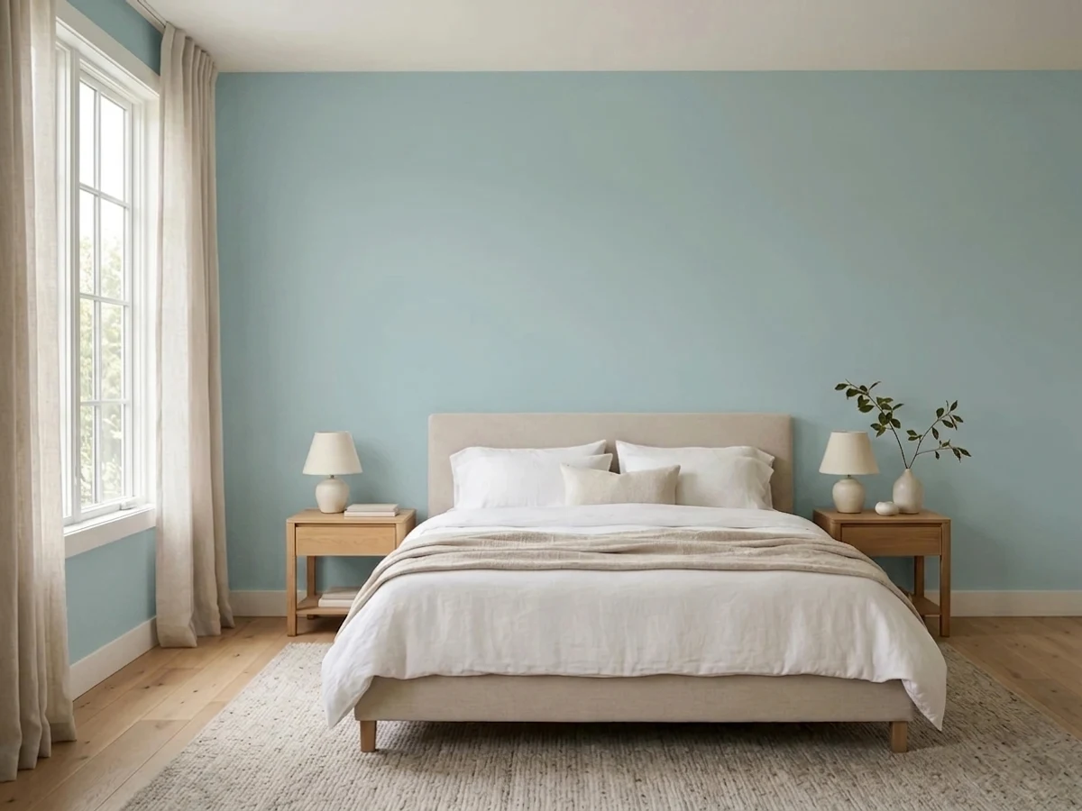
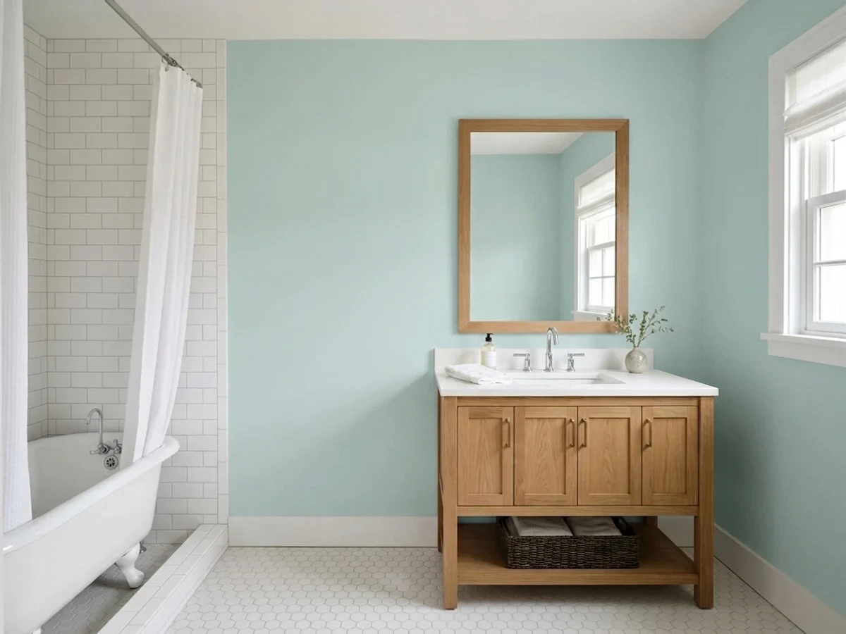
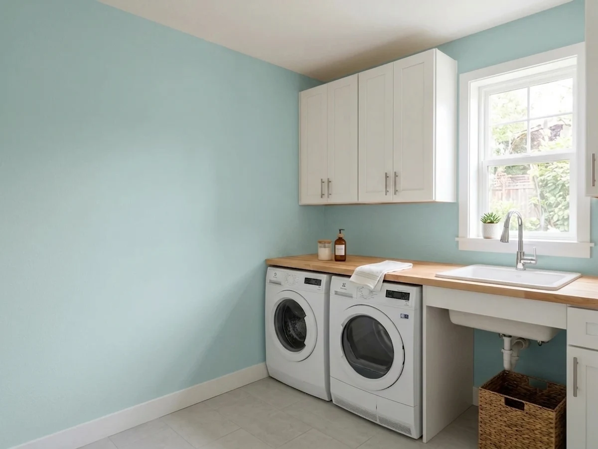
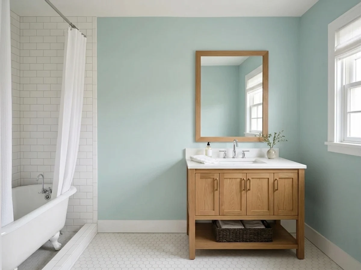
- 1Stardew43
- 2Quietude48
- 3Palladian Blue60
- 4Gray Owl65
- 5Glass Slipper70
The Fast Verdict
Palladian Blue is the color people picture when they say "spa bathroom" — soft, watery, calm, never baby blue. It has been a Benjamin Moore best-seller for two decades because it delivers real color while still behaving like a neutral.
The catch is honest and worth knowing before you buy: it sits exactly on the blue-green line, and your light decides which side it lands on. Half the people who paint it say it looks like soft aqua, the other half say it turned sage.
Bathrooms and bedrooms with real daylight · vanities and cabinets against white counters · coastal and cottage houses · anyone who wants color that still reads calm
Your trim and cabinets are cream or almond · you want a color that reads clearly blue every hour · your bathroom has no window and cool LED bulbs · your tile is warm tan or beige travertine
- Real color that still behaves like a calm neutral
- LRV 60 keeps small, windowless bathrooms feeling open
- Gorgeous on vanities and cabinets against white counters
- Works with brushed nickel, chrome and brass equally
- Stays soft in strong sun instead of turning loud
- Reads green as often as blue, and you do not control which
- Makes cream and almond trim look yellowed
- Goes cold and gray under 4000K bulbs
- A whole kitchen of it reads themed, not finished
What Color Is Palladian Blue, Really?
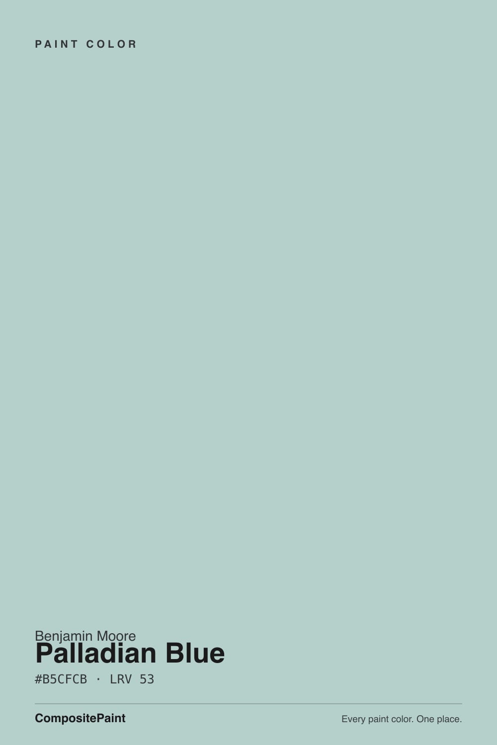
A muted blue-green that sits right on the fence between the two families. Most "soft blue" paints are blue with a touch of gray, and they stay blue. Palladian Blue is built differently: there is enough green in the base that in warm light it steps across the line and reads like pale sea glass, then steps back to soft aqua when the light cools. Designers call this a chameleon and they mean it kindly, but it is also the single reason people are surprised by it. The chip in the store is lit by cool white fluorescents, which is the lighting that makes it look bluest.
At LRV 60 it reflects a little over half the light that hits it, so it is a light color with real body. That matters more than it sounds. Put it next to Sherwin-Williams Sea Salt at LRV 63 and Palladian Blue is visibly a step deeper and clearly more colored — Sea Salt looks like a tinted neutral, Palladian Blue looks like a decision. It is light enough to keep a small windowless bathroom feeling open, but it will never wash out to almost-white in a sunny room the way the lighter spa colors do.
Undertone in one line: cool blue-green with a gray softener — never purple, never a true sky blue. If your sample looks like sage, that is warm light or a warm floor pulling the green forward, not a mistint.
Where It Shines
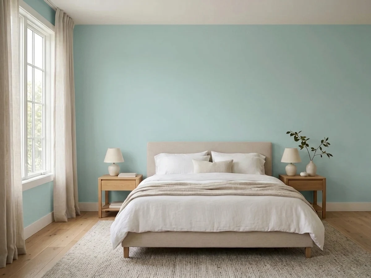
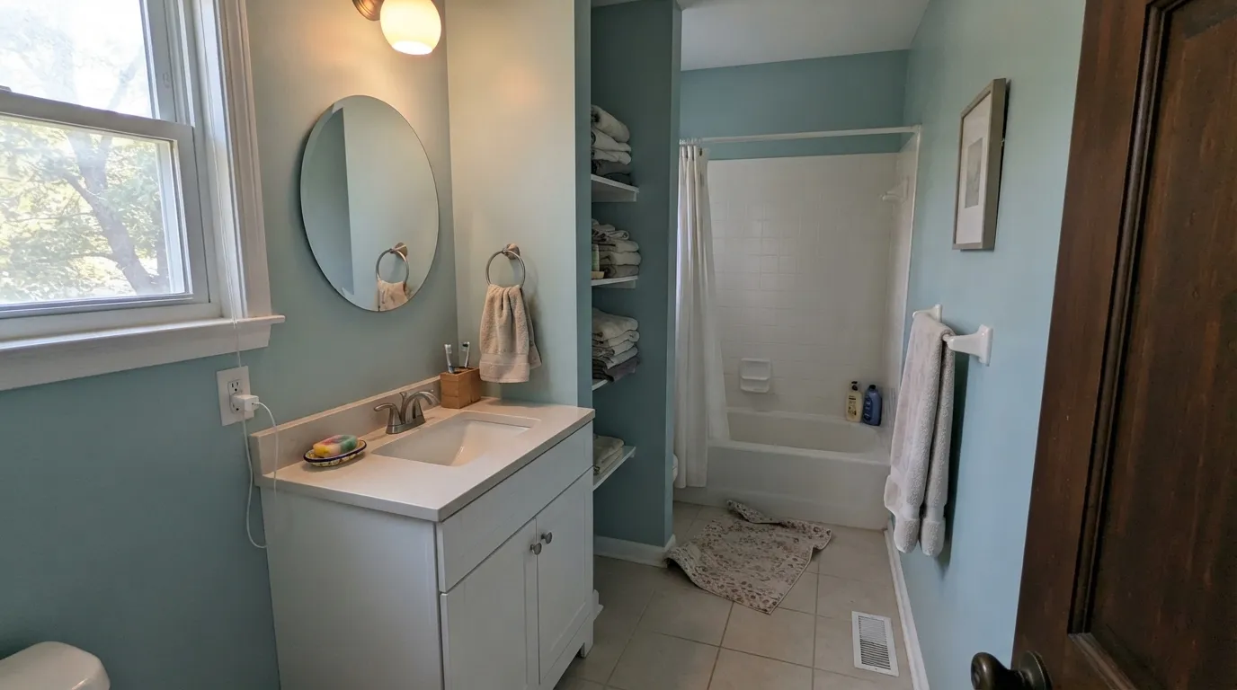
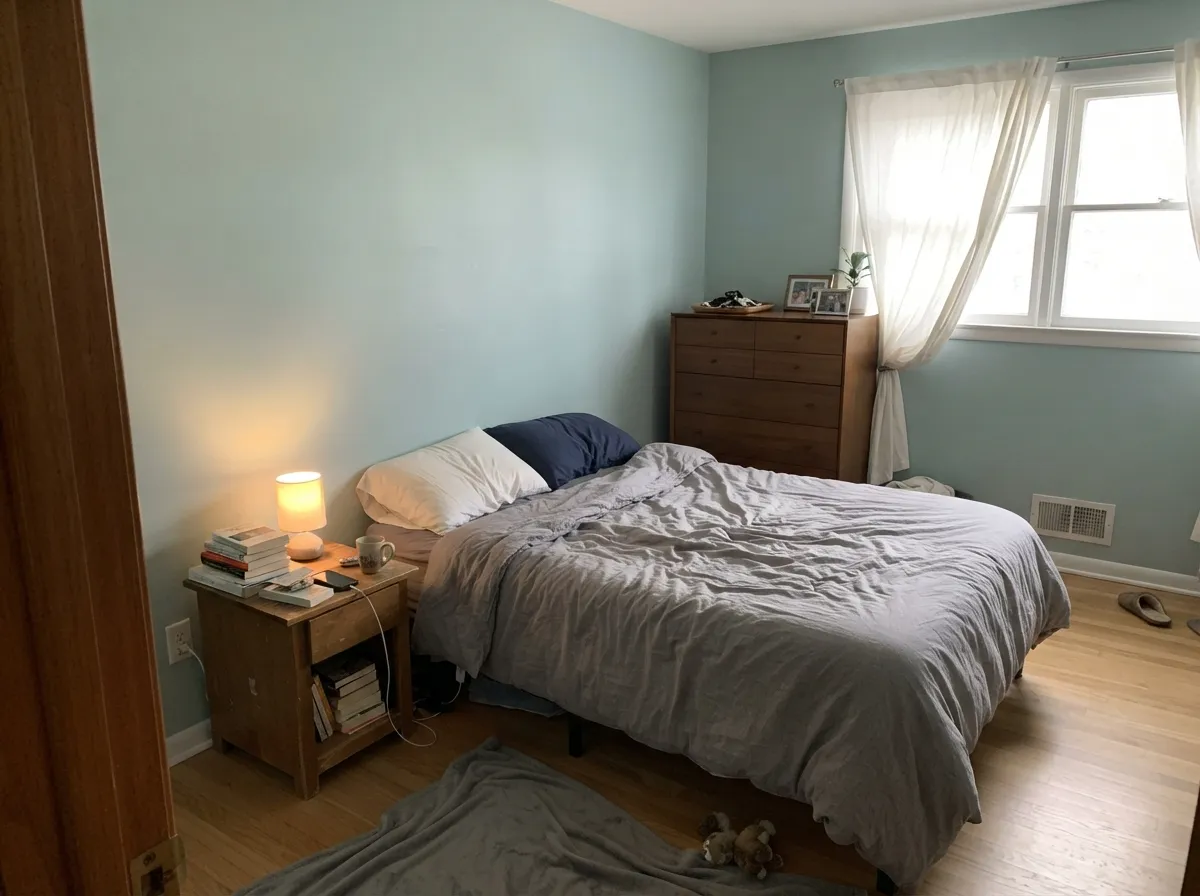
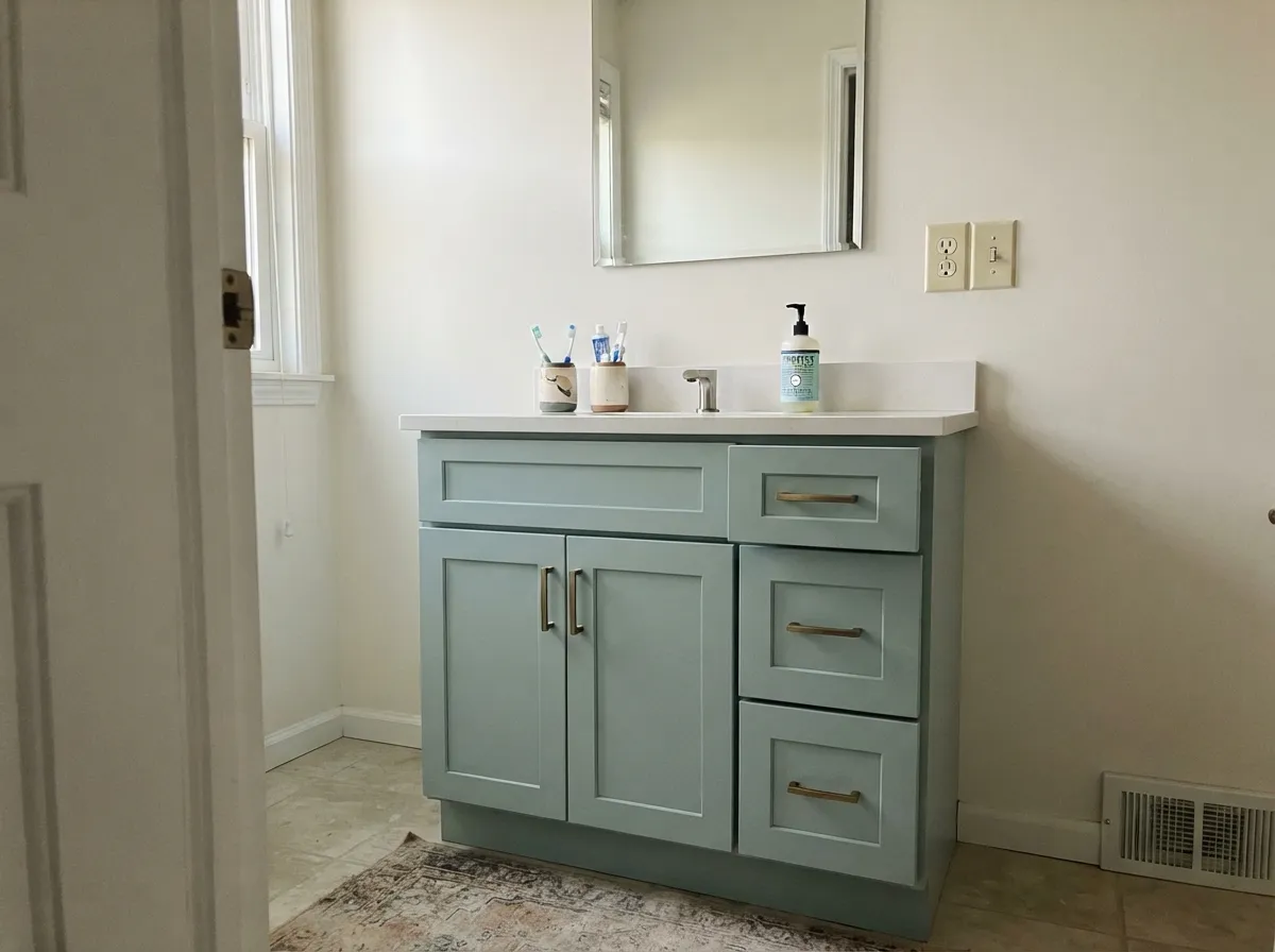
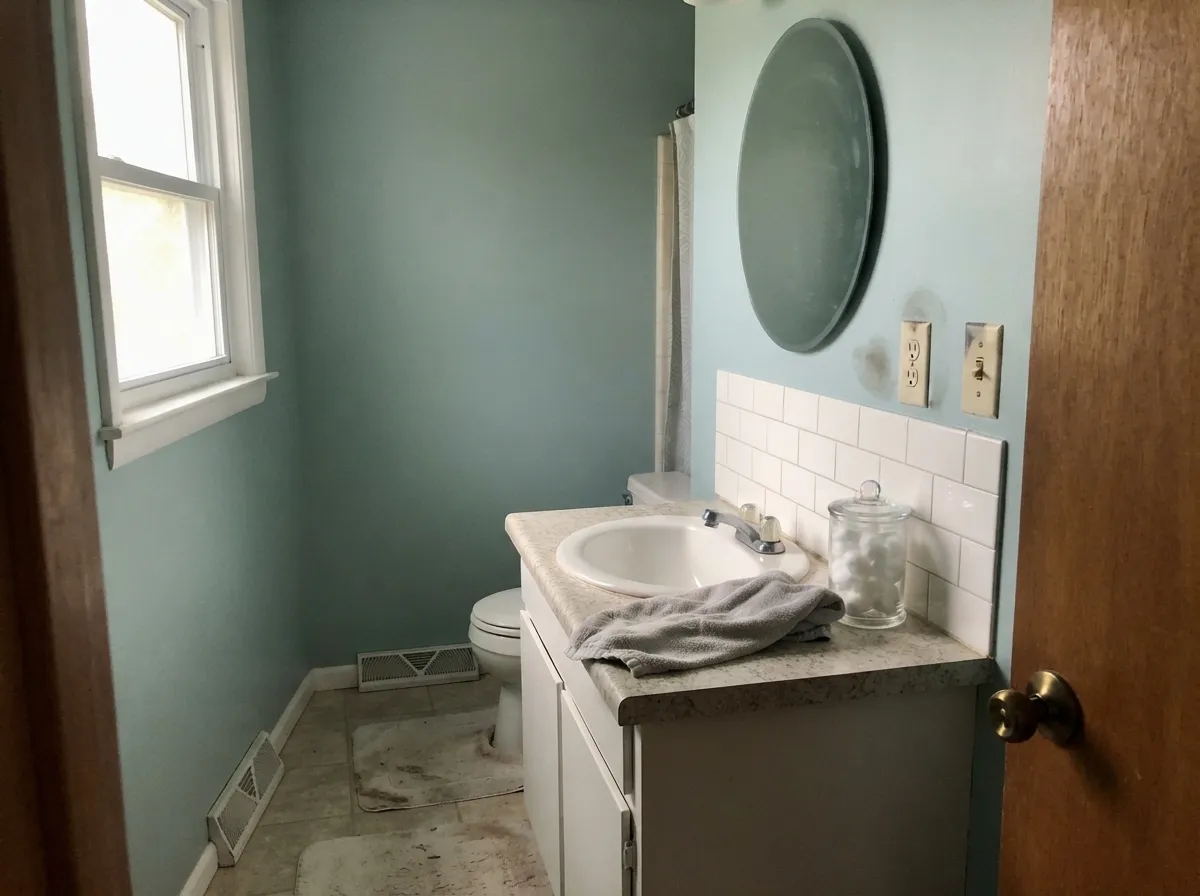
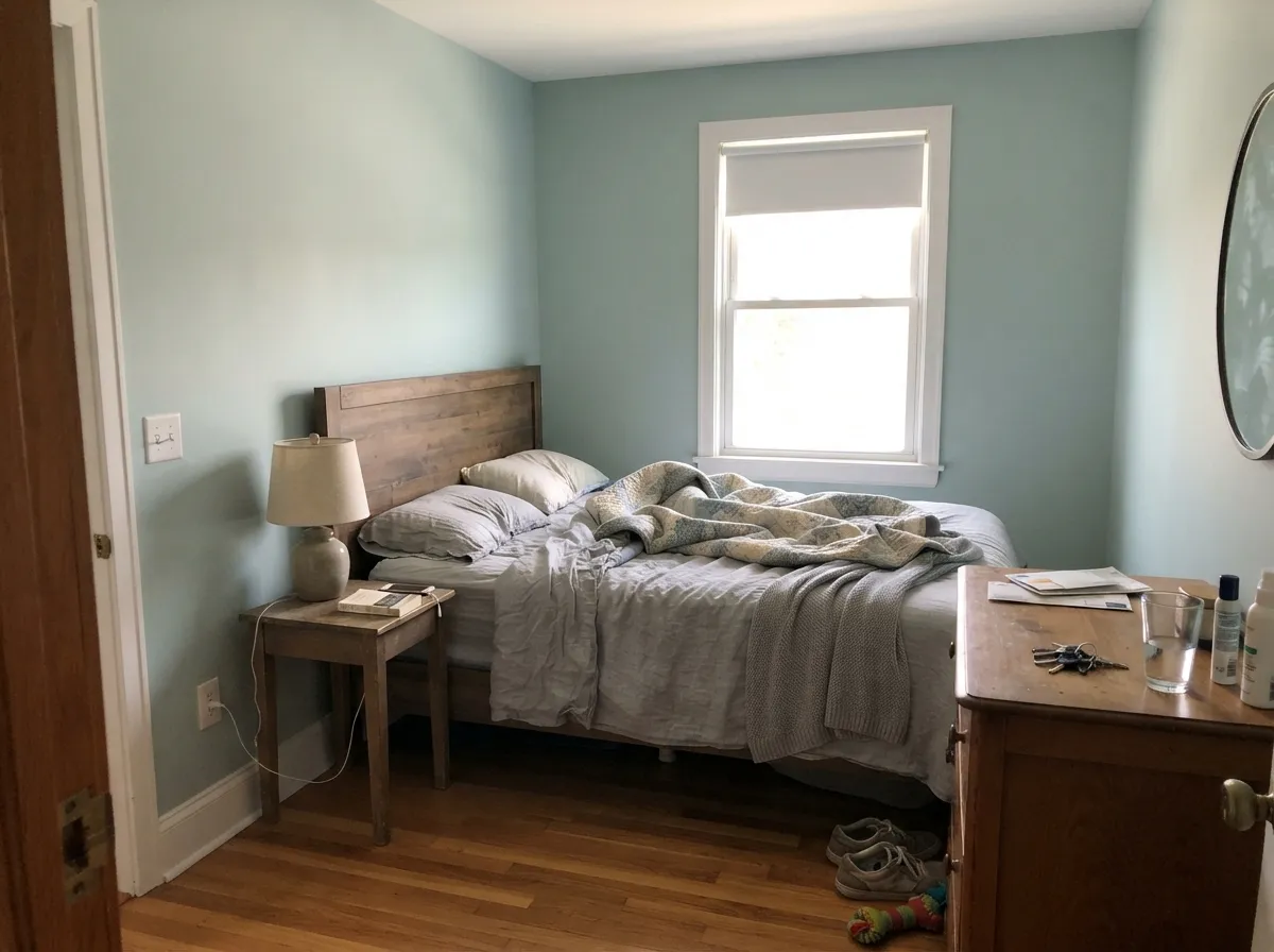
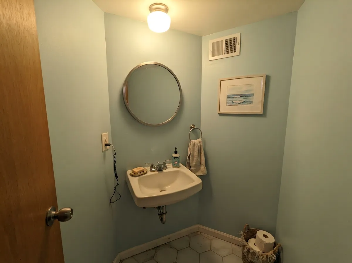
Give it daylight and white trim and it does exactly what the photos promise. Bathrooms are its home turf — the soft aqua against a white vanity and chrome is the look that made it famous — and bedrooms are a close second, where it reads restful without going cold.
Where It Fails
The unhappy stories about Palladian Blue almost all come from three situations, and all three are predictable before you open the can. If your room matches one of them, no extra coat will save it.
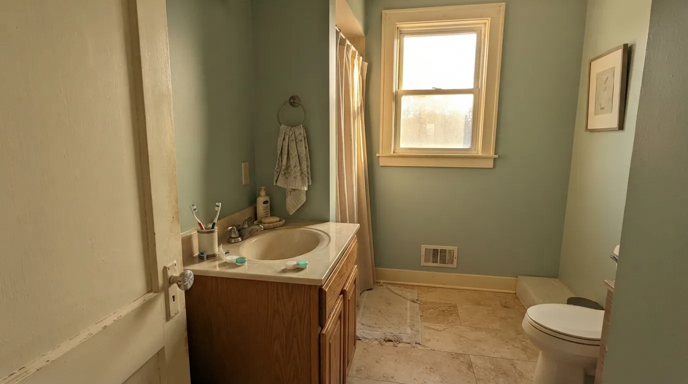
This is the number-one regret. Palladian Blue is cool and genuinely colored, so it does not soften cream — it exposes it. The trim starts to look yellowed and dirty, and the walls look colder to compensate. If the cream woodwork is not getting repainted, go warmer and greener instead: Benjamin Moore Saybrook Sage (HC-114).
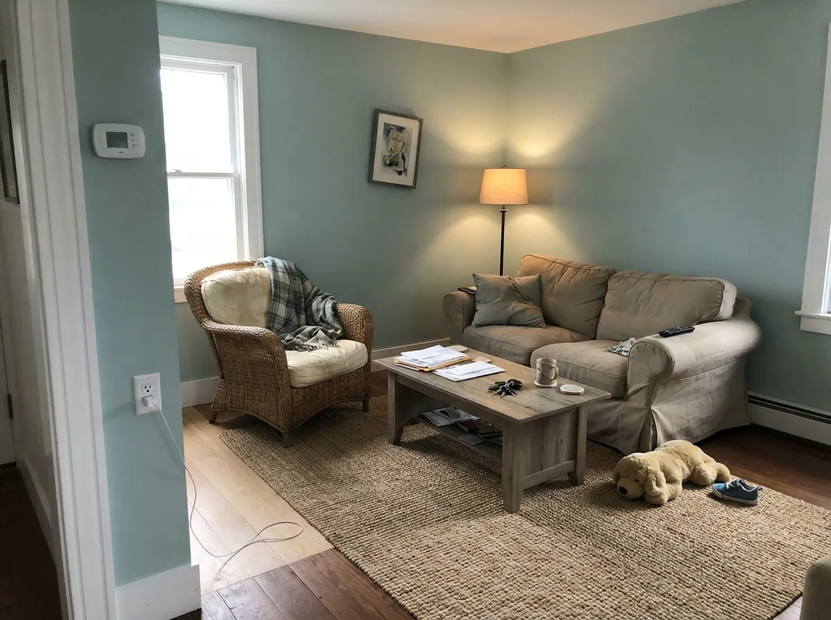
In a south-facing room, or under 2700K bulbs, or above a honey oak floor, the green in it comes forward and it reads celadon rather than aqua. People describe it as "pretty, but not the color I chose." If you need it to stay visibly blue, pick Benjamin Moore Woodlawn Blue (HC-147) — same family, more blue in the base.
On one vanity it is charming. On thirty cabinet doors it stops being a soft color and becomes the loudest thing in the room, and the kitchen starts to read themed instead of finished. For that much surface area, drop the chroma: Sherwin-Williams Sea Salt (SW 6204) gives the same spa feeling with far less commitment.
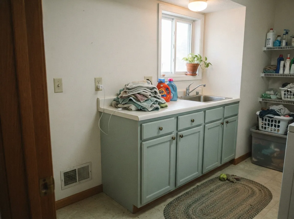
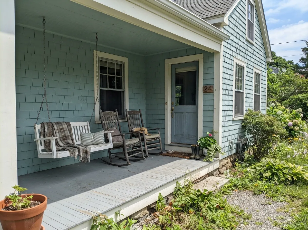
Room by Room
Your Light Is the Risk
Cool daylight keeps the blue visible and mutes it slightly. This is where it looks most like the chip.
Warm afternoon sun pushes the green forward — it reads sea glass, not aqua. Sample here first.
2700K lamps: softer, greener, cozier. 4000K LEDs: cold gray-blue. Change bulbs, not paint.
Enough color saturation to stay a color under artificial light instead of collapsing to gray.
Most complaints about Palladian Blue are a light mismatch. Upload a photo of your actual room and see it on your walls — then ask for the same wall in north light or evening lamps before you buy a single sample.
Need It From Another Brand?
Any paint counter can custom-tint Benjamin Moore HC-144 directly. If you would rather stay in one brand's own deck, these are the closest stock matches, measured as ΔE2000. Under 2 is a difference you will not see on the wall.
| Brand | Closest color | ΔE | LRV | |
|---|---|---|---|---|
| Sherwin-Williams | WaterscapeSW 6470 · Sherwin-Williams | 1.2 | 62 | Color page → |
| Behr | Frosted JadePPU11-13 · Behr | 1.4 | 61 | Color page → |
| Valspar | Take a HikeV100-2 · Valspar | 1.1 | 62 | Color page → |
| PPG / Glidden | White CloverPPG10-31 · PPG / Glidden | 2.0 | 61 | Color page → |
| Glidden | White CloverPPG10-31 · Glidden | 1.6 | 61 | Color page → |
| Dutch Boy | Soothing Waves333-2DB · Dutch Boy | 2.4 | 62 | Color page → |
Similar Benjamin Moore Colors
The nearest shades to Palladian Blue within Benjamin Moore's own range, ranked by perceptual color distance — useful when you want the same look a touch lighter, darker, or warmer.
WCAG 2.1: AA is 4.5 : 1 for normal text, 3 : 1 for large text, AAA is 7 : 1.
Palladian Blue vs the Colors You're Also Considering
Every Palladian Blue sample board has the same rivals on it. The numbers show the real lightness gap — then it comes down to which risk you would rather live with.
Pick this if you want the color quiet, pale and barely there.
Benjamin Moore HC-143 · LRV 48Wythe BluePick this when the green-blue should read clearly and confidently, not whisper.
Side-by-side comparison →Pick this when you want a touch more depth and presence.
Benjamin Moore HC-147 · LRV 61Woodlawn BluePick this if it must stay visibly blue in warm light.
Wythe Blue (HC-143) is the deeper sibling. At a lower light reflectance it is noticeably more saturated and greener, closer to a muted celadon. Choose Wythe Blue when you want the color to read clearly as green-blue; choose Palladian Blue when you want it paler and quieter.
Woodlawn Blue (HC-147) is a touch lighter and reflects a bit more light, so it looks slightly softer and airier on the wall. The two are close, but Woodlawn is the safer pick for a small or dim bathroom where you want maximum lightness.
Sea Salt (SW 6204) from Sherwin-Williams is the famous comparison. It is lighter and leans more gray-green than blue, so it reads as a soft sage where Palladian Blue keeps more visible blue. Pick Sea Salt for a grayer, more neutral spa look, and Palladian Blue when you want that recognizable soft aqua.
Palladian Blue Coordinating Colors
The rule with Palladian Blue is simple: keep the whites clean and the neutrals warm-but-quiet. It loves crisp whites, soft greiges, and one deep anchor color. It argues with cream, almond, and anything yellow-based, because those make its coolness look like a mistake instead of a choice. These are the partners that actually hold up in real rooms:
Palladian Blue on Cabinets and Vanities
This is where the color quietly outperforms its reputation. A single bathroom vanity, a laundry base run, or a kitchen island in Palladian Blue against white quartz is one of the easiest wins in the Benjamin Moore deck — it is soft enough that it never fights the room, but colored enough that the cabinetry looks intentional instead of builder-grade. Use a satin, urethane-fortified cabinet enamel; the sheen keeps the blue-green looking wet and clean rather than chalky.
The limit is surface area. Once you paint every cabinet in a kitchen, the same softness turns into wall-to-wall color and the room reads themed. The standard fix is a split: Palladian Blue on the lowers or the island, Chantilly Lace (OC-65) on the uppers and trim, and a warm wood shelf or floor to keep it from going cold. If you want the whole kitchen in one blue-green, step down in chroma to something grayer instead.
Palladian Blue With Tile, Wood, and Metals
Your hard finishes decide this color more than your paint sheen does. Cool finishes — white quartz, carrara-look tile, gray porcelain, chrome and polished nickel — hold the blue in place and give you the spa look people are shopping for. Warm finishes do the opposite: beige travertine, tan grout, honey oak and orange-leaning LVP all reflect warmth back at the wall and drag the green forward. Neither is wrong, but you should know which room you have before you buy five gallons.
Metals are more forgiving than tile. Brushed nickel and chrome keep it cool and clean, brass and unlacquered bronze warm it up in a way that reads coastal rather than dated, and matte black gives it the crisp modern edge it lacks on its own. Wood is the real decision point: walnut and white oak sit beautifully against it, while orange-toned red oak floors are the one pairing worth taping a large sample against before you commit.
Three Ready Palettes Built on Palladian Blue
A color is never alone on the wall. These are complete combinations in the 60-30-10 pattern, with the reason each one holds together. Every one opens in the visualizer.
Chantilly Lace is cool and clean, so it keeps the blue in Palladian Blue visible instead of letting the green take over. The navy vanity gives the room one dark anchor, which is what stops a soft spa color from floating.
Try this palette in your roomWhite Dove is warm enough to soften the cool walls without the yellowed look real cream trim gives it. Revere Pewter in the hall sits at almost the same value, so the doorway reads as a change of temperature rather than a jolt.
Try this palette in your roomSun lightens Palladian Blue by roughly a step outdoors, so the body needs dark shutters or the whole house goes pastel. Kendall Charcoal supplies that weight while White Dove keeps the trim from cutting too hard against a soft body color.
Try this palette in your roomPalladian Blue FAQ
Is Palladian Blue blue or green?
Both, and the room decides. It is a true blue-green, so cool north light and cool bulbs bring the blue forward, while south sun, 2700K lamps and warm wood floors bring the green forward. Expect it to shift through the day — that is the color working as designed, not a mistint.
Is Palladian Blue too dark for a small bathroom?
No. At LRV 60 it reflects over half the light that lands on it, which keeps a small bath feeling open rather than closed in. What actually shrinks a small bathroom is dark tile and one weak ceiling fixture, not this paint.
What trim white goes with Palladian Blue?
Chantilly Lace (OC-65) if you want the blue to stay crisp and visible — it is cool and bright, so it pushes the wall bluer. White Dove (OC-17) if you want a softer, warmer frame. Avoid cream or almond trim entirely; it will look yellowed next to this color.
Palladian Blue or Sea Salt?
Palladian Blue reads as a recognizable soft aqua. Sea Salt (SW 6204) is lighter at LRV 63 and grayer, so it behaves more like a tinted neutral. Pick Palladian Blue if you want people to notice the color, Sea Salt if you want the room to just feel calm.
Does Palladian Blue work on kitchen cabinets?
On an island or a run of lower cabinets, yes — it is beautiful against white quartz and brass. On every cabinet in the room it becomes overpowering and starts to look like a themed spa kitchen. Use satin in a urethane-fortified cabinet paint.
Will Palladian Blue look dated?
It can, in one specific setup: full walls plus beige travertine tile plus oak vanity, which is the 2010s spa bathroom people are tired of. Paired with white trim, black or brass hardware and simple tile, it reads classic rather than dated — it has been in the Historic Collection for decades for a reason.
Have you painted with Palladian Blue?
Rate it — one tap helps the next reader decide.
Ask a Question