Quiet Moments
The Pinterest spa color, reviewed honestly: where its calm blue-green works, the exact rooms where it flips to turquoise, and what to paint instead.

Jessica has spec'd whites and neutrals for more than 300 rooms and keeps a sample wall of painted drawdowns in her studio. Every color review is checked against real reader rooms in the comments and re-tested when a formula changes. About the testing process →
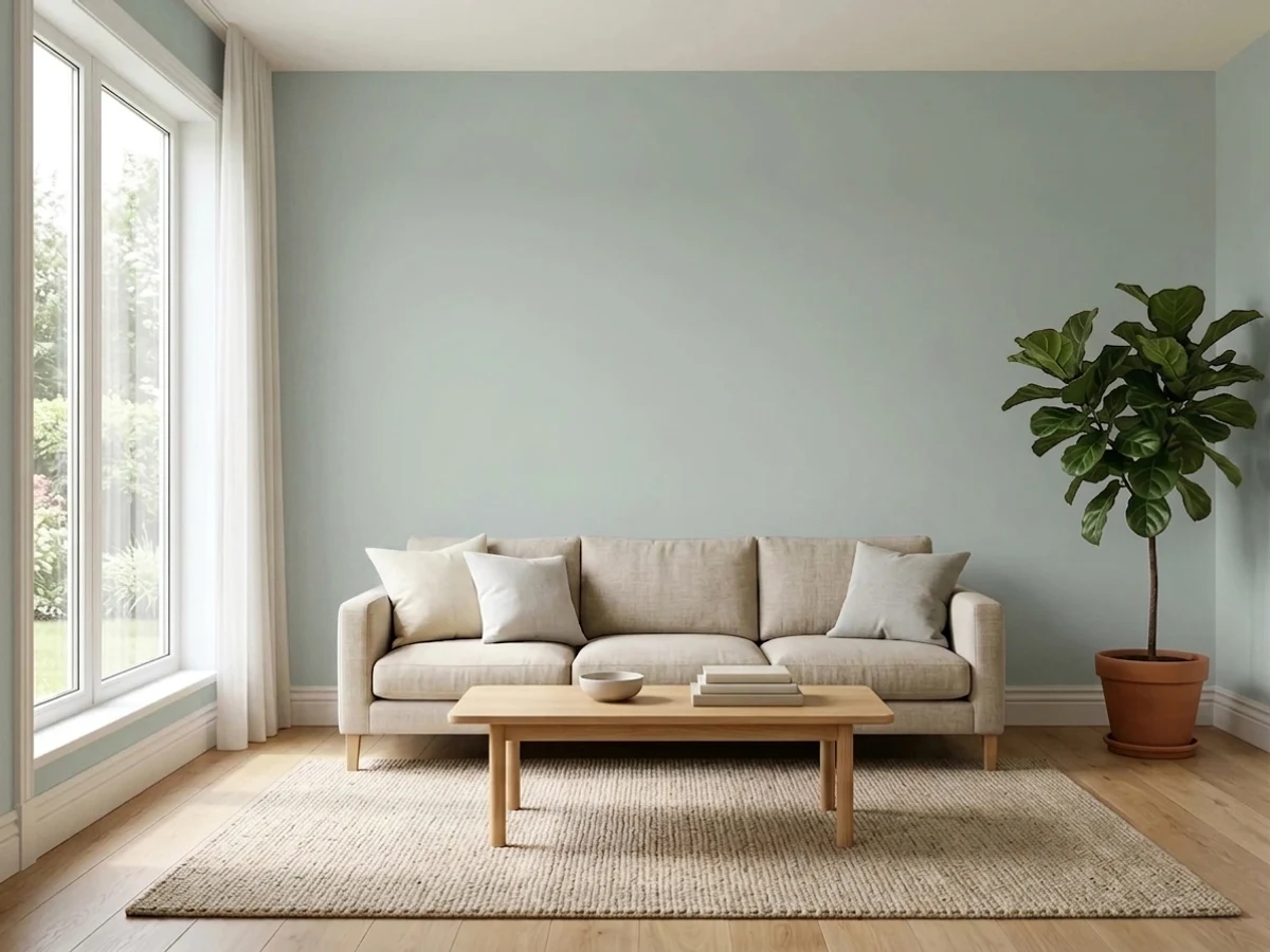
- 1Stardew43
- 2Smoke56
- 3Quiet Moments61
- 4Wickham Gray68
- 5Spring Thaw83
The Fast Verdict
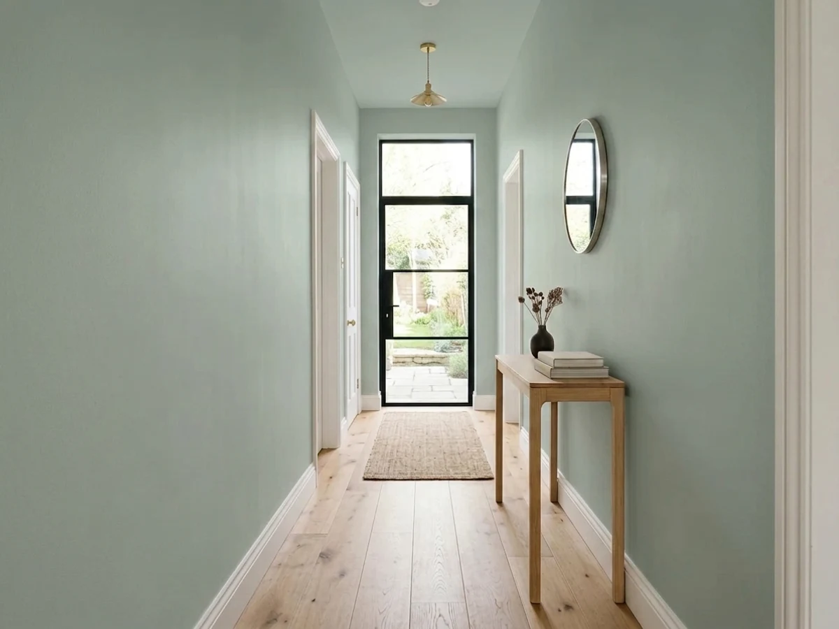
Quiet Moments is the color people paint when they want a room to feel like a deep breath. Most of the time it reads as a soft gray with a cool blue-green breath, and in a bedroom or a bathroom that is exactly right.
The catch is that it moves: pile on bright daylight or cool recessed LEDs and the gentle gray jumps to spa turquoise. Sample it on two walls and look at it at night as well as at noon — you will know within a day whether your room gets the calm version or the aqua one.
Bedrooms with soft, even daylight · bathrooms with warm bulbs and white trim · coastal and cottage homes · cabinets with wood counters and brass
Your room is dim and north-facing · your lights are cool 4000K recessed cans · you want a true gray with no color in it · you need a color that looks the same all day
- Genuinely calming — reads restful, never decorated
- LRV 61 gives real color without darkening a small room
- One of the best bathroom and bedroom colors in the BM deck
- Flatters oak, walnut, butcher block and brass hardware
- Low saturation lets it live beside existing grays without clashing
- A chameleon — can read soft gray in one room and bright turquoise in the next
- Cool 4000K recessed LEDs push it aqua; this is the most common complaint
- Goes cold and flat in dim north-facing rooms
- Washes out to a dull gray on exteriors in full sun
What Color Is Quiet Moments, Really?
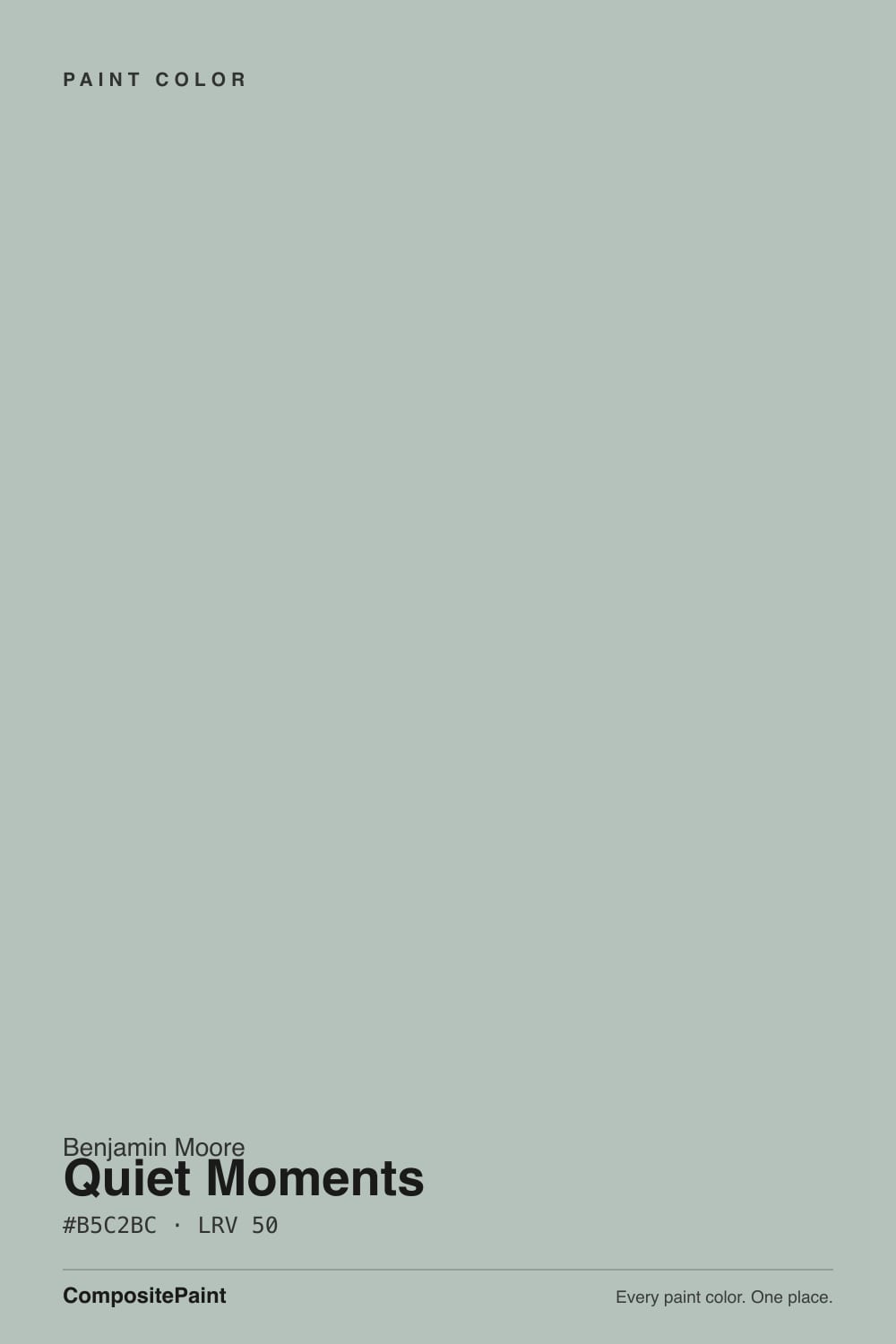
A near-neutral gray with a cool blue-green tilt — and the tilt is the whole story. Saturation is only around ten percent, so on most walls your eye reads gray first and color second. But which color steps forward is not fixed: cool light pulls the blue out, warm and generous daylight pulls the green out, and the same gallon can look like sage in one room and spa-blue in the next room of the same house. Benjamin Moore files it under gray, which is fair on paper and about half the truth on a wall.
At LRV 61 it sits dead center on the light scale, and that is the useful part. It has real body — unlike a pale tint such as Healing Aloe (1562, LRV 68), which mostly disappears once it is up — and it is nowhere near a light neutral like White Dove (OC-17, LRV 85). It bounces enough light to keep a small bathroom from feeling closed in, but it will always look like a color decision, not a safe off-white.
Undertone in one line: cool gray with a blue-green core — never warm, never yellow, never sage-brown. If your sample looks turquoise, that is your bulbs and your window, not the paint.
Where It Shines
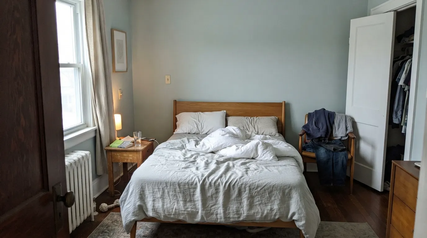
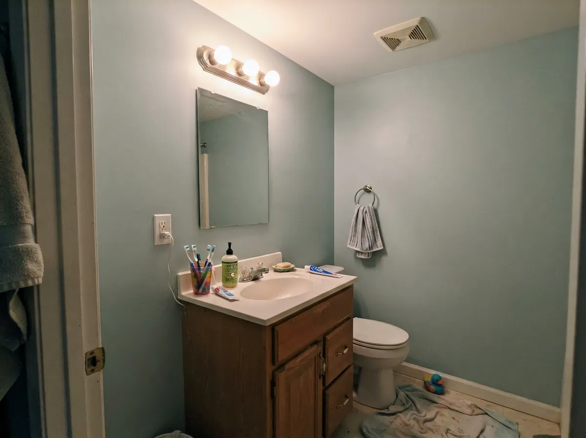
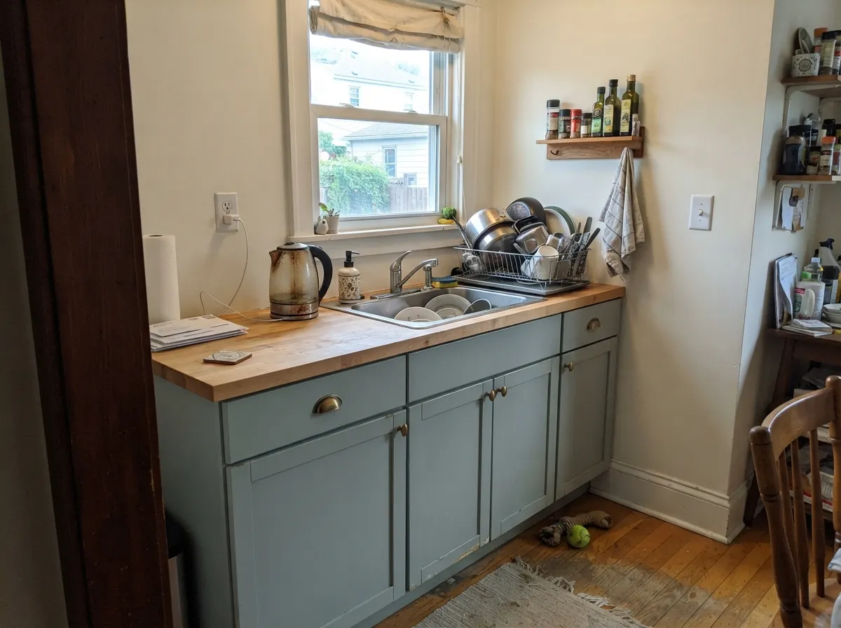
Give it soft, even daylight and warm bulbs and it does exactly what the name promises. Bedrooms, bathrooms and cabinets are where readers keep it and stay happy with it years later.
Where It Fails
Nearly every bad Quiet Moments story is the same story told three ways: the color moved. Here is where it moves the most, and what to paint instead when your room is one of these.
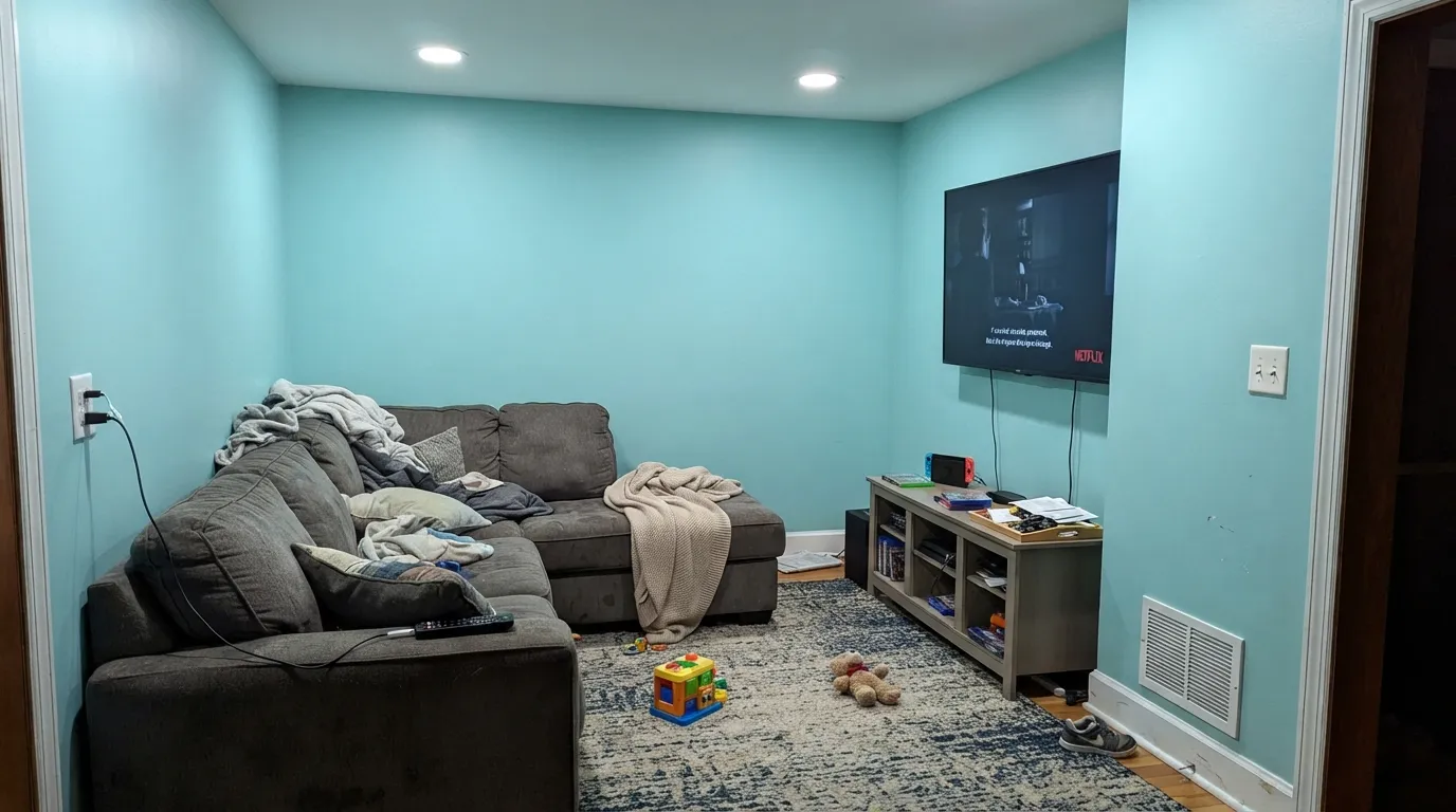
This is the number-one real complaint, and people usually discover it inside their own house: the same gallon that reads soft blue-gray in the dining room reads bright turquoise-aqua in the living room under recessed LEDs. The paint did not change, the light did. Warm 2700K bulbs pull most of it back; if you want a color that will not move at all, use Winter Solstice (Benjamin Moore 1605) instead.
North light is cool and indirect, so it drains the green out and leaves the blue-gray exposed. On an overcast day the room reads chilly and a little flat rather than restful. Go greener and gentler with Sea Salt (Sherwin-Williams SW 6204), or lighter and airier with Healing Aloe (Benjamin Moore 1562).
Outdoors, direct sun bleaches the low saturation right out of it and the siding reads as a washed, dull gray-white from the curb — it needs crisp white trim just to register as a color at all. If you want the blue-green to actually survive daylight, step down to Woodlawn Blue (Benjamin Moore HC-147) or Palladian Blue (Benjamin Moore HC-144).
Room by Room
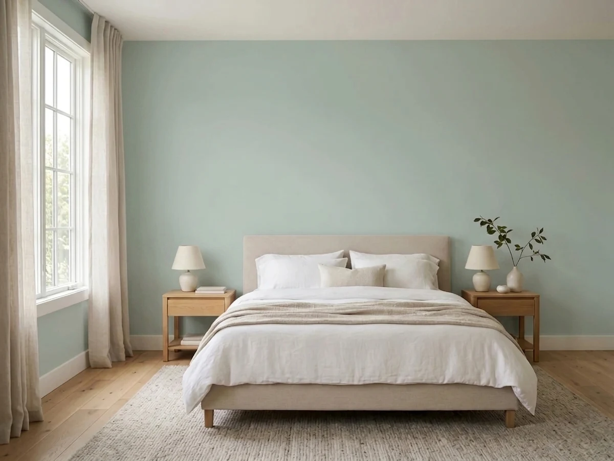
Soft daylight plus warm 2700K lamps is exactly the recipe this color wants. Eggshell on the walls, White Dove (OC-17) trim in semi-gloss. Skip it if the bedroom is both north-facing and dim.
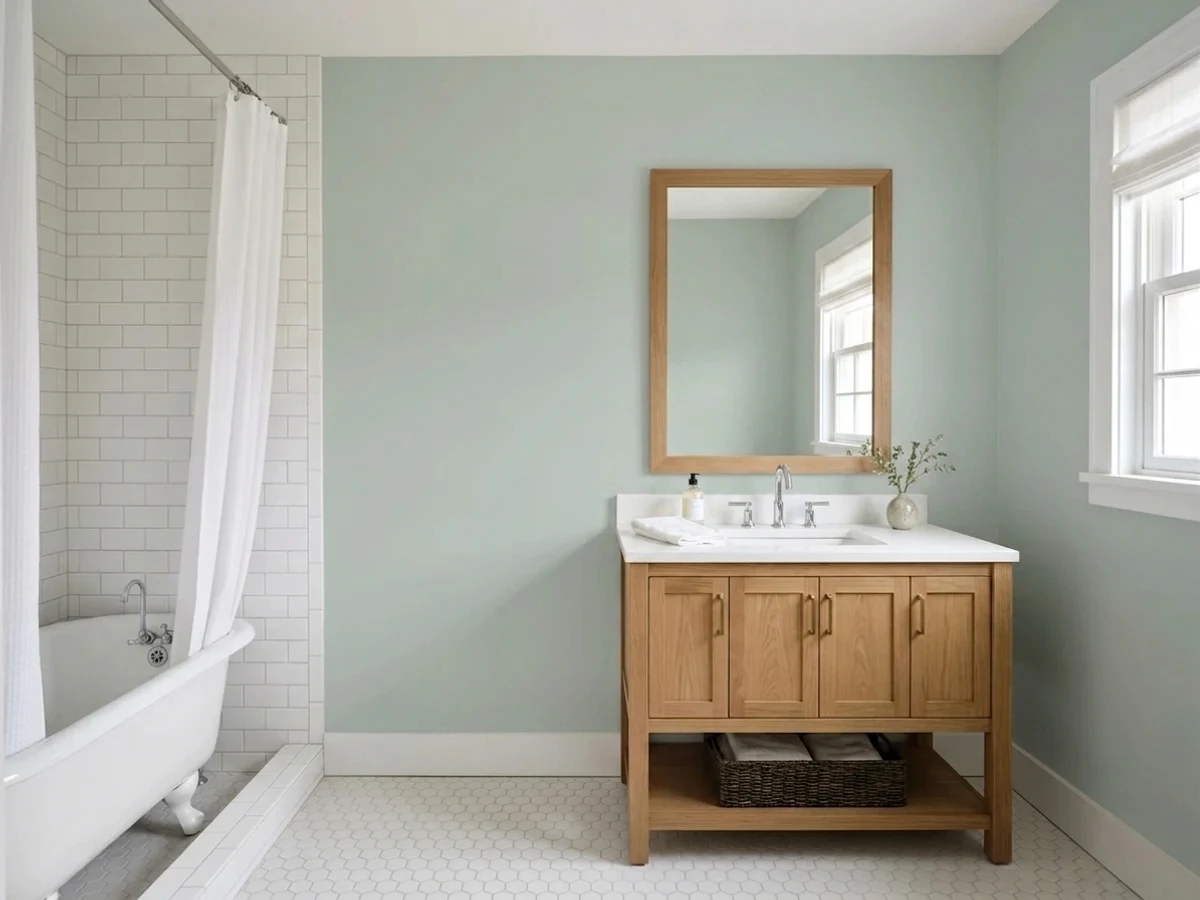
The spa read everyone is after, and at LRV 61 it still bounces enough light to keep a small bath open. Satin holds up to steam. Warm bulbs keep it soft; cool vanity LEDs are what turn it blue.
In even, moderate daylight it is a calm, grown-up backdrop for oak, linen and black metal. In a bright room with cool cans it can go turquoise across a big wall. Paint a full-wall sample before you commit the largest room in the house.
Use a urethane cabinet enamel in satin; butcher block, walnut and brass pulls all sit well with it. Expect it to read quieter on doors than on walls — bright overhead light plus cabinet sheen takes some of the color away.
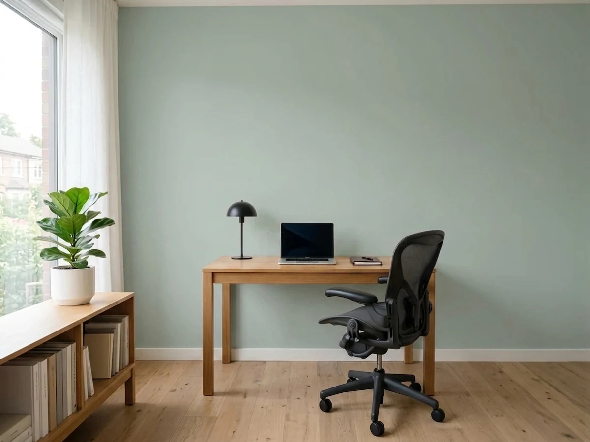
Quiet enough to sit behind a screen all day and light enough not to close in a hallway. Put Revere Pewter (HC-172) in an adjoining room so the cool tilt has a warm partner somewhere in the sightline.
Sun washes it toward pale gray, so it needs Chantilly Lace (OC-65) trim and dark shutters or a Wrought Iron (2124-10) door to read as a color. Walk the sample around the house; the shaded north wall will look noticeably bluer than the sunny side.
Your Light Is the Risk
Warm, generous light softens it and brings the green forward. The most flattering daylight it gets.
Cool light strips the green and leaves a chilly blue-gray. Warm lamps and wood tones are not optional here.
2700K bulbs mute it back to soft gray-green. 4000K daylight LEDs turn it spa-blue — change bulbs before you repaint.
Lots of cool downlight and no daylight is where readers report turquoise walls. Test under your actual fixtures, at night.
Most complaints about Quiet Moments are a light mismatch. Upload a photo of your actual room and see it on your walls — then ask for the same wall in north light or evening lamps before you buy a single sample.
Need It From Another Brand?
Any paint counter can custom-tint Benjamin Moore 1563 directly. If you would rather stay in one brand's own deck, these are the closest stock matches, measured as ΔE2000. Under 2 is a difference you will not see on the wall.
| Brand | Closest color | ΔE | LRV | |
|---|---|---|---|---|
| Sherwin-Williams | Sea SpraySW 9651 · Sherwin-Williams | 0.9 | 61 | Color page → |
| Behr | Silver SettingPWL-89 · Behr | 1.8 | 61 | Color page → |
| Valspar | Fountain FoamV099-2 · Valspar | 1.3 | 61.3 | Color page → |
| PPG / Glidden | White CloverPPG10-31 · PPG / Glidden | 3.1 | 61 | Color page → |
| Glidden | White CloverPPG10-31 · Glidden | 2.8 | 61 | Color page → |
| Dutch Boy | Silvered Cloud426-2DB · Dutch Boy | 0.7 | 61 | Color page → |
Similar Benjamin Moore Colors
The nearest shades to Quiet Moments within Benjamin Moore's own range, ranked by perceptual color distance — useful when you want the same look a touch lighter, darker, or warmer.
WCAG 2.1: AA is 4.5 : 1 for normal text, 3 : 1 for large text, AAA is 7 : 1.
Quiet Moments vs the Colors You're Also Considering
Every Quiet Moments sample board has the same rivals on it. The numbers show the real lightness gap — then it comes down to which risk you would rather live with.
Pick this when you want the blue-gray side of the family, not the green.
Sherwin-Williams SW 6204 · LRV 63Sea SaltPick this for the greener, gentler read that suits warm oak and cream tile.
Pick this for the grayer, quieter one that still behaves like a neutral.
Benjamin Moore 1564 · LRV 41Beach GlassPick this when you want the sea-glass color to actually show up.
Beach Glass (1564), LRV 50, shares the same brightness and family but reads slightly clearer and more blue-green; Quiet Moments is the grayer, quieter of the two. If you want a hair more visible sea-glass color, choose Beach Glass; if you want it to behave more like a neutral, stay with Quiet Moments.
Winter Solstice (1605), LRV 51, is nearly the same lightness but leans more toward plain gray with less green. Pick it when you want the calm without any spa tint. Woodland Green (459), LRV 52, tips a bit more toward green and feels slightly warmer and sagier.
Healing Aloe (1562), LRV 68, is a lighter, airier relative. At that higher LRV it reads much paler and more delicate on the wall, closer to an off-white with a green whisper, while Quiet Moments has noticeably more color and body.
Quiet Moments Coordinating Colors
Quiet Moments is a cool color with almost no warmth to spare, so the job of its partners is to keep the house from turning chilly. In practice that means soft whites rather than blue-whites on trim, one warm greige somewhere in the sightline, and a real dark note so the scheme has a floor. These are the partners that keep showing up next to it:
Quiet Moments on Cabinets and Vanities
Cabinets are the second life of this color, and they behave differently from walls. Paint sheen reflects more light than an eggshell wall does, so a satin or urethane cabinet enamel gives back a quieter, grayer version of the same color. In a bright kitchen with a big window and downlights, that can tip into washed-out — the doors read as plain gray-green rather than the soft spa color you sampled on cardboard. Hold the sample vertically, at door height, under the lights you actually use at dinner time.
What it loves: butcher block and walnut counters, unlacquered brass or aged-bronze pulls, and a warm white above. What fights it: cool white quartz with gray veining, which pulls the blue forward and makes the cabinets look slightly icy. On a bathroom vanity the same rules apply and the risk is lower, because vanities are small and usually lit warm.
Quiet Moments on Exteriors
Outside is where this color is weakest, and it is worth being blunt about it. Sunlight is far brighter than anything indoors, and a color built on ten percent saturation has very little to hold on to — from the street the siding can read as a plain gray-white with a faint blue cast, not the soft coastal blue-green the sample promised. The shaded north elevation, meanwhile, stays visibly bluer than the sunny south side, so the same house can look like two colors on the same afternoon.
If you still want it, contrast is what saves it. Chantilly Lace (OC-65) trim, dark shutters, and a Wrought Iron (2124-10) or Hale Navy (HC-154) front door give the eye something to measure the body color against, and suddenly it reads deliberate. If you want a facade that actually holds its blue-green all day, go a step deeper with Woodlawn Blue (HC-147) or Palladian Blue (HC-144) and keep Quiet Moments for the interior.
Three Ready Palettes Built on Quiet Moments
A color is never alone on the wall. These are complete combinations in the 60-30-10 pattern, with the reason each one holds together. Every one opens in the visualizer.
White Dove is warm enough to take the chill off a cool wall color without ever reading yellow beside it. Hale Navy on the vanity is the ten percent dark note that keeps a pale bathroom from looking washed out.
Try this palette in your roomChantilly Lace gives a clean edge that makes the wall color look deliberate instead of dusty. Revere Pewter in the hallway is the warm thirty percent, so the cool blue-green never takes over the whole floor.
Try this palette in your roomThe cabinets carry the color here, so the walls stay a quiet near-white that will not compete with the green-gray. Wrought Iron on the island supplies the dark ten percent that stops a pale kitchen from floating away.
Try this palette in your roomQuiet Moments FAQ
Why does Quiet Moments look turquoise in my room?
Almost always the bulbs. Cool 4000K LEDs and bright recessed cans push the blue-green forward until the wall reads spa turquoise instead of gray. Swap to 2700K bulbs and the gray comes back. If daylight alone is doing it, the color is simply stronger in your room than it looked on the chip.
Quiet Moments or Sea Salt?
This is the real fight, and it comes down to blue versus green. Sea Salt (SW 6204) leans green and reads a touch warmer and softer; Quiet Moments leans blue-gray and reads cooler and quieter. With warm fixed finishes — oak floors, cream tile — Sea Salt blends more easily. With cool grays, white marble and chrome, Quiet Moments is the cleaner match.
Will it work in a north-facing bedroom?
It works, but expect the cool version of it. North light removes the green and leaves a gray-blue that can feel chilly on an overcast day. Warm 2700K lamps, wood furniture and White Dove (OC-17) trim fix most of that. If the room is north-facing and dark, Sea Salt (SW 6204) is the safer pick.
Is it good for a bathroom with no window?
Yes, and this is one of its best uses — at LRV 61 it keeps a small windowless bath from feeling boxed in. The only real decision is the bulb. Warm bulbs keep it soft gray-green; cool vanity LEDs turn it into a distinctly blue spa. Use satin so steam and splashes wipe off.
Can I paint kitchen cabinets Quiet Moments?
Yes, and it is a popular alternative to plain white or a saturated sage. It sits beautifully with butcher block, walnut and brass. One warning from real kitchens: bright overhead light plus cabinet sheen can wash it out to near-gray, so it reads quieter on doors than on walls. Use a urethane cabinet enamel in satin.
Does Quiet Moments work on a house exterior?
Only with strong trim around it. Full sun bleaches its low saturation and the siding can read as a dull off-gray from the street. With Chantilly Lace (OC-65) trim and dark shutters it reads coastal and calm. If you want the blue-green to actually show outdoors, use Woodlawn Blue (HC-147) instead.
Have you painted with Quiet Moments?
Rate it — one tap helps the next reader decide.
Ask a Question