Stardew
The gray that quietly turns blue on the wall, reviewed honestly: the rooms where that is the whole point, the rooms where it backfires, and what to buy instead.

Jessica has spec'd whites and neutrals for more than 300 rooms and keeps a sample wall of painted drawdowns in her studio. Every color review is checked against real reader rooms in the comments and re-tested when a formula changes. About the testing process →
- 1Kendall Charcoal15
- 2Retreat21
- 3Stardew43
- 4Upward57
- 5Sea Salt63
The Fast Verdict
Stardew is a mid-tone gray with a soft blue-green lean, and that lean is much easier to see on a wall than on the chip. When you want it — a calm bathroom, a coastal bedroom, a kitchen island with depth — it is one of the best colors Sherwin-Williams makes in this range. When you wanted a plain gray, it is the color that makes people say "why is my room blue?" Buy it on purpose, sample it big, and it will not surprise you.
Bathrooms with white tile and real daylight · bedrooms you want calm and cool · kitchen islands and vanities · exteriors with cedar, stone and white trim
You actually wanted a neutral gray · the room has no window · your floors are orange-toned oak or builder LVP · you keep 4000K bulbs everywhere
- Never drifts purple or brown the way most mid-tone grays do
- LRV 43 gives real depth while still leaving a room open
- Looks expensive against white tile, quartz and chrome
- Excellent on cabinets and islands without the navy commitment
- Low saturation keeps it from dating like a saturated blue
- Reads plain gray on the chip and clearly blue on the wall
- Goes cold and clinical in north light with white tile
- Too heavy for a windowless room at LRV 43
- Fights orange-toned oak and builder vinyl plank
What Color Is Stardew, Really?
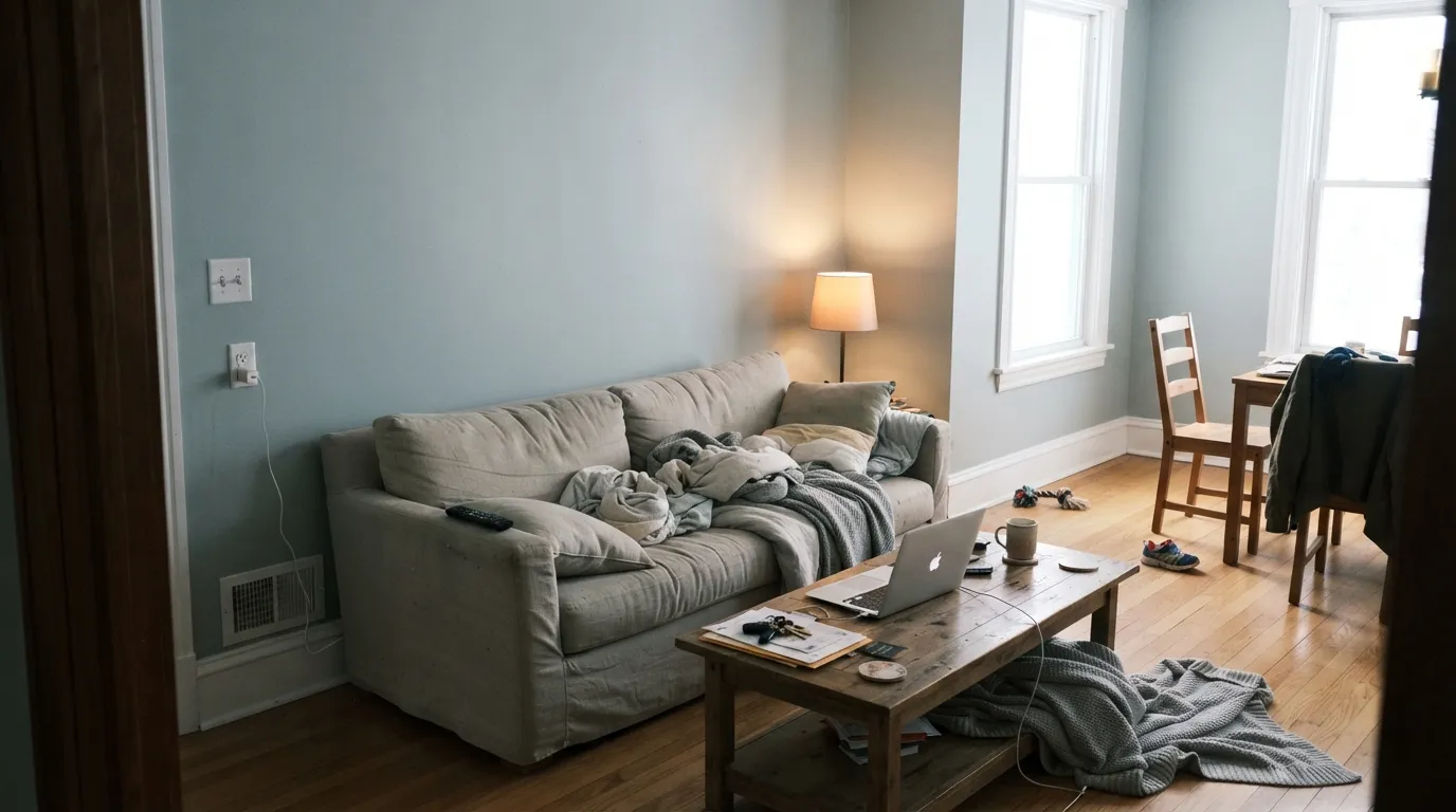
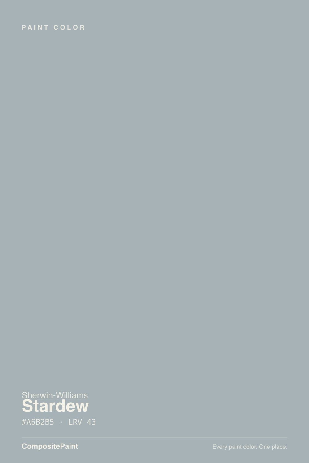
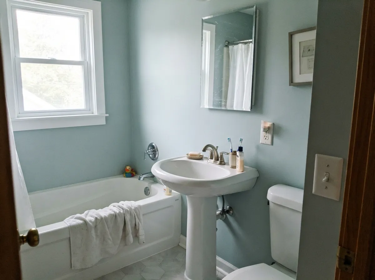
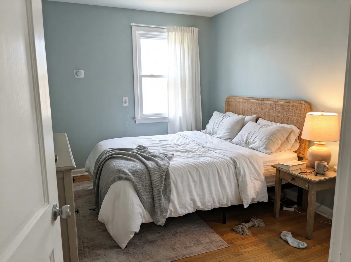
On the little chip it looks like a plain mid gray. On a wall it is a soft blue. That gap is the single most important thing to know about Stardew, and it catches people every year. The color is only about 9 percent saturated, so a two-inch chip has almost no room to show its hue — but four walls of it gather enough color for your eye to finally name it, and the name it picks is usually "blue." A little green sits underneath, which keeps it from ever looking like a nursery blue, but the blue is the half most people notice first.
At LRV 43 it sits right in the middle of the light scale, and that is deeper than most people picture when they say "gray walls." Put it beside Sea Salt SW 6204 at LRV 63 — the color it is most often cross-shopped against — and Stardew is a full 20 points darker. Sea Salt tints a room. Stardew colors it. In a bright room that extra weight is exactly why it looks expensive; in a dim one it is why the room shrinks.
Undertone in one line: cool blue with a quiet green underneath — never purple, never brown, never warm. If your sample looks like plain gray, your chip is too small or your bulbs are too warm.
Where It Shines
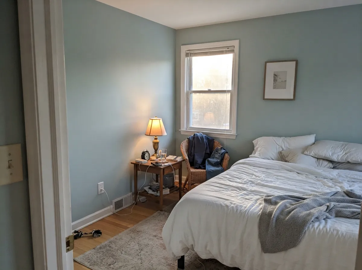
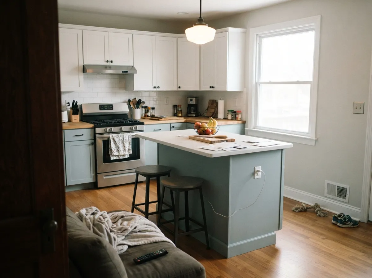
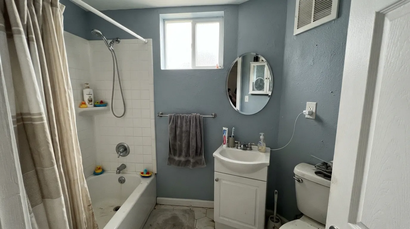
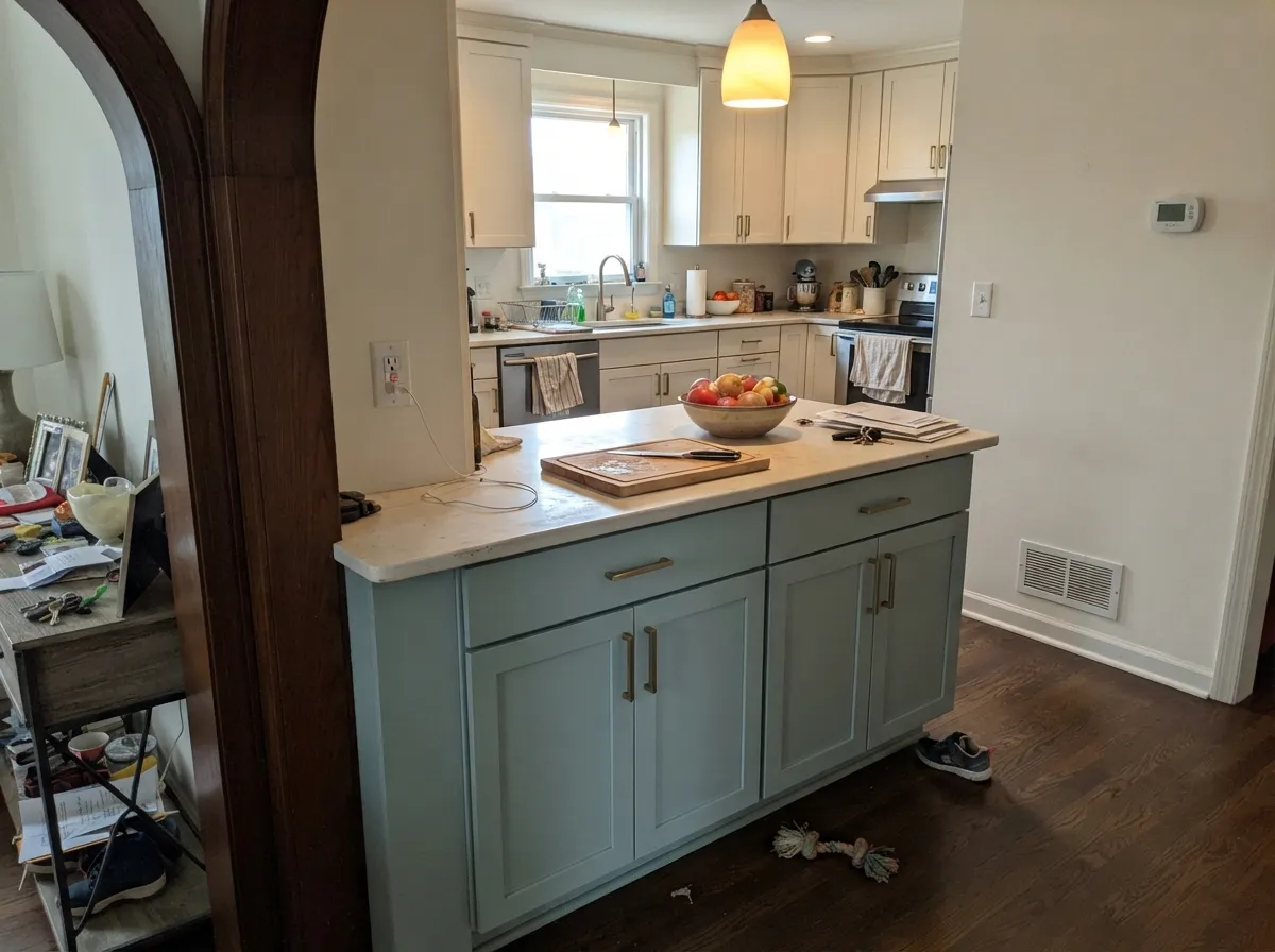
Give it daylight and something white and hard to sit against — tile, quartz, painted trim — and Stardew stops being ambiguous and turns into a genuinely handsome color. Bathrooms are its home. Bedrooms and kitchen islands are close behind, because at LRV 43 it delivers real depth without the commitment of a charcoal or a navy.
Where It Fails
The unhappy stories about Stardew are remarkably consistent, and every one of them is predictable from the numbers. It is not a temperamental paint. It is a cool mid-tone doing exactly what a cool mid-tone does in the wrong room.
This is the number one regret. North light is already cool, white tile bounces more cold light back, and chrome adds a blue glint. All three stack, and the walls go from soft blue to hospital blue. People describe waking up in a room that feels cold. If you want the spa feeling in cool light, go lighter and greener with Sea Salt SW 6204.
Powder rooms, basements, interior hallways. LRV 43 returns a moderate amount of light, and with only a bulb to work with there is nothing to return. The blue drains out, the walls read as a flat heavy gray, and the room feels smaller than it did in primer. Stay in the same quiet family but go much lighter — Silver Strand SW 7057 at LRV 59 keeps the calm and gives the room its lift back.
Blue and orange are opposites, so they make each other louder. Honey oak, red oak, and the warm brown vinyl plank in most new builds all push Stardew's blue forward, and Stardew pushes their orange forward right back. The room reads as two colors arguing rather than one scheme. If the floors are staying, Uncertain Gray SW 6234 gives you the exact same depth at LRV 43 with no blue to fight.
Room by Room
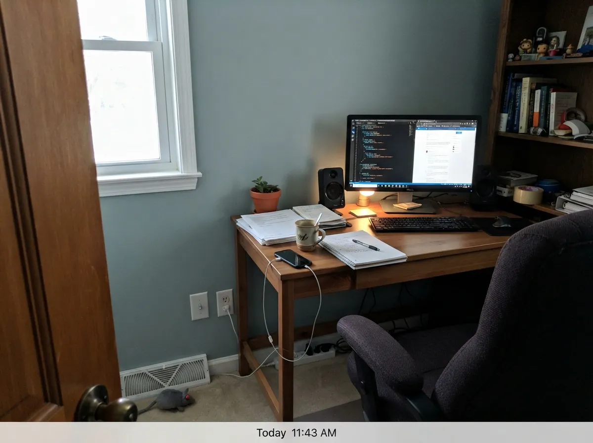
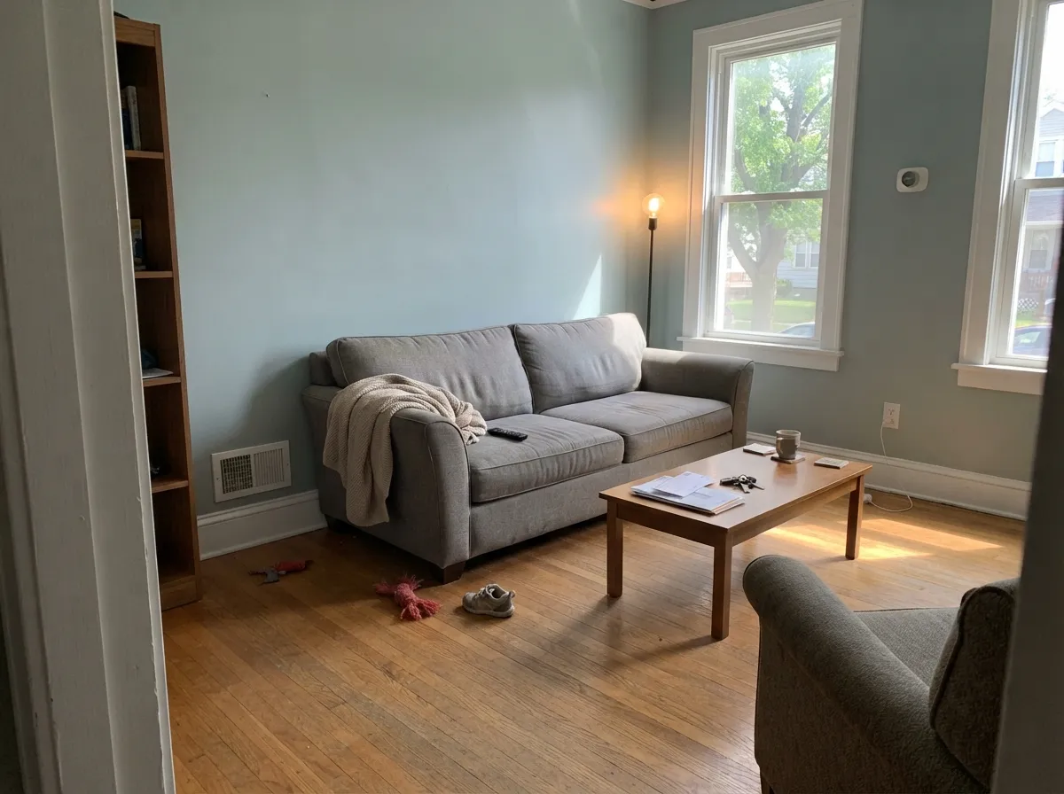
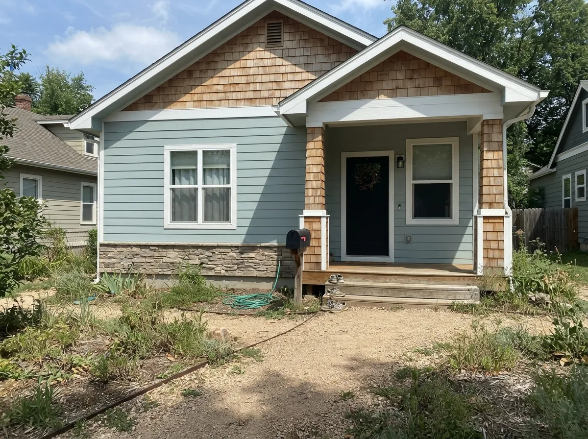
Your Light Is the Risk
Cool indirect daylight amplifies the blue and deepens it. This is where people get a bluer room than they signed up for.
Warm sun cancels the cool cast. The walls settle into a soft, expensive gray-blue and hold it most of the day.
2700K lamps mute the blue toward gray and warm the room. 4000K LEDs bring the blue back hard and read clinical.
Windowless baths and basements: LRV 43 has nothing to reflect, so it flattens into a dull, closed-in gray.
Most complaints about Stardew are a light mismatch. Upload a photo of your actual room and see it on your walls — then ask for the same wall in north light or evening lamps before you buy a single sample.
Need It From Another Brand?
Any paint counter can custom-tint Sherwin-Williams SW 9138 directly. If you would rather stay in one brand's own deck, these are the closest stock matches, measured as ΔE2000. Under 2 is a difference you will not see on the wall.
| Brand | Closest color | ΔE | LRV | |
|---|---|---|---|---|
| Behr | Porch CeilingPPF-27 · Behr | 1.6 | 44 | Color page → |
| Benjamin Moore | Silver Mink1586 · Benjamin Moore | 2.6 | 43 | Color page → |
| Valspar | Granite Fog8006-8C · Valspar | 2.8 | 43 | Color page → |
| PPG / Glidden | Special DeliveryPPG1037-3 · PPG / Glidden | 0.6 | 43 | Color page → |
| Glidden | Special DeliveryPPG1037-3 · Glidden | 1.0 | 43 | Color page → |
| Dutch Boy | Timber Wolf430-3DB · Dutch Boy | 0.9 | 44 | Color page → |
Similar Sherwin-Williams Colors
The nearest shades to Stardew within Sherwin-Williams's own range, ranked by perceptual color distance — useful when you want the same look a touch lighter, darker, or warmer.
WCAG 2.1: AA is 4.5 : 1 for normal text, 3 : 1 for large text, AAA is 7 : 1.
Stardew vs the Colors You're Also Considering
Every Stardew sample board has the same rivals on it. The numbers show the real lightness gap — then it comes down to which risk you would rather live with.
Pick this when you want the soft coastal lean, not just gray.
Sherwin-Williams SW 6234 · LRV 43Uncertain GrayPick this for the identical depth with no blue cast at all.
Pick this when you want the wall to read as a real color.
Sherwin-Williams SW 6204 · LRV 63Sea SaltPick this for dim rooms — 20 LRV points lighter and greener.
Uncertain Gray SW 6234 shares the same LRV of 43 but sits at #A9B0B1, which is more neutral and less blue-green. Choose it when you want gray without a cast, and Stardew when you want the faint coastal lean. Morning Fog SW 6255 at LRV 42 is a shade deeper at #A8AEB1 and also more neutral. Mineral Deposit SW 7652 at LRV 43 goes the other direction at #ABB0AC, warmer and greener.
Dockside Blue SW 7601 matches the LRV at 43 but is clearly bluer at #A0B3BC, so it looks like a color rather than a gray. Jubilee SW 6248 at LRV 45 is slightly lighter, and Eventide SW 9643 at LRV 41 is slightly deeper and greener.
Across brands, PPG Special Delivery PPG1037-3, Dunn-Edwards Yreka DET594, and Dutch Boy Timber Wolf 430-3DB are effectively the same color, and Behr Flint Smoke 730F-4 is visually identical in normal room light. Benjamin Moore Silver Mink 1586 and Valspar Granite Fog 8006-8C are very close but worth sampling first.
Stardew Coordinating Colors
The rule with Stardew is to decide up front whether you want the blue louder or quieter, then choose partners on that side. Cool, low-yellow whites and deep blues make it read coastal and crisp. Warm creamy whites and warm woods calm it down and make it read closer to a soft transitional gray. Mixing both halves is what produces the rooms people describe as "off" without being able to say why. These are the partners that actually work:
Stardew on Cabinets and Islands
Cabinets are where Stardew earns most of its money, and they are also where it behaves best. On a vertical door face in a lit kitchen the color settles, and because it is a mid-tone rather than a dark, it adds depth to a room without eating the light. It is a genuinely good alternative for anyone who wants an island that is not white and not navy.
Two practical warnings. First, undercabinet LED strips are usually 4000K or cooler, and that light lands directly on lower cabinets and drawer fronts — it will push the blue harder than the rest of the room, so match your strip temperature to your ceiling cans before you decide the color is wrong. Second, use a real cabinet enamel in satin, not wall paint in satin; a mid-tone shows every handprint around a pull, and a hard enamel is the difference between wiping it and repainting it.
Stardew on Exteriors
Outside is the one place Stardew's blue becomes an advantage rather than a gamble. Direct sun lifts it roughly a step lighter than the chip and neutralizes some of the cool cast, so the finished house reads as a soft weathered gray with a hint of sea in it — the look people are chasing when they ask for a coastal gray. It sits comfortably with cedar shakes, gray stone and standing-seam metal.
Trim is the decision that makes or breaks it. A crisp white keeps the whole facade looking clean and intentional; a creamy white next to Stardew looks slightly yellowed by contrast, which is not the effect anyone wants on a whole house. For the dark note, Iron Ore on shutters gives a softer, more traditional result than Tricorn Black, and Naval on the front door is the pairing that leans hardest into the coastal read. One more thing worth doing: check the shaded north elevation as well as the sunny side, because the two faces of the same house can look like two different colors.
Three Ready Palettes Built on Stardew
A color is never alone on the wall. These are complete combinations in the 60-30-10 pattern, with the reason each one holds together. Every one opens in the visualizer.
Pure White is low-yellow, so it keeps Stardew looking clean instead of muddying the blue the way a creamy white would. Naval is the same cool family taken to LRV 4, which gives the room one deep anchor without introducing a second undertone.
Try this palette in your roomThis is the version for people who love the color but not the chill: Alabaster's soft warmth takes the clinical edge off Stardew without dulling it. Riverway is the same blue-green hue several steps deeper, so the built-ins add weight while staying inside one family.
Try this palette in your roomFull sun lightens Stardew about a step, so the body needs crisp white trim to hold its edges rather than a soft one. Tricorn Black at LRV 3 supplies the small dark note that keeps a mid-tone facade from looking washed out from the curb.
Try this palette in your roomStardew FAQ
Does Stardew ever look green?
Sometimes, and it depends on what is next to it. Beside a true blue, or against blue-gray tile, the green half comes forward and Stardew reads as a soft sage-gray. Beside anything warm — oak, beige, brass — the blue wins instead. It almost never looks green on its own.
Is Stardew too dark for a small bedroom?
Not if the room has a decent window. LRV 43 is a mid-tone, so it will feel like a colored room rather than a light one, but small rooms handle that fine when daylight reaches them. In a small bedroom with one north window and no lamps, step up to Silver Strand SW 7057 at LRV 59.
Stardew or Sea Salt?
They are not close in person. Sea Salt SW 6204 sits at LRV 63 and leans green, so it barely tints a room. Stardew is 20 points deeper and leans blue, so it actually colors the walls. Pick Sea Salt for a light airy bath, Stardew when you want the room to have a color.
What should the ceiling be with Stardew walls?
A flat white, not Stardew. Pure White SW 7005 in flat is the clean match; Extra White SW 7006 works if the trim is already Extra White. Painting the ceiling Stardew too makes the blue read much stronger and drops the whole room a step darker — only do it in a bright room where you want that.
Does Stardew go with oak floors?
White oak and gray-washed oak, yes — they are neutral enough to sit quietly under it. Honey oak, red oak and warm brown vinyl plank are a real problem, because orange is the opposite of blue and each one makes the other louder. Sample a large board against the actual floor before you buy paint.
Is Stardew still current, or does it look dated?
It holds up. Saturation is only about 9 percent, so it never reads as a trend blue the way a bolder coastal color does, and mid-tone blue-grays have stayed in rotation for cabinets and exteriors for years. The dated risk is not the color — it is pairing it with 2015-era cool gray floors and cool gray counters.
Have you painted with Stardew?
Rate it — one tap helps the next reader decide.
Ask a Question