Retreat
The gray-green everyone calls sage on the chip and gray on the wall, reviewed honestly: where it earns its price, and the rooms where it flattens.

Jessica has spec'd whites and neutrals for more than 300 rooms and keeps a sample wall of painted drawdowns in her studio. Every color review is checked against real reader rooms in the comments and re-tested when a formula changes. About the testing process →
- 1Black Fox7
- 2Pewter Green12
- 3Retreat21
- 4Stardew43
- 5Quietude48
The Fast Verdict
Retreat is the color people choose when they want green without owning a green room. It is deep, quiet, and almost neutral, which makes it one of the best cabinet colors Sherwin-Williams sells and a grounded pick for a study or a bedroom.
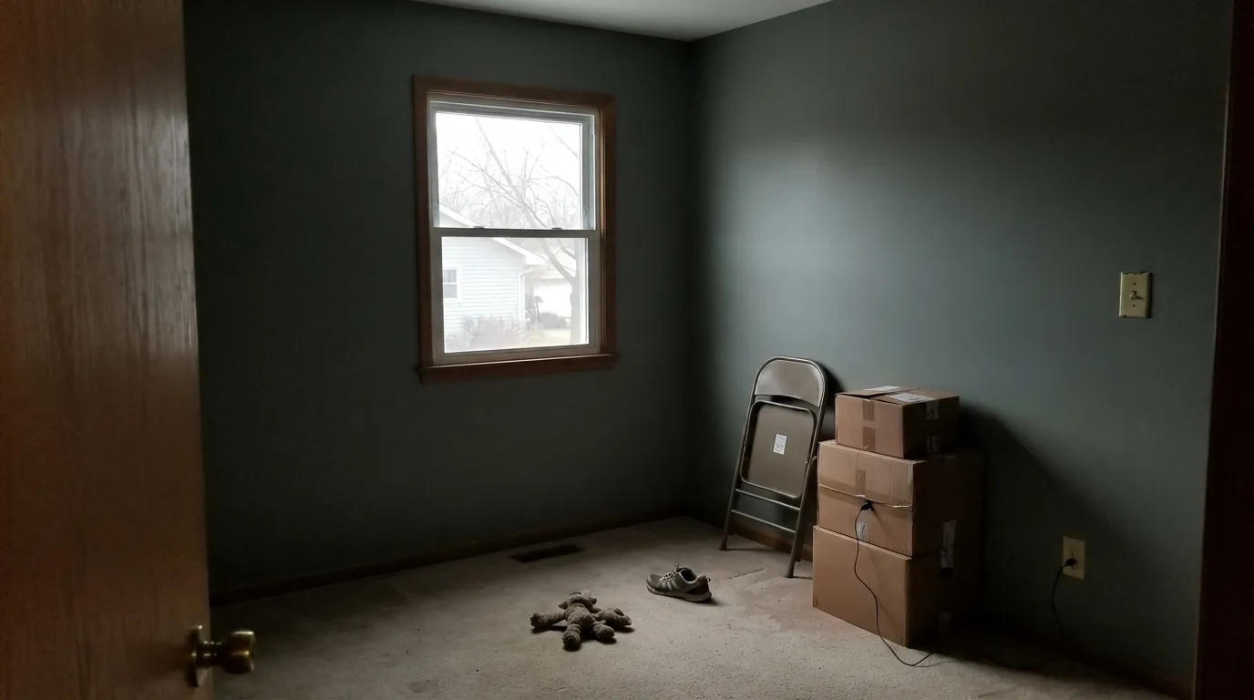
The catch is light: at LRV 21 it needs windows or good lamps, and in a dim north room the green drains away and leaves a heavy gray. Sample it in the darkest corner of the room, at night, before you buy gallons.
Kitchen cabinets and islands · studies and home offices that should feel grounded · bedrooms with real lamps · exteriors with wood, stone and black trim
The room faces north and stays dim · your bulbs are 4000K daylight LEDs · you want an obvious sage green · it is a small windowless bathroom
- Reads as a calm neutral, so it does not date like a saturated sage
- One of the best cabinet colors Sherwin-Williams makes — deep without shouting
- Hides fingerprints, scuffs and pot marks that a light cabinet color broadcasts
- Sits comfortably with oak, walnut, brass, bronze and matte black at once
- So low in saturation it rarely argues with existing counters, tile or stone
- At LRV 21 it needs real light — dim rooms turn it into a flat, heavy gray
- The green almost disappears under cool 4000K LEDs
- Too much for all four walls of a small windowless room
- Touch-ups flash on a dark color; plan to roll the whole wall
What Color Is Retreat, Really?
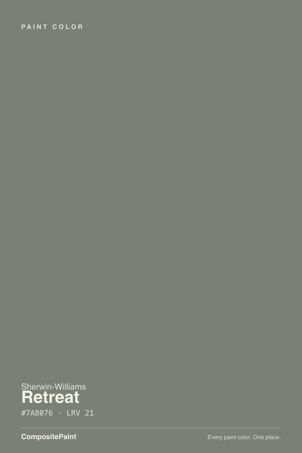
A dark gray that keeps one thread of green. The measured hue sits at 96 degrees, which is technically green, but the saturation is only about 4 percent — so weak that the color spends most of its life behaving like a neutral and only shows its green when something warm sits next to it. That is exactly why people buy it. It gives you the feeling of a sage room with none of the commitment, and it does not go out of style the way a saturated green does.
The number that decides everything is LRV 21. Put it beside Evergreen Fog (SW 9130) at LRV 30 and the nine points read as a full step, not a nudge: Evergreen Fog is a soft sage that keeps a room feeling light, and Retreat is a color with weight that pulls a room inward. Most disappointment with Retreat comes from expecting the first and getting the second. The chip in your hand is lit by the store; the wall is lit by your window.
Undertone in one line: gray first, green second, never blue-teal and never olive-warm. If your wall looks cold and slightly military, that is a 4000K bulb or flat north light talking — not the paint.
Where It Shines
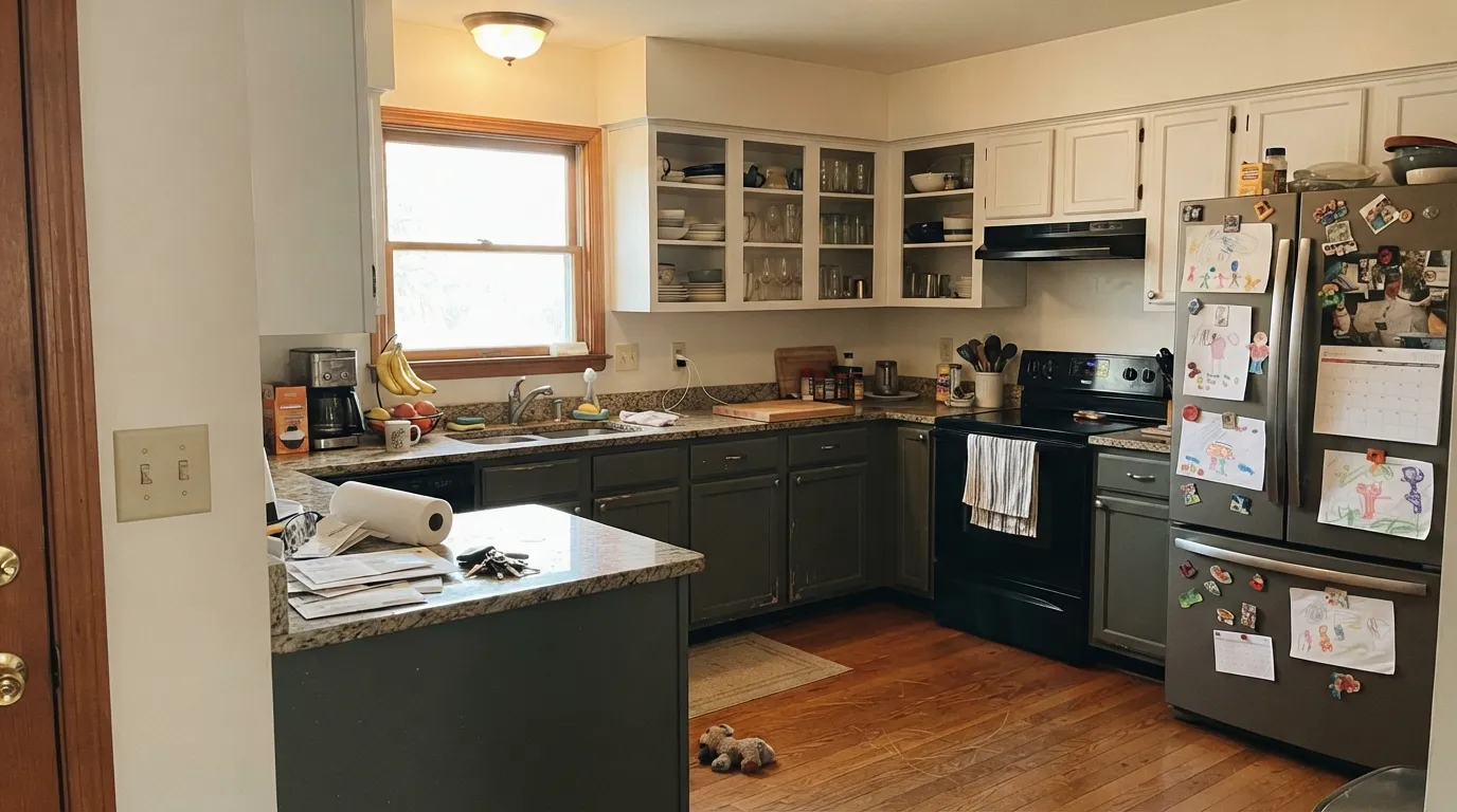
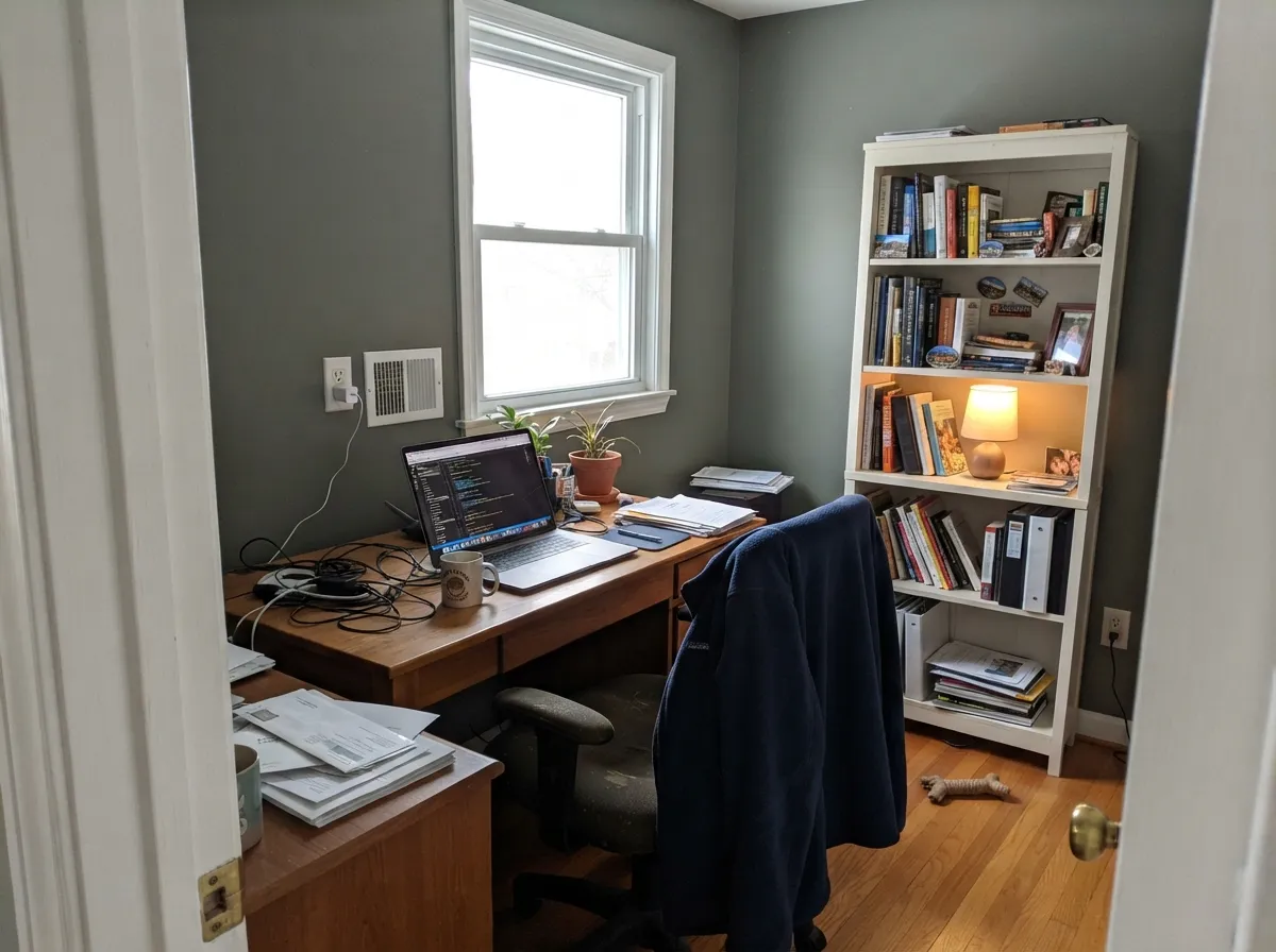
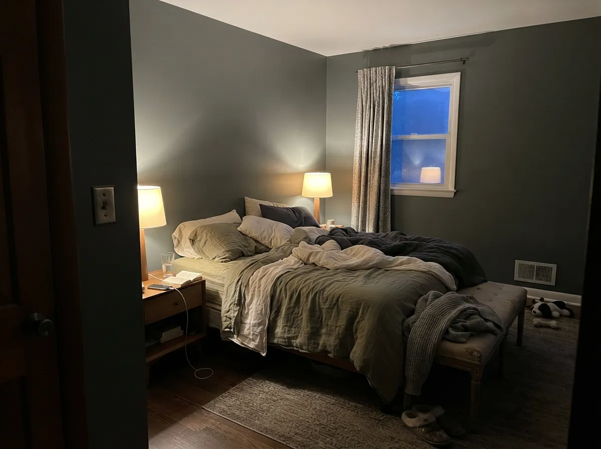
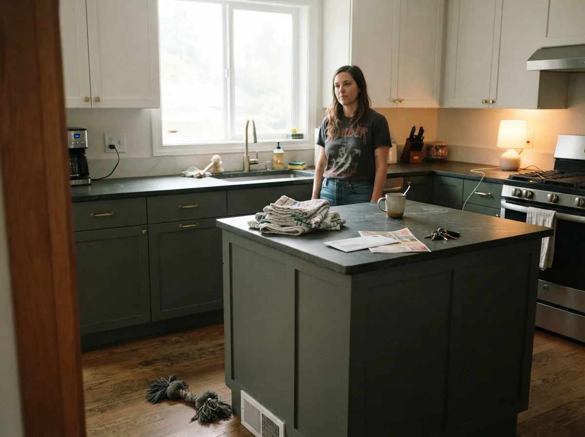
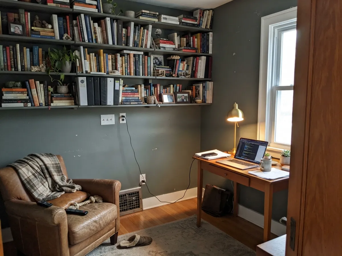
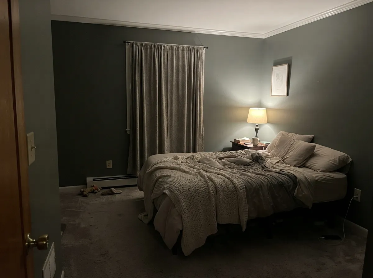
Give it light and something warm to sit against and it is excellent. Cabinets are its best work: a Retreat island or lower run under white uppers reads expensive from across the room and quiet up close. Studies, offices and bedrooms with real lamps get the same benefit — a room that feels settled rather than decorated.
Where It Fails
The bad stories about Retreat are all the same story told three ways, and every one of them is about light rather than paint. If your room matches one of these, no second coat will fix it.
North light is cool and flat. It kills the last 4 percent of green and leaves a dense, stony gray, and at LRV 21 the walls step toward you. If the room has one small window and no lamps, go lighter: Evergreen Fog (SW 9130) at LRV 30 or Acacia Haze (SW 9132) at LRV 32 keep the same mood with air in the room.
Daylight LEDs strip the warmth out and pull the gray-blue side forward — this is the room people describe as cold, or as looking like army surplus. Change the bulbs to 2700K before you change the paint. If you want the green to survive any bulb, use Dried Thyme (SW 6186), the same depth with real green in it.
Full-height Retreat works in a big kitchen with windows and dies in a galley. In anything under about 150 square feet, keep the uppers light — Alabaster (SW 7008) — and put Retreat on the base cabinets and island, or step up to Oyster Bay (SW 6206) if you want the color everywhere.
Room by Room
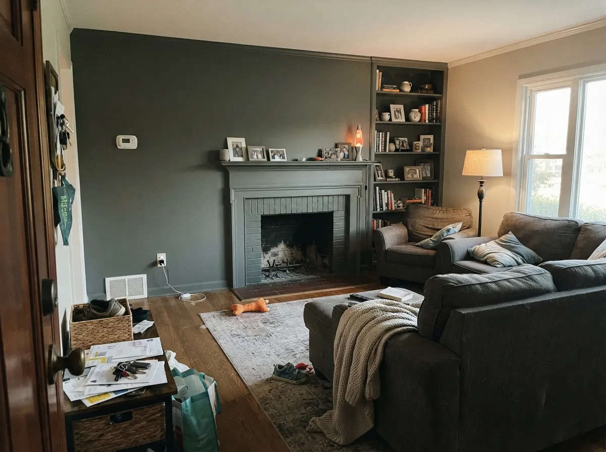
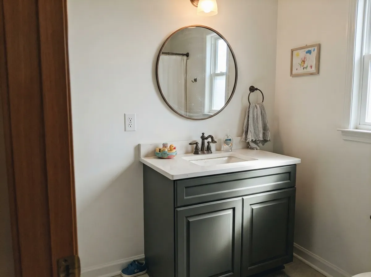
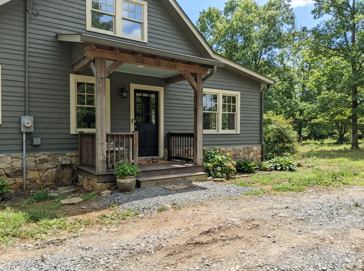
Your Light Is the Risk
Cool, even daylight erases the green and leaves dense gray. Fine for a moody study, wrong for a small room.
Warm sun lifts it and the sage side finally shows, especially on the walls facing the window in the afternoon.
2700K lamps warm it toward soft olive and it feels cozy. 4000K LEDs make it cold and gray — swap bulbs, not paint.
Cheap cool strips over Retreat cabinets read gray-blue and cheapen the whole run. Buy 2700K–3000K strips with the paint.
Most complaints about Retreat are a light mismatch. Upload a photo of your actual room and see it on your walls — then ask for the same wall in north light or evening lamps before you buy a single sample.
Need It From Another Brand?
Any paint counter can custom-tint Sherwin-Williams SW 6207 directly. If you would rather stay in one brand's own deck, these are the closest stock matches, measured as ΔE2000. Under 2 is a difference you will not see on the wall.
| Brand | Closest color | ΔE | LRV | |
|---|---|---|---|---|
| Behr | Cedar ForestHDC-AC-22 · Behr | 1.9 | 21 | Color page → |
| Benjamin Moore | Geddy GrayCW-720 · Benjamin Moore | 3.5 | 21 | Color page → |
| Valspar | Lead Cast5007-2B · Valspar | 3.0 | 21 | Color page → |
| PPG / Glidden | Industrial RevolutionPPG0997-6 · PPG / Glidden | 5.0 | 20 | Color page → |
| Glidden | Autumn GrayPPG1028-5 · Glidden | 4.7 | 21 | Color page → |
| Dutch Boy | Sweetbrier425-5DB · Dutch Boy | 2.6 | 21 | Color page → |
Similar Sherwin-Williams Colors
The nearest shades to Retreat within Sherwin-Williams's own range, ranked by perceptual color distance — useful when you want the same look a touch lighter, darker, or warmer.
WCAG 2.1: AA is 4.5 : 1 for normal text, 3 : 1 for large text, AAA is 7 : 1.
Retreat vs the Colors You're Also Considering
Every Retreat sample board has the same rivals on it. The numbers show the real lightness gap — then it comes down to which risk you would rather live with.
Pick this for real depth — Evergreen Fog can look washed out in bright rooms.
Sherwin-Williams SW 9130 · LRV 30Evergreen FogPick this for a dim room, or when you want the green to be obvious.
Side-by-side comparison →Pick this when Pewter Green would swallow what little light the room has.
Sherwin-Williams SW 6208 · LRV 12Pewter GreenPick this for cabinets you want unmistakably green and nearly black-deep.
The comparison people ask about most is Evergreen Fog (SW 9130) at LRV 30. Evergreen Fog is nine points lighter and clearly greener, with a hex of #A0A38E against Retreat's #7A8076. In practice Evergreen Fog reads as a sage that behaves like a neutral, while Retreat reads as a gray that hints at sage. If your room is short on daylight or you want the green to be obvious, Evergreen Fog gives you more of both.
Within the brand, Dried Thyme (SW 6186) at LRV 21 matches Retreat's depth with much more green. Cityscape (SW 7067) at LRV 22 is the neutral gray version of the same idea.
Across brands, the HGTV Home by Sherwin-Williams version of Retreat (HGSW 3283) is deltaE 0, the same color. C2 Paint Stream (C2-937), Backdrop Hartford (BD-HF), and Behr Cedar Forest (HDC-AC-22) all fall between deltaE 1.52 and 1.95 and will look visually identical in normal room light. Dunn-Edwards Harbor Mist Gray (DET515) at deltaE 2.74, Valspar Lead Cast (5007-2B) at deltaE 3.02, and Benjamin Moore Geddy Gray (CW-720) at deltaE 3.49 are very close but worth sampling first. Glidden Autumn Gray (PPG1028-5) at deltaE 4.66 is close but visibly different side by side.
Retreat Coordinating Colors
Retreat coordinates by temperature, not by hue. Because it carries almost no saturation, its partners decide whether the room reads as a soft sage or as cold stone — warm whites, beiges and clay tones bring the green forward, while cool grays and blue-grays flatten it into slate.
These are the partners that keep showing up in rooms where Retreat actually looks good: a warm trim white, a beige to bridge the walls, a lighter sibling from the same family for adjoining rooms, and one deep anchor for a door or an island.
Retreat on Kitchen Cabinets
If you only paint one thing this color, paint cabinets. On a door front the low saturation stops it from reading as a green kitchen, while the depth gives the run the weight that light cabinets never have. It also does the unglamorous job well: at LRV 21 it hides the marks around handles, the splash beside the sink and the scuffs under the island overhang.
The layout rule is simple. Big kitchen with windows: full-height Retreat is beautiful. Small or galley kitchen: Retreat on the base cabinets and island only, with Alabaster (SW 7008) uppers and Accessible Beige (SW 7036) on the walls. Either way, get the lighting right before you blame the color — cool under-cabinet strips will turn a warm gray-green into cold blue-gray every time.
Hardware is where the color pays off. Brass, unlacquered bronze and matte black all sit well against it, and so do walnut open shelves and butcher block. Polished chrome is the one finish that reads cold beside it. Use a urethane-fortified cabinet enamel in satin.
Lighter and Darker Than Retreat
Most people who sample Retreat and back away do not want a different color — they want the same color with more or less weight. Going lighter, Evergreen Fog (SW 9130) at LRV 30 and Acacia Haze (SW 9132) at LRV 32 both keep the muted gray-green idea while letting a room breathe, and Oyster Bay (SW 6206) at about LRV 44 is the version that still works in a dim space. Sea Salt (SW 6204) at about LRV 63 is the far end of the family, soft enough for a whole house.
Going darker, Pewter Green (SW 6208) at LRV 12 is the one people compare it against most. It is roughly nine points deeper and much more clearly green — the right call for a moody library or a black-hardware kitchen, and the wrong call for anything with modest daylight. If you like Retreat but the sample looks timid on the wall, Pewter Green is the step; if it looks heavy, go up to Evergreen Fog.
Three Ready Palettes Built on Retreat
A color is never alone on the wall. These are complete combinations in the 60-30-10 pattern, with the reason each one holds together. Every one opens in the visualizer.
Retreat holds the room at 60 percent, Alabaster takes the trim and ceiling at 30 and keeps the depth from closing in, and Redend Point is the 10 percent warm clay note that stops the scheme from going cold. The warmth in Alabaster is what keeps the faint green alive instead of turning it to slate.
Try this palette in your roomPutting the dark color low and the white high is what makes a small kitchen survive an LRV of 21, and Pure White is clean enough to sharpen the green instead of muddying it. Accessible Beige on the walls is the warm bridge that keeps the room from reading gray on gray.
Try this palette in your roomSun lifts Retreat a full step outdoors, so the siding reads greener than any interior wall and needs a trim white with a little softness rather than a bright one. Tricorn Black on the door and shutters supplies the single hard edge that keeps a muted body color from looking faded.
Try this palette in your roomRetreat FAQ
Is Retreat too dark for a small room?
It depends entirely on the window, not the square footage. A small room with a decent south or west window handles it and feels like a jewel box; a small room with one north window turns into a gray closet. If you love the color but the room is dim, use it on a vanity, a built-in or a single wall instead of all four.
Retreat or Evergreen Fog?
Evergreen Fog (SW 9130) is nine LRV points lighter and clearly greener — it is the safer choice for low light and for anyone who wants people to notice the green. Retreat is the one to pick when the room has good light and you want depth and quiet. On cabinets, Retreat looks more expensive; on the walls of an average room, Evergreen Fog is easier to live with.
Is Retreat good for kitchen cabinets?
It is one of its best uses. The low saturation keeps it from looking like a green kitchen, the depth hides handprints, and it works with brass, bronze and matte black hardware without choosing sides. Use a satin urethane cabinet enamel, and in a small kitchen keep the uppers in Alabaster (SW 7008).
What trim white goes with Retreat?
Alabaster (SW 7008) for a warm, organic look that keeps the green side alive, or Pure White (SW 7005) for a crisper, more modern edge that pushes Retreat toward gray. Both give plenty of contrast against LRV 21. Do not trim it in anything close to its own depth — the trim simply vanishes.
Does Retreat ever look blue?
It can, in cool light. North exposure and 4000K or higher LED bulbs pull the gray-blue side forward and the green disappears — that is the version people call cold or military. Warm 2700K bulbs and any warm wood in the room push it back toward sage.
Does Retreat work with orange-toned oak floors?
Yes, and this is one of the reasons people buy it. Warm wood is the thing that makes the green step forward, so honey oak and Retreat flatter each other instead of fighting. Cool gray LVP is the harder pairing — it drains the warmth and leaves both surfaces looking flat.
How many coats does Retreat need?
Two over a mid-tone wall, and usually a gray-tinted primer plus two coats over white or over a previous dark color. Skipping primer on a color this deep is how people end up rolling a third and fourth coat. Buy enough that you can roll a whole wall at once, because touch-ups on a dark color flash.
Have you painted with Retreat?
Rate it — one tap helps the next reader decide.
Ask a Question