Room Colors · Whole House
6 Best Whole House Paint Colors for 2026
ideas, combinations, and real rooms
6 curated picks from real whole houses — with the exact colors, honest reasons why, and the combinations that hold the room together.

Former interior stylist who can spot a green undertone from across a room. Jessica writes the color and mood pieces — what to choose, what pairs, and why your "white" looks pink.

Top Picks for the Whole House
Pick a color family, tap a shade to see the whole house in it, then try it on your own room.
Whole House Color Trends 2026 — What's In, What's Out


- Icy Blue-Grays Everywhere — Cool blue-leaning grays running through a whole house now read cold and firmly 2015; the warmth trend has pushed them out.
- Stark Builder White — Untinted bright white on every wall reads clinical and unfinished — the whites people actually choose now carry a warm undertone.
- Gray-on-Gray Flip Style — Gray walls plus gray floors plus gray cabinets has become shorthand for a quick flip, and designers say it now reads builder-grade rather than chosen.
- A New Color at Every Doorway — Switching colors room by room chops up the sightlines that open plans depend on — the choppy look is exactly what one-color flow replaced.
The 6 Best Whole House Paint Colors
Every pick below is a real rendered whole house, not a chip. The lead color first; the swatches are the full scheme in the photo — walls, furniture, textiles, accent.

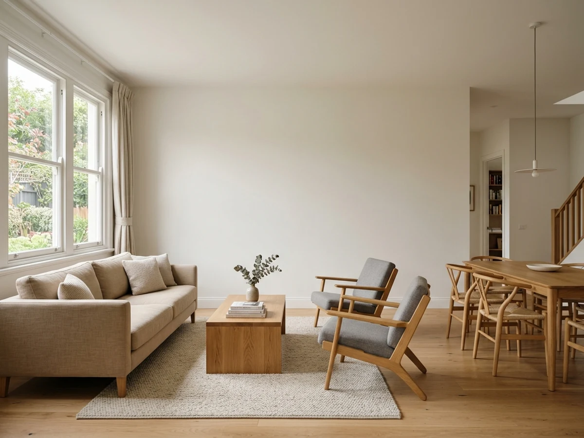
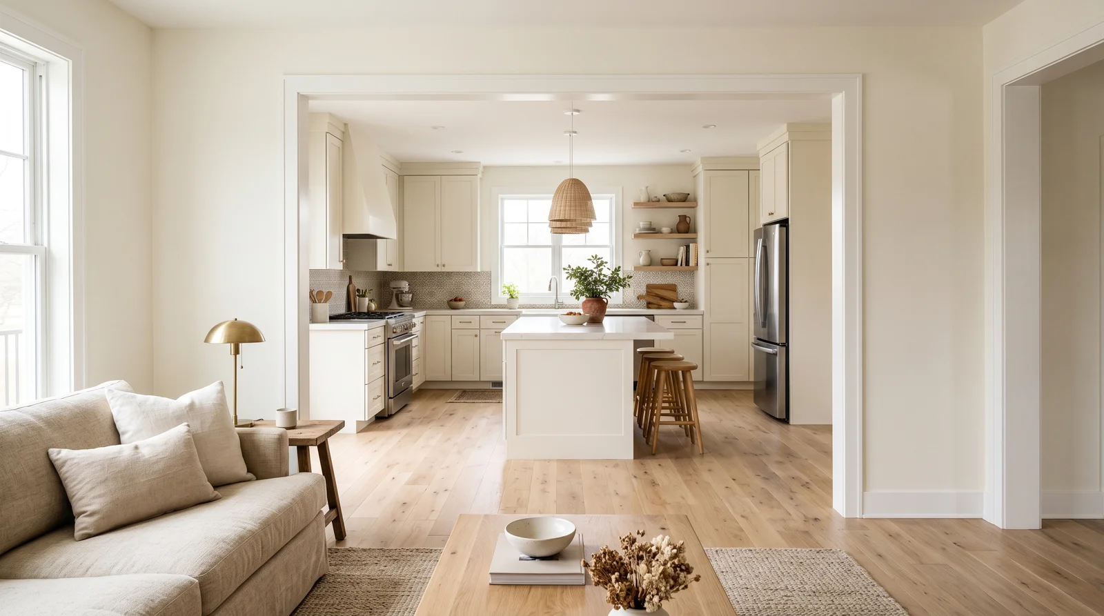
One creamy, yellow-free white running from the living room straight into the kitchen, so every hour of daylight feels soft instead of stark.
Greek Villa is the whole-house white for people who find true white cold but fear cream will go yellow — at LRV 84 it bounces light down a hallway without glare. Running it through connected spaces lets your furniture change room to room while the backdrop never argues with itself; it flatters white oak floors, brass or black fixtures, and linen upholstery equally. Paint the kitchen cabinets in the same color and the sightline reads as one calm sweep. If your main floor faces north and Greek Villa starts leaning gray, its warmer neighbor Sherwin-Williams Shoji White is the safer pick.
SEE GREEK VILLA ON YOUR WALLS →
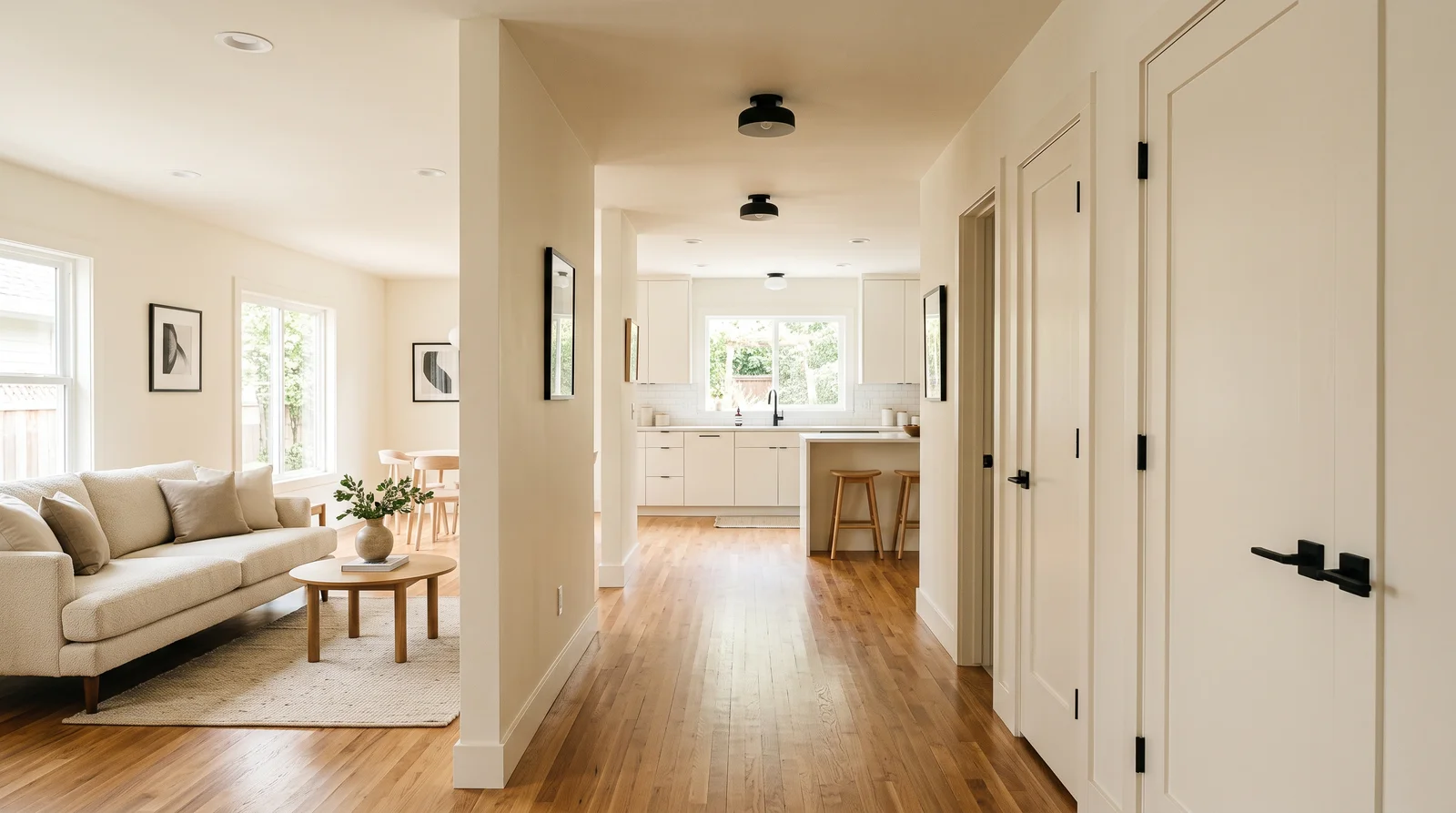
The budget-friendly warm white that makes a whole main floor feel bright and settled at once — happiest with plenty of daylight to keep its cream soft.
Behr Swiss Coffee is the one-color answer when you are painting every room this weekend and the budget matters: one product, one sheen, walls and hallways done. At LRV 88 it is the brightest pick on this page, so small connected rooms and dim halls stay light, while its faint cream undertone keeps it from the sterile look of untinted builder white. It pairs with almost anything — oak, walnut, black metal, colorful art — which is exactly what a whole house needs. If your rooms get strong warm evening sun and the cream turns buttery, Benjamin Moore White Dove is the slightly more muted neighbor.
SEE SWISS COFFEE ON YOUR WALLS →
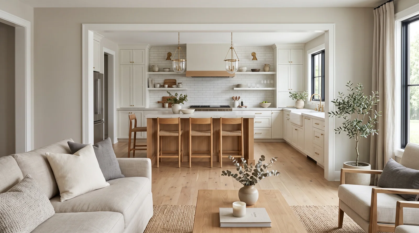
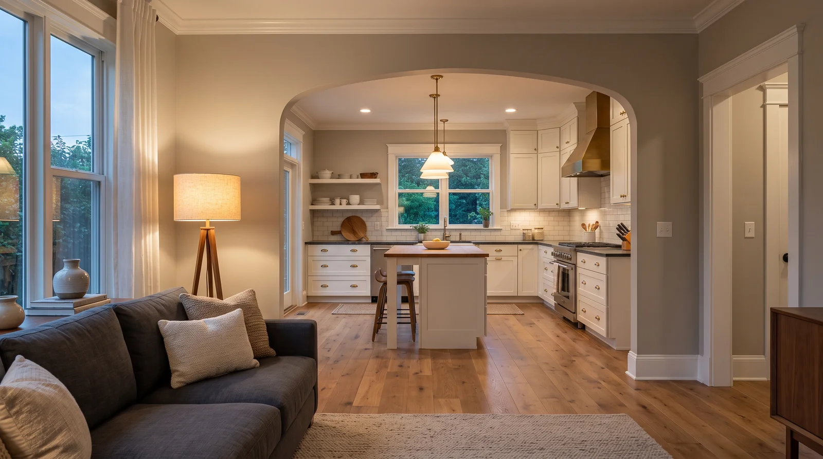
A light warm greige pulling living room, hall, and kitchen into one calm thread — the no-regrets pick that behaves in any light you give it.
Agreeable Gray is the most-specified whole-house color in America for a plain reason: at LRV 60 it is light enough for hallways with no daylight of their own, and its beige undertone keeps it from going cold the way true grays do. Through an open sightline it reads as one continuous neutral against white trim, so kitchens, living rooms, and stair halls feel deliberately connected instead of separately decorated. It sits comfortably with both gray-washed and warm oak floors, which almost no other neutral manages. If your whole house leans warm — wood everywhere, south light — its beige-forward neighbor Accessible Beige will feel more intentional.
SEE AGREEABLE GRAY ON YOUR WALLS →
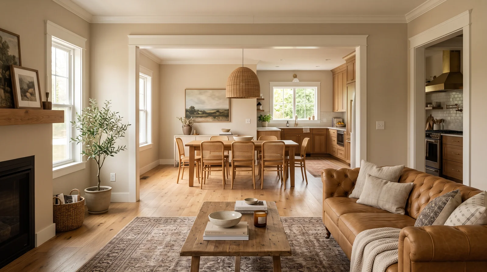
A soft warm beige moving through every connected room like low afternoon sun — made for houses full of wood, rattan, and warm-toned floors.
Accessible Beige is the whole-house pick for the warm-minimalism moment: beige that borrowed just enough gray to stay quiet, so an entire main floor in it feels cozy rather than dated. At LRV 58 it holds noticeably more color than a white, which gives long sightlines depth — the hallway actually looks painted, not primed. It flatters oak, walnut, leather, and cream upholstery, and it hides scuffs in busy connector spaces better than any white can. In a house with mostly cool north light its green-gray side can surface; the lighter, cleaner Benjamin Moore Edgecomb Gray is the neighbor to sample first.
SEE IT ON YOUR WALLS →
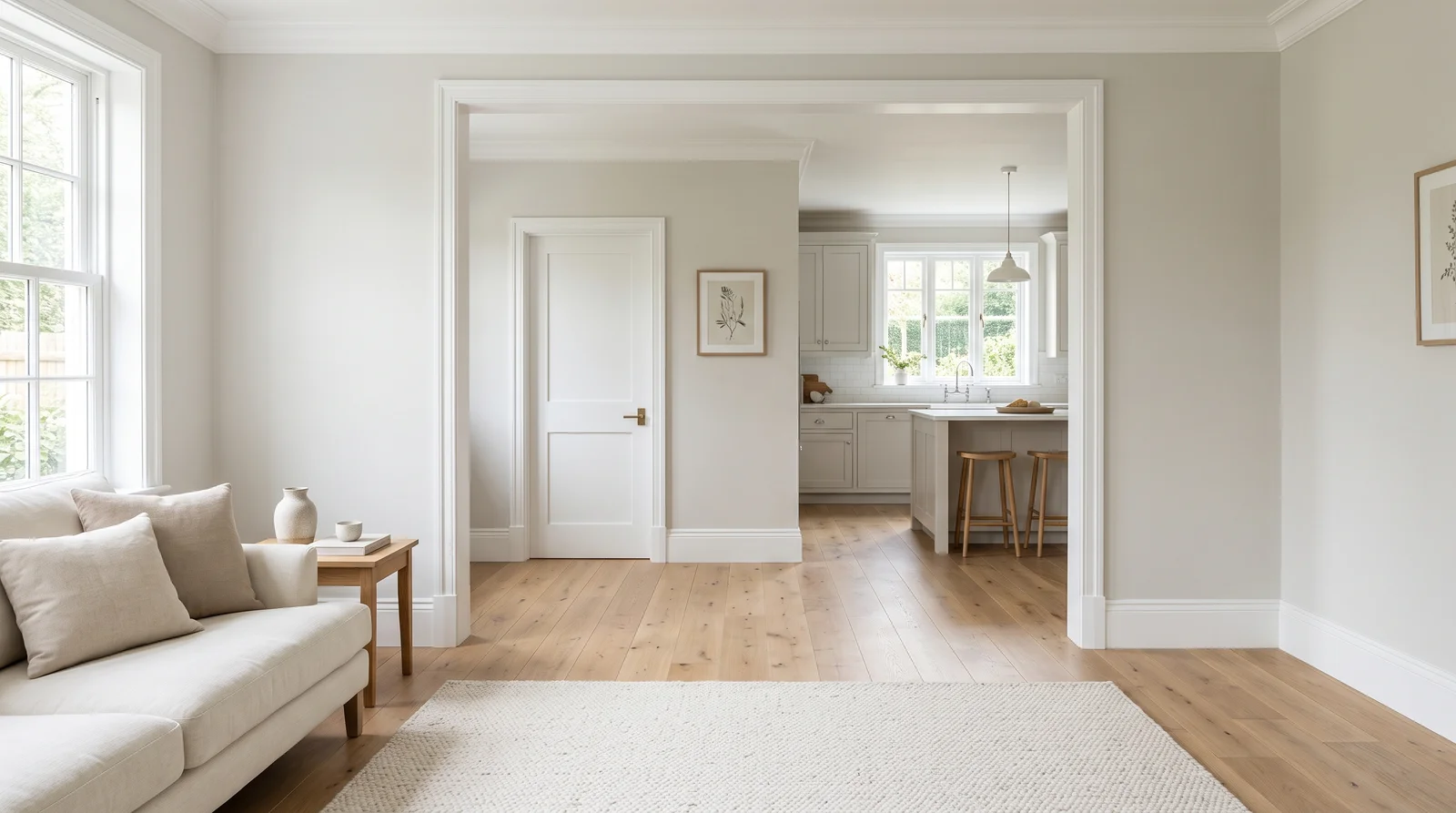
The gentlest greige on the chart, barely there and endlessly patient — it keeps a whole house hushed in any light from morning to lamp-lit evening.
Edgecomb Gray is the whole-house color for people who want 'something, but almost nothing': at LRV 63 it is a half-step deeper than the whites, so trim still pops against it but the walls never demand attention. That restraint is exactly what connected rooms need — art, rugs, and furniture carry each space while the paint quietly agrees from room to room. It is famously forgiving across exposures, staying warm without ever going yellow or muddy. If you want the walls to visibly deepen at the end of a long sightline, step down to its classic darker neighbor Revere Pewter for one connected zone.
SEE EDGECOMB GRAY ON YOUR WALLS →
The deepest neutral that still flows house-wide — a stone-like greige that turns golden and enveloping the moment the lamps come on.
Revere Pewter is the dark end of the whole-house spectrum: at LRV 55 it is the deepest color you can run through every connected room without the hallways closing in. That extra depth is the point — white trim, white cabinets, and doorway casings suddenly read crisp and architectural against it, and an open floor plan gets real definition instead of a pale blur. Its taupe-green undertone loves wood, stone, iron, and anything textural. In a genuinely dim house, though, LRV 55 everywhere can feel heavy; keep Revere Pewter for the main sightline and lift bedrooms with its lighter sibling Edgecomb Gray.
SEE REVERE PEWTER ON YOUR WALLS →Whole House Wall Color Combinations
A wall color never works alone. These are the full schemes from the rooms above — the lead color first, then the supporting colors that make the photo work.
One creamy, yellow-free white running from the living room straight into the kitchen, so every hour of daylight feels soft instead of stark.
TRY THIS PALETTE →The budget-friendly warm white that makes a whole main floor feel bright and settled at once — happiest with plenty of daylight to keep its cream soft.
TRY THIS PALETTE →A light warm greige pulling living room, hall, and kitchen into one calm thread — the no-regrets pick that behaves in any light you give it.
TRY THIS PALETTE →A soft warm beige moving through every connected room like low afternoon sun — made for houses full of wood, rattan, and warm-toned floors.
TRY THIS PALETTE →The easiest whole-house formula is a warm neutral on the walls with a soft white on the trim and ceilings. Agreeable Gray or Revere Pewter on the walls with White Dove, Alabaster, or Cashmere trim gives you crisp lines without a harsh contrast. Keeping the same trim white in every room is what makes the home feel like one connected space.
Watch your undertones with floors and cabinets. Warm wood floors and beige tile pair naturally with greige; cooler gray floors and white cabinets pair better with a balanced gray. Hold a paint sample right against the floor and the cabinets in daylight, because the surfaces you cannot repaint should guide the color you can.
Light or Dark Whole House Colors?
Go Light (LRV 60+) If…
The room is small, faces north, or has to work at every hour. Light warm colors make it feel bigger and stay calm in evening light — the light you actually live in.
Go Dark (LRV Under 20) If…
You want the cocoon effect and the room has real daylight. Dark works best on one feature wall — or fully color-drenched in a large room with good windows.
A whole house never gets one kind of light, so test your color in the actual rooms it will live in. North-facing rooms get cool, flat light that can turn gray paint dull or blue; warmer greiges like Accessible Beige or Revere Pewter hold up better there. South and west rooms get warm, strong light that can push beige toward yellow, so a more balanced gray like Agreeable Gray stays truer.
Light also changes from morning to night. Paint a big sample on two walls and look at it at breakfast, mid-afternoon, and under your evening lamps before you commit. Artificial light matters as much as sun, since most rooms are used after dark.
LRV (Light Reflectance Value) is a 0–100 number that tells you how light or dark a color reads; higher reflects more light. Whites like White Dove and Alabaster sit high on that scale, so they bounce light around and make small or dark rooms feel bigger. Mid-range greiges like Revere Pewter and Accessible Beige land lower, which is why they feel cozier and more grounded.
For a whole house, a good trick is to keep one main wall color throughout but let LRV do the adjusting. Use your lighter whites in dim rooms and north-facing spaces, and save the deeper neutrals for rooms that already get plenty of sun and can handle a cozier feel.
See It. Love It.
Paint It.
Upload one photo of your whole house and try every color on this page on your own walls — in your own light, before you buy a drop of paint.

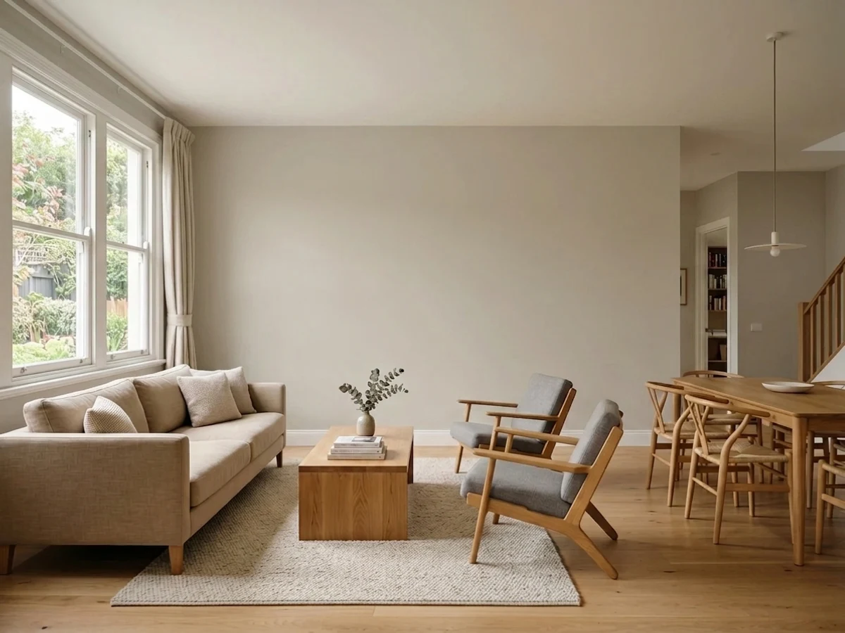
Revere PewterBeforeThe Best Color Directions for a Whole House
For a whole house, lean on three directions: warm gray (greige), soft warm white, and a true light neutral. Greige tones like Revere Pewter, Agreeable Gray, and Accessible Beige feel grounded and welcoming, and they carry through an open floor plan without ever feeling like a statement. Warm whites like White Dove, Alabaster, and Cashmere brighten small or dark rooms and make a great trim color everywhere else.
The mood each one creates is simple to predict. Greige feels cozy and lived-in, soft white feels clean and airy, and a light gray reads calm and modern. Pick one as your main color, then borrow from the others for rooms that want a slightly different feeling.
Picking the Right Finish for Each Surface
Use sheen by where the surface lives, not by room. Walls in bedrooms, living rooms, and hallways look best in a flat or matte finish, which hides drywall flaws and gives color its richest, softest look. Kitchens, bathrooms, mudrooms, and busy hallways do better in eggshell or satin because those wipe clean and shrug off moisture and fingerprints.
Trim, doors, and cabinets want semi-gloss or satin so they stand up to scrubbing and bumps. Ceilings stay flat to kill glare and hide imperfections. Keeping the wall color the same but stepping up the sheen on hardworking surfaces is how a whole-house scheme stays both pretty and practical.
The Most Common Whole-House Color Mistakes
The biggest mistake is choosing a color from a tiny chip or a phone screen instead of a large sample on the wall. The second is using too many unrelated colors, which makes the house feel busy and broken up instead of calm and flowing. Stick to one main color and a couple of close relatives.
People also forget that a neutral has an undertone, so a greige can suddenly look pink or green next to certain floors and lighting. And do not assume a color you loved in a friend's house will look the same in yours; their light and finishes are different. Sample, look at it day and night, then buy.
About Whole House Paint Colors
Painting a whole house is different from painting one room. You are not picking a single favorite color; you are picking a small family of colors that flow from room to room so the home feels calm and connected instead of choppy. That is why neutrals, soft grays, and warm whites do most of the heavy lifting here. They are the colors that look good in every kind of light and never fight with the next room down the hall.
The smart move is to choose one main wall color, one trim color, and maybe one or two close cousins for special spots like a bedroom or powder room. Colors like Revere Pewter, Agreeable Gray, and Accessible Beige are popular whole-house picks for exactly this reason: they are flexible greige and gray neutrals that sit happily next to most flooring, cabinets, and furniture. For trim and ceilings, soft whites like White Dove, Alabaster, and Cashmere keep everything fresh without looking cold.
Every color on this page is mixed to order at a paint store, so you are not locked into one brand. If you love a shade but buy a different brand's paint, the store can cross-match it closely. That gives you room to shop on price, finish, and availability without giving up the look you want.
The Questions Everyone Asks
What color should I paint my whole house?
If you want one answer, start with the safe picks above — White Dove, Alabaster, Agreeable Gray, Revere Pewter. They read well in any light and survive furniture changes. Then check the light: strong afternoon sun wants a step cooler, a north-facing room wants a step warmer.
What are the best whole-house paint colors?
Flexible neutrals work best because they flow room to room. Popular whole-house picks include Revere Pewter, Agreeable Gray, and Accessible Beige for walls, with White Dove, Alabaster, or Cashmere for trim and ceilings. Choose one main color and a couple of close relatives so the home feels connected.
Should every room in the house be the same color?
Not necessarily, but it helps to keep one main wall color through the open, connected spaces. You can vary it in bedrooms or a powder room with a close cousin shade. The goal is flow, so any change should feel like a small step, not a jump to an unrelated color.
What sheen should I use throughout the house?
Use flat or matte on most walls because it hides flaws and looks rich. Step up to eggshell or satin in kitchens, baths, mudrooms, and busy hallways so they wipe clean. Keep trim and doors in satin or semi-gloss, and ceilings flat to cut glare.
How does room lighting change a whole-house color?
North light is cool and can make grays look dull or blue, so warmer greiges hold up better there. South and west rooms get warm light that can push beige toward yellow. Always test a large sample in each room and look at it in daylight and under your evening lamps before deciding.
What is LRV and why does it matter for a whole house?
LRV (Light Reflectance Value) is a 0–100 scale showing how much light a color reflects; higher numbers read brighter. High-LRV whites like White Dove and Alabaster open up small or dark rooms, while mid-range greiges like Revere Pewter feel cozier. Use lighter colors in dim rooms and save deeper neutrals for sunny ones.
Can I match a color across different paint brands?
Yes. Every color shown here is mixed to order at a paint store, so you are not locked into one brand. If you love a shade but want to buy a different brand's paint, the store can cross-match it closely, which lets you shop on price and availability without losing the look.
How do I avoid picking the wrong neutral?
Buy a sample and paint a large patch on two walls instead of judging from a chip or your phone. Hold it against your floors and cabinets in daylight to check the undertone, since greige can read pink or green next to certain surfaces. Then look at it morning, afternoon, and night before you commit.
What two-color combination works best in a whole house?
The reliable pattern is a quiet main color plus one deep accent on a single wall. Keep trim and ceiling in one warm white so the two colors are the only event in the room — the combination cards above show complete schemes from real rooms.
What colors make a whole house look bigger?
High-LRV, slightly warm colors — LRV 60–75 is the sweet spot. Paint the walls and trim close to the same light color so the corners blur, and keep the ceiling white. Stark cool white actually works against you; it creates hard shadows that show the room's edges.

Ask a Question