Swiss Coffee
Home Depot's most-searched off-white, reviewed honestly: where the cream flatters a room, where it tips butter-yellow, and the name mix-up that costs people a whole gallon.

Jessica has spec'd whites and neutrals for more than 300 rooms and keeps a sample wall of painted drawdowns in her studio. Every color review is checked against real reader rooms in the comments and re-tested when a formula changes. About the testing process →
- 1First Star69
- 2Classic Gray74
- 3Swiss Coffee85
- 4Chantilly Lace91
- 5Ultra Pure White97
The Fast Verdict
Swiss Coffee is the off-white that makes a room feel lived-in on day one. It is genuinely creamy, not barely-warm, and that is both the reason people love it and the reason a few people repaint. In daylight with wood floors it is close to perfect; under 2700K bulbs at night it can read butter, and next to a bright white ceiling it looks dingy. Buy it knowing it is a cream, not a white, and it rarely disappoints.
Whole-house walls in homes with oak or walnut floors · older houses with lots of trim · kitchen cabinets with brass and butcher block · anyone who finds bright whites cold
Your ceiling and trim stay builder bright white · your counters are stark white quartz · your floors are cool gray LVP · you want a crisp modern gallery look
- Genuinely forgiving with oak, walnut, and honey-toned floors
- Bright at LRV 87 — safe in small or single-window rooms
- Walls, trim, and ceiling in one color works beautifully
- Stocked at every Home Depot, tinted in minutes, cheap to buy in quantity
- Softens orange-leaning builder oak instead of amplifying it
- Reads clearly yellow under 2700K bulbs at night
- Looks dingy next to bright white ceilings, trim, or quartz
- Fights cool gray floors and blue-gray tile
- Shares its name with a different Benjamin Moore color — a constant mix-up
What Color Is Swiss Coffee, Really?
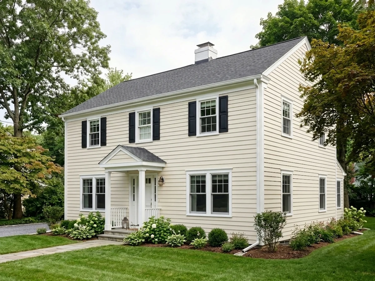
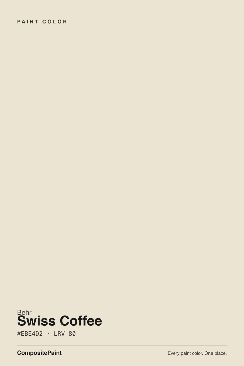
A cream that gets away with calling itself a white. Swiss Coffee's hue sits at the orange edge of yellow, and unlike most off-whites it does not gray that warmth down — there is no dose of taupe or greige holding it back. What saves it is lightness: at 87 percent lightness the warmth spreads thin and reads as soft cream instead of yellow paint. Cover a whole room, though, and the warmth stacks up. The gallon behaves warmer than the chip, which is the single most common surprise people report.
LRV 87 puts it in bright-but-not-blinding territory. Against Behr Ultra Pure White (1850) at LRV 92 the difference is not subtle — Swiss Coffee suddenly looks like coffee with a lot of milk in it, and that twelve-point gap is exactly why bright white trim can make these walls look unwashed. Against Benjamin Moore's Swiss Coffee (OC-45) at LRV 84, Behr's version is the deeper, creamier of the two. It has body, and in a dim room you can see it.
Undertone in one line: warm yellow-orange with nothing cooling it down — never pink, never green, and never mistaken for a true white once it is on four walls.
Where It Shines
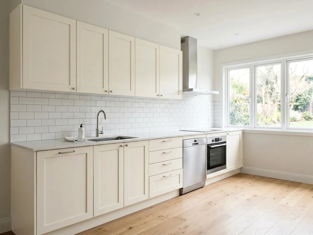
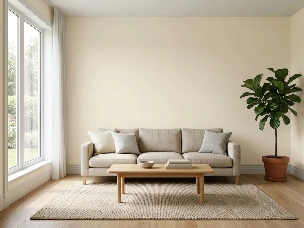
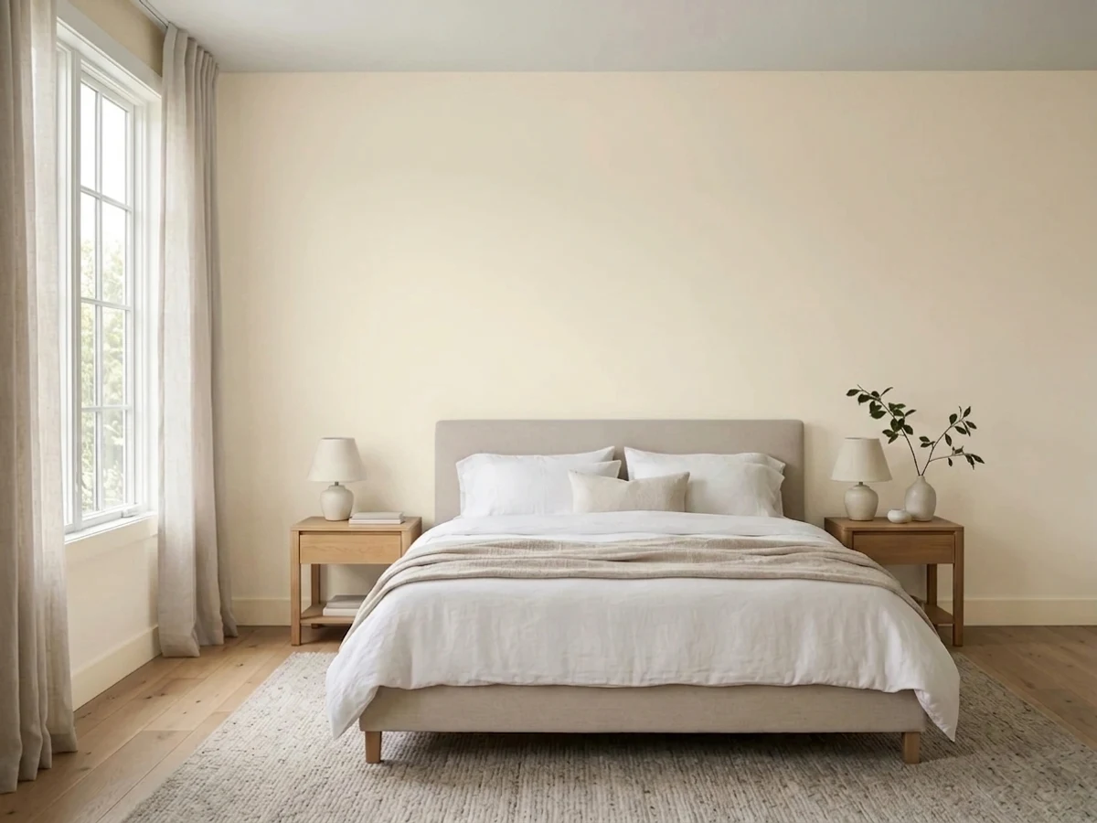
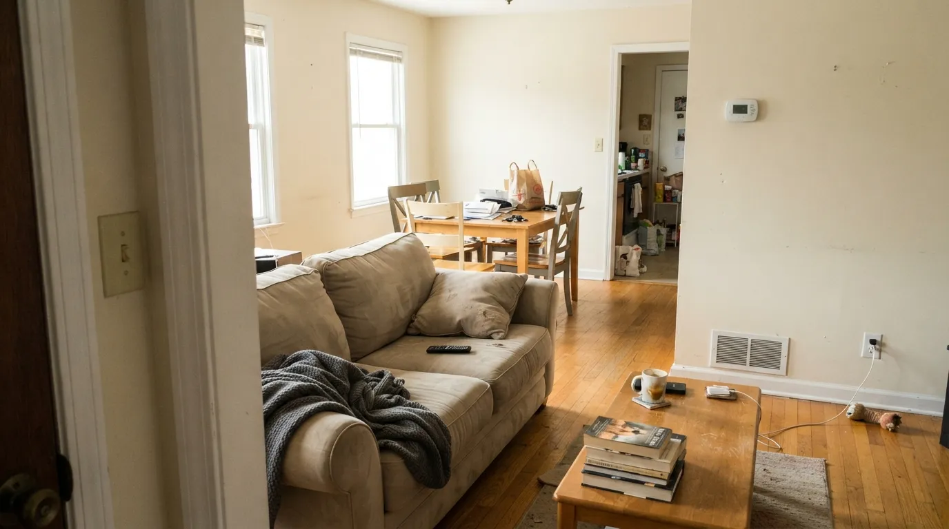
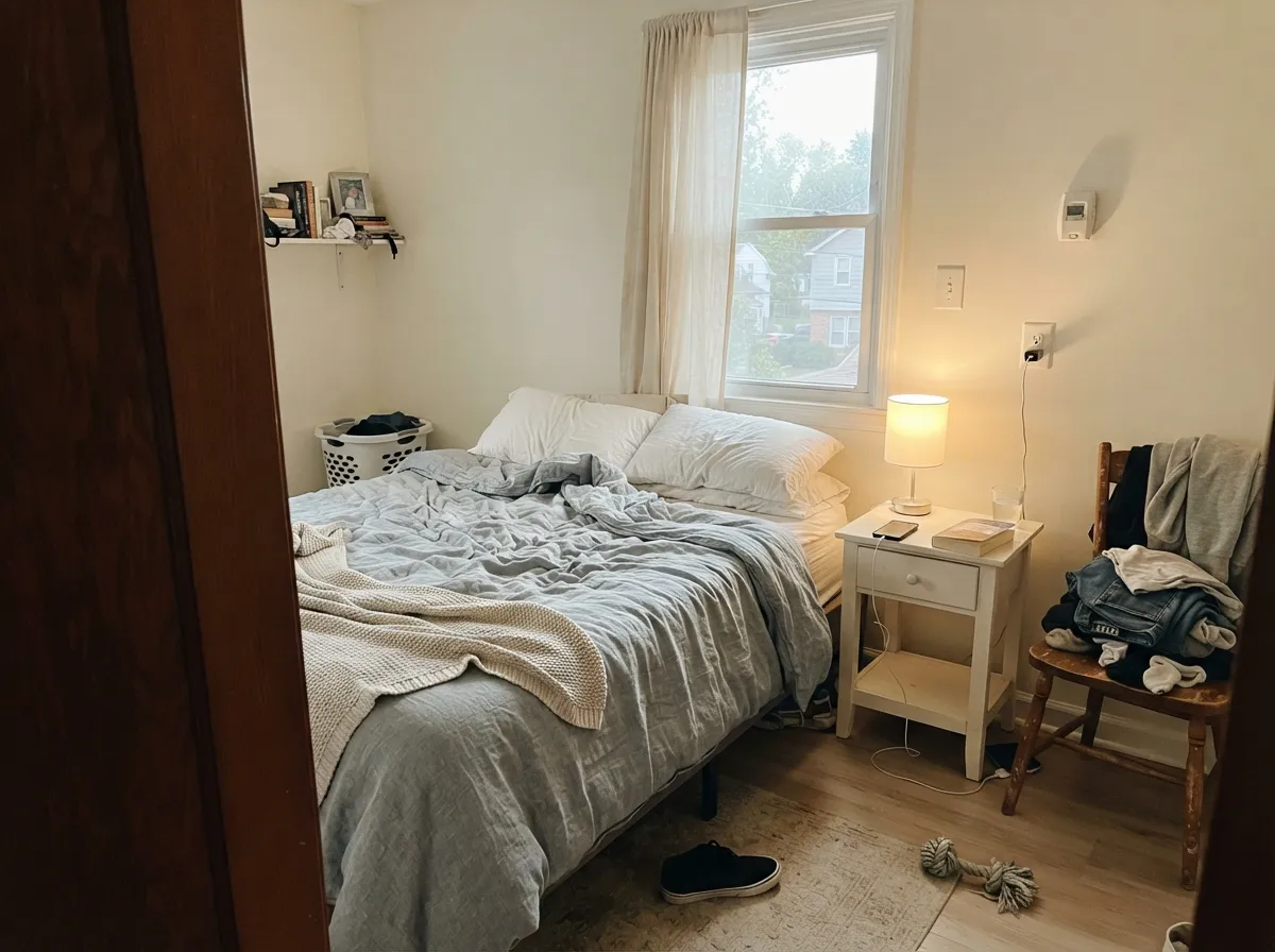
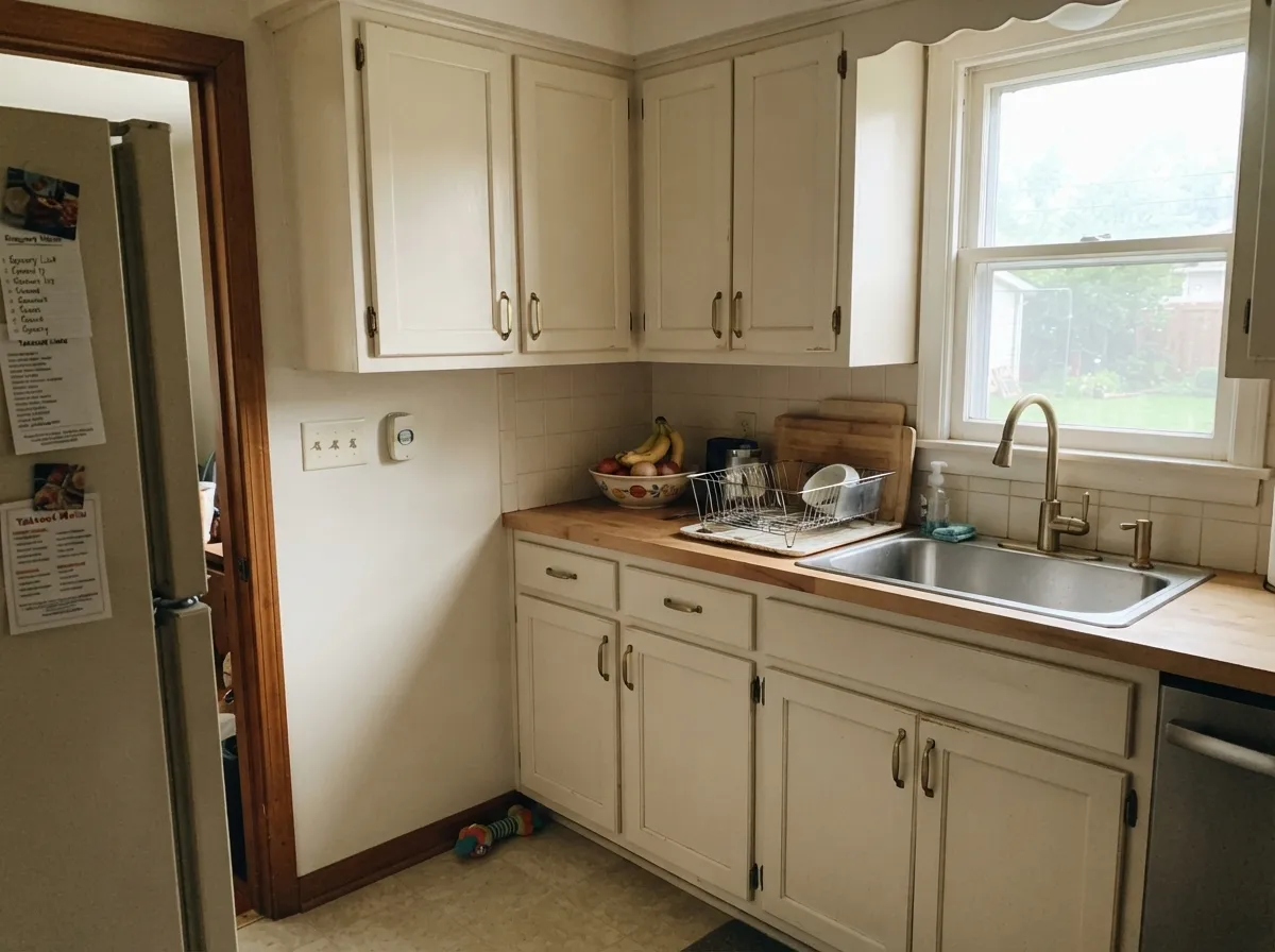
Give it daylight, wood, and warm metals and it does what its reputation promises: rooms look settled rather than freshly painted. It is at its best carrying a whole floor — living room, hallway, bedrooms — where its warmth keeps every connected space feeling like one house.
Where It Fails
The complaints about Swiss Coffee are remarkably consistent, and none of them are about coverage or durability. All three come down to one thing: people expected a white and got a cream. If your room matches one of these, no amount of coats fixes it.
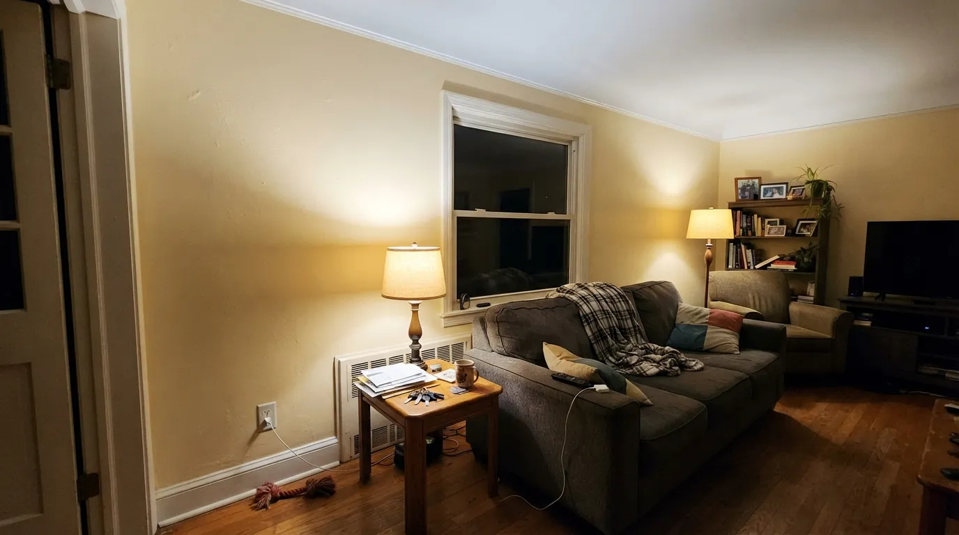
Under 2700K bulbs the yellow-orange base has nothing holding it back, and the walls tip toward butter. The most repeated line in real reviews is some version of "we liked it in the day, it was too yellow in the evening." If evenings are when you actually live in the room, either move to 3000K–3500K bulbs or pick a lighter, calmer white like Behr Polar Bear (75).
Ultra Pure White (1850) next to Swiss Coffee is a twelve-point LRV drop, and the eye reads the lower number as dirty. People post photos asking why their fresh walls look dingy — it is the ceiling, not the paint. Fix it by running Swiss Coffee on the trim and ceiling too, or step the wall up to Behr Polar Bear (75).
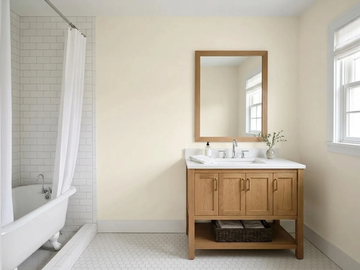
Gray LVP, gray-washed oak, and blue-gray bathroom tile sit at the opposite temperature and shove Swiss Coffee's warmth into the open, where it reads plainly yellow. With cool floors you want a more neutral white — Sherwin-Williams Pure White (SW 7005) is the usual rescue.
Room by Room
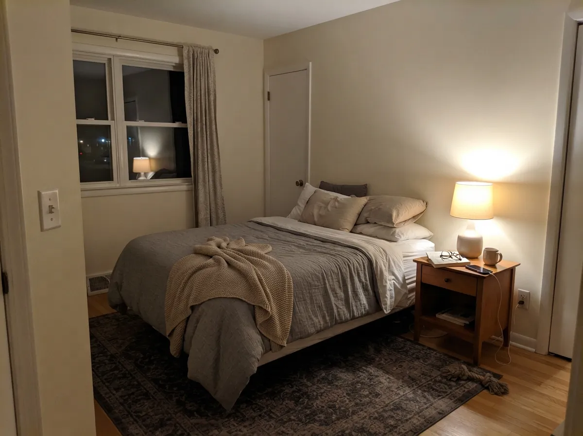
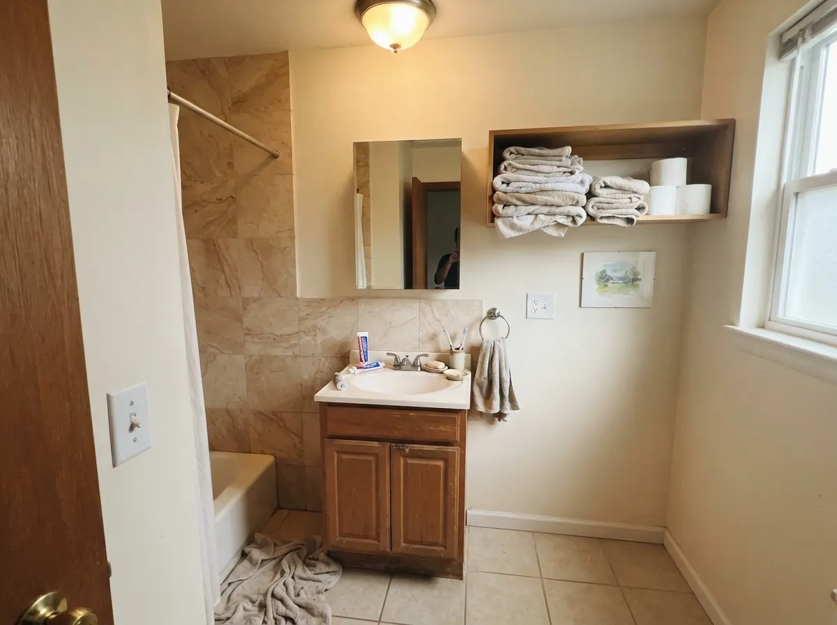
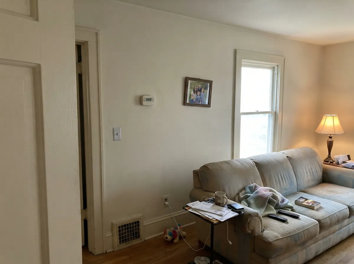
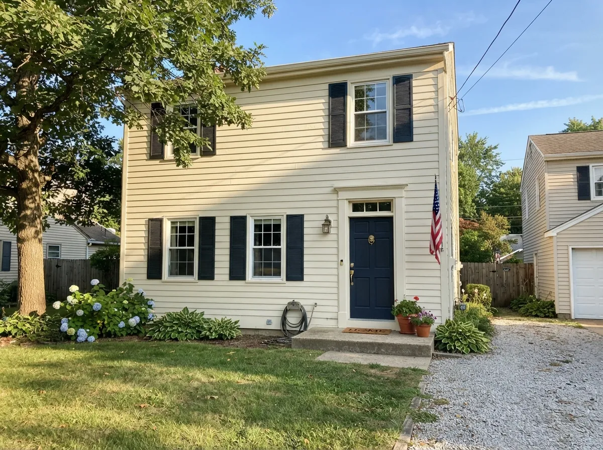
Your Light Is the Risk
Cool gray daylight cancels some of the cream. This is where Swiss Coffee is at its most balanced — warm, not yellow.
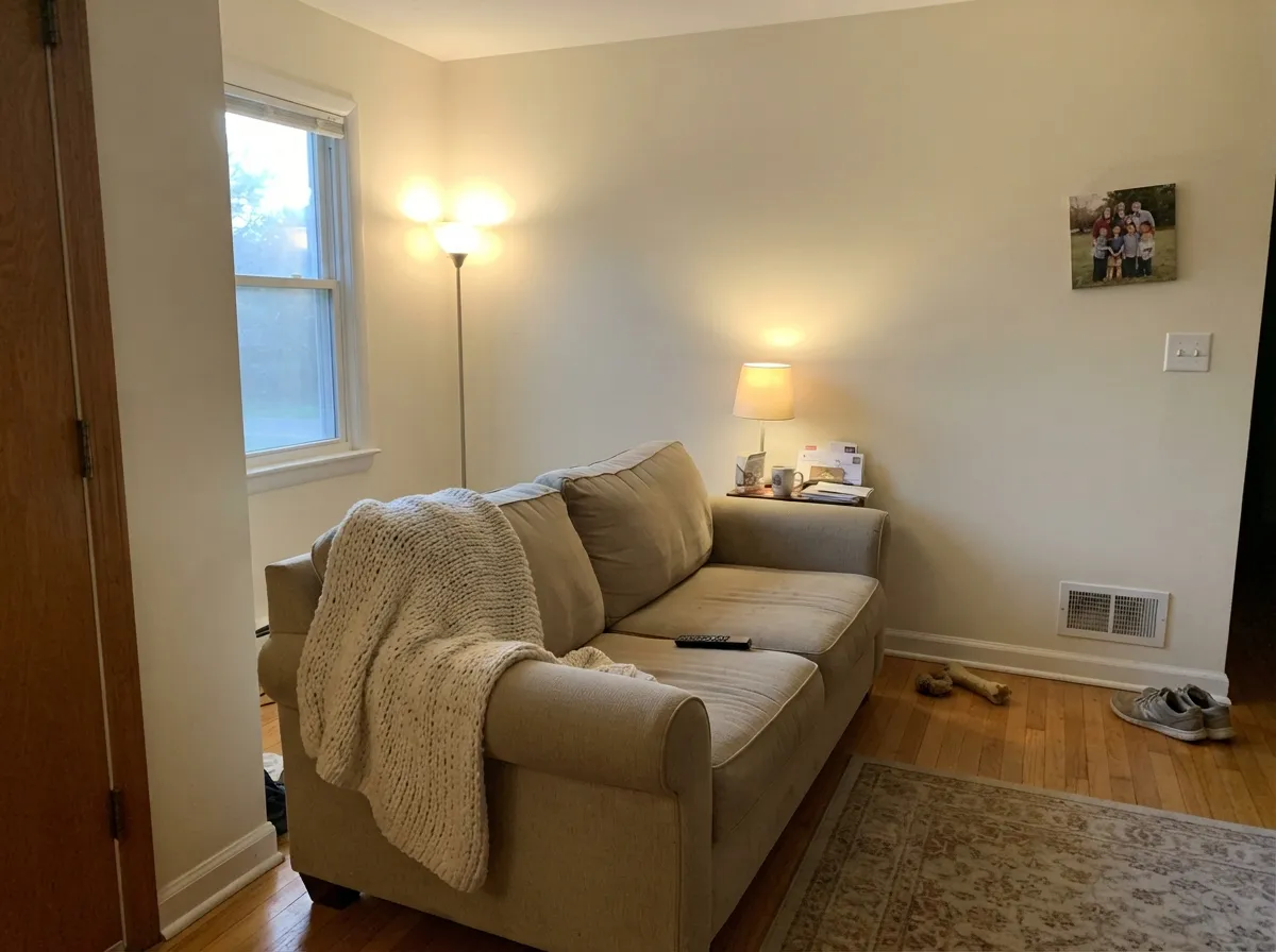
Steady warm sun pushes it to soft butter around midday. Most people like it; sample a big patch anyway.
2700K bulbs are where the complaints start. Try 3000K–3500K before you blame the paint.
Richest at sunrise in east rooms, at sunset in west ones. Quiet and near-white the rest of the day.
Most complaints about Swiss Coffee are a light mismatch. Upload a photo of your actual room and see it on your walls — then ask for the same wall in north light or evening lamps before you buy a single sample.
Need It From Another Brand?
Any paint counter can custom-tint Behr 12 directly. If you would rather stay in one brand's own deck, these are the closest stock matches, measured as ΔE2000. Under 2 is a difference you will not see on the wall.
| Brand | Closest color | ΔE | LRV | |
|---|---|---|---|---|
| Sherwin-Williams | Greek VillaSW 7551 · Sherwin-Williams | 1.3 | 84 | Color page → |
| Benjamin Moore | Arbor WhiteES-01 · Benjamin Moore | 0.5 | 85 | Color page → |
| Valspar | Polar White7003-16 · Valspar | 0.2 | 83.7 | Color page → |
| PPG / Glidden | Candlelit BeigePPG1207-1 · PPG / Glidden | 0.5 | 84 | Color page → |
| Glidden | Candlelit BeigePPG1207-1 · Glidden | 0.0 | 85 | Color page → |
| Dutch Boy | Whispered White019W · Dutch Boy | 0.6 | 83 | Color page → |
Similar Behr Colors
The nearest shades to Swiss Coffee within Behr's own range, ranked by perceptual color distance — useful when you want the same look a touch lighter, darker, or warmer.
WCAG 2.1: AA is 4.5 : 1 for normal text, 3 : 1 for large text, AAA is 7 : 1.
Swiss Coffee vs the Colors You're Also Considering
Every Swiss Coffee sample board has the same rivals on it. The numbers show the real lightness gap — then it comes down to which risk you would rather live with.
Pick this for a creamier, deeper off-white that you can buy at Home Depot tonight.
Benjamin Moore OC-45 · LRV 84Swiss CoffeePick this if you want the same idea a shade lighter and airier — and if your painter buys Benjamin Moore.
Side-by-side comparison →Pick this when you want the warmth to actually show and the room to feel cozy.
Behr 75 · LRV 86Polar BearPick this for rooms used at night, or when your ceiling stays bright white.
The name collision people search most is Benjamin Moore Swiss Coffee (OC-45), LRV 84. Despite sharing a name, they are not the same paint. The Benjamin Moore version is lighter and reads a touch brighter on the wall; Behr's version, at LRV 80, has slightly more body and cream. If you want the airier of the two, OC-45 wins; if you want a bit more visible warmth, Behr's is the pick.
Sherwin-Williams Alabaster (SW 7008), LRV 82, is the quieter alternative. Its warmth is softer and less yellow, so it suits rooms with cool stone or gray flooring where Behr Swiss Coffee might clash.
Inside Behr's own deck, Antique White (23), LRV 78, is nearly a twin, just a half step deeper. In a bright south-facing room the difference almost disappears; in a dim hallway Antique White will look noticeably creamier, so choose Swiss Coffee when you need the lighter read.
Swiss Coffee Coordinating Colors
Swiss Coffee has one rule: nothing next to it should be cooler and brighter at the same time. It sits happily under warm greiges, muted greens, deep navies, and near-blacks, and it loses every fight with icy whites and blue-grays. These are the Behr partners that hold up in real rooms:
Swiss Coffee on Cabinets and Trim
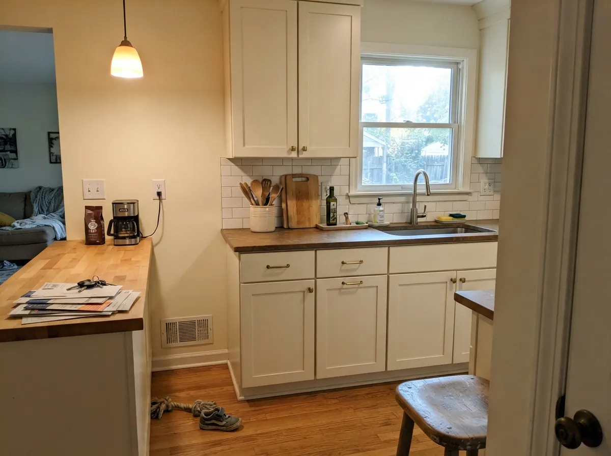
Cabinets are where Swiss Coffee earns its money. A bright white kitchen shows every fingerprint and every dent in the door edge; a cream one does not, and the warmth makes cheap plywood boxes look older and more expensive than they are. Use a satin urethane cabinet enamel, not wall paint, and give the doors a full week before you hang them back.
The thing that decides the result is the countertop. Warm quartz, butcher block, soapstone, and honed marble all sit comfortably with it. Stark white quartz does not — it wins the whiteness contest and the doors look yellowed next to it. If your counters are already white and cool, either accept a two-tone look or go with Ultra Pure White (1850) on the uppers and keep Swiss Coffee for the island and trim.
The Two Swiss Coffees, Sorted Out
This is the most expensive mistake attached to this color, and it has nothing to do with how it looks. Behr Swiss Coffee (12) and Benjamin Moore Swiss Coffee (OC-45) are different paints that happen to share a name. People buy one, decide they want a second gallon at a different store, and end up with walls that do not match — the four-point LRV gap is small on a chip and obvious on a wall.
If you are choosing rather than matching: Behr's is deeper and creamier and costs less; Benjamin Moore's is lighter, a touch brighter, and easier to live with in a room used at night. And if you want the same warmth with less yellow in it, Sherwin-Williams Alabaster (SW 7008) is the third name that belongs in this conversation. Whichever you pick, write the brand on the lid, because in two years you will not remember.
Three Ready Palettes Built on Swiss Coffee
A color is never alone on the wall. These are complete combinations in the 60-30-10 pattern, with the reason each one holds together. Every one opens in the visualizer.
One color at three sheens removes the bright-white ceiling problem entirely, which is the single fix for most Swiss Coffee complaints. The navy door supplies the one dark note the scheme cannot make on its own.
Try this palette in your roomSilver Drop is a warm greige, so the wall sits quietly behind the cabinets instead of competing for whitest-thing-in-the-room. The navy island grounds all that cream and makes brass hardware look intentional.
Try this palette in your roomBack to Nature is a muted sage that shares Swiss Coffee's yellow base, so the accent wall reads restful rather than decorated. Polar Bear trims it with only six LRV points of contrast — enough to define the edges, not enough to make the walls look dirty.
Try this palette in your roomSwiss Coffee FAQ
Does Behr Swiss Coffee look yellow?
In daylight, no — it reads as soft cream. At night under 2700K bulbs, yes, it can look distinctly buttery, and that is the most common complaint people post. Swap to 3000K or 3500K bulbs and most of the yellow goes away.
Behr Swiss Coffee or Benjamin Moore Swiss Coffee — which do I ask for?
Say the brand out loud, because they are two different colors with the same name. Behr's (12) is LRV 87 and creamier; Benjamin Moore's (OC-45) is LRV 84 and lighter. If a painter says "Swiss Coffee" without naming a brand, ask which one before they buy.
Will it look dirty next to my white ceiling?
If the ceiling is builder bright white, probably yes. The gap to Ultra Pure White (1850) is twelve LRV points and the eye reads the darker one as unwashed. Either paint the ceiling Swiss Coffee in flat, or pick a lighter wall white like Polar Bear (75).
Does it work with gray floors?
It is the pairing that causes the most regret. Cool gray LVP and gray-washed wood pull the warmth forward and the walls read yellow. Warm rugs and wood furniture help, but if the floor is a strong blue-gray, use Sherwin-Williams Pure White (SW 7005) instead.
Which Behr finish should I use?
Eggshell for walls in living rooms and bedrooms, satin for kitchens, baths, and cabinets, semi-gloss on trim and doors, flat on ceilings. Behr's flat finishes burnish where you scrub them, so skip flat on any wall you will wipe.
How many coats does it take?
Two over any existing light or white wall. Over a dark or saturated color, prime with a gray-tinted primer first — a light cream over red or navy can take four coats otherwise, which costs more than the primer.
Is it too plain or builder-basic?
It is the default off-white in a lot of rental and builder housing, so if you have lived in one, it may feel familiar. On the wall that reads as neutral rather than cheap. Give it dark trim, a color accent, or real wood and nobody reads it as a landlord special.
Have you painted with Swiss Coffee?
Rate it — one tap helps the next reader decide.
Ask a Question