Polar Bear
Behr's best-selling soft white, reviewed honestly: the searches call it the budget White Dove, but its LRV and undertone tell a different story — here's where it actually shines and where it turns cold.

Jessica has spec'd whites and neutrals for more than 300 rooms and keeps a sample wall of painted drawdowns in her studio. Every color review is checked against real reader rooms in the comments and re-tested when a formula changes. About the testing process →
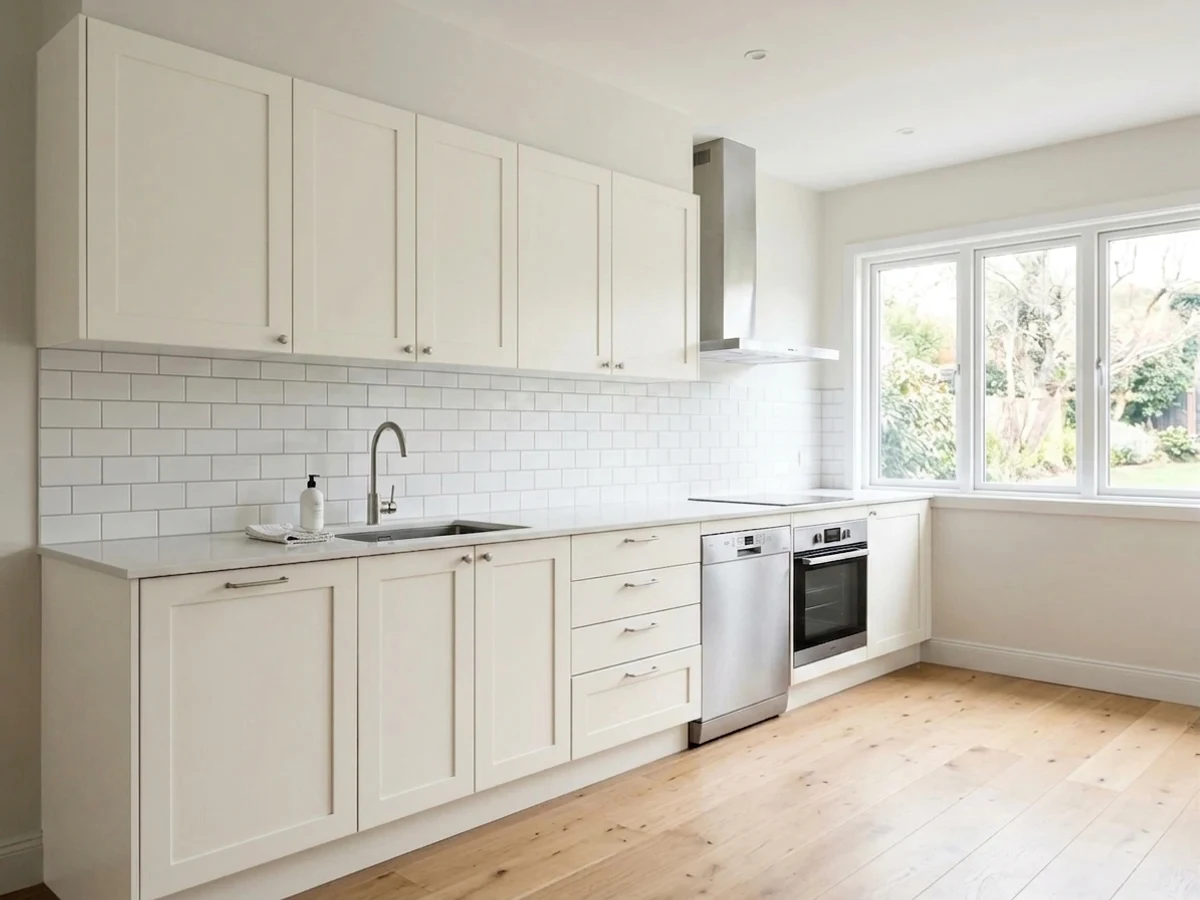
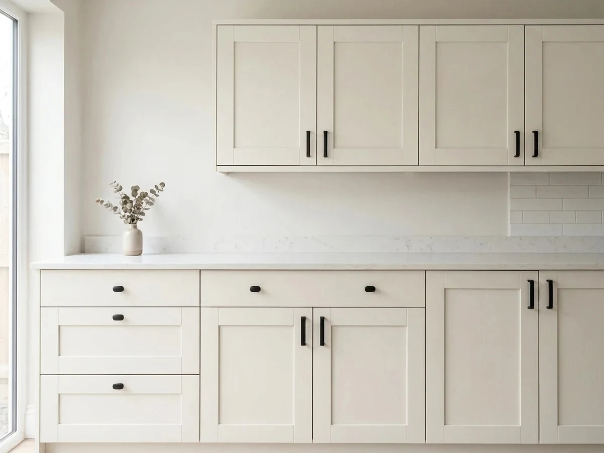
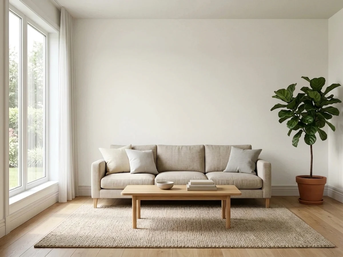
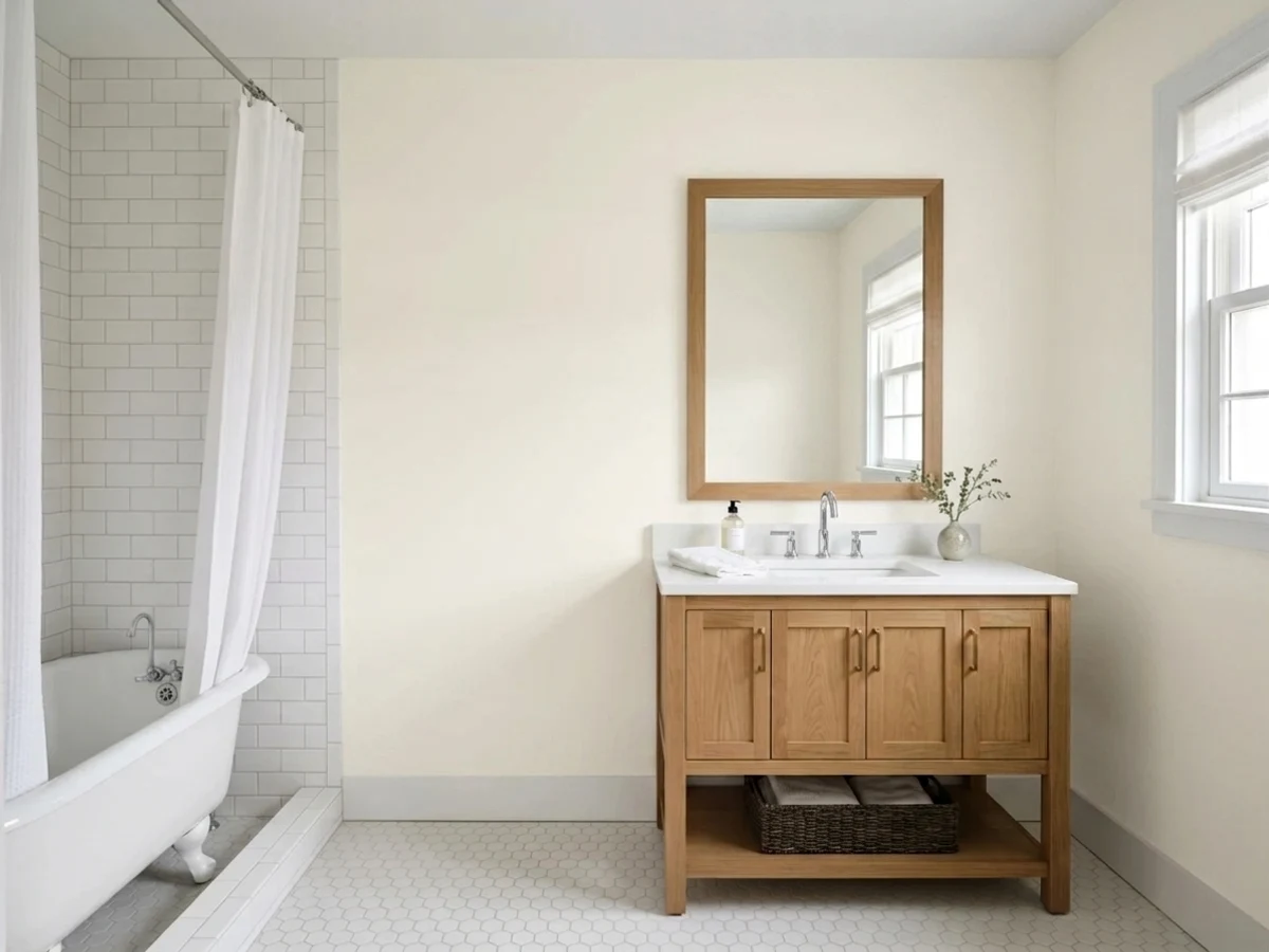
- 1Classic Gray74
- 2Alabaster82
- 3Polar Bear90
- 4Ultra Pure White97
The Fast Verdict
Polar Bear is the white Behr shoppers reach for when they want something that just works — cheap, forgiving, and sold at every Home Depot in the country. At LRV 94 it is genuinely bright, with an undertone so faint it barely qualifies as one: warm light and wood pull it toward a whisper of cream, cool light and grey flooring push it toward a whisper of blue-grey. That flexibility is the whole appeal and the whole risk. Buy it as Behr's cleanest all-purpose white, not as a dollar-store swap for Benjamin Moore White Dove — the two behave differently on a wall, even if they get typed into the same search bar.
Trim, doors and ceilings under almost any wall color · whole-house budget whites bought at Home Depot · exterior siding and trim in bright climates · small or dim rooms that need brightness more than warmth
You actually want White Dove's warm grayed cream · your room is dim and north-facing with cool floors · you're painting it next to a warmer white and expect them to match · you want a white with zero undertone drama
- Bright, clean white (LRV 94) that opens up small or dim rooms
- Undertone so subtle it rarely clashes with any wall color as a trim white
- Budget-friendly and stocked at every Home Depot, in wall, trim and cabinet formulas
- Reliable exterior white, especially paired with dark trim for a farmhouse look
- Genuinely versatile across design styles — coastal, Scandinavian, traditional, modern
- Not an actual match for White Dove despite the reputation — cooler and brighter
- Can drift blue-grey to violet in dim, north-facing, cool-lit rooms
- Cabinet enamel needs real primer prep or it bubbles and streaks
- Its neutrality can read a little characterless next to a warmer, creamier white
What Color Is Polar Bear, Really?
Polar Bear (SKU 75) is Behr's standard-issue soft white, the one stocked in every Home Depot paint aisle and mixed into everything from wall paint to cabinet enamel to exterior stain. It carries no fancy collection name and no Color of the Year moment — it is simply the default white Behr customers grab, which is exactly why it shows up so often searched alongside Benjamin Moore White Dove: both are their brand's reflexive answer to "just give me a nice white." The comparison is popular, but the paint chemistry underneath it is not identical, and treating them as swaps is the single most common regret story about this color.
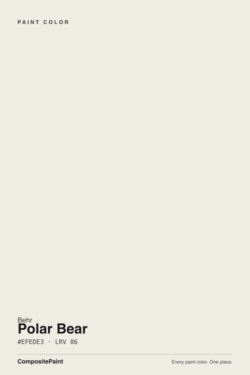
At LRV 94 it sits well above White Dove's LRV 83 and above Behr's own Swiss Coffee (LRV 80) and Blank Canvas (LRV 79) — Polar Bear is a brighter, cooler white than either of those creamier Behr shades, and only a shade warmer than Ultra Pure White (LRV 92). That places it firmly in true-white territory rather than warm-cream territory. Where White Dove holds a visible grayed-yellow body even in bright light, Polar Bear reflects enough light that it reads close to plain white in full sun, and only shows character once the light gets flat or dim.
Undertone in one line: so subtle it is closer to a neutral than a warm or a cool white — and that neutrality is exactly what makes it swing. Reviewers genuinely disagree on it: some call it a faint creamy-yellow or peachy white, others (especially in north-facing rooms) see a distinct blue, grey or even violet cast under cool bulbs. Both are correct descriptions of the same paint in different rooms. If your sample looks warm, that is your wood floor and afternoon sun talking; if it looks cold, that is your north window and grey tile talking. Polar Bear has less built-in personality than White Dove, so the room does more of the talking.
Where It Shines
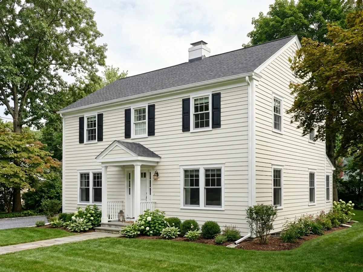
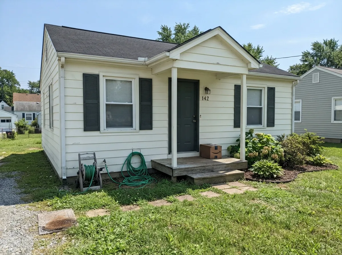
Give it trim, moldings, ceilings and door casings and it disappears the way a good white should — bright, clean, cheap to buy in bulk, and unlikely to clash with whatever the wall color ends up being. It is also a genuine exterior workhorse: Behr's own farmhouse pairings put Polar Bear siding against a dark charcoal-green like Hidden Gem for the modern-farmhouse look, and full outdoor sun is where its brightness reads best. Budget renovations and small, light-starved rooms are its other sweet spot — at LRV 94 it does more to visually open a cramped room than a creamier, lower-LRV white would.
Where It Fails
Nearly every disappointed review of Polar Bear traces back to one of three predictable situations, and none of them are really the paint's fault — they are a mismatch between what the room offers and what this particular white needs to look good.
Polar Bear gets recommended as Behr's answer to White Dove constantly, but the two are not twins — Polar Bear is three LRV points brighter and carries far less built-in warmth. Painted side by side, White Dove reads soft and creamy while Polar Bear reads clean and a little cooler. If you want the actual closest Behr match to White Dove's warm grayed cream, ask your Behr desk about Silky White instead, and treat Polar Bear as its own color, not a stand-in.
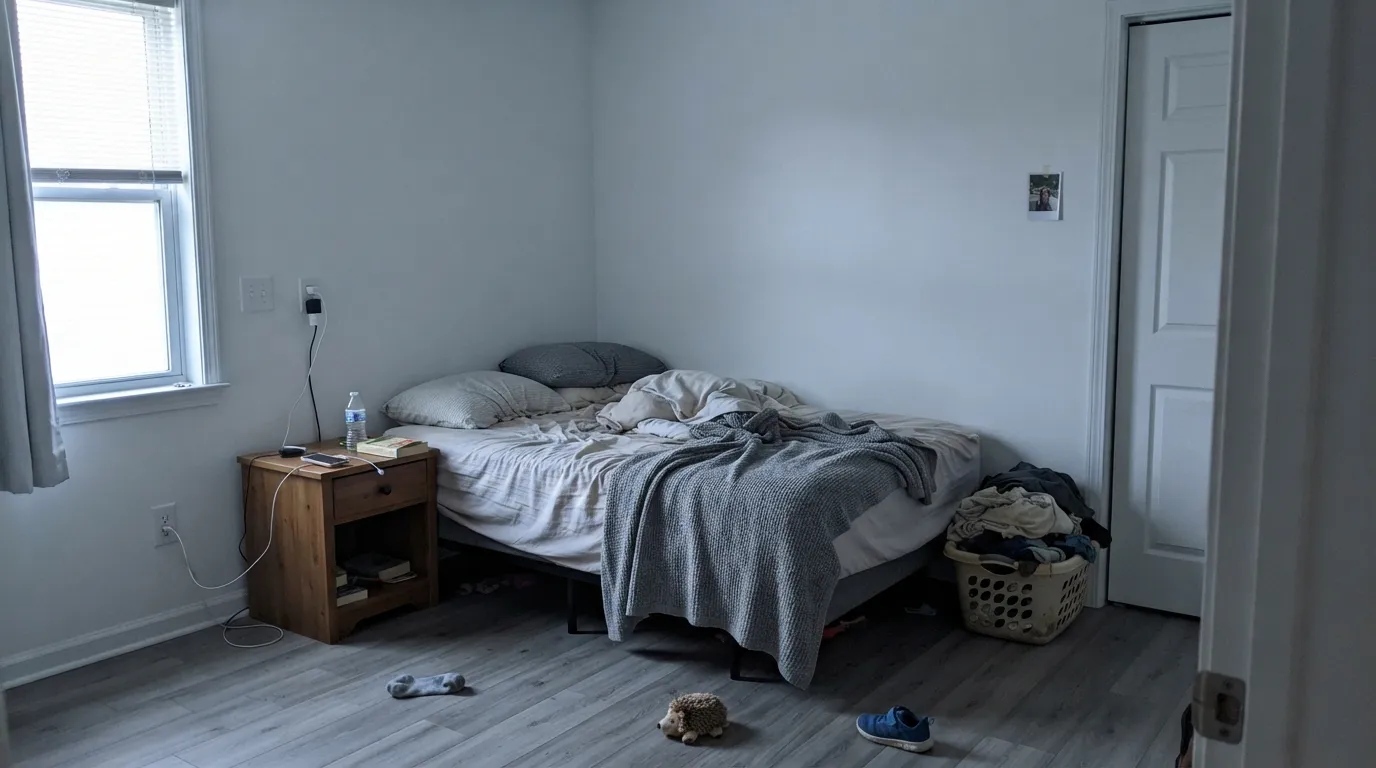
This is where the blue-grey-violet undertone reviewers report actually shows up. Cool daylight and grey-toned tile or LVP amplify Polar Bear's cool side and it can read flat, faintly cold, almost lavender-grey by evening. The paint did not change; the light and the floor pulled the undertone the cool direction. Warm 2700K bulbs and a warm rug fix most of it — or step down to Swiss Coffee if the room can't be helped.
The most common Home Depot review complaint on Polar Bear cabinet and trim enamel is bubbling, streaking or a thin, uneven finish — almost always tied to skipping primer or rushing coats on bare or glossy cabinet doors. Two thin coats over a proper bonding primer solve it; one thick coat straight over old cabinet finish is the version that goes wrong.
Room by Room
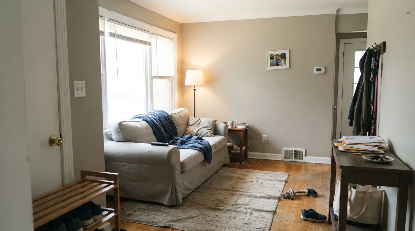
With real daylight it is a clean, unfussy backdrop that stays out of the way of furniture and art. In a dim or north-facing living room, add warm lamps or step down to a creamier white — Polar Bear alone won't supply the warmth.
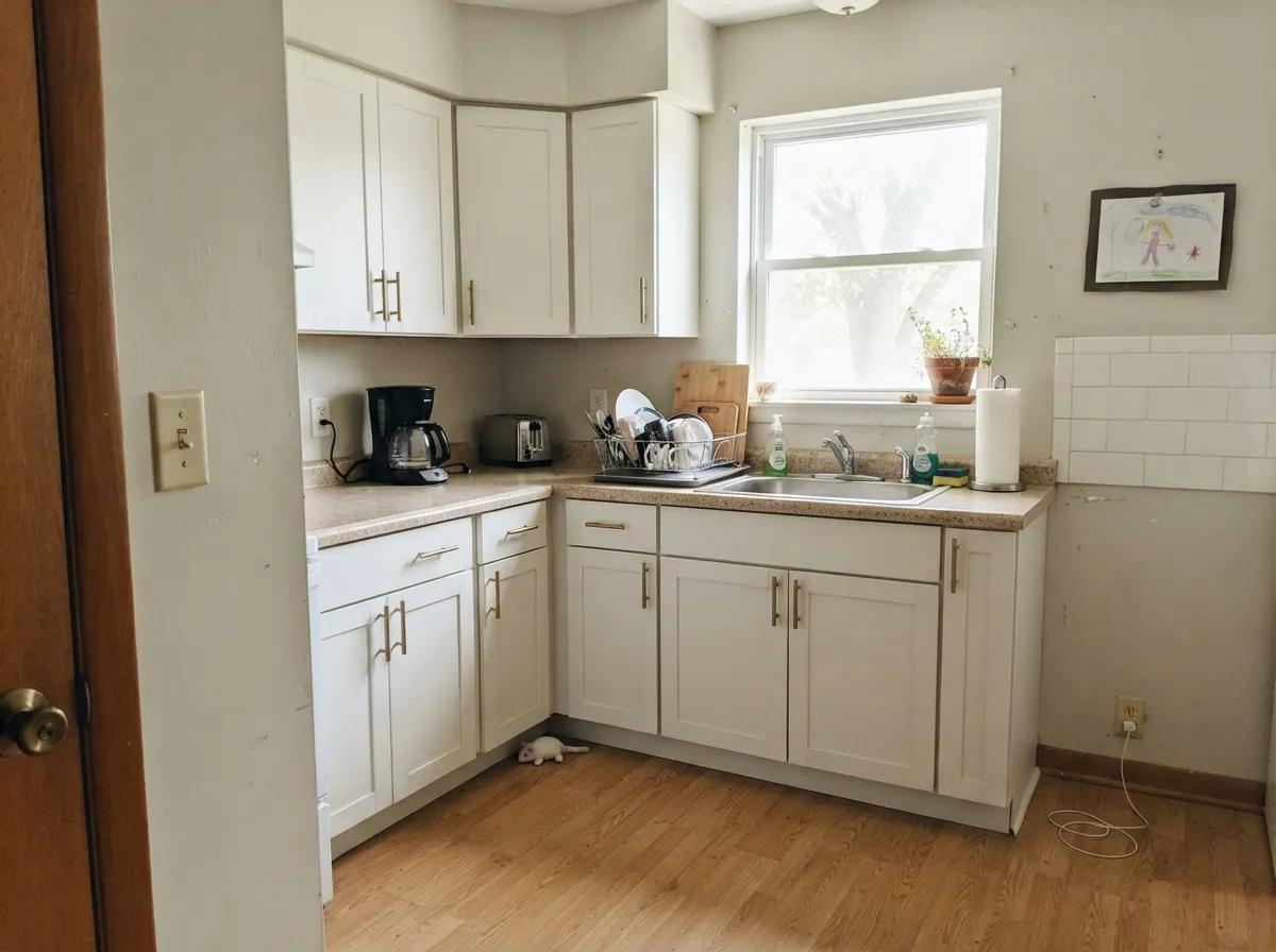
A budget-friendly cabinet white that reads crisp against most counters. Prime bare wood first and use two thin coats of the satin enamel; skipping primer is behind most of the bubbling complaints. Brass and warm wood soften its coolness nicely.
Under 2700K lamplight it goes gently soft at night. In a north-facing bedroom with cool LEDs, expect a faint blue-grey cast rather than the cream White Dove shoppers are hoping for.
With warm stone, wood vanities and brass fixtures it reads clean and bright. Against cool grey or blue-grey tile it can drift the same direction and start to look flat rather than fresh.
Semi-gloss Polar Bear trim works under nearly any wall color, warm or cool, because its own undertone is so muted it rarely fights back. This is genuinely the strongest, lowest-risk use of the color.
Full sun reads it bright and clean, and Behr's own pairing guides put it against charcoal-green (Hidden Gem) and other dark trims for a modern-farmhouse look. One of the more dependable budget exterior whites.
Your Light Is the Risk
Reads bright, clean and close to true white — the light that makes its LRV 94 obvious and flattering, indoors or out.
The subtle cool side comes forward — reviewers report a blue-grey or faintly violet cast. Sample here before committing a whole room.
A faint creamy warmth at the sun hours, closer to neutral the rest of the day. The swing is gentle, not dramatic.
2700K lamps warm it toward a soft ivory. Cool white LEDs flatten it and can expose the blue-grey side — swap bulbs before repainting.
Most complaints about Polar Bear are a light mismatch. Upload a photo of your actual room and see it on your walls — then ask for the same wall in north light or evening lamps before you buy a single sample.
Need It From Another Brand?
Any paint counter can custom-tint Behr 75 directly. If you would rather stay in one brand's own deck, these are the closest stock matches, measured as ΔE2000. Under 2 is a difference you will not see on the wall.
| Brand | Closest color | ΔE | LRV | |
|---|---|---|---|---|
| Sherwin-Williams | White SnowSW 9541 · Sherwin-Williams | 0.9 | 90 | Color page → |
| Benjamin Moore | Mountain Peak White2148-70 · Benjamin Moore | 0.9 | 91 | Color page → |
| Valspar | Ivory Keys8007-4A · Valspar | 1.0 | 91 | Color page → |
| PPG / Glidden | Delicate WhitePPG1001-1 · PPG / Glidden | 2.0 | 88 | Color page → |
| Glidden | Crisp Linen White61YY 89/040 · Glidden | 2.0 | 89 | Color page → |
| Dutch Boy | Ultra White002W · Dutch Boy | 1.0 | 91 | Color page → |
Similar Behr Colors
The nearest shades to Polar Bear within Behr's own range, ranked by perceptual color distance — useful when you want the same look a touch lighter, darker, or warmer.
WCAG 2.1: AA is 4.5 : 1 for normal text, 3 : 1 for large text, AAA is 7 : 1.
Polar Bear vs the Colors You're Also Considering
Every Polar Bear sample board has the same rivals on it. The numbers show the real lightness gap — then it comes down to which risk you would rather live with.
Pick this for a crisper, brighter finish that won't read beige under strong sun.
Behr 12 · LRV 80Swiss CoffeePick this if you want the warmer, creamier Behr white — Swiss Coffee tips gently toward yellow where Polar Bear stays close to neutral.
Pick this when you want a bright white without the slightly clinical, blue-leaning edge Ultra Pure White can get in cool light.
Behr 1850 · LRV 92Ultra Pure WhitePick this for the brightest, coolest true white in the Behr deck — maximum contrast against colored walls, zero warmth.
Side-by-side comparison →Pick this for a lighter, cooler look that brightens a small or dim room more forcefully.
Behr DC-003 · LRV 79Blank CanvasPick this for a balanced, warmer wall-and-cabinet white that sits happier next to honey wood tones.
Pick this if you're shopping at Behr on a budget and love the White Dove idea — just go in knowing this runs cooler and brighter, not a true twin.
Benjamin Moore OC-17 · LRV 85White DovePick this if what you actually want is a warm, creamy white with real body — White Dove holds a grayed-yellow base Polar Bear does not have.
The comparison people search most is Polar Bear versus Ultra Pure White (1850). Ultra Pure White has an LRV of 92 against Polar Bear's 86, and it is Behr's brightest, most neutral white. Side by side, Polar Bear looks cream and Ultra Pure White looks stark. Choose Ultra Pure White for trim, ceilings, and modern high-contrast schemes; choose Polar Bear for walls in rooms where a bare white would feel cold.
Within Behr's warm whites, Blank Canvas (DC-003) at LRV 85 is the closest rival. It is a near-twin in depth, and on separate walls most people could not tell them apart; pick whichever samples better against your floors. Snowy Pine (PPU10-13), also LRV 85, is another sibling that runs a touch softer.
The practical takeaway: differences inside this cluster are subtle, so decide between Polar Bear and its near-twins with real samples in your light, but the Polar Bear versus Ultra Pure White choice is a genuine warm-versus-stark decision.
Polar Bear Coordinating Colors
Because Polar Bear's own undertone is so quiet, it pairs easily with almost anything — but it looks most deliberate next to genuinely warm neutrals (to balance its coolness) or genuinely dark, saturated colors (for contrast it can't supply on its own). These are the partners that show up most often in real rooms:
Is Polar Bear Really the Budget White Dove?
This question drives most of the search traffic to Polar Bear, and the honest answer is: not quite. Both colors occupy the same role in their brand's deck — the reflexive, whole-house, everyone-recommends-it white — which is why they get typed into the same sentence constantly. But the numbers don't line up. White Dove sits at LRV 83 with a clearly warm, grayed-yellow body that holds its color even in bright light. Polar Bear sits at LRV 94, three points brighter, with an undertone so muted it barely registers as warm or cool until the room's light pushes it one way or the other.
Painters who have tested Behr and Benjamin Moore whites side by side generally point to a different Behr color, Silky White, as the closer match to White Dove's warmth — the difference there is described as "almost imperceptible." Polar Bear, by comparison, reads like its own thing: a clean, bright, slightly chameleon white that leans warm in good light and cool in bad light, rather than a paint that carries its own warmth into any room. If you love the idea of White Dove but are shopping at Behr on a budget, it's worth sampling both Polar Bear and Silky White before you commit — they are not interchangeable, even though the internet often treats them that way.
Polar Bear on Exteriors
Outside is where Polar Bear's brightness stops being a liability and starts being the whole point. Full sun reads it clean and crisp rather than washed out, and because the undertone is so subtle it doesn't fight with roofing, stone or brick the way a stronger cream or a stark cool white can. It's one of the more reliably budget-friendly exterior whites for exactly that reason — low undertone risk, high reflectivity, wide compatibility.
Behr's own styling guides pair Polar Bear siding with darker, more saturated trims for contrast — charcoal-green (Hidden Gem) is a current favorite for the modern-farmhouse look, and matte black or navy doors do the same job in a more classic register. The one thing to plan around: like most bright whites, the shaded side of the house will read noticeably cooler and flatter than the sunny side, so walk the full exterior with a large sample before ordering gallons.
Three Ready Palettes Built on Polar Bear
A color is never alone on the wall. These are complete combinations in the 60-30-10 pattern, with the reason each one holds together. Every one opens in the visualizer.
Bright, budget-friendly siding needs a genuinely dark frame to look deliberate rather than plain — Iron Ore trim gives the crisp modern-farmhouse contrast, and a navy door is the one saturated note the scheme needs.
Try this palette in your roomWarm greige walls carry the room's warmth so the cooler cabinet white doesn't feel stark, and a navy island gives the kitchen one grounded, non-white surface. All three are inexpensive, easy-to-match colors.
Try this palette in your roomPolar Bear's cooler cast, which fights against creamy neutrals, is an asset next to a soft coastal blue — this is the light, airy all-white-plus-one-color bedroom reviewers photograph most often.
Try this palette in your roomPolar Bear FAQ
Is Behr Polar Bear the same as Benjamin Moore White Dove?
No, even though it's constantly recommended as the budget swap. Polar Bear is brighter (LRV 94 vs 83) and carries far less built-in warmth — White Dove holds a visible grayed-yellow body, Polar Bear stays close to neutral. If you specifically want White Dove's warm cream at Behr prices, ask about Behr Silky White instead; painters who have tested both side by side call it the closer match.
Is Polar Bear warm or cool?
Neither, strongly — that's the trick and the risk. Its undertone is so faint that warm light and wood pull it toward a whisper of cream, while cool light and grey flooring push it toward a whisper of blue-grey. It has less built-in personality than most whites, so your room's light and floors do more of the deciding than the paint does.
What's the best sheen for Polar Bear on cabinets and trim?
Satin for cabinets, semi-gloss for trim and doors. On cabinets, prime bare or previously-finished wood first — the most common complaint (bubbling, streaky finish) traces back to skipping primer, not the paint itself.
Does Polar Bear work on exteriors?
Yes — it's one of Behr's more dependable budget exterior whites, reading bright and clean in full sun. Behr's own pairing guides put it against dark charcoal-green trims like Hidden Gem for a modern-farmhouse look; it also works with black or navy trim for a crisper, more classic contrast.
Why does Polar Bear look blue or grey in my room?
That's the cool side of its very subtle undertone showing up — it happens most in north-facing rooms with cool daylight and grey-toned floors or tile. It isn't a paint defect; warming the bulbs to 2700K and adding warm-toned furnishings usually fixes it. If the room stays stubbornly cool, a creamier white like Swiss Coffee will behave more predictably.
Does Polar Bear work with honey oak floors?
Reasonably well, though not as flattering as a warmer white. Because Polar Bear runs cooler and brighter, it won't amplify orange undertones in golden oak the way a stark blue-white would, but it also won't soften them the way White Dove or Swiss Coffee will. Expect a clean, fairly neutral pairing rather than a dramatically flattering one.
Have you painted with Polar Bear?
Rate it — one tap helps the next reader decide.
Ask a Question