Whipped Cream
Behr's quietest true white, reviewed honestly: why almost nobody has heard of it, where it disappears in the best way, and where every white this pale runs into trouble.

Jessica has spec'd whites and neutrals for more than 300 rooms and keeps a sample wall of painted drawdowns in her studio. Every color review is checked against real reader rooms in the comments and re-tested when a formula changes. About the testing process →

- 1Classic Gray74
- 2Alabaster82
- 3Whipped Cream91
- 4Ultra Pure White97
The Fast Verdict
Whipped Cream is Behr's quiet answer to Benjamin Moore Simply White: a true near-white at LRV 91 with the barest whisper of warmth — not enough to actually read as cream despite the name, just enough to keep it from feeling clinical. It lives in Behr's smaller Designer Collection rather than the headline numbered deck, which means most homeowners have never heard of it even though it does the job as well as colors with a hundred times the search volume. Give it real daylight and it disappears in the best way; put it on all four walls in a dim room and it goes flat, like every true white this pale.
Trim, ceilings and cabinets under almost any wall color · a whole-house near-white for rooms with real daylight · Home Depot shoppers who want a Simply-White-level true white without switching brands · pairing with both warm wood and cool stone — the undertone is too faint to argue with either
Your room is dim and north-facing · you want the actual cream warmth the name promises · you already have a warmer white (Swiss Coffee, Polar Bear) elsewhere that this one will sit next to · you want a color a hundred other people have already tested online before you
- True near-white (LRV 91) with almost no undertone to fight
- Works as a neutral base with both warm wood and cool stone
- Classic trim-and-ceiling white under nearly any wall color
- No known yellow-flash or blue-flash complaint pattern the way some famous true whites have
- A Home Depot option for the Simply-White-level true-white tier without switching brands
- Sterile and flat on all four walls in a dim, north-facing room — the standard risk at this LRV
- The name oversells the actual warmth — it reads far closer to plain white than cream
- Shows scuffs and fingerprints more than a deeper off-white
- Small Designer Collection line with a thin real-world track record to check your room against
What Color Is Whipped Cream, Really?
Whipped Cream is DC-001 in Behr's Designer Collection, a smaller, curated line sold alongside Behr's core numbered deck rather than one of the paint aisle's headline names — which is the first honest thing to say about it: almost nobody searches for this color by name, and there is no Color-of-the-Year run or viral room attached to it. What you get instead is a very competent near-white. The hex breaks down to R246 G245 B239 — a seven-point gap between the warmest and coolest channel, which is barely a whisper of undertone. Whipped cream the dessert is warm and yellow; Whipped Cream the paint is closer to true white with a hint of cream stirred in, not the other way around.
At LRV 91 it sits in the same true-white bracket as Benjamin Moore Simply White (LRV 91) and one point under Behr's own Ultra Pure White (LRV 92) — bright, high-reflectance territory, not a soft off-white like Behr Swiss Coffee (LRV 80) or Behr Polar Bear (LRV 86). That matters for how it behaves: true whites at this LRV read crisp and clean with real daylight, but they don't carry enough pigment to warm up a dim room the way a lower-LRV white can. Think of it as Behr's answer to Simply White, not a Behr answer to White Dove.
Undertone in one line: warm-neutral, so faint it reads as "just white" to most eyes. If your sample looks cool or slightly gray, that is your light or a nearby warmer white doing the work — there simply isn't enough color in this paint to fight back.
Where It Shines
Give it real daylight and it does the quiet-white job as well as any color in this bracket: trim that stays crisp against almost any wall color, ceilings that read clean without going stark-clinical, and cabinets that don't pick a fight with either warm wood counters or cool quartz. Because the undertone is so faint, it is one of the few whites here that genuinely doesn't care what temperature the room already leans.
Where It Fails
There isn't a pile of Reddit horror stories to draw on here — Whipped Cream sits in Behr's smaller Designer Collection rather than the heavily-searched core deck, so real-world reports are thin. What follows is grounded in how every true white at LRV 91 with this little undertone behaves, plus the specifics we do know about this one:
At LRV 91 there isn't enough pigment in Whipped Cream to warm up a room the way a lower-LRV white (Polar Bear, Swiss Coffee) can. In flat, cool daylight it reads sterile rather than soft. This is the standard risk for every true white in this bracket, not a defect unique to Whipped Cream — but it is real.
The name promises dessert-level warmth; the hex delivers a seven-point gap between warm and cool channels — closer to "true white with a whisper" than an actual cream. If you want the color BM Cream or Behr Blank Canvas gives you, Whipped Cream will look thin by comparison.
Put it beside Swiss Coffee trim or a Polar Bear ceiling and Whipped Cream will read cooler and slightly gray by contrast, even though on its own it reads neutral. Match whites room to room, or commit to Whipped Cream everywhere trim shows.
Room by Room
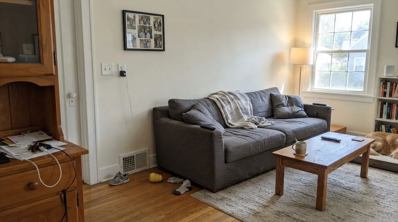
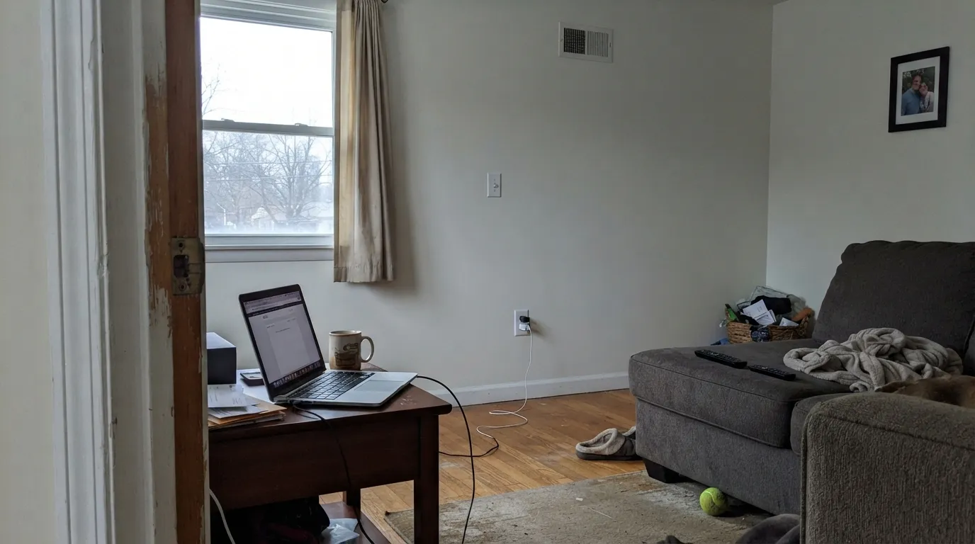
In a bright room it is a clean, quiet backdrop that stays out of the way of furniture and art. In a dim or north-facing room, dial it back to trim only or add warm lamps.
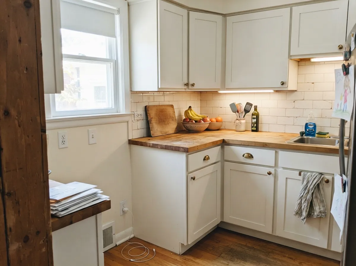
The faint undertone means it won't argue with warm butcher block or cool quartz. The tradeoff of a true white this pale: it shows fingerprints and scuffs more readily than a deeper off-white, so plan on a wipeable satin cabinet enamel.
Under 2700K bulbs at night it is calm and soft. Under cool LEDs or in a dim room by day, it can feel sterile rather than restful — swap the bulb before you swap the paint.
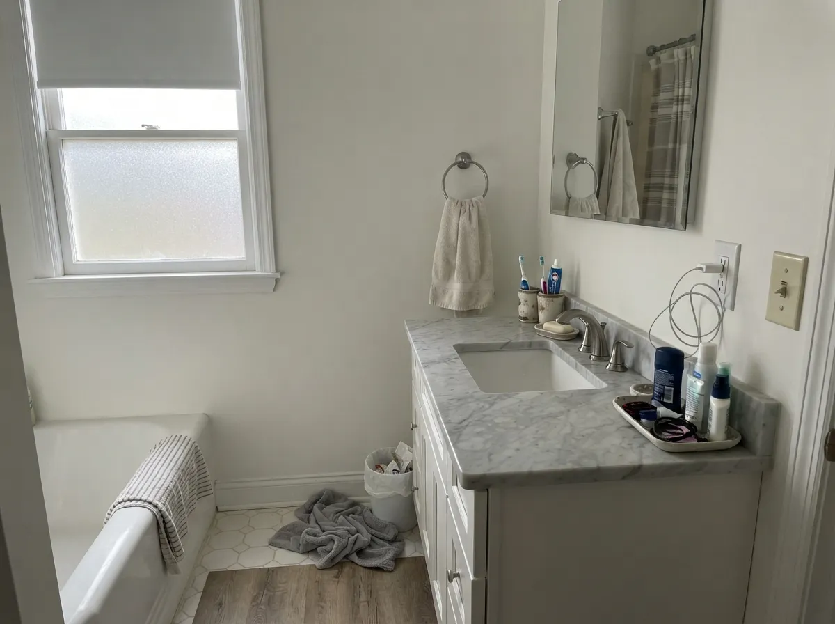
Neutral enough to sit next to warm travertine or cool gray marble without picking a side. One of the safer whites here for a bathroom that hasn't settled on a stone temperature yet.
Semi-gloss trim and flat ceiling in Whipped Cream reads crisp under nearly any wall color, warm or cool. This is the use case the LRV and the undertone were built for.
There's little documented history of Whipped Cream used outdoors. General true-white behavior applies — expect it to read brighter and more reflective in full sun — but walk a large sample around the house in different light before committing, since this specific color hasn't built up a track record outside.
Your Light Is the Risk
Full daylight is where a faint-undertone true white looks its best — clean and quiet, with no yellow or blue flash to manage.
With almost no pigment to fall back on, it goes flat and slightly cold across four walls. Fine on trim; riskier as the only color in the room.
A gentle warm cast at the sun hours, back to neutral white the rest of the day. The shift is subtle, not dramatic — there isn't much undertone to shift.
2700K bulbs add a touch of the cream the name promises; cool LEDs push it toward sterile. Swap the bulb before you swap the paint.
Most complaints about Whipped Cream are a light mismatch. Upload a photo of your actual room and see it on your walls — then ask for the same wall in north light or evening lamps before you buy a single sample.
Need It From Another Brand?
Any paint counter can custom-tint Behr DC-001 directly. If you would rather stay in one brand's own deck, these are the closest stock matches, measured as ΔE2000. Under 2 is a difference you will not see on the wall.
| Brand | Closest color | ΔE | LRV | |
|---|---|---|---|---|
| Sherwin-Williams | White SnowSW 9541 · Sherwin-Williams | 0.2 | 90 | Color page → |
| Benjamin Moore | Chantilly Lace2121-70 · Benjamin Moore | 1.4 | 91 | Color page → |
| Valspar | Cuddle Down8007-6F · Valspar | 0.5 | 91 | Color page → |
| PPG / Glidden | Delicate WhitePPG1001-1 · PPG / Glidden | 1.5 | 88 | Color page → |
| Glidden | Delicate WhitePPG1001-1 · Glidden | 1.4 | 88 | Color page → |
| Dutch Boy | Ultra White002W · Dutch Boy | 0.5 | 91 | Color page → |
Similar Behr Colors
The nearest shades to Whipped Cream within Behr's own range, ranked by perceptual color distance — useful when you want the same look a touch lighter, darker, or warmer.
WCAG 2.1: AA is 4.5 : 1 for normal text, 3 : 1 for large text, AAA is 7 : 1.
Whipped Cream vs the Colors You're Also Considering
Every Whipped Cream sample board has the same rivals on it. The numbers show the real lightness gap — then it comes down to which risk you would rather live with.
Pick this for a hair more breathing room on walls — Whipped Cream's warmth is subtle but it is there.
Behr 1850 · LRV 92Ultra Pure WhitePick this for the true-white benchmark in Behr's core deck — same brand, one point brighter, the same "stunning on trim, stark on four walls" rule applies.
Pick this to stay in the Behr aisle and sidestep that sun-flash risk — Whipped Cream holds steadier through the day.
Benjamin Moore OC-117 · LRV 91Simply WhitePick this if you're shopping Benjamin Moore instead of Home Depot — nearly the same LRV, but watch for its known yellow flash in strong afternoon sun.
Pick this when you specifically want the true-white tier, not an off-white — Polar Bear is Behr's popular White Dove alternative, but it is a different, deeper color.
Behr 75 · LRV 86Polar BearPick this for more forgiveness in a dim room — Polar Bear sits a step lower on the LRV chart and reads calmer, not stark.
Inside Behr's deck the differences are tiny. Cotton Ball HDC-CT-18G shares the same hex value #F6F5EF and the same LRV of 91, so the two are interchangeable on a wall. Snow Day HDC-WR16-01 (#F7F5ED, LRV 91) is slightly warmer. Swan Wing W-F-400 (#F7F6EE, LRV 92) and Palais White GR-W15 (#F7F6ED, LRV 92) are a shade brighter. Whisper White HDC-MD-08 (#F5F3ED, LRV 90) is a touch softer and creamier.
Across brands, White Snow SW 9541 from Sherwin-Williams (LRV 90, deltaE 0.21), Cuddle Down 8007-6F from Valspar (LRV 91, deltaE 0.49), Ultra White 002W from Dutch Boy (LRV 91, deltaE 0.49), All White No. 2005 from Farrow and Ball (LRV 92, deltaE 0.99), and True White JG-21 from Magnolia Home (LRV 92, deltaE 0.99) are all true matches. Chantilly Lace 2121-70 from Benjamin Moore (LRV 91, deltaE 1.42) is visually identical in normal room light, though it reads a hair cooler.
Whipped Cream Coordinating Colors
Because the undertone is so faint, Whipped Cream doesn't fight much of anything — the real decision is what to pair it with, not what to avoid. It sits happily next to warm greiges, soft sage, and near-black accents; the one thing to watch is placing it beside a noticeably warmer white, where it will read cooler by comparison. These are the partners that make the most sense:
Whipped Cream in Behr's Designer Collection
Whipped Cream carries the DC prefix, which marks it as part of Behr's Designer Collection rather than the numbered core deck most Behr shoppers browse. It's a smaller, more curated set of colors, and DC-001 — the very first number in the collection — is about as unglamorous a paint story as a true white can have: no Color of the Year run, no viral before-and-after, just a solid near-white sitting quietly in a chip rack most people walk past.
That obscurity cuts both ways. There is no pile of owner reviews to cross-check your room against, the way there is for Simply White or White Dove. But the numbers hold up: LRV 91, a barely-there undertone, and the same true-white behavior professional colorists rely on for trim and ceilings across a dozen brands. If you're comfortable trusting the data over the crowd, it's a legitimately good pick — you just won't find a hundred Reddit threads to confirm it first.
Whipped Cream With Wood Tones and Floors
A near-white with almost no undertone is the safest possible partner for wood: honey oak, walnut, white oak, cherry — none of them fight it, because there isn't enough color in the paint to clash. That is the real advantage of a color this faint: it defers to whatever floor is already there instead of trying to correct it.
The one place to slow down is a room with cool gray LVP or gray-washed floors and no warm wood anywhere else. With nothing warm in the mix, Whipped Cream's whisper of warmth can get overwhelmed and the whole room reads a little cold and showroom-like. A few warm accents — a wood shelf, brass hardware, a jute rug — are usually enough to fix it.
Three Ready Palettes Built on Whipped Cream
A color is never alone on the wall. These are complete combinations in the 60-30-10 pattern, with the reason each one holds together. Every one opens in the visualizer.
Whipped Cream's near-neutral warmth stays out of Agreeable Gray's way instead of competing with it the way a warmer trim white would; Hale Navy on the door gives the palette its one dark, well-lit accent.
Try this palette in your roomThe faint-undertone white lets Revere Pewter's warmth carry the room's temperature instead of two neutrals fighting each other; Wrought Iron's soft near-black anchors the pairing without going stark.
Try this palette in your roomWhipped Cream's true-white brightness keeps a sage island from feeling heavy, and Kendall Charcoal on a single pantry door gives the kitchen one grounding dark note without darkening the whole room.
Try this palette in your roomWhipped Cream FAQ
Is Behr Whipped Cream warm or cool?
Neither, really — it is a warm-neutral true white with barely any undertone at all. The hex works out to a seven-point gap between its warmest and coolest channel, which most eyes will simply read as "white," not cream or gray.
What is the difference between Whipped Cream and Behr Ultra Pure White?
One LRV point apart (91 vs 92) and both very low in undertone — close enough that the honest answer is: pick whichever one your store has swatched, and sample both on the actual wall. Ultra Pure White is the better-known name; Whipped Cream is the same idea from Behr's smaller Designer Collection.
Does it work on kitchen cabinets?
Yes. At this LRV and with this little undertone it is neutral enough to sit next to warm butcher block or cool quartz without an argument. Use a satin or semi-gloss cabinet enamel — a true white this pale shows fingerprints faster than a deeper off-white, so a wipeable finish matters.
Is Whipped Cream good for a whole room, or just trim?
It is safest on trim, ceilings and cabinets. On all four walls it needs real daylight to avoid feeling flat and sterile — a dim, north-facing room will expose how little pigment this color is carrying.
What sheen should I use?
Eggshell on walls, semi-gloss on trim and doors, flat on the ceiling. That split hides minor wall imperfections while keeping trim wipeable — the same formula that works for any near-white.
Is Whipped Cream part of Behr's main paint line?
It carries the DC prefix, which marks it as part of Behr's smaller Designer Collection rather than the numbered core deck most shoppers browse in-store. That is also why it has so little of an online track record compared to a color like Simply White or White Dove — it is a legitimately good true white that simply hasn't been searched, tested and argued about by thousands of homeowners yet.
Have you painted with Whipped Cream?
Rate it — one tap helps the next reader decide.
Ask a Question