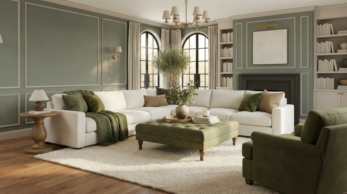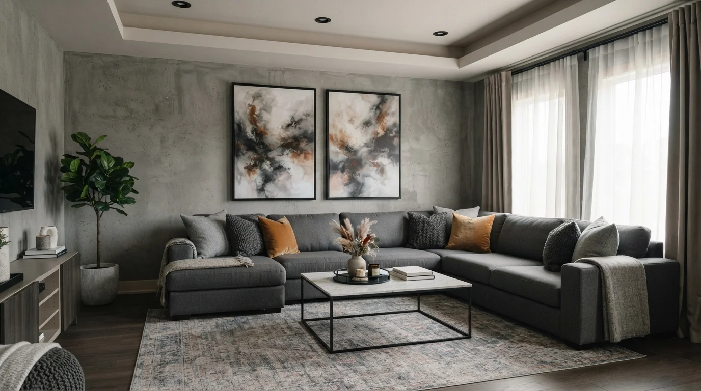
Room Colors · Family Room
12 Best Family Room Paint Colors for 2026
ideas, combinations, and real rooms
12 curated picks from real family rooms — with the exact colors, honest reasons why, and the combinations that hold the room together.

Former interior stylist who can spot a green undertone from across a room. Jessica writes the color and mood pieces — what to choose, what pairs, and why your "white" looks pink.
The Fast Answer
Don't want to read 12 picks? These four are the safe answers.

Top Picks for the Family Room
Pick a color family, tap a shade to see the family room in it, then try it on your own room.
Cozy warm neutral that hides smudges and pairs with most family-room furniture.
Family Room Color Trends 2026 — What's In, What's Out


- Cool gray-on-gray — The 2015 builder scheme reads cold and provisional now — the first thing buyers repaint.
- Stark bright white — Cold, blue-tinged whites feel clinical in a lived-in room; warm creams took over.
- Flat blue-gray greige — The gray-leaning greiges got overdone; the survivors all lean mushroom and taupe instead.
- Overly bright statement colors — Loud saturated walls are fading; 2026 rooms get depth from earthy, muted color instead.
The 12 Best Family Room Paint Colors
Every pick below is a real rendered family room, not a chip. The lead color first; the swatches are the full scheme in the photo — walls, furniture, textiles, accent.

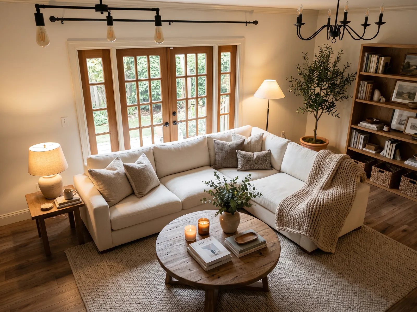
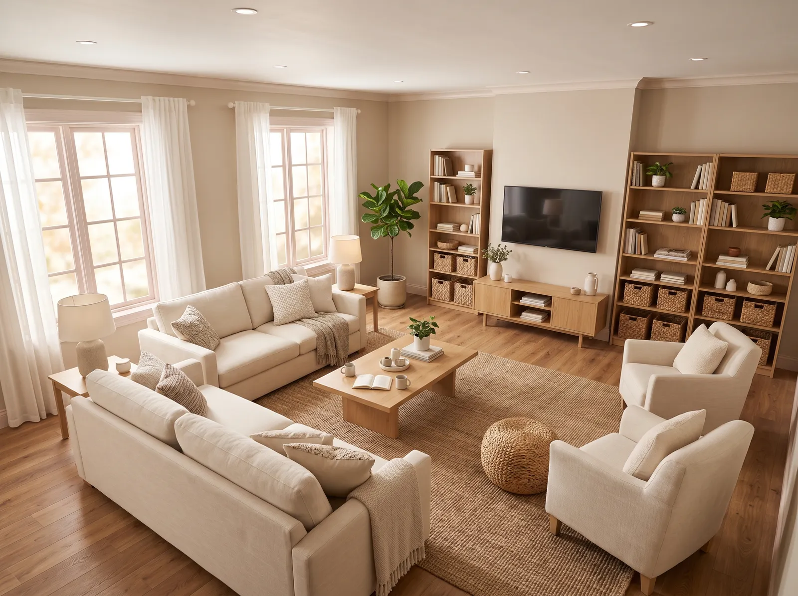
Gentle Pillar Beige walls and creamy Stonewashed Pink trim give a family room a soft, settled feel that hides everyday wear.
Creamy beige is the ultimate friendly neutral, offering a soft, sun-kissed backdrop that feels instantly welcoming. Here, that gentle beige coats the walls, matching the plush cream sofas and off-white armchairs. A light oak coffee table and wooden bookshelves anchor the space, while a textured tan jute rug ties the seating area together. The entire room feels incredibly calm, airy, and cozy. This monochromatic look works because layering different textures—like woven jute, soft knits, and smooth wood—keeps the single-tone scheme interesting. It is perfect for anyone wanting a serene, clutter-free sanctuary.
SEE MAYBE MUSHROOM ON YOUR WALLS →
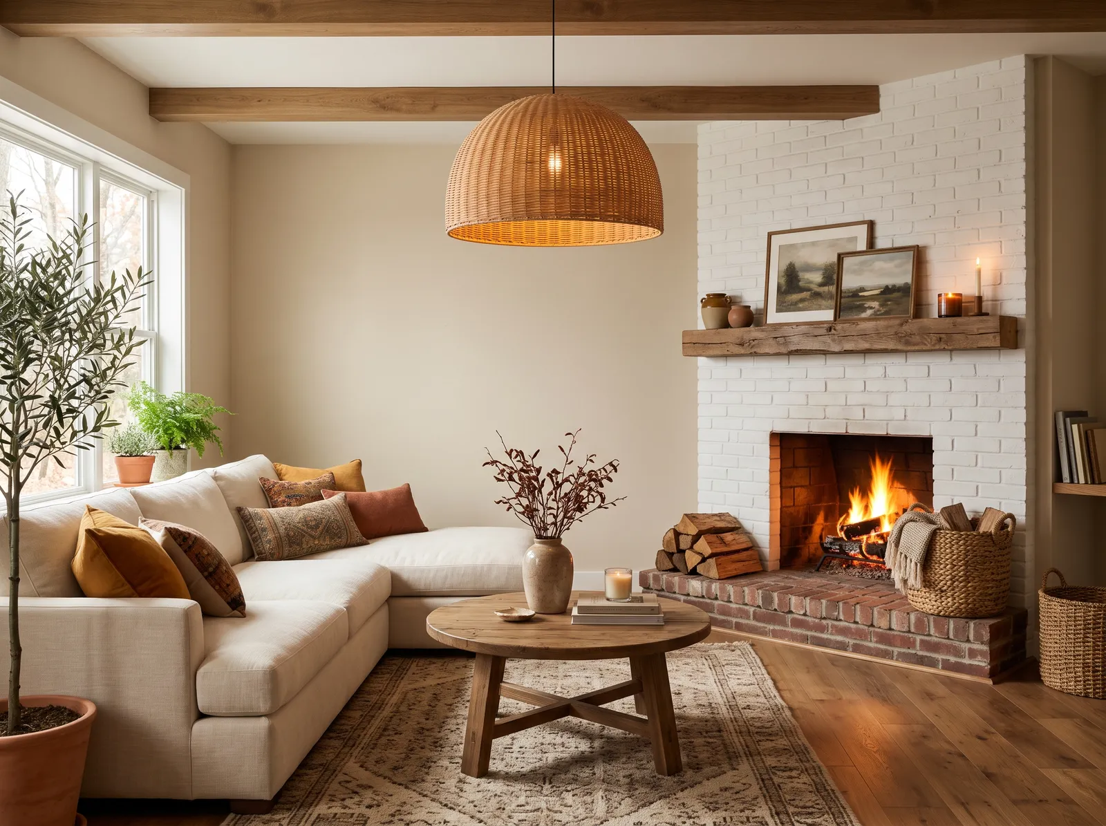
Warm Botany Beige walls catch the light like late-afternoon sun, wrapping a family room in an easy, golden kind of cozy.
Beige is a classic, sandy neutral that brings instant comfort to any space. In this living room, that soft beige wraps the walls, creating a serene backdrop for the cream sectional sofa and the rustic wooden coffee table. A patterned taupe rug anchors the seating, while terracotta and mustard cushions add pops of earthy color. The space feels incredibly snug and inviting, especially with the glowing fireplace. This combination works beautifully because the natural wood tones and woven textures ground the light walls. It is perfect for anyone who loves a cozy, rustic-modern retreat.
SEE PLASTER ON YOUR WALLS →
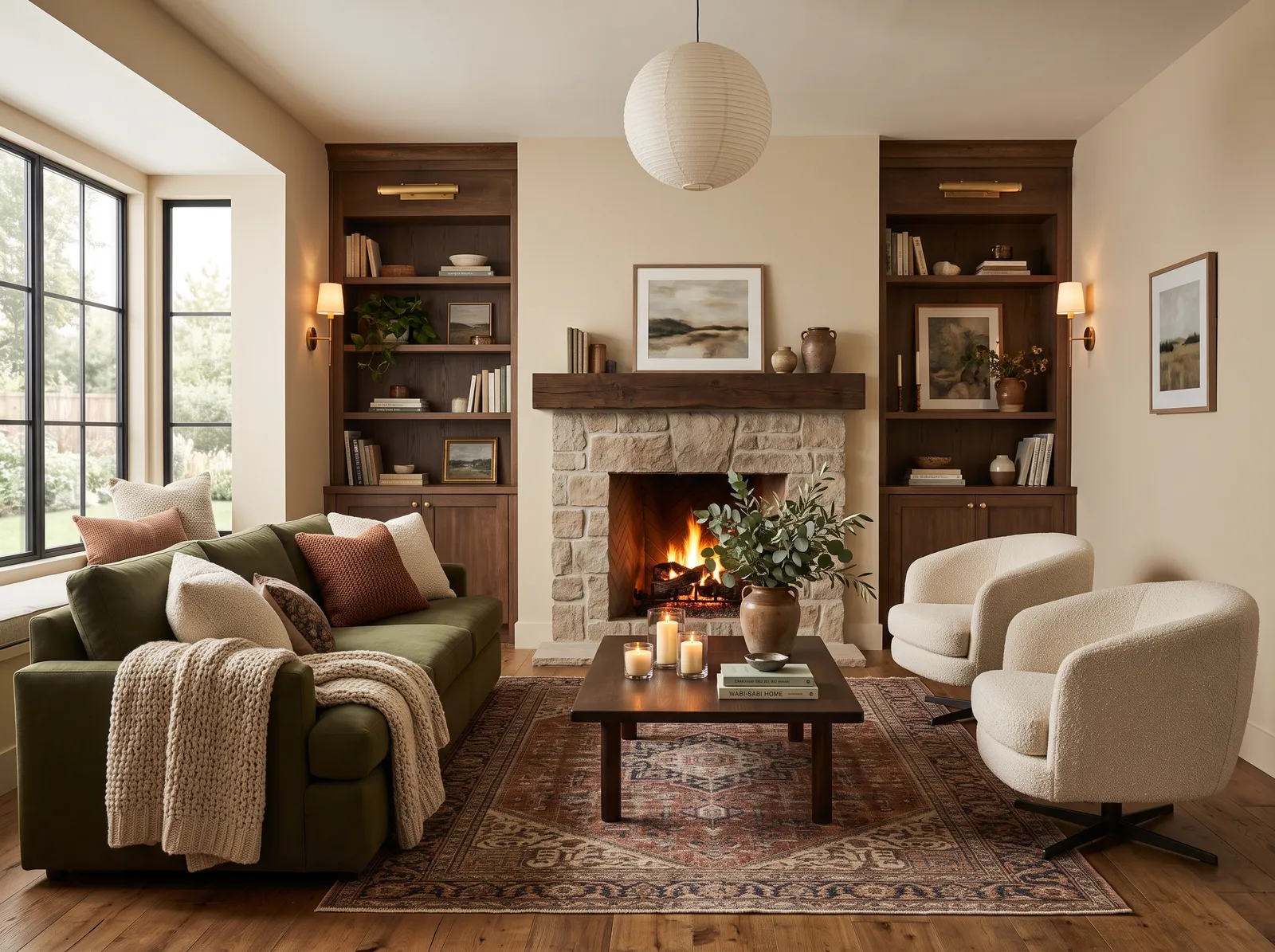
Soft Wheat Sheaf walls bring a quiet, toasty warmth that makes a family room feel calm and ready to relax in.
Cream is a wonderfully soft, buttery neutral that instantly makes a space feel like a hug. In this living room, that creamy hue wraps the walls, while deep walnut cabinets frame the stone fireplace. A rich olive green sofa anchors the seating, paired with two cozy, textured cream boucle chairs. Underfoot, a patterned rust and brown rug ties the layout together. The entire setup feels incredibly snug and grounded. This combination works beautifully because earthy forest tones and warm wood naturally bring the outdoors inside. It is perfect for anyone who loves a classic, nature-inspired retreat.
SEE TURBINADO ON YOUR WALLS →
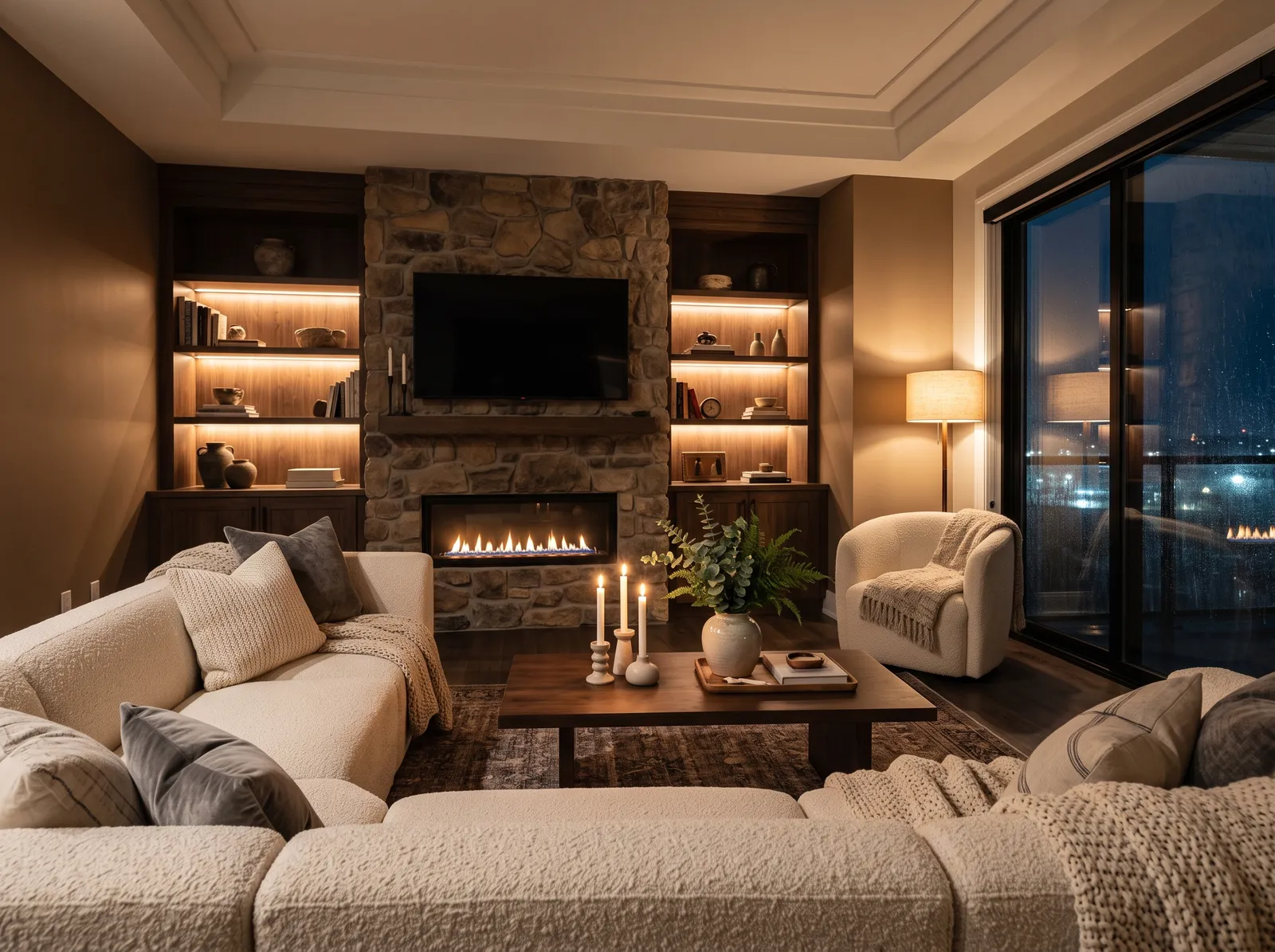
Deeper Cabot Trail taupe paired with lighter French Beige gives a family room real depth and a snug, grounded feel for movie nights.
Taupe is a rich, earthy gray-brown that brings instant intimacy to a room. Here, this deep hue wraps the walls, framing dark espresso cabinets and a rugged stone fireplace. A massive cream bouclé sectional and matching armchair soften the space, while a low walnut coffee table sits on a dark, textured rug. The entire room feels incredibly snug and cocooning, like a high-end mountain lodge. This combination works because the bright cream upholstery pops against the dark wood, keeping the heavy textures from feeling gloomy. It is perfect for anyone who loves to curl up by the fire.
SEE IT ON YOUR WALLS →
Warm Pacer White walls with soft French Cream trim keep a family room light and fresh without ever feeling cold or stark.
Cream is a wonderfully soft, buttery white that instantly makes a room feel like a hug. In this living room, that gentle cream coats the walls, matching the plush sectional sofa. A textured beige rug anchors the space, while a rustic wooden coffee table and tall bookshelf bring in rich, earthy oak tones. The entire setup feels incredibly cozy, calm, and snug. This combination works beautifully because layering different shades of cream and natural wood creates depth without any jarring contrasts. It is perfect for anyone wanting a peaceful, nature-inspired sanctuary.
SEE ASH ON YOUR WALLS →
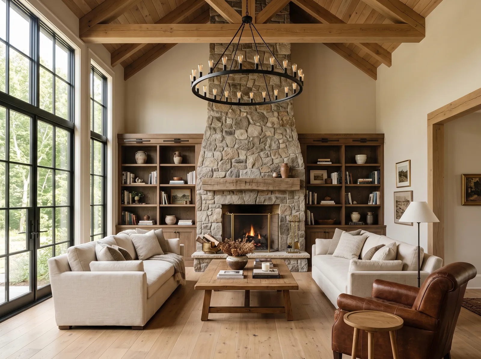
Soft Ash walls sit right between gray and beige, an easygoing backdrop that works with wood, leather, and busy family life.
Cream is a soft, comforting off-white that brings instant sunshine indoors. In this rustic living room, that gentle cream coats the walls and plush sofas, while honey-toned wood beams line the ceiling. Built-in cabinets and a sturdy coffee table show off rich medium-brown wood, anchored by a cognac leather armchair. The space feels incredibly snug and grounded. This combination works beautifully because the natural stone fireplace and warm wood textures keep the light seating from looking too stark. It is perfect for anyone who loves a cozy, cabin-inspired retreat.
SEE FEATHER STONE ON YOUR WALLS →
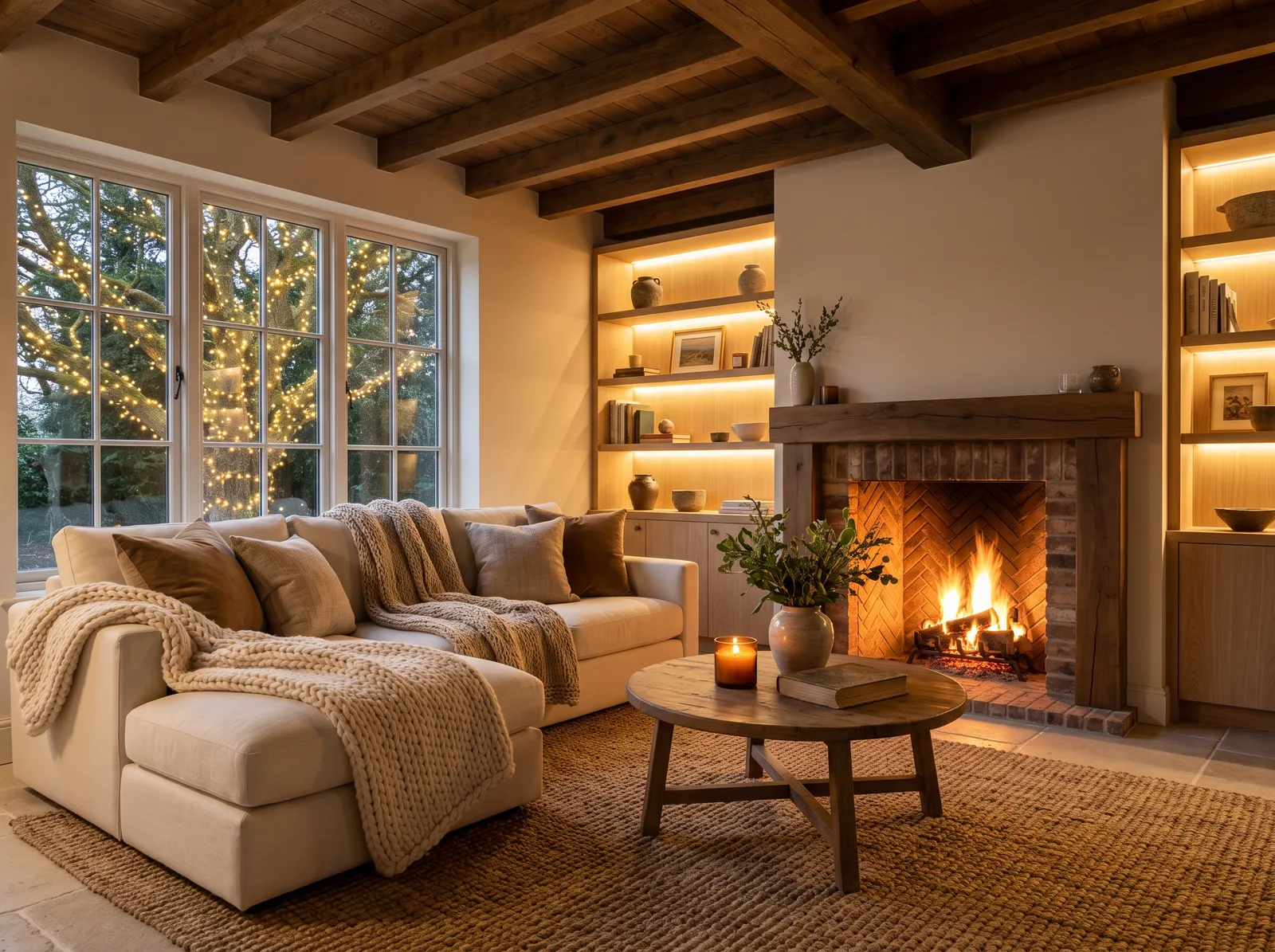
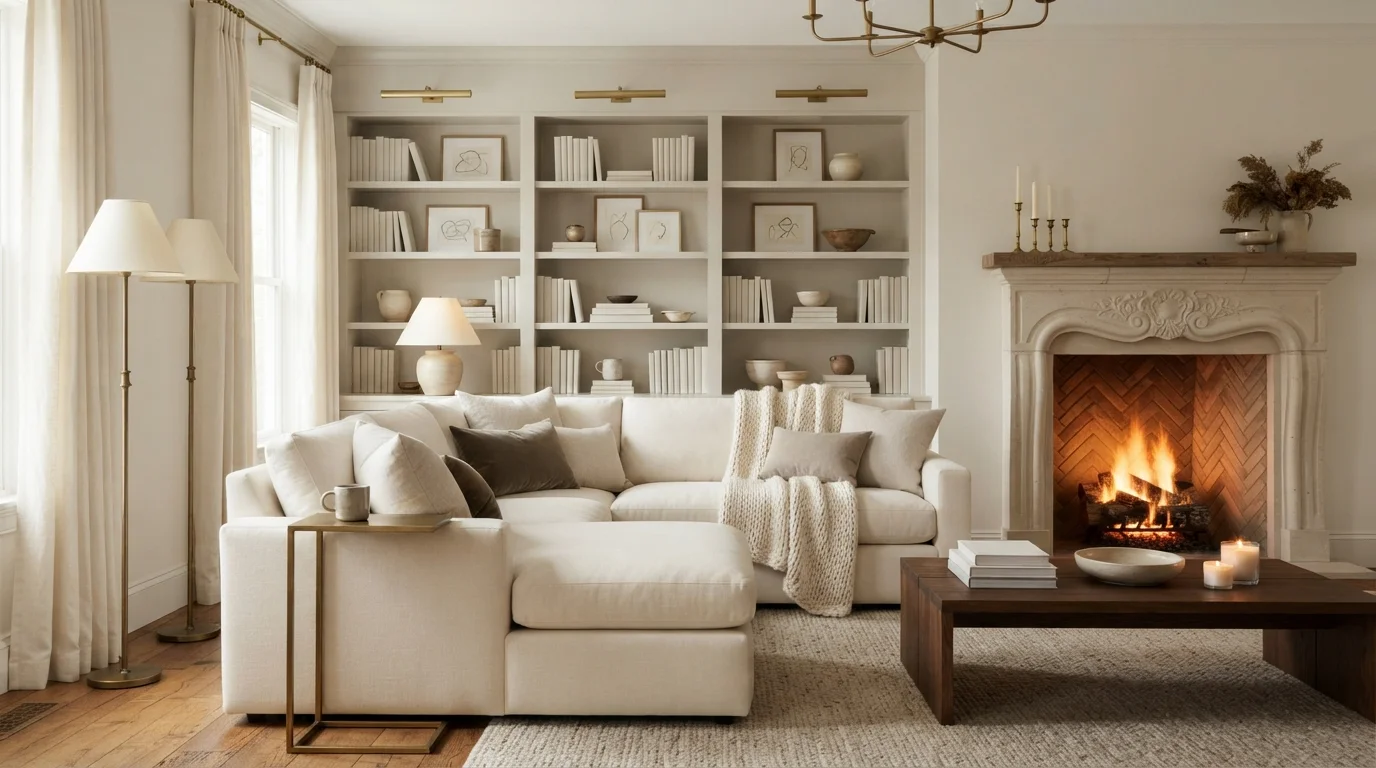
Cozy Ivory Ridge walls glow against a fire and chunky knits, giving a family room that warm, wrapped-up winter feeling.
Cream is a soft, buttery off-white that brings instant sunshine indoors. Here, this gentle cream coats the walls and shelving, while a matching cream sofa anchors the seating area. A rustic wooden coffee table sits on a chunky, woven jute rug, surrounded by deep chocolate brown cushions. The entire space feels incredibly snug, cozy, and safe from the cold. This combination works because the natural wood textures and earthy browns ground the light cream base. It is perfect for anyone who wants a rustic cabin retreat.
SEE WHEAT SHEAF ON YOUR WALLS →
Soft Quill taupe walls under a creamy Cascade Beige ceiling feel rich and tucked-in, perfect for a relaxed TV room.
Sandy beige is the ultimate comforting backdrop for a living space. In this room, that sandy beige covers the walls, while the plush sofas and large textured rug are a lighter cream. A chunky natural oak coffee table sits in the center, anchored by a dark wood media cabinet beneath the fireplace. The entire space feels incredibly cozy, calm, and snug. This combination works beautifully because layering different shades of cream and wood creates rich texture without needing bright colors. It’s perfect for anyone who wants a serene, nature-inspired sanctuary to unwind in.
SEE CANYON VIEW ON YOUR WALLS →
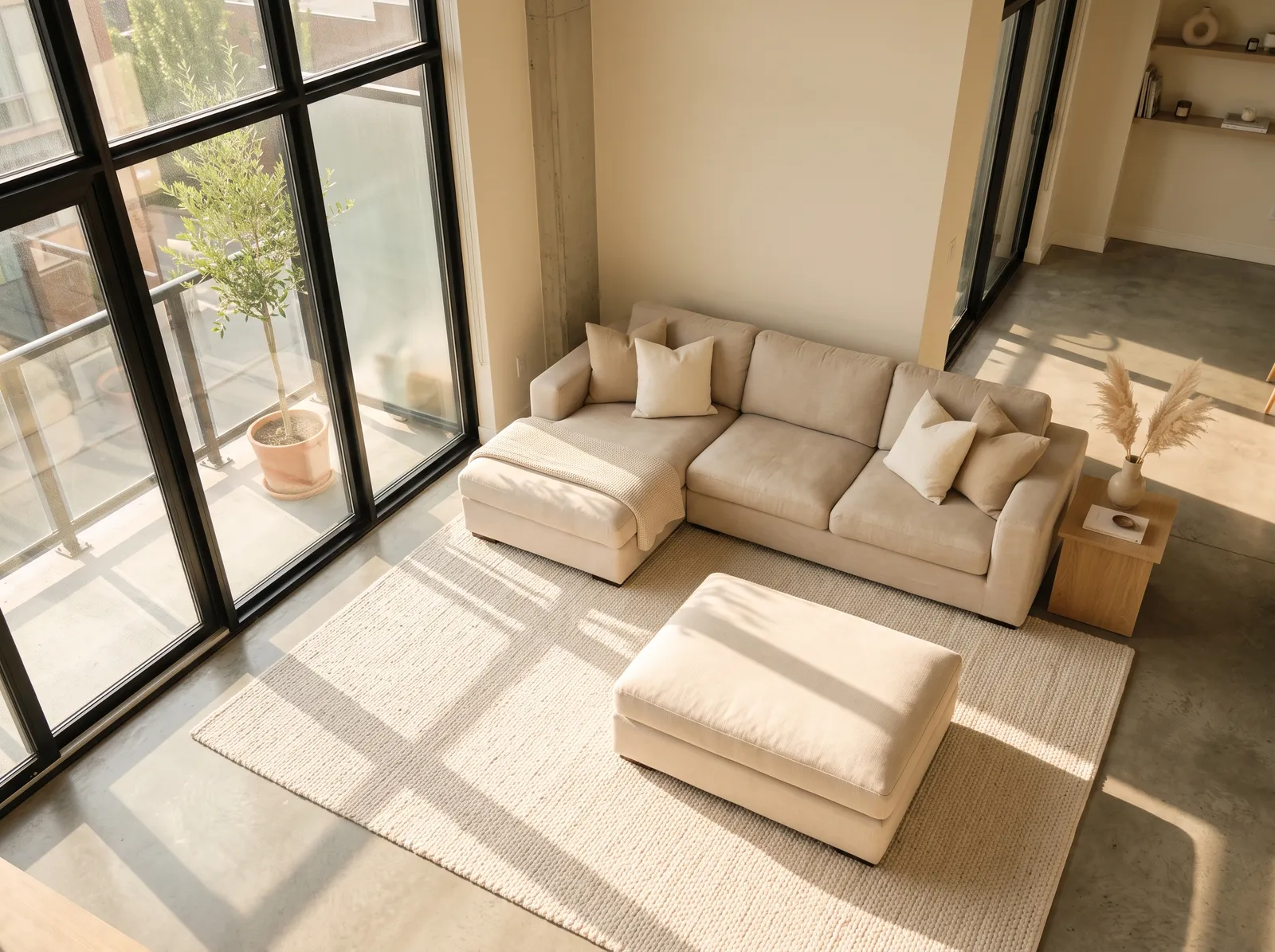
Light Hint of Cream walls bounce sunshine around the room, keeping a family space open, breezy, and easy to live in.
Cream is a wonderfully soft, buttery neutral that instantly makes a room feel like a gentle hug. In this sunlit loft, that creamy hue wraps the walls, while an oatmeal-toned sectional sofa and matching ottoman anchor the center. A textured off-white rug lies underneath, complemented by a light oak side table and soft ivory cushions. The entire space feels incredibly calm and peaceful. This monochromatic look works because layering different textures of the same color family keeps things interesting without adding visual noise. It is perfect for anyone wanting a serene, minimalist sanctuary.
SEE ILLUSIVE DREAM ON YOUR WALLS →
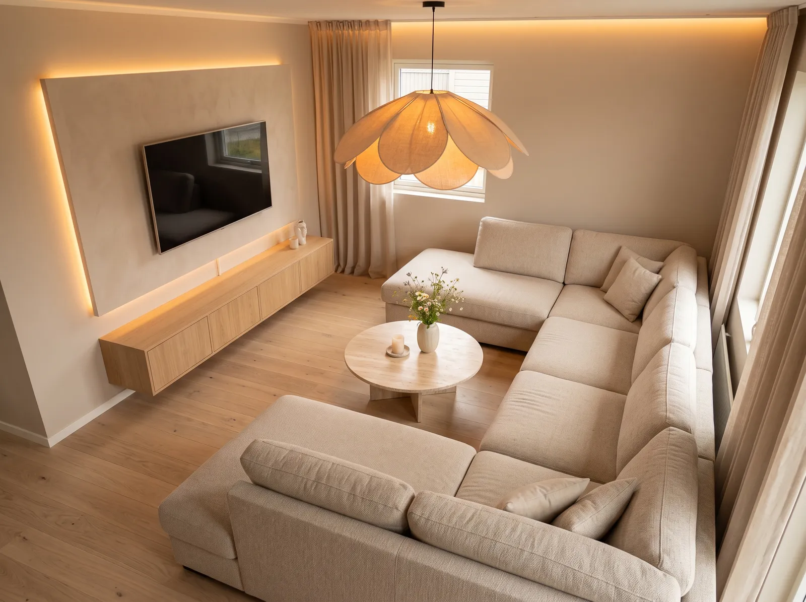
Warm Mocha Cream walls with a lighter Cocoa Butter accent build a soft, layered cozy that feels calm but never flat.
Beige is a wonderfully soft, sandy neutral that instantly relaxes a room. In this living space, that gentle beige wraps the walls, while a massive oatmeal-colored sectional sofa anchors the seating area. A light oak media cabinet floats along the wall, matching the round wooden coffee table in the center. The entire space feels incredibly snug and calm. This combination works beautifully because layering similar natural tones creates a seamless, peaceful flow without any harsh contrasts. It is perfect for anyone wanting a quiet, cloud-like sanctuary to unwind.
SEE FRENCH BEIGE ON YOUR WALLS →
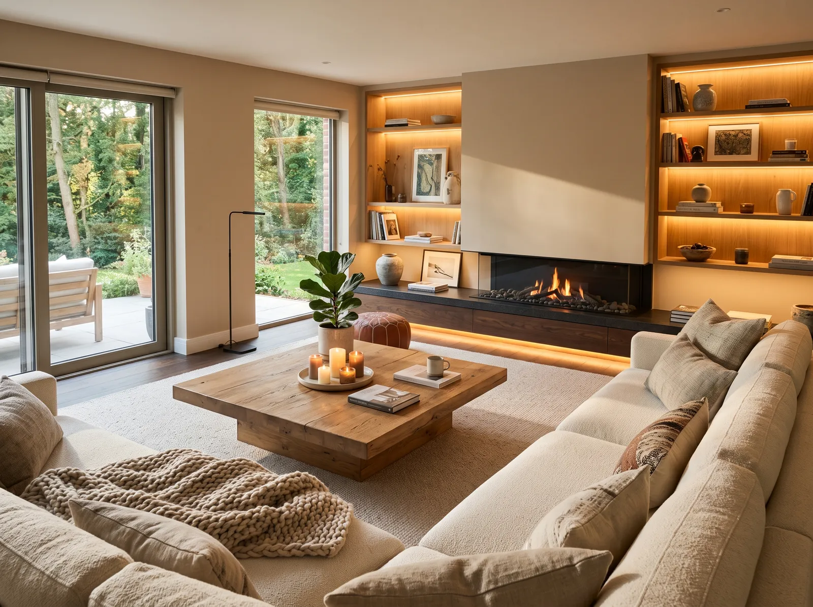
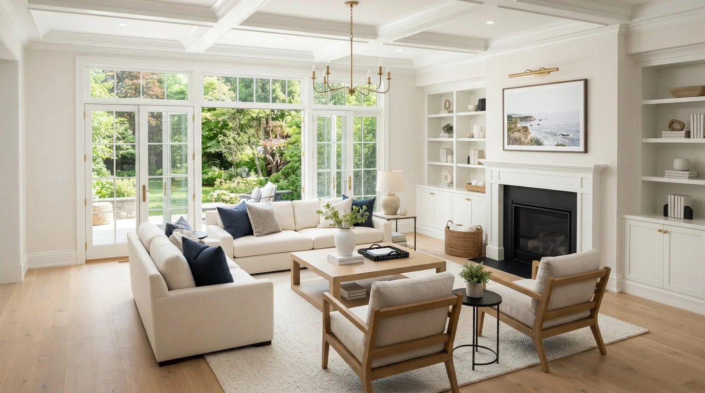
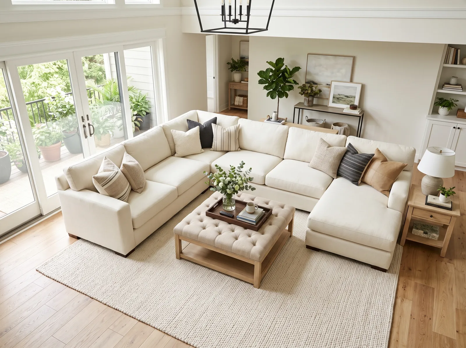
Gentle Simplified White walls and crisp All White trim keep a family room clean and bright while still feeling warm and welcoming.
Cream is the ultimate friendly base color, offering a softer alternative to stark white. In this bright living space, a gentle cream coats the walls, matching the massive U-shaped sectional and the textured woven rug. Light oak wood tones anchor the tufted ottoman coffee table, while a mix of beige, tan, and deep charcoal cushions adds subtle depth. The entire setup feels incredibly calm and airy. This combination works beautifully because layering similar light neutrals keeps the large furniture from overwhelming the room. It is perfect for families wanting a serene sanctuary.
SEE DOVE WHITE ON YOUR WALLS →
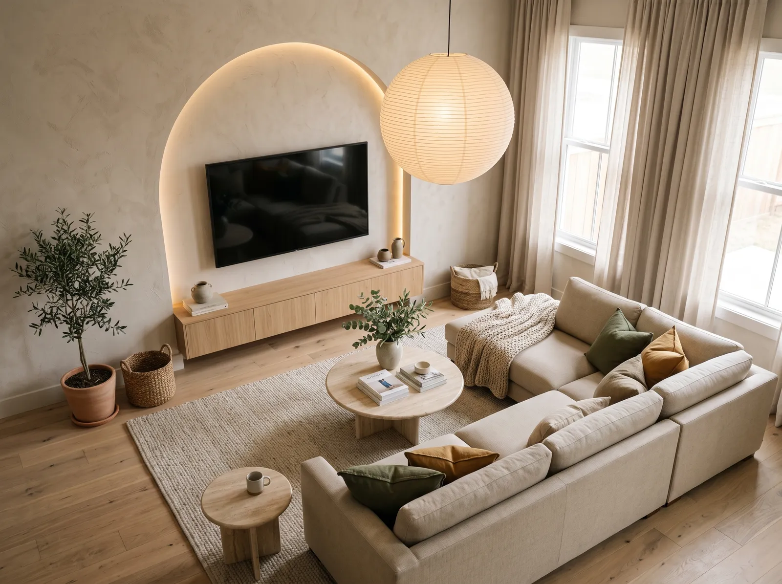
Sandy Shaggy Dog walls bring a soft, earthy warmth that makes a family room feel calm, grounded, and gently modern.
Oatmeal is a soft, sandy beige with a lovely earthy texture. In this serene living room, that gentle oatmeal tone wraps the walls, while a light cream sectional sofa anchors the seating area. A pale oak media cabinet and matching round coffee tables bring in natural wood tones, all resting on a textured greige woven rug. The space feels incredibly calm, airy, and deeply relaxing. This combination works beautifully because the earthy olive green and mustard cushions add just enough organic contrast to keep the monochrome look from feeling flat. It is perfect for anyone wanting a peaceful, minimalist sanctuary.
SEE IT ON YOUR WALLS →Family Room Wall Color Combinations
A wall color never works alone. These are the full schemes from the rooms above — the lead color first, then the supporting colors that make the photo work.
Gentle Pillar Beige walls and creamy Stonewashed Pink trim give a family room a soft, settled feel that hides everyday wear.
TRY THIS PALETTE →Warm Botany Beige walls catch the light like late-afternoon sun, wrapping a family room in an easy, golden kind of cozy.
TRY THIS PALETTE →Soft Wheat Sheaf walls bring a quiet, toasty warmth that makes a family room feel calm and ready to relax in.
TRY THIS PALETTE →Deeper Cabot Trail taupe paired with lighter French Beige gives a family room real depth and a snug, grounded feel for movie nights.
TRY THIS PALETTE →The easiest, most timeless combo is a soft white trim and ceiling against a slightly deeper wall. White Dove works beautifully as a trim and ceiling color because it's warm enough to pair with almost any wall shade, from Eucalyptus to Accessible Beige. Keep the ceiling the same white as the trim or a hair lighter so the room feels finished, not busy.
Match the warmth of your color to your floors and big pieces. Warm wood floors love greiges and greens like Cashmere and Sage; cooler gray floors pair well with grays and crisp whites. Tie in your fixtures and any built-ins too, so brass hardware leans warm-toned colors and black or chrome reads fine against cooler, grayer walls.
Family Room Color Ideas by Color
Set on a color family already? Each page has its own real rooms and picks.
Light or Dark Family Room Colors?
Go Light (LRV 60+) If…
The room is small, faces north, or has to work at every hour. Light warm colors make it feel bigger and stay calm in evening light — the light you actually live in.
Go Dark (LRV Under 20) If…
You want the cocoon effect and the room has real daylight. Dark works best on one feature wall — or fully color-drenched in a large room with good windows.
Look at which way your windows face before you commit. North-facing family rooms get cool, flat light, so warm colors like Cashmere, Accessible Beige, or Dirty Chai keep the space from feeling gray and chilly. South-facing rooms get strong, warm sun all day and can take cooler, calmer shades like Eucalyptus or a soft gray without feeling washed out.
Don't judge a color only in daylight. A family room gets used hard after dark, so check your samples at night under your actual lamps and overhead lights. Warm bulbs push beiges and greens warmer and can make a gray look slightly brown, so the shade you see at noon is not the shade you'll watch TV in.
LRV, or light reflectance value, tells you how light or dark a color reads on a scale from 0 to 100. Higher numbers bounce more light, so a bright, airy family room wants colors higher on that scale, like White Dove or a light greige. Lower numbers soak up light, which is how you get a cozy, den-like feeling.
For a smaller or darker family room, a high-LRV color keeps it feeling open and roomy. For a large room with lots of windows, or one you want to feel like a snug retreat at night, a mid-range or lower-LRV color like Dirty Chai or a deeper Sage adds warmth and intimacy without making the space feel closed in.
See It. Love It.
Paint It.
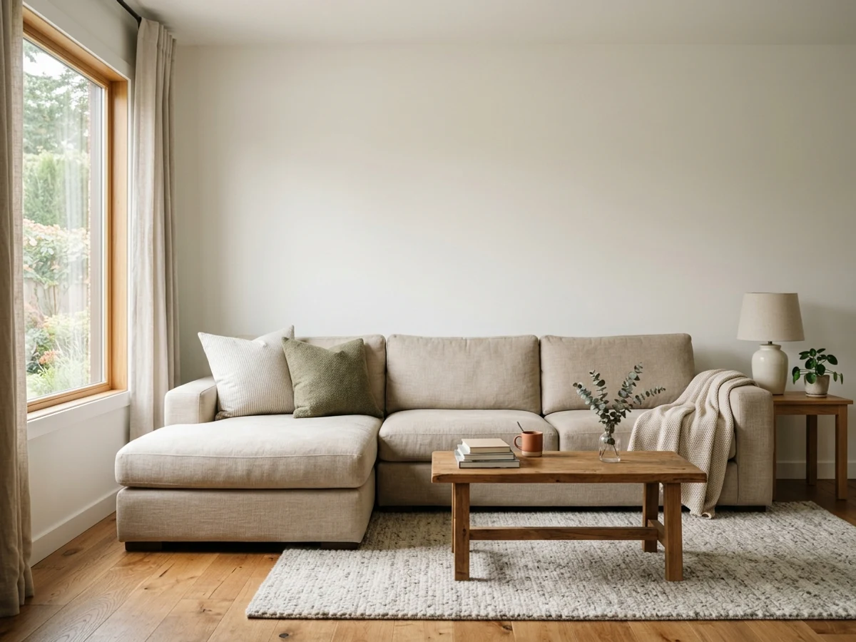
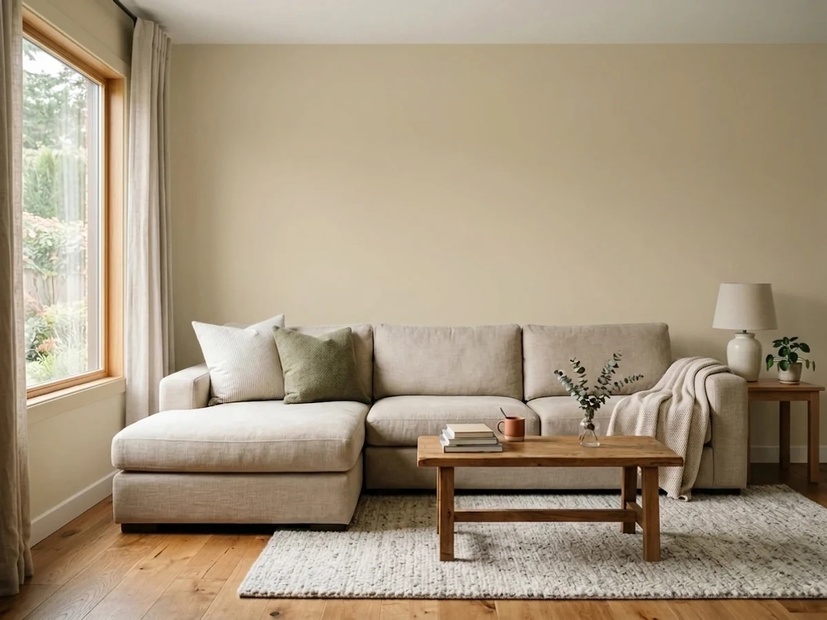
Upload one photo of your family room and try every color on this page on your own walls — in your own light, before you buy a drop of paint.

Manchester TanBeforeThe Right Finish For Everyday Wear
A family room takes a beating, so skip flat finishes on the walls. Go with eggshell or satin. Both have a soft, low glow that hides minor wall flaws while still letting you wipe off fingerprints, scuffs, and the odd splash of juice. Eggshell is the everyday favorite; satin is a touch tougher and easier to clean if you have young kids or pets.
Save higher-gloss finishes for the hard-working trim and doors, where you want maximum durability and easy cleaning. Keep the ceiling in flat or matte to cut glare and hide imperfections overhead. If the room gets a lot of direct sun, lean toward eggshell over satin so bright light doesn't bounce off the walls and create shine.
Common Mistakes To Avoid
The biggest mistake is picking the color off a tiny chip or a phone screen. Always buy a sample, paint a big swatch on two different walls, and watch it for a few days in morning, afternoon, and night light. The second mistake is choosing a stark, cool white or a flat gray that looks crisp in the store but turns cold and uninviting in a room people actually relax in.
Three more to dodge: using flat paint that you can't wipe clean, forgetting to test the color against your couch and rug, and going too dark in a room with little natural light. When in doubt, lean a shade warmer and a step lighter than you think, since family rooms almost always feel better a little soft and inviting than crisp and showroom-perfect.
About Family Room Paint Colors
The family room is where your house actually lives. People pile onto the couch, kids spread out on the floor, the TV glows at night, and sunlight pours in during the day. So the color you pick here has to do two jobs at once. It needs to feel welcoming and relaxed, and it needs to hold up to real life.
That usually points toward calm, easy-to-live-with directions: soft neutrals, warm whites, gentle greens, and quiet grays. These colors don't fight with your furniture, your art, or the constant change in light through the day. They give the room a steady, settled feeling that works for movie night and for a sunny Saturday morning.
Every color shown here is mixed to order at the paint counter, so you're not locked into one brand. If you fall for a shade like Sage or Accessible Beige, a store can mix it or match it across brands. That means you can choose the look you love first and sort out the brand second.
The Questions Everyone Asks
What color should I paint my family room?
If you want one answer, start with the safe picks above — White Dove, Accessible Beige, Manchester Tan, Back to Nature. They read well in any light and survive furniture changes. Then check the light: strong afternoon sun wants a step cooler, a north-facing room wants a step warmer.
what is the best paint color for a family room?
There's no single best, but warm, easy neutrals win most of the time. Soft whites like White Dove, greiges like Accessible Beige, and warm taupes like Cashmere are flexible and welcoming. If you want a little color, gentle greens like Sage or Eucalyptus stay calm and livable for years.
what paint finish should i use in a family room?
Use eggshell or satin on the walls. Both wipe clean and resist scuffs while keeping a soft, low glow. Save semi-gloss for trim and doors, and keep the ceiling flat or matte to cut glare.
how does my window direction change the color i should pick?
North-facing rooms get cool light, so warm colors like Cashmere or Dirty Chai keep them from feeling chilly. South-facing rooms get warm sun and can handle cooler shades like Eucalyptus. Always test your sample in both daylight and at night before you commit.
what does LRV mean and why should i care?
LRV is light reflectance value, a 0 to 100 scale for how light or dark a color reads. Higher numbers bounce more light and keep a room bright and open; lower numbers absorb light and feel cozy. Pick higher LRV for small or dim rooms and lower LRV when you want a snug, den-like feel.
what trim and ceiling color goes with a family room?
A soft white like White Dove is the go-to for both trim and ceiling because it pairs with almost any wall color. Keep the ceiling the same white as the trim or slightly lighter. Match the overall warmth to your floors so wood floors get warm walls and gray floors get cooler ones.
can i match one brand's color in a different brand of paint?
Yes. Every color here is mixed to order at the paint counter, and stores can cross-match a shade between brands. So you can choose the exact look you love, like Sage or Accessible Beige, and have it mixed in whichever brand of paint you prefer.
what's the most common mistake people make painting a family room?
Picking the color from a tiny chip or a phone screen instead of testing a large sample on the wall. Light changes everything through the day. Paint a big swatch, live with it for a few days, and check it against your couch and rug before buying gallons.
What two-color combination works best in a family room?
The reliable pattern is a quiet main color plus one deep accent on a single wall. Keep trim and ceiling in one warm white so the two colors are the only event in the room — the combination cards above show complete schemes from real rooms.
What colors make a family room look bigger?
High-LRV, slightly warm colors — LRV 60–75 is the sweet spot. Paint the walls and trim close to the same light color so the corners blur, and keep the ceiling white. Stark cool white actually works against you; it creates hard shadows that show the room's edges.


Ask a Question