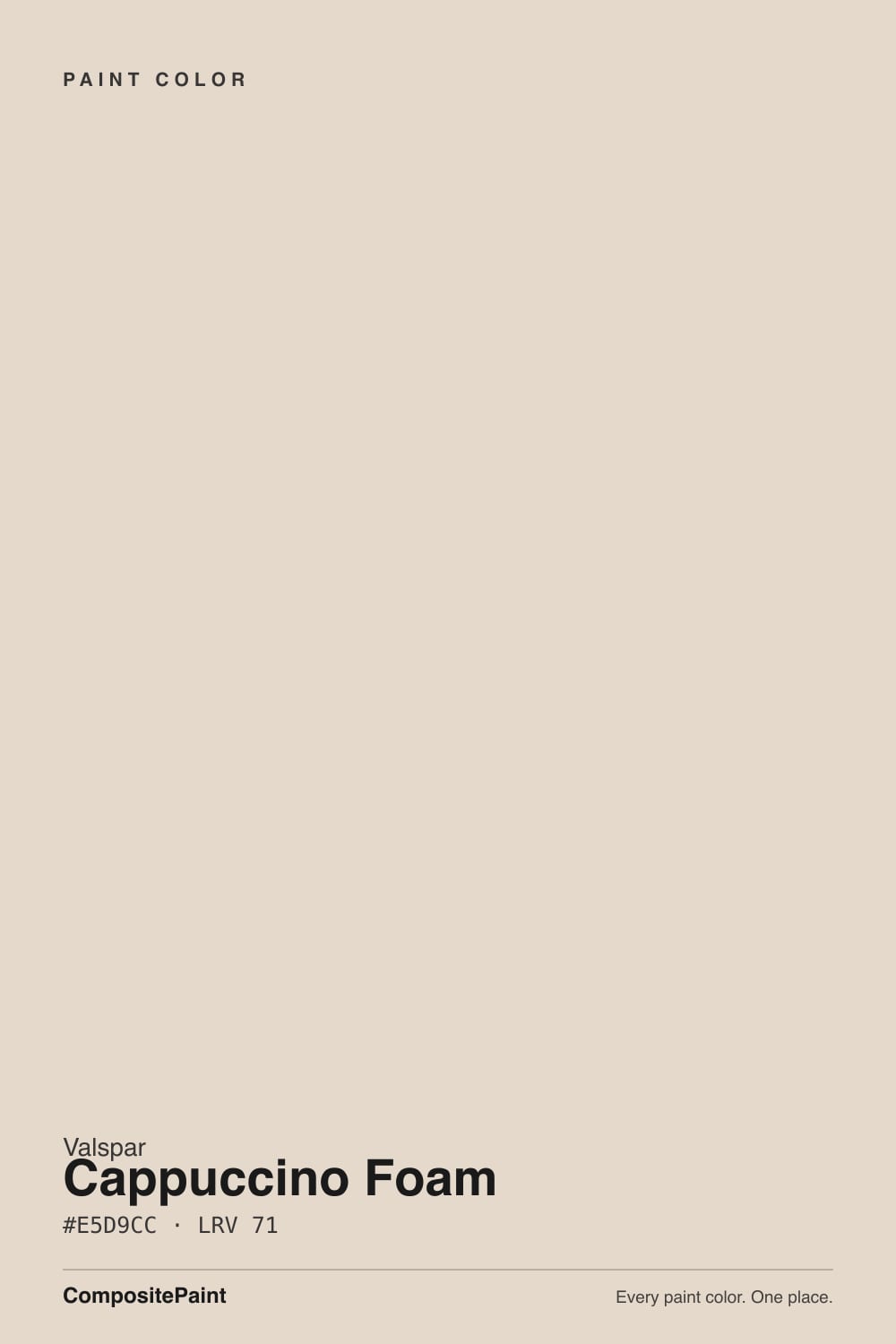
Cappuccino Foam
A warm cream sold through Lowe's, reviewed honestly against the near-identical colors bigger brands already made famous — and what the thin online track record actually means for you.

Jessica has spec'd whites and neutrals for more than 300 rooms and keeps a sample wall of painted drawdowns in her studio. Every color review is checked against real reader rooms in the comments and re-tested when a formula changes. About the testing process →
- 1Agreeable Gray60
- 2Balboa Mist66
- 3Cappuccino Foam71
- 4Pearly White77
- 5Dover White83
The Fast Verdict
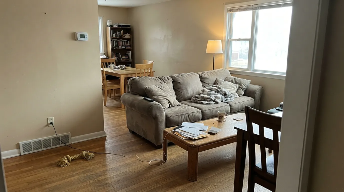
Cappuccino Foam is a milky, warm tan-cream — the pale foam on top of a latte, not the coffee itself. At LRV 71 it sits solidly in the light-and-livable zone: brighter than a true beige, warmer and softer than a white. The formula itself is proven — its hex numbers land almost on top of warm creams from Benjamin Moore and Behr that have years of owner feedback behind them. What it does not have is its own public track record: this is a Lowe's private-label name with almost no independent reviews or real-room photos anywhere online. Judge the color on the numbers, not on buzz, because there is none to judge it on.
Whole-house warm neutral, walls or trim · living and dining rooms with real daylight · kitchens with wood tones and warm metal hardware · Lowe's shoppers who want a proven warm-cream formula without special-ordering
You actually want a white, not a beige · your room runs mostly on cool LEDs with little daylight · your floors or counters are cool gray · you want real owner photos and reviews to check the color against before buying
- A genuine warm cream-tan, not a muddy or indecisive beige
- LRV 71 is bright enough for most rooms without going stark white
- Nearly identical by hex to warm creams from bigger decks with years of proven owner feedback
- Flatters warm wood, brass, and butcher block the way its close cousins do
- Works as a whole-house neutral carrying hallway into living space without clashing
- Almost no independent owner reviews or real-room photos exist online for this specific SKU
- Not a true white — buyers hoping for "off-white" will see clear beige on the wall
- Warm afternoon sun likely pushes it toward peach, based on how its near-twins behave
- Needs some daylight or warm bulbs in the room to read as cream rather than flat
What Color Is Cappuccino Foam, Really?
A warm neutral cream with a tan base — Valspar's own color library files it under "Neutral" in the US catalog and "Creams" in its UK one, and the RGB breakdown backs that up: 229 red, 217 green, 204 blue, a gentle 25-point gap between red and blue that reads as warm without tipping orange or pink. The name is literal: cappuccino foam is the pale, milky layer sitting on top of the coffee, and that is exactly the depth this color holds — light, warm, a little toasted, never dark enough to read as "coffee" itself.
At LRV 71 it is close kin to several colors this site has already reviewed from bigger decks — close enough that the comparison is the most useful thing we can tell you. Benjamin Moore Bone White (#E5DFCB, LRV 73) and Behr Almond Wisp (#E5DBC5, LRV 75) share the identical E5 red channel and land within two or three points on green and blue. These are not similar colors in the loose sense designers use; the actual hex codes are nearly interchangeable. Cappuccino Foam is a Lowe's-exclusive SKU (8005-9A) sitting in the same tiny neighborhood of the warm-cream color space that Benjamin Moore and Behr have already sold for years.
Undertone in one line: warm tan first, nothing else fighting for attention — no green, no visible pink, no lavender flash in our research. What we could not find is Cappuccino-Foam-specific owner reports confirming that in real rooms; the closest available evidence is how its near-twins behave, which we lean on honestly throughout this review rather than pretending we tested this exact can.
Where It Shines
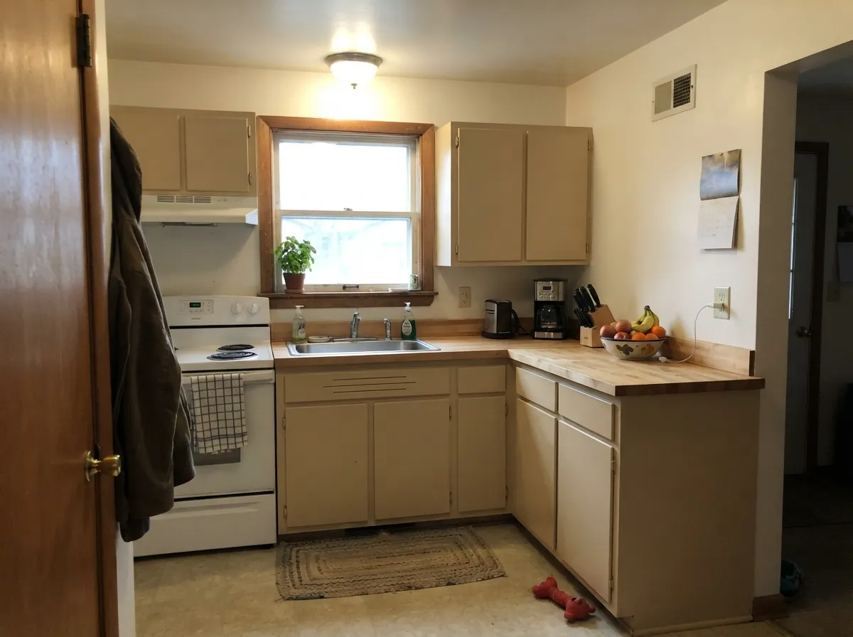
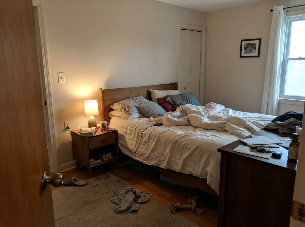
Give it real daylight and it does what every color in this hex family does well: reads as a genuine warm cream, not a muddy beige, and carries a whole floor plan without clashing room to room. It is at its best as a whole-house neutral — hallway into living room into dining room — where a color has to stay likeable in five different light exposures. Warm wood, brass, butcher block and leather all sit comfortably next to it, the same company that flatters its close cousins Bone White and Almond Wisp.
Where It Fails
Nothing here comes from a pile of one-star Cappuccino Foam reviews — there mostly aren't any to read yet. These three situations come from the color's own numbers and from how its near-identical siblings behave in the wrong room, so treat them as informed expectations rather than confirmed incident reports.
LRV 71 is bright, but the RGB gap is real tan, not white-with-a-tint. Buyers who pick a color this light expecting "off-white" and get a clear warm beige on the wall are the single most common regret with colors in this exact family — see Benjamin Moore White Sand, its near-twin in depth, which this site already flagged for the same reason.
Colors sharing this hex neighborhood tend to push toward peach as the light warms — Sherwin-Williams Natural Linen and Behr Sandy Beige, both close relatives by RGB, are on record for exactly that flash. We have no Cappuccino-Foam-specific report of it, but the formula gives no reason to expect it behaves differently. Sample it on the actual west wall before committing a whole room.
A warm tan this soft depends on some warmth in the room to read as cream rather than flat. Cool gray LVP, cool white quartz, or a room lit only by 5000K bulbs will drain the warmth and can leave it looking dingy rather than creamy — the same trap every warm cream in this LRV band falls into without daylight or warm bulbs to back it up.
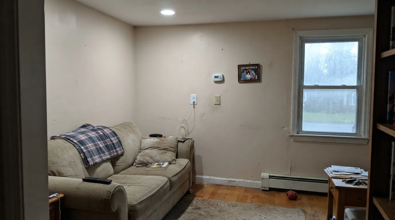
Room by Room
Reads as a calm, warm cream that lets furniture and art do the talking. Eggshell on walls, same color in semi-gloss on trim keeps the room from feeling chopped up.
Warm cabinetry, butcher block, and brass hardware all sit well against it. Valspar's own Cabinet and Furniture Enamel can be tinted to this exact color if you want cabinets and walls to match.
Cozy rather than stark at night with 2700K bulbs. If the room faces north and stays dim through the day, expect it to look flatter and less "cream" than the chip promises.
A warm wood table, brass fixture, and cream linens are its natural company; it stays quiet enough to let a chandelier or a bold rug be the room's one loud choice.
Its job in this room is to not pick a fight with whatever color is behind every door off the hall. Warm neutrals like this one are built for exactly that, and it is the same trick Bone White and Almond Wisp are already known for.
We found no exterior-specific data or owner reports for this color. Interior warm creams often read brighter and slightly cooler in full outdoor sun; sample a real exterior swatch board before committing siding or trim to it.
Your Light Is the Risk
The clearest, most honest read: a genuine warm cream, neither white nor muddy. Sample here first.
Without warmth in the room to meet it halfway, the cream can flatten toward a dull beige. Test before painting the whole room.
Expect it to warm further at sun-facing hours, the same way its close hex relatives do — watch for peach on a west wall.
2700K bulbs deepen the tan and make it feel like a latte at dusk; cool LEDs flatten it back toward plain beige.
Most complaints about Cappuccino Foam are a light mismatch. Upload a photo of your actual room and see it on your walls — then ask for the same wall in north light or evening lamps before you buy a single sample.
Need It From Another Brand?
Any paint counter can custom-tint Valspar 8005-9A directly. If you would rather stay in one brand's own deck, these are the closest stock matches, measured as ΔE2000. Under 2 is a difference you will not see on the wall.
| Brand | Closest color | ΔE | LRV | |
|---|---|---|---|---|
| Sherwin-Williams | White SesameSW 9586 · Sherwin-Williams | 2.2 | 71 | Color page → |
| Behr | Varnished IvoryMQ3-40 · Behr | 2.4 | 71 | Color page → |
| Benjamin Moore | Cocoa Butter1023 · Benjamin Moore | 1.0 | 72 | Color page → |
| PPG / Glidden | WarmstonePPG1015-3 · PPG / Glidden | 1.3 | 70 | Color page → |
| Glidden | Maybe MushroomPPG1020-2 · Glidden | 1.0 | 70 | Color page → |
| Dutch Boy | Dust Flats414-1DB · Dutch Boy | 1.7 | 72 | Color page → |
Similar Valspar Colors
The nearest shades to Cappuccino Foam within Valspar's own range, ranked by perceptual color distance — useful when you want the same look a touch lighter, darker, or warmer.
WCAG 2.1: AA is 4.5 : 1 for normal text, 3 : 1 for large text, AAA is 7 : 1.
Cappuccino Foam vs the Colors You're Also Considering
Every Cappuccino Foam sample board has the same rivals on it. The numbers show the real lightness gap — then it comes down to which risk you would rather live with.
Pick this if you are already buying Valspar at Lowe's and want the closest match without special-ordering.
Benjamin Moore OC-23 · LRV 73Bone WhitePick this if you want the same near-identical cream from a brand with a longer public track record.
Pick this for the Lowe's-specific version of the same cream, at the same store you're already shopping.
Behr PPU4-13 · LRV 75Almond WispPick this for the same depth and warmth with a slightly higher LRV and Behr's national availability.
Cappuccino Foam Coordinating Colors
The rule for coordinating with a warm cream this quiet: stay warm on the trim, and save the contrast for one deep, deliberate accent. It pairs easily with warm greiges, warm whites, and near-blacks, and it argues with anything icy or cool-gray. These are the partners that make the most sense from the reviewed decks:
Cappuccino Foam vs. the Warm Creams You Already Know
Valspar sells Cappuccino Foam almost entirely through Lowe's, and it shows up in searches next to color-matching sites and pin boards rather than owner blogs or forum threads — the usual signs of a color with real formula quality but no marketing push behind it. Its own catalog groups it under "Neutral" in the US and "Creams" in Valspar's UK line, alongside a family of coffee-themed names (Milk Chocolate, Cookie Dough, Timber Dust) that all sit in the same tan-to-brown range.
What makes it worth a second look is how close its numbers sit to colors this site has already reviewed at length. Benjamin Moore Bone White and Behr Almond Wisp are, by RGB, close enough to Cappuccino Foam that a painter mixing any of the three on the same wall would be hard-pressed to tell them apart once dry. If you already trust one of those reviews, you can trust this formula the same way — you're just buying it under a different name, at a different store.
Cappuccino Foam With Wood Tones and Floors
Warm wood is the safe, easy pairing: honey oak, walnut, butcher block, and cedar all sit comfortably next to a cream this warm, the same relationship its close cousins Bone White and Almond Wisp already have with wood tones. Brass and warm bronze hardware read as intentional rather than dated against it.
Cool gray-washed or gray LVP flooring is the pairing to sample first. A cream this warm can look slightly out of step next to true cool gray, in the same way every color in this hex family does — not a hard clash, but worth a large sample propped against the actual floor before painting the whole room.
Three Ready Palettes Built on Cappuccino Foam
A color is never alone on the wall. These are complete combinations in the 60-30-10 pattern, with the reason each one holds together. Every one opens in the visualizer.
Cloud White is warm enough to not fight the cream, so the wall-to-trim handoff stays soft instead of chalky; the charcoal door supplies the one dark note the scheme needs without going cold.
Try this palette in your roomRevere Pewter and Cappuccino Foam share the same warm-neutral base, so the island grounds the room without introducing a new undertone; Cloud White cabinets keep the whole kitchen light without going stark.
Try this palette in your roomThe warm cream keeps the room from feeling cold under lamplight, and a single navy accent wall gives it the one deep, saturated note a bedroom this soft usually wants.
Try this palette in your roomCappuccino Foam FAQ
Is Cappuccino Foam warm or cool?
Warm. The RGB numbers show a clear red-over-blue lean with no green or lavender flash in the research we could find. It reads as a soft, milky tan-cream, not a gray-leaning greige.
Is it basically the same as Bone White or Almond Wisp?
By the numbers, yes — the hex codes land within a few points of each other and all three share the same LRV band. The formulas are close enough that picking between them mostly comes down to which brand you're already shopping, not which one looks different on the wall.
Why can't I find more reviews of this exact color?
It's a Lowe's-exclusive Valspar SKU without the decades of design-blog and forum attention that Benjamin Moore and Sherwin-Williams colors accumulate. That doesn't make the formula worse — the closest documented cousins behave well — but it does mean you're buying on the numbers and a sample, not on a pile of owner photos.
Can I use it on kitchen cabinets?
Yes — Valspar's Cabinet and Furniture Enamel can be tinted to this color. Use satin for a wipeable finish, and expect the same warm-wood, warm-metal compatibility described above.
What trim white goes with it?
A warm white, not a stark cool one — Cloud White or a comparable warm off-white keeps the trim from making the walls look dingy by contrast. A bright cool white will fight it the same way it fights every color in this warm-cream family.
Does it work with honey oak or walnut floors?
Warm woods are its best company — walnut, honey oak, and butcher block all read comfortably against it, the same pairing that works for its close relatives. Cool gray-washed floors are the one flooring choice worth sampling first, since they can make the warmth look slightly out of step.
Have you painted with Cappuccino Foam?
Rate it — one tap helps the next reader decide.
Ask a Question