Edgecomb Gray
The light greige everyone recommends, reviewed honestly: the rooms where it glows, the rooms where it turns muddy, and what to buy instead.

Jessica has spec'd whites and neutrals for more than 300 rooms and keeps a sample wall of painted drawdowns in her studio. Every color review is checked against real reader rooms in the comments and re-tested when a formula changes. About the testing process →
- 1Light French Gray53
- 2Accessible Beige58
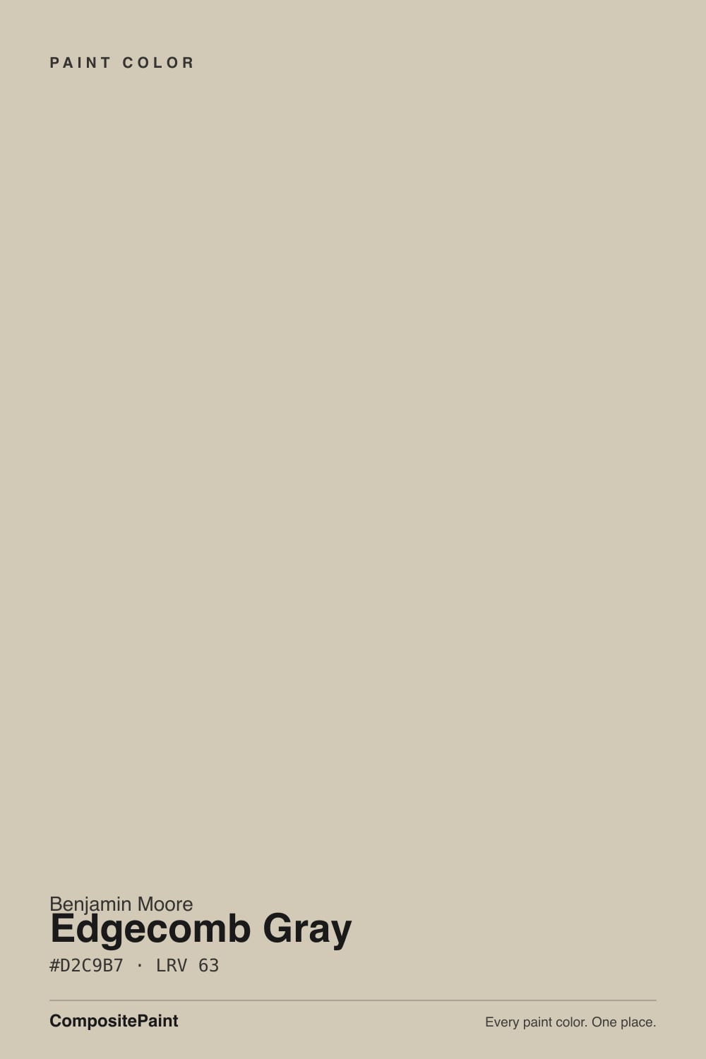
- 3Edgecomb Gray63
- 4Pale Oak69
- 5Shoji White74
The Fast Verdict
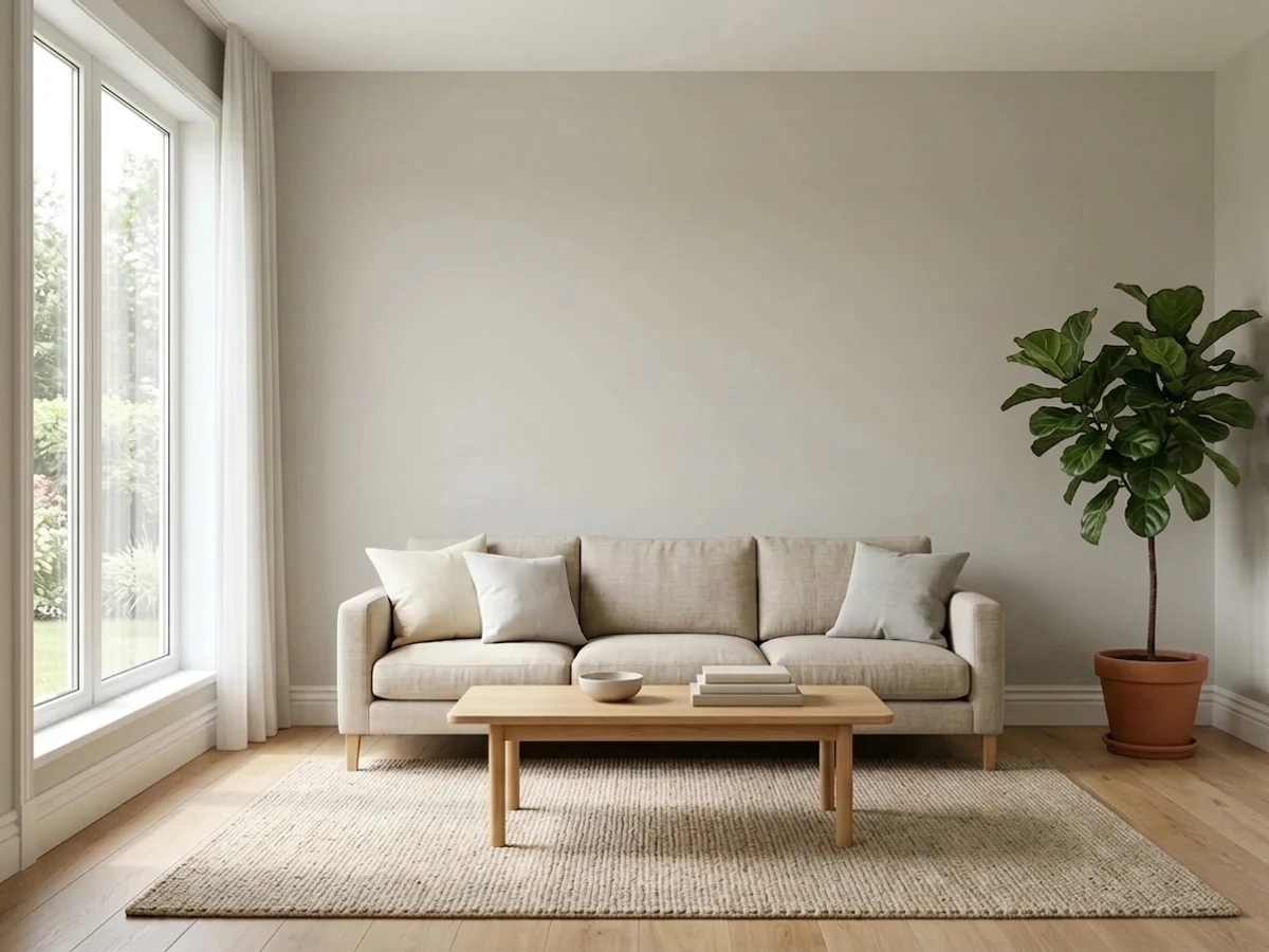
Edgecomb Gray is the greige people pick when Revere Pewter feels too heavy and plain beige feels dated. At LRV 63 it stays light and warm, it flows through a whole main floor, and it makes oak floors and brass look intentional.
The catch is real: it needs daylight. Give it one small window and it stops looking soft and starts looking dingy — that is where almost every bad review comes from.
Whole main floors with several windows · homes full of oak, beige tile or cream trim · kitchen cabinets with brass or black hardware · anyone who found Revere Pewter too dark
Your room has one small north window · your trim is a bright white and stays that way · you want a clean, cool gray · your counters and tile are cool blue-gray
- Light and warm at once — keeps rooms open without going cold
- Runs through a whole main floor across four light directions
- The easy step down from Revere Pewter when it reads too heavy
- Blends with oak floors, beige tile and cream trim instead of fighting them
- Excellent warm cabinet color with brass or black hardware
- Turns muddy and dingy in rooms with one small window
- Flashes yellow-green next to bright white trim in strong sun
- Picks up green bounce from a lawn or trees outside
- Reads more beige than the chip promises on a big sunny wall
What Color Is Edgecomb Gray, Really?
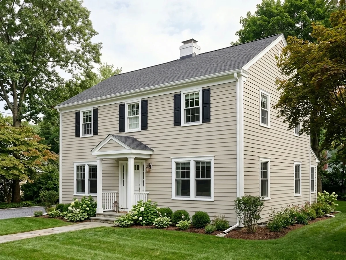
A light warm greige — a gray with real beige in it, not a gray with a hint of beige. The measured hue sits in the orange-tan part of the wheel at 23 percent saturation, which is more color than a true neutral carries. That is why it never looks cold, and also why it can look tan on a big sunny wall instead of the soft gray people expect from the chip. The chip fools people because it is small and surrounded by white card stock; the wall shows the beige.
LRV 63 is the number that decides whether you will like it. Revere Pewter sits at 56, and that seven-point gap is exactly why so many people move here after seeing Revere Pewter go heavy in a hallway. But 63 is not bright — Pale Oak is 67 and Classic Gray is 74, and both of those look noticeably airier on the same wall. Edgecomb Gray is light enough to keep a normal room open and dark enough to go dull when the light runs out.
Undertone in one line: warm tan-gray, with a faint green-gray flicker that only shows in cool light or when green bounces in from a lawn — never pink, never blue.
Where It Shines
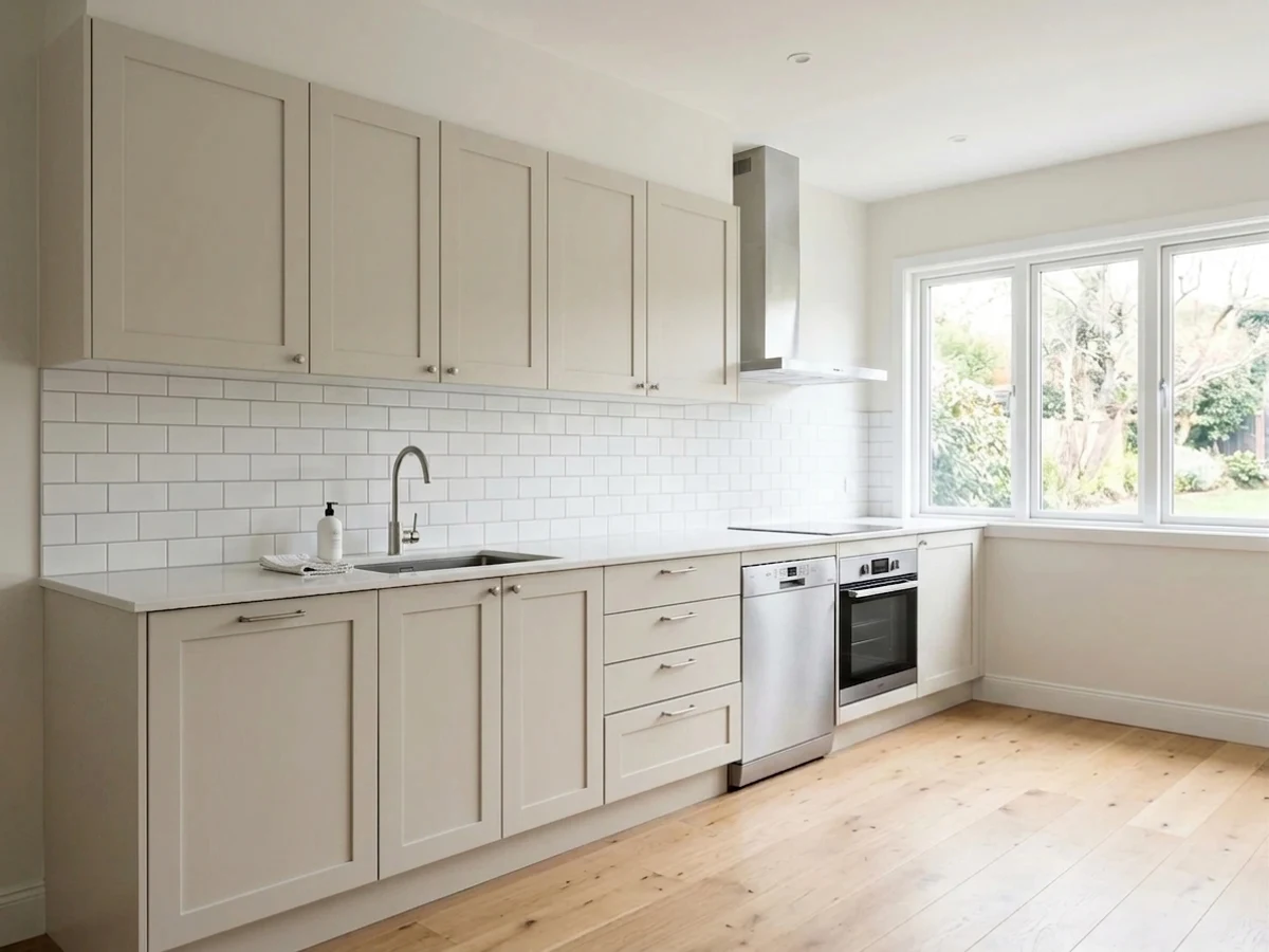
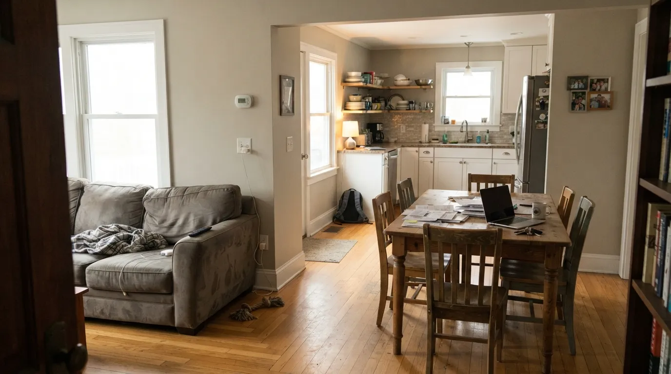
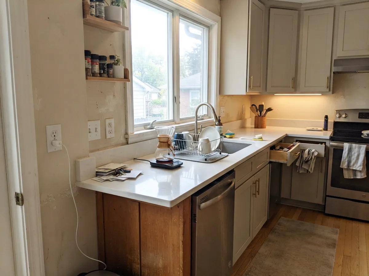
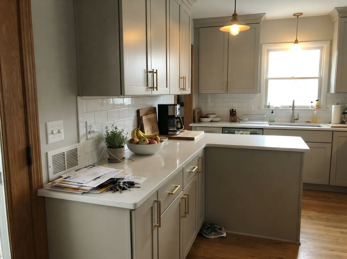
Give it a couple of windows and warm wood and it does exactly what people hire it for: it makes a whole floor feel calm and finished without any single room shouting. Kitchens are its second job — on cabinets it is a warm alternative to white that hides fingerprints and flatters brass, bronze and black hardware.
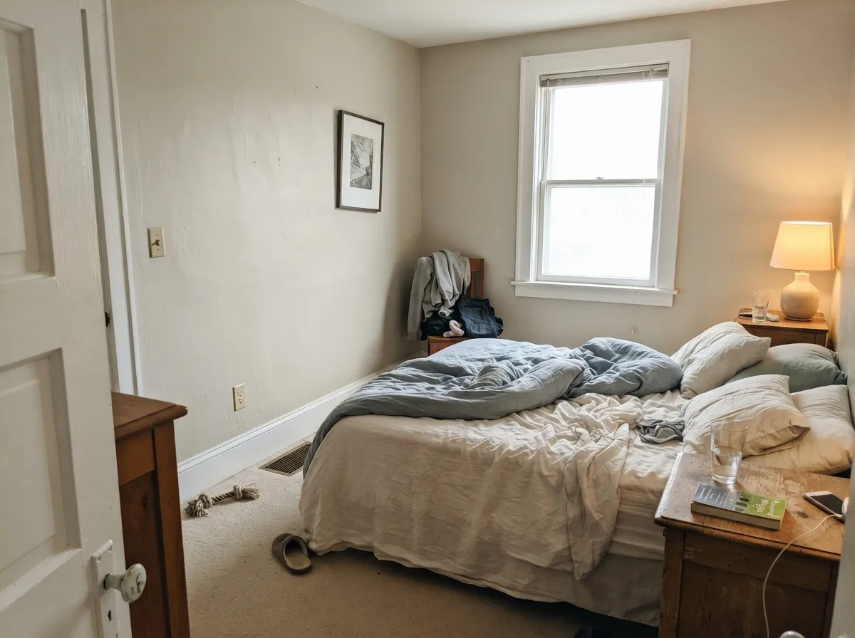
Where It Fails
The complaints about Edgecomb Gray are remarkably consistent. Three situations produce nearly all of them, and every one is predictable before you open a can.
This is the number one story: the walls do not look soft, they look muddy and dingy. LRV 63 needs light to bounce; without it the beige goes brown-gray and the room reads unwashed. Painters hear this so often that having it mixed at 50 percent strength is a standard request. If you are already asking, skip the half-strength gamble and use Classic Gray OC-23 (LRV 74) instead.
Against a crisp white like Chantilly Lace OC-65, warm afternoon light pushes the walls yellow-green — the exact complaint people describe as looking like an old yellowed tooth. The fix is the trim, not the wall: White Dove OC-17 shares the warmth and the pairing calms down instantly.
Summer green bouncing through the window lands on the wall and wakes up the gray-green side of this color. It is reflection, not a bad batch, but it is still your wall. If the yard fills the window, use Pale Oak OC-20 — its slight taupe-pink lean cancels the green instead of joining it.
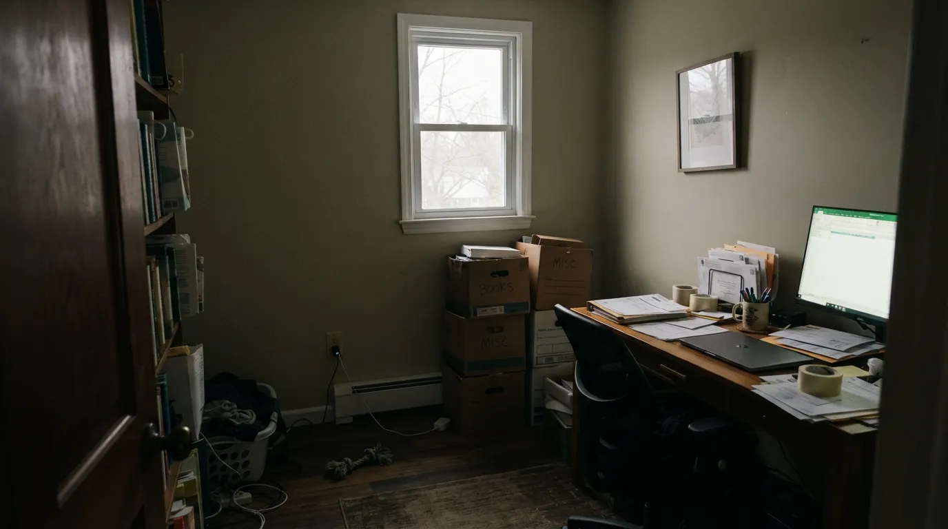
Room by Room
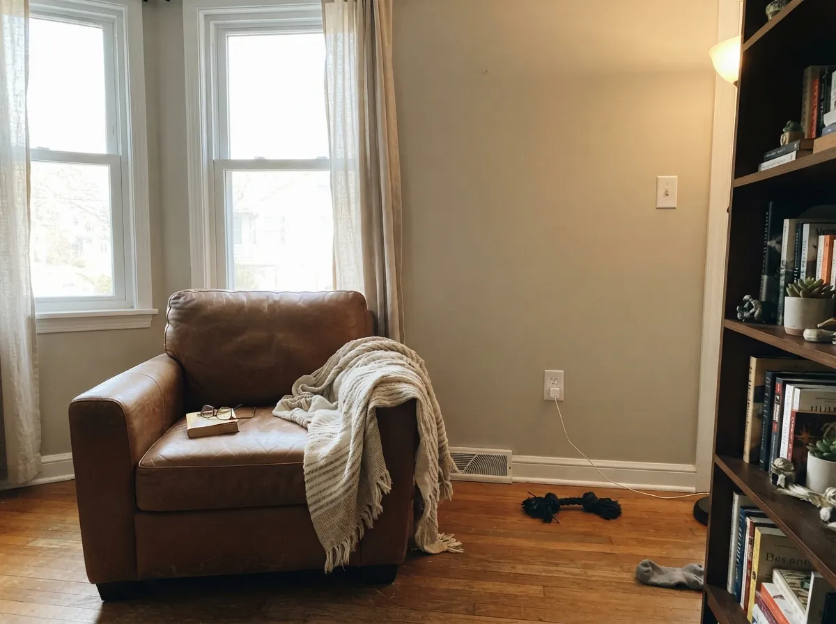
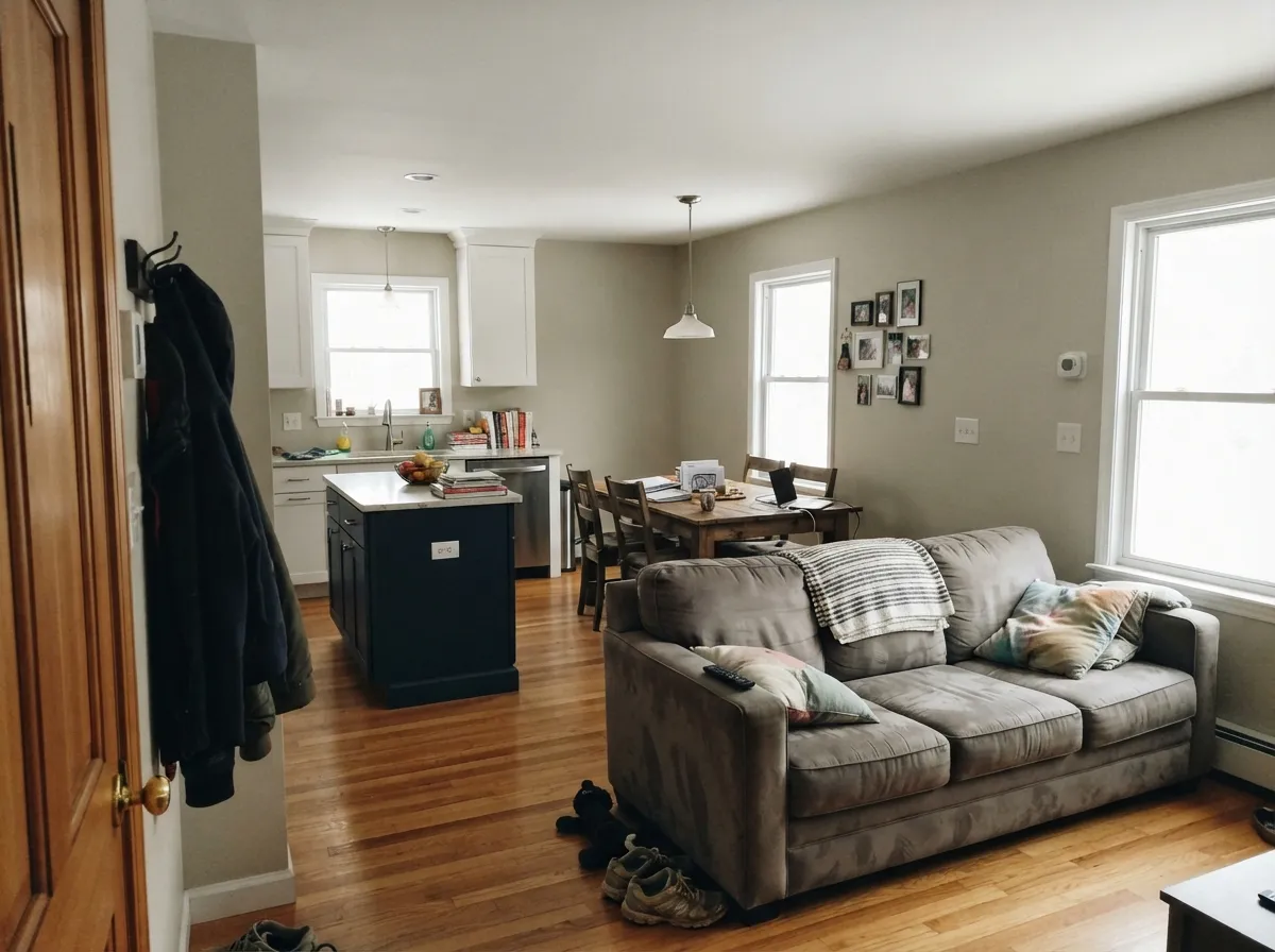
Your Light Is the Risk
Steady warm light all day keeps it soft and creamy — the version everyone photographs.
Cool flat light drains the warmth and the gray-green side comes forward. Dim north rooms go drab.
Golden and tan at the sun hours, quiet gray after. West rooms can tip peach at sunset.
2700K bulbs push it to plain beige. 3000K to 3500K keeps the gray in it. Swap bulbs, not paint.
Most complaints about Edgecomb Gray are a light mismatch. Upload a photo of your actual room and see it on your walls — then ask for the same wall in north light or evening lamps before you buy a single sample.
Need It From Another Brand?
Any paint counter can custom-tint Benjamin Moore HC-173 directly. If you would rather stay in one brand's own deck, these are the closest stock matches, measured as ΔE2000. Under 2 is a difference you will not see on the wall.
| Brand | Closest color | ΔE | LRV | |
|---|---|---|---|---|
| Sherwin-Williams | Natural TanSW 7567 · Sherwin-Williams | 2.0 | 65 | Color page → |
| Behr | Traditional TanPPF-14 · Behr | 1.8 | 64 | Color page → |
| Valspar | Warm Putty6006-1A · Valspar | 1.6 | 64.8 | Color page → |
| PPG / Glidden | Gray BeigePPG14-30 · PPG / Glidden | 2.4 | 65 | Color page → |
| Glidden | Papyrus Paper50YY 65/071 · Glidden | 1.6 | 65 | Color page → |
| Dutch Boy | Existence420-1DB · Dutch Boy | 0.9 | 63 | Color page → |
Similar Benjamin Moore Colors
The nearest shades to Edgecomb Gray within Benjamin Moore's own range, ranked by perceptual color distance — useful when you want the same look a touch lighter, darker, or warmer.
WCAG 2.1: AA is 4.5 : 1 for normal text, 3 : 1 for large text, AAA is 7 : 1.
Edgecomb Gray vs the Colors You're Also Considering
Every Edgecomb Gray sample board has the same rivals on it. The numbers show the real lightness gap — then it comes down to which risk you would rather live with.
Pick this for the same warmth without losing light — 63 versus 56.
Benjamin Moore HC-172 · LRV 56Revere PewterPick this when a big bright room needs grounding and real depth.
Side-by-side comparison →Pick this when you want the walls to read as an actual color.
Benjamin Moore OC-20 · LRV 67Pale OakPick this for a barely-there neutral, or when green bounces in.
Side-by-side comparison →Edgecomb Gray versus Revere Pewter HC-172 is the most common decision. Revere Pewter sits at LRV 56 to Edgecomb Gray's 63, so it is visibly deeper and moodier on the wall. Same warm greige family, but Revere Pewter can close in a small or dim room; Edgecomb Gray keeps those rooms feeling open. Pick Revere Pewter for big, bright spaces that need grounding, Edgecomb Gray everywhere else.
Against Sherwin-Williams Agreeable Gray SW 7029, LRV 60, the two look close at a glance. Agreeable Gray is a touch grayer and slightly deeper; Edgecomb Gray carries a bit more beige warmth. With warm wood floors, Edgecomb Gray blends better; with cooler finishes, Agreeable Gray fits more easily.
Benjamin Moore Pale Oak OC-20, LRV 67, is one step lighter and softer. Choose Pale Oak for a barely-there wall color, Edgecomb Gray when you want the walls to register as an actual color.
Edgecomb Gray Coordinating Colors
The rule is simple: stay warm and change value, not temperature. Edgecomb Gray pairs cleanly with warm whites, deeper warm greiges, muted greens and near-blacks, and it argues with cool blue-grays and bright builder whites. These are the partners that come up again and again in real houses:
The Edgecomb Gray Ladder: Lighter and Darker
Most people who almost buy Edgecomb Gray actually need the step above or below it, and the whole ladder lives in the same warm family, so switching costs you nothing in coordination. Going up: Pale Oak OC-20 at LRV 67 is one soft step lighter and reads barely-there; Classic Gray OC-23 at LRV 74 is the real rescue color for dim rooms, still warm but with much more lift.
Going down: Revere Pewter HC-172 at LRV 56 is the famous heavier sister, right for big bright rooms that need grounding and wrong for hallways. Below that, Kendall Charcoal HC-166 is where the family turns into an accent — islands, built-ins, shutters, a study.
A useful trick for whole-house work: pick two rungs, not one. Edgecomb Gray on the open main floor with Revere Pewter in a den or on an island gives you variety that still looks like one house, because the underlying warmth never changes.
Edgecomb Gray With Wood Floors, Tile and Countertops
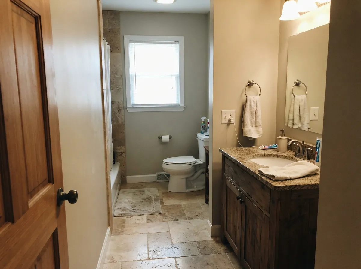
This is the question that decides the color for most people, because almost nobody is painting a room with nothing in it. Warm floors are the easy case: honey oak, red oak, walnut and hickory all sit comfortably against Edgecomb Gray, and orange-leaning builder oak looks calmer next to it than next to any cool gray. Beige travertine, cream tile and tan carpet disappear into it in the best way — that is exactly why it saves so many houses with finishes nobody wants to replace yet.
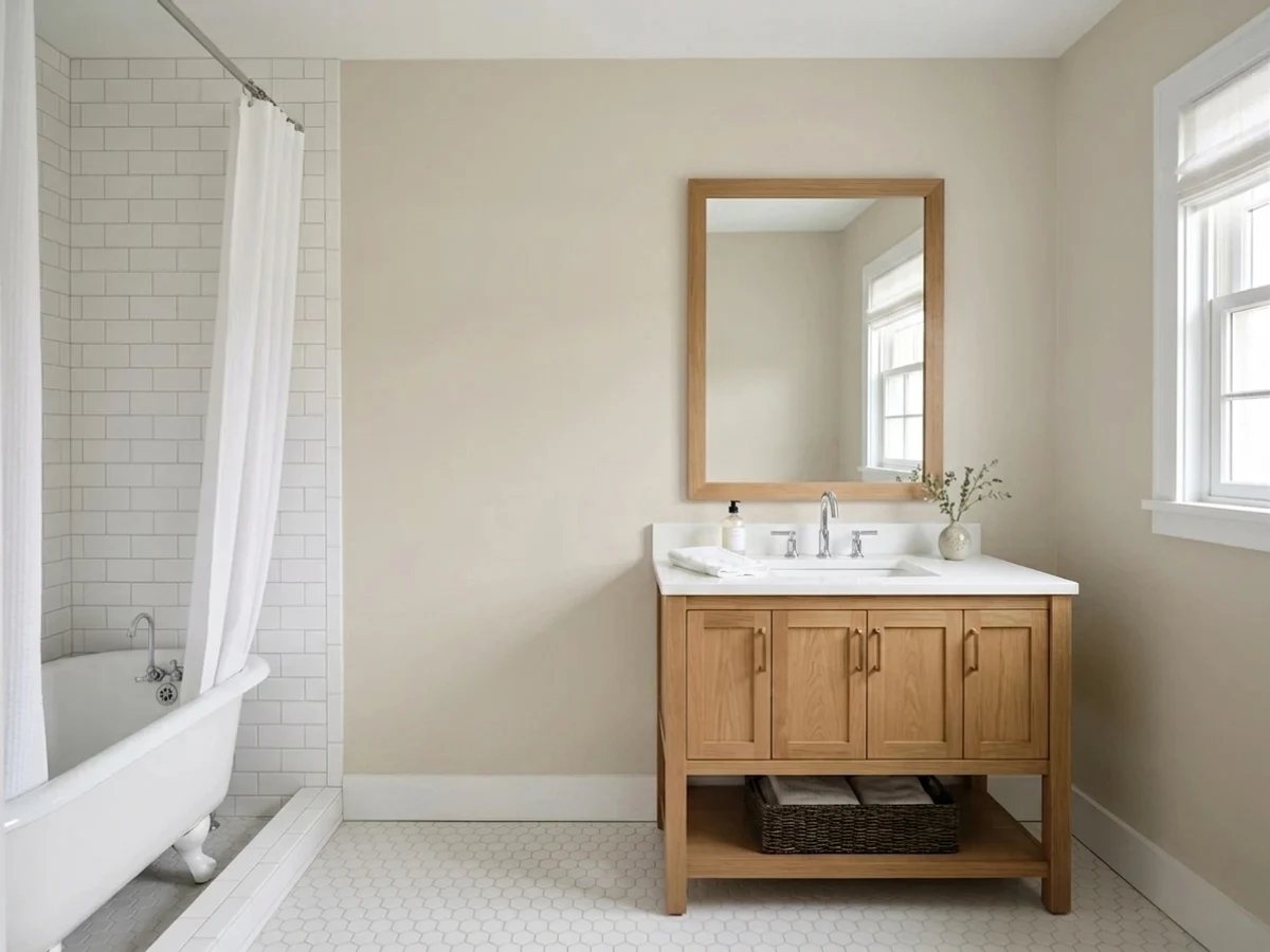
Cool finishes are the hard case. Gray LVP, blue-gray tile and Carrara-type marble sit at the opposite temperature and push the walls to look plainly beige, sometimes slightly dirty. It is not always a dealbreaker if you add warm rugs, wood furniture and brass, but you should see it before you commit. Against genuinely cool stone and floors, Stonington Gray HC-170 or Gray Owl OC-52 will look intentional where Edgecomb Gray looks like a compromise.
Countertops are the third check. Warm-fleck granite, butcher block and creamy quartz are easy. Bright white quartz is fine too, but it will make the walls read a shade deeper than you expect — which is a good thing in a bright kitchen and a bad thing in a dark one.
Three Ready Palettes Built on Edgecomb Gray
A color is never alone on the wall. These are complete combinations in the 60-30-10 pattern, with the reason each one holds together. Every one opens in the visualizer.
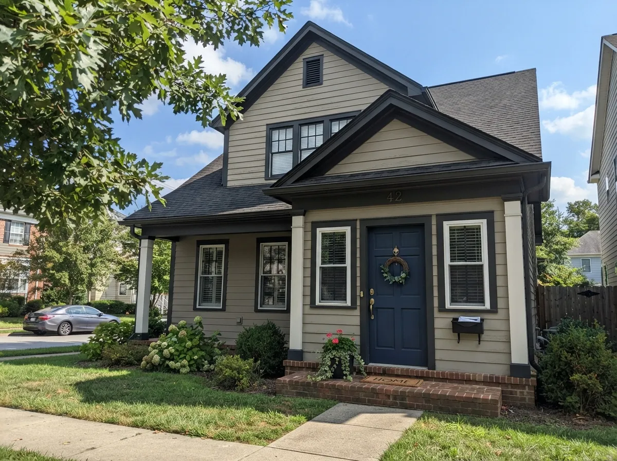
Edgecomb Gray takes the 60 percent, White Dove takes the 30 as trim and ceiling, and both share the same warm base so the line where they meet looks soft instead of chalky. Hale Navy is the 10 percent — one dark note that makes the walls look cleaner than they are.
Try this palette in your roomPutting the greige on the cabinets and a cleaner white on the walls is what keeps Edgecomb Gray from reading dingy in a kitchen — it needs something whiter beside it to look intentional. Kendall Charcoal on the island supplies the dark anchor, and all three flatter brass or bronze pulls.
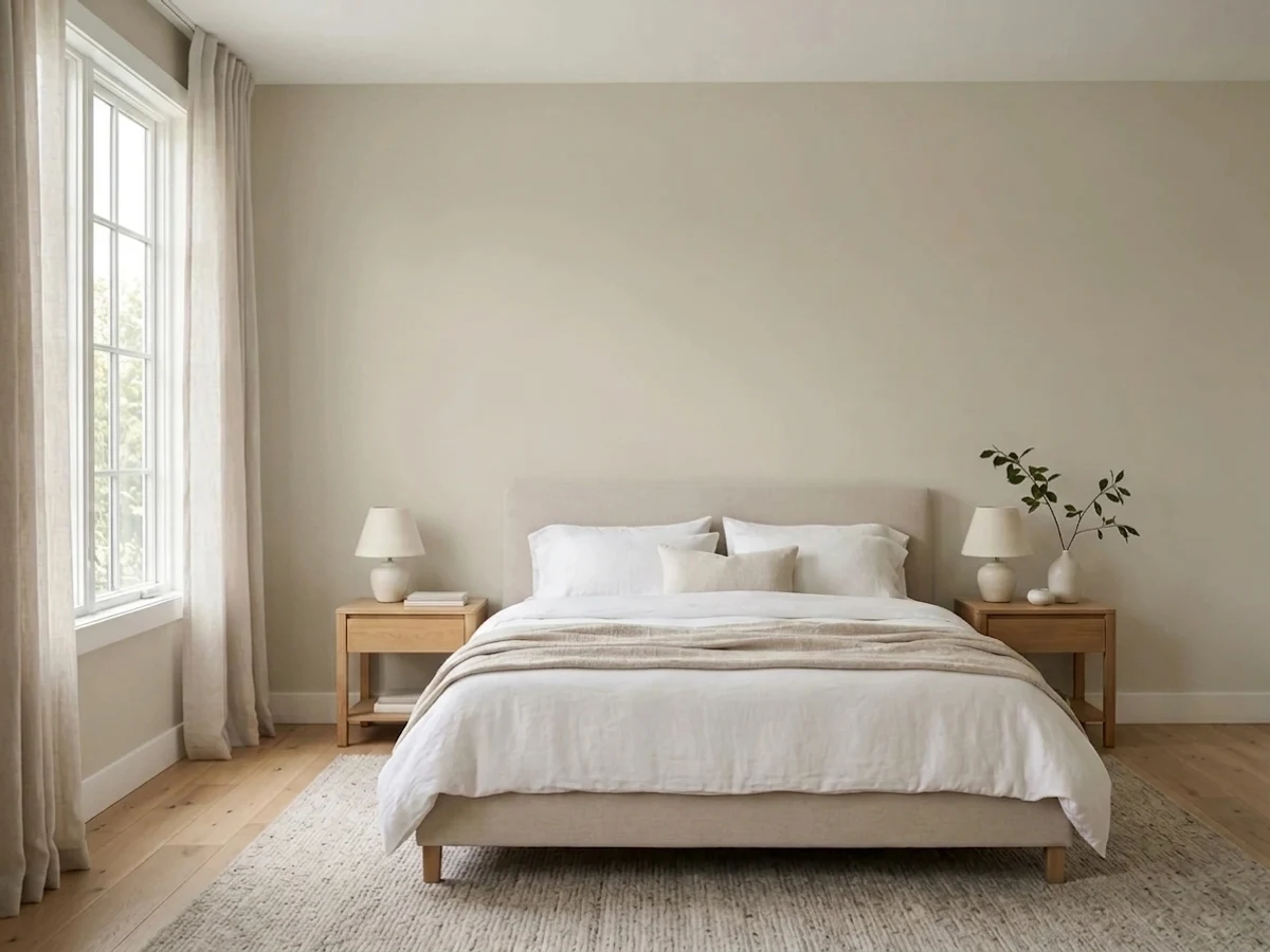
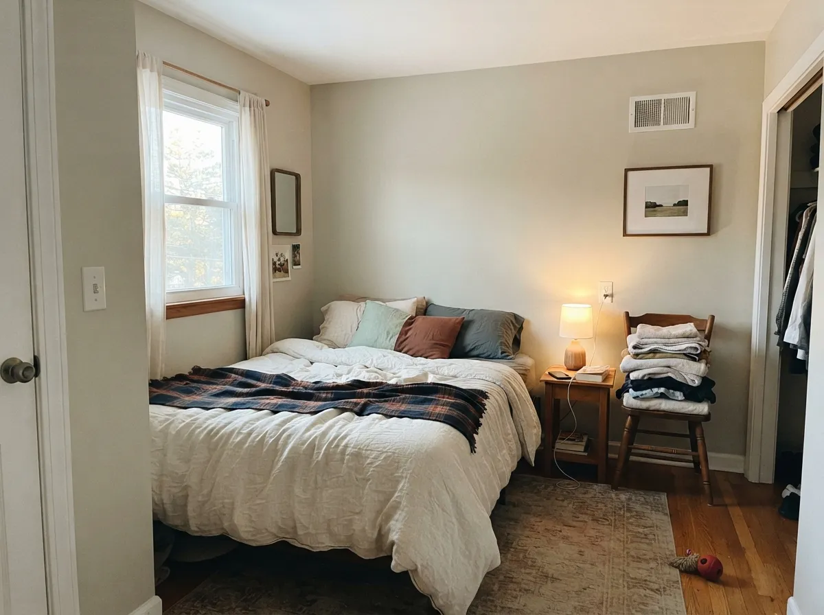
Try this palette in your roomEdgecomb Gray already carries a faint gray-green flicker, so a muted sage behind the bed reads as a deliberate deepening of the same idea rather than a second color. White Dove trim keeps the whole thing warm, and everything quiets down together under lamps.
Try this palette in your roomEdgecomb Gray FAQ
Does Edgecomb Gray look green?
Sometimes, and this is the most common surprise. The base is warm tan, but in cool north light, or when summer green reflects in from a lawn or trees, the gray-green side comes forward. Bright white trim makes it more obvious; White Dove OC-17 trim makes it disappear.
Is Edgecomb Gray too dark for a room with one window?
Usually yes. At LRV 63 it needs light bouncing around to stay soft, and in a single-window room it goes brown-gray and looks dirty. Classic Gray OC-23 at LRV 74 gives you the same warm family with enough lift to survive the dark corner.
Should I have it mixed at 50 percent strength?
It is a common request, and it usually means you have picked the wrong color. Half-strength changes the undertone balance too, so you may not get a lighter Edgecomb Gray — you get a different color you cannot re-order confidently. Buy Pale Oak OC-20 or Classic Gray OC-23 at full strength instead.
Edgecomb Gray or Accessible Beige?
Accessible Beige SW 7036 is a little deeper at LRV 58 and carries a green-gray undertone that surprises people in some light. Edgecomb Gray is lighter and its warmth is more predictable across the day. With warm oak and beige tile either works; in a room that already runs dim, Edgecomb Gray is the safer of the two.
Will it clash with orange oak floors?
No — this is one of its best tricks. Because it is warm, it meets orange-leaning builder oak halfway and softens it instead of making it glow. Cool gray floors are the harder pairing; against gray LVP the walls can look distinctly beige, so sample above the actual floor.
What ceiling color goes with Edgecomb Gray?
White Dove OC-17 in flat is the standard answer and never looks cold overhead. In a low or dark room, ceiling white in flat also works if the walls need every bit of bounce. Do not put Edgecomb Gray itself on the ceiling in a dim room — that is the fastest way to make it feel closed in.
Can Edgecomb Gray look pink?
Rarely, and not on its own. Its warmth sits in the orange-tan range, so what people read as pink is almost always reflection — terracotta tile, red-toned oak, or a brick patio outside the window. Put a big sample against those surfaces and you will see whether your room does it.
Have you painted with Edgecomb Gray?
Rate it — one tap helps the next reader decide.
Ask a Question