Saybrook Sage
Benjamin Moore's quiet historic sage, reviewed honestly: the rooms where it reads calm and expensive, the light that turns it minty, and what to paint instead.

Jessica has spec'd whites and neutrals for more than 300 rooms and keeps a sample wall of painted drawdowns in her studio. Every color review is checked against real reader rooms in the comments and re-tested when a formula changes. About the testing process →
- 1Sage Green22
- 2Evergreen Fog30
- 3Saybrook Sage45
- 4Urban Nature51
- 5Soft Fern57
The Fast Verdict
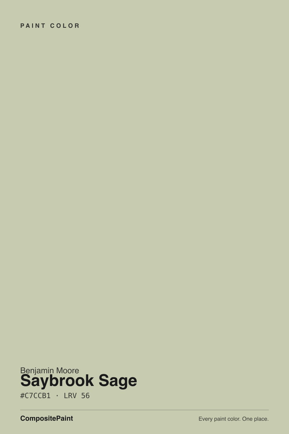
Saybrook Sage is the green people pick when they want color without a statement. At LRV 45 it stays light and livable, and against wood, brass and a warm white it looks calm and slightly old-money.
The catch is that it takes its temperature from the room: put it in cool light with cream furniture and it can flip minty, and sit it under 2700K bulbs and it slides toward khaki. Sample it on two walls, not one.
Bedrooms and living rooms with real daylight · kitchen and bath cabinets with brass · shingle-style and coastal exteriors · anyone who wants green that stays quiet
You want an earthy olive · your room is dim and east or north facing · your fixed finishes are all cream and beige · you need one color to look identical in every room
- Green you can use on every wall without the room feeling colored in
- LRV 45 keeps rooms open — it never darkens a space
- Flatters oak, walnut, rattan, terracotta and unlacquered brass
- One of the safest greens for kitchen and bath cabinets
- A proven exterior body color for shingle and coastal houses
- Reads minty in cool light when nothing warm is nearby
- Slides toward khaki under 2700K bulbs and gold-veined stone
- Too light and too beachy if you wanted a real olive
- Looks like two different colors on a north wall and a south wall in the same room
What Color Is Saybrook Sage, Really?
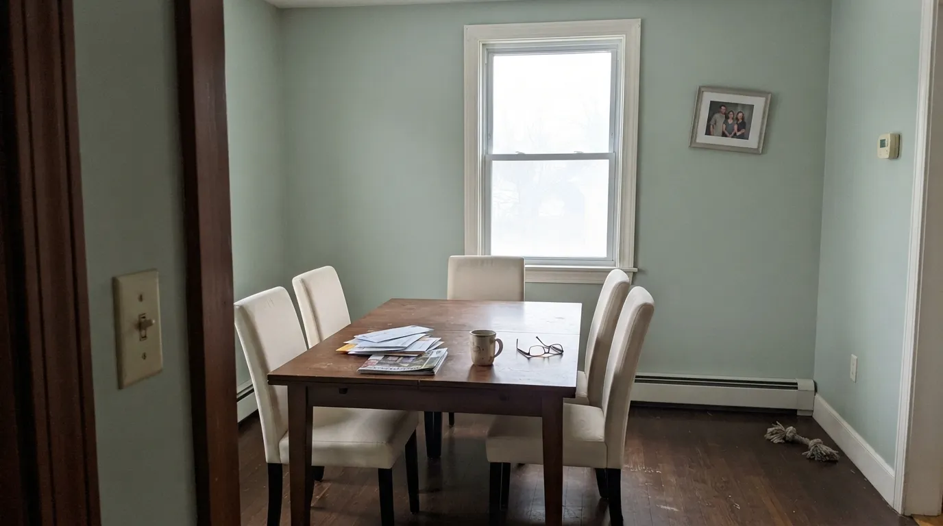
On paper this is a yellow-green: the hue sits at 71 degrees, which is the olive side of the wheel, with saturation dialed down to 21 percent. In practice people describe it two completely different ways, and both camps are right. Next to warm wood and a creamy white it looks like a soft, dusty sage with a hint of olive. Put it in a room where everything else is cream, beige or gray, and the same paint goes cool and slightly minty, because there is nothing left in the room for the yellow to hold onto. That gap between chip and wall is where almost every complaint about this color starts.
LRV 45 puts it exactly where Revere Pewter HC-172 lives, so think of it as a mid-light color, not a pastel. It reflects a little more than half the light that hits it, which is enough to keep a room open, and enough body to read clearly as green rather than as a tinted white. That is the practical reason it works as a whole-room color and not just an accent wall: it never darkens a space, but you always know it is there.
Undertone in one line: grayed yellow-green that behaves like a cool color when the room gives it nothing warm to lean on.
Where It Shines
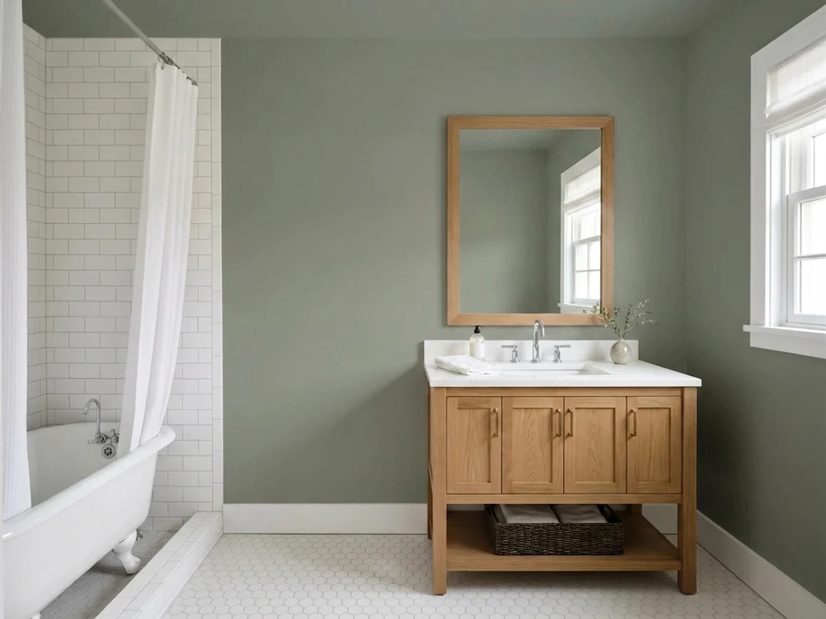
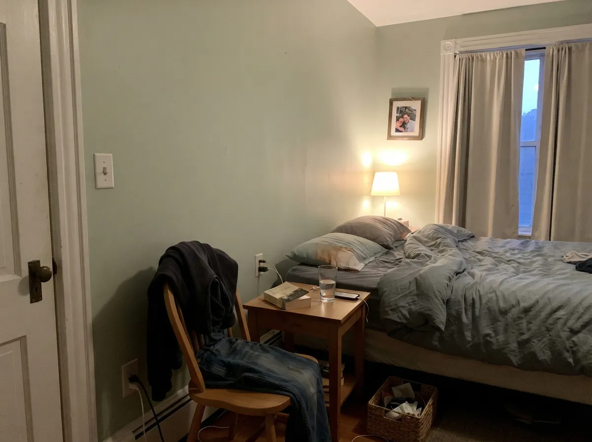
Give it daylight, wood and one warm metal and it earns its reputation. Bedrooms, living rooms and cabinet runs are where it looks most expensive, because the color is soft enough to sit under everything else instead of competing with it.
Where It Fails
The unhappy stories about Saybrook Sage are remarkably consistent, and none of them are about coverage or quality. All three come down to what is around the paint and what is in the bulbs.
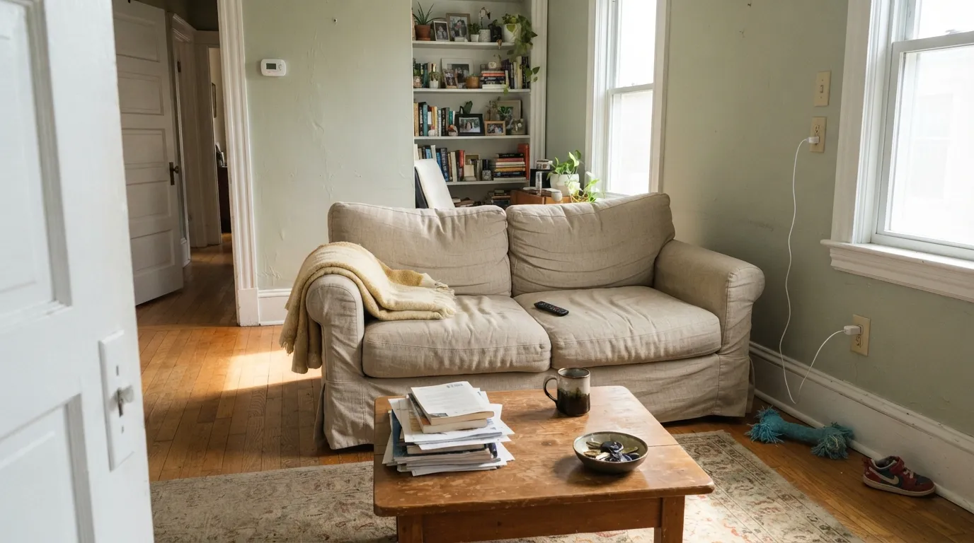
This is the exact combination that produces the "I painted it and it looks minty" post. Cool morning or indirect light plus cream upholstery and pale trim strips the yellow out and leaves a chalky green that reads mint. If you want the color to stay grounded in that light, use Benjamin Moore October Mist 1495 instead, which carries more gray and more moss.
People shopping for a leafy, earthy green often land here and are surprised how beachy and light it is. Saybrook Sage is a coastal green, not a woodland one. If the picture in your head is dried herbs and old leather, go to Sherwin-Williams Clary Sage SW 6178, which has the weight and the warmth this color deliberately leaves out.
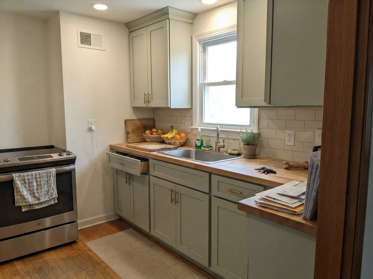
Under 2700K lamps, next to Calacatta Gold marble or a quartz with heavy gold veining, the hue-71 yellow comes all the way forward and the cabinets can look khaki and slightly dirty. Either move the bulbs to 3000K neutral, or switch to Benjamin Moore Guilford Green HC-116, which is grayer and holds its shape better in yellow light.
Room by Room
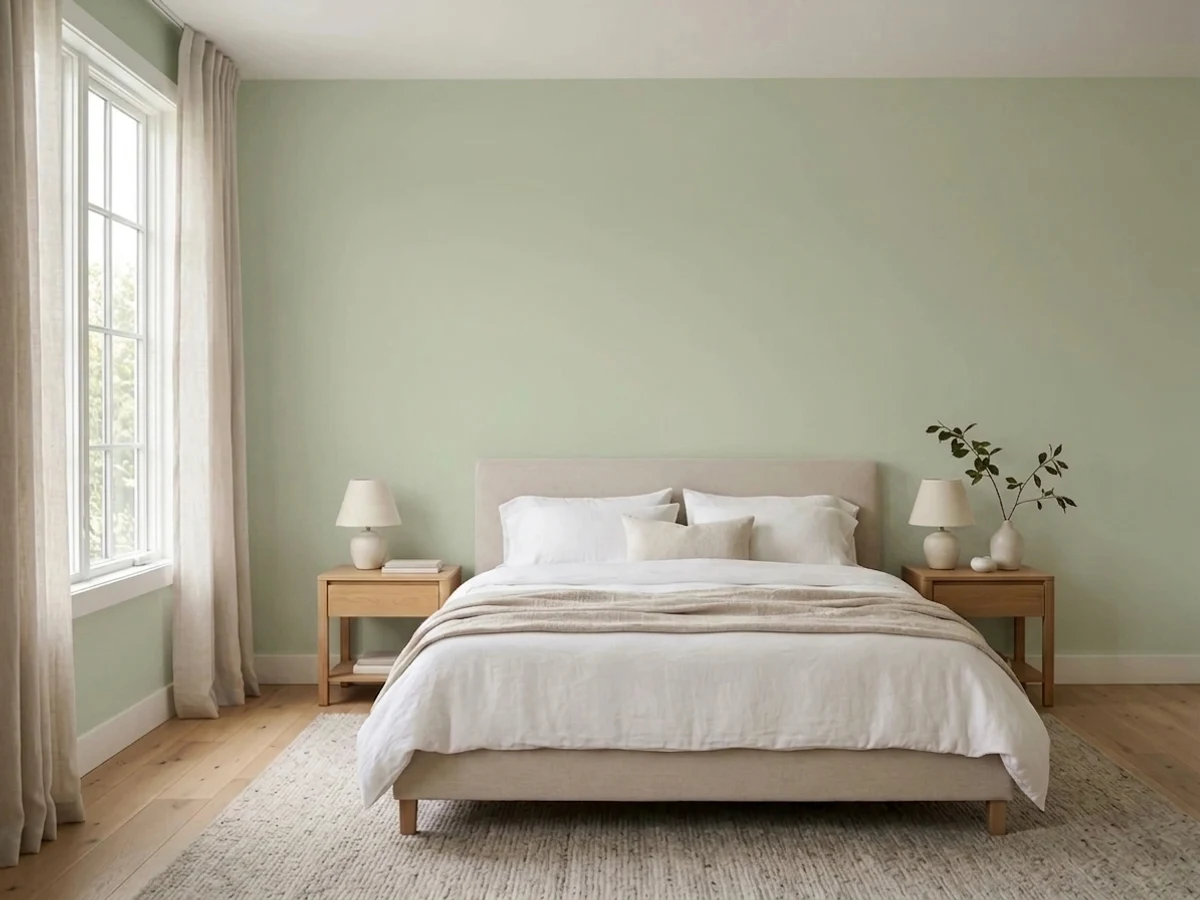
Soft enough to sleep in, colored enough to feel decided. Eggshell walls with White Dove OC-17 trim and ceiling. Add a lamp or two at 3000K so it does not go gray after dark.
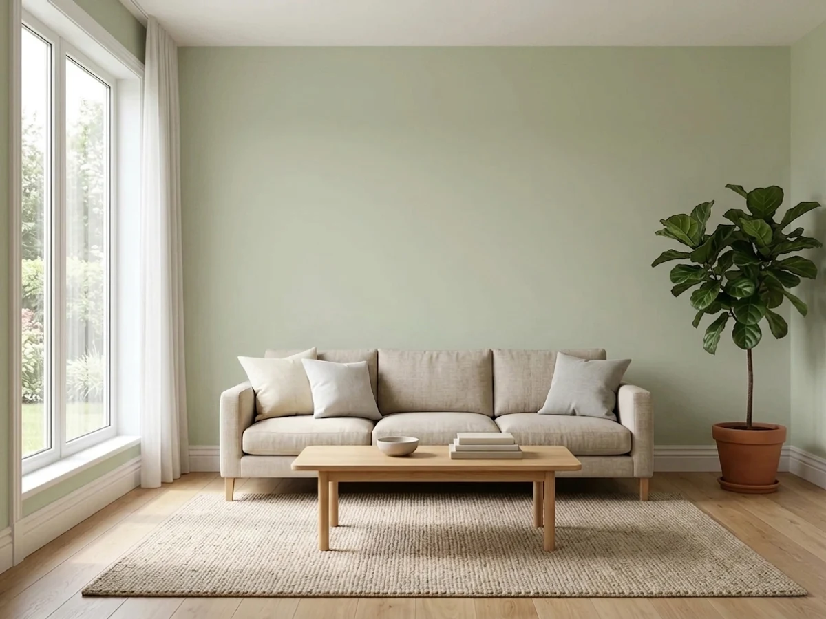
It needs a warm anchor: oak floors, a leather chair, rattan, brass. With all-gray furniture it drifts cold. Eggshell walls, Ballet White OC-9 trim if you want the softer edge.
Satin cabinet enamel, perimeter walls in Swiss Coffee OC-45 or White Dove OC-17. Unlacquered brass suits it better than bronze, which drags the green toward brown. Sample against your counter first — heavy gold veining is the risk.
In a bath with daylight it is lovely with white oak and honed marble. In a windowless powder room lit by 4000K cans it turns pale gray-green stone. Scrubbable matte or eggshell, and fix the bulbs before you blame the paint.
Dining rooms are where the minty complaints cluster, because they are often east facing with cream chairs and no daylight at dinner. It can be beautiful with wainscoting below and a warmer white above — just paint a big board and look at it at 7pm.
Shingle-style and coastal houses have used this green for decades, and full sun reads it fresher and slightly lighter than indoors. Simply White 2143-70 trim, Hale Navy HC-154 door. Never trim it in the same green.
Your Light Is the Risk
Cool indirect light grays it into pale greenish stone. Pretty if you want restraint, flat if the room has no lamps.
Warm sun pulls the yellow forward and it settles into a soft celadon. This is the version on the chip.
The mint hour. Cool early light plus cream furniture is the exact recipe behind most regret stories.
2700K makes it warm and slightly khaki; 4000K makes it gray-green. 3000K is the honest middle.
Most complaints about Saybrook Sage are a light mismatch. Upload a photo of your actual room and see it on your walls — then ask for the same wall in north light or evening lamps before you buy a single sample.
Need It From Another Brand?
Any paint counter can custom-tint Benjamin Moore HC-114 directly. If you would rather stay in one brand's own deck, these are the closest stock matches, measured as ΔE2000. Under 2 is a difference you will not see on the wall.
| Brand | Closest color | ΔE | LRV | |
|---|---|---|---|---|
| Sherwin-Williams | Forever GreenSW 9653 · Sherwin-Williams | 3.5 | 44 | Color page → |
| Behr | EnvironmentalPPU11-09 · Behr | 0.7 | 45 | Color page → |
| Valspar | FanfareT626 · Valspar | 2.2 | 46.6 | Color page → |
| PPG / Glidden | Mellow MoodPPG1030-3 · PPG / Glidden | 0.4 | 45 | Color page → |
| Glidden | Mellow MoodPPG1030-3 · Glidden | 0.4 | 46 | Color page → |
| Dutch Boy | Foggy Gray424-2DB · Dutch Boy | 0.9 | 45 | Color page → |
Similar Benjamin Moore Colors
The nearest shades to Saybrook Sage within Benjamin Moore's own range, ranked by perceptual color distance — useful when you want the same look a touch lighter, darker, or warmer.
WCAG 2.1: AA is 4.5 : 1 for normal text, 3 : 1 for large text, AAA is 7 : 1.
Saybrook Sage vs the Colors You're Also Considering
Every Saybrook Sage sample board has the same rivals on it. The numbers show the real lightness gap — then it comes down to which risk you would rather live with.
Pick this when you want the room to read clearly as green
Benjamin Moore HC-116 · LRV 57Guilford GreenPick this when you want a green that behaves like a neutral
Pick this for the lighter, airier, more coastal version
Benjamin Moore 1495 · LRV 39October MistPick this for cool rooms — the extra gray stops the mint flip
Inside Benjamin Moore, Guilford Green HC-116 at #CBCDAE and LRV 57 is the closest comparison. It is a fraction lighter and grayer, so it behaves a little more like a neutral. Soft Fern 2144-40 at #C8CAB2 and LRV 57 is nearly the same weight with a slightly softer edge. Harbor Town 493 at #CBCBAD and LRV 56 pushes a little more yellow. Spring Meadow 486 at LRV 59 is the lightest of the set.
Across brands the matches are unusually tight. Valspar Apple Blossom Green 8003-31C and Dutch Boy Green Grove 327-2DB, both at hex #CACFB2, LRV 60 and deltaE 0.94, are effectively the same color. Behr Stone Creek BXC-56 at LRV 59 and deltaE 1.26 is visually identical in normal room light. Sherwin-Williams Acanthus SW 29 at LRV 60 and deltaE 2.32 is very close but worth sampling first, and Dunn-Edwards Hidden Hills DE5569 at deltaE 3.56 is close but visibly different side by side.
Saybrook Sage Coordinating Colors
The rule with this color is simple: give it something warm to hold onto. Warm whites, warm greiges, wood tones and brass keep it reading as sage. Cool grays and blue-leaning whites are what tip it toward mint. These are the partners that do the most work:
Saybrook Sage on Kitchen and Bath Cabinets
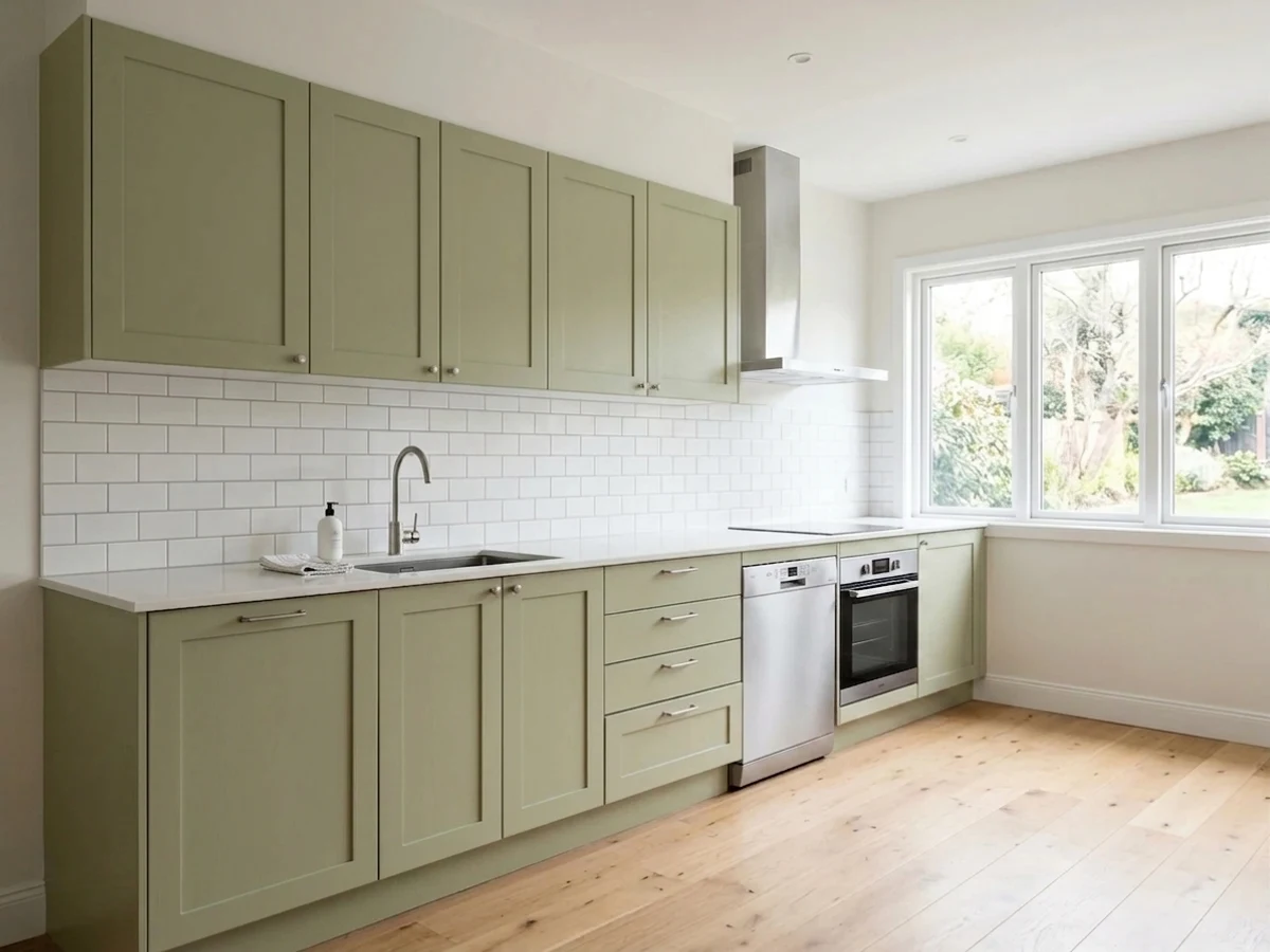
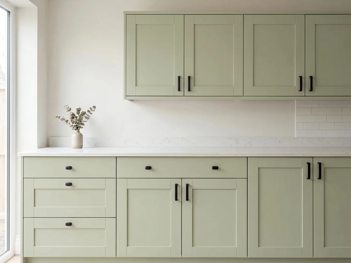
Cabinets are where this color is most worth the money. A run of Saybrook Sage doors gives a kitchen a color story without locking it into a trend, and at LRV 45 the doors stay light enough that a small kitchen does not close in. Use a urethane-fortified cabinet enamel in satin; the sheen wipes clean around handles and reflects just enough to keep the green from going chalky.
The decisions that actually matter are the stone and the metal. Against white oak, honed marble and unlacquered brass it looks calm and considered. Against quartz or marble with strong gold veining under warm bulbs, the green picks up the yellow and can look khaki — that is the one combination worth a full-size sample door before you order. Oil-rubbed bronze hardware pulls it brown; brass, nickel and matte black all read cleaner. Keep the perimeter walls in a warm white like Swiss Coffee OC-45 or White Dove OC-17 rather than a gray, or the cabinets lose their warmth against the wall.
Saybrook Sage on Exteriors
Outside it behaves better than its indoor reputation suggests. Full sun does the opposite of a dim east room: it drives the yellow forward and the body reads as a fresh, slightly lighter sage that sits down into a landscape instead of standing out from it. That is why it has been a shingle-style and coastal standard for decades, on siding and on shutters against a cream or white body.
Two rules keep it from looking washed out. First, use a genuinely bright trim white — Simply White 2143-70 or Chantilly Lace 2121-70 — because a soft cream trim next to a light green facade blurs the edges and the whole house goes hazy. Second, give the entrance one dark note: Hale Navy HC-154 or Kendall Charcoal HC-166 on the door and shutters. And walk the house before you commit, since the shaded north elevation will read a full step cooler and grayer than the sunny side.
Three Ready Palettes Built on Saybrook Sage
A color is never alone on the wall. These are complete combinations in the 60-30-10 pattern, with the reason each one holds together. Every one opens in the visualizer.
Swiss Coffee gives the sage the warm neighbor it needs, so the green stays sage instead of turning mint on the cabinet doors. Kendall Charcoal grounds the room at 10 percent and keeps brass hardware looking deliberate.
Try this palette in your roomBallet White is warm enough to flatter the yellow lean, which stops the walls from cooling off at night. Nantucket Gray is the same green family several steps down, so the accent adds depth without introducing a second undertone.
Try this palette in your roomFull sun lifts the sage, so the trim white has to be clean and bright or the body reads washed out. Hale Navy on the door is the single dark note that keeps a light green facade from looking like primer.
Try this palette in your roomSaybrook Sage FAQ
Does Saybrook Sage look minty?
It can, and this is the most common complaint. Mint shows up in cool light — north rooms, east rooms in the morning — especially when the furniture and trim are cream or gray with nothing warm nearby. Add wood, brass or a warm white and it settles back into sage. If the room has no warm materials at all, October Mist 1495 is the safer choice.
Is it too green for kitchen cabinets?
No. On cabinets it reads as color rather than as green, which is why it survives kitchens where a stronger sage would date fast. Use a satin cabinet enamel and check it against your counter before ordering — quartz and marble with heavy gold veining will pull the yellow out of it.
Saybrook Sage or October Mist?
Saybrook Sage is lighter and more coastal; October Mist carries more gray and holds its color better in poor light. In a bright south or west room, Saybrook Sage is the prettier of the two. In a dim or north-facing room, October Mist will not flip on you.
Should the trim be a warm white or a crisp white?
Warm white if you want the room soft and the green to stay sage — Ballet White OC-9 or White Dove OC-17. Crisp white if you want the millwork to snap and you are happy for the green to look cooler — Simply White 2143-70 or Chantilly Lace 2121-70. Do not paint the trim the same green; at LRV 45 it needs a clean edge.
Will it work in a windowless bathroom?
Only if you fix the light first. Under 4000K can lights it goes flat gray-green and looks like stone rather than sage. Swap to 3000K bulbs with a decent color rendering index and it comes back. In a powder room you can also lean into it with a warmer green instead.
Does it go with gold-veined marble and brass?
Brass yes, gold veining with care. Unlacquered and satin brass sit beautifully against this green. Calacatta Gold and similar warm-veined stone push the color toward khaki under warm bulbs, so tape a large sample directly against the slab before you commit the whole kitchen.
How many coats over an existing beige wall?
Two coats of a quality eggshell over any light beige or off-white. Going over a dark or saturated color, prime first — a green at 21 percent saturation has very little pigment to hide with, and a third coat is the expensive way to find that out.
Have you painted with Saybrook Sage?
Rate it — one tap helps the next reader decide.
Ask a Question