Soft Fern
A muted sage-khaki so light and quiet it borders on greige, reviewed honestly: where it reads as a real green, the light that erases it, and the near-identical Benjamin Moore twin most shoppers never find.

Jessica has spec'd whites and neutrals for more than 300 rooms and keeps a sample wall of painted drawdowns in her studio. Every color review is checked against real reader rooms in the comments and re-tested when a formula changes. About the testing process →
- 1Evergreen Fog30
- 2Clary Sage41
- 3Soft Fern57
- 4Hancock Green66
- 5Alabaster82
The Fast Verdict
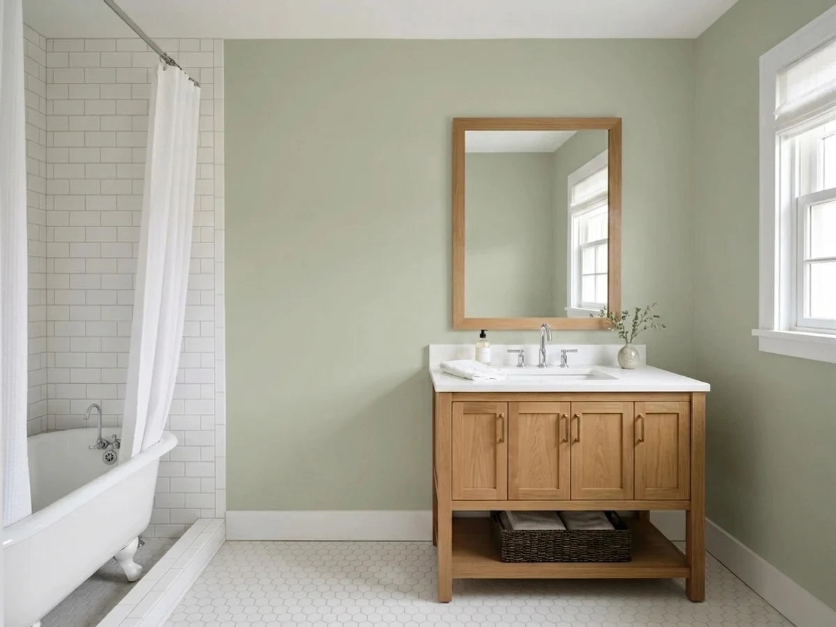
Soft Fern is a grayed-down yellow-green pitched so light (LRV 57) that it spends half its life pretending to be a greige. Give it real daylight and warm wood and the sage comes forward, gentle and grown-up. Give it a dim room or a stark white neighbor and it goes quiet enough that guests will ask if the wall is even painted. That is not a flaw so much as the whole personality: this is the green for someone who wants a hint of color, not a statement.
Kitchens and living rooms that want a whisper of green, not a statement · warm wood, rattan and brass · rooms with real daylight · anyone who likes October Mist but wants it a shade lighter and quieter
You want an obvious, saturated farmhouse green · your room is dim or north-facing with no lamps · you want maximum contrast against white trim · you already own Saybrook Sage and think you're buying something different
- A genuine "maybe-green" that reads as sophisticated neutral to anyone who doesn't love bold color
- High LRV (57) keeps rooms bright while still adding a hint of color
- Flatters warm wood, rattan, and brass without a fight
- Lighter, less closed-in alternative to deeper sage cabinet colors
- Pairs cleanly with warm white trim — no undertone argument
- In dim or north light it nearly loses its green identity and reads as flat, muddy gray
- Too subtle for anyone wanting an obvious, saturated farmhouse sage
- Practically identical to Saybrook Sage — easy to buy the "wrong" one without realizing it
- Next to a very bright white trim it can look washed-out instead of soft
What Color Is Soft Fern, Really?
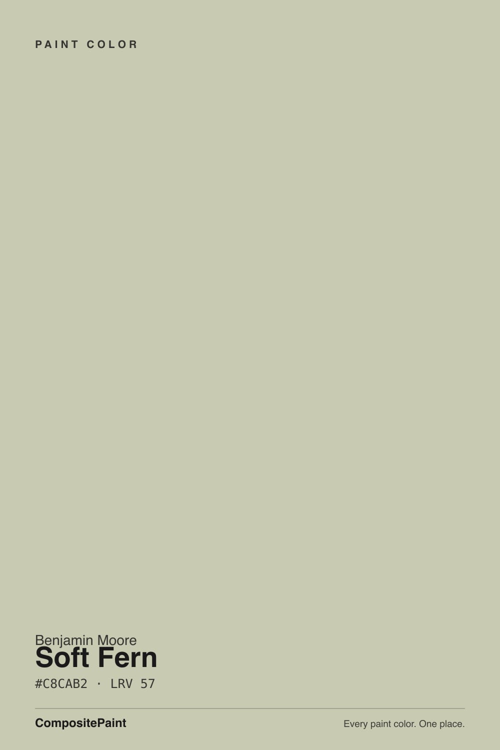
A muted yellow-green pulled almost all the way to neutral — the red-green-blue mix sits at roughly 200/202/178, which is technical shorthand for "barely more green than gray." There is no blue in it and no real warmth either; it is a cool, quiet khaki-sage that leans on daylight to prove it is a color at all. Benjamin Moore doesn't market it as a headline color, and that quietness is the whole point: it was built to sit in a room and behave, not to announce itself.
At LRV 57 it sits well above the deck's usual sage territory. October Mist (LRV 39) is a full step darker and reads unmistakably green in most light; Soft Fern is lighter than that, closer to a pale, grayed olive than a garden green. The higher LRV keeps rooms bright, which is exactly why it works as a "maybe-green" for people not ready to commit to visible color on the walls.
The color it is genuinely hardest to tell apart from is its own stablemate, Saybrook Sage (HC-114, LRV 56, hex #C7CCB1) — the numbers are close enough that most people could not pick the two apart on a wall. If your paint store's chip wall has both, that overlap is worth knowing before you buy a gallon of the "wrong" one by accident.
Where It Shines
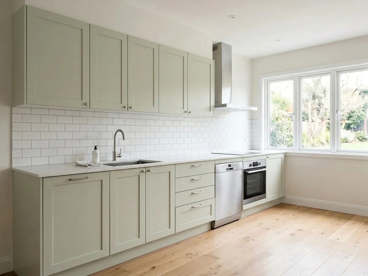
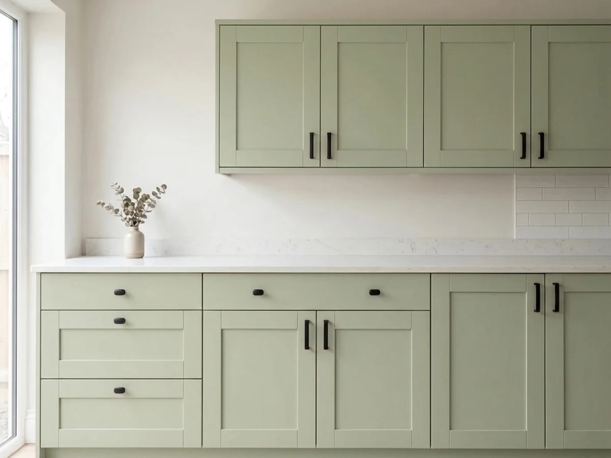
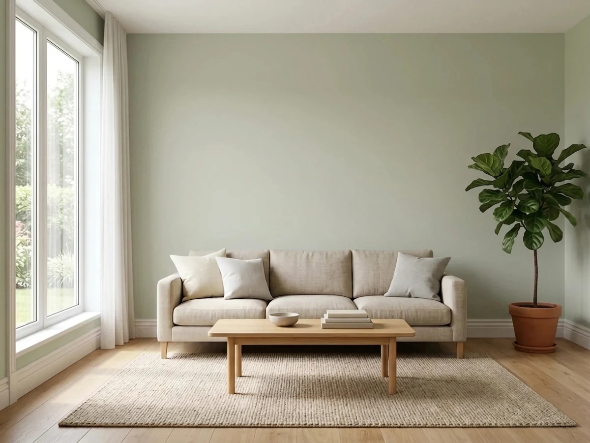
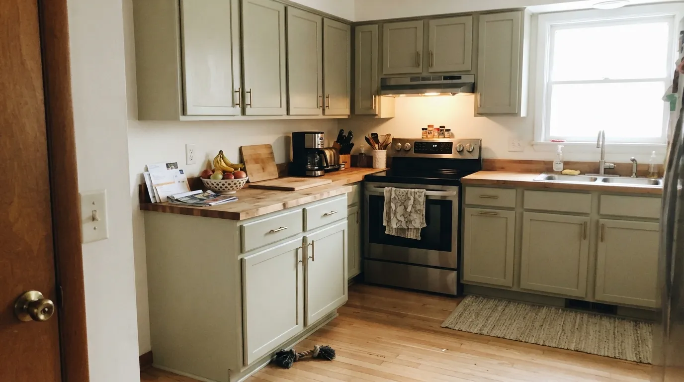
Bright, indirect daylight is what makes this color make sense. Under real light — a south or west room, even one filtered through sheers — the sage steps forward against its own gray base and reads as a genuinely sophisticated, grown-up green, especially next to warm wood, rattan, or brass. It is also a quietly good sage-cabinet color: lighter than the deeper cabinet greens (Evergreen Fog, Rosemary), it keeps a kitchen from feeling closed in the way a darker sage can in a small galley layout.
Where It Fails
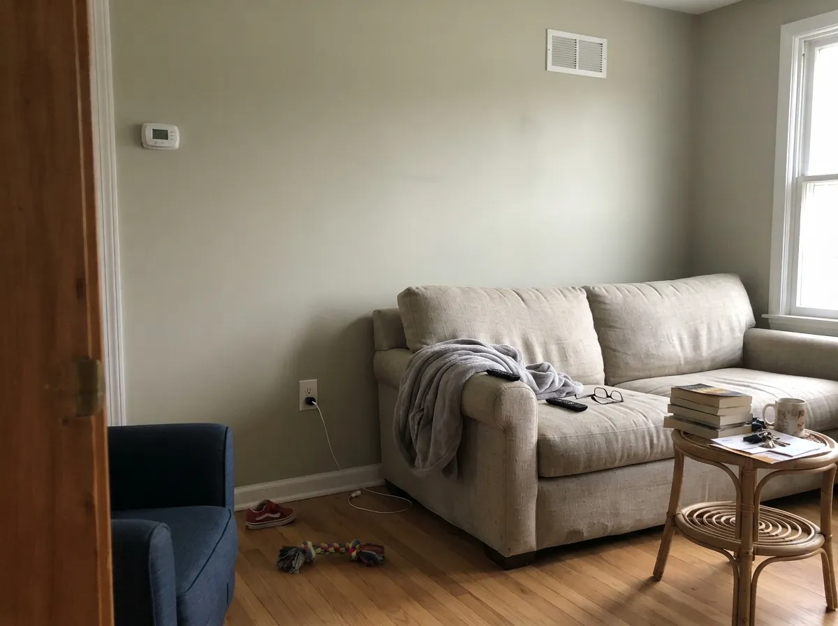
Almost every disappointed review of a light, grayed sage like this one comes from one of three predictable setups. None of them are the paint failing — they are the paint being exactly as subtle as its formula promises, in a room that needed more color than that.
This is a light, desaturated green — on the chip it can look like it will read as sage on the wall, but four walls of it in average light often just reads as a soft, warm-ish gray. If you want an obvious farmhouse sage, look at October Mist (LRV 39) or Evergreen Fog instead; both hold their green far more assertively.
Cool, low daylight flattens the little bit of yellow-green pigment this color has and leaves a dull, slightly murky greige with no life in it. It is the same trap that catches every high-LRV grayed color — Repose Gray, Sea Salt, this one — daylight does most of the work, and a dim room won't do it for you.
Pair it with something crisp like Chantilly Lace and Soft Fern's softness starts to look like weakness — the wall reads pale and undecided instead of quietly green. A warmer white trim (White Dove, Swiss Coffee) gives it something closer to its own temperature to play off, and the color holds together better.
Room by Room
In a bright room it reads as a gentle, sophisticated green-gray that doesn't compete with art or furniture. In a dim one, skip it — see the fails section.
Lighter and airier than the deeper sage cabinet colors, so it doesn't close in a small kitchen the way Evergreen Fog or Rosemary can. Satin, urethane-fortified enamel; brass or unlacquered hardware is its best match.
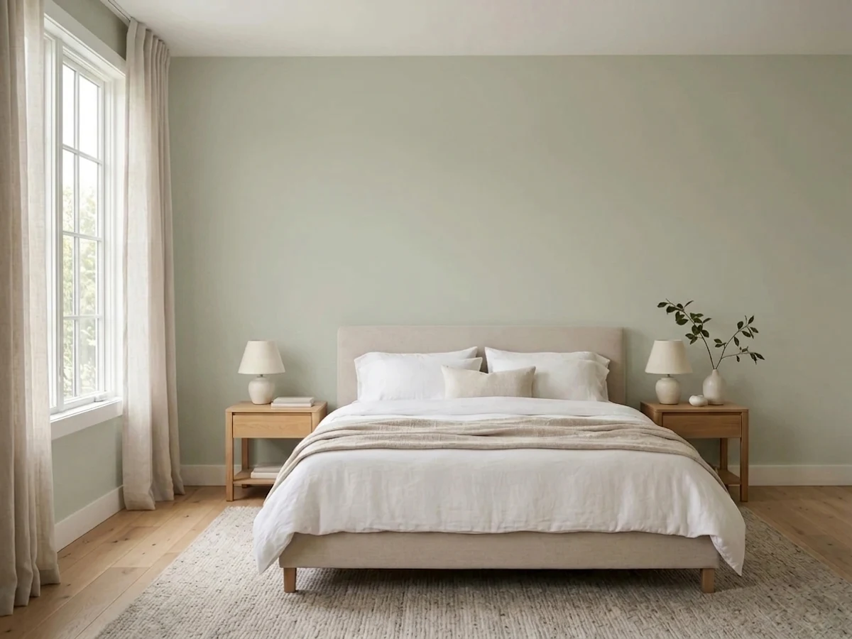
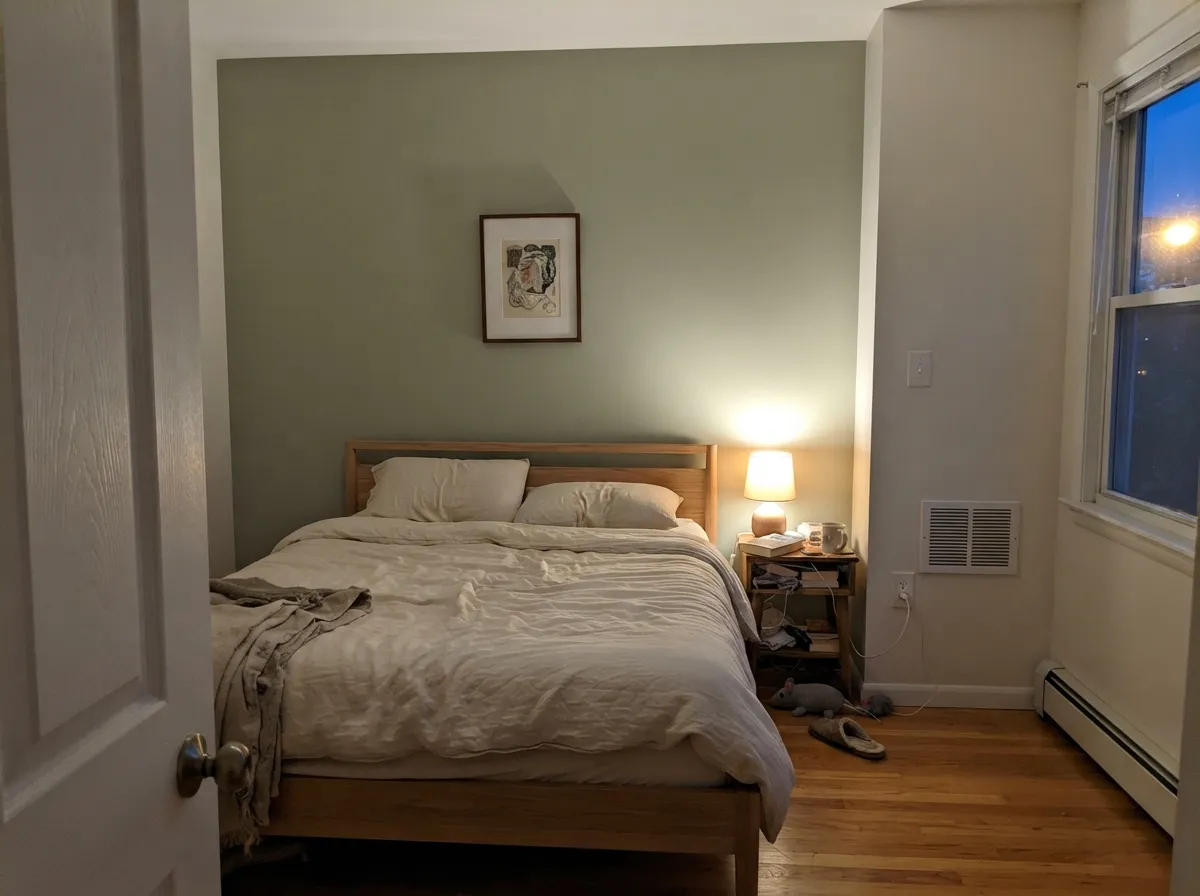
A restful backdrop that won't fight linen bedding, rattan headboards, or cream drapery. It just needs a window; a windowless or heavily shaded bedroom will read gray, not green.
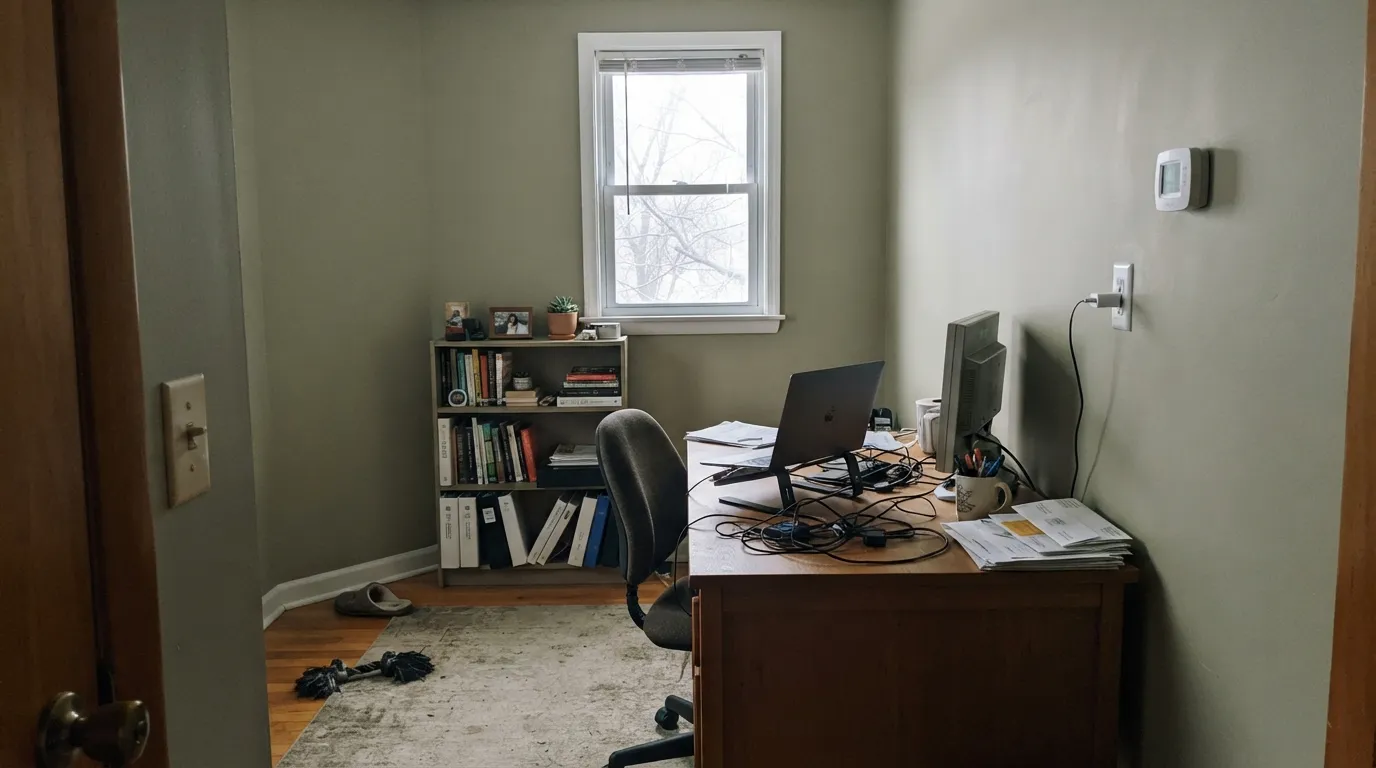
Doesn't compete with bookshelves, wood desks, or a wall of frames the way a bolder color would. Good choice for a room meant to fade into the background while you work.
Cream or travertine-toned surfaces let the sage read warm and settled. Stark white marble or cool gray subway tile pulls it the other way, toward a flat, slightly cold gray-green.
Too subtle to read as a real color from the street on full walls; as an accent on shutters, a front door, or a porch ceiling it's a quiet, tasteful note next to a white or greige body.
Your Light Is the Risk
South or west rooms, even filtered through sheers: the sage steps forward against its gray base and looks genuinely green, not just off-white.
Cool, flat daylight cancels the yellow-green pigment and leaves a dull, slightly murky gray with no color left in it.
Cooler and paler in the morning, mellowing warmer as the day goes on — the shift is gentle, not dramatic.
Warm 2700K bulbs push it toward a soft khaki-beige at night. Cool LEDs keep it grayer and slightly colder — pick bulbs based on which mood you want after dark.
Most complaints about Soft Fern are a light mismatch. Upload a photo of your actual room and see it on your walls — then ask for the same wall in north light or evening lamps before you buy a single sample.
Need It From Another Brand?
Any paint counter can custom-tint Benjamin Moore 2144-40 directly. If you would rather stay in one brand's own deck, these are the closest stock matches, measured as ΔE2000. Under 2 is a difference you will not see on the wall.
| Brand | Closest color | ΔE | LRV | |
|---|---|---|---|---|
| Sherwin-Williams | AcanthusSW 29 · Sherwin-Williams | 1.2 | 60 | Color page → |
| Behr | Stone CreekBXC-56 · Behr | 2.1 | 59 | Color page → |
| Valspar | Mint Frost6001-3B · Valspar | 1.4 | 56.9 | Color page → |
| PPG / Glidden | Whispering PinePPG1125-3 · PPG / Glidden | 1.6 | 57 | Color page → |
| Glidden | Whispering PinePPG1125-3 · Glidden | 1.1 | 58 | Color page → |
| Dutch Boy | Countryside328-2DB · Dutch Boy | 4.4 | 57 | Color page → |
Similar Benjamin Moore Colors
The nearest shades to Soft Fern within Benjamin Moore's own range, ranked by perceptual color distance — useful when you want the same look a touch lighter, darker, or warmer.
WCAG 2.1: AA is 4.5 : 1 for normal text, 3 : 1 for large text, AAA is 7 : 1.
Soft Fern vs the Colors You're Also Considering
Every Soft Fern sample board has the same rivals on it. The numbers show the real lightness gap — then it comes down to which risk you would rather live with.
Pick this only for the marginally lighter, slightly grayer read — most people won't be able to tell them apart on the wall.
Benjamin Moore HC-114 · LRV 56Saybrook SagePick this if you're going to buy the near-twin anyway — it needs the same warm company (wood, brass) to look its best.
Pick this for a lighter, quieter green that reads closer to a neutral in most rooms.
Benjamin Moore 1495 · LRV 39October MistPick this for a full step more green and more depth — BM's safest, best-known sage, if your room has real daylight.
Wind Chime AF-465 matches Soft Fern at LRV 57 with a hex of #C7CAB6 against #C8CAB2, so the only real difference is a touch less yellow in Wind Chime. Camouflage 2143-40 at LRV 55 is slightly deeper and warmer, and Harbor Town 493 at #CBCBAD and LRV 56 carries a bit more yellow, which shows in strong afternoon light.
Cross-brand, C2 Paint Leap Year C2-687 at LRV 56 has a deltaE of 0.59 and Diamond Vogel Plume Grass 0414 at LRV 58 comes in at 0.88, so both are the same color for practical purposes. Glidden Whispering Pine PPG1125-3 at LRV 58 and deltaE 1.06, and Sherwin-Williams Acanthus SW 29 at LRV 60 and deltaE 1.21, are visually identical in normal room light, though Acanthus gives back a little more light.
Behr Stone Creek BXC-56 at LRV 59 and deltaE 2.11 is very close and worth sampling first. Farrow and Ball Skimmed Milk White No. W7 at LRV 59 and deltaE 3.58 is close but visibly different side by side.
Soft Fern Coordinating Colors
The rule for coordinating with Soft Fern: warm whites and warm neutrals bring out its green side, and cool grays or stark whites push it toward looking washed-out. It layers easily with other quiet neutrals in the same lightness range, which makes it a low-risk accent or secondary color rather than a bold statement wall.
Soft Fern vs. Saybrook Sage: Two Names, One Color
Look up the numbers and the overlap is hard to miss: Soft Fern is #C8CAB2 at LRV 57; Saybrook Sage is #C7CCB1 at LRV 56. That is a one-point difference in reflectance and a handful of RGB values apart — closer than most brands' own light-to-medium steps within a single color strip. On a chip under a loupe you might spot a whisper more gray in Soft Fern; on a wall, in real household light, almost nobody will.
This isn't a knock on either color — Benjamin Moore's deck has plenty of close cousins across its hundreds of greens, and having two near-identical entries just means two names lead to the same paint can. The practical takeaway: don't order samples of both expecting different results, and don't assume the store is out of one because they can point you to the other. Pick whichever name your store stocks or your designer already speced, and treat the choice as settled.
Soft Fern With Wood Tones and Floors
Warm wood is this color's easiest pairing. Honey oak, golden pine, rattan and wicker all share the same yellow-based warmth that Soft Fern carries underneath its gray, so the two read as a coordinated, collected room rather than a clash. Walnut and espresso tones work too, giving the sage a deeper, more grounded partner to sit against.
Cool-toned floors are where to be careful — cool gray LVP, ash-gray engineered wood, or cool white stone counters all pull in the opposite temperature direction and can leave Soft Fern looking more gray than green, compounding the same fade-to-neutral effect that dim light causes. If your floor is already cool, lean on warm textiles (a jute rug, brass fixtures, linen drapery) to keep the room from reading flat.
Three Ready Palettes Built on Soft Fern
A color is never alone on the wall. These are complete combinations in the 60-30-10 pattern, with the reason each one holds together. Every one opens in the visualizer.
White Dove's warmth keeps the sage cabinets from looking washed-out the way a stark white would, and Wrought Iron supplies the one dark note the kitchen needs so the palette doesn't drift too pale.
Try this palette in your roomSwiss Coffee's cream keeps enough warmth to meet the sage halfway, and Kendall Charcoal — the deck's best-behaved dark gray — grounds the room without fighting the green's quiet temperament.
Try this palette in your roomPale Oak and Soft Fern sit close enough in lightness that the accent wall reads as a shift in tone, not a clashing color — a low-risk way to bring green into a bedroom without repainting the whole box.
Try this palette in your roomSoft Fern FAQ
Is Soft Fern green or gray?
Both, depending on the light. It is technically a muted yellow-green, but at LRV 57 it is light and desaturated enough to read as a soft gray in dim or north-facing rooms and only show its green side in real daylight. If you need a color that reads green everywhere, this isn't it.
What's the difference between Soft Fern and Saybrook Sage?
Almost nothing you'll see on a wall — Soft Fern is #C8CAB2 at LRV 57, Saybrook Sage is #C7CCB1 at LRV 56. They are effectively the same color under two different names in the Benjamin Moore deck. Don't buy both thinking you're getting two options; pick one and sample it before committing to either.
Does it work with honey oak floors?
Reasonably well — sage greens generally sit fine next to warm wood because both lean toward the same yellow-based family. It's cool grey floors or cool white stone that fight this color, not warm oak.
What trim white goes best with Soft Fern?
A warm white — White Dove or Swiss Coffee — rather than a stark, cool white like Chantilly Lace. A very bright white trim makes the wall color look pale and washed-out instead of quietly green.
Is Soft Fern good for kitchen cabinets?
Yes, and it's one of its better uses — lighter than deeper cabinet sages like Evergreen Fog, so it keeps a small kitchen from feeling closed in. Use a satin, urethane-fortified cabinet enamel and warm hardware.
Will it look washed out in a small room?
It can, especially with limited windows or a north exposure — the color needs real daylight to show its green side. In a small, dim room, expect it to read as a soft gray more than a soft green.
Have you painted with Soft Fern?
Rate it — one tap helps the next reader decide.
Ask a Question