Hancock Green
Benjamin Moore files it as a crisp mint. It isn't — reviewed honestly: the small rooms where the celery green sings, the light that turns it khaki, and what to buy instead.

Jessica has spec'd whites and neutrals for more than 300 rooms and keeps a sample wall of painted drawdowns in her studio. Every color review is checked against real reader rooms in the comments and re-tested when a formula changes. About the testing process →
- 1Clary Sage41
- 2October Mist47
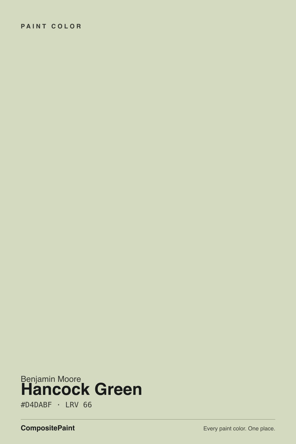
- 3Hancock Green66
- 4Honeydew71
- 5Alabaster82
The Fast Verdict
Hancock Green is a pale, dusty celery green, and Benjamin Moore's own chip description — which leans on the word minty — is the single most misleading line in the Historical Collection. There is no blue in this color. What you get is a soft yellow-green with the volume turned almost all the way down: at LRV 66 it bounces back most of the light in the room and keeps only a whisper of hue. In a small room with a real window — a laundry, a pantry, a powder room — that whisper is exactly right. Spread across four big walls in weak light, it thins out into a tinted off-white and people wonder what they paid for.
Laundry rooms, pantries and mudrooms · bathrooms and powder rooms · kitchen and vanity cabinet doors · small rooms that want color without a mood
You actually want mint or a spa blue-green · the room is windowless or lit only by 2700K bulbs · you want a color that reads across an open main floor · your room is already all cream and orange-stained oak
- Historic green with no trend timestamp — in the deck since 1976
- Right scale for small rooms: laundry, pantry, powder room, mudroom
- Excellent on cabinet doors, where shadow lines give it depth
- Light enough at LRV 66 to keep a one-window room bright
- Easy with white appliances, brass, and plain white subway tile
- Not mint — the official description sets buyers up for the wrong color
- Very low chroma: on big walls it thins out to a tinted off-white
- 2700K bulbs pull it toward khaki after dark
- Reads yellow and dull next to blue-green or true mint tile
What Color Is Hancock Green, Really?
A pale yellow-green with the saturation dialed almost all the way down — celery, not mint. That distinction is the whole review. Benjamin Moore's official one-line description points at mint, and mint is a blue-green; Hancock Green sits on the yellow side of green, in the same neighborhood as dried herbs, faded leaves and old milk paint. It has been in the deck since the Historical Collection arrived for the 1976 bicentennial, a 191-color palette drawn from eighteenth- and nineteenth-century American buildings, and it looks exactly like that: a color from a house museum, not from a trend deck.
At LRV 66 it belongs with the light neutrals, not with the sages people compare it to. Pair that lightness with very low chroma and you get a color whose behavior depends almost entirely on scale: the smaller the surface and the more shadow lines it has, the more green you see. Cabinet doors, a pantry with open shelves, a laundry with one window — the green reads clearly and looks deliberate. A tall open great room — it evaporates into a green-tinted white. Nobody warns buyers about this, and it is behind more disappointment than any undertone problem.
Undertone in one line: yellow-green first, gray second — never blue. If your sample looks khaki, warm bulbs or low afternoon sun are doing it. If it looks almost white, the room is simply too bright for a color this quiet.
Where It Shines
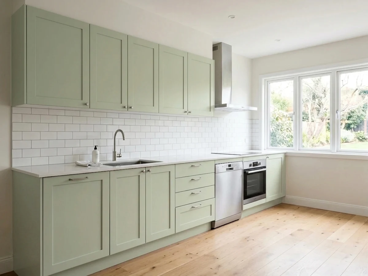
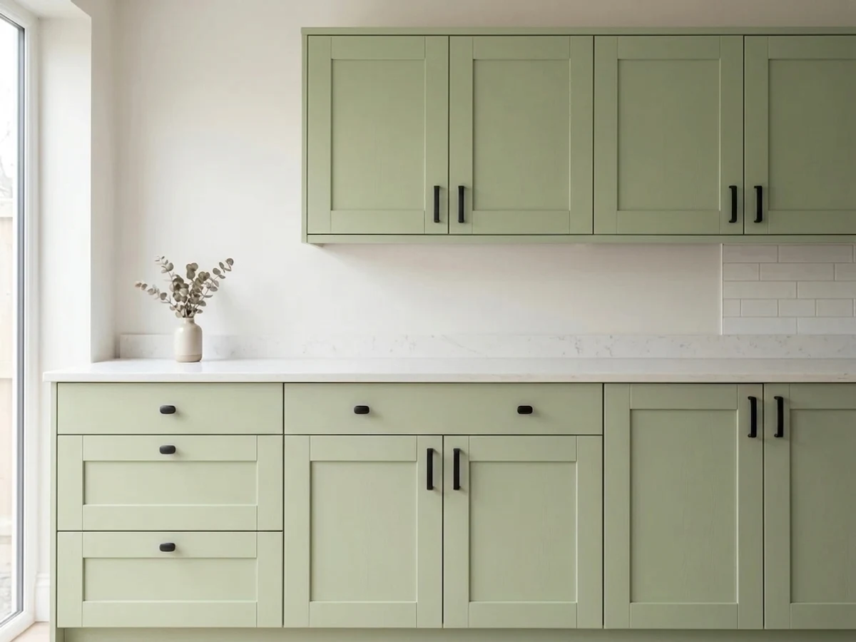
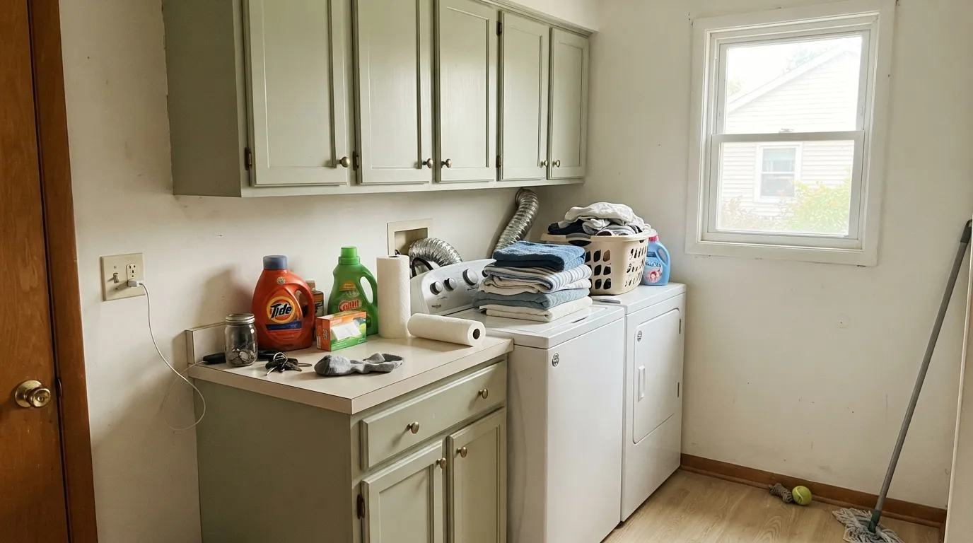
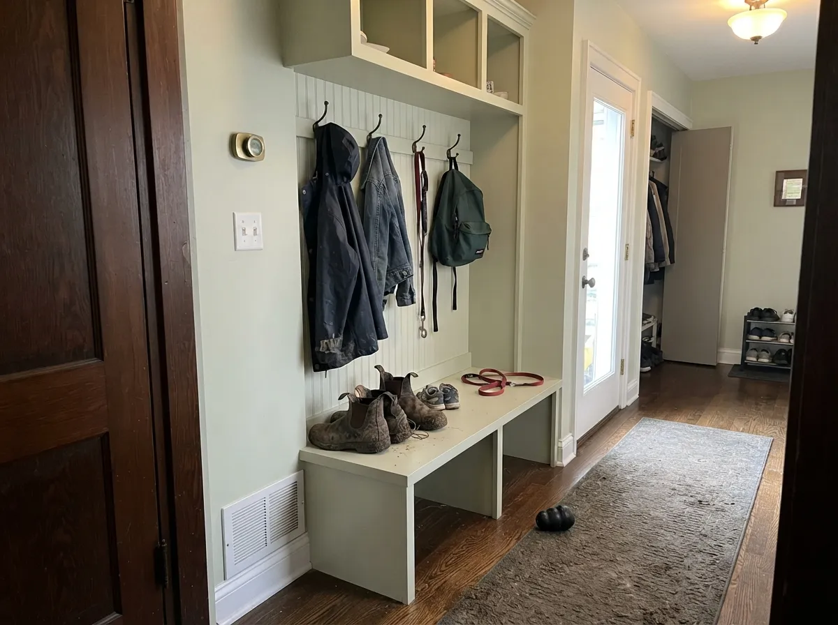
This is a small-room color and a cabinet color, and it is very good at both. Utility rooms are its home turf: a laundry, a pantry, a mudroom with cubbies — rooms that are mostly white appliances, wire baskets and painted shelves, where a soft historic green makes the whole thing look considered instead of leftover. On shaker doors in satin, with brass or matte-black pulls, it does the green-kitchen thing without the commitment of a deep sage. Give it white subway tile, unlacquered brass, plain white oak and daylight from one real window, and it looks like it has been there since the house was built.
Where It Fails
The bad reviews of Hancock Green fall into three buckets, and all three are predictable from your floor plan and your light bulbs before you open a can. Sampling bigger will only confirm them faster.
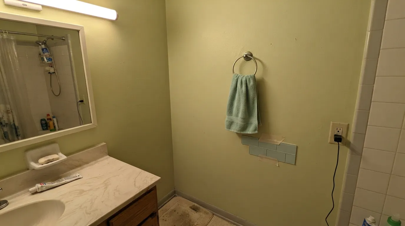
The name on the chip and the brand's own description both point toward mint, and mint is a blue-green. This is a yellow-green. Hold it next to a mint towel or a seafoam tile and the wall instantly reads celery, even faintly olive. If the picture in your head was a spa bathroom, Sea Salt is the color you are actually describing.
2700K bulbs push the yellow forward, and with no daylight to balance it the wall slides from green to khaki — the windowless-laundry complaint, where owners say the room came out looking dirty-beige. Change the bulbs before you blame the paint: 3000K to 3500K keeps it recognizably green. If the room has no window and you cannot touch the fixture, pick something with more pigment in it.
Low chroma at LRV 66 needs edges and shadows to show up at all. Across an open main floor it flattens into a tinted off-white, and the job reads like an expensive way to repaint white. Keep it where the surfaces are small or broken up — cabinet fronts, a pantry, a stair nook — or step down to Guilford Green, which still holds its green on a big wall.
Room by Room
Small, usually one window, usually full of white machines and open shelving: exactly the conditions this color was built for. It gives the room a color without giving it a mood, and it makes plain appliances and wire baskets look intentional. Scrubbable eggshell on the walls, satin if you carry it onto the cabinet fronts.
Benches, cubbies and hook rails break the color into small planes with real shadow between them, which is where it looks its best. Go satin or semi-gloss here — this is the wall that takes wet coats, backpacks and boot scuffs.
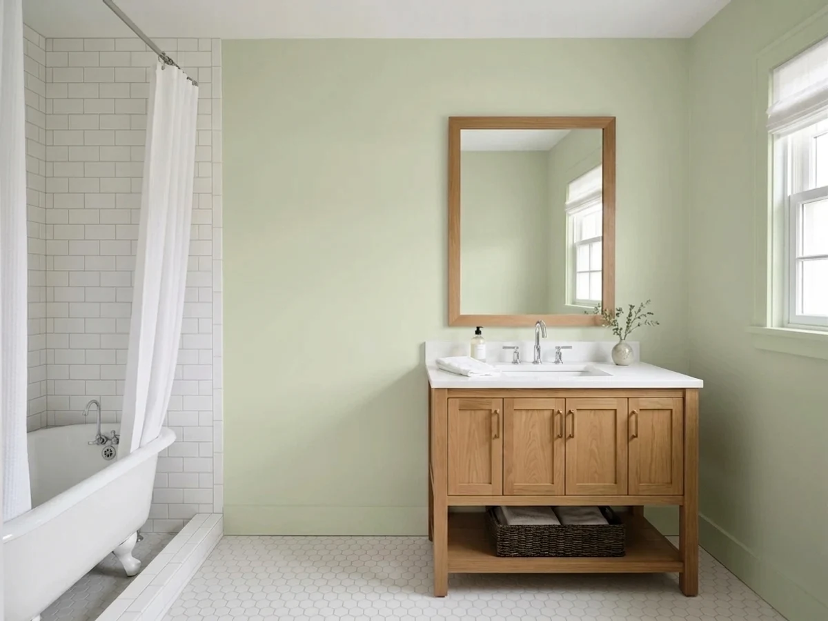
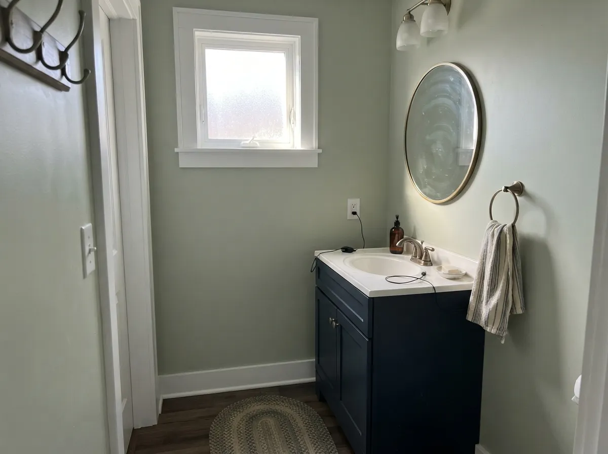
Lovely with white subway, honed marble, brass and a wood vanity. The one thing to sample against is existing tile: next to blue-green or true mint tile the walls read yellow and slightly dingy. Next to warm white, cream or gray-veined stone they read fresh.
On shaker fronts in satin with brass or matte-black pulls it is a genuinely good kitchen green: soft enough to live with daily, old enough not to look like a 2026 trend pick. On kitchen walls it mostly disappears behind cabinets and backsplash, so spend the color where it shows.
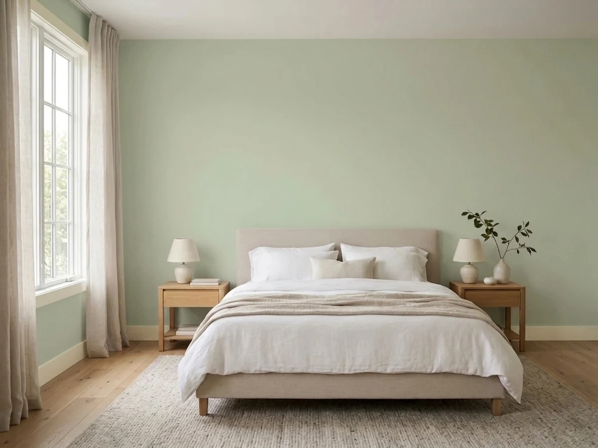
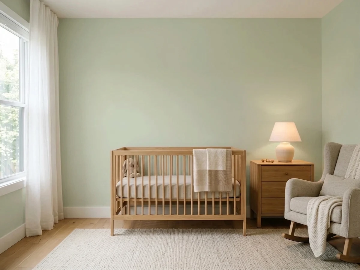
A low-contrast green that calms a room without turning it into a mood room, which also makes it a natural nursery color. Keep the lamps at 3000K; a bedroom full of 2700K bulbs and cream bedding will push the walls khaki after dark.
In a closed living room with real daylight it is pleasant, quiet and easy to furnish around. In an open main floor it stops being a color and becomes a faintly green white — and if that is the result you want, buy a warm white and save the trouble.
Your Light Is the Risk
An east or north room with one good window is where it looks best: even, cool-ish daylight damps the yellow and the wall reads as a clean, soft green with a gray edge.
Nothing to reflect means nothing to see. In a windowless laundry or an interior closet the green drains away and settles into a dull, slightly dirty beige. This is the number-one regret.
Midday sun bleaches it toward a green-tinted white; low gold light in the late afternoon swings it the other way, into celery and then khaki. Look at the same wall at noon and again at six.
2700K bulbs bring the yellow forward and the green goes olive; 3000K to 3500K keeps it green; cool 4000K LEDs strip the warmth and leave it gray and flat. Bulb choice matters more here than with almost any neutral.
Most complaints about Hancock Green are a light mismatch. Upload a photo of your actual room and see it on your walls — then ask for the same wall in north light or evening lamps before you buy a single sample.
Need It From Another Brand?
Any paint counter can custom-tint Benjamin Moore HC-117 directly. If you would rather stay in one brand's own deck, these are the closest stock matches, measured as ΔE2000. Under 2 is a difference you will not see on the wall.
| Brand | Closest color | ΔE | LRV | |
|---|---|---|---|---|
| Sherwin-Williams | Supreme GreenSW 6442 · Sherwin-Williams | 3.4 | 69 | Color page → |
| Behr | Ocean Pearl780C-3 · Behr | 0.8 | 68 | Color page → |
| Valspar | Prairie Willow6001-5B · Valspar | 2.2 | 67.4 | Color page → |
| PPG / Glidden | BreezewayPPG11-21 · PPG / Glidden | 0.4 | 68 | Color page → |
| Glidden | BreezewayPPG11-21 · Glidden | 0.5 | 69 | Color page → |
| Dutch Boy | Spring Green Leaf326-2DB · Dutch Boy | 0.8 | 70 | Color page → |
Similar Benjamin Moore Colors
The nearest shades to Hancock Green within Benjamin Moore's own range, ranked by perceptual color distance — useful when you want the same look a touch lighter, darker, or warmer.
WCAG 2.1: AA is 4.5 : 1 for normal text, 3 : 1 for large text, AAA is 7 : 1.
Hancock Green vs the Colors You're Also Considering
Every Hancock Green sample board has the same rivals on it. The numbers show the real lightness gap — then it comes down to which risk you would rather live with.
Pick this for small, bright rooms, where Guilford Green can land heavier than you planned.
Benjamin Moore HC-116 · LRV 57Guilford GreenPick this if you want the same historic green with enough pigment to hold a full-size wall — the 2015 Color of the Year is the grown-up version of this idea.
Pick this when you want the lightest, freshest end of the same historic green family.
Benjamin Moore HC-114 · LRV 56Saybrook SagePick this for a proper grayed sage with more depth — it needs warm company to look its best, but it never disappears.
Pick this when the green should still read as green; Filmy Green is the first to vanish when the light goes cool.
Sherwin-Williams SW 6190 · LRV 64Filmy GreenPick this if you want the same near-white lightness with no yellow in it at all — cooler, grayer, safer next to cool tile.
Hancock Green Coordinating Colors
The rule for coordinating with Hancock Green: give it one clean white and one dark anchor, and keep heavy creams away from it. Because the green is so light and so low in chroma, it needs a partner with weight — a charcoal door, a deep green island, a navy vanity — or the whole scheme floats. These are the partners that keep showing up in rooms that work:
A 1976 Bicentennial Green, Back on Cabinet Doors
Hancock Green is an HC number, and that prefix is the story. Benjamin Moore built the Historical Collection around the 1976 bicentennial — 191 colors pulled from eighteenth- and nineteenth-century American buildings — and the collection turns fifty this year. It is the same set that produced Revere Pewter, Edgecomb Gray and Hale Navy, the colors that quietly ran American interiors for two decades. Hancock Green never got that treatment. It sat in the fan deck as one of the quiet ones while the famous HC neutrals did all the work.
What brought it back is the green-cabinet decade. Once every kitchen and laundry started getting a painted green box, the deep sages sold out first, and then people started looking for the same idea in a lighter key — a green that reads historic rather than trendy and does not darken a small room. That is exactly this color's lane. Its age is a genuine advantage here: a pale colonial green cannot really date the way a named trend color does, because it was never new.
Hancock Green With Wood Tones, Counters and Metals
Wood is the easy part with a yellow-green. Natural white oak, rift oak, butcher block and pale unstained floors are its best company — the two warmths agree, and the wood gives the room the depth the paint cannot supply on its own. Gray-washed floors and cool LVP also work, in a different way: they pull the yellow back and the green reads cleaner and more modern.
Two wood situations need a sample first. Orange-stained honey oak is not a clash — it sits on the same yellow side of the wheel — but a room with honey oak floors, honey oak trim and pale green walls tips into an all-yellow scheme that reads dated fast. A crisp white trim and black hardware pull it back. Red-toned cherry and mahogany are the real fight: the red pushes the green toward muddy olive and both surfaces lose.
Counters and metals are simpler. White quartz, honed marble with gray veining, soapstone and plain white subway tile all sit well against it; heavily gold-flecked granite fights the yellow already in the paint. Unlacquered brass, aged bronze, matte black and brushed nickel all work. Polished chrome is the only finish that consistently reads cold next to it.
Three Ready Palettes Built on Hancock Green
A color is never alone on the wall. These are complete combinations in the 60-30-10 pattern, with the reason each one holds together. Every one opens in the visualizer.
White Dove keeps a small hard-working room bright and puts the green where it actually reads — on the cabinet fronts, with shadow lines to give it depth. Kendall Charcoal on the door is the anchor that keeps pale green and warm white from drifting into nursery territory.
Try this palette in your roomChantilly Lace is the clean, crisp white here on purpose: it keeps the green looking fresh instead of creamy, which is what a warm white does when it meets the yellow in this color. The blue vanity is the old colonial move — a historic green and a historic blue, separated by a clean white so neither one goes muddy.
Try this palette in your roomTonal green is what keeps a green kitchen from reading as a theme: pale celery on the perimeter doors, a deep grayed green on the island, and a warm white holding the walls together. Both greens come out of the same historic collection, so the jump between them looks planned rather than borrowed. Brass or matte black on the pulls; polished chrome is the one metal that goes cold against this green.
Try this palette in your roomHancock Green FAQ
Is Hancock Green mint or sage?
Sage — and on the yellow side of sage. The official description calls it minty, which is why so many buyers are surprised: mint is a blue-green and there is no blue in this paint. On a wall it reads pale celery, herbal and slightly dusty, much closer to Guilford Green than to anything spa-like.
What trim white goes with Hancock Green?
Either a crisp white or a warm one — just know what each does. Chantilly Lace or Simply White keeps the green looking fresh and makes the yellow less obvious. White Dove goes softer and pushes the room warmer and more historic. What to avoid is a heavy cream: against this green it reads yellow on yellow, and the wall looks tired.
Will Hancock Green look yellow on my walls?
It can, in two situations: under 2700K bulbs at night, and in low late-afternoon sun. In flat daylight it reads clearly green with a gray edge. If any yellow is a dealbreaker, look at Filmy Green — nearly the same lightness with no yellow in it — or Sea Salt if you want the blue-green version.
Is it a good laundry room color?
It is close to the best use for it, with one condition: the room needs a window or decent neutral light. With daylight, pale green walls make white machines and open shelving look deliberate. Windowless, swap the bulbs to 3000K or 3500K first — otherwise move the color onto the cabinet doors and leave the walls white.
Hancock Green or Guilford Green?
Scale decides it. Hancock Green at LRV 66 is the lighter, quieter one — right for a small room, a pantry or cabinet doors. Guilford Green at LRV 57 has enough pigment to still read green across a whole living room. In a big bright space Hancock Green washes out; in a tiny powder room Guilford Green can feel like more color than you asked for.
Can I use it on kitchen or bathroom cabinets?
Yes, and cabinets are arguably where it works best — door panels and rails create shadow, and shadow is what gives a low-chroma color something to hold onto. Use a satin urethane-fortified cabinet enamel, prime bare or previously stained wood, and expect two coats over a white factory finish.
Have you painted with Hancock Green?
Rate it — one tap helps the next reader decide.
Ask a Question