Cushing Green
A 200-year-old sage-olive green from Benjamin Moore's history books, reviewed honestly: the light where it turns rich and grounded, the light where it goes nearly black, and what to pick instead.

Jessica has spec'd whites and neutrals for more than 300 rooms and keeps a sample wall of painted drawdowns in her studio. Every color review is checked against real reader rooms in the comments and re-tested when a formula changes. About the testing process →
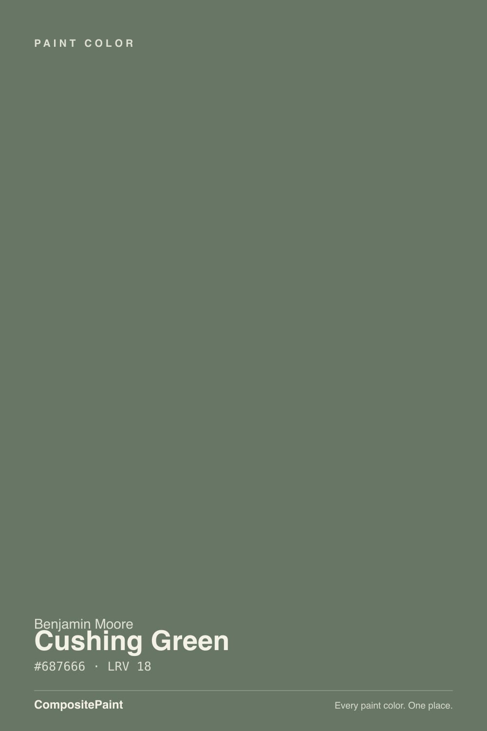
- 1Essex Green6
- 2Vintage Vogue12
- 3Cushing Green18
- 4Evergreen Fog30
- 5Clary Sage41
The Fast Verdict
Cushing Green is what a 19th-century paint archive looks like with a modern SKU: a low-saturation, barely-warm olive-sage, dark enough (LRV 18) to read as real color instead of a pastel wash. It was never built for a mood board — Benjamin Moore's Historical Colors line documents real old-house paint, not design trends — and that shows in how it behaves: steady, grounded, happiest on a front door, an island, or a den with real light. Put it in a dim room with no lamps and it stops looking green at all.
Front doors and shutters on a light-colored house · kitchen islands and built-ins with warm wood and brass · a den, library or home office with real daylight · anyone who wants green to read as a neutral, not a statement
You want the pale, airy sage everyone is chasing right now · your room is small, north-facing, and short on lamps · you want green to announce itself across the room · you're not willing to sample it big before committing
- A genuinely neutral-leaning green — barely warm, no blue, so it never fights wood or gray
- LRV 18 holds real color in daylight instead of washing out like a pale sage
- Sourced from Benjamin Moore's Historical Colors line — built for old houses, not a five-year trend cycle
- Flatters walnut, brass, black iron and aged materials
- Small-dose friendly: a door, an island or a powder room commits without repainting a whole house
- Needs real daylight or lamps — dim north rooms push it toward near-black
- Far too deep and grounded if you actually want the pale sage trend
- Cool white trim makes it read muddy instead of deliberate
- Photos and screens exaggerate how dark it reads; a paint chip undersells the depth
What Color Is Cushing Green, Really?
A grayed, low-chroma olive-sage green — genuinely close to neutral on the color wheel, with only the faintest lean toward yellow and almost no blue in it at all. That balance is the whole personality: it isn't the blue-leaning "spa green" of the 2010s or the yellow-heavy "olive" of the recent farmhouse look, it sits almost exactly between them. Cushing Green belongs to Benjamin Moore's Historical Colors collection, a line built from real old-house paint archives rather than invented for a design trend — which is why it doesn't chase the current sage-green moment so much as sit quietly underneath it, the way it has for decades.
At LRV 18 it is a genuine mid-to-dark tone, meaningfully deeper than the pastel sages currently trending — Saybrook Sage sits at LRV 56, Sherwin-Williams Sage at LRV 32. That depth is the tradeoff: a pale sage washes out in shade and needs almost no light to look pretty, but Cushing Green needs real light to read as green at all — starve it of daylight or lamps and it slides toward a near-black charcoal, which is the single biggest surprise in how this color behaves on an actual wall versus a paint chip.
Undertone in one line: green first, a whisper of yellow-olive second, no blue. If your sample looks nearly black, that is depth plus shadow, not a defect — give it a lamp or real daylight before judging it. If it looks brownish or khaki, check your light source; warm bulbs push any grayed green toward olive, and that is expected, not a mismatch.
Where It Shines
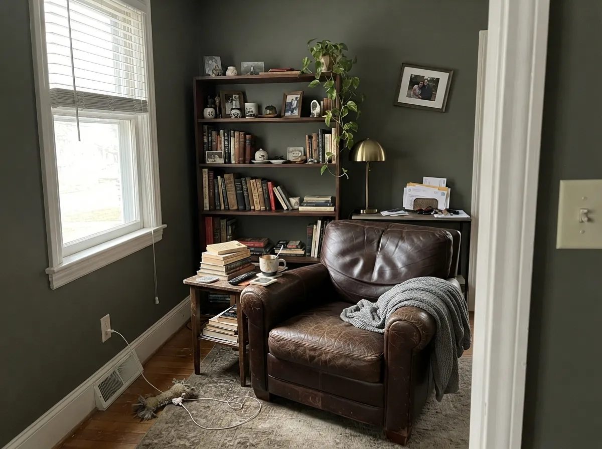
Give it real light and warm materials and Cushing Green earns its keep quietly rather than loudly. On a front door or shutters against a light-colored house it is the classic New England move — grounded, historic, never trendy-looking in a bad way. Inside, it does its best work in small, high-commitment doses: an island under pendant lights, a den with an afternoon window, built-ins next to a brass lamp. It flatters walnut, aged brass and black iron the way only a genuinely neutral-leaning green can.
Where It Fails
Almost every regret story about a deep, grayed color like Cushing Green comes from one of three mismatches, and all three are predictable before the first coat. None of them are the paint's fault — but if your room or your expectations match one of these, sample it big before you commit.
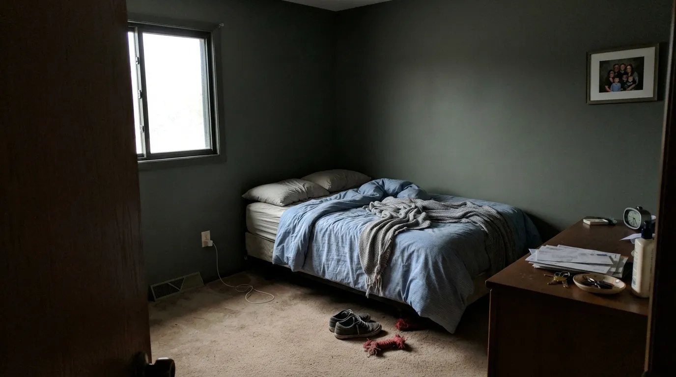
LRV 18 is not a lot of light to work with, and a north-facing room with no supplemental light will push Cushing Green toward near-black in the corners by late afternoon. Readers who wanted "a soft green accent" report it just reading dark, almost like charcoal. Add warm lamps or reserve it for a room that gets real daylight.
Saybrook Sage and Sherwin-Williams Sage sit at LRV 56 and 32 — a different tier of color entirely. Cushing Green is not a deeper version of those you can just repaint lighter later; it is a genuinely dark, grounded green built for a different job. If you pinned a pale, breezy sage kitchen, this is the wrong swatch.
A bright, blue-leaning white trim makes the grayed olive undertone look muddy and heavy instead of intentional — the contrast is too cold for how warm-neutral this green actually is. A cream or warm white (Swiss Coffee, White Dove) lets the green read as deliberate; a cool white just makes it look like it needs a second coat.
Room by Room
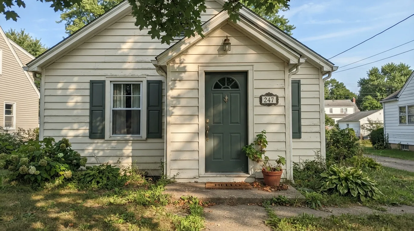
This is the historically honest job: a deep, grayed green door or shutters against a lighter clapboard body reads as old-New-England restoration, not a trend. Semi-gloss holds up outdoors and the color reads richer in full sun than it does in shade.
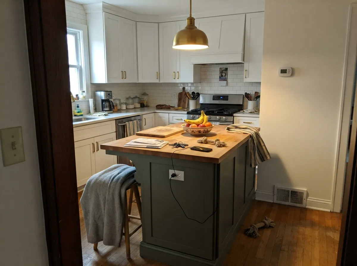
One piece of furniture-grade color under warm pendant lighting is where most people actually live with Cushing Green successfully. It pairs with butcher block and brass without fighting them, and satin cabinet enamel wipes clean around the handles.
Afternoon sun through a real window plus walnut shelving is this color's second home. It is a color for rooms you sit in, not rooms you pass through — the depth rewards time spent looking at it.
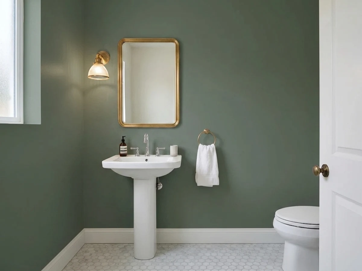
Four walls of a small room take deep color well, and a powder room is low-commitment enough to justify going dark. Add a brass sconce and it looks considerably more expensive than the can.
Beautiful in a room with genuine daylight and warm furniture; disappointing in a dim or small living room where it just reads heavy. Check the room's actual light before committing to four full walls.
As a whole-house body color it reads almost black from the street in anything but full sun. As door, shutter, or trim color against a lighter siding, it is exactly the restrained, historic accent it was built for.
Your Light Is the Risk
Full or filtered sun plus a wood floor is where the grayed olive comes forward and the green reads rich, not black. Sample it in this light, not a cloudy one.
Cool north daylight with no supplemental light pushes LRV 18 toward near-black in the corners. Readers expecting "soft green" report "basically dark gray" or "looks black in photos."
On a gray day it reads closer to charcoal-green; on a sunny afternoon the same door or shutters show real, identifiable color. Judge it on a bright day.
2700K bulbs pull it warmer, closer to olive and moss. Cool white LEDs flatten it toward gray-black — warm bulbs are doing real work on a color this deep.
Most complaints about Cushing Green are a light mismatch. Upload a photo of your actual room and see it on your walls — then ask for the same wall in north light or evening lamps before you buy a single sample.
Need It From Another Brand?
Any paint counter can custom-tint Benjamin Moore HC-125 directly. If you would rather stay in one brand's own deck, these are the closest stock matches, measured as ΔE2000. Under 2 is a difference you will not see on the wall.
| Brand | Closest color | ΔE | LRV | |
|---|---|---|---|---|
| Behr | Pepper MillBXC-44 · Behr | 1.6 | 17 | Color page → |
| Valspar | Nature LoverV097-5 · Valspar | 2.6 | 15.5 | Color page → |
| PPG / Glidden | English IvyPPG1134-6 · PPG / Glidden | 2.0 | 18 | Color page → |
| Glidden | English IvyPPG1134-6 · Glidden | 2.1 | 18 | Color page → |
| Dutch Boy | Earthy Green425-6DB · Dutch Boy | 4.2 | 17 | Color page → |
| HGTV Home by Sherwin-Williams | Fresh BalsamHGSW 3252 · HGTV Home by Sherwin-Williams | 3.1 | 15 | Color page → |
Similar Benjamin Moore Colors
The nearest shades to Cushing Green within Benjamin Moore's own range, ranked by perceptual color distance — useful when you want the same look a touch lighter, darker, or warmer.
WCAG 2.1: AA is 4.5 : 1 for normal text, 3 : 1 for large text, AAA is 7 : 1.
Cushing Green vs the Colors You're Also Considering
Every Cushing Green sample board has the same rivals on it. The numbers show the real lightness gap — then it comes down to which risk you would rather live with.
Pick this for the more neutral, less brown-leaning version of the same idea.
Sherwin-Williams SW 6186 · LRV 21Dried ThymePick this if your painter works in Sherwin-Williams — nearly the same grayed depth, one step lighter and browner.
Pick this for the lighter, easier-to-live-with depth that still needs real light to earn its keep.
Sherwin-Williams SW 6187 · LRV 12RosemaryPick this for noticeably deeper and more saturated — a green that reads as green even from across a room.
Caldwell Green HC-124 (#627067, LRV 15) is the darker, slightly cooler version of the same idea, a better pick for cabinetry when you want more contrast against white counters. In the Garden CSP-805 (#697562, LRV 17) is close enough in weight that the difference is mostly a hair more yellow-green. Amherst Gray HC-167 (#757670, LRV 19) and Gray Gardens CSP-55 (#717571, LRV 17) both drop most of the green and read as warm-neutral grays.
Across brands, Behr Pepper Mill BXC-44 (#687763, LRV 17) at a deltaE of 1.64 and PPG English Ivy PPG1134-6 (#6B7B6B, LRV 18) at 1.97 are visually identical to Cushing Green in normal room light. Farrow and Ball Dyrehaven No. 9819 (LRV 16) at 2.06 and Valspar Nature Lover V097-5 (LRV 15.5) at 2.65 are very close, so sample before switching. Clare Daily Greens PNT100-DP-61 at 3.9 is close but visibly different side by side.
Cushing Green Coordinating Colors
The rule for coordinating with Cushing Green: warm creams over cool whites, real wood over anything painted gray, and one near-black if you want contrast. It is grayed and neutral enough to sit next to almost any warm neutral without a fight — these are the partners that keep showing up in rooms that work:
A Historical Color, Not a Trend Color
Cushing Green comes out of Benjamin Moore's Historical Colors collection — a line built from real paint documented on old New England houses, not dreamed up for a design cycle. That lineage explains why it doesn't behave like the sage-green colors currently everywhere: the pale, grey-green revival colors filling kitchen islands right now are chasing a specific decade's mood. Cushing Green is older, darker, and quieter than all of them.
The practical upside: a color built to look right on 19th-century clapboard and shutters is not likely to look dated the way a trend-cycle color can. It carries more risk than a beige because it is still a real color decision, but less repaint risk than the trendy pale sages currently flooding kitchens — this one was never chasing a moment to begin with.
Cushing Green With Wood Tones and Floors
Walnut, aged oak, and anything with real grain and depth are this color's best company — the grayed olive and warm brown depth meet in the middle instead of fighting. Black iron and unlacquered brass hardware are the easy accents; polished chrome is the one metal that reads slightly cold against it.
The floor that needs a sample first is very orange, glossy honey oak — the contrast can make both the floor and the wall look a little dated together, more 1990s than heritage. Whitewashed or pale oak, dark walnut, and painted black floors all work fine; it is really only the loud orange middle ground that argues with it.
Three Ready Palettes Built on Cushing Green
A color is never alone on the wall. These are complete combinations in the 60-30-10 pattern, with the reason each one holds together. Every one opens in the visualizer.
Swiss Coffee's warm cream keeps a light siding from looking stark next to a dark historic door; Wrought Iron supplies the one near-black note so the whole facade reads deliberate, not accidental.
Try this palette in your roomEdgecomb Gray's warm greige and White Dove's warm white already agree with each other, so the island is the only thing doing the work — brass hardware and butcher block finish the look without a fourth color.
Try this palette in your roomKendall Charcoal sits close enough in depth to read as the same family without competing, so the built-ins recede instead of fighting the walls; White Dove keeps the millwork from disappearing into the green at night.
Try this palette in your roomCushing Green FAQ
Is Cushing Green actually green, or does it read gray or black?
It is genuinely green — a grayed, low-saturation olive-sage — but at LRV 18 it needs real light to prove it. In a dim room with no lamps it can slide toward near-black, and that is the most common surprise reported about this color. Judge it in daylight or under a warm lamp, never in a dim corner.
Is Cushing Green warm or cool?
Right in the middle, leaning very slightly warm. The undertone is green first with a whisper of yellow-olive and essentially no blue, so it doesn't fight warm wood the way a blue-leaning green would, and it doesn't look sickly next to cool grays either.
What trim white goes with Cushing Green?
A warm white — White Dove or Swiss Coffee — reads as intentional and lets the grayed olive settle in. A stark, cool-leaning white trim makes the green look muddy by contrast instead of deliberate.
Is it good for kitchen cabinets or an island?
Yes, especially in doses — an island or a run of built-ins under warm pendant lighting is where most people live happily with this color. It flatters brass and butcher block. Use a satin, urethane-fortified cabinet enamel for durability.
Does it work on a front door or exterior?
It's one of the classic uses — door and shutter color against a lighter siding, in the historic New England tradition the color comes from. As a whole-house body color it reads almost black from the street outside of full sun, so save it for the accent, not the body.
Will it look too dark for my room?
Depends entirely on your light. In a room with real daylight or warm lamps, LRV 18 reads as a rich, grounded green. In a small, north-facing room with no supplemental light, it can read closer to charcoal than green. Sample a large swatch on the actual wall before committing to four walls.
Have you painted with Cushing Green?
Rate it — one tap helps the next reader decide.
Ask a Question