Rosemary
The dark green everyone puts on islands and front doors, reviewed honestly: where the green actually shows, the rooms where it turns to charcoal, and what to pick instead.

Jessica has spec'd whites and neutrals for more than 300 rooms and keeps a sample wall of painted drawdowns in her studio. Every color review is checked against real reader rooms in the comments and re-tested when a formula changes. About the testing process →
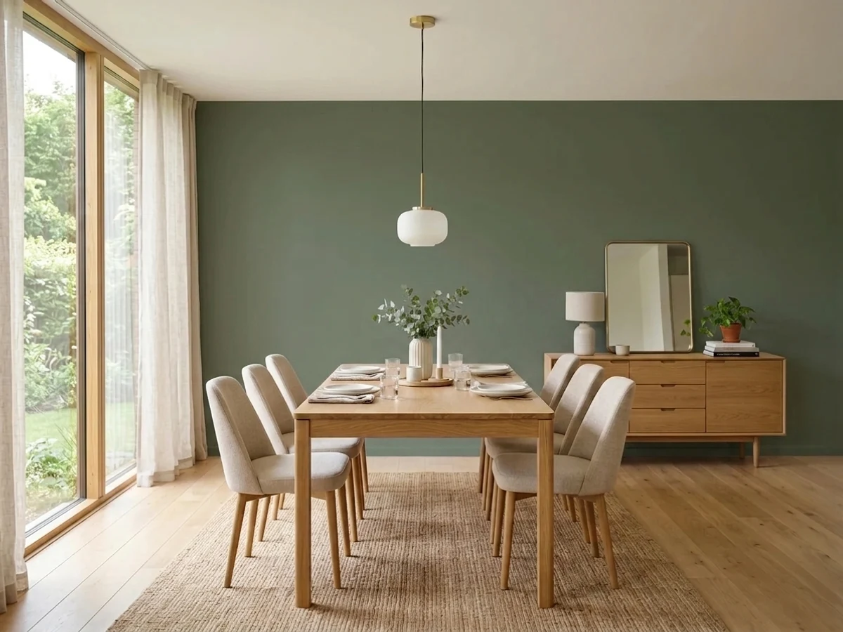
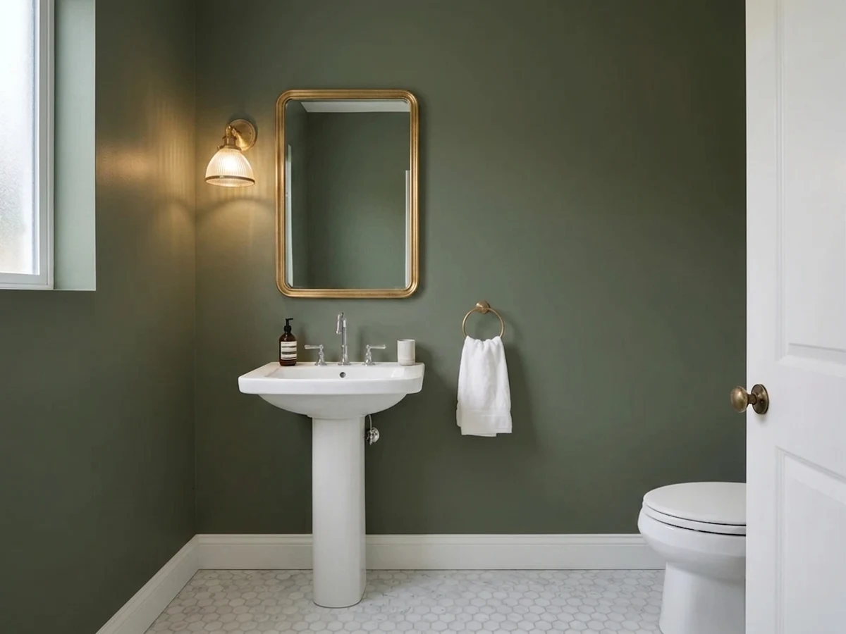
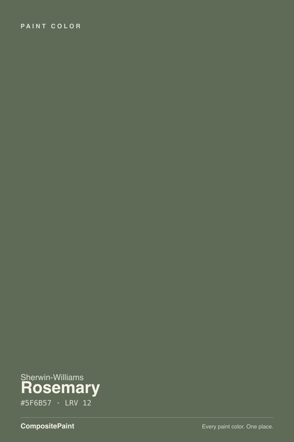
- 1Black Emerald1
- 2Essex Green6
- 3Rosemary14
- 4Sage Green22
- 5Evergreen Fog30
The Fast Verdict
Rosemary is the green people choose when black feels heavy and navy feels cold. At LRV 12 it carries real weight, and the olive thread in it stays friendly with oak, brass and warm whites instead of fighting them.
The catch is light: give it a sunny window or warm bulbs and the green is obvious, take the light away and it flattens into charcoal. On an island, a run of lower cabinets or a front door it is close to foolproof; on all four walls of a dim room it is a gamble.
Kitchen islands and lower cabinets with a lighter perimeter · dining rooms and studies you want dark on purpose · front doors and shutters with brass or bronze · built-ins and paneled walls in a bright room
Your only window faces north and the room needs to feel open · your fixtures are fixed 4000K LEDs · your floors are orange-toned builder oak · you want a green that quietly passes for gray
- Dark enough for drama but still reads as a color, not black
- The olive thread flatters oak, walnut, brass and warm whites
- Behaves like a dark neutral — it does not fight counters or stone
- Excellent on islands, built-ins and doors where a lighter frame carries the room
- Works outside as well as inside: doors, shutters, even full siding
- At LRV 12 it goes near-charcoal in weak or north light
- Cool 4000K bulbs drain the green completely after dark
- Reads army khaki next to orange-toned oak floors
- Dark satin cabinets show dust, fingerprints and touch-up flashing
What Color Is Rosemary, Really?
A dark, grayed green with an olive thread — and the gray is the whole point. The hue measures 96 degrees, which is technically the yellow side of green, but saturation sits near 10 percent, so nothing about it reads forest or emerald. In the hex #5F6B57 the green channel leads and blue sits lowest, which is why it never tips teal the way so many dark greens do. What lands on the wall behaves like a dark neutral: heavy enough to shape a room, quiet enough to sit under wood and brass without shouting.
LRV 12 means it hands back about a tenth of the light that hits it — the dark band, near charcoal territory. Put it beside Evergreen Fog SW 9130 at LRV 30 and the gap is obvious: Evergreen Fog is a green you can put in a dim bedroom, Rosemary is a green you have to bring light to. Its true peer is Pewter Green SW 6208, also LRV 12, so the two carry identical weight in a room and the only real difference is how much green you end up seeing.
Undertone in one line: grayed green with an olive lean — never teal, never blue. If your sample looks black on the wall, that is the LRV doing its job, not the wrong green.
Where It Shines
It earns its reputation on smaller surfaces with something lighter framing them — an island, a lower run of cabinets, built-ins, a front door. Give it one good window or a pair of warm lamps and the green reads clearly against white trim, oak floors and brass hardware.
Where It Fails
Nearly every regret story about Rosemary comes down to light, and all of it is predictable before you open the can. At LRV 12 the color takes light away and gives depth back, and when the room has no light to spare that trade goes badly.
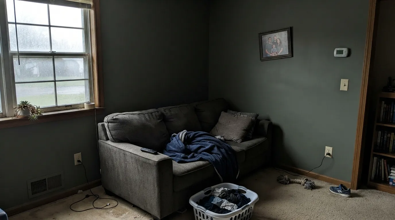
North light is cool and weak, and there is not enough of it for a color at LRV 12 to show its hue. The green drains out and the walls read charcoal with a faint dirty cast — dramatic if you wanted that, depressing if you did not. Stay green but come up in light: Dried Thyme SW 6186 at LRV 21, or Evergreen Fog SW 9130 at LRV 30.
Rosemary leans on the yellow side of green, and cool white LEDs strip exactly that. Under recessed cans in a kitchen the cabinets stop reading green and go gray-black by dinnertime. Change bulbs to 2700K first, that is the cheap fix; if the fixtures are sealed and cool, use a lighter green that survives them, like Basil SW 6194 or Retreat SW 6207.
Warm orange wood pushes the olive side forward, and the color can slide from sober green to army khaki — the complaint people usually word as "it looks military." If the floors are staying, pick the grayer twin: Pewter Green SW 6208 sits at the same LRV 12 and ignores the orange instead of answering it.
Room by Room
A green base with a lighter perimeter is the safest way to use this color, because the room stays open while the island gets the weight. Satin cabinet enamel, with Alabaster SW 7008 on the uppers and Accessible Beige SW 7036 on the walls. Brass or oil-rubbed bronze pulls, not chrome.
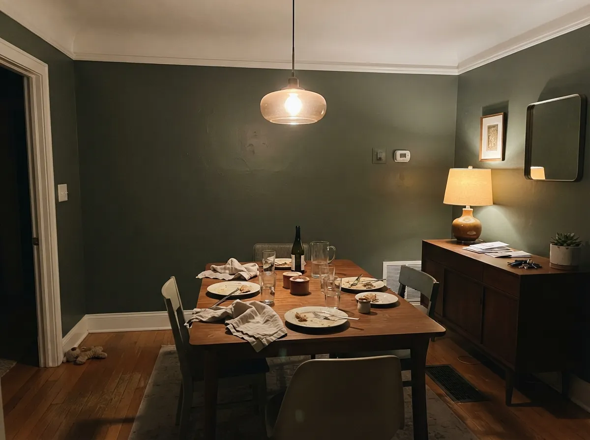
Dining rooms are used at night, which is exactly when a dark green pays off under warm bulbs and candles. Eggshell walls, Pure White SW 7005 trim and ceiling in semi-gloss and flat. Add one warm note — a terracotta like Cavern Clay SW 7701 in the next room — so the scheme is not all cool.
Screens make their own light, so the low LRV is less of a problem here than anywhere else, and the color kills glare instead of bouncing it. Eggshell on walls, or Rosemary on built-in shelving with the walls in Shoji White SW 7042. Keep one warm lamp at desk height.
A small windowless room in Rosemary reads almost black, which some people want and most do not. If you go for it, keep the ceiling in Alabaster SW 7008 and put warm bulbs at the mirror. Bathrooms with a real window handle it far better.
It makes a genuinely restful bedroom when there is a decent window and two lamps, and a cave when there is not. Eggshell walls, white trim, and warm bedding rather than gray. In a north bedroom step up to Dried Thyme SW 6186 instead.
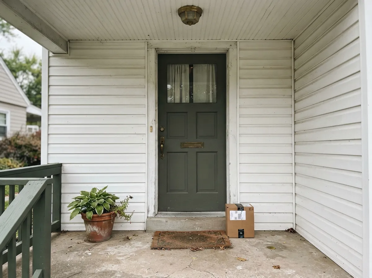
Outside there is more light than any interior gets, so the green always reads, and it is a quieter choice than black or navy. Satin exterior enamel on the door, with siding in Snowbound SW 7004. Bronze or brass hardware; details in the exterior section below.
Your Light Is the Risk
Strong warm sun lifts the yellow side and the green is unmistakable all day.
Cool weak daylight leaves nothing to reflect — it reads charcoal green. Sample big.
2700K keeps it green and warm. 4000K LEDs kill it — change bulbs, not paint.
Powder rooms and basements lose the hue entirely. Fine if black-green is the goal.
Most complaints about Rosemary are a light mismatch. Upload a photo of your actual room and see it on your walls — then ask for the same wall in north light or evening lamps before you buy a single sample.
Need It From Another Brand?
Any paint counter can custom-tint Sherwin-Williams SW 6187 directly. If you would rather stay in one brand's own deck, these are the closest stock matches, measured as ΔE2000. Under 2 is a difference you will not see on the wall.
| Brand | Closest color | ΔE | LRV | |
|---|---|---|---|---|
| Behr | Pinecone HillN410-6 · Behr | 1.4 | 14 | Color page → |
| Benjamin Moore | Rainy Afternoon1575 · Benjamin Moore | 1.8 | 15 | Color page → |
| PPG / Glidden | Double DutyPPG1030-7 · PPG / Glidden | 2.7 | 14 | Color page → |
| Glidden | Double DutyPPG1030-7 · Glidden | 2.7 | 14 | Color page → |
| Dutch Boy | Antiquated Olive424-6DB · Dutch Boy | 0.0 | 14 | Color page → |
| HGTV Home by Sherwin-Williams | Fresh BalsamHGSW 3252 · HGTV Home by Sherwin-Williams | 3.5 | 15 | Color page → |
Similar Sherwin-Williams Colors
The nearest shades to Rosemary within Sherwin-Williams's own range, ranked by perceptual color distance — useful when you want the same look a touch lighter, darker, or warmer.
WCAG 2.1: AA is 4.5 : 1 for normal text, 3 : 1 for large text, AAA is 7 : 1.
Rosemary vs the Colors You're Also Considering
Every Rosemary sample board has the same rivals on it. The numbers show the real lightness gap — then it comes down to which risk you would rather live with.
Pick this when you want the green to be seen, not guessed.
Sherwin-Williams SW 6208 · LRV 12Pewter GreenPick this when you want a dark green that behaves like gray.
Side-by-side comparison →Pick this for the version that still shows green in normal light.
Sherwin-Williams SW 6195 · LRV 8Rock GardenPick this for a deeper, heavier green on a paneled study.
Pewter Green SW 6208 (#5C615A, LRV 12) is the comparison people ask about most. Both sit at LRV 12, so they carry the same weight in a room, but the hex values separate them. Pewter Green has red, green, and blue channels close together, which reads as a gray-green that behaves like a dark neutral. Rosemary spreads those channels wider, so the green is more obvious and the color leans warmer and more olive. Choose Pewter Green for a dark green that can pass for gray, and Rosemary when you want the green seen.
Within the line, Basil SW 6194 (#626E60, LRV 15) is lighter and slightly cooler, while Oakmoss SW 6180 (#65684C, LRV 13) is clearly more olive.
Across brands, Behr Royal Orchard PPU11-01 (LRV 14, deltaE 0.96) is a direct match. Dunn-Edwards Italian Basil DE6287 (LRV 12, deltaE 1.27) and Dutch Boy Preserved Moss 327-6DB (LRV 14, deltaE 1.71) are visually identical in normal room light. Farrow and Ball Minster Green No. 224 (LRV 12, deltaE 2.25) is very close, so sample first.
Rosemary Coordinating Colors
The rule with Rosemary is to stay warm and stay clearly lighter. It absorbs so much light that anything within a few LRV points of it turns into one dark mass, and anything cool and blue-gray next to it makes the olive look muddy. These are the partners that consistently hold up beside it:
Rosemary on Kitchen Cabinets
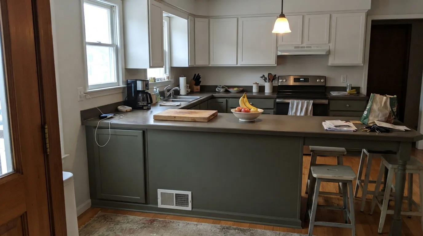
This is where most people meet the color, and the two-tone kitchen is why it works. Rosemary on the island or the lower run, something light above, and the room keeps its ceiling height while the green does the work at counter level. It sits comfortably with warm white quartz, soapstone, butcher block and terracotta tile, and it does not fight the beige flecks in ordinary builder granite the way a saturated green would.
Two practical warnings. First, dark cabinet doors show everything — dust on the top rail, fingerprints around pulls, and touch-ups that flash because the deep base dries at a slightly different sheen; keep the leftover paint and touch up whole doors, not spots. Second, check the bulbs before you commit. Kitchens are full of recessed cans, and a 4000K can over a Rosemary island turns it gray-black at night no matter how good it looked at noon.
Rosemary Outside: Doors, Shutters and Siding
Outdoors is where the low LRV stops being a problem. There is far more light on a facade than in any room, so the green reads properly even on the shaded north side of the house, and the muted, grayed quality keeps it from looking like a novelty door. As a front door it is the calm alternative to black — quieter, warmer, and much better with brass, bronze and aged copper than a true forest green would be.
As a full body color it also works, with two rules. Keep the trim in a distinctly lighter white so the shape of the house still reads — Snowbound SW 7004 or Alabaster SW 7008 — and expect the south elevation to look noticeably greener than the north elevation all day. Paint two large boards and walk them around the house at mid-morning and again at sunset before you order five gallons.
Three Ready Palettes Built on Rosemary
A color is never alone on the wall. These are complete combinations in the 60-30-10 pattern, with the reason each one holds together. Every one opens in the visualizer.
Alabaster and Accessible Beige are both warm and gently grayed, so they meet Rosemary's olive lean halfway instead of arguing with it. The dark green stays a 10 percent accent on one cabinet run, which is the only way LRV 12 works in a kitchen without closing it in.
Try this palette in your roomAt LRV 12 the walls swallow light, so trim needs to be clean and clearly brighter — Pure White at LRV 84 keeps the edges of the room legible. Cavern Clay is the warm terracotta note that stops the scheme reading cold once the sun goes down.
Try this palette in your roomSnowbound is a soft white with a hint of gray, so the green door reads as a deliberate color rather than a hole in a bright facade. Urbane Bronze is warm and dark enough to tie the shutters to the door without repeating the same green twice.
Try this palette in your roomRosemary FAQ
Does Rosemary look black?
In weak light, close to it. At LRV 12 there is not enough reflected light for the hue to show, so a north room or a windowless powder room can read charcoal-black with only a hint of green. In daylight or under 2700K bulbs the green comes back clearly. Tape a large sample to the wall and look at it at 9 p.m. before you buy.
Rosemary or Pewter Green for kitchen cabinets?
Same depth, different amount of green. Both sit at LRV 12, so they weigh the same in a kitchen, but Pewter Green SW 6208 has its color channels grouped tightly and reads gray-green, while Rosemary spreads them and shows the green plus a warm olive edge. Pick Rosemary if you want people to notice the cabinets are green; pick Pewter Green if you want them to read as a dark neutral.
What sheen should I use on Rosemary cabinets?
Satin, in a real cabinet enamel rather than wall paint. Gloss on a color this dark turns every door into a mirror and shows sanding scratches; flat will not survive being wiped. Dark satin still shows fingerprints around pulls, so plan on a damp cloth every few weeks.
Does Rosemary work with oak floors?
With white oak and walnut, yes — the olive in it settles right into those tones. With orange-toned red oak or a honey builder floor it gets riskier, because the orange amplifies the olive and the walls can look khaki. Put the sample board flat on the floor before you decide, not just against the wall.
How many coats does it need?
Two coats over a tinted primer, three if you skip the primer or go over white. Deep colors like this are mixed into a deep or ultra-deep base with less white pigment, so they cover unevenly on the first pass and roller laps show. Have the store tint the primer gray and keep a wet edge.
Is Rosemary too dark for a small powder room?
Not automatically — small dark rooms are where dark colors are least risky, because nobody expects a powder room to feel airy. What kills it is a flat ceiling light with a cool bulb. Use a warm bulb at the mirror, keep the ceiling in Alabaster SW 7008, and the room reads jewel-box instead of cave.
Have you painted with Rosemary?
Rate it — one tap helps the next reader decide.
Ask a Question