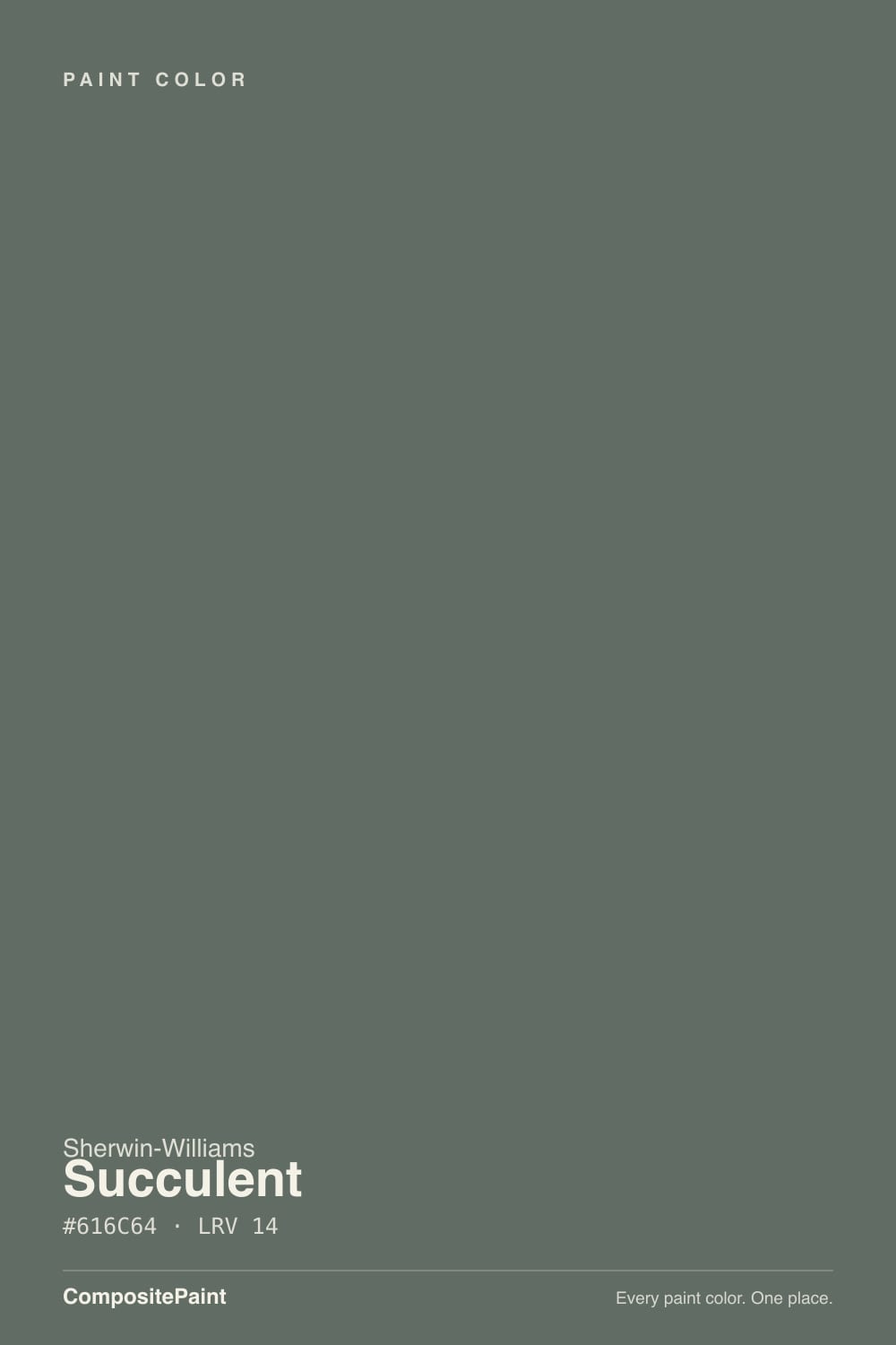
Succulent
SW 9650 · #616C64 · LRV 14 — cool green tone, dark — high drama, needs strong daylight or warm bulbs.
- 1Black Emerald1
- 2Essex Green6
- 3Succulent14
- 4Sage Green22
- 5Evergreen Fog30
What Color Is Succulent, Really?
Succulent SW 9650 is a deep, heavily muted green. Its hue sits at 136 degrees, which is true green territory, but saturation is only 5 percent, so almost all of the color has been drained toward gray. At hex #616C64 and an LRV of 14, it lands in the dark band, absorbing most of the light in a room and reading like a green-tinged charcoal rather than a forest or a sage.
People reach for it when they want a moody green that will not shout. A saturated green at this darkness can feel like a strong design statement; Succulent behaves more like a dark neutral that happens to lean green. That makes it easy to live with on cabinets, doors, and paneling next to wood, stone, and warm metals.
The practical catch is the same one every dark color has. At LRV 14 there is little reflectance to work with, and in weak or cool light the green disappears and the wall simply looks dark gray. It also flips: put it next to a real green and the color reads gray, put it next to a warm charcoal and the green comes back.
The undertone is green, and the data is clear about it: hue 136 degrees, dead centre of green, with saturation at just 5 percent. That low saturation is what keeps it from being an obvious color. On a chip Succulent often looks like a slightly odd charcoal. Spread across a wall or a run of cabinet doors, the green settles in and becomes readable.
Context decides how much of it you see. Against a saturated forest or olive, Succulent looks gray and washed. Against a warm brown-black or a plain charcoal, the green steps forward clearly. Warm oak, terracotta, and brass all push it greener; cool gray stone pulls it back toward neutral.
Hold the sample against your countertop and floor before deciding. Anything already green in the room will make this paint look grayer than it does on its own.
Best Rooms and Uses for Succulent
Succulent is best used where you want depth. Studies, dining rooms, powder rooms, and bedroom accent walls all suit it, and in a room with generous windows it can take all four walls without feeling like a cave. In a dim room, keep it to one wall or to millwork.
Cabinets are where this tone earns its keep. At LRV 14 it gives a kitchen island or a full run of lowers strong contrast against light counters, and the muted green is calmer over a large surface than a saturated green would be. Bathroom vanities, built-in bookcases, and panelled walls work the same way.
Outside it makes a good front door, shutter, or trim accent, and works as a dark body color on homes surrounded by trees, where the green sits naturally against the landscape. Keep exterior trim in a clear white so the architecture stays visible from the street.
How Lighting Changes Succulent
With an LRV of 14, Succulent reflects very little light, so the room controls what you get. North-facing rooms give cool, flat daylight that pulls the green toward gray and makes the color feel heavier. In a small north room it can go nearly black in the corners.
South-facing light is the most flattering. The extra warmth lifts the green and lets the color show its character across the day. East rooms read cool and dense in the morning and soften later. West rooms sit flat until the afternoon sun arrives and warms them up.
Bulbs make a real difference at this darkness. Warm 2700K light brings out the green and keeps the room comfortable at night. Cooler 3500K to 4000K bulbs strip the warmth and leave a grayer, colder wall. Because a 14 LRV shows every lap mark and shadow, good lighting and careful application both matter.
Most complaints about Succulent are a light mismatch. Upload a photo of your actual room and see it on your walls — then ask for the same wall in north light or evening lamps before you buy a single sample.
Need It From Another Brand?
Any paint counter can custom-tint Sherwin-Williams SW 9650 directly. If you would rather stay in one brand's own deck, these are the closest stock matches, measured as ΔE2000. Under 2 is a difference you will not see on the wall.
| Brand | Closest color | ΔE | LRV | |
|---|---|---|---|---|
| Behr | Gray OwlBNC-37 · Behr | 1.6 | 14 | Color page → |
| Benjamin Moore | Rainy Afternoon1575 · Benjamin Moore | 2.0 | 15 | Color page → |
| Valspar | Victorian TapestryV141-5 · Valspar | 2.6 | 15.3 | Color page → |
| PPG / Glidden | Gunmetal GrayPPG1033-6 · PPG / Glidden | 1.1 | 15 | Color page → |
| Glidden | Gunmetal GrayPPG1033-6 · Glidden | 1.4 | 14 | Color page → |
| Dutch Boy | Zinc-ed426-7DB · Dutch Boy | 3.1 | 15 | Color page → |
Similar Sherwin-Williams Colors
The nearest shades to Succulent within Sherwin-Williams's own range, ranked by perceptual color distance — useful when you want the same look a touch lighter, darker, or warmer.
WCAG 2.1: AA is 4.5 : 1 for normal text, 3 : 1 for large text, AAA is 7 : 1.
Succulent vs Similar Colors
Basil SW 6194 at LRV 15 and hex #626E60 is the closest sibling and slightly greener, with a touch more yellow in it. Rocky River SW 6215 at LRV 15 and hex #5E706A pushes the other way, toward blue-green, and reads cooler. Rosemary SW 6187 at LRV 14 leans olive, and Storm Warning SW 9555 at LRV 14 has the least color of the group.
Homburg Gray SW 7622 at LRV 15 is the near-neutral version of this depth, useful if the green in Succulent turns out to be more than you wanted.
Across brands, PPG and Glidden Gunmetal Gray PPG1033-6 at LRV 15, C2 Paint Morris Green C2-678 at LRV 14, Farrow and Ball Douter No. 318 at LRV 15, and Behr Gray Owl BNC-37 at LRV 14 are all visually identical in normal room light. Benjamin Moore Rainy Afternoon 1575 at LRV 15 is in the same group. Magnolia Home Wellington Green JG-66 at LRV 14 is close but visibly different side by side.
Colors That Go With Succulent
Start with trim. A bright white gives the sharpest edge against a color this dark, and UltraWhite SW 9500 at LRV 94 sits near the top of the white range for maximum separation. A softer warm white makes the pairing gentler and reads more traditional.
For a lighter wall partner, Illusive Green SW 9164 at LRV 29 is the natural relative: the same muted green-gray character, roughly twice the reflectance. Hinting Blue SW 6519 at LRV 68 gives a light cool contrast for an adjoining room or a ceiling in a bath.
If you like the depth but want a different lean, Storm Warning SW 9555 at LRV 14 sits at the same darkness with less green, and Rosemary SW 6187 at LRV 14 shifts toward olive. Needlepoint Navy SW 32 at LRV 13 is the blue equivalent if the room wants cooler weight. Warm woods, unlacquered brass, and aged bronze all suit it better than polished chrome.
Coordinated palette
Generated by hue-rotating #616C64 in HSL space. Pair Succulent with one accent and one neutral — the swatches below are starting points, not final picks.
Succulent FAQ
Is Succulent green or gray?
It is a green that behaves like a dark gray. The hue sits at 136 degrees, which is true green, but saturation is only 5 percent, so the color is heavily muted. On a chip it can pass for charcoal, while a full wall or a cabinet run shows the green clearly.
What LRV is Succulent?
Succulent has an LRV of 14. Light reflectance value runs from 0 for black to 100 for white, so 14 sits in the dark band and reflects very little light. That is what gives the color depth on cabinets and paneling, and also why the room needs decent daylight or warm lamps.
Does Succulent work in a dark room?
It works if you want the room to feel enveloping rather than bright. At LRV 14 it will not help a dim space feel larger, and in cool north light the green fades toward gray. Warm 2700K bulbs and a couple of extra lamps keep it looking intentional instead of gloomy.
What white trim goes with Succulent?
A clean bright white creates the crispest contrast against this depth. UltraWhite SW 9500 at LRV 94 sits near the top of the white range and makes the green read as a deliberate choice. A softer warm white reduces the contrast and suits older houses and traditional millwork better.
Is Succulent good for kitchen cabinets?
Yes, it is one of the strongest uses for this tone. At LRV 14 it gives an island or a run of lower cabinets real contrast against light counters, and the low saturation keeps a large green surface calm rather than loud. It pairs naturally with oak floors, warm white counters, and brass or bronze hardware.
How is Succulent different from Basil?
Basil SW 6194 sits at LRV 15 and hex #626E60 against Succulent's LRV 14 and #616C64, so they are almost the same darkness. Basil carries a bit more green and a touch more yellow, which makes it read slightly more like a real green. Succulent stays closer to a green-tinged charcoal.
Have you painted with Succulent?
Rate it — one tap helps the next reader decide.
Ask a Question