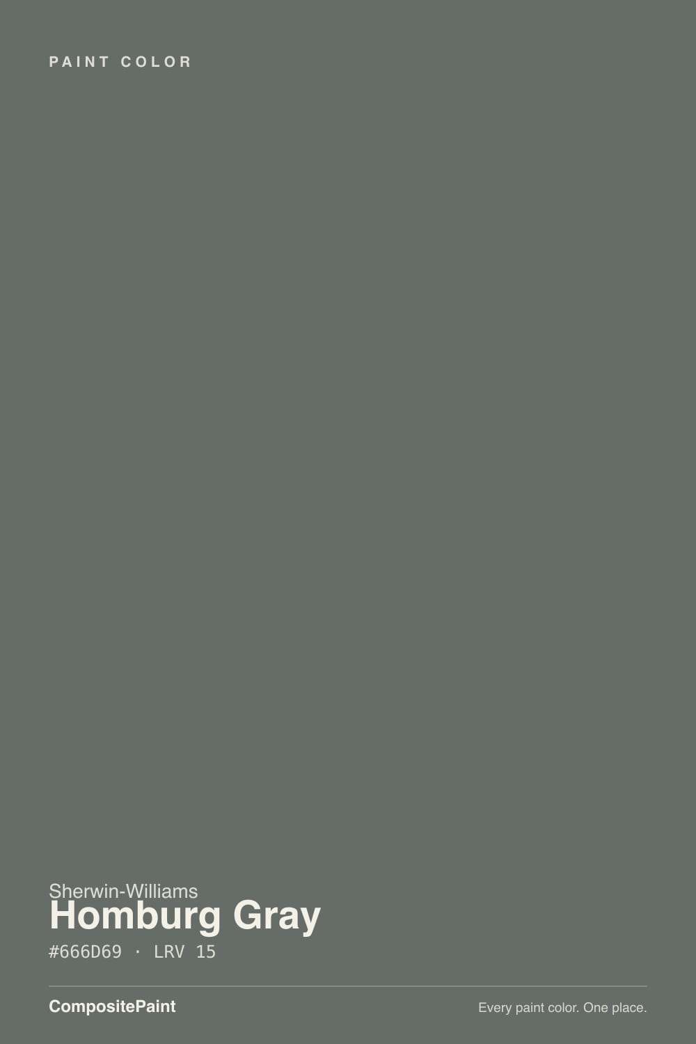
Homburg Gray
Sherwin-Williams' quietest deep blue-green, reviewed honestly: the light that turns it green, the light that turns it blue, and why it never became as famous as Peppercorn.

Jessica has spec'd whites and neutrals for more than 300 rooms and keeps a sample wall of painted drawdowns in her studio. Every color review is checked against real reader rooms in the comments and re-tested when a formula changes. About the testing process →
- 1Urbane Bronze8
- 2Homburg Gray15
- 3Retreat21
- 4Stardew43
The Fast Verdict
Homburg Gray is a deep, muted blue-green — not a plain dark gray with a hint of color. Sherwin-Williams classifies it in its own Blue Green hue family with a low chroma, which is the technical way of saying: quiet, but real, and it moves. At LRV 15 it sits in the same depth range as Peppercorn and Kendall Charcoal. It was Sherwin-Williams' Color of the Month for February 2023 — a real but modest claim to fame — and it has since settled into a workhorse role: front doors, kitchen islands, exterior trim. Strong sun pulls the green forward; shade, north light, and evening pull the blue forward. It never goes flat so much as it changes its mind — which is exactly why real owners argue over whether it's blue or green.
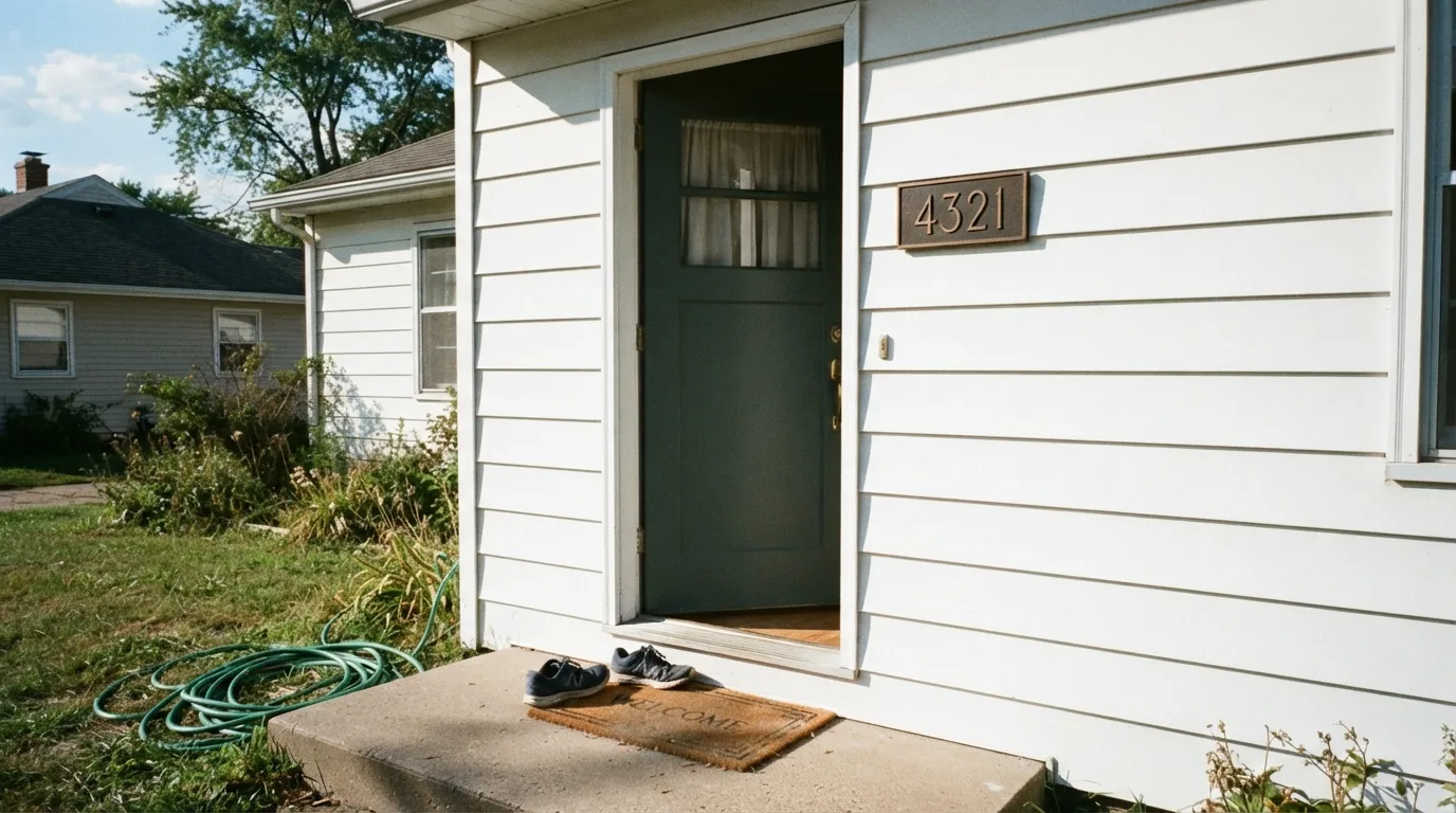
Front doors and shutters · kitchen islands and cabinets · exterior trim and garage doors · anyone who wants real depth without committing to true black
You want a genuinely neutral dark gray, not a color that shifts blue-green · your space has no real light source at all (windowless, one dim bulb) · your house is red brick · you're chasing a famous, viral color
- Genuine deep blue-green — more character than a flat charcoal
- Reads sophisticated on front doors, shutters, and exterior trim
- Anchors a kitchen island without committing to full black
- LRV 15 hides dirt, fingerprints, and weather grime between cleanings
- Pairs cleanly with white, black, and warm wood in the right light
- Genuinely near-black with no real light source at all — windowless rooms lose the color entirely
- Reads as blue or green depending on the light — no single settled undertone to plan around
- The blue-green base clashes with warm red brick unless it's a deliberate pairing
- Little brand marketing or forum history to check your instincts against
What Color Is Homburg Gray, Really?
A deep, muted color built on a genuine blue-green base, not a straightforward dark gray. Sherwin-Williams' own hue classification puts it in the Blue Green family with a low chroma — muted enough to read gray at a glance, but the color underneath is real and it moves. Sherwin-Williams' marketing calls it "an intriguing, dark gray with cyan undertones that shift with lighting," which is honest as far as it goes, but does not tell you the shift has a direction: bright, sun-hit surfaces pull the green forward, while north light, shade, and evening pull the blue forward and read cooler and moodier — not flat.
At LRV 15 it sits deep in the deck — darker than Chelsea Gray (LRV 22), close to Kendall Charcoal (LRV 13), and a shade lighter than Peppercorn (LRV 11). That depth is the whole point: it is built to anchor a single element — a door, an island, a run of exterior trim — not to fill four walls of a room and stay interesting. Sherwin-Williams named it Color of the Month for February 2023, a real distinction but a modest one; it never got a Color of the Year push, and reviewers who have used it call the coordinating options "limited" and warn it "may be too dark for some." This is a confident, narrow-purpose color, not an easy whole-house neutral.
Undertone in one line: blue-green, leaning greener in strong light and bluer in weak light — never warm, never a plain neutral gray. A real Houzz thread asking straight out "is it a blue or green?" sums up the color better than any marketing copy: with a real sample in real light, people genuinely can't agree, and that disagreement is the whole undertone story.
Where It Shines
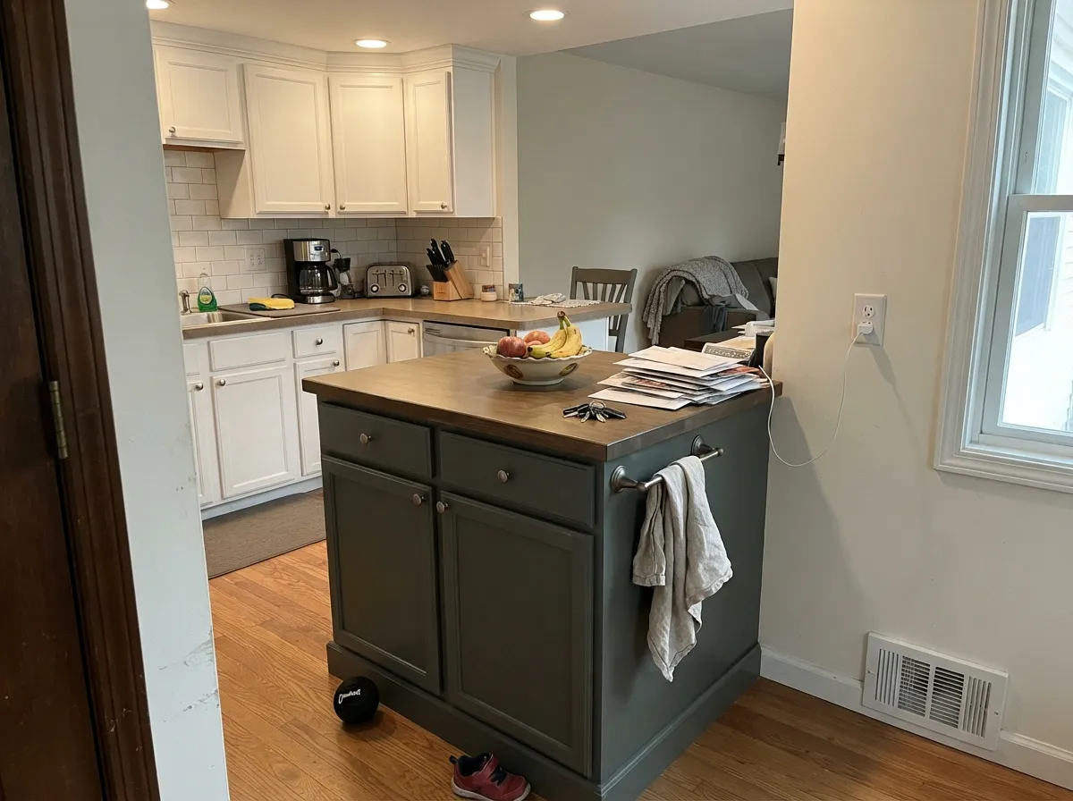
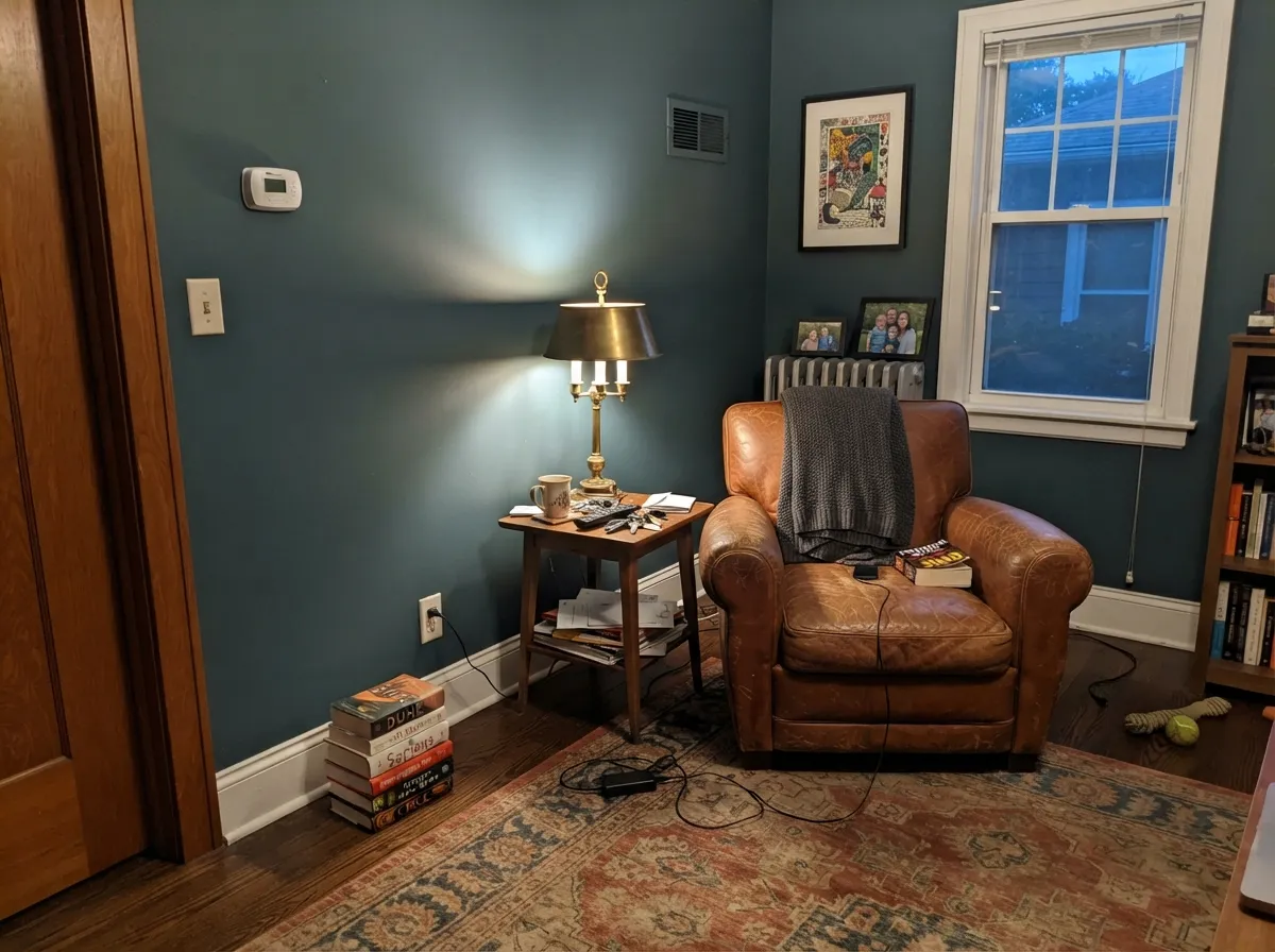
This is a color that rewards a specific light rather than needing maximum light. Direct sun on a front door pulls the green forward and reads as a considered slate-green; a north-facing kitchen island or a lamplit den pulls the blue forward and reads cooler and more polished, not duller. That directional shift is the trick — light does not just brighten this color, it decides which color you get. In doses — a door, an island, a den with lamps — it reads custom and deliberate rather than heavy.
Where It Fails
Almost every disappointing story with Homburg Gray traces back to one of three situations, and all three are predictable before the first coat. None of them are the paint's fault — but if your project matches one, sample it big before you commit a whole exterior or a whole room.
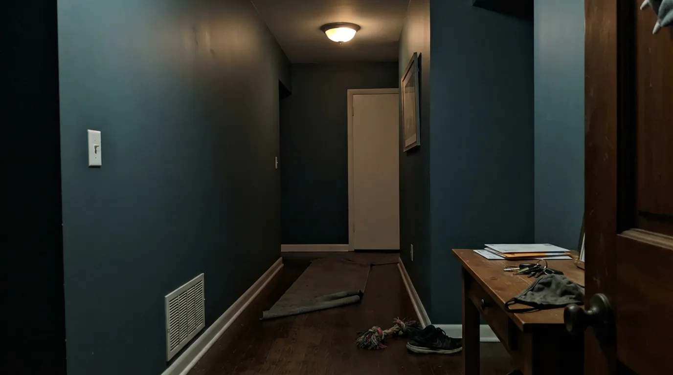
At LRV 15 this color needs some real light — daylight or a real lamp — to show its blue-green. A windowless hallway, an unlit stairwell, or a room running on one dim overhead fixture flattens it to plain near-black, and four walls of that is heavier and smaller-feeling than the chip promised. It's built to anchor one door, one island, one accent wall with light nearby — not carry a whole room that needed to feel open.
This is a real Blue Green family color, by Sherwin-Williams' own hue classification — not a charcoal with a whisper of tint. Owners genuinely argue over whether it reads blue or green; a whole Houzz thread exists just to ask. If you want an undertone-free dark neutral, this isn't it — try Peppercorn instead, which takes on whatever undertone the room gives it rather than bringing its own.
Blue-green sits close to opposite warm red on the color wheel, and against red brick that contrast is unmistakable. It isn't necessarily a mistake — Sherwin-Williams' own coordinating palette for this color includes a deep red, so the brand treats the pairing as a real design move, not an accident to avoid. What it doesn't survive is stumbling into it unplanned: sample it against your actual brick, in your actual light, before buying the gallon.
Room by Room
Deep enough to read as a real color decision, dark enough to hide pollen and weather grime between washes. Satin or semi-gloss. Pair with white or light-gray siding so the door has somewhere to stand out against.
Against white or Alabaster perimeter cabinets it anchors an open kitchen without going full black. Satin urethane-fortified cabinet enamel; brass or matte-black hardware both work.
A closed room with warm lamp light and leather or walnut furniture is where the color feels cocooning rather than heavy. Eggshell for durability where chairs and desks scuff the walls.
Best behind a headboard with warm lamps nearby, where it settles into a cozy teal-charcoal. Four full walls in a room that only gets overhead light will feel heavy and closed-in — keep it to one wall.
One vanity under a bright fixture, with brass or matte-black hardware, reads expensive without repainting the whole room. Skip it if the vanity sits in a windowless interior bath with a single dim fixture.
Full-body siding in Homburg Gray with a black roof and white trim is a real modern look. On a red-brick house, sample the pairing first — the green-versus-red contrast is either the whole point or the whole problem, and there is no middle ground.
Your Light Is the Risk
Full sun on a front door or exterior trim pulls the green forward — reads as a considered slate-green, not just "dark."
A windowless hallway, closet, or a room with just one dim overhead fixture flattens it toward plain near-black — the one situation where the color genuinely disappears rather than shifts.
This is where it gets interesting, not dull: indirect north daylight and shaded exteriors pull the blue forward, reading cooler and moodier. One owner comparing it for a north-facing island noted the "blue light cast" before ever picking up a brush.
Warm 2700K lamps mute the blue and settle it toward a soft charcoal-green. Cool white LEDs keep the blue-green edge but strip out the warmth entirely.
Most complaints about Homburg Gray are a light mismatch. Upload a photo of your actual room and see it on your walls — then ask for the same wall in north light or evening lamps before you buy a single sample.
Need It From Another Brand?
Any paint counter can custom-tint Sherwin-Williams SW 7622 directly. If you would rather stay in one brand's own deck, these are the closest stock matches, measured as ΔE2000. Under 2 is a difference you will not see on the wall.
| Brand | Closest color | ΔE | LRV | |
|---|---|---|---|---|
| Behr | Simple Silhouette790B-5 · Behr | 1.8 | 15 | Color page → |
| Benjamin Moore | Kitty Gray1589 · Benjamin Moore | 0.9 | 16 | Color page → |
| Valspar | Victorian TapestryV141-5 · Valspar | 1.5 | 15.3 | Color page → |
| PPG / Glidden | Gunmetal GrayPPG1033-6 · PPG / Glidden | 2.9 | 15 | Color page → |
| Glidden | ArmoryPPG1009-6 · Glidden | 3.1 | 15 | Color page → |
| Dutch Boy | Zinc-ed426-7DB · Dutch Boy | 0.0 | 15 | Color page → |
Similar Sherwin-Williams Colors
The nearest shades to Homburg Gray within Sherwin-Williams's own range, ranked by perceptual color distance — useful when you want the same look a touch lighter, darker, or warmer.
WCAG 2.1: AA is 4.5 : 1 for normal text, 3 : 1 for large text, AAA is 7 : 1.
Homburg Gray vs the Colors You're Also Considering
Every Homburg Gray sample board has the same rivals on it. The numbers show the real lightness gap — then it comes down to which risk you would rather live with.
Pick this if you want the color to genuinely change with the light instead of settling into one hue — Homburg Gray shifts blue-green, Pewter Green stays green.
Sherwin-Williams SW 6208 · LRV 12Pewter GreenPick this if you want the green settled and dominant instead of shifting — the SW deck's best cabinet sage, though it shares Homburg Gray's need for real light to look its best.
Pick this if you want the color to hold its own personality instead of borrowing the room's — Homburg Gray's blue-green stays put in good light.
Sherwin-Williams SW 7674 · LRV 11PeppercornPick this for a dark neutral that takes on whatever undertone your room gives it, with no blue-green of its own to manage.
Pick this if true black feels too heavy — same depth of statement, a lighter LRV, and a real blue-green undertone instead of none.
Sherwin-Williams SW 7069 · LRV 6Iron OrePick this for a genuine near-black with a cool, dead-neutral base — the closest the SW deck gets to true black without buying Tricorn.
Pick this for more depth and a real green cast instead of Chelsea Gray's warmer, browner charcoal.
Benjamin Moore HC-168 · LRV 22Chelsea GrayPick this if your painter works in Benjamin Moore and you want the same charcoal mood at a friendlier LRV 22 — easier to live with on four full walls.
Within Sherwin-Williams, Succulent SW 9650 at hex #616C64 and LRV 14 is a touch darker and greener. Night Out SW 9560, hex #656A6E at LRV 14, is the cooler blue-gray version, and Storm Warning SW 9555, hex #696863 at LRV 14, is the warmer, browner one. Rocky River SW 6215 at #5E706A shares the LRV of 15 but is the most clearly green of the set.
Across brands, Dutch Boy Zinc-ed 426-7DB is the same value at deltaE 0, and Benjamin Moore Kitty Gray 1589 at deltaE 0.92 and LRV 16 is effectively the same color. Valspar Victorian Tapestry V141-5 at 1.49 and Behr Simple Silhouette 790B-5 at 1.79 are visually identical in normal room light. Diamond Vogel Tornado Wind 0584 at 2.3, PPG Gunmetal Gray PPG1033-6 at 2.89, and Farrow and Ball Douter No. 318 at 2.95 are very close, so sample first. Clare Current Mood at 4.25 and Magnolia Home Wellington Green JG-66 at 4.59 are close but visibly different side by side.
Homburg Gray Coordinating Colors
Sherwin-Williams' own coordinating palette for Homburg Gray is telling: a matching muted green, a warm cream, a crisp warm white — and, notably, a deep red. That last pick confirms the brick caution above is about intention, not accident: the brand itself treats the complementary red-against-blue-green contrast as a real design move. It works in doses far better than as a whole-room color, so most of its best partners are the surfaces around it, not competing walls.
Color of the Month, Not Color of the Year
Homburg Gray's one real claim to fame is modest: Sherwin-Williams named it Color of the Month for February 2023. It never had a Color of the Year campaign behind it, and it shows in how little chatter follows it around compared to a Peppercorn or an Iron Ore. What forum discussion does exist is thin but genuine — a Houzz thread simply asking "is it a blue or green?" is closer to the real story than any before-and-after gallery would be. People who use this color mostly found it searching for a specific blue-green, not chasing a trend.
Read that as reassurance, not a warning: a deep, undertone-rich color with no hype cycle to fall out of is, if anything, a safer long-term bet than a color riding a moment. The tradeoff is practical, not aesthetic — fewer independent reviews and comparison photos to check your gut against before you buy the gallon, so lean harder on a real in-room sample than you would with a color everyone has already photographed.
Homburg Gray on Exteriors
This is the color's strongest use case. Reviewers who track exterior colors call it at home across modern, rustic, and classic elevations — a field color for a full house or a door-and-shutter accent, either way. On a front door, shutters, or a full run of exterior trim, the deeper LRV reads as intentional and current, and it hides pollen, dust, and weather streaking better than a lighter color would between washes. Paired with white or light-gray siding and a black roofline, it is a clean combination that does not depend on a Pinterest trend to still look right in five years.
The one real caution is brick. Blue-green sits close to opposite warm red on the color wheel, and against red brick that contrast is impossible to miss. Sherwin-Williams' own coordinating palette includes a deep red, which tells you the brand treats this as a legitimate style choice rather than a mistake — but a deliberate one, chosen with a real sample in hand, not stumbled into. Hold a sample against your actual brick, in your actual daylight, before ordering paint for the whole trim package.
Three Ready Palettes Built on Homburg Gray
A color is never alone on the wall. These are complete combinations in the 60-30-10 pattern, with the reason each one holds together. Every one opens in the visualizer.
Pure White siding gives the door somewhere to stand out. Iron Ore on the gutters and roofline adds one true near-black note so the green in the door reads as a color choice, not a mismatch with the metalwork.
Try this palette in your roomAlabaster perimeter cabinets keep the kitchen light and workable; the island carries all the depth. Agreeable Gray walls sit quietly between the two so the eye lands on the island, not the walls.
Try this palette in your roomTwo depths of dark neutral, separated by a crisp white trim, let the room read layered instead of just dark. This needs real lamp light — pair with warm 2700K fixtures, not a single overhead LED.
Try this palette in your roomHomburg Gray FAQ
Is Homburg Gray blue or green?
Officially, blue-green — Sherwin-Williams classifies it in its own Blue Green hue family, with a low chroma that keeps it muted. In real rooms it splits by light: strong sun pulls the green forward, north light, shade, and evening pull the blue forward. A well-known Houzz thread asks this exact question, and the honest answer is "both, depending on when you look."
Is it too dark for a whole room?
At LRV 15, four walls in a room that needed to feel open will feel smaller and heavier no matter which way the color leans that day. Its own marketing undersells this — the blue-green stays interesting, but the depth itself doesn't lighten up. It does best on one wall, a door, an island, or a well-lit den, not a whole room you wanted bright.
What's the difference between Homburg Gray and Peppercorn?
Peppercorn (SW 7674, LRV 11) is a more neutral dark gray that leans on whatever undertone the room gives it. Homburg Gray (LRV 15) carries its own green undertone that shows up in good light regardless of the room around it.
Does it work on kitchen cabinets?
Yes, especially as an island color against white or Alabaster perimeter cabinets. Use a satin, urethane-fortified cabinet enamel — the same finish logic as any dark cabinet color.
What white trim pairs best with Homburg Gray?
Pure White or Extra White for a crisp, modern edge; Alabaster if you want the trim slightly softer. Avoid a warm cream trim — it fights the green instead of framing it.
Is it good for a front door or exterior?
Yes — it's one of its strongest uses, working across modern, rustic, and classic exteriors alike, as a field color or a door/shutter accent. It reads deep and deliberate against white or light-gray siding and pairs well with black roofing and gutters. The one exception is red brick, where the blue-green undertone creates a real complementary contrast — Sherwin-Williams' own coordinating palette even includes a deep red, so the pairing is a real style option, not just a risk, but sample it against your actual brick first.
Have you painted with Homburg Gray?
Rate it — one tap helps the next reader decide.
Ask a Question