Urbane Bronze
The 2021 Color of the Year, reviewed honestly: where the bronze warmth actually shows up, the rooms where it turns flat black, and what to paint instead.

Jessica has spec'd whites and neutrals for more than 300 rooms and keeps a sample wall of painted drawdowns in her studio. Every color review is checked against real reader rooms in the comments and re-tested when a formula changes. About the testing process →

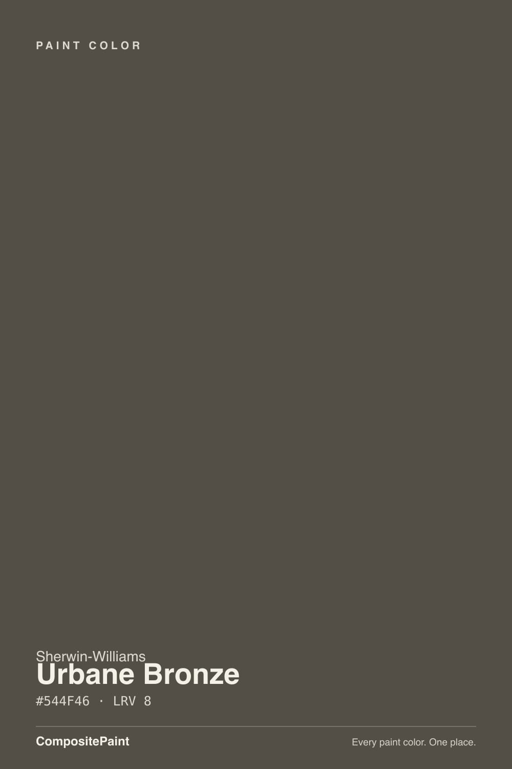
- 1Urbane Bronze8
- 2Kendall Charcoal15
- 3Retreat21
The Fast Verdict
Urbane Bronze is the dark color people pick when black feels too hard. There is real brown-bronze warmth in it, and in daylight it is genuinely beautiful — soft, deep, expensive-looking.
But it only pays that warmth out when light hits it. In a dim north room, or after sunset under cool LED bulbs, it collapses into a flat near-black and you lose the exact quality you paid for.
Accent walls and studies with real daylight · kitchen islands and lower cabinets · front doors on almost any siding · modern and craftsman exterior bodies
The room is small, north-facing and dim · your floors are orange honey oak · you want a true cold near-black · you will not add lamps and layered light
- Warm enough to avoid the cold, hard look of true black
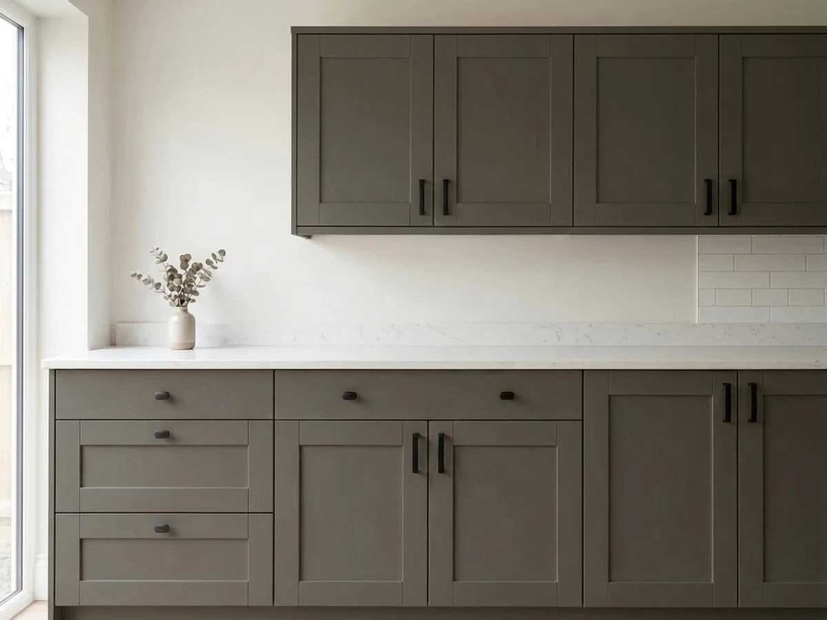
- Hides fingerprints, water spots and scuffs on cabinets and doors
- Works indoors and outdoors from the same can of color
- Pairs with warm wood, brass and aged bronze without fighting them
- A front door color that suits brick, stone, white and gray siding alike
- Loses all its warmth in north light and reads flat black
- Can flash olive-green under weak light or over orange oak floors
- At LRV 8 it makes a small dim room noticeably darker, not moodier
- Touch-ups mixed in the wrong base dry visibly washed out
What Color Is Urbane Bronze, Really?
A very dark warm neutral that sits in the yellow-red family — technically a dark yellow with the color drained almost all the way out. That last part is the part nobody warns you about. When a yellow-based color is this low in saturation, it does not simply look brown; it can swing greenish or olive depending on what light it gets and what sits next to it. Most of the time you see bronze. Sometimes, under low light or bouncing off warm wood, you see a soft olive-charcoal instead. Both are the same paint.
At LRV 8 it reflects almost nothing. Put it beside Tricorn Black (SW 6258) at LRV 3 and you will finally see the brown — Urbane Bronze looks soft and slightly warm, Tricorn looks like a hole in the wall. Put it beside Peppercorn (SW 7674) at LRV 11 and the gap runs the other way: Peppercorn still reads as dark gray on a wall, while Urbane Bronze reads as almost-black. That three-point difference is small on paper and enormous in a room.
Undertone in one line: warm bronze-brown over a yellow base — never blue, never purple, but capable of flashing olive in weak light.
Where It Shines
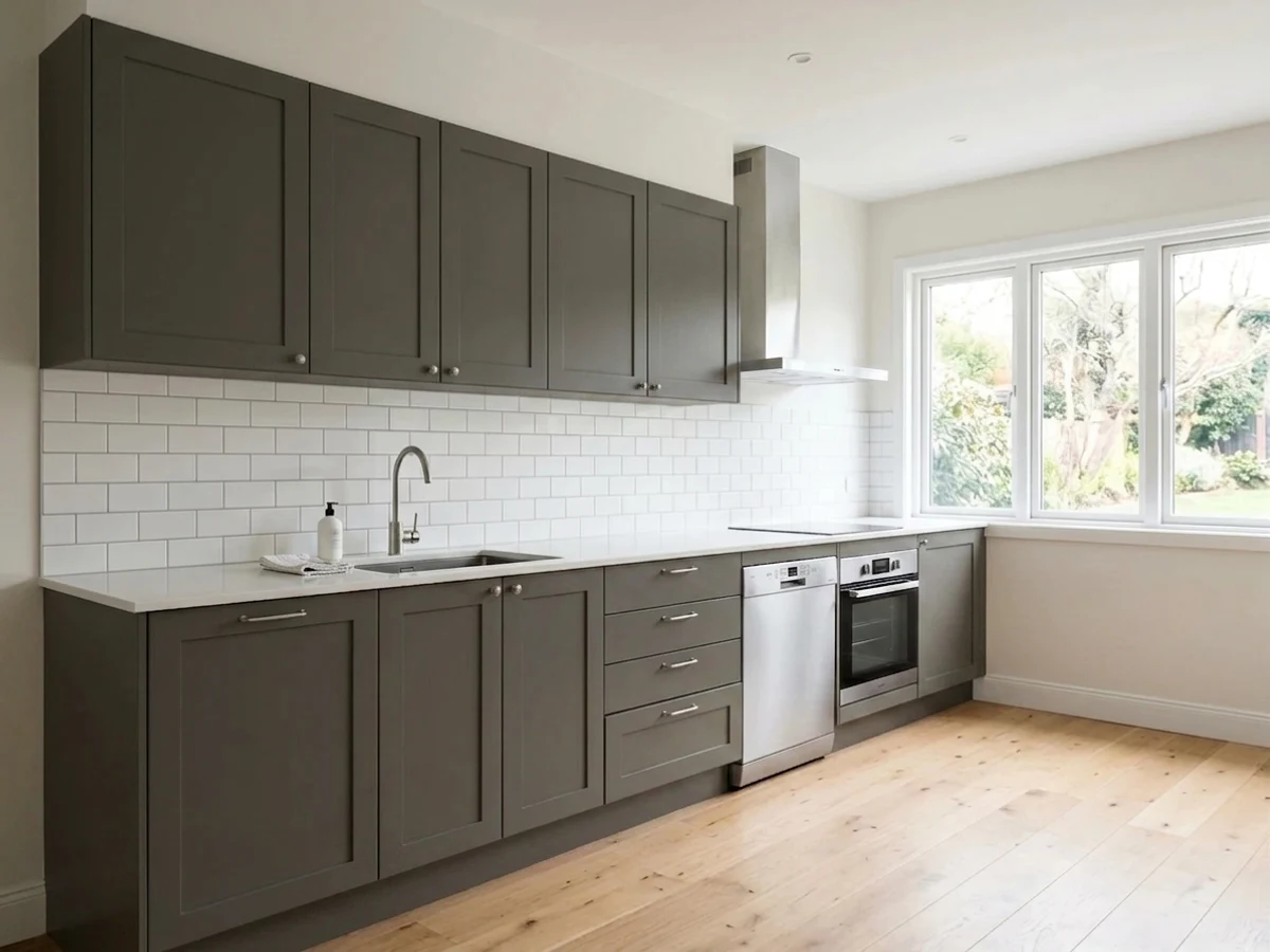
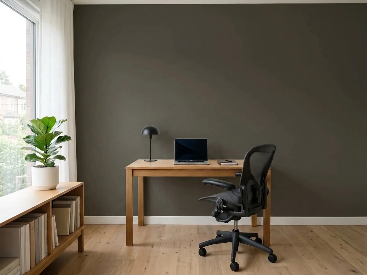
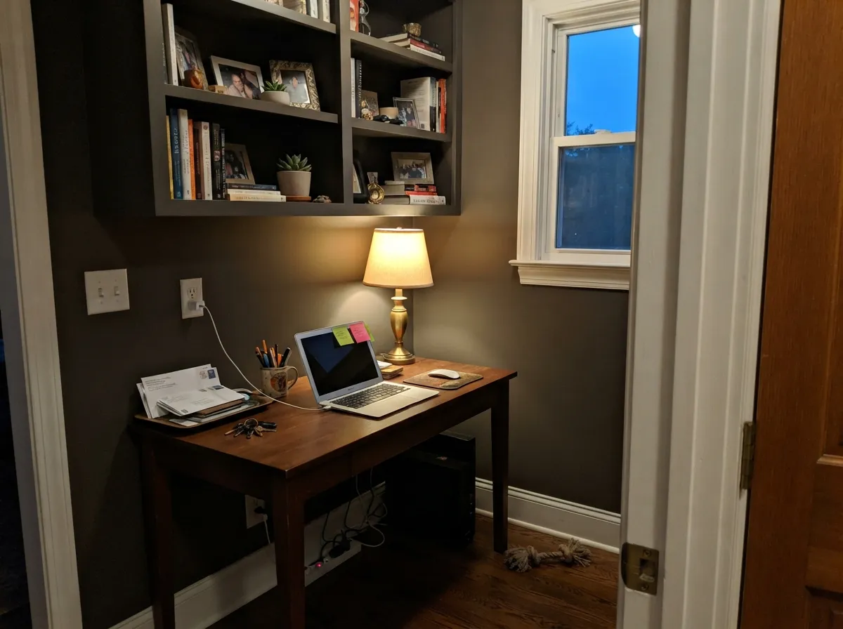
Give it a window and it earns every bit of its reputation. A study or a den with real daylight, a kitchen island under pendants, a front door in afternoon sun — those are the places the bronze actually surfaces and the color stops looking like generic dark paint.
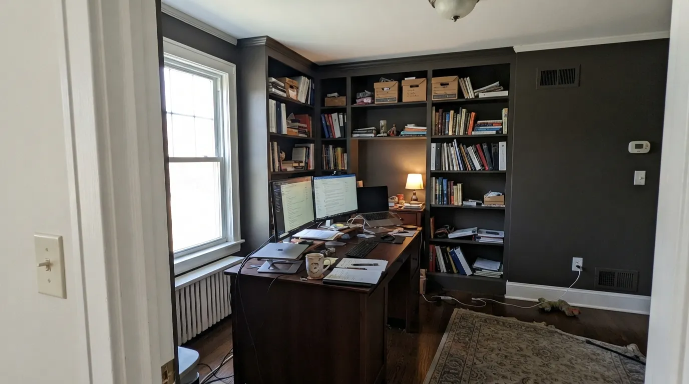
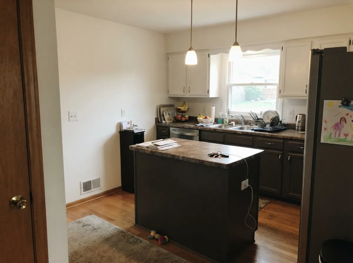
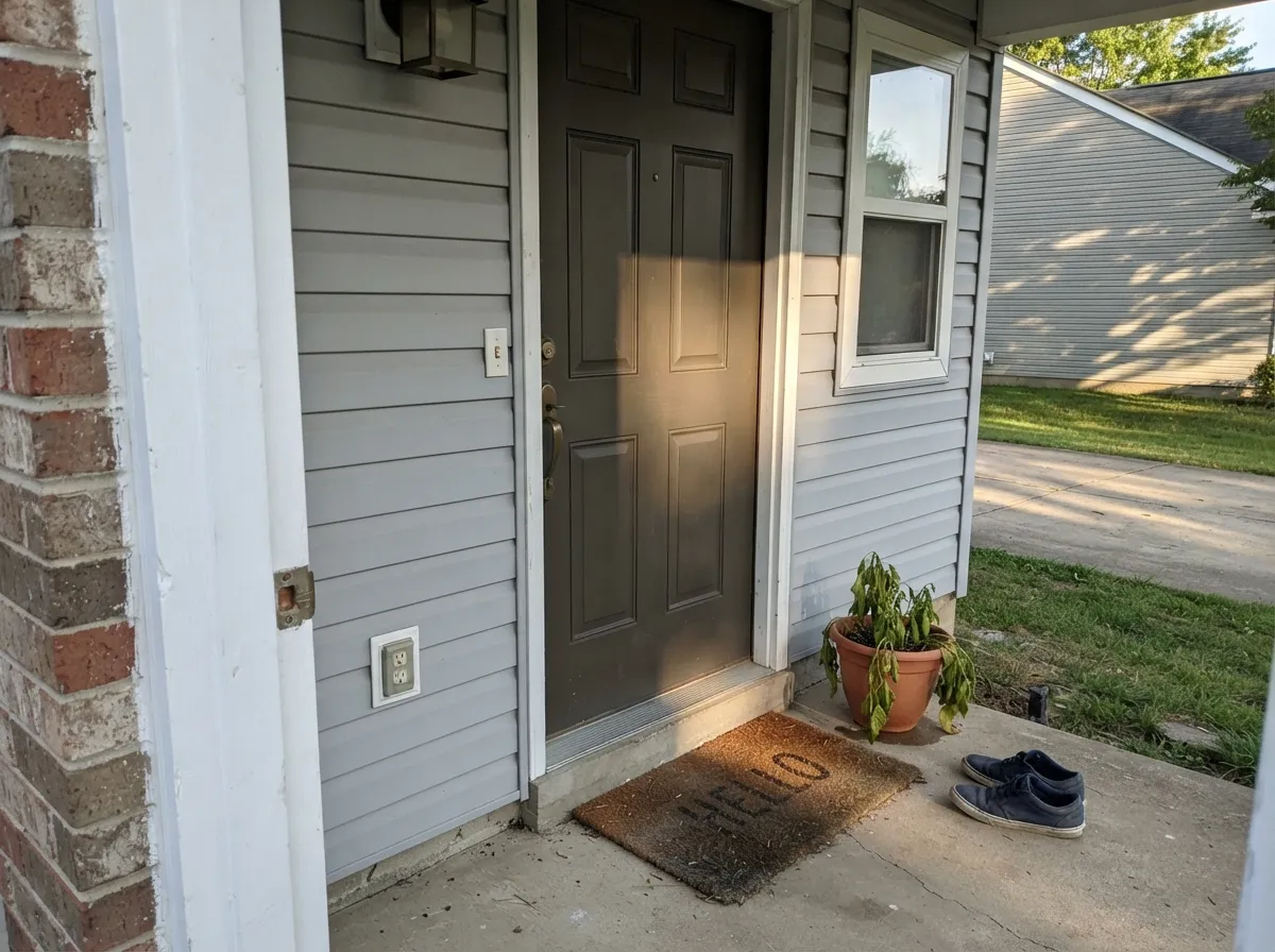
Where It Fails
The complaints about this color are remarkably consistent, and none of them are about quality. They are about three situations where the warmth simply never shows up. If your room is one of them, no second coat and no sheen change will rescue it.
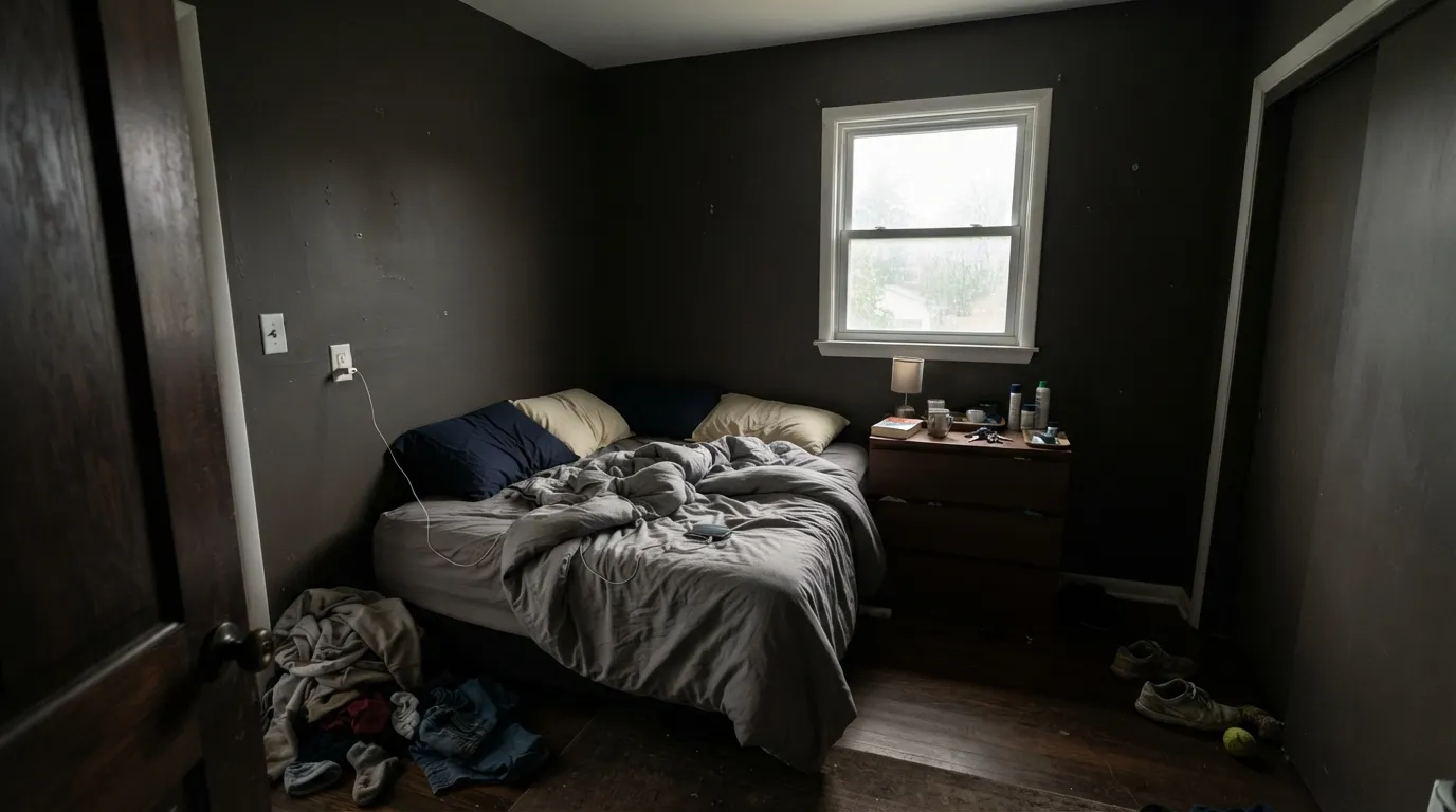
North light is cool and indirect all day. It strips the bronze out completely and leaves a flat, heavy near-black that eats the corners of the room. This is the single most common regret story with this color. If you want dark but still want to read the wall as a color, use Peppercorn (SW 7674) at LRV 11, or step to Porpoise (SW 7047) at LRV 13 for the same family with room to breathe.
Warm wood bounces yellow light up the wall, and yellow landing on a low-chroma yellow-based color pushes it toward olive. People describe it as looking muddy or slightly green, and they blame the paint. Sample it above the actual floor before you commit. If it goes olive on you, Iron Ore (SW 7069) is the neutral fix — same drama, no brown, no green.
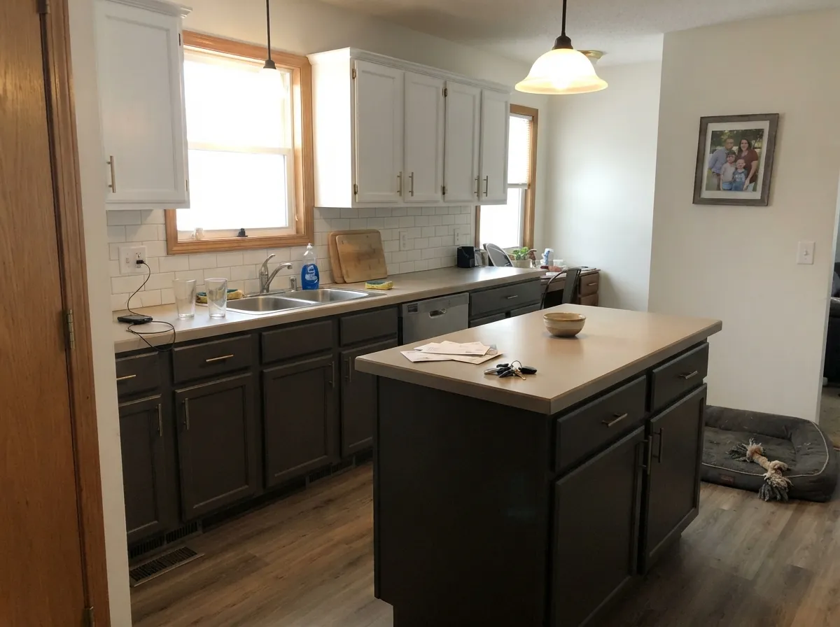
It hides fingerprints beautifully, which is why people want it everywhere. But full-height dark cabinets in a small kitchen close the room in fast, and the warmth disappears into the shadow under the wall cabinets. Keep it on the island and lowers with light uppers, or if you want one color on all of it, drop to Dovetail (SW 7018) at LRV 26.
Room by Room
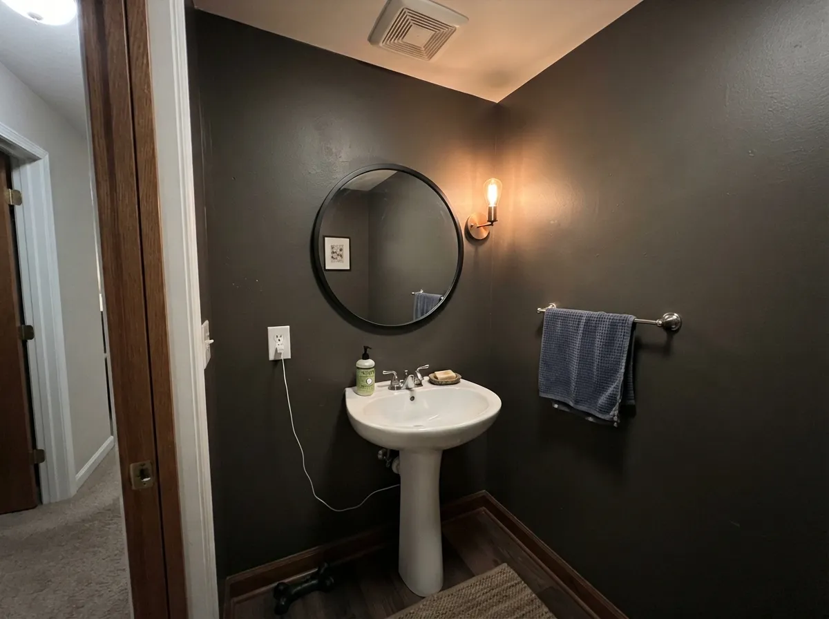
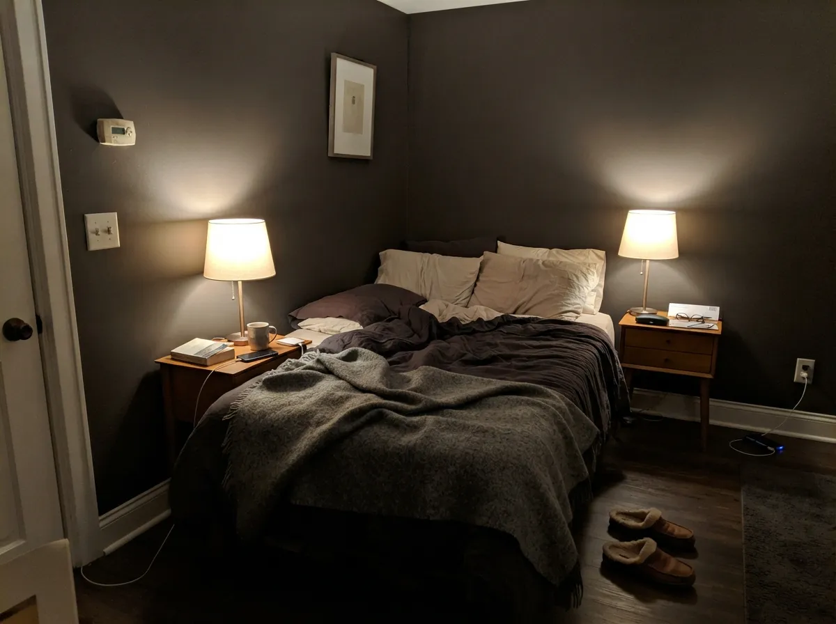
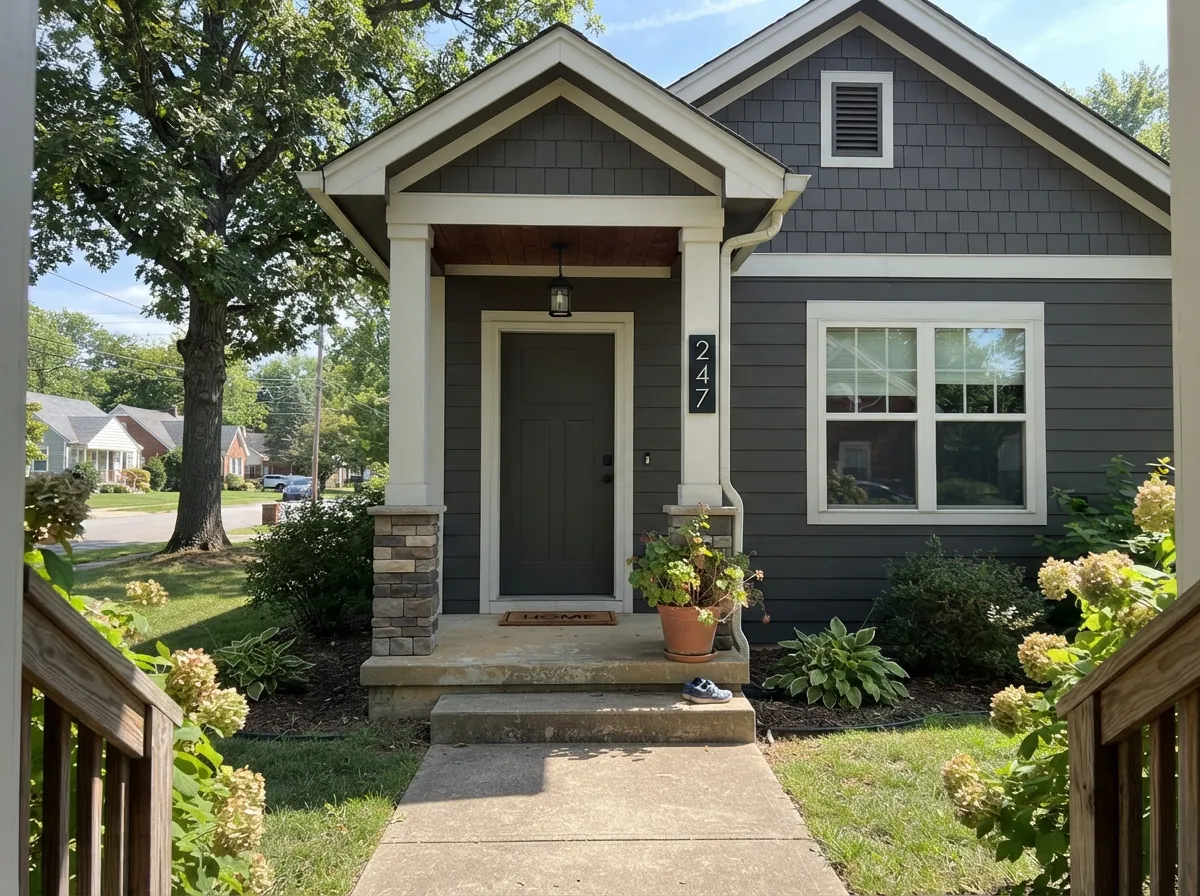
Your Light Is the Risk
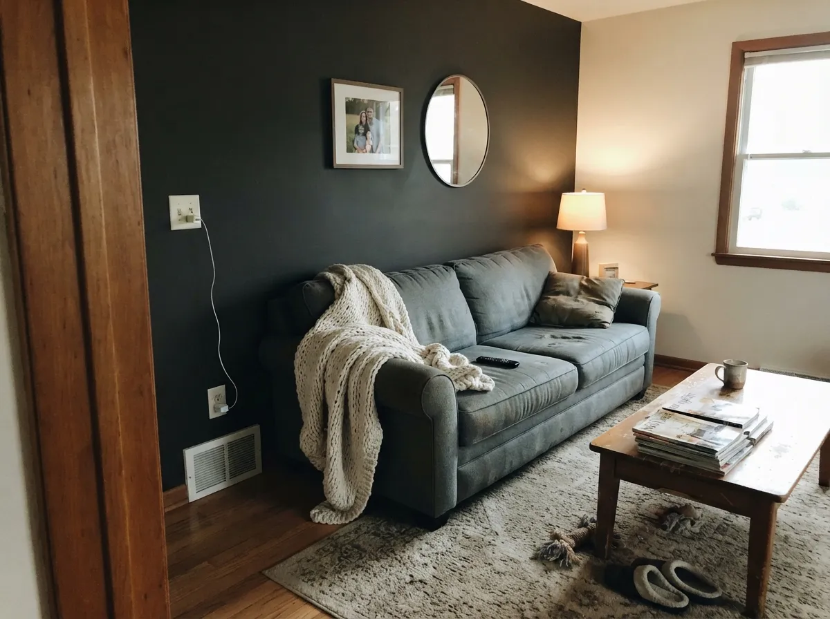
Direct sun pulls the bronze and brown right out. This is the color you were sold.
Cool indirect light kills the warmth. Flat near-black all day. Test before you buy.
Rich and bronzy at the sun hours, plain dark charcoal the rest of the day.
2700K keeps it warm. Cool 4000K LEDs strip it out and can push it olive.
Most complaints about Urbane Bronze are a light mismatch. Upload a photo of your actual room and see it on your walls — then ask for the same wall in north light or evening lamps before you buy a single sample.
Need It From Another Brand?
Any paint counter can custom-tint Sherwin-Williams SW 7048 directly. If you would rather stay in one brand's own deck, these are the closest stock matches, measured as ΔE2000. Under 2 is a difference you will not see on the wall.
| Brand | Closest color | ΔE | LRV | |
|---|---|---|---|---|
| Behr | Berry BrownPPU24-02 · Behr | 2.1 | 8 | Color page → |
| Benjamin Moore | Dragon's Breath1547 · Benjamin Moore | 0.7 | 9 | Color page → |
| Valspar | Semi-Sweet4003-2C · Valspar | 1.7 | 8.6 | Color page → |
| PPG / Glidden | LicoricePPG1009-7 · PPG / Glidden | 3.4 | 8 | Color page → |
| Glidden | Burnt Bark30YY 08/082 · Glidden | 3.0 | 8 | Color page → |
| Dutch Boy | Ironside422-7DB · Dutch Boy | 3.2 | 9 | Color page → |
Similar Sherwin-Williams Colors
The nearest shades to Urbane Bronze within Sherwin-Williams's own range, ranked by perceptual color distance — useful when you want the same look a touch lighter, darker, or warmer.
WCAG 2.1: AA is 4.5 : 1 for normal text, 3 : 1 for large text, AAA is 7 : 1.
Urbane Bronze vs the Colors You're Also Considering
Every Urbane Bronze sample board has the same rivals on it. The numbers show the real lightness gap — then it comes down to which risk you would rather live with.
Pick this for warmth — browner, bronzier, softer than a straight charcoal.
Sherwin-Williams SW 7069 · LRV 6Iron OrePick this for a clean cool near-black with no brown in it.
Side-by-side comparison →Pick this for maximum depth, when almost-black is the goal.
Sherwin-Williams SW 7674 · LRV 11PeppercornPick this if you still want the wall to read as gray.
Side-by-side comparison →The closest comparison people make is Iron Ore (SW 7069), LRV 6. Iron Ore is a touch darker and reads as a cooler, more neutral charcoal, with none of the brown warmth. If you want the moody-dark look but with a slightly bronzy, softer feel, choose Urbane Bronze; if you want a cleaner near-black, choose Iron Ore.
Enduring Bronze (SW 7055), LRV 7, is a sibling in the same family. It is marginally deeper and browner, so it can feel a little more like a dark chocolate than a charcoal.
Peppercorn (SW 7674), LRV 11, is lighter and more of a true gray. It shows more as a distinct dark gray on the wall, while Urbane Bronze collapses closer to black. For a bedroom where you still want to read the color as gray, Peppercorn is safer; for maximum depth and warmth, Urbane Bronze wins.
Urbane Bronze Coordinating Colors
Because the warmth in Urbane Bronze is quiet, the colors around it decide which version of it you see. Warm off-whites and soft greiges let the bronze come forward. Cool blue-whites and gray-blue stone push it toward flat brown. These are the partners that work reliably in real homes:
Urbane Bronze on Exteriors
Outside is where this color is easiest to get right. Full sun gives it exactly what it needs, so the bronze reads clearly on siding instead of hiding the way it does indoors, and the whole house looks warmer and less severe than the black-and-white farmhouse look it replaced. It holds up well too — dark exteriors do fade over years, but with a quality UV-resistant exterior paint the first year shows no visible change and no chalking.
Two practical notes. First, confirm the can says Ultradeep base; deep colors mixed in a lighter base dry washed out, and on a facade you cannot hide that. Second, walk the house before you commit — the shaded north elevation will read a full step darker and cooler than the sunny south side, and people are often surprised by how different the two look on the same day.
For trim, a soft white keeps the contrast from looking cut out; for windows and gutters, going darker than the body with Tricorn Black is a cleaner look than trying to match. A saturated door color reads well against it because the body itself is so quiet.
Urbane Bronze With Wood Tones and Floors
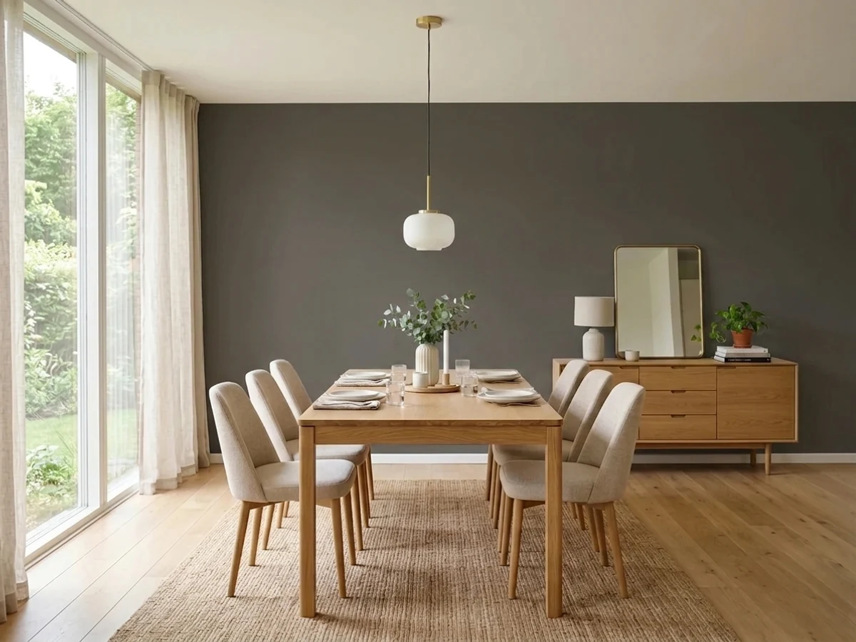
This is the pairing that decides whether you love the color or feel tricked by it. Walnut, white oak, and anything with a neutral or gray-brown cast sit beautifully against Urbane Bronze — the wood grain reads richer and the wall stays bronze. Warm metals help too: brass, aged bronze and unlacquered copper all belong in the same room as this color.
The problem child is orange-leaning honey oak, whether that is 1990s flooring, a stair rail, or oak cabinets you are keeping. That wood throws yellow light onto the wall, and on a yellow-based color with the saturation pulled out, the result is an olive-ish cast people describe as muddy. It is not a defect, it is reflection, and it will not sand out with a second coat. Tape a large sample board directly above the floor and look at it at four in the afternoon before you order paint.
With gray-washed LVP or cool gray tile you get the opposite effect: the floor makes Urbane Bronze look distinctly brown. That can be lovely if brown is what you wanted and jarring if you were expecting charcoal. Iron Ore (SW 7069) is the swap in that situation.
Three Ready Palettes Built on Urbane Bronze
A color is never alone on the wall. These are complete combinations in the 60-30-10 pattern, with the reason each one holds together. Every one opens in the visualizer.
Alabaster at LRV 82 is warm enough that the contrast reads soft instead of cut with a knife, which is what keeps a dark room from feeling harsh. Evergreen Fog shares the same muted earthy base, so the shelves add a color note without turning into decoration.
Try this palette in your roomDark on the bottom and light on top keeps the eye level bright, which is the whole reason tuxedo kitchens work in normal-sized rooms. Accessible Beige at LRV 58 sits between the two so the wall never looks like a third argument.
Try this palette in your roomSnowbound is a hair cooler than Alabaster, which keeps white trim from looking dingy against a dark body in full sun. Naval is deep enough to hold its own as the door without competing for attention with the siding.
Try this palette in your roomUrbane Bronze FAQ
Does Urbane Bronze look green?
Sometimes, yes. It is built on a yellow base with almost no saturation left, and when light is weak or a warm oak floor bounces yellow up the wall, that base can surface as olive. In good daylight it reads brown-bronze as advertised. Sample it in the actual room, at night as well as midday.
Is Urbane Bronze basically black?
In most rooms it looks close, but it is not. At LRV 8 it sits a step above Iron Ore (SW 7069, LRV 6) and well above Tricorn Black (SW 6258, LRV 3). If you want a true solid black effect on a door or cabinet, this will disappoint you — it will always look slightly soft and slightly brown up close.
Urbane Bronze or Iron Ore for an exterior?
Urbane Bronze if you want the house to feel warm and a little bronze in the sun. Iron Ore if you want unmistakable dark charcoal with nothing brown in it. Iron Ore is the safer pick when the siding sits next to cool gray stone or a blue-gray roof, because Urbane Bronze's warmth will fight it.
Can I paint a whole small room in it?
Only if you actually want the room to feel enclosed — a powder room, a study, a media room. It will not feel cozy in a small north-facing bedroom; it will feel dim. Plan lamps at two heights and warm 2700K bulbs before you open the can.
What white trim goes with Urbane Bronze?
Alabaster (SW 7008) at LRV 82 is the standard answer because its softness matches the bronze warmth. Pure White (SW 7005) gives a crisper line if you want the contrast sharper. Avoid a cool blue-white — it makes Urbane Bronze look muddy brown by comparison.
Why does my touch-up look faded next to the wall?
Almost always the base. A color this deep has to be mixed in Ultradeep base, and if the store loads it into a light or medium base it dries lighter and chalky-looking. Check the base printed on the can lid, and keep a labeled quart from the original batch for repairs.
How many coats does it take?
Two over a tinted gray primer, always. Going straight over white drywall or old builder beige, expect a patchy third coat and roller-lap streaks in raking light. Ask for the primer tinted to about 75 percent of the color — it saves a full gallon on a big room.
Have you painted with Urbane Bronze?
Rate it — one tap helps the next reader decide.
Ask a Question