Sherwin-Williams Iron OrevsSherwin-Williams Urbane Bronze
Two ways to get black without painting black. Iron Ore is clean and slightly steely with no brown in it at all; Urbane Bronze carries real warmth, but only when there is light to pay it out.

Built from our full reviews of both colors — same measured data, same real-room photos. About the testing process →
The Numbers
LRV is essentially equal (6 vs 8) — both reflect light the same.
The Real Difference on a Wall
Put a board of each side by side and the difference is instant. Iron Ore looks scrubbed. There is no brown anywhere in it, just the faintest cool blue lean, which is what keeps it from ever going muddy. Urbane Bronze looks soft next to it, because it sits in the yellow-brown family with almost all the color drained out. In direct sun that leftover bronze comes forward and the wall looks deep and expensive. In the same room after dark, under a cool bulb, most of that warmth is simply gone.
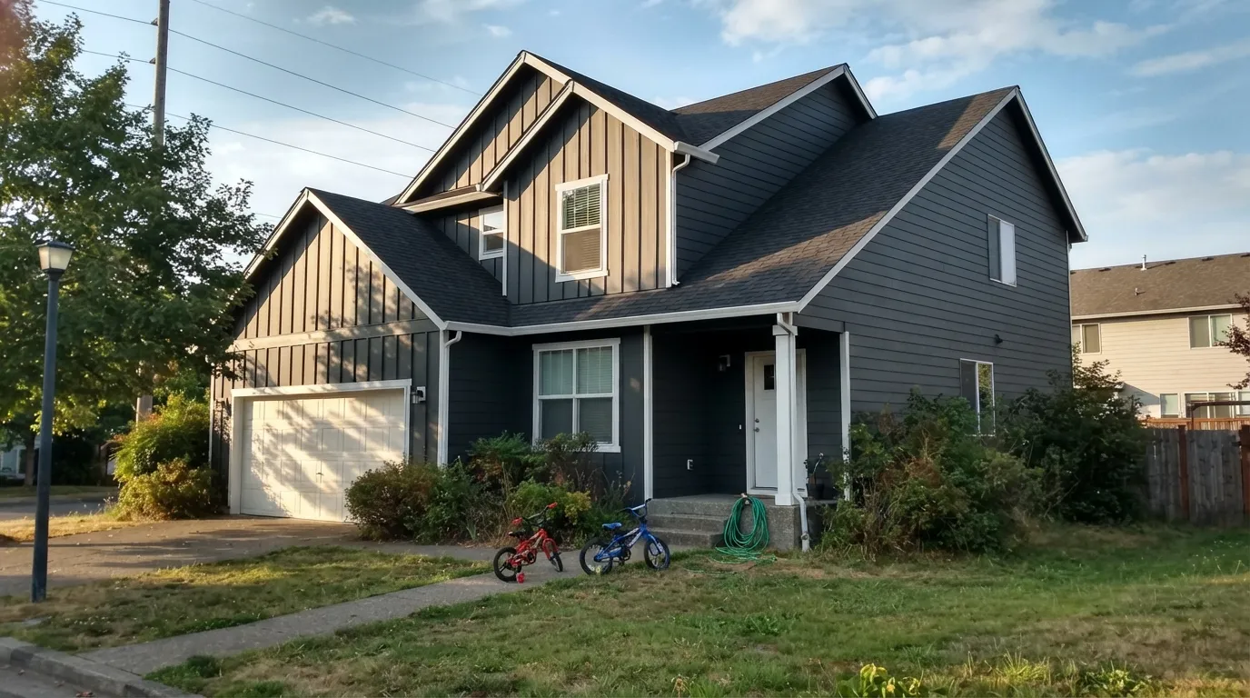
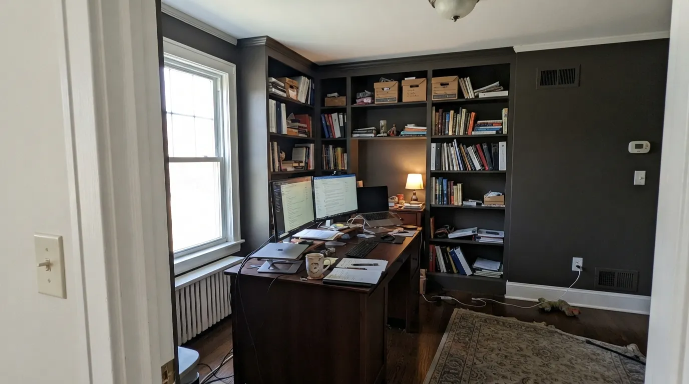
The way each one misbehaves is different too. Iron Ore is so close to neutral that it has almost nothing of its own to show, so it borrows. Over a lawn it picks up bronze-green, under open sky it goes navy, under a warm lamp it turns inky. Same gallon, two elevations, two colors. Urbane Bronze has its own color but needs light to hand it over. In a dim north-facing room, or over honey-oak floors bouncing yellow up the wall, it can turn a flat near-black with an olive cast, and people describe it as muddy.
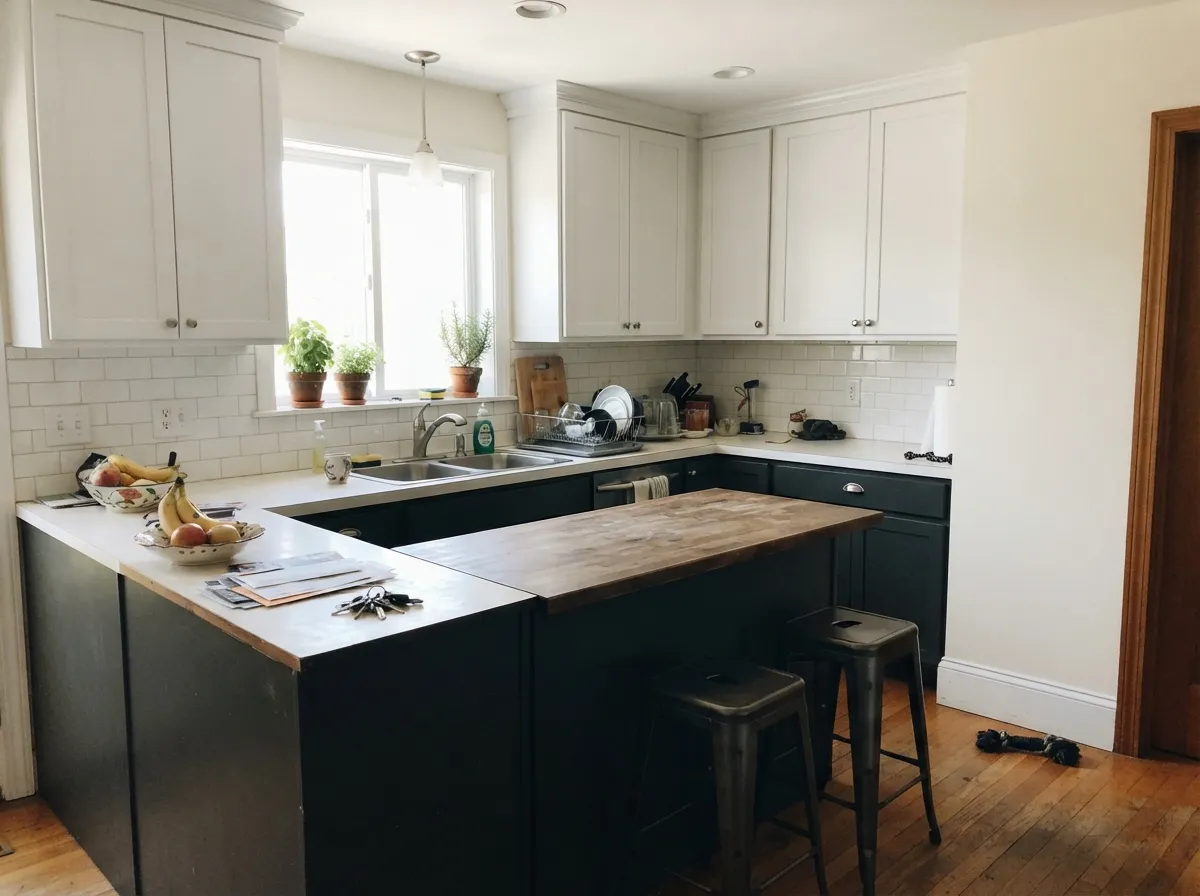
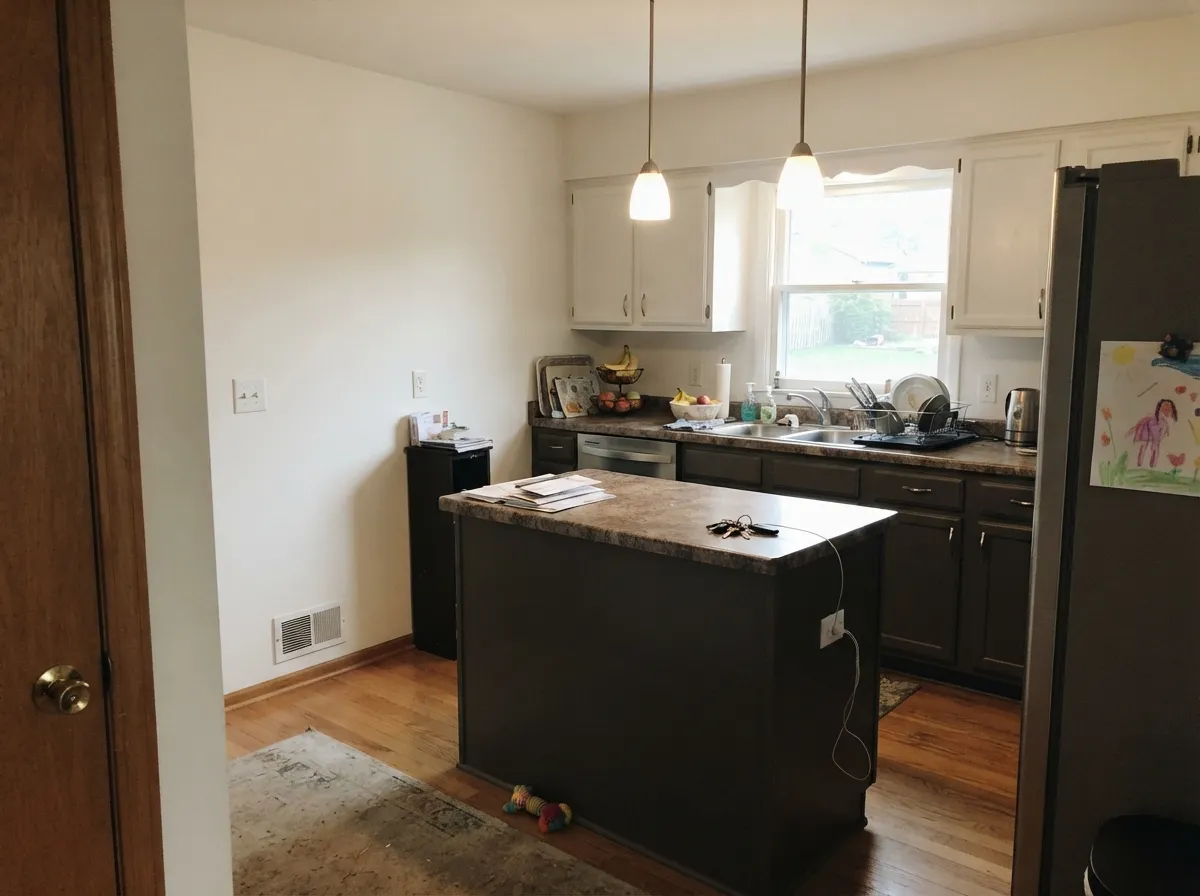
Depth is the last piece. Iron Ore is a step darker, and that shows up on a facade: it reads black from the street while Urbane Bronze still reads as a dark warm brown-gray. Indoors the difference is smaller than the paint chips suggest, because both eat most of the light in the room. What matters more indoors is the company they keep. Iron Ore looks deliberate with white trim, matte black hardware and cool quartz. Urbane Bronze looks right with brass, walnut, leather and warm stone, and it hides fingerprints on cabinets better than almost anything else.
Urbane Bronze is the flasher: weak light, 4000K LEDs, or yellow bounce off orange oak floors pushes it olive-green. Iron Ore does not flash so much as borrow — bronze-green over grass, navy under an open sky — so the sunny side and the shaded side of the same house can honestly disagree about what color it is.
What Each Color Really Is
It is a near-black charcoal that is only barely a color at all. Saturation sits at 7 percent — a hair away from pure gray — with the hue at 210 degrees, which is the blue part of the wheel. That means you will almost never look at an Iron Ore wall and think "blue." What you notice instead is what is missing: there is no brown in it. Put it beside a warm charcoal and Iron Ore looks scrubbed clean and a little steely. This is also why people argue about it online — one person swears theirs went green, the next swears theirs went navy. Both are right. A color this close to neutral has almost nothing of its own to show, so it borrows from whatever is bouncing into it: a lawn pushes it green, a bright sky pushes it navy, a warm bulb pushes it soft and inky.
LRV 6 means it reflects about six percent of the light that hits it and absorbs the rest. The useful comparison is Tricorn Black (SW 6258) at LRV 3. Three points sounds like nothing; on a wall it is the whole difference. Tricorn is a flat hole in the room — light goes in and nothing comes back. Iron Ore keeps just enough reflectance that in a sunbeam or under a picture light you can still see it is charcoal, with the edges of trim and panel molding readable instead of dissolved. It is black with dimension left in it, which is exactly why it beat every other black on cabinets and facades.
A very dark warm neutral that sits in the yellow-red family — technically a dark yellow with the color drained almost all the way out. That last part is the part nobody warns you about. When a yellow-based color is this low in saturation, it does not simply look brown; it can swing greenish or olive depending on what light it gets and what sits next to it. Most of the time you see bronze. Sometimes, under low light or bouncing off warm wood, you see a soft olive-charcoal instead. Both are the same paint.
At LRV 8 it reflects almost nothing. Put it beside Tricorn Black (SW 6258) at LRV 3 and you will finally see the brown — Urbane Bronze looks soft and slightly warm, Tricorn looks like a hole in the wall. Put it beside Peppercorn (SW 7674) at LRV 11 and the gap runs the other way: Peppercorn still reads as dark gray on a wall, while Urbane Bronze reads as almost-black. That three-point difference is small on paper and enormous in a room.
Specs Side by Side
| Spec | Iron Ore | Urbane Bronze |
|---|---|---|
| Brand | Sherwin-Williams | Sherwin-Williams |
| SKU | SW 7069 | SW 7048 |
| Hex | #434341 | #54504A |
| RGB | 67, 67, 65 | 84, 80, 74 |
| LRV | 6 | 8 |
| Undertone | true neutral | red-orange / warm |
| Family | Black | Gray |
How Light Changes Them
Cool weak light kills the charcoal and it reads flat black. Fine on cabinets, heavy on walls.
Strong light lifts it to a real dark charcoal — this is where you see it as a color, not a void.
2700K bulbs soften it into an inky soft black. It genuinely looks better at night.
Sky and lawn bounce straight into it. Expect the shaded side and the sunny side to disagree.
Direct sun pulls the bronze and brown right out. This is the color you were sold.
Cool indirect light kills the warmth. Flat near-black all day. Test before you buy.
Rich and bronzy at the sun hours, plain dark charcoal the rest of the day.
2700K keeps it warm. Cool 4000K LEDs strip it out and can push it olive.
Both Colors in Real Rooms
Photos from our full reviews — the same rooms and captions, so you can judge each color where it actually lives, not on a chip.
When to Pick Which
Choose Iron Ore if you want it to read black from the street and stay clean up close, or if your fixed finishes are cool. It is the stronger whole-exterior color of the two, and it holds panel and trim detail instead of dissolving into a hole. Skip it if your windows, gutters or roof are already true black, because beside real black it looks like faded gray siding.
Choose Urbane Bronze if black feels too hard and your materials are warm — brass, oak, walnut, brick, warm stone. It is the better front door on almost any siding and the better island in a kitchen with warm counters. Skip it if the room is small, dim and north-facing, because you will pay for warmth you never get to see.
No comparison page can see your light. Upload one photo of your room and try both colors on the same walls, seconds apart.
Iron Ore vs Urbane Bronze FAQ
Which one survives a north-facing study?
Iron Ore, because it is not promising you warmth in the first place — you already accepted it as a near-black and cool north light does not take anything away. Urbane Bronze in that room loses the bronze entirely and becomes a flat heavy black, which is the most common regret story with it. If you want to still read the wall as a color in a dim room, use Peppercorn SW 7674 instead of either.
Which is better on kitchen cabinets or an island?
Both are proven, and the choice is set by your counters and metals. Urbane Bronze with warm quartz, butcher block and brass; Iron Ore with white or cool quartz, marble and matte black. Urbane Bronze hides fingerprints and water spots slightly better; Iron Ore keeps crisper edges on shaker detail. In a small kitchen keep either to the island and lowers, with light uppers.
Which one is the better whole-exterior color?
Iron Ore, and it is not close. Siding, shutters, gutters, garage and door can all be the one color and the house looks designed. Urbane Bronze works on a body too, but the shaded elevation over greenery is where it drifts olive. Neither belongs on vinyl siding — both are too dark and will hold heat.
My windows are factory black. Which one goes next to them?
Urbane Bronze. It is clearly a different, warmer color, so the contrast reads as a choice. Iron Ore beside true-black frames stops looking black and starts looking like washed-out gray siding, and it is worst in flat morning light. If you want the whole envelope to agree instead, paint the body Tricorn Black SW 6258.
What trim white goes with each?
Pure White SW 7005 with Iron Ore — a crisp white keeps the steely edge honest. Alabaster SW 7008 with Urbane Bronze, because a warm white supports the bronze instead of exposing how little color is in it. A cream trim next to Iron Ore is one of the pairings that makes people report their black went green.
Ask a Question