Room Colors · Accent Wall
6 Best Accent Wall Paint Colors for 2026
ideas, combinations, and real rooms
6 curated picks from real accent walls — with the exact colors, honest reasons why, and the combinations that hold the room together.

Former interior stylist who can spot a green undertone from across a room. Jessica writes the color and mood pieces — what to choose, what pairs, and why your "white" looks pink.

Top Picks for the Accent Wall
Pick a color family, tap a shade to see the accent wall in it, then try it on your own room.
Accent Wall Color Trends 2026 — What's In, What's Out


- Icy Gray Pop Walls — The cool millennial-gray accent wall reads sterile now — designers consistently list it among the first things to repaint.
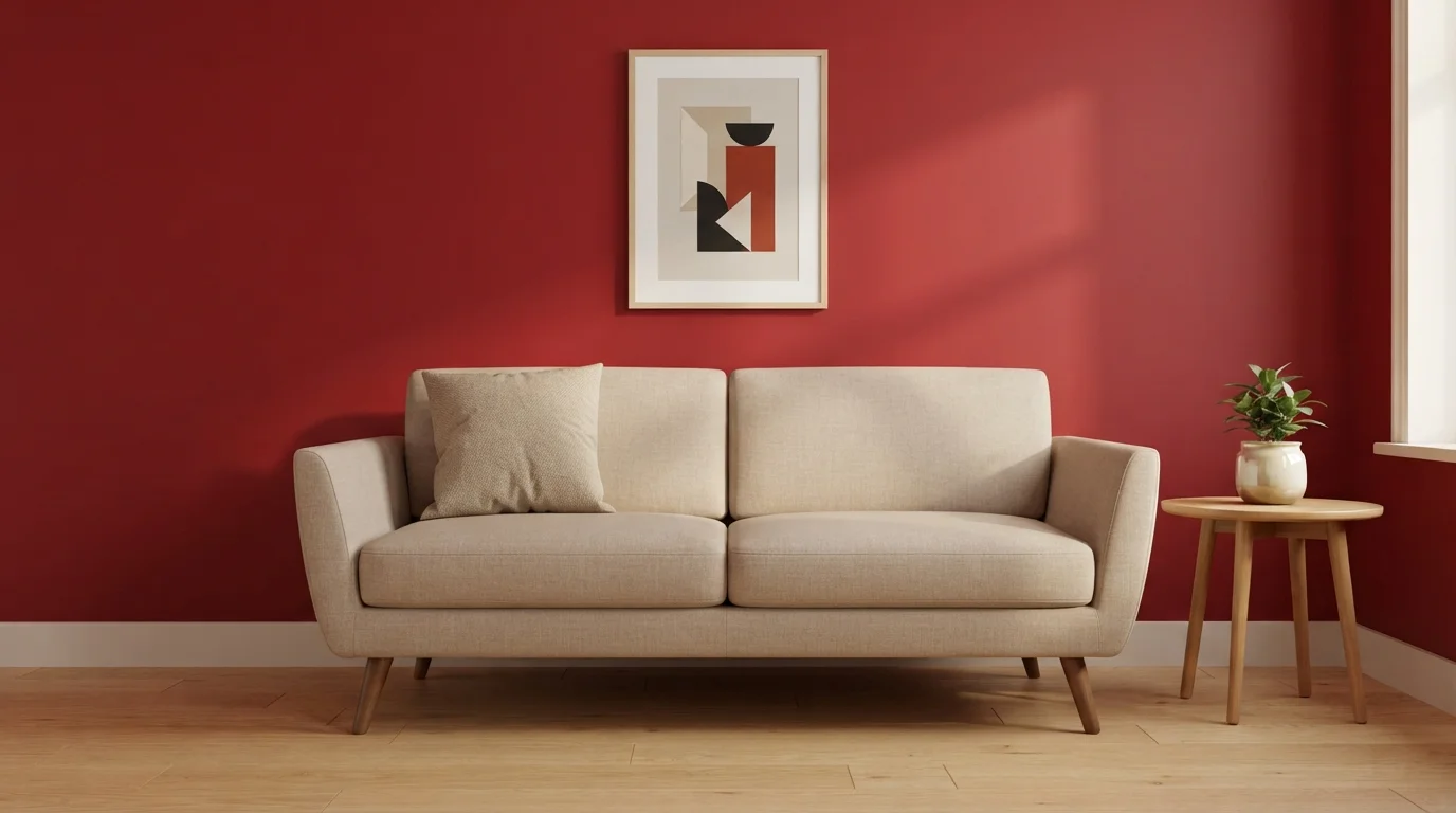
- The Lone Red Wall — One saturated bright wall with no echo anywhere else in the room is the 2010s move that dates a space fastest.
- Painter's-Tape Geometry — Triangles and half-moons in tape-line patterns had their moment; a single well-chosen deep color outlasts all of them.
- The Random Wall Choice — Accenting whichever wall was empty is over — 2026 accent walls sit behind something (bed, sofa, table) or they don't happen.
The 6 Best Accent Wall Paint Colors
Every pick below is a real rendered accent wall, not a chip. The lead color first; the swatches are the full scheme in the photo — walls, furniture, textiles, accent.

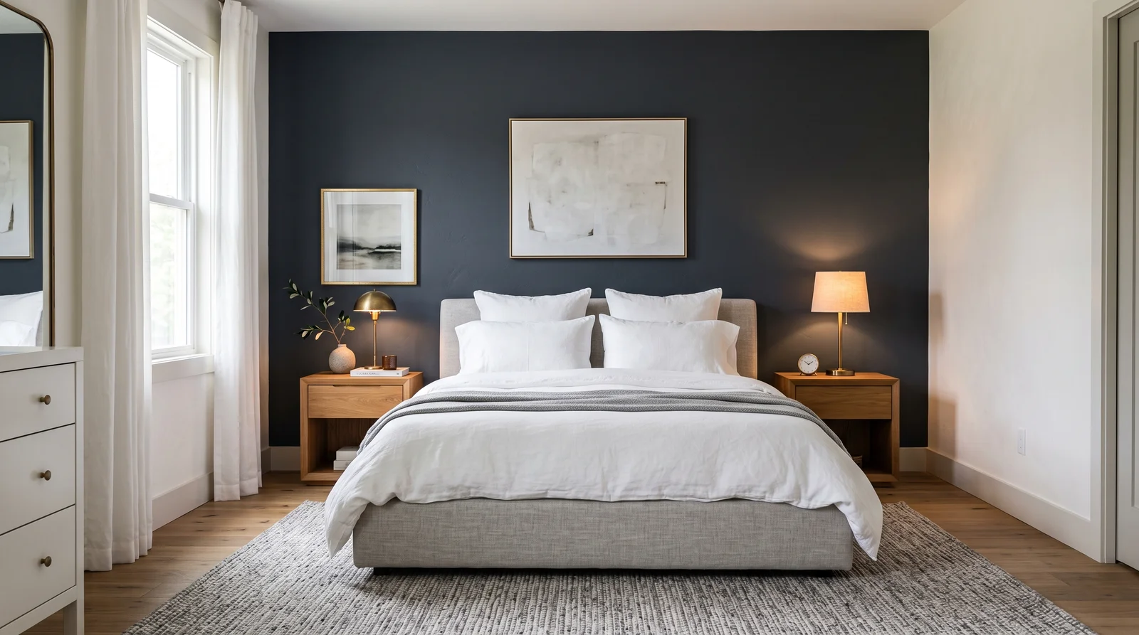
A deep, gray-softened navy that turns the headboard wall into the whole point of the room, richest under warm lamp light.
Hale Navy is the most-painted accent wall in America, and the headboard wall is where it earns that. At LRV 8 it is dark enough to anchor the bed all by itself, but it keeps enough gray to read calm instead of nautical. It pairs naturally with warm oak nightstands, brass lamp bases, and plain white bedding against White Dove main walls. In a bedroom whose only window faces north, it can slide toward charcoal after dusk — Naval (SW 6244) holds more actual blue if you want the color to stay legible at night.
SEE HALE NAVY ON YOUR WALLS →
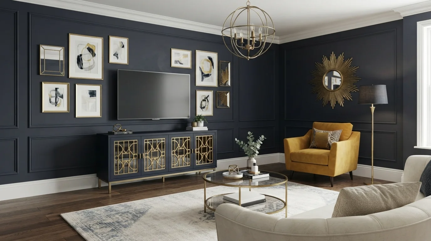
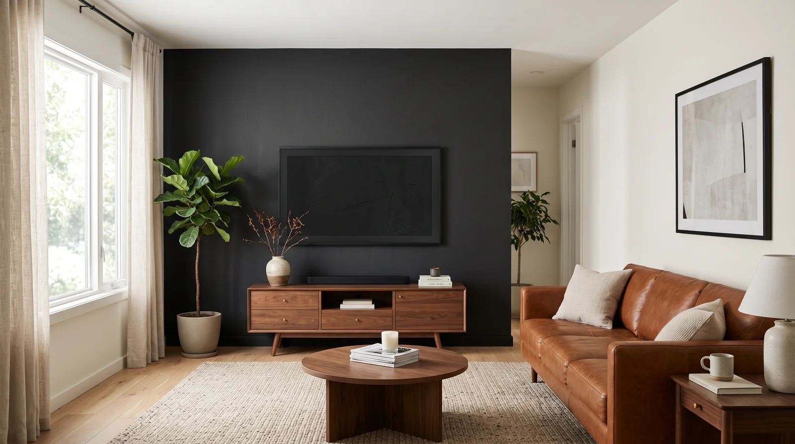
A soft black that swallows the TV whole, so the screen stops being a black rectangle on a pale wall and the room finally looks finished.
The best argument for Iron Ore is practical: a television disappears against it. At LRV 6 it is a black with the harshness sanded off — in daylight you can still see it is a very dark charcoal, not a void. It pairs with a walnut media console, cognac leather, and Alabaster on the surrounding walls so the contrast feels deliberate rather than abrupt. If the living room is small or dim, Peppercorn (SW 7674) does the same trick two steps lighter.
SEE IRON ORE ON YOUR WALLS →
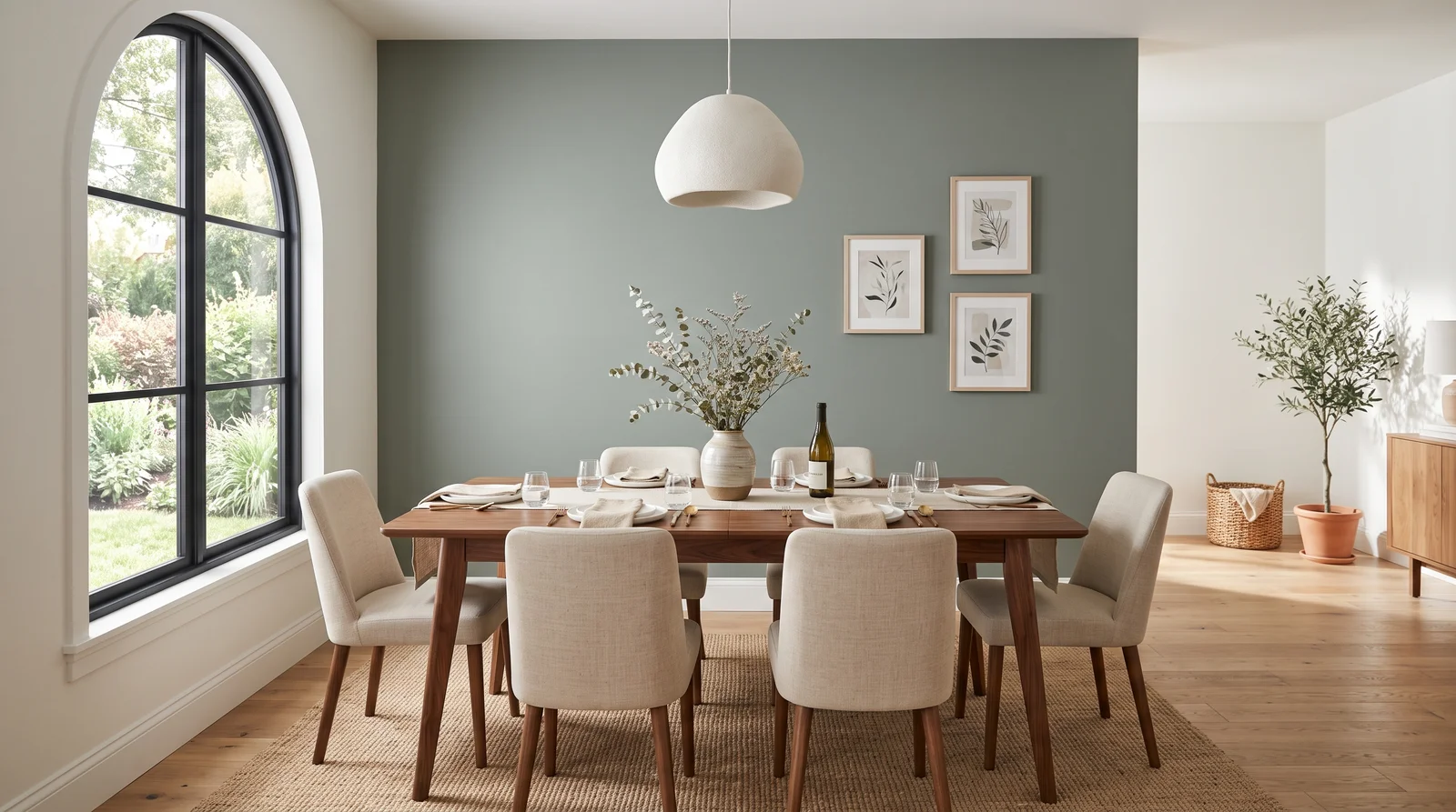
A foggy gray-green that reads as a statement without ever raising its voice — the accent wall for rooms that get plenty of daylight and people who hesitate at navy.
Not every accent wall needs to be dark, and Evergreen Fog is the proof. At LRV 30 it is the lightest color in this lineup, so the jump from Pure White main walls feels like a gradient instead of a cliff — which is exactly where accent walls are heading in 2026. On a dining feature wall it flatters a walnut table and linen-covered chairs, and it photographs beautifully at dinner-party hour. If your dining room gets strong afternoon sun and the wall starts washing out, step down to Pewter Green (SW 6208) for the same green with more spine.
SEE EVERGREEN FOG ON YOUR WALLS →
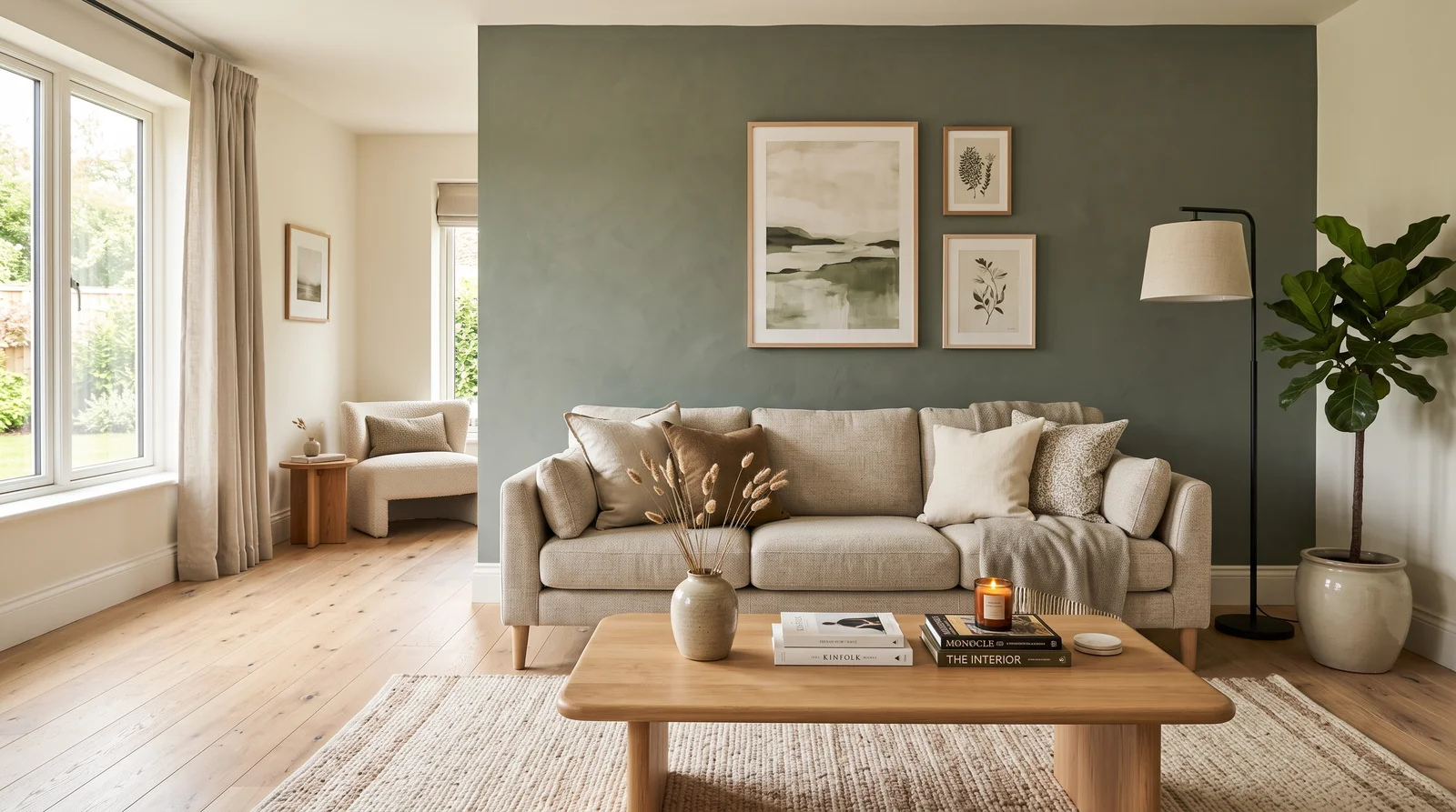
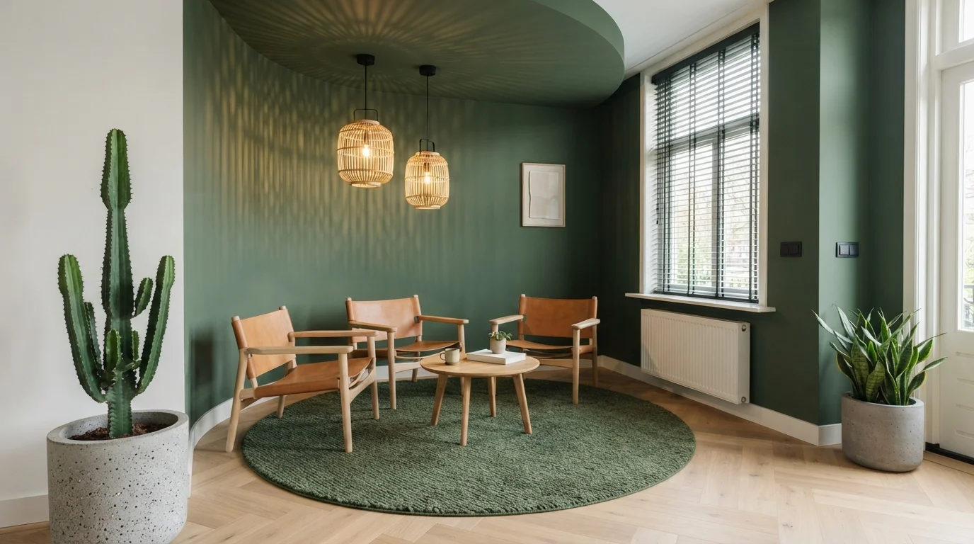
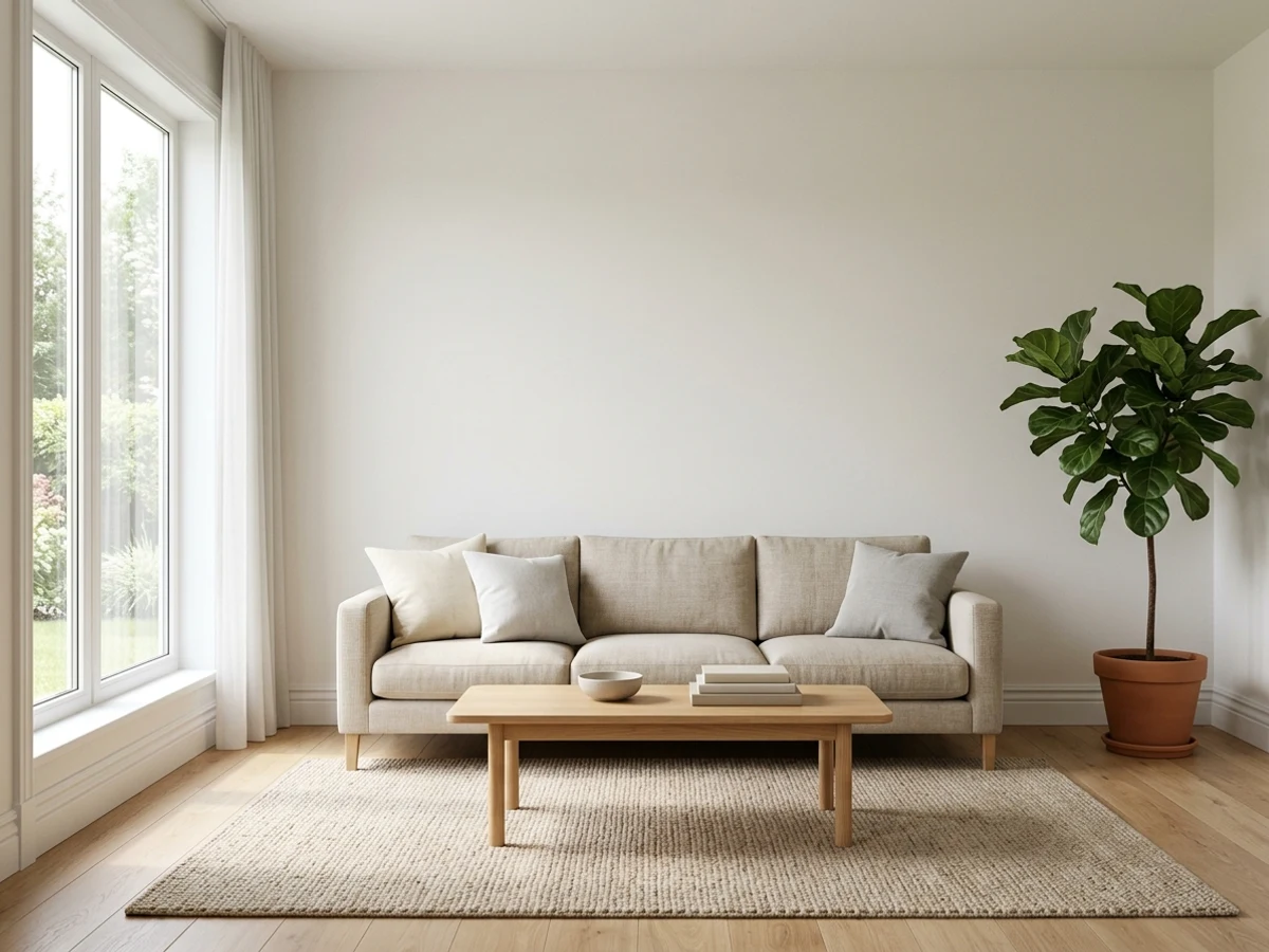
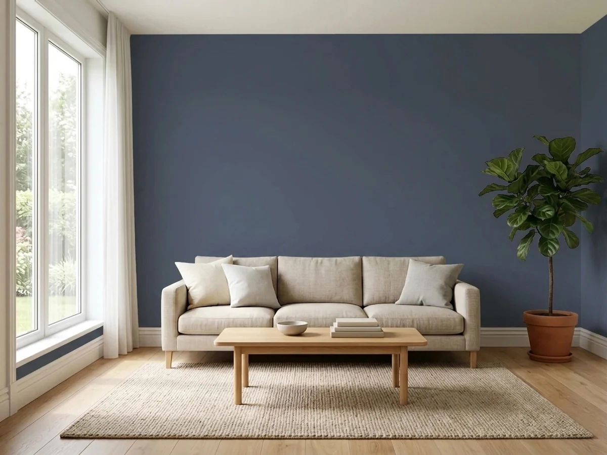
A muted, mossy green behind the sofa that makes cream upholstery and oak floors look intentional, steady in daylight and moody by lamp light.
Pewter Green is the mid-depth answer in a category dominated by navy and black. At LRV 12 it sits in the useful middle: dark enough to anchor a sofa wall, light enough that you can still tell it is green after sunset instead of a mystery dark. It works with cream or oatmeal upholstery, white oak floors, and black metal accents, with Alabaster keeping the other walls quiet. Deep greens are one of the strongest accent directions of 2026 — pick Evergreen Fog (SW 9130) instead if the room is small and you want the statement without the depth.
SEE PEWTER GREEN ON YOUR WALLS →
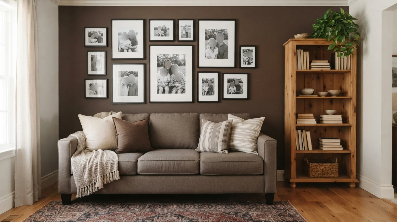
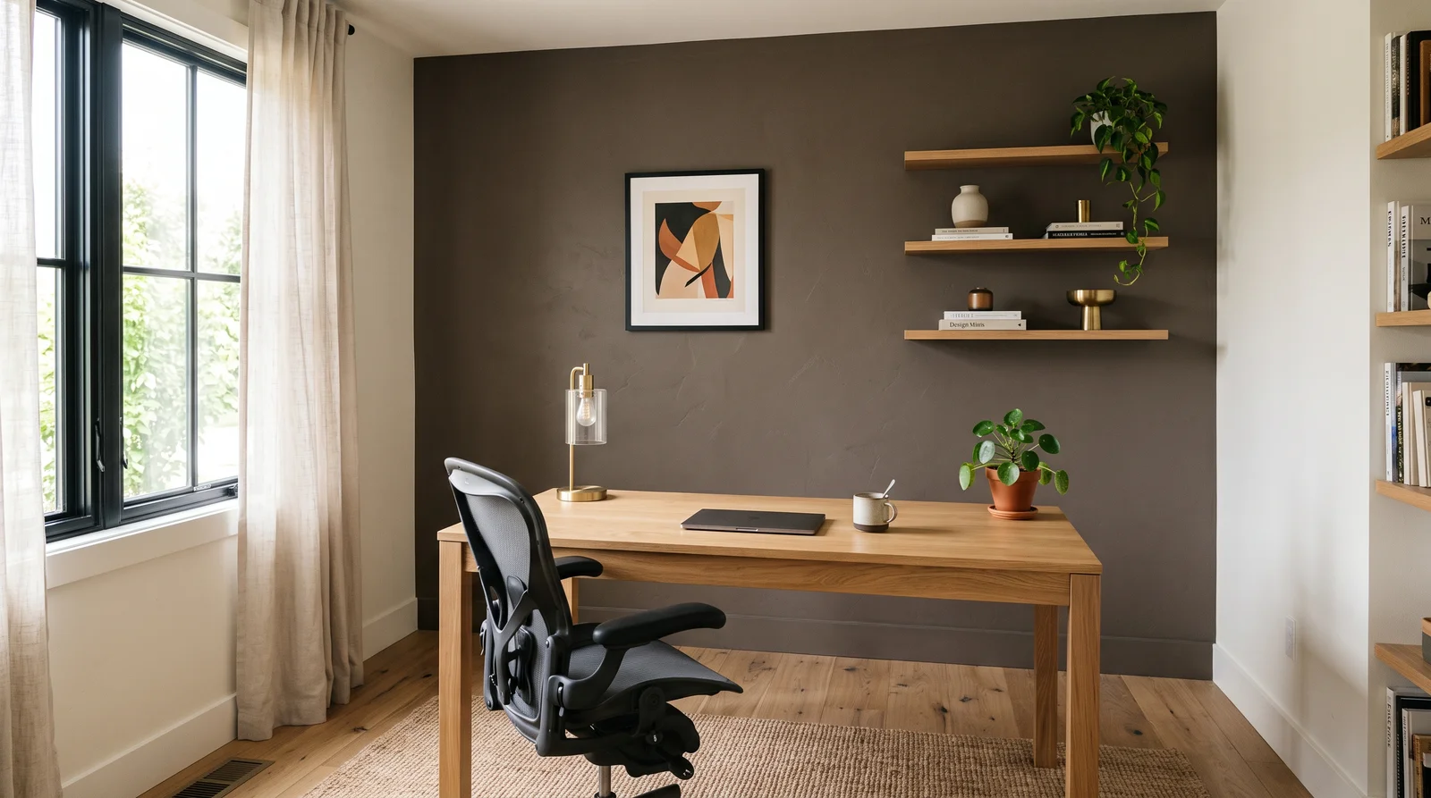
A warm brown-gray behind the desk that feels like strong coffee — serious, grounded, and flattering in the soft light of a work day.
Urbane Bronze brings the one thing navy and charcoal cannot: warmth. At LRV 8 it is a true dark, but its brown base keeps a home office from feeling cold during long hours, and it makes an unusually good on-camera backdrop for video calls. It pairs with an oak desk, black hardware, and White Dove on the remaining walls so the room stays bright where you actually work. Earthy browns and bronzes are the comeback story of 2026 accent colors; if you want the warmth with less commitment, sample it next to Cracked Pepper (Behr PPU18-01) and see which base your light prefers.
SEE URBANE BRONZE ON YOUR WALLS →
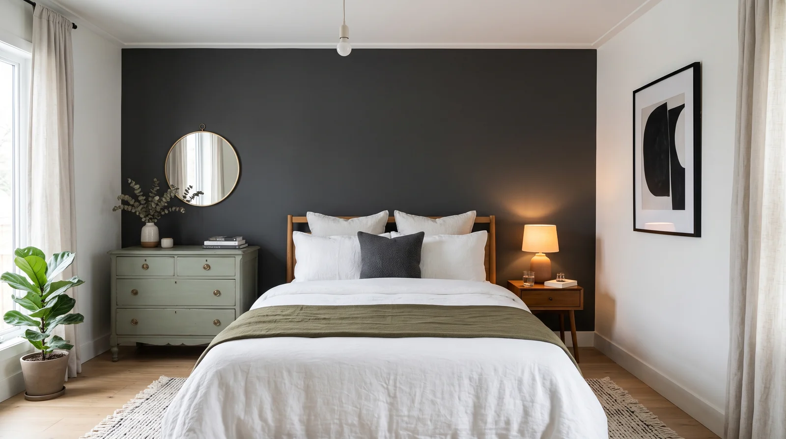
A soft neutral charcoal that makes white bedding glow against it, quietly dramatic in any light and never cold.
Cracked Pepper is Behr's soft black, and on a bedroom headboard wall it does what gray accent walls used to promise and rarely delivered: real depth without any icy blue chill. At LRV 8 it holds its charcoal character in daylight and lamp light alike, which makes it the easy pick when you cannot predict how the room's light behaves. It pairs with crisp white bedding, a dresser painted Pewter Green if you want a second color in the room, and Pure White on the other walls. If charcoal feels too neutral, Hale Navy (HC-154) gives the same depth with a color story attached.
SEE CRACKED PEPPER ON YOUR WALLS →Accent Wall Wall Color Combinations
A wall color never works alone. These are the full schemes from the rooms above — the lead color first, then the supporting colors that make the photo work.
A deep, gray-softened navy that turns the headboard wall into the whole point of the room, richest under warm lamp light.
TRY THIS PALETTE →A soft black that swallows the TV whole, so the screen stops being a black rectangle on a pale wall and the room finally looks finished.
TRY THIS PALETTE →A foggy gray-green that reads as a statement without ever raising its voice — the accent wall for rooms that get plenty of daylight and people who hesitate at navy.
TRY THIS PALETTE →A muted, mossy green behind the sofa that makes cream upholstery and oak floors look intentional, steady in daylight and moody by lamp light.
TRY THIS PALETTE →Keep the trim and ceiling simple so the wall stays the star. Crisp white trim gives a deep accent a clean edge and reads as deliberate; a soft warm white ceiling keeps the room from feeling boxed in. Resist painting the trim a second bold color, which turns one focal point into a fight.
Tie the wall to what is already in the room. Navy and green love warm wood floors, brass or black fixtures, and natural fiber rugs. Terracotta and Old World sit well with leather, rattan, and cream textiles, while Oxblood pairs best with deep woods and matte black hardware. The accent wall should pick up a color or material the room already has, not arrive from nowhere.
Accent Wall Color Ideas by Color
Set on a color family already? Each page has its own real rooms and picks.
Light or Dark Accent Wall Colors?
Go Light (LRV 60+) If…
The room is small, faces north, or has to work at every hour. Light warm colors make it feel bigger and stay calm in evening light — the light you actually live in.
Go Dark (LRV Under 20) If…
You want the cocoon effect and the room has real daylight. Dark works best on one feature wall — or fully color-drenched in a large room with good windows.
Look at which way the windows face before you commit. North-facing light is cool and flat, so it can drain a color and make blues and greens look gray; warmer earthy picks like Terracotta or Old World hold up better there. South and west light is warm and strong, which deepens navy and green beautifully but can push reds and oranges toward hot, so test those carefully.
The wall will also look like a different color at night. Warm bulbs pull everything toward yellow and amber, which flatters Oxblood and Terracotta but can mute a cool teal. Tape a large sample to the wall and check it in daylight and again under your evening lamps before you buy a gallon.
LRV, the light reflectance value, tells you how light or dark a color reads, from 0 (black) to 100 (white). Accent walls are usually where you go low on purpose. A deep navy, hunter green, or oxblood will sit in the single digits to low teens, and that low LRV is what gives the wall its cozy, enveloping weight.
If the room is already small or dim, a very dark accent can close it in more than you want. In that case, reach for a mid-range LRV instead, like Aegean Teal or a softer terracotta, so you still get color and contrast without swallowing the light. One dark wall against three light ones is the classic balance.
See It. Love It.
Paint It.
Upload one photo of your accent wall and try every color on this page on your own walls — in your own light, before you buy a drop of paint.

Hale NavyBeforeThe Best Color Directions For An Accent Wall
Deep blue is the safest bold move. A navy like Hale Navy reads as calm and grown-up, not loud, and it flatters wood, brass, and white trim without trying. Green is the next easy win. A forest tone like Hunter Green or a softer blue-green like Aegean Teal brings in a settled, natural feel that works behind a bed, a sofa, or a desk.
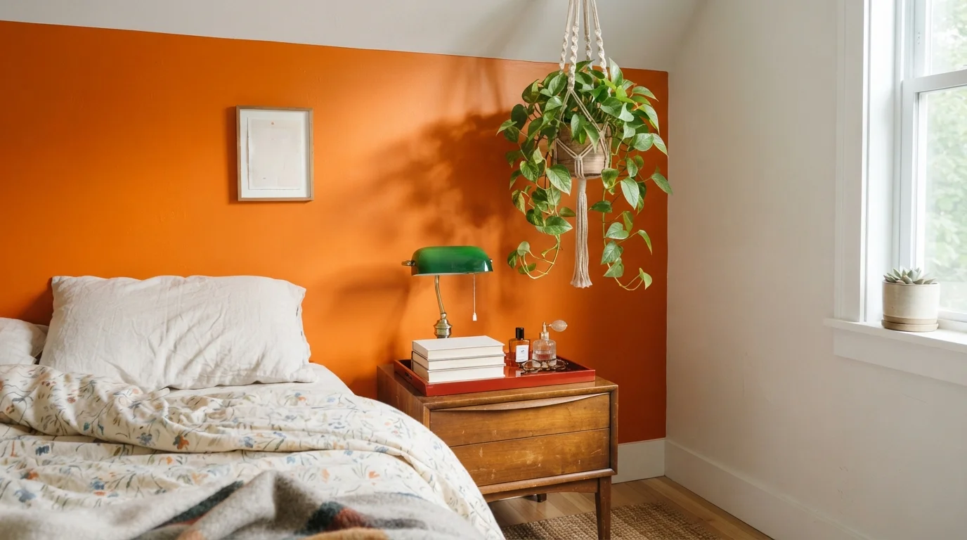
When you want warmth and energy instead of calm, go earthy rather than bright. Terracotta and Old World lean into clay and spice, which feel cozy and lived-in. Oxblood and other grounded reds are the most dramatic choice on this list; they make a small wall feel rich and intentional, but they ask for the rest of the room to stay quiet.
Finish And Sheen That Suit An Accent Wall
For most accent walls, eggshell or matte is the right call. A low sheen hides small wall flaws and, more importantly, keeps a deep color looking like deep color instead of a glare-filled mirror. The richer and darker the shade, the more a shiny finish will bounce light and cheapen it, which is why a flat or matte navy or oxblood looks so much more expensive than a satin one.
Step up to satin only where the wall takes abuse or moisture. A hallway accent, a kid's room, or a wall near a kitchen or bath benefits from satin because it wipes clean. If the wall is purely decorative and rarely touched, stay matte and enjoy the depth.
Common Accent Wall Mistakes To Avoid
The biggest mistake is choosing the wrong wall. The accent should fall on a wall the eye naturally lands on, like the one behind a bed or sofa, not a broken-up wall full of doors and windows. The second mistake is picking the color off a tiny chip; deep shades change dramatically at full scale, so always sample large on the actual wall.
People also forget the rest of the room. A bold wall needs the other three to stay calm, and it needs at least one or two things in the space to echo its color. Finally, skipping a tinted primer under a dark or red shade like Oxblood almost always means extra coats and a patchy, uneven finish.
About Accent Wall Paint Colors
An accent wall is the one wall you let go bold. Because it is a single plane and not the whole room, you can reach for color that would feel heavy everywhere else and still keep the space livable. That freedom is exactly why people overdo it or, just as often, play it too safe and end up with a wall that reads as a mistake instead of a choice.
This guide walks through the color directions that actually work on an accent wall, how the room's light should steer you, and the finish that keeps the wall looking right up close. We lean on five families that carry an accent well: deep blue, rich green, grounded red, warm orange, and earthy brown. Where it helps, we name real examples like Hale Navy, Hunter Green, Aegean Teal, Terracotta, Oxblood, and Old World so you have something concrete to picture.
Every color here is mixed to order at the paint counter, so the family matters more than the label. If you fall for a shade in one brand, it can almost always be cross-matched into another. Pick the direction first, then chase the exact can.
The Questions Everyone Asks
What color should I paint my accent wall?
If you want one answer, start with the safe picks above — Hale Navy, Aegean Teal, Hague Blue, Old World. They read well in any light and survive furniture changes. Then check the light: strong afternoon sun wants a step cooler, a north-facing room wants a step warmer.
Which wall should I actually paint as the accent?
Pick the wall your eye lands on first when you walk in, usually the one behind a bed, sofa, or fireplace. Choose a solid, mostly unbroken wall rather than one chopped up by doors and windows, since a clean surface lets the color do its job.
What color is safest if I'm nervous about going bold?
A deep blue like Hale Navy is the most forgiving choice. It feels calm and grown-up instead of loud, flatters white trim and wood, and works in almost any room. A soft blue-green like Aegean Teal is another low-risk pick.
What finish should I use on an accent wall?
Eggshell or matte for most walls, because a low sheen keeps a deep color rich and hides small surface flaws. Step up to satin only on walls that get touched or splashed, like a hallway, kid's room, or a wall near a kitchen or bath, so you can wipe it clean.
Will a dark accent wall make my small room feel smaller?
It can, since dark colors have a low LRV and absorb light. The trick is to keep the other three walls light, which makes the dark wall feel like depth rather than a closed-in box. If the room is very small or dim, choose a mid-range shade like a softer terracotta or teal instead of the darkest option.
How does my room's light change the color?
North light is cool and can gray out blues and greens, so warm earthy tones like Terracotta or Old World hold up better there. South and west light is warm and strong, deepening navy and green nicely but pushing reds and oranges hotter. Always check your sample in daylight and again under evening bulbs.
Do I need primer for a dark accent color?
Usually yes, especially for deep reds like Oxblood and rich navies. A tinted primer close to your final color gives you even coverage in fewer coats and prevents the patchy, uneven look you get when a dark shade goes straight over plain white.
Can I match an accent color across different paint brands?
Yes. Every color shown here is mixed to order at the paint counter, and a shade you love in one brand can almost always be cross-matched into another. Pick the color direction you want first, then have it matched in whatever brand or product line fits your finish and budget.
What two-color combination works best in a accent wall?
The reliable pattern is a quiet main color plus one deep accent on a single wall. Keep trim and ceiling in one warm white so the two colors are the only event in the room — the combination cards above show complete schemes from real rooms.
What colors make a accent wall look bigger?
High-LRV, slightly warm colors — LRV 60–75 is the sweet spot. Paint the walls and trim close to the same light color so the corners blur, and keep the ceiling white. Stark cool white actually works against you; it creates hard shadows that show the room's edges.

Ask a Question