Stage Beauty
The near-black brick-oxblood Backdrop names after a spotlight, reviewed honestly: the light that makes it glow garnet, the light that makes it disappear, and what to pick instead.

Jessica has spec'd whites and neutrals for more than 300 rooms and keeps a sample wall of painted drawdowns in her studio. Every color review is checked against real reader rooms in the comments and re-tested when a formula changes. About the testing process →
- 1Redwood0
- 2Stage Beauty5
- 3Million Dollar Red13
- 4Cinnamon Slate19
The Fast Verdict
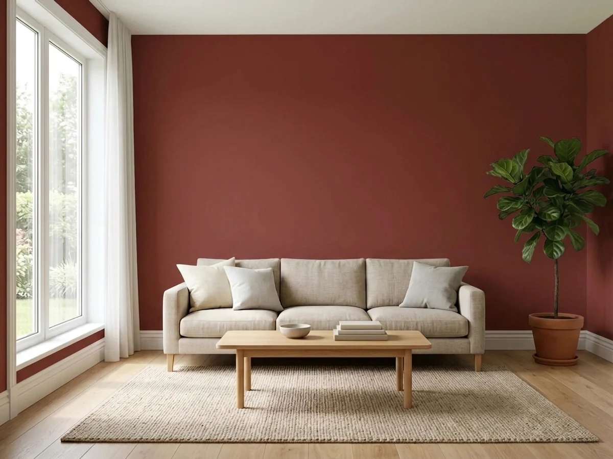
Stage Beauty is theater-curtain red run through an iron-oxide filter: at LRV 5 it sits right at the edge of black, and only real light — direct sun, a warm lamp, a candle — pulls the wine-red back out of it. On a front door or in a small, lamplit room it is genuinely striking. Across four daylit walls it is a much bigger bet than the name's velvet-and-spotlight glamour suggests, and Backdrop is small enough that you are largely testing this one on your own wall, not on a decade of other people's photos.
A front door · a dining room lit mostly by a chandelier or pendant · a windowless powder room · cabinetry or a bar built-in · anyone who wants oxblood, not orange-red
You want the room to read red in daylight, not near-black · your only light is cool white LEDs · your fixtures and stone are cool gray or chrome · you need a mainstream deck with a long track record before committing
- A real brick-oxblood — brown-red, not orange, not purple — built on a pigment family with a genuine track record
- Turns garnet and velvety under warm lamplight, which is exactly what the name promises
- A classic, timeless front-door color that does not chase trend reds
- Deep enough to hide scuffs and fingerprints on a door or cabinetry
- Small, artificially-lit rooms (powder rooms, bars, built-ins) take it beautifully
- At LRV 5, most everyday indoor light reads it as near-black, not red
- Four dim walls of it can feel like a cave rather than a jewel box
- Backdrop is a small DTC brand — this specific color has almost no independent, in-home track record to check against
- Fights chrome, cool gray stone, and cool white LEDs — needs warm metal and warm bulbs
What Color Is Stage Beauty, Really?
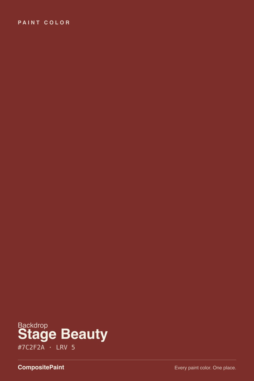
Stage Beauty is a brick-oxblood — a warm, brownish red built on the same iron-oxide family that has painted barn doors and front doors for two centuries, because that pigment is cheap, opaque, and does not fade the way a clean chemical red does. At LRV 5 it reflects almost none of the light that hits it, which puts it in genuine near-black territory: in flat or dim light it will read as a very dark brown-black, not as "red," and that gap between the paint chip and the wall is the single biggest thing to plan around before you buy a gallon.
For a useful reference point, Stage Beauty's hex and LRV land exactly on top of Pratt & Lambert's Brick Red — a professional-grade oxide red that trade painters have used on doors for decades specifically because it is dark enough to hide grime and true enough to still read red in sun. That is good company: it means Backdrop did not invent a novelty color here, it packaged a proven, historically grounded red into its own small-batch line and gave it a theater name instead of a paint-store one.
Undertone in one line: brown-red, never orange, never purple. It sits warmer and browner than a true fire-engine red (think Benjamin Moore Caliente) and less purple than a wine oxblood like Bewitched — closer to dried blood or old brick than to lipstick or burgundy velvet, which is exactly what "oxide" reds are built to do.
Where It Shines
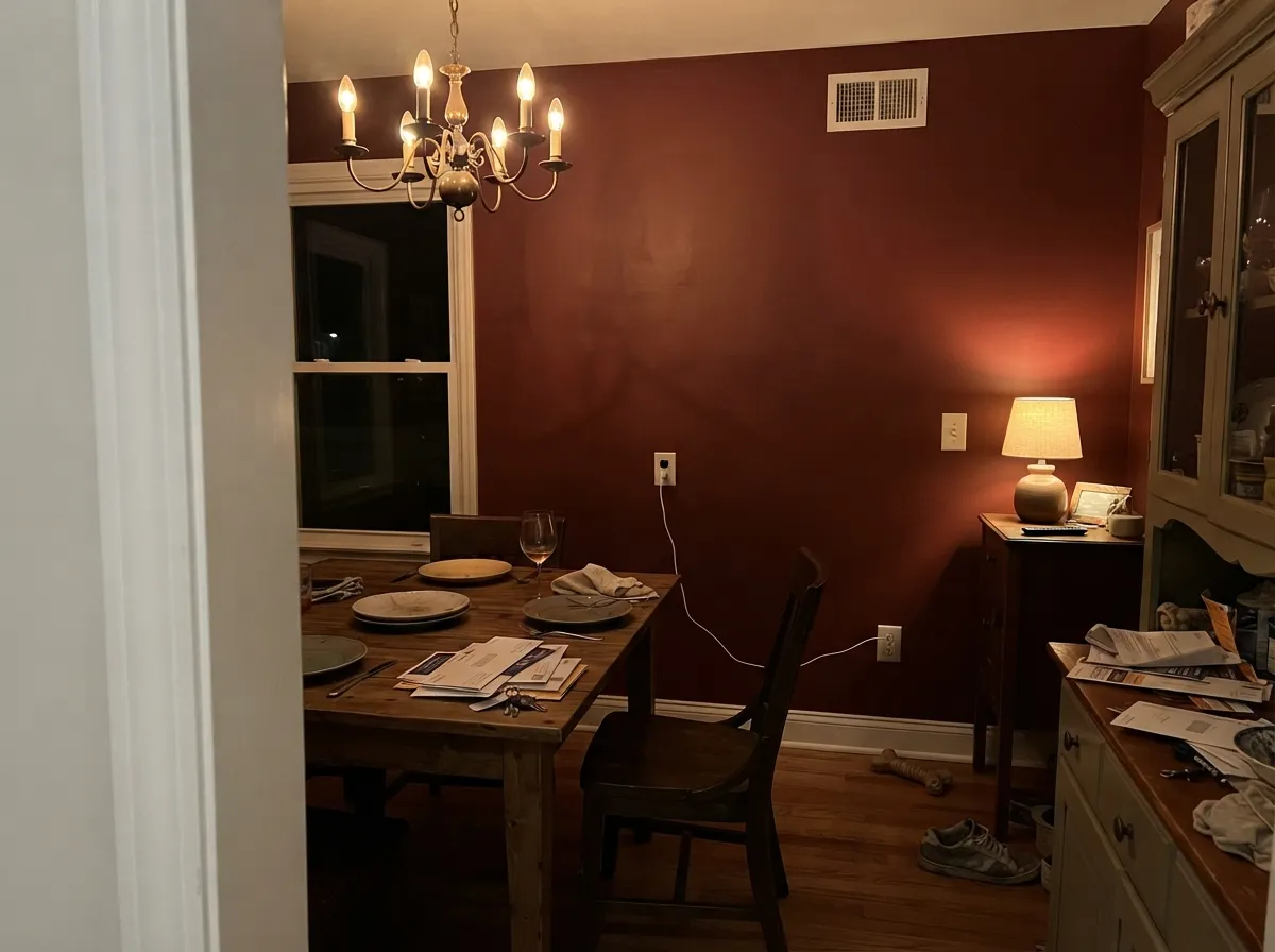
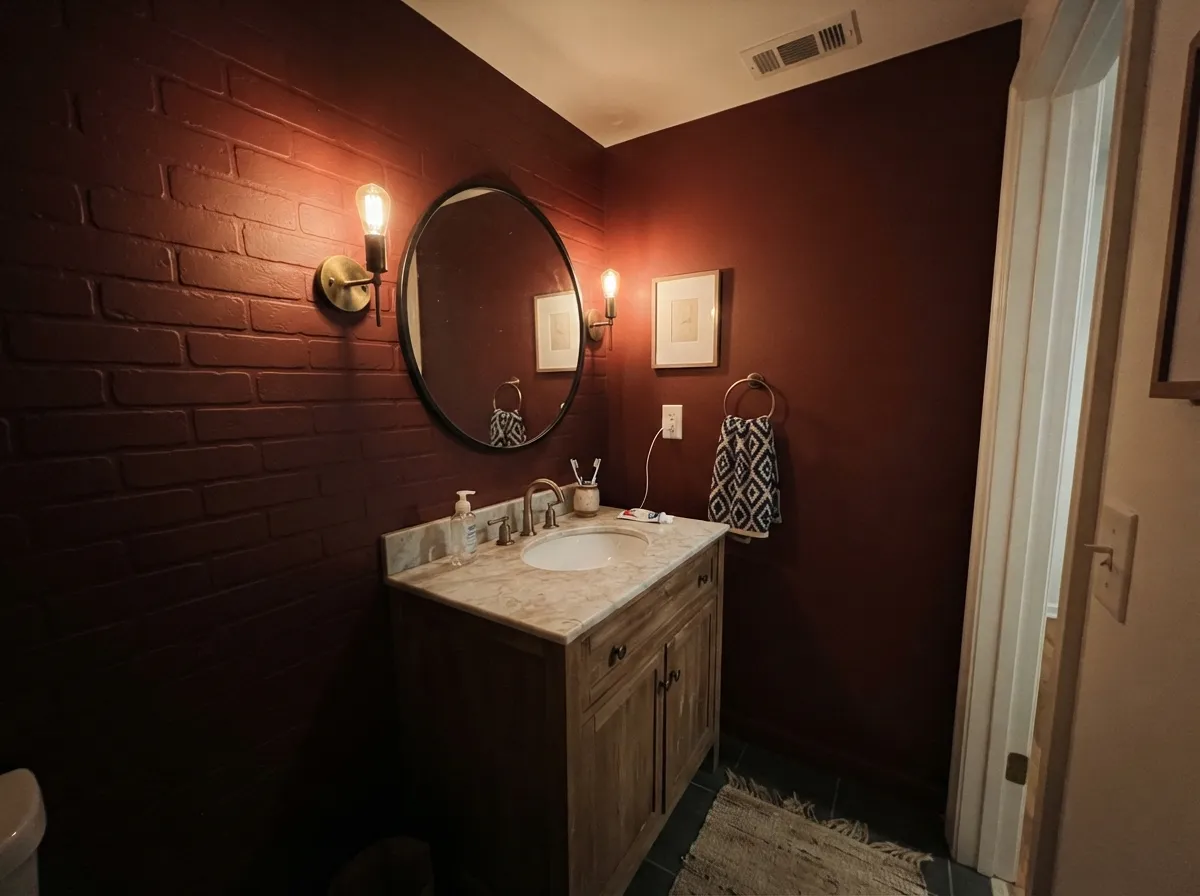
This color wants a job with edges, not four open walls. On a front door it is a genuine classic — dark enough to read sophisticated against nearly any siding color, warm enough that black hardware and brass both look intentional next to it. Indoors, its best rooms are the ones people mostly use after the sun goes down: a dining room lit by a chandelier, a home bar or built-in hutch, a windowless powder room where the paint is never fighting daylight in the first place. Under a warm 2700K bulb the brown drops away and the wine-red comes forward — this is the "stage" the name is describing, and it is real.

Where It Fails
Almost every disappointed story with a color this dark follows the same three scripts, and none of them are really about the paint quality — Backdrop's coverage and application get consistently good marks in general reviews of the line. They are about matching a near-black red to the wrong light, wrong room size, or wrong metal finish.
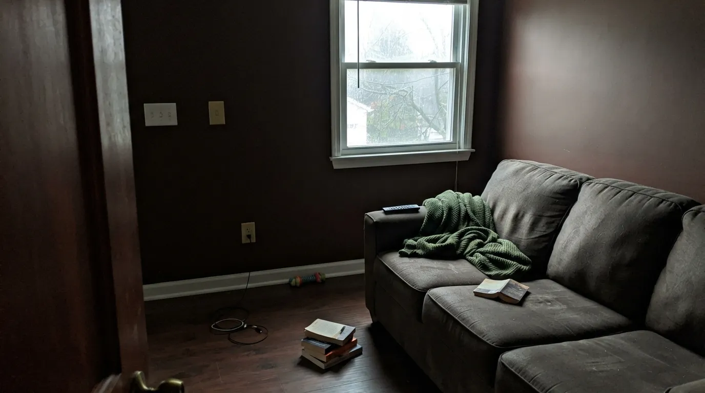
LRV 5 is genuinely dark — darker than most people picture when they hear "red." Overcast days, north-facing windows, and rooms lit only by ceiling cans will show you a flat brown-black wall, not a garnet one. If you need to see red at 2pm on a cloudy Tuesday, this is not that color; look at Behr Rumors or Sherwin-Williams Heartthrob instead.
A near-black red on every wall of a small, dim room reads like a cave rather than a jewel box — the effect that works beautifully in a lit dining room or a powder room with a good fixture falls apart without it. Give it a window, a chandelier, or a lamp, or keep it to one wall, a door, or cabinetry instead of the whole box.
This is a warm color built for warm company — brass, black iron, walnut, leather. Next to chrome fixtures, cool gray quartz, or blue-white LED bulbs, the brown-red argues with the room instead of grounding it. Swap the bulbs before you swap the paint; it is the cheaper fix and it is usually the actual problem.
Room by Room
A brick-oxide red door is a genre unto itself, and this color does it honestly: dark enough to look expensive against white, cream, or green siding, and it will not fade to pink the way a brighter red door can. Semi-gloss, and confirm with Backdrop that the specific can you're buying is rated for an exterior door before you commit — the brand's core line is built around interior walls, trim, and cabinets.
This is the room the name is describing: chandelier or pendant light on, wine glasses catching the wall color, the brown-red turning genuinely velvety. Daytime it will look darker and flatter, which most dining rooms can live with since they are evening rooms anyway.
Small, mostly windowless, artificially lit rooms are where a color this deep gets to be exactly what it wants to be without daylight ever arguing with it. Drench all four walls; brass hardware and a warm-toned mirror frame do the rest.
On an island, a bar cart, or a built-in hutch under lighter walls it reads confident and collected, not overwhelming. A full kitchen of cabinets this dark is a bigger commitment and needs real task lighting or it will read black at the counter.
Evening-use rooms with a lamp and a leather chair are natural company for an oxide red this deep — think old private-club red, not stoplight red. Eggshell where hands and chairs will scuff it.
It can be genuinely romantic with warm lamps and no cool overhead light, but four walls of a near-black red is a big swing for a room you wake up in every morning. An accent wall behind the headboard, paired with a lighter ceiling and trim, is the safer version of the same idea.
Your Light Is the Risk
2700K bulbs are where this color earns its name — the brown drops out and a genuine garnet-red comes forward. This is the light to sample it under before deciding.
Flat, cool daylight reads it as a dark brown-black with almost no visible red. If this is your room's only light source most of the day, expect a black wall, not a red one.
Full sun is the other honest read: it unlocks the brick-red undertone at midday and glows warmer at golden hour. Outside of direct sun it stays close to black.
2700K warm bulbs wake the wine-red; cool white or blue-leaning LEDs flatten it toward charcoal. This is the fastest, cheapest fix if the color is reading wrong.
Most complaints about Stage Beauty are a light mismatch. Upload a photo of your actual room and see it on your walls — then ask for the same wall in north light or evening lamps before you buy a single sample.
Need It From Another Brand?
Any paint counter can custom-tint Backdrop BD-SB directly. If you would rather stay in one brand's own deck, these are the closest stock matches, measured as ΔE2000. Under 2 is a difference you will not see on the wall.
| Brand | Closest color | ΔE | LRV | |
|---|---|---|---|---|
| Sherwin-Williams | FireweedSW 6328 · Sherwin-Williams | 2.1 | 7 | Color page → |
| Benjamin Moore | Country RedwoodHC-183 · Benjamin Moore | 2.1 | 8 | Color page → |
| Valspar | Wine CaskT513 · Valspar | 3.0 | 7.3 | Color page → |
| Dutch Boy | Red Farmhouse305-7DB · Dutch Boy | 2.1 | 7 | Color page → |
| HGTV Home by Sherwin-Williams | FireweedHGSW 2061 · HGTV Home by Sherwin-Williams | 2.1 | 7 | Color page → |
| C2 Paint | DivaC2-519 · C2 Paint | 3.7 | 7 | Color page → |
Similar Backdrop Colors
The nearest shades to Stage Beauty within Backdrop's own range, ranked by perceptual color distance — useful when you want the same look a touch lighter, darker, or warmer.
WCAG 2.1: AA is 4.5 : 1 for normal text, 3 : 1 for large text, AAA is 7 : 1.
Stage Beauty vs the Colors You're Also Considering
Every Stage Beauty sample board has the same rivals on it. The numbers show the real lightness gap — then it comes down to which risk you would rather live with.
Pick this for Backdrop's small-batch buying experience and curated color story — the paint itself is essentially identical.
Pratt & Lambert 20-9 · LRV 5Brick RedPick this if you want the exact same brick-oxide red from a trade-standard brand with a longer professional track record.
Pick this for the clearer, more unmistakably red-brown identity — Bewitched reads more black, less brick.
Benjamin Moore CSP-450 · LRV 6BewitchedPick this for an even darker, more purple-leaning oxblood built purely for drama, not for daylight.
Within Backdrop, the closest reds are Punk Rock (BD-PR), LRV 8, and Bahaus (BD-BH), LRV 8. Both are a step lighter and noticeably more saturated, so they read as clear, assertive reds even in average light. Stage Beauty, three points darker and more muted, holds onto shadow and brick tones instead. If you want a red people register the moment they walk in, on a front door or a powder room, Punk Rock or Bahaus does that; if you want a red that behaves like a dark neutral until the light finds it, Stage Beauty wins.
It's a Date (BD-IT), LRV 7, is the other neighbor, but it is a dark brown rather than a red. Side by side, It's a Date recedes and pairs quietly with almost anything, while Stage Beauty brings actual color. Choose It's a Date when you want depth without commitment to red, and Stage Beauty when the red is the point.
Stage Beauty Coordinating Colors
The rule for coordinating with a brick-oxblood this dark: warm whites, warm metals, and one true dark to ground it. It wants brass or black iron, walnut or leather, and a white trim that leans warm rather than stark and cool. These are the partners that keep it from feeling isolated:
Why Brick-Oxide Reds Like This One Never Really Left
Iron-oxide reds are among the oldest pigments in the paint trade — cheap, opaque, colorfast, and originally used because rust-derived pigment was easy to make and did not fade the way early organic reds did. That is why barn doors, colonial front doors, and trade-standard "brick red" cans have looked roughly like this for two centuries, and why a small DTC brand naming its version after a theater spotlight is really just repackaging a very old, very reliable idea.
The red front door specifically carries its own folklore — a welcoming, "safe harbor" signal in early American towns — but the practical reason it endures has nothing to do with symbolism: an oxide red this dark hides road grime, weathering, and hand marks on a door far better than a brighter, cleaner red does.
Stage Beauty With Wood Tones and Metals
Walnut, dark stained oak, and leather furniture are this color's natural company — the shared brown base means nothing fights, and the red reads as an intensified version of the wood rather than a competing color. Pale, honey-toned oak is a less obvious clash than it is with a purple-leaning color, but the contrast can still read a little harsh; a rug or a darker stain helps.
For metal, warm wins: unlacquered brass, aged bronze, and matte black hardware all sit comfortably against it. Polished chrome and cool nickel are the one combination worth testing before you commit — a warm brick-red next to a cold, bright metal tends to make both look slightly wrong.
Three Ready Palettes Built on Stage Beauty
A color is never alone on the wall. These are complete combinations in the 60-30-10 pattern, with the reason each one holds together. Every one opens in the visualizer.
A warm white body lets the door do the talking; the deep green shutters echo the classic red-door-on-a-green-house pairing without betting the whole facade on either dark color.
Try this palette in your roomWhite Dove keeps the ceiling from swallowing the light the room depends on, and Iron Ore gives one true dark note so the red reads deliberate rather than accidental under the chandelier.
Try this palette in your roomA windowless small room is the one place a color this dark never has to fight daylight. Saddle Soap's leather-brown vanity and a near-black mirror frame keep it warm and grounded instead of cave-like.
Try this palette in your roomStage Beauty FAQ
Is Stage Beauty red or brown?
Both — it is a brick-oxblood, an iron-oxide red with real brown in it, never orange and never purple. In warm lamplight the red comes forward; in flat daylight the brown and the LRV 5 depth take over and it can look closer to near-black.
Will Stage Beauty look black on my wall?
In dim or overcast light, largely yes. At LRV 5 this is one of the darkest colors in any deck, and most everyday indoor light will not pull much visible red out of it. You need direct sun or a warm lamp for the color to read clearly as red rather than near-black.
What goes with Stage Beauty on a front door?
Warm white or cream siding, black or dark green shutters, and brass or black hardware are the classic pairing. Avoid cool gray or blue-white trim right next to it — the warm brown-red wants warm company.
Is it a good bedroom color?
With caution. It can feel romantic and cozy with warm lamps and no cool overhead light, but four walls of a near-black red is a big daily commitment. An accent wall with lighter trim and ceiling is the safer version of the same look.
How is Stage Beauty different from Pratt & Lambert Brick Red?
They share the same hex code and the same LRV 5 — as close to the identical color as two different brands get. The real difference is the buying experience: Pratt & Lambert is a trade-standard brand with decades of professional use behind this exact red; Backdrop is a small DTC line with a curated color story and far less independent track record for this specific can.
Can I use it on kitchen cabinets or an island?
Yes, and it is one of its better jobs — an island or a hutch in this color under lighter walls reads confident without needing four walls of commitment. Use a satin, urethane-fortified cabinet enamel and make sure the space has real task lighting, or the cabinets will read black at the counter.
Have you painted with Stage Beauty?
Rate it — one tap helps the next reader decide.
Ask a Question