Two Step
Backdrop's warm coffee-brown accent color, reviewed honestly: the near-identical Sherwin-Williams brown it echoes, the light it needs to read as brown at all, and what to pick instead.

Jessica has spec'd whites and neutrals for more than 300 rooms and keeps a sample wall of painted drawdowns in her studio. Every color review is checked against real reader rooms in the comments and re-tested when a formula changes. About the testing process →
- 1Mahogany0
- 2Turkish Coffee5
- 3Two Step14
- 4Cavern Clay20
- 5Redend Point30
The Fast Verdict
Two Step is Backdrop's warm coffee-brown accent color, and the numbers don't lie: at LRV 14 it lands almost exactly on Sherwin-Williams Rookwood Brown, the Craftsman-era standard the whole warm-brown category still gets measured against. Give it real daylight and some walnut or brass and it reads like stained wood — rich, deliberate, expensive. Starve it of light and it collapses toward black before it ever reads as brown. Buy it for one surface with a real light source, not a whole dim room.
A front door · kitchen island or cabinets with warm wood and brass · a powder room · a home office or den with a real window · anyone who wants a genuine brown, not a gray-brown
Your only light is a dim, lamp-free north window · your countertops or tile are cool gray · you want a taupe or greige, not an orange-warm brown · you need a can from a local store today, not a shipped order
- Genuine warm coffee brown — never reads as muddy gray-brown
- Nearly identical to Sherwin-Williams Rookwood Brown, a color with decades of documented real-world use
- LRV 14 holds real brown color instead of collapsing to near-black the way deeper browns do
- Reads expensive next to brass, walnut, and leather
- Works as a single-surface commitment — door, island, vanity — without repainting a whole room
- Almost no independent owner reviews or photos of this specific color exist yet
- Dim, lamp-free rooms pull it toward flat near-black fast
- Genuinely orange-warm — clashes with cool gray stone, quartz, and blue-gray tile
- Backdrop is online-only, so there is no same-day can from a local store
What Color Is Two Step, Really?
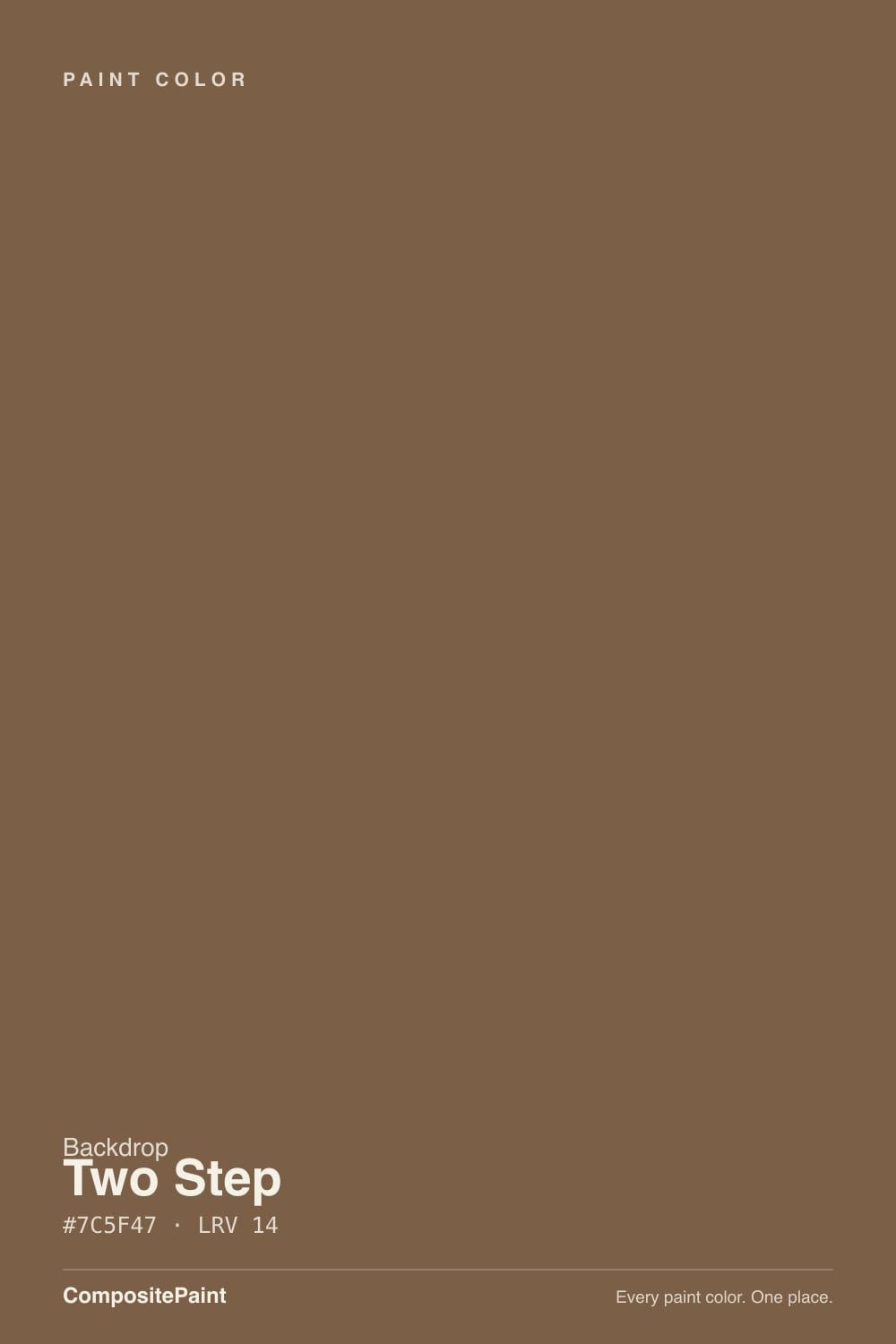
Run the hex — 7C5F47 — and the undertone is unambiguous: red sits highest at 124, green next at 95, blue lowest at 71, a spread that puts the hue right around 27 degrees on the color wheel. That is textbook warm brown, orange-leaning, the same family as stained walnut, saddle leather, or a dark roast coffee bean. There is no gray flattening it toward taupe and no red pushing it toward rust — it is brown in the plainest sense of the word. Numerically it is close enough to Sherwin-Williams Rookwood Brown (hex 7F614A, also LRV 14) that if you have ever seen Rookwood Brown on a Craftsman porch ceiling or a stained-wood front door, you have essentially already seen what Two Step does on a wall.
At LRV 14 it is a real mid-dark color, not a near-black. That depth is exactly what lets it read as brown instead of shadow — a genuinely near-black brown like Sherwin-Williams Sable (LRV 8) needs strong direct light to prove it is brown at all, while Two Step holds its color through an average amount of daylight. Take that daylight away entirely, though, and the same math works in reverse: a dim, lamp-free room will still pull it down toward flat near-black, the same way it does for every color in this depth range.
Backdrop is a Los Angeles direct-to-consumer paint brand founded in 2018 by Natalie and Caleb Ebel — no big-box aisle, no dealer network, ordered online in a curated deck of roughly 85 colors named for pop-culture phrases rather than descriptive words (siblings in the brand's earthy lineup include Old Soul and Carry the Two). The paint itself is Backdrop's Standard interior finish, a low-VOC, self-priming acrylic at a soft matte-to-eggshell sheen, with a separate Grand semi-gloss line for trim and doors. Worth saying plainly: at the time of writing, Two Step has almost no independent owner reviews, Houzz threads, or design-blog features of its own online. This review is grounded in the color's own numbers and its very close numerical match to a well-documented Sherwin-Williams brown — not in claims about buzz that does not yet exist.
Where It Shines
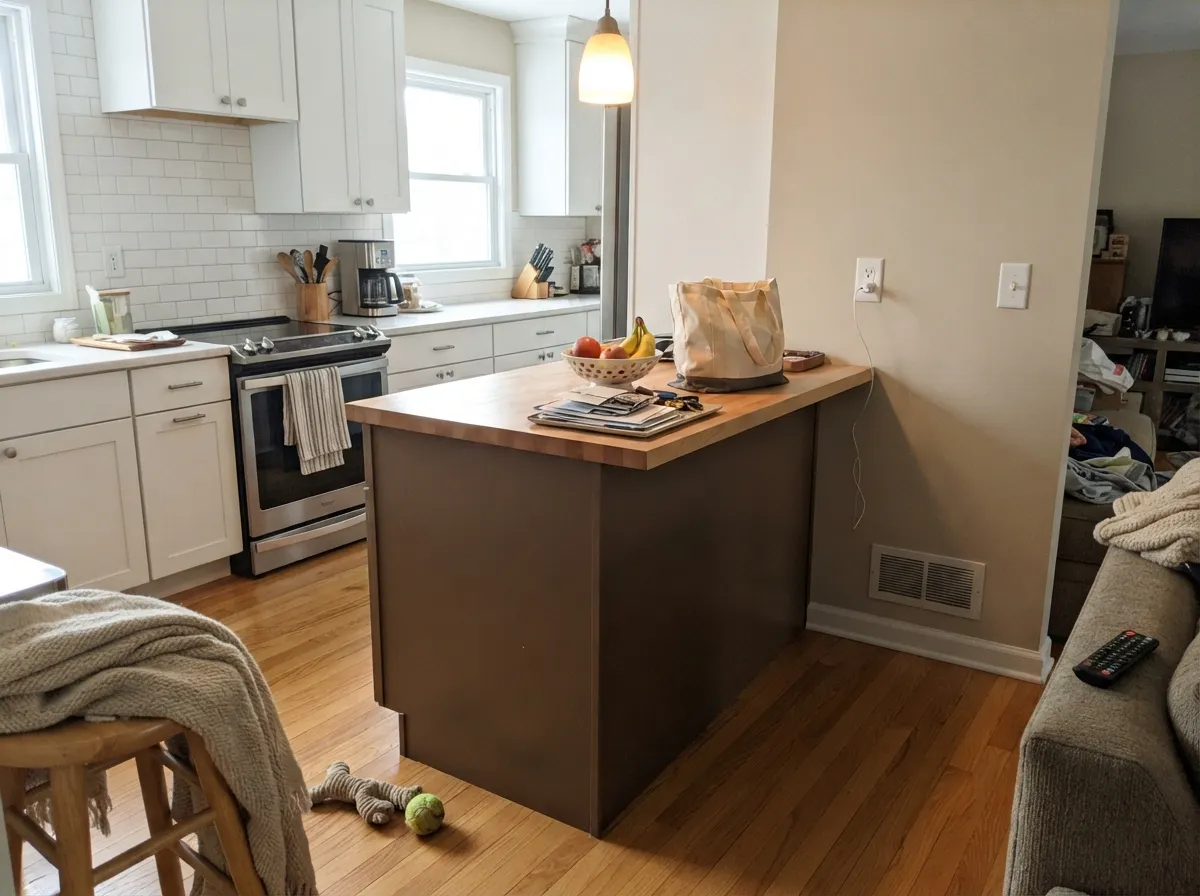
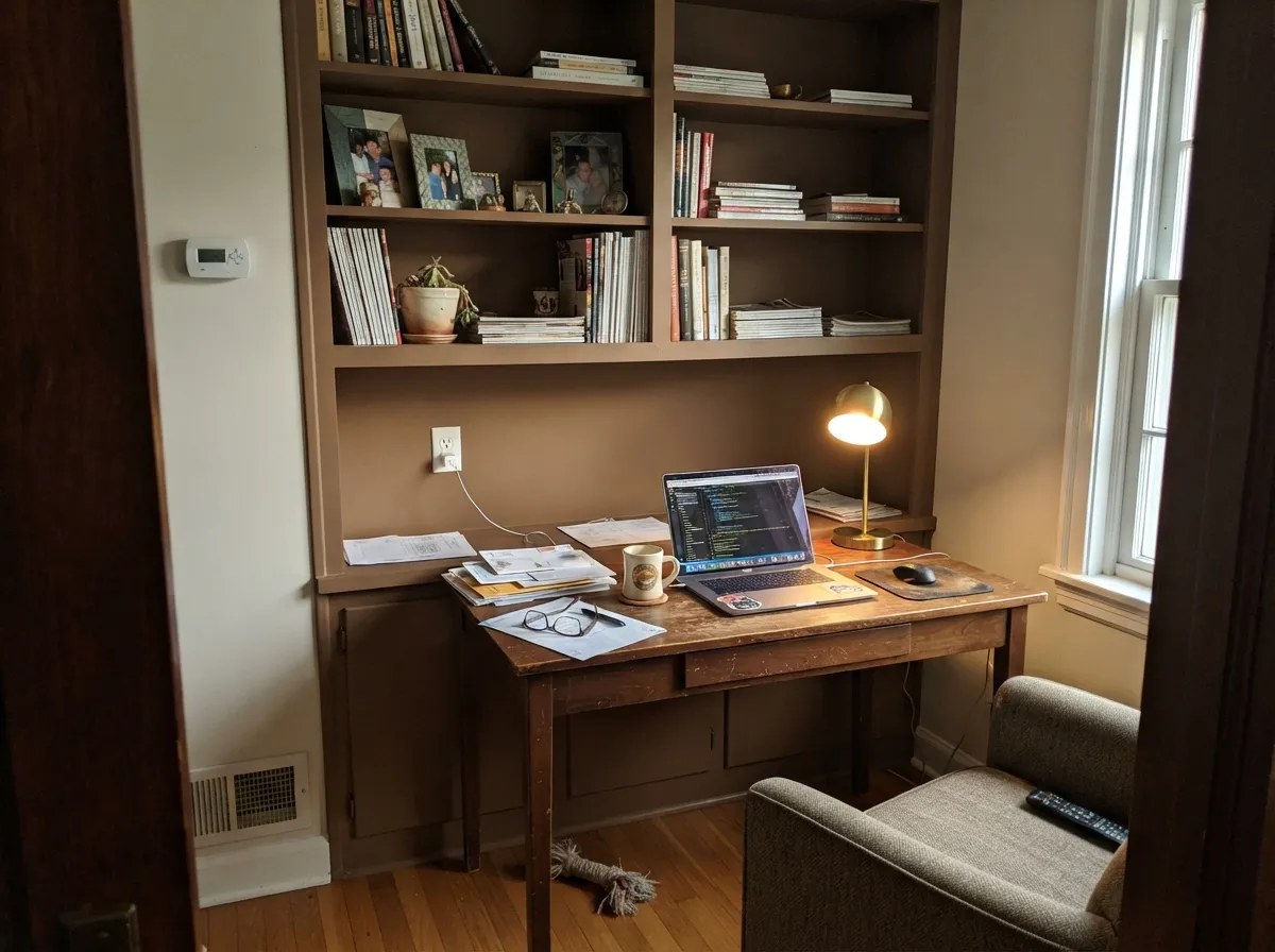
Give it a real light source and warm materials and Two Step earns the coffee-brown comparison. On a front door in Grand semi-gloss it reads like stained hardwood against any trim color. On a kitchen island under brass hardware and butcher block it looks custom, not painted. In a den or home office with walnut shelving and a warm lamp on, it goes deep and quiet instead of muddy. It is a color built for one confident surface, not a whole room's worth of walls.
Where It Fails
Almost every way Two Step disappoints traces back to one of three predictable situations. None of them are the paint's fault — the same hex would behave the same way in any brand's deck — but if your room matches one of these, sample big before you commit a whole door or island to it.
The undertone math is clear: red leads green by nearly 30 points and blue by more than 50. That is a genuinely warm, orange-leaning brown, not a taupe or a griege. Next to cool gray quartz or blue-gray tile it will look like it is fighting the room instead of finishing it — pick a color with the red and green channels closer together if you actually want gray.
LRV 14 sounds mid-depth, but that number only holds up with real daylight or real fixtures behind it. In a north-facing room with the lights off it reads almost black, and the warm coffee character disappears entirely. If the room has no window worth mentioning, this is not the color to gamble a whole wall on.
A stark, blue-leaning white makes the warm brown look muddy and dated instead of rich. The fix is the same one that works for every warm color: pair it with a warm white like White Dove, not a cool bright white, and the two temperatures stop arguing.
Room by Room
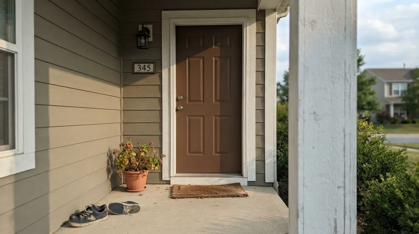
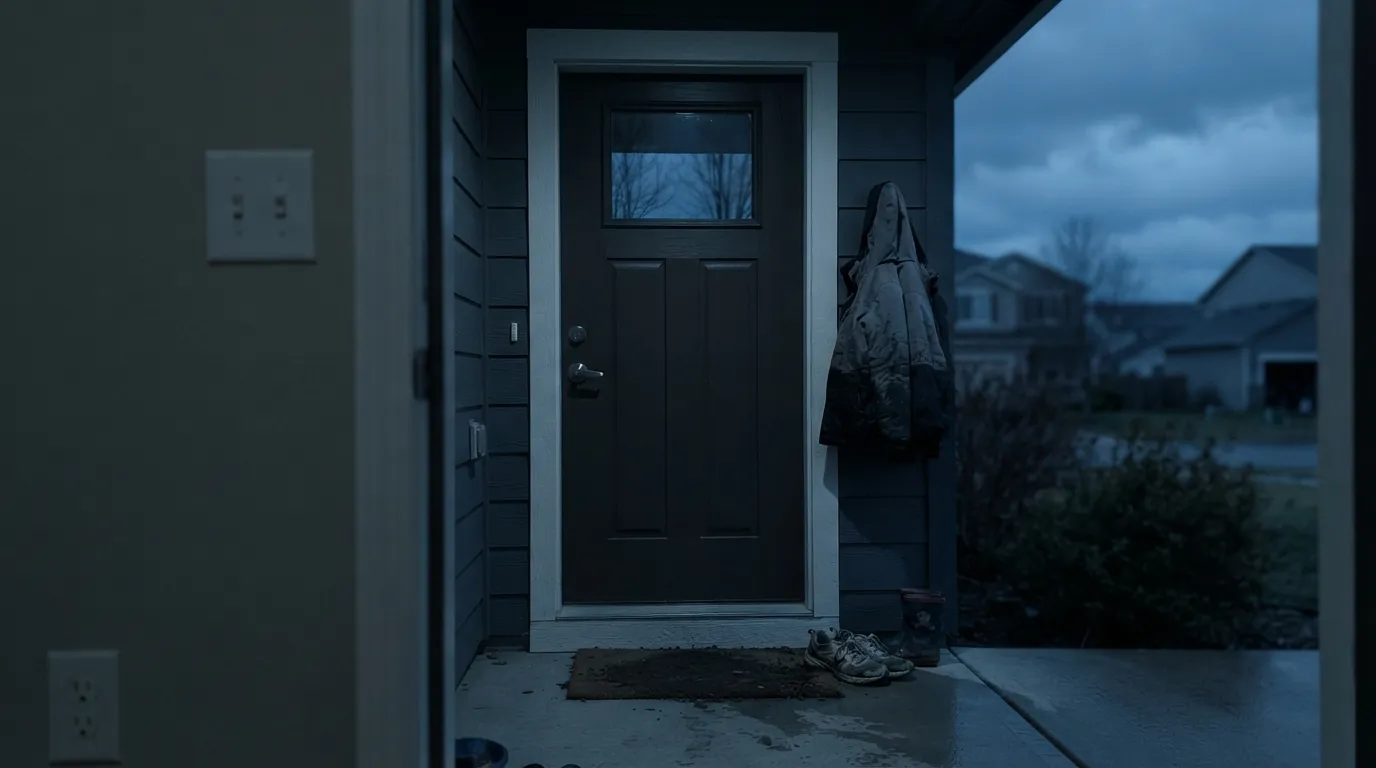
Semi-gloss in Backdrop's Grand finish reads like real stained wood from the curb, and it works with almost any body color as long as the trim leans warm. This is the single most reliable use for this color.
Under a perimeter of warm white cabinets, with brass hardware and butcher block nearby, an island in Two Step reads expensive and deliberate. Satin cabinet enamel for durability around handles.
Small rooms take depth well, and a powder room gives Two Step a contained space to be the whole point. Add a real light fixture — this is not a room to leave to one dim overhead bulb.
Walnut shelving, leather, and a warm lamp make the brown feel intentional rather than heavy. Skip it if the room's only light is a single north window with the blinds usually closed.
Works as a full accent wall or wainscot in a room that gets real daylight or evening candlelight and lamps; a dim, rarely-lit dining room will just look dark rather than moody.
The depth and the orange-warm lean that make it work as an accent are exactly what make it wrong as a whole-house neutral. It is a one-surface color, not a background one.
Your Light Is the Risk
South-facing sun or a bright, unobstructed window brings out the full coffee-walnut warmth. This is the light the color needs to prove its name.
Without real light the brown drains out and it reads close to black. Test a large sample in your actual room before committing a door or island to it.
Warmest and most coffee-toned at the sun hours, quieter and slightly deeper the rest of the day. The shift is gentle, not a color change.
2700K warm bulbs deepen the coffee tone and make it glow at night. Cool white LEDs flatten it toward a dull, slightly gray brown — swap the bulb before you swap the paint.
Most complaints about Two Step are a light mismatch. Upload a photo of your actual room and see it on your walls — then ask for the same wall in north light or evening lamps before you buy a single sample.
Need It From Another Brand?
Any paint counter can custom-tint Backdrop BD-TS directly. If you would rather stay in one brand's own deck, these are the closest stock matches, measured as ΔE2000. Under 2 is a difference you will not see on the wall.
| Brand | Closest color | ΔE | LRV | |
|---|---|---|---|---|
| Sherwin-Williams | Burnished BrandySW 7523 · Sherwin-Williams | 1.4 | 12 | Color page → |
| Behr | Rich WalnutPMD-60 · Behr | 1.3 | 13 | Color page → |
| Benjamin Moore | Hidden Valley1134 · Benjamin Moore | 2.7 | 13 | Color page → |
| Valspar | Muddy Mississippi3004-9A · Valspar | 1.4 | 12.7 | Color page → |
| PPG / Glidden | Chocolate RipplePPG1078-7 · PPG / Glidden | 2.9 | 13 | Color page → |
| Glidden | Fig BranchesPPG1085-7 · Glidden | 2.6 | 14 | Color page → |
Similar Backdrop Colors
The nearest shades to Two Step within Backdrop's own range, ranked by perceptual color distance — useful when you want the same look a touch lighter, darker, or warmer.
WCAG 2.1: AA is 4.5 : 1 for normal text, 3 : 1 for large text, AAA is 7 : 1.
Two Step vs the Colors You're Also Considering
Every Two Step sample board has the same rivals on it. The numbers show the real lightness gap — then it comes down to which risk you would rather live with.
Pick this if you want Backdrop's peel-and-stick sampling and packaging and don't mind waiting on shipping.
Sherwin-Williams SW 2806 · LRV 14Rookwood BrownPick this if you want this exact brown off a paint-store shelf today instead of an online-only order — the two colors are numerically almost identical.
Pick this for more depth and a stronger coffee-cognac statement on a door or island.
Benjamin Moore 2110-30 · LRV 18Saddle SoapPick this for a lighter, softer leather brown that holds more daylight before it reads dark.
Within Backdrop, the closest comparison is literal: Buenos Aires (BD-BA) shares the same measured values, including an LRV of 14, so on the wall they are interchangeable. If you are torn between the two, pick by whichever coordinating scheme you prefer; you are not choosing a different color.
It's a Date (BD-IT) is the meaningfully darker sibling. At LRV 7 it is half as reflective as Two Step and reads closer to espresso, with less visible red-orange. Choose It's a Date when you want near-black depth on cabinetry or a moody wall; choose Two Step when you still want the brown to read as warm brown, not shadow.
Old Soul (BD-OS), LRV 18, sits a step lighter but shifts family entirely, into a muted olive green. Side by side, Two Step is the leathery, red-leaning one and Old Soul the earthy, green-leaning one. Old Soul suits schemes built on greens and naturals; Two Step suits wood, brick, and rust.
Two Step Coordinating Colors
The rule for coordinating with Two Step is simple: stay warm. It pairs easily with warm whites and warm greiges, argues with anything cool or blue-leaning, and sits comfortably next to a true near-black when the room wants one dark, decisive note instead of two competing browns. These are the partners that keep the temperature consistent:
Backdrop, Two Step, and the Brown It Echoes
Backdrop is a Los Angeles direct-to-consumer paint brand — no big-box aisle, no dealer network, ordered online and shipped in one of roughly 85 curated colors named for phrases and pop culture (siblings in the brand's earthy lineup include Old Soul and Carry the Two, not "Brown 42"). The paint itself is Backdrop's Standard interior finish, a low-VOC, self-priming acrylic, with a separate Grand semi-gloss line built for trim and doors — positioned on ease of application and modern branding rather than on decades of colorist history the way a Benjamin Moore or Sherwin-Williams color has.
That newness is worth saying plainly: Two Step does not yet have the trail of Reddit threads, Houzz photos, or design-blog features that a color like Rookwood Brown has built up over decades. What it does have is a formula close enough to Rookwood Brown — same LRV 14, hex within a few points — that the two colors will behave almost identically on a wall. If you want to see roughly how Two Step will look before committing, Rookwood Brown's documented real-world photos are the closest thing available.
Two Step With Wood Tones and Metals
Because this is a brown-on-brown pairing question rather than a brown-versus-a-different-hue question, it's more forgiving than most color pairings. Walnut, leather, and butcher block are the natural company — the warmth meets in the middle and nothing fights. Honey oak works too, which is unusual for a color this deep; unlike a cool color, a warm brown rarely clashes with a warm wood floor.
Metals split more clearly. Unlacquered brass, aged bronze, and matte black hardware all read as intentional against Two Step. Polished chrome and cool brushed nickel are the one combination to sample first — their cool cast can make the warm brown look slightly duller by comparison, the same way any cool metal argues with any warm wall color.
Three Ready Palettes Built on Two Step
A color is never alone on the wall. These are complete combinations in the 60-30-10 pattern, with the reason each one holds together. Every one opens in the visualizer.
Edgecomb Gray's warm putty base doesn't fight the door's orange-brown lean the way a cooler gray would, and White Dove trim keeps the whole front elevation on the same warm temperature so the door reads as the intended focal point, not an outlier.
Try this palette in your roomTwo warm off-whites keep the room bright and let the island carry all the depth; brass hardware and butcher block are the natural bridge between the near-white perimeter and the coffee-brown island.
Try this palette in your roomPale Oak's warm putty tone stays out of Two Step's way instead of clashing with the orange lean the way a cool gray would; Wrought Iron supplies one true near-black note without introducing a second brown to compete with it.
Try this palette in your roomTwo Step FAQ
Is Two Step warm or cool?
Warm, unambiguously. The hex breaks down to red well ahead of green, green ahead of blue — a straightforward orange-leaning brown with no gray or cool pull in it. It never reads pink, purple, or gray; it reads coffee, walnut, or saddle leather depending on the light.
Is Two Step basically the same as Sherwin-Williams Rookwood Brown?
Numerically, almost. Rookwood Brown sits at hex 7F614A and LRV 14 — within a few points of Two Step's 7C5F47 at the same LRV. They are separate proprietary formulas from different companies, but if you want to preview roughly how Two Step will behave on a wall and your local store doesn't carry Backdrop, Rookwood Brown is the closest documented reference.
Does Two Step work on a front door?
Yes — it's the color's best-proven job. Use Backdrop's Grand semi-gloss finish for durability, and give it real daylight; a shaded, north-facing entry will read closer to black than brown.
Will it clash with gray countertops or gray-tile floors?
It can. Two Step is a genuinely orange-warm brown, not a gray-brown, so cool gray stone or blue-gray tile will look like it's arguing with the wall or door color. It pairs much better with warm stone, butcher block, and wood tones.
How do I get a sample if Backdrop is online-only?
Backdrop ships peel-and-stick 12-by-12 samples instead of selling swatch cards or cans in stores. Order the sample, move it around your actual room at different times of day, and check it under both daylight and your evening bulbs before committing a can to it.
Is there much real-world feedback on this specific color?
Honestly, not yet — Two Step doesn't have a visible trail of Houzz threads or design-blog features the way an established Benjamin Moore or Sherwin-Williams color does. This review leans on the color's own hex and LRV numbers, and on its very close match to Sherwin-Williams Rookwood Brown, rather than on claims about popularity that don't exist yet.
Have you painted with Two Step?
Rate it — one tap helps the next reader decide.
Ask a Question