Old Soul
The dusty khaki-olive from a DTC paint brand, reviewed honestly: the light that makes it glow army-green, the light that turns it muddy brown, and what to pick instead.

Jessica has spec'd whites and neutrals for more than 300 rooms and keeps a sample wall of painted drawdowns in her studio. Every color review is checked against real reader rooms in the comments and re-tested when a formula changes. About the testing process →
- 1Essex Green6
- 2Vintage Vogue12
- 3Old Soul18
- 4Evergreen Fog30
- 5Clary Sage41
The Fast Verdict
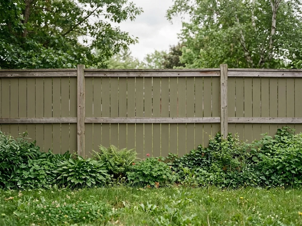
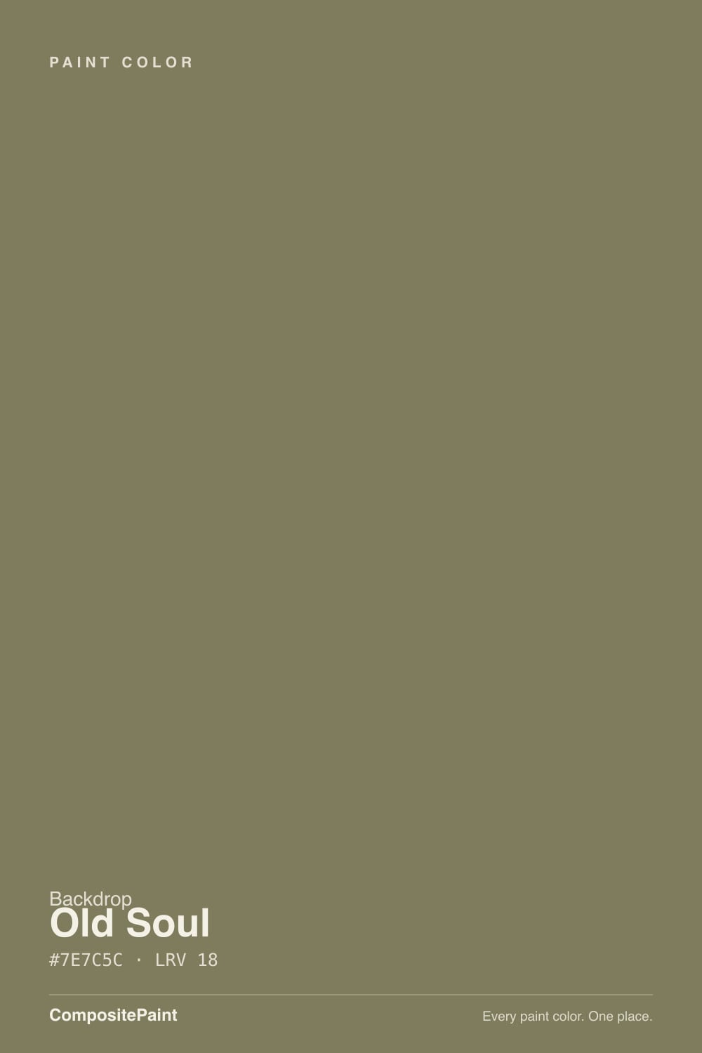
Old Soul is Backdrop's antique take on green: a warm, grayed-down olive that sits right at the border of khaki and army green, not garden green. At LRV 18 it is genuinely dark — deep enough to read as a real color decision, not a safe neutral. In good daylight with brass and walnut around it, it looks like it has been in the room for decades. In a dim room it just goes muddy brown-black and loses the whole point.
Kitchen cabinets and islands · a den or home office that wants some age to it · powder rooms and mudrooms · anyone who wants a green that reads antique-military, not garden
You want a true grass or emerald green · your room is dim, north-facing, and lamp-free · you're chasing a whole-house safe color · you only sampled it on a screen
- A genuinely antique khaki-olive, not another garden green
- LRV 18 holds real color in a bright room instead of washing out
- Flatters brass, walnut, leather, and butcher block
- Small doses (cabinets, a door, a powder room) read expensive without repainting the whole house
- Low-VOC, Greenwise-certified formula from a DTC brand that ships real peel-and-stick samples
- Goes muddy, near-black brown in a dim north-facing room
- Not a true green — disappointing if you wanted grass or emerald
- Fights cool gray stone, blue-gray tile, and chrome
- A newer DTC color with far less design track record than a decades-old deck color
What Color Is Old Soul, Really?
A warm, low-saturation yellow-green — sitting right at the hinge point between khaki and olive, with a hue that reads as green everywhere it gets real light and as a soft warm brown everywhere it doesn't. There is no blue or gray-cool pull to it at all: the undertone leans entirely warm, closer to weathered canvas or aged brass than to a cool forest green. That warmth is also why it never turns minty or blue-green the way some sage-family colors do — Old Soul stays firmly on the yellow side of the wheel in every light it's been photographed in.
At LRV 18 it is a genuine mid-dark color, roughly in the same depth range as Sherwin-Williams Dried Thyme and Retreat — deep enough that it doesn't wash out in a bright room, but also deep enough that a dim room with no real daylight will pull it toward near-black before it reads as green at all. Depth like this rewards a room that already has light to give; it does not create light. Plan the room around a window, not around the paint.
Backdrop is a direct-to-consumer paint brand founded in 2018 by Natalie and Caleb Ebel, sold online-only with low-VOC, Greenwise-certified formulas and peel-and-stick 12x12 samples instead of chip cards — and its color names lean cinematic and a little moody (Hocus Pocus, Lost in the 80s, Road to Todos Santos). Old Soul fits that house style: a name for a color that's meant to look like it's always been there, not one chasing a trend.
Where It Shines
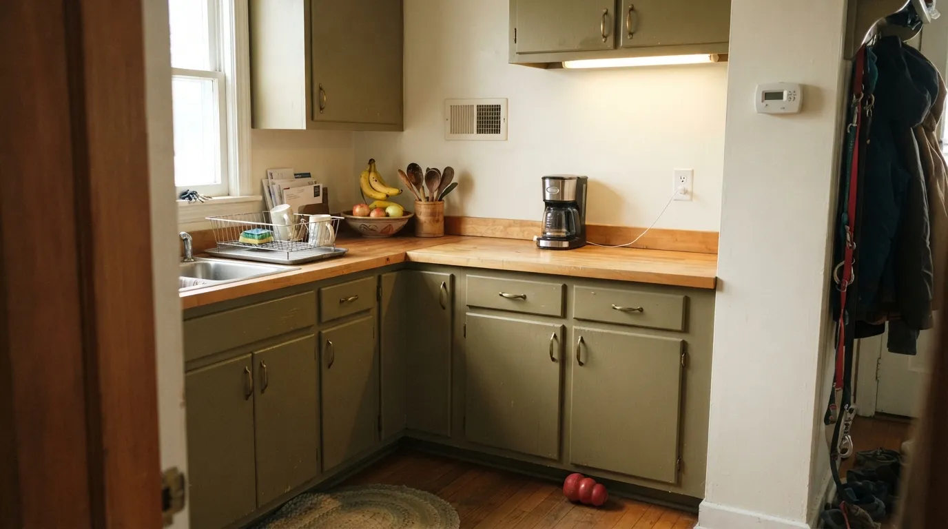
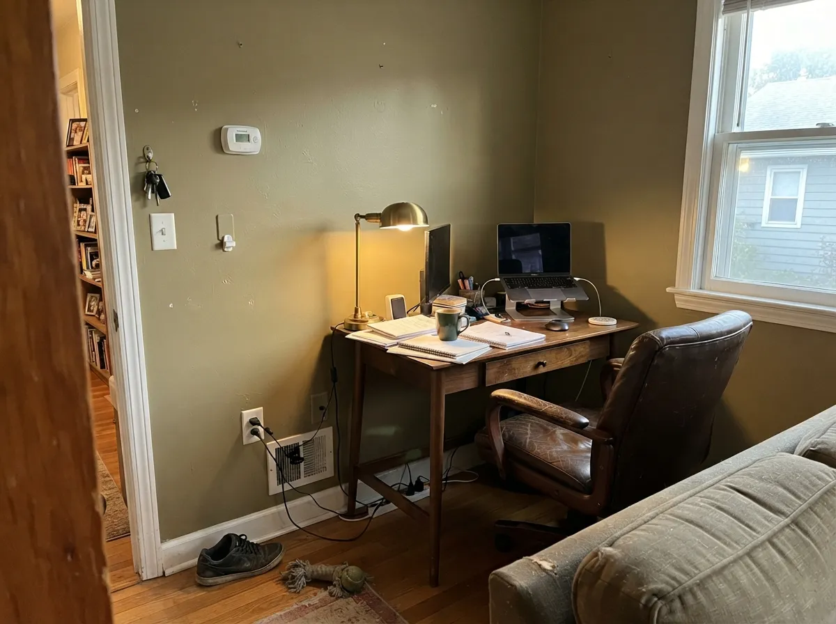
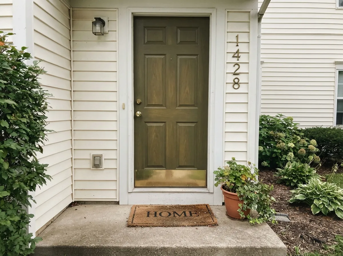
Give it real daylight and warm materials and Old Soul earns its name. On cabinets and islands it reads antique and expensive next to brass hardware, butcher block, and warm quartz — the exact vintage-but-not-dated look a lot of kitchen remodels are chasing right now. Its second home is a den or home office: with leather, walnut shelving, and a warm lamp on, the color settles into the room instead of announcing itself, which is the whole appeal of a color this deep and this quiet at once.
Where It Fails
Almost every regret story with a color this deep comes down to one of three mismatches, and all three are predictable before the first coat goes on. None of them are the paint's fault — but if your room or your expectation matches one of these, sample bigger before you commit four walls to it.
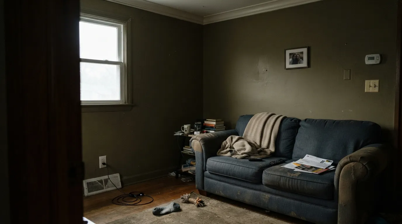
Cool, low daylight is exactly what this color depends on light to fight off. Without it, Old Soul drains to a flat, muddy brown-black that could pass for a bad chocolate color rather than a green. The fix is not more coats — it's a warmer bulb plan or a smaller dose (cabinets, an accent wall, a door) instead of all four walls.
This is khaki and army-green territory, not grass or emerald — the yellow-warm undertone keeps it grounded and a little dusty on purpose. If the goal was a saturated, unmistakably green green, this will read disappointingly brown to you even in perfect light. That's a color-family mismatch, not a defect.
Old Soul's undertone is entirely warm, so it argues with cool gray quartz, blue-gray tile, and polished chrome the same way any warm olive does — the pairing reads muddy on both sides. Give it brass, unlacquered bronze, walnut, and warm-white quartz instead, and the clash disappears.
Room by Room
The color this shade was made for. Backdrop's Grand semi-gloss on cabinets wipes clean, flatters brass pulls and butcher block, and reads custom rather than trendy. Keep the walls a warm cream so the color has a light surface to play off.
Low, warm light is this color's best friend, and a den rarely fights for bright daylight the way a living room does. Pair with walnut shelving, leather, and a real lamp, and the room feels settled instead of dark.
A small room takes a deep, saturated color better than a big one — all four walls in Old Soul with a brass sconce and a marble-look counter reads like a design decision, not an accident.
Depth hides scuffs, boot marks, and daily wear better than a pale color would, and the antique-khaki read suits a working entry. Satin or Backdrop's Grand finish for durability.
Works as a single feature wall behind a sofa or a built-in hutch, especially with warm wood furniture. A full room of it is a bigger bet — it needs consistent light on all four walls to stay green instead of going patchy dark in the shadowed corners.
Backdrop sells an exterior line, and a door this deep reads like weathered bronze against a warm white or cream house body. Avoid pairing it with a cool-gray exterior — the same warm-vs-cool clash shows up outdoors.
Your Light Is the Risk
Real sun is what pulls the green forward and keeps it out of brown territory. This is the light to sample it in first.
Cool, dim daylight drains the warmth and leaves a flat, muddy brown-black. Test big before committing a whole room.
Warmer and greener at the sun hours, quieter and browner once the direct light passes. Expect real movement through the day.
2700K lamps keep the olive alive after dark. Cool white LEDs flatten it toward gray-brown — swap the bulbs before you blame the paint.
Most complaints about Old Soul are a light mismatch. Upload a photo of your actual room and see it on your walls — then ask for the same wall in north light or evening lamps before you buy a single sample.
Need It From Another Brand?
Any paint counter can custom-tint Backdrop BD-OS directly. If you would rather stay in one brand's own deck, these are the closest stock matches, measured as ΔE2000. Under 2 is a difference you will not see on the wall.
| Brand | Closest color | ΔE | LRV | |
|---|---|---|---|---|
| Sherwin-Williams | EdamameSW 7729 · Sherwin-Williams | 1.9 | 20 | Color page → |
| Behr | MeadowlandHDC-AC-17 · Behr | 2.5 | 19 | Color page → |
| Benjamin Moore | Pining for You1512 · Benjamin Moore | 3.6 | 19 | Color page → |
| Valspar | Zipline GreenT618 · Valspar | 2.2 | 19.5 | Color page → |
| PPG / Glidden | Pine GarlandPPG1126-6 · PPG / Glidden | 3.5 | 20 | Color page → |
| Glidden | Pine GarlandPPG1126-6 · Glidden | 3.9 | 20 | Color page → |
Similar Backdrop Colors
The nearest shades to Old Soul within Backdrop's own range, ranked by perceptual color distance — useful when you want the same look a touch lighter, darker, or warmer.
WCAG 2.1: AA is 4.5 : 1 for normal text, 3 : 1 for large text, AAA is 7 : 1.
Old Soul vs the Colors You're Also Considering
Every Old Soul sample board has the same rivals on it. The numbers show the real lightness gap — then it comes down to which risk you would rather live with.
Pick this for the deeper, more khaki-warm version of the same cabinet green.
Sherwin-Williams SW 6186 · LRV 21Dried ThymePick this if your painter works in Sherwin-Williams — it's the closest match in the deck, a shade lighter and slightly greener.
Pick this when you want the color to read unmistakably green, not just quietly earthy.
Sherwin-Williams SW 7046 · LRV 20AnonymousPick this for a more neutral earthy tone that reads less green and holds up better as a whole-exterior color.
Within Backdrop, the closest neighbor is Hartford (BD-HF), LRV 22. On paper they are both muted mid-dark greens, but Hartford is a gray-green with a cooler, foggier cast, while Old Soul is warmer and more yellow. Side by side, Hartford looks like eucalyptus and Old Soul looks like olive. Choose Hartford for calmer, cooler rooms and coastal-leaning palettes; choose Old Soul when the room has wood, leather, and warm light to feed it.
Buenos Aires (BD-BA), LRV 14, sits a step darker and swaps the green entirely for brown. If you keep reaching for Old Soul but the samples look too green in your space, Buenos Aires gives you similar depth with a chocolate-leather character instead.
Anita (BD-AN), LRV 33, is the lighter escape hatch: a warm beige-taupe that carries some of the same earthiness at nearly twice the light reflectance, better suited to dim rooms where Old Soul would go heavy.
Old Soul Coordinating Colors
The rule for coordinating with Old Soul: warm whites, warm woods, and near-blacks — and keep cool gray stone at arm's length. It pairs with cream far better than with anything blue-gray, loves brass and walnut, and sits comfortably next to other warm charcoal-greiges. These are the partners that keep showing up in rooms that work:
Backdrop and the DTC Paint Wave
Backdrop is one of the direct-to-consumer paint brands that showed up in the late 2010s to sell paint the way skincare and mattresses were being sold: online-only, no big-box counter, samples mailed to your door. Founded in 2018 by Natalie and Caleb Ebel, the brand is Climate Neutral Certified and Greenwise Certified, with a low-VOC, low-odor formula and 12x12-inch peel-and-stick samples that re-stick instead of leaving a paper chip on the wall.
The color names lean cinematic and specific — Hocus Pocus, Lost in the 80s, Road to Todos Santos — rather than the paint-store convention of naming a green after a plant. Old Soul fits that pattern: a color built to look like it's always been in the room, not one chasing a season. For walls, Backdrop's paint is sold as their Standard finish; cabinets, trim, and furniture use the Grand line, their more durable semi-gloss enamel.
Old Soul With Wood Tones and Floors
This is an easy pairing question compared to most muted colors, because the wall and warm wood are on the same team: honey oak, golden pine, and butcher block all share the yellow-warm lean that Old Soul carries, so nothing fights. Walnut and espresso add welcome contrast rather than a clash — the deeper wood reads as intentional layering next to the olive rather than competing with it.
The one flooring that argues with it is cool gray — gray-washed engineered wood or cool LVP. The warm olive and the cool floor pull in opposite directions, and the wall can start to look muddy rather than rich. If the floor is staying gray, keep the color to cabinets or a door rather than four walls, and bring in brass or warm-toned furniture to bridge the gap.
Three Ready Palettes Built on Old Soul
A color is never alone on the wall. These are complete combinations in the 60-30-10 pattern, with the reason each one holds together. Every one opens in the visualizer.
White Dove keeps the trim soft instead of stark against a color this deep, and Wrought Iron adds one true near-black note so the room reads deliberate rather than just dark. Walnut furniture and a warm lamp finish it.
Try this palette in your roomSwiss Coffee keeps the room bright while the cabinets carry the color; Chelsea Gray on the island bridges the warm olive and a cooler counter without fighting either one. Brass hardware finishes the vintage look.
Try this palette in your roomA warm white body lets the door read like weathered bronze instead of just another dark color, and Kendall Charcoal shutters ground the elevation without competing with the door's warmth.
Try this palette in your roomOld Soul FAQ
Is Old Soul green or brown?
Both, depending on the light — and that is by design, not a flaw. It's a warm, low-saturation yellow-green that reads as khaki-olive in real daylight and drifts toward a soft warm brown as the light drops. It never turns blue, cool, or minty; the undertone is entirely warm in every light it's been seen in.
What white goes best with Old Soul?
A warm white — White Dove or Swiss Coffee, not a bright cool white. A stark white trim makes the olive look muddy by contrast; a soft warm white lets it read as intentional and finished.
Can I use it on kitchen cabinets?
Yes — it's arguably the color's best job. Use Backdrop's Grand semi-gloss finish for durability, pair it with brass hardware and butcher block or warm quartz, and keep cool gray stone out of the room.
Will it look too dark in a small room?
It depends entirely on the light, not the room's size. A small room with a real window handles it well — small rooms take deep color better than large ones. A small room with no direct daylight will read near-black; use it as a door or an accent instead of all four walls there.
Does it work with honey oak floors?
Yes, and this is one of the easier warm-color pairings — both the floor and the wall lean yellow-warm, so they harmonize instead of fighting the way a cool or violet color would. Add a walnut piece or a black metal fixture for contrast so the room doesn't read too matched.
Is Backdrop a good paint brand?
It has a solid reputation as a direct-to-consumer paint company: founded in 2018 by Natalie and Caleb Ebel, Climate Neutral and Greenwise certified, low-VOC, and known for smooth application and real peel-and-stick samples instead of paper chips. It's newer and smaller than the legacy decks, so don't expect in-store color matching — Backdrop colors are sold online-only, direct from the brand.
Have you painted with Old Soul?
Rate it — one tap helps the next reader decide.
Ask a Question