Anita
A deep, honest taupe from a paint brand with almost no paper trail on this one color — reviewed straight from its own numbers: where it holds its warmth, the light that flattens it, and what to pick instead.

Jessica has spec'd whites and neutrals for more than 300 rooms and keeps a sample wall of painted drawdowns in her studio. Every color review is checked against real reader rooms in the comments and re-tested when a formula changes. About the testing process →
- 1Anonymous20
- 2Felted Wool28
- 3Anita33
- 4Revere Pewter55
- 5Agreeable Gray60
The Fast Verdict
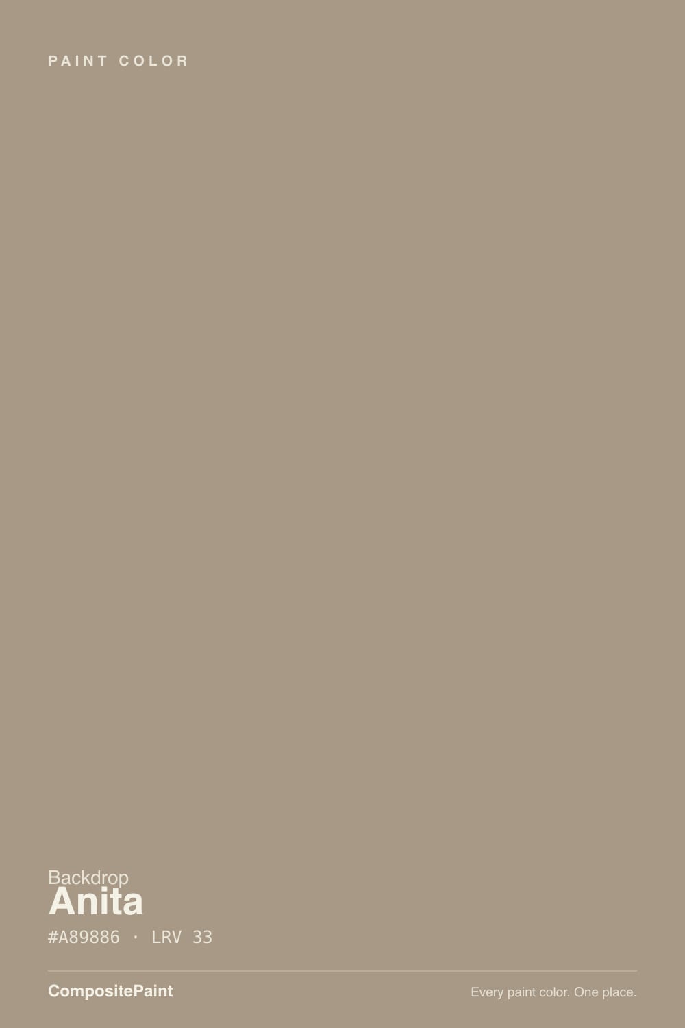
Anita is a deep, no-nonsense taupe — equal parts warm brown and cool gray, with nothing tipping it pink or gold. At LRV 33 it has real weight: enough to read as a color choice, not a whisper-neutral, but not so dark it swallows a room. Backdrop is a small direct-to-consumer brand and Anita has not built up the pile of design-blog and Houzz chatter that a Benjamin Moore bestseller has, so this review leans on what the color itself actually does — hex, depth, and how a taupe at this exact balance behaves in real light.
Living rooms and dens with afternoon or south light · bedrooms that want warmth without going brown-beige · kitchen islands and cabinets under a lighter wall · anyone who wants "gray" with body, not a pale whisper
Your room is north-facing and dim · you run cool white LEDs and won't switch bulbs · you want a true cool gray with zero warmth · you need a widely-reviewed color with years of reader photos to compare against
- A genuine, balanced taupe — warm and gray in close to equal measure
- LRV 33 gives it real body without going cave-dark
- Flatters warm wood, brass, and leather
- Reads settled and grounded rather than trendy or pastel
- A strong lamp-lit color for dens, bedrooms, and offices
- Goes flat and muddy in dim, north-facing rooms
- Cool white LEDs fight the warmth — 2700K bulbs are close to mandatory
- Buyers hunting for a true cool gray will find this warmer than expected
- Almost no independent reviews or reader photos exist yet to compare against
What Color Is Anita, Really?
Backdrop built its paint line around a short, curated color list with playful names — Punk Rock, Mom Jeans, Le Freak — and Anita sits quietly among them without a published backstory or the kind of design-press attention that follows the brand's louder shades. It also hasn't accumulated the years of Houzz threads and Reddit paint-fail posts that a color like White Dove or Agreeable Gray has, because Backdrop is still a small operation next to the majors. That is a real gap, and this review says so plainly instead of inventing praise or complaints nobody has actually posted: what follows is grounded in the color's own hex, LRV, and how a taupe built this way reliably behaves.
The numbers tell a clear story. At #A89886, the RGB values step down evenly — 168, 152, 134 — dropping about 16 to 18 points at each stage from red to green to blue. That even, gradual slope is the fingerprint of a genuine taupe: it isn't hiding a pink agenda (which would show a bigger jump between red and green) or a gold one (a bigger jump between green and blue). Anita is warm brown and gray in close to equal measure, which is a harder balance to hit than it sounds — most "greige" paints lean hard to one side the moment they're on a wall.
LRV 33 puts it in genuine mid-depth territory — noticeably deeper than the pale greiges most people default to (Revere Pewter sits at 56, Agreeable Gray at 60), closer in weight to Benjamin Moore's Stone Hearth or a deep Perfect Greige. That depth is the whole personality: it holds its color in full daylight instead of washing out, but it also has less light to give back in a dim room, so the room's actual light does more of the work than it would with a paler neutral.
Where It Shines
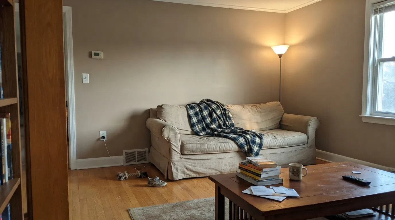
Give Anita real daylight — south or west exposure, or a room that gets a good afternoon wash — and the warm side of the taupe comes forward: a brown-gray that reads expensive and settled rather than flat. It is built for rooms people actually use in the evening, where a warm lamp brings out the brown side further. Pair it with white or warm-white trim and it reads like a color decision, not a hedge; pair it with wood, brass, or leather and it stops looking like a compromise color entirely.
Where It Fails
Anita's failure modes are the predictable ones for any mid-depth warm neutral, and because this specific color doesn't have a long trail of owner complaints to draw from, the honest thing to do is name the failure modes a taupe at this exact hex and LRV is built to have — not report ones nobody has documented yet.
Cool, indirect daylight strips the warm side out of any taupe and leaves the gray exposed — at LRV 33, Anita has less reflected light to fall back on than a pale greige, so the effect is more noticeable, not less. If the room is dim and stays dim, this is not the color to gamble a whole-room sample on.
4000K-plus "daylight" bulbs read blue against a warm taupe and push it toward a flat, slightly muddy gray. This is a bulb problem, not a paint problem — swap to 2700K warm bulbs before repainting anything.
Because the name and the swatch photograph gray-ish on a screen, some buyers expect a cool, blue-leaning gray. On the wall the warmth is unmistakable. If you specifically want cool and neutral with zero brown, this reads warmer than that search.
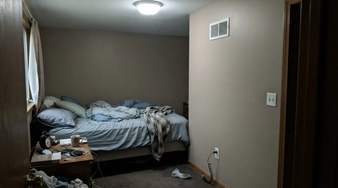
Room by Room
In a room that gets genuine daylight, Anita is a confident, grounded neutral that flatters wood furniture without fighting it. Eggshell finish; keep trim a warm white rather than a stark one.
The depth reads cozy rather than cave-like once evening lamps come on. If the bedroom is north-facing and dim during the day, expect the color to look flatter at noon than at night — that is normal for this depth of taupe.
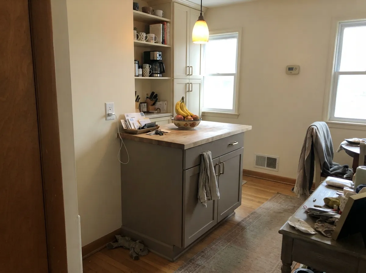
As an island or lower-cabinet color under lighter walls, Anita reads warm and custom against brass and butcher block. A full kitchen of cabinets this deep is a bigger commitment and needs strong, consistent light to avoid looking heavy.
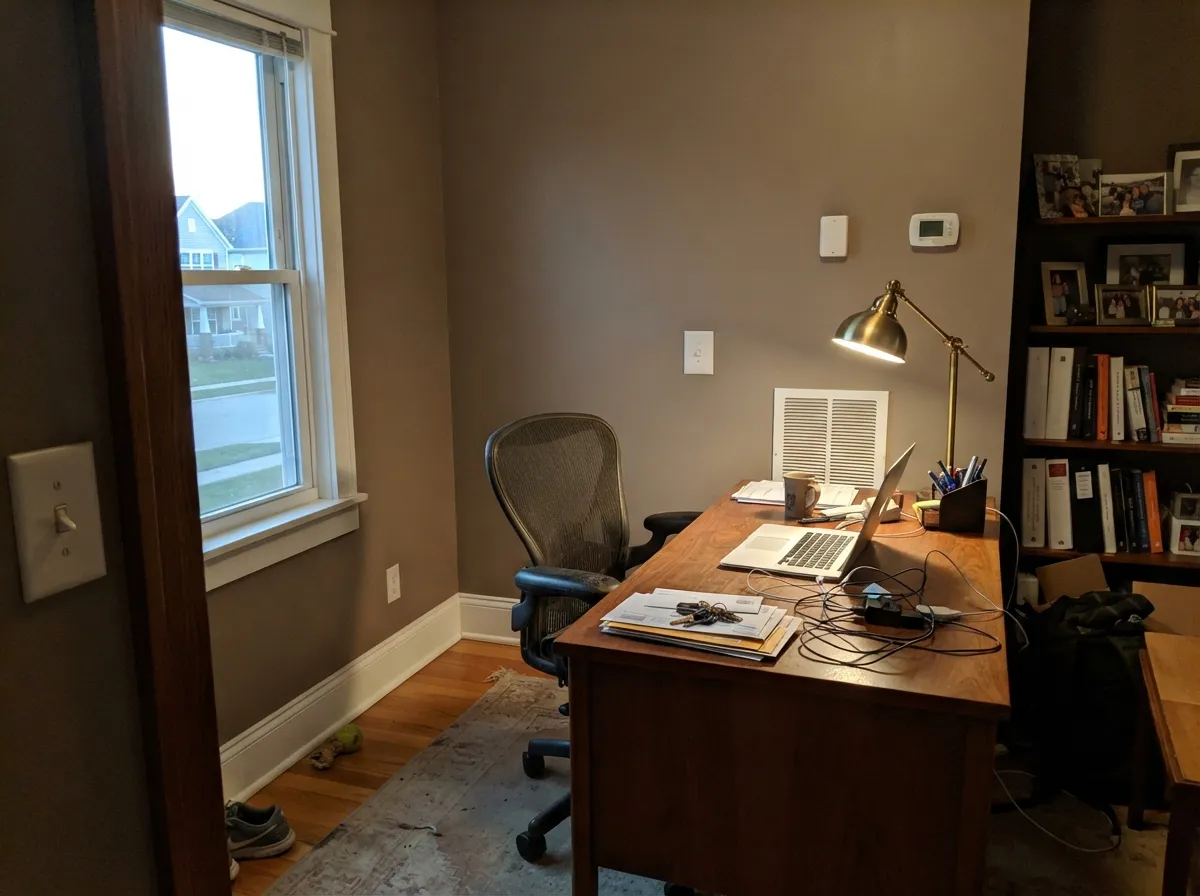
Low-traffic rooms that run on lamps more than daylight are exactly where a mid-depth warm taupe earns its keep. Satin for durability where a desk chair scuffs the baseboard.
With warm wood vanities and brass hardware it is a comfortable match. Against cool gray quartz or marble the two undertones argue — sample against the actual counter before committing.
Full outdoor sun reads any taupe brighter and slightly flatter than it looks indoors. As a front-door or shutter color against a lighter house it is a safe, grounded choice; committing an entire facade to an unreviewed color from a small brand is a bigger bet than most homeowners want to make sight-unseen.
Your Light Is the Risk
The warm brown side comes forward and the taupe holds its color all day — this is the light the color needs to look its best.
Cool, flat daylight drains the warmth and leaves a duller gray with less life. Sample it in your actual room before committing to a whole wall.
Cooler and grayer at midday, warmer and browner as the light turns gold in late afternoon — a bigger shift than a pale neutral shows, because there's more color here to move.
2700K warm bulbs pull the brown forward and the room turns cozy. Cool LEDs flatten it toward gray — swap the bulb before you second-guess the paint.
Most complaints about Anita are a light mismatch. Upload a photo of your actual room and see it on your walls — then ask for the same wall in north light or evening lamps before you buy a single sample.
Need It From Another Brand?
Any paint counter can custom-tint Backdrop BD-AN directly. If you would rather stay in one brand's own deck, these are the closest stock matches, measured as ΔE2000. Under 2 is a difference you will not see on the wall.
| Brand | Closest color | ΔE | LRV | |
|---|---|---|---|---|
| Sherwin-Williams | SanderlingSW 7513 · Sherwin-Williams | 1.2 | 31 | Color page → |
| Behr | Chic TaupeN230-4 · Behr | 2.4 | 32 | Color page → |
| Benjamin Moore | DowntownCSP-165 · Benjamin Moore | 3.6 | 33 | Color page → |
| Valspar | Land of NodT589 · Valspar | 3.2 | 33.4 | Color page → |
| PPG / Glidden | DiversionPPG1021-4 · PPG / Glidden | 1.0 | 33 | Color page → |
| Glidden | DiversionPPG1021-4 · Glidden | 0.8 | 33 | Color page → |
Similar Backdrop Colors
The nearest shades to Anita within Backdrop's own range, ranked by perceptual color distance — useful when you want the same look a touch lighter, darker, or warmer.
WCAG 2.1: AA is 4.5 : 1 for normal text, 3 : 1 for large text, AAA is 7 : 1.
Anita vs the Colors You're Also Considering
Every Anita sample board has the same rivals on it. The numbers show the real lightness gap — then it comes down to which risk you would rather live with.
Pick this if you specifically want Backdrop's paint formula and curated small-brand look over a legacy deck color.
Benjamin Moore 984 · LRV 30Stone HearthPick this if you want the closest well-documented match — same depth, same warm-earth family, with decades of BM reader photos to check against.
Pick this for more depth and a browner, less gray-forward lean than Perfect Greige gives you.
Sherwin-Williams SW 6073 · LRV 42Perfect GreigePick this for a lighter, better-known reference greige with a huge base of reader reviews to learn from.
Within Backdrop's own deck, the closest call is Carry the Two (BD-CT). It shares Anita's LRV of 33, so the depth is identical, but its lean is greener and more olive where Anita leans red-orange. On a wall, Carry the Two reads slightly earthier and more khaki; Anita reads softer and more clay-like. Choose Carry the Two in rooms with cool gray stone or green landscaping views, and Anita where wood tones and warm textiles dominate.
Nuevo (BD-NU), at LRV 38, is a step lighter and shifts firmly toward green-gray sage. It suits people who liked Anita's calm but found the warmth too pink in their light.
Rosita (BD-RO), also LRV 38, goes the other way: it takes Anita's red-orange lean and turns it into an open, dusty pink-terracotta. If a sampled Anita felt too tame and you wanted the warmth turned up, Rosita is that answer; if it felt too pink, move to Carry the Two.
Anita Coordinating Colors
Because Anita sits in the warm-neutral middle ground, it coordinates best with warm whites, other earth-toned neutrals, and one confident dark note rather than a bright accent. Keep cool blue-grays and pastels at a distance — they read as a mismatch against this specific undertone balance.
What We Actually Know About Anita
Backdrop built its reputation on a short, opinionated color list rather than the thousands of chips a legacy brand offers, and on names with more personality than a paint-deck code — Punk Rock, Mom Jeans, Buenos Aires. Anita fits that catalog's tone, but unlike the brand's more talked-about shades, it hasn't turned up in design-press round-ups or accumulated a visible trail of reader photos and complaints. That is worth saying plainly rather than papering over: this is a genuinely under-documented color from a small DTC brand, and the responsible way to review it is off its real numbers, not off invented buzz.
What the numbers say is straightforward: a mid-depth taupe at LRV 33, with red, green, and blue values that step down almost evenly rather than skewing hard toward pink or gold. That is a specific, checkable fact, not a marketing line — and it is the most honest starting point for anyone deciding whether to order a sample.
Anita With Wood Tones and Floors
Warm wood is the safest pairing: walnut, white oak, and even honey-toned oak sit comfortably against Anita because the paint's own undertone already leans brown. It won't fight a golden floor the way a cooler gray-greige would.
The pairing to test first is cool gray or heavily gray-washed flooring — two different temperatures of neutral sitting on top of each other can look like a mismatch rather than a scheme. Bring a large sample board down to the actual floor before painting a full room, especially since this color doesn't have a long trail of other homeowners' floor photos to check against yet.
Three Ready Palettes Built on Anita
A color is never alone on the wall. These are complete combinations in the 60-30-10 pattern, with the reason each one holds together. Every one opens in the visualizer.
A warm white trim keeps Anita from reading dark or heavy, and the near-black door supplies the one deep note the room needs without competing with the wall color's own depth.
Try this palette in your roomCream walls keep the kitchen bright while the island carries the color; Kendall Charcoal on the hood gives the eye one darker anchor so the taupe island doesn't have to do all the contrast work alone.
Try this palette in your roomTwo Backdrop neutrals from the same warm-earth family layer cleanly — Old Soul's khaki-olive built-ins read as a deliberate shade shift, not a mismatch, and White Dove trim keeps the room from feeling closed in.
Try this palette in your roomAnita FAQ
Is Anita warm or cool?
Warm, but genuinely balanced — the red, green, and blue values step down evenly, which is the signature of a true taupe rather than a color secretly leaning pink or gold. On the wall the warmth is clear; it is not a cool gray.
Is Anita more gray or more brown?
Both, almost exactly in equal measure — that is what "taupe" means. In good light it can look more brown; in flat or cool light it can look more gray. Neither read is wrong, it is the same paint responding to different light.
What trim color goes with Anita?
A warm white works best — White Dove or Swiss Coffee territory — because a stark cool white will make the wall look duller by contrast. Satin or semi-gloss trim against Anita's eggshell walls.
Is there a lot of information out there about this specific color?
Honestly, not much yet. Backdrop is a small direct-to-consumer brand, and Anita hasn't built up the years of design-blog coverage or Houzz and Reddit threads that a Benjamin Moore or Sherwin-Williams bestseller has. This review is built from the color's real hex and LRV data rather than borrowed opinions — order a sample and test it in your own light before committing to a full room.
Does it work with oak or golden wood floors?
Reasonably well — the brown in Anita's own undertone means it doesn't fight golden wood the way a cooler gray would. It pairs even more comfortably with walnut, espresso, or white oak, where the contrast in depth reads intentional.
Can I use Anita on kitchen cabinets?
Yes, especially as an island or lower-cabinet color under a lighter wall. A full kitchen of cabinets this deep is a bigger commitment and needs consistently good light to avoid looking heavy — use a satin, urethane-fortified cabinet enamel either way.
Have you painted with Anita?
Rate it — one tap helps the next reader decide.
Ask a Question