Felted Wool
Sherwin-Williams' deep, no-fanfare warm greige, reviewed honestly: the rooms it makes moody instead of muddy, the light that flattens it, and what to pick instead.

Jessica has spec'd whites and neutrals for more than 300 rooms and keeps a sample wall of painted drawdowns in her studio. Every color review is checked against real reader rooms in the comments and re-tested when a formula changes. About the testing process →
- 1Roycroft Brass15
- 2Anonymous20
- 3Felted Wool28
- 4Light French Gray53
- 5Accessible Beige58
The Fast Verdict
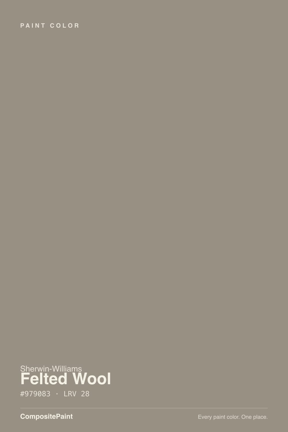
Felted Wool is what happens when Sherwin-Williams designs a deep greige and skips the marketing campaign entirely. At LRV 28 it's a genuine mid-dark neutral — a brown-grey base, warm without tipping tan — built for rooms where Agreeable Gray reads too pale and true charcoal reads too stark. It has no Color of the Year press and almost no fan threads to check your gut against. That's not a defect. Some good colors just never go viral.
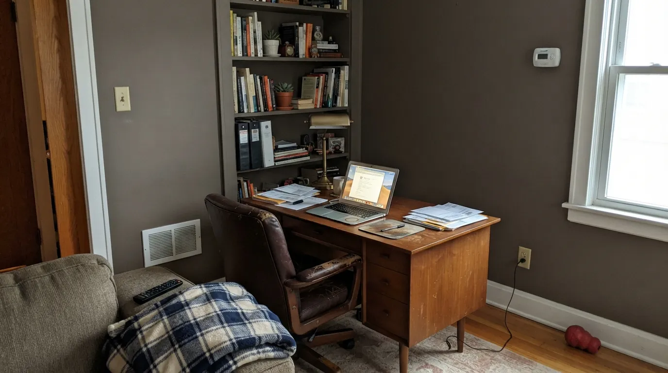
Dens, home offices, and accent walls with real daylight · kitchen islands under white perimeter cabinets · exterior siding and shutters · anyone who wants depth without picking a trend name
Your room is small with one window · you're chasing a true, brown-free gray · your trim stays a stark cool white · you want to research the color on Reddit first and there's nothing there
- A genuine deep greige with no pink and no candy-purple surprise
- Flatters walnut, leather, and brass in low, warm light
- Works on islands, exteriors, and offices without the fame-tax of a famous color
- Hides scuffs and shadows better than a mid-tone neutral
- No trend baggage to age out of — it was never trendy to begin with
- Needs real daylight or warm bulbs, or it goes flat and heavy
- Wrong for small, dim rooms — this is an LRV-28 color, and it acts like one
- So obscure that there are almost no real owner photos to sample-check against
- Cool white trim makes it read muddy instead of grounded
What Color Is Felted Wool, Really?
A deep warm greige — a grey base carrying just enough brown to keep it from reading cold, without enough to call it tan. Run the deck's own numbers — R151, G144, B131 — and the drop from red to blue is a gentle 20 points, spread almost evenly through green. That gentle taper is why the color gets described differently depending who's looking at it: some reviewers call it a warm gray, some call it taupe, one corner of the internet insists it leans green. It's none of those emphatically. It's a quiet brown-grey that never commits hard to one direction, which is exactly why it holds up in a room that gets both morning and evening light.
At LRV 28 it sits in genuinely dark-neutral territory — deeper than Agreeable Gray (LRV 60) or Worldly Gray (LRV 57), in the same range as Dovetail (LRV 26) and Chelsea Gray (LRV 22). SW filed it in a small, unpromoted run of four consecutive SKUs — Studio Clay SW 9172, Felted Wool SW 9171, Shiitake SW 9173, Moth Wing SW 9174 — released together with a textile-inspired naming convention and no real marketing push behind any of them. Shiitake (LRV 51) became the better-known face of that family; Felted Wool, its darker sibling, stayed the quiet one. Fewer real-world rooms to check your gut against, but also a color that hasn't been picked over by trend-chasers.
Undertone in one line: warm brown-grey, gentle and unforced — never pink, and not the green some blog reviews claim. If your sample looks flat and lifeless, that's the light draining it, not a hidden undertone surfacing.
Where It Shines
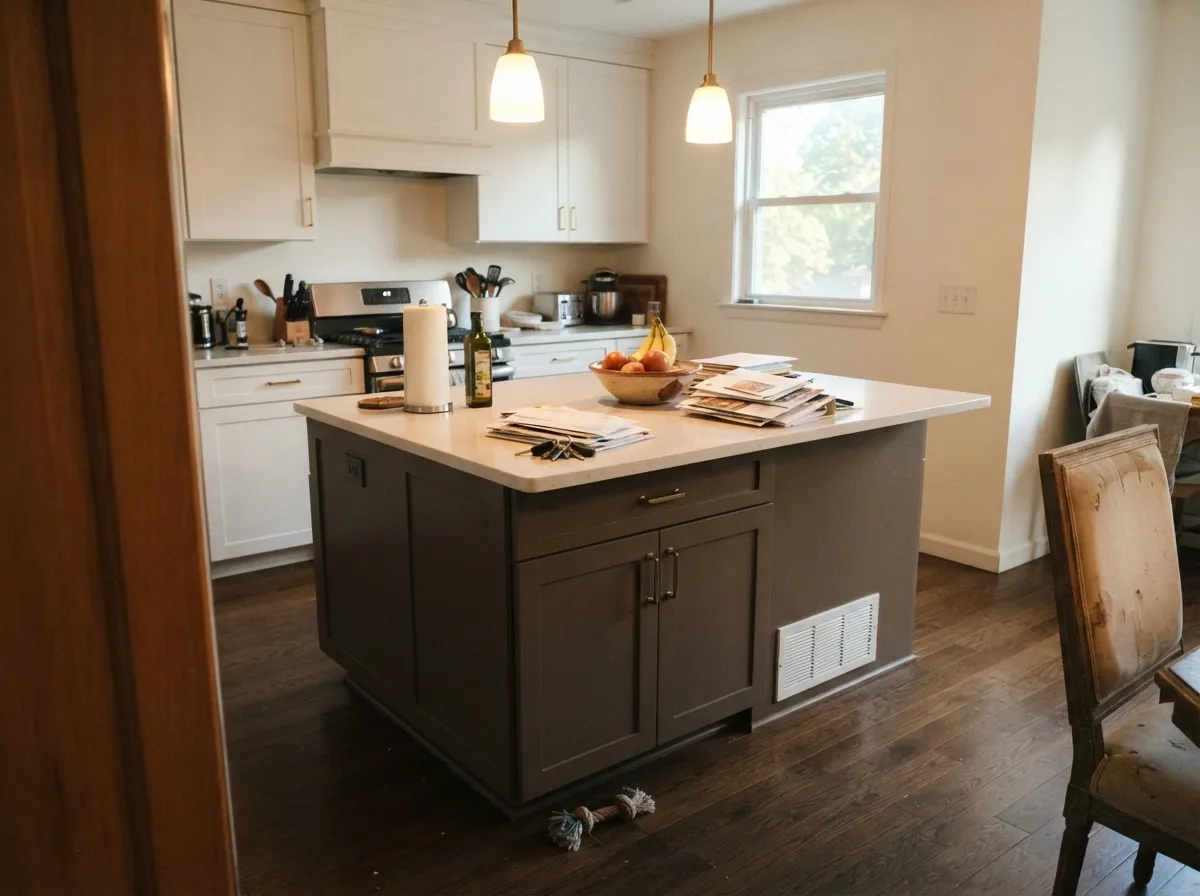
Give it a room with real daylight or a warm lamp and Felted Wool turns genuinely cozy — the color earns its name, reading soft and textural rather than flat. It's a den and home-office color first: the kind of quiet backdrop that makes leather, walnut, and brass look considered instead of staged. On a kitchen island or exterior trim, its depth reads as intentional rather than heavy, especially set against a crisp warm white.
Where It Fails
Felted Wool doesn't have hundreds of horror-story threads to mine — it's too obscure for that — but the handful of documented complaints and the plain physics of an LRV-28 color point to the same three predictable traps.
Below LRV 30, a color needs real light bouncing around to stay alive. In a cramped room with limited daylight, the reviewers who've actually tried it describe the result as suffocating, not cozy. Reserve it for rooms with generous windows, or use it on one wall instead of four.
Felted Wool's warmth needs a warm partner. Pair it with a bright blue-white trim and the wall reads muddy by comparison — the same mismatch that trips up every warm greige. Go with a soft white like Alabaster instead of a cool one like Extra White.
Without warm light to carry it, the brown drops out and the wall goes flat charcoal-grey at night. This is a color that needs 2700K bulbs in the room as part of the plan, not an afterthought.
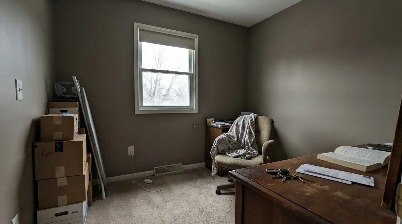
Room by Room
The low LRV and warm base make it a natural for a room used mostly with the lamps on. Walnut desk, leather chair, brass task lamp — it reads intentional, not dark for dark's sake. Eggshell or matte.
Under white perimeter cabinets (Alabaster or a similar soft white) a Felted Wool island reads custom without the commitment of a full kitchen. Satin cabinet enamel; brass or matte black hardware both work.
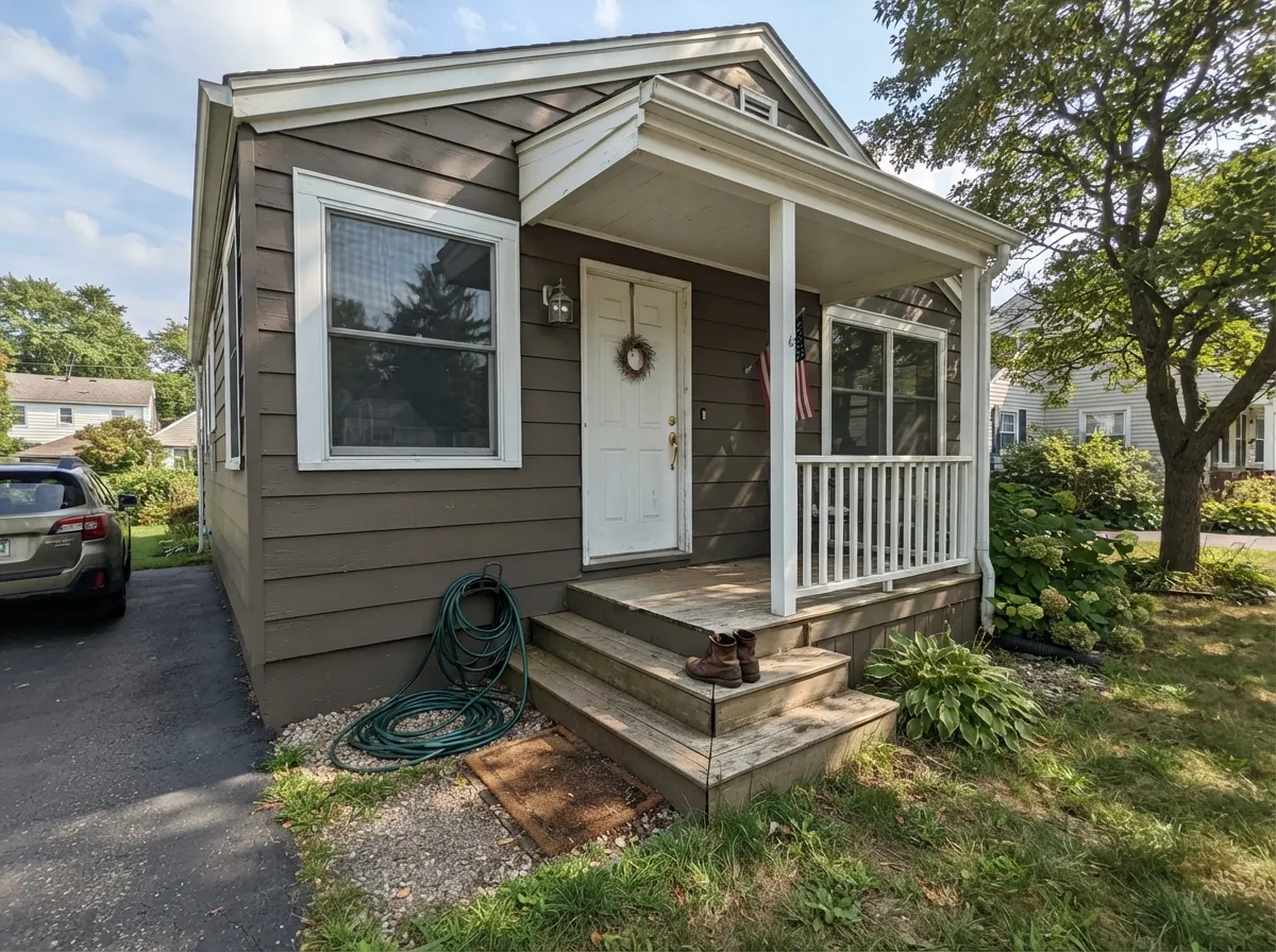
Full sun reads it lighter and greyer than it looks indoors. Against white or cream trim it's a modern, understated alternative to the black-and-white farmhouse look. Test a large sample panel outside — exterior light is unforgiving of undertone guesses.
One wall behind the headboard, cream bedding, a warm lamp — genuinely restful. Four walls in a north-facing bedroom risks the dim-room trap above.
In an open, sun-filled room it's a grounded, sophisticated neutral. In a north-facing or small living room, sample it big before committing — this is the room most likely to disappoint if the light is wrong.
Spa-like in a bathroom that gets real daylight; in a windowless powder room it reads cave-dark without strong artificial light. A skylight or a big mirror bouncing light helps.
Your Light Is the Risk
Full sun keeps the brown-grey balance and gives the wall real depth without going murky — the light this color was built for.
Not enough light bouncing around, and the color goes heavy and almost cave-like. Not the paint's fault — an LRV-28 color needs light to work with.
Soft brown warmth at the morning or golden-hour sun, quieter and greyer through the middle of the day. The shift is gentle, not dramatic.
2700K lamps pull the brown forward and it turns genuinely cozy. Cool LEDs flatten it toward charcoal — change the bulbs, not the paint.
Most complaints about Felted Wool are a light mismatch. Upload a photo of your actual room and see it on your walls — then ask for the same wall in north light or evening lamps before you buy a single sample.
Need It From Another Brand?
Any paint counter can custom-tint Sherwin-Williams SW 9171 directly. If you would rather stay in one brand's own deck, these are the closest stock matches, measured as ΔE2000. Under 2 is a difference you will not see on the wall.
| Brand | Closest color | ΔE | LRV | |
|---|---|---|---|---|
| Behr | Gray SquirrelN320-5 · Behr | 0.9 | 28 | Color page → |
| Benjamin Moore | Sage Mountain1488 · Benjamin Moore | 3.1 | 28 | Color page → |
| Valspar | State of Mind8005-10E · Valspar | 4.2 | 28 | Color page → |
| PPG / Glidden | Eiffel TowerPPG1022-5 · PPG / Glidden | 3.0 | 28 | Color page → |
| Glidden | Stone Castle Greige50YY 28/071 · Glidden | 0.9 | 28 | Color page → |
| Dutch Boy | Stone Cottage421-4DB · Dutch Boy | 2.9 | 28 | Color page → |
Similar Sherwin-Williams Colors
The nearest shades to Felted Wool within Sherwin-Williams's own range, ranked by perceptual color distance — useful when you want the same look a touch lighter, darker, or warmer.
WCAG 2.1: AA is 4.5 : 1 for normal text, 3 : 1 for large text, AAA is 7 : 1.
Felted Wool vs the Colors You're Also Considering
Every Felted Wool sample board has the same rivals on it. The numbers show the real lightness gap — then it comes down to which risk you would rather live with.
Pick this if you want the sibling that actually commits — Shiitake keeps second-guessing itself between pink and gray; Felted Wool doesn't.
Sherwin-Williams SW 9173 · LRV 51ShiitakePick this if you want the lighter, cream-leaning sibling from the same numbered SW family — same warm base, a full 23 points brighter.
Pick this for the extra brown warmth that keeps the color from going flat in the exact low light that trips up Dovetail.
Sherwin-Williams SW 7018 · LRV 26DovetailPick this for the same depth with the brown dialed back — a true warm gray instead of a greige.
Pick this if you'd rather not gamble on a color almost nobody's reviewed — Felted Wool sits a touch lighter and warmer, easier to live with on four walls.
Benjamin Moore HC-168 · LRV 22Chelsea GrayPick this for a proven charcoal-greige with a real track record on islands and exteriors — one shade deeper, one degree cooler.
Elephant Ear SW 9168 shares the LRV of 28 but at hex #988F85 leans a little more taupe and less olive. Canal Street SW 9523 at LRV 29 and #969281 is slightly lighter and clearly greener. Zeus SW 7744 at LRV 28 and #99907E is the most golden of the group, while Studio Clay SW 9172 at LRV 27 and #958D7F is marginally darker and softer.
Across brands, Dunn-Edwards Countryside DEGR27 at LRV 29 is a delta E of 0.59 from Felted Wool and Glidden Stone Castle Greige 50YY 28/071 at LRV 28 is 0.91 away, both close enough to call the same color. Behr Smokey Tan BXC-49 at LRV 28 is 1.41 away, visually identical in normal room light.
Farrow and Ball Chemise No. 216 at LRV 29 is 2.0 away, very close but worth sampling first, and Benjamin Moore Sage Mountain 1488 at LRV 28 is 3.08, close but visibly greener side by side.
Felted Wool Coordinating Colors
The rule for coordinating with Felted Wool is simple: keep the whites warm and let the accents share its brown-grey lean. It pairs cleanly with soft warm whites, sits comfortably next to its own deeper and lighter cousins, and takes brass and matte black hardware equally well. These are the partners that keep showing up in rooms that actually work:
The Quiet 9170s Family: Why Felted Wool Never Went Viral
Felted Wool shares its launch with three siblings: Studio Clay SW 9172, Shiitake SW 9173, and Moth Wing SW 9174, a small run of textile-named neutrals SW released together without a single big campaign behind any of them. Shiitake, at LRV 51, ended up the most-discussed of the four simply because it's lighter and easier to use whole-house. Felted Wool, at LRV 28, stayed in the background — deep enough that it reads as a specialty color rather than a default wall pick.
That obscurity is the honest headline of this review: there is no famous room, no Color of the Year moment, and comparatively few real owner photos to check your instincts against. What there is instead is a genuinely well-built deep greige that behaves predictably once you understand it needs real light. If you're the kind of buyer who wants social proof before you commit, order the sample and paint a big board — you'll be one of the first to document it, not the last.
Felted Wool With Wood Tones and Floors
Walnut, cognac leather, and aged brass are the color's natural company — all warm, all deep enough to sit at the same visual weight as an LRV-28 wall, so nothing looks washed out next to it. This is the pairing to build a den or office around.
Honey oak and other strongly golden floors are trickier, not because the temperatures clash but because they compete: two warm, saturated surfaces in a dim room can read heavy together. A lighter warm-white trim breaks up the weight and keeps the room from feeling like one solid block of brown.
Cool grey flooring or grey-washed wood is the real mismatch — the temperature difference is the same problem that trips up every warm greige, and Felted Wool's depth makes it more noticeable, not less. If the floor is staying cool and grey, a true warm gray like Dovetail is the safer bet.
Three Ready Palettes Built on Felted Wool
A color is never alone on the wall. These are complete combinations in the 60-30-10 pattern, with the reason each one holds together. Every one opens in the visualizer.
Alabaster keeps the trim warm instead of stark, so the switch from wall to woodwork feels soft, not clinical. Anonymous on the door adds one shade deeper from the same warm-neutral family — nothing fights, nothing competes for attention.
Try this palette in your roomAlabaster keeps the perimeter bright so the kitchen still feels open; Felted Wool carries the color on the one piece built to hold it. Chelsea Gray on the pantry door adds a second deep note without crowding the room — brass or matte black hardware ties all three together.
Try this palette in your roomPure White trim gives the greige siding definition without turning cold; Porpoise on the door supplies the one near-black note the scheme needs — and because it's warm too, nothing fights the siding's undertone.
Try this palette in your roomFelted Wool FAQ
Is Felted Wool warm or cool?
Warm, but gently — a brown-grey where the red-to-blue drop is only about 20 points. It reads as a soft warm gray in bright light and leans taupe under lamps. A few blog reviews describe a green cast; the color's own numbers don't support that, and it's not something you'll see on the wall.
Is Felted Wool too dark for a small room?
At LRV 28, yes, unless the room has generous windows. In a small space with one window, the depth reads heavy rather than cozy. Use it as an accent wall or save it for a room with real light.
What trim color goes with Felted Wool?
A soft, warm white — Alabaster or a similar creamy trim white. A stark cool white makes the walls look muddy by contrast, the same mistake that trips up almost every warm greige.
Is Felted Wool good for a kitchen island?
Yes — it's one of its strongest jobs. Under white perimeter cabinets, a Felted Wool island reads custom and grounded without committing the whole kitchen to a dark color. Use a satin cabinet enamel.
Does Felted Wool work on exteriors?
Yes, and it's arguably underused there. Full sun reads it lighter and greyer than it looks indoors, and paired with white trim it gives a modern, quiet alternative to the black-and-white farmhouse look. Sample a large panel outside before committing — exterior light changes the read.
Why haven't I heard of Felted Wool before?
It's genuinely obscure — no Color of the Year run, no viral room, released quietly alongside three sibling SKUs (Studio Clay, Shiitake, Moth Wing) that got more of the attention. That means fewer real rooms to compare against, but it also means the color hasn't been picked over. Sample it big before you commit, the same advice that applies to any less-documented color.
Have you painted with Felted Wool?
Rate it — one tap helps the next reader decide.
Ask a Question