Porpoise
The warm brown-gray dark neutral that quietly runs front doors, islands, and exteriors, reviewed honestly: the light it needs, the rooms where it goes muddy, and what to pick instead.

Jessica has spec'd whites and neutrals for more than 300 rooms and keeps a sample wall of painted drawdowns in her studio. Every color review is checked against real reader rooms in the comments and re-tested when a formula changes. About the testing process →
- 1Mahogany0
- 2Turkish Coffee5
- 3Porpoise13
- 4Cavern Clay20
- 5Redend Point30
The Fast Verdict
Porpoise is not a famous color. There is no Color of the Year press release, no viral Pinterest board attached to it — it is the quiet, dependable member of Sherwin-Williams' dark-neutral lineup, sitting between the softer greiges and the near-blacks like Urbane Bronze and Black Fox. What it actually is: a deep gray built on a warm brown-bronze base, named for the animal's own brown-and-gray coloring. Give it real light — a covered porch, a sunlit island, a well-lit exterior — and it reads sophisticated and warm. Starve it of light and it collapses into a flat, muddy near-black with no personality left.
Front doors and exterior trim · a kitchen island or lower cabinets under white uppers · a moody accent wall with real daylight · anyone who wants Urbane Bronze's warmth without going that dark
Your room has one small window and no real daylight plan · you want a true gray with zero brown in it · you're painting an entire small room floor-to-ceiling with no white trim to break it up · you need the room to feel bright and open
- Warm brown-bronze base gives it more personality than a flat charcoal
- Reads sophisticated on a front door or exterior trim in nearly any architectural style
- Deep enough for island or cabinet drama without going full black
- Lighter and easier to live with than Urbane Bronze at almost the same warm-dark family
- Coordinates cleanly with Sherwin-Williams' warm-white lineup — Alabaster, Greek Villa, Shoji White, Snowbound
- Needs real light — roughly 40+ lumens per square foot — or it goes flat and muddy
- The brown base can flash olive-green under cool or overcast light
- Quiet reputation with no famous designer moment or Color of the Year status behind it
- A whole small room without white trim to break it up can feel like a cave
What Color Is Porpoise, Really?
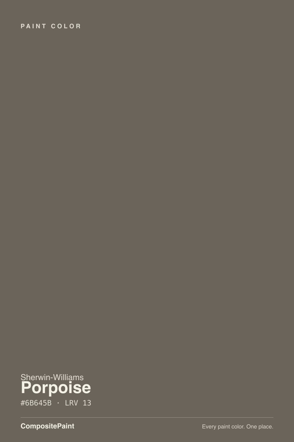
A dark warm neutral built on brown and bronze, with a gray overlay pulled across the top — the paint blogs that cover it consistently describe it as "smoky gray meets deep bronze," and the name follows the same logic: harbor porpoises show exactly that mix of brown, bronze, and gray in their own coloring. It is not a greige in the pale, whole-house sense; at RGB 107/100/91 it sits closer to a warm charcoal than to any of the mid-tone taupes.
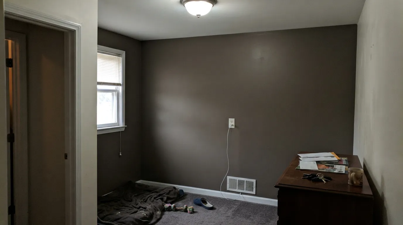
At LRV 13 it is a genuinely dark color, and that number does the real work here. In strong, direct light it settles into a softened taupe-brown that reads warm and expensive. In anything dimmer it loses that warmth fast and turns into a flat, undifferentiated dark gray with almost no undertone left to see — several independent write-ups put the safe threshold at roughly 40 lumens per square foot of real light, which is a lot for a room that isn't south-facing or well-lamped.
Undertone in one line: warm brown-bronze base, gray overlay, with an olive-green cast that can surface under cool or overcast light. If your sample reads flat and colorless, that is dim or cool light stripping the bronze out — not a defect in the paint.
Where It Shines
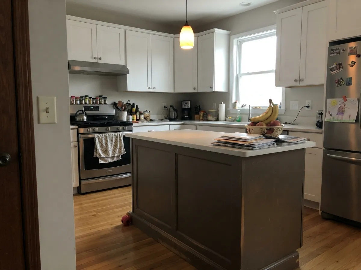
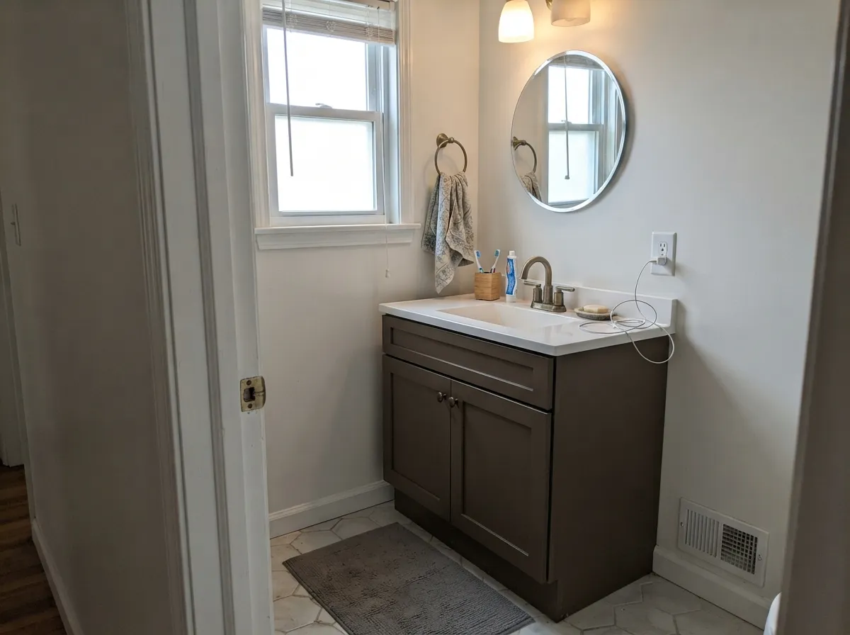
This color earns its keep in small, well-lit doses rather than as a whole-room commitment. A front door under a porch light, an exterior painted in real daylight, a kitchen island with task lighting overhead, a bathroom vanity under a window — all of these give Porpoise enough light to show the bronze-brown warmth that makes it worth choosing over a flatter charcoal. It also works as the deeper, more approachable stand-in for Urbane Bronze: same warm-dark family, three points lighter on the LRV scale, easier to live with on cabinetry and trim where full black-brown can feel heavy.
Where It Fails
The complaints that show up around Porpoise all trace back to one of three predictable mismatches, and none of them are the paint misbehaving — they are the paint being asked to do a job it was never suited for.
This is the single biggest factor with a color this dark. A north-facing room, a small window, or a hallway with no fixture overhead will pull nearly all the visible undertone out of Porpoise and leave a flat, muddy near-black. It is not a moody-and-intentional dark at that point — it just reads unfinished. Add real fixtures (aim high, not one lamp in a corner) or pick a lighter neutral instead.
Every independent write-up of this color lands on the same fact: the base is warm and brown, not neutral gray. If your goal was "dark gray, no warmth," Porpoise will read distinctly brown-tinted next to it, especially against cool whites or chrome fixtures. Go with Peppercorn or Kendall Charcoal instead — both hold a truer gray at a similar depth.
Floor-to-ceiling Porpoise in a small room with dark trim and no white anywhere reads like a cave rather than a cocoon — the effect this color is actually good at needs a light surface nearby (trim, ceiling, an adjacent wall) to bounce light back in. Use it on a door, an island, or one accent wall, or pair it with a real white trim, not another dark.
Room by Room
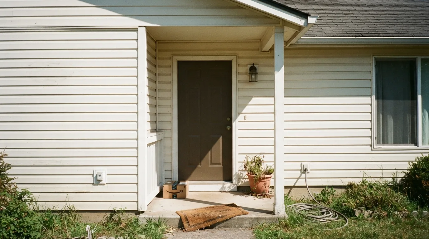
A single dark, warm door against a lighter house is the single most-repeated use of this color, and it is the easiest place to get right: the door gets daylight, it is a small surface, and the warm bronze base reads as intentional and expensive rather than heavy. Semi-gloss for wipe-down durability.
Works on both rustic and contemporary houses, on siding as the main color or on trim and shutters against a lighter body. Full outdoor daylight is exactly the light this color needs to show its bronze warmth instead of going flat.
Under white or light upper cabinets, with task lighting overhead, Porpoise gives an island real weight without the commitment of a true black. Pairs well with oak, black hardware, and aged brass. Satin, urethane-fortified cabinet paint, not a wall product.
In a bathroom with a real window or strong overhead light, a Porpoise vanity against white walls and natural stone reads polished and calm. In a windowless powder room with only a single overhead bulb, it will go flat — add a sconce at mirror height before committing.
One wall, real daylight or warm 2700K lamps at night, and it settles into a sophisticated, cocooning dark. Skip it as the only light source in the room is a single ceiling fixture — that is the setup that produces the flat, muddy complaints.
Studies and dining rooms show up in the real-world photo examples, but nearly all of them keep a white ceiling or trim to bounce light back. Without that, a small room in Porpoise floor-to-ceiling reads dark and closed rather than moody.
Your Light Is the Risk
South or east daylight, or a well-lit exterior, reveals the softened taupe-bronze character in full. This is the light every good photo of this color was taken in.
Under roughly 40 lumens per square foot the bronze drops out and the color settles into a flat, undifferentiated dark gray. The most common regret with this paint.
Cooler ambient light can pull an olive-green cast forward that direct sun never shows. Sample on an overcast day, not just a sunny one.
Warm 2700K bulbs bring the bronze back after dark. Cool white LEDs push it toward flat, slightly green-gray — swap the bulb before you swap the paint.
Most complaints about Porpoise are a light mismatch. Upload a photo of your actual room and see it on your walls — then ask for the same wall in north light or evening lamps before you buy a single sample.
Need It From Another Brand?
Any paint counter can custom-tint Sherwin-Williams SW 7047 directly. If you would rather stay in one brand's own deck, these are the closest stock matches, measured as ΔE2000. Under 2 is a difference you will not see on the wall.
| Brand | Closest color | ΔE | LRV | |
|---|---|---|---|---|
| Behr | Patio StoneN360-6 · Behr | 1.0 | 13 | Color page → |
| Benjamin Moore | Deep Creek1477 · Benjamin Moore | 1.0 | 15 | Color page → |
| Valspar | Catch of the Day8005-2F · Valspar | 1.5 | 12 | Color page → |
| PPG / Glidden | IntrospectivePPG15-18 · PPG / Glidden | 3.3 | 13 | Color page → |
| Glidden | Grey Squirrel30YY 14/070 · Glidden | 1.3 | 14 | Color page → |
| Dutch Boy | Eagles Feathers442-6DB · Dutch Boy | 2.1 | 13 | Color page → |
Similar Sherwin-Williams Colors
The nearest shades to Porpoise within Sherwin-Williams's own range, ranked by perceptual color distance — useful when you want the same look a touch lighter, darker, or warmer.
WCAG 2.1: AA is 4.5 : 1 for normal text, 3 : 1 for large text, AAA is 7 : 1.
Porpoise vs the Colors You're Also Considering
Every Porpoise sample board has the same rivals on it. The numbers show the real lightness gap — then it comes down to which risk you would rather live with.
Pick this for the lighter, easier-to-live-with version with more of the warm undertone visible day to day.
Sherwin-Williams SW 7048 · LRV 8Urbane BronzePick this if you want it darker and more dramatic — Urbane Bronze reads nearly black in dim light.
Pick this if you specifically want the warm bronze-brown character Peppercorn doesn't commit to either way.
Sherwin-Williams SW 7674 · LRV 11PeppercornPick this if you want a dark gray that takes its undertone from the room instead of committing to a fixed brown base.
Limestone SW 9599, at #6A655C and LRV 13, is the near twin, a shade less warm but not enough to change a room. Griffin SW 7026, at #6F6459 and LRV 13, is slightly lighter in feel and browner. Braintree SW 9595, at #65635B and LRV 12, is darker and cooler, closer to a plain charcoal. Cast Iron SW 6202, at #64645A and LRV 12, drops the red-orange and reads greener. Folkstone SW 6005, at #6D6562 and LRV 14, leans purple-gray instead of brown.
Across brands, HGTV Home by Sherwin-Williams lists Porpoise as HGSW 3482 with the identical hex, so it is the same color under a different label. Benjamin Moore Deep Creek 1477 at LRV 15 is a deltaE of 0.96, a true match. Glidden Grey Squirrel 30YY 14/070, Valspar Catch of the Day 8005-2F, and Behr Derby N180-6 are all visually identical in normal room light. Farrow and Ball Salon Drab No. 290 at LRV 13 is very close, so sample it first.
Porpoise Coordinating Colors
The rule with Porpoise: pair it with warm whites and give it real light nearby, never a cold white and never total darkness on every side. It sits comfortably next to other warm-dark neutrals when a scheme needs two depths of the same family, and it shares its brown-olive undercurrent with a few other earthy BM and SW colors worth knowing about.
Porpoise on Exteriors
Outside is where this color does its most confident work, and the reason is simple: full daylight is the one light situation Porpoise never struggles in. It shows up as a full siding color on both rustic and contemporary houses and, more often, as the trim, shutter, or front-door color against a lighter body — the smaller the surface, the more forgiving the light requirement becomes.
The pairing follows the same warm-white rule as indoors: a warm white or soft neutral body color keeps the house from feeling heavy, while Porpoise carries the depth on the door or shutters. Natural materials — oak accents, black hardware, aged brass fixtures, real stone — read as intended next to it; a stark, blue-white body color will make the brown undertone look duller by contrast rather than crisper.
Where Porpoise Sits in the SW Deck
Sherwin-Williams' neutral family runs a long ladder from pale greige down to near-black, and Porpoise sits in the deep end of it — noticeably lighter and warmer than Urbane Bronze, and warmer in undertone than a true charcoal like Peppercorn. It is not the star of that ladder; it is the workhorse dark option people reach for when Urbane Bronze feels like too much commitment and a flat black-gray feels like too little personality.
That quiet positioning is honest, not a knock. Not every good color needs a Color of the Year moment — Porpoise's job is to do front doors, islands, and exteriors well, in the right light, without asking for attention it hasn't earned.
Three Ready Palettes Built on Porpoise
A color is never alone on the wall. These are complete combinations in the 60-30-10 pattern, with the reason each one holds together. Every one opens in the visualizer.
A warm white siding keeps the house bright and gives Porpoise the daylight it needs on the door to read bronze instead of flat. Peppercorn on the shutters echoes the depth without competing for attention.
Try this palette in your roomAlabaster keeps the perimeter cabinets light and the room from feeling boxed in, while Porpoise on the island supplies the one dark, warm anchor a kitchen this bright can carry. Shoji White walls share the same warm base so nothing fights.
Try this palette in your roomAgreeable Gray keeps most of the room bright enough to stay livable, so the one Porpoise wall gets to do the moody, warm-dark work it is actually good at. Pure White trim gives the eye somewhere light to land.
Try this palette in your roomPorpoise FAQ
Is Porpoise gray or brown?
Both — it is a genuine greige built on a warm brown-bronze base with a gray overlay on top, and under cool or overcast light it can flash a touch of olive-green. In real, direct light the brown-bronze reads clearly; in dim light the gray takes over and it goes flat.
Will Porpoise work in a room without much natural light?
Not well. Independent color reviews put the safe threshold at roughly 40 lumens per square foot, which most dim or north-facing rooms fall well short of. Below that, the warmth drops out and the wall reads as a flat, muddy dark gray rather than the intended warm dark. Add real overhead lighting or pick a lighter neutral.
What's the difference between Porpoise and Urbane Bronze?
LRV — Porpoise sits at 13, Urbane Bronze at 8, both in the same warm-dark SW family. Five points sounds small, but it is the difference between a color that still shows visible undertone day to day and one that reads nearly black except in strong light. Pick Porpoise if you want a dark that still looks like a color; pick Urbane Bronze if you want it to look nearly black.
Is Porpoise a good exterior color?
Yes — it shows up on siding, trim, and shutters on both rustic and contemporary houses, and full outdoor daylight is exactly the light it needs to look its best. Pair it with a white or light-neutral trim so the house doesn't lose its light-bouncing surfaces.
What white goes with Porpoise?
A warm white, not a stark cool one — Alabaster, Greek Villa, Shoji White, and Snowbound all share enough of the same warm base to sit next to it without a visible seam. A cold, blue-white trim will make Porpoise's brown undertone look muddier by contrast.
Can I use Porpoise on kitchen cabinets or an island?
Yes — it is a common island or lower-cabinet color under white or light upper cabinets, especially with oak, black hardware, or aged brass nearby. Use a satin, urethane-fortified cabinet enamel rather than a wall paint, and make sure the island gets real task lighting overhead.
Have you painted with Porpoise?
Rate it — one tap helps the next reader decide.
Ask a Question