Cast Iron
The dark warm gray Sherwin-Williams never bothered to hype, reviewed honestly: where it reads rich charcoal, the exact light where it goes flat and muddy, and what to pick instead.

Jessica has spec'd whites and neutrals for more than 300 rooms and keeps a sample wall of painted drawdowns in her studio. Every color review is checked against real reader rooms in the comments and re-tested when a formula changes. About the testing process →
- 1Black Emerald1
- 2Essex Green6
- 3Cast Iron12
- 4Sage Green22
- 5Evergreen Fog30
The Fast Verdict
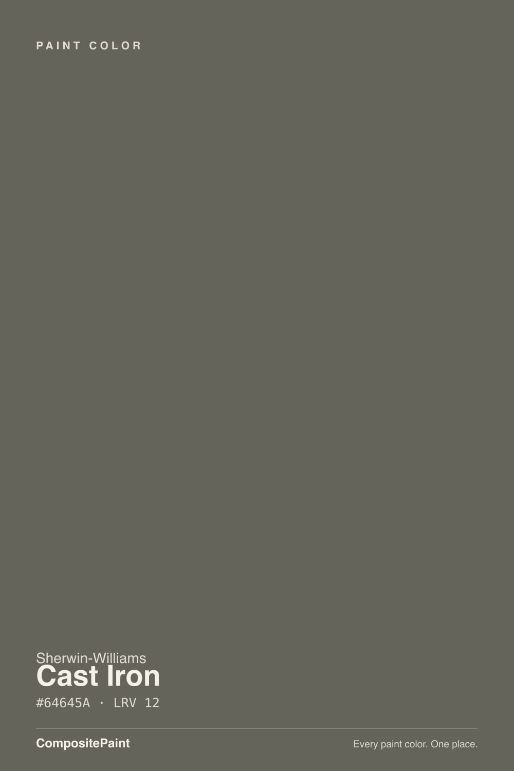
Cast Iron is what a dark neutral looks like when nobody wrote a press release for it. At LRV 12 it sits in true dark-charcoal territory, warmed by a whisper of olive-brown instead of the blue-black chill of Iron Ore or the flat void of Tricorn Black. Give it a front door, a kitchen island, or a wall that actually gets daylight and it reads rich and deliberate. Put it in a room with no light source and it goes flat and muddy fast — this is a color that has to earn its depth honestly, coat by coat, in real light.
Front doors and shutters · a kitchen island against white perimeter cabinets · a home-office or den accent wall with real daylight · anyone who wants black's drama without black's coldness
You want a true, neutral black with zero warmth · the room has no window and no plan for lamps · your floors and trim are heavy honey oak · you're chasing a color with a design-magazine backstory
- A dark warm neutral that avoids the flat coldness of true black
- Genuinely strong on front doors, shutters, and exterior trim
- Reads expensive on a kitchen island against white cabinets and brass
- Holds its warm-charcoal color well in real daylight, indoors or out
- A dependable workhorse with no trend expiration date to worry about
- Goes flat and muddy fast in a room with no window or lamp
- Not a true black — disappoints anyone expecting zero warmth
- Fights heavy honey oak floors and yellow-beige trim
- Little real-world photo reference online before you commit — sample big
What Color Is Cast Iron, Really?
A dark warm gray with equal parts red and green in its formula and noticeably less blue — which is the technical way of saying it leans olive-brown rather than true neutral. That single fact separates it from the two SW darks everyone already knows: Iron Ore reads cool and almost blue-black, Tricorn Black reads as close to true black as paint gets, and Cast Iron sits between them, warmer and softer than both. It shares a numbering block with SW's soft green-grays — Oyster Bay, Retreat, Rainwashed, Pewter Green — but at LRV 12 it is dramatically deeper than any of them, which is why it reads charcoal first and olive second, not the other way around.
Depth-wise, it sits almost exactly where Kendall Charcoal (BM, LRV 13) and Porpoise (SW 7047, LRV 13) live, and Porpoise in particular is close enough in hex to be a genuine sibling — same warm-neutral core, about a point brighter. None of these three colors ever had a Color of the Year moment or a viral design-blog run; they are the quiet workhorses professional painters reach for on doors, shutters, and islands precisely because they behave the same way every time, without a trend clock attached.
Undertone in one line: warm neutral gray with a whisper of olive-brown — never a clean black, never a true green. If your sample reads muddy or slightly khaki, that is low light or yellow-toned wood talking, not a flaw in the paint; if it reads close to black, that is simply LRV 12 doing what LRV 12 does in a shaded corner. One sign of how little attention this color gets: the handful of paint-catalog sites that cover it can't agree with each other, calling the same swatch blue-leaning, green-leaning, and neutral in the same search results — a color with a real design following doesn't get described three different ways by three different sites.
Where It Shines
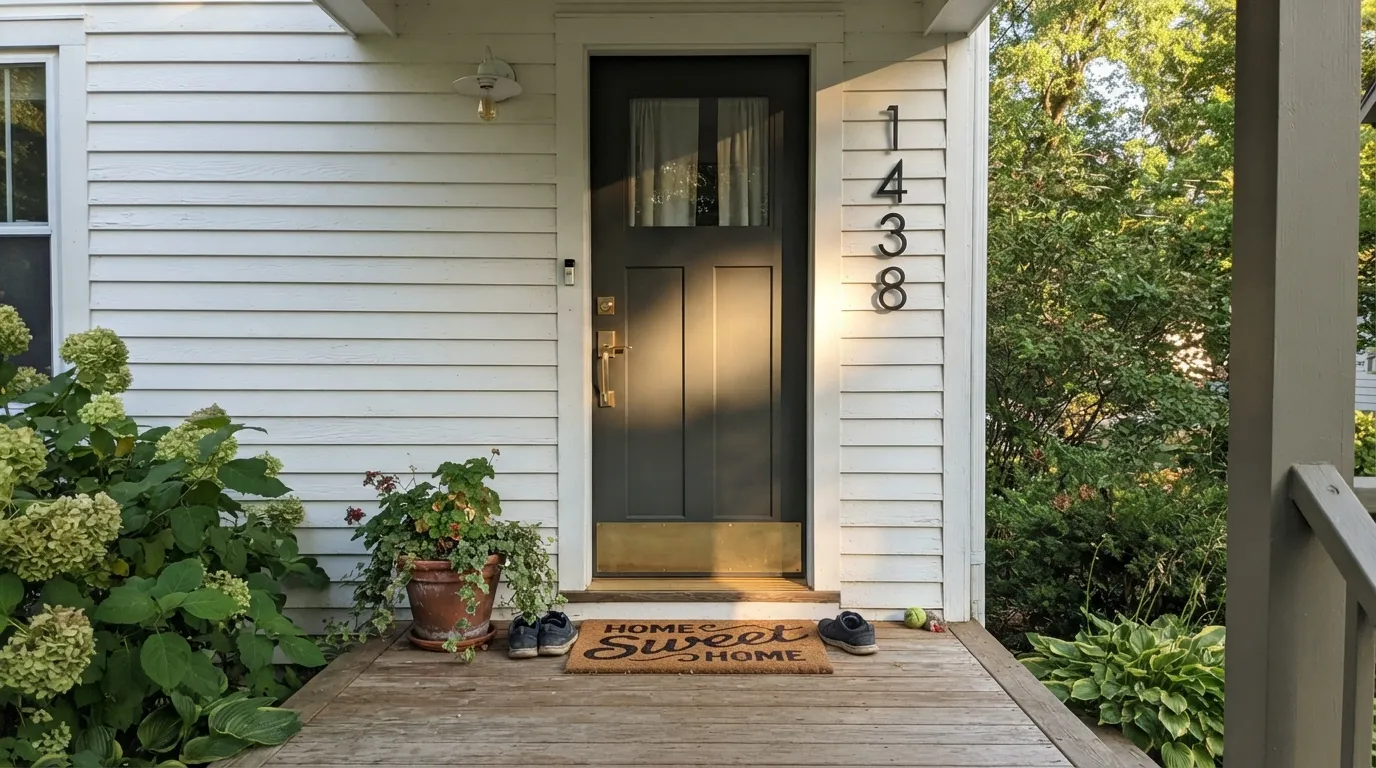
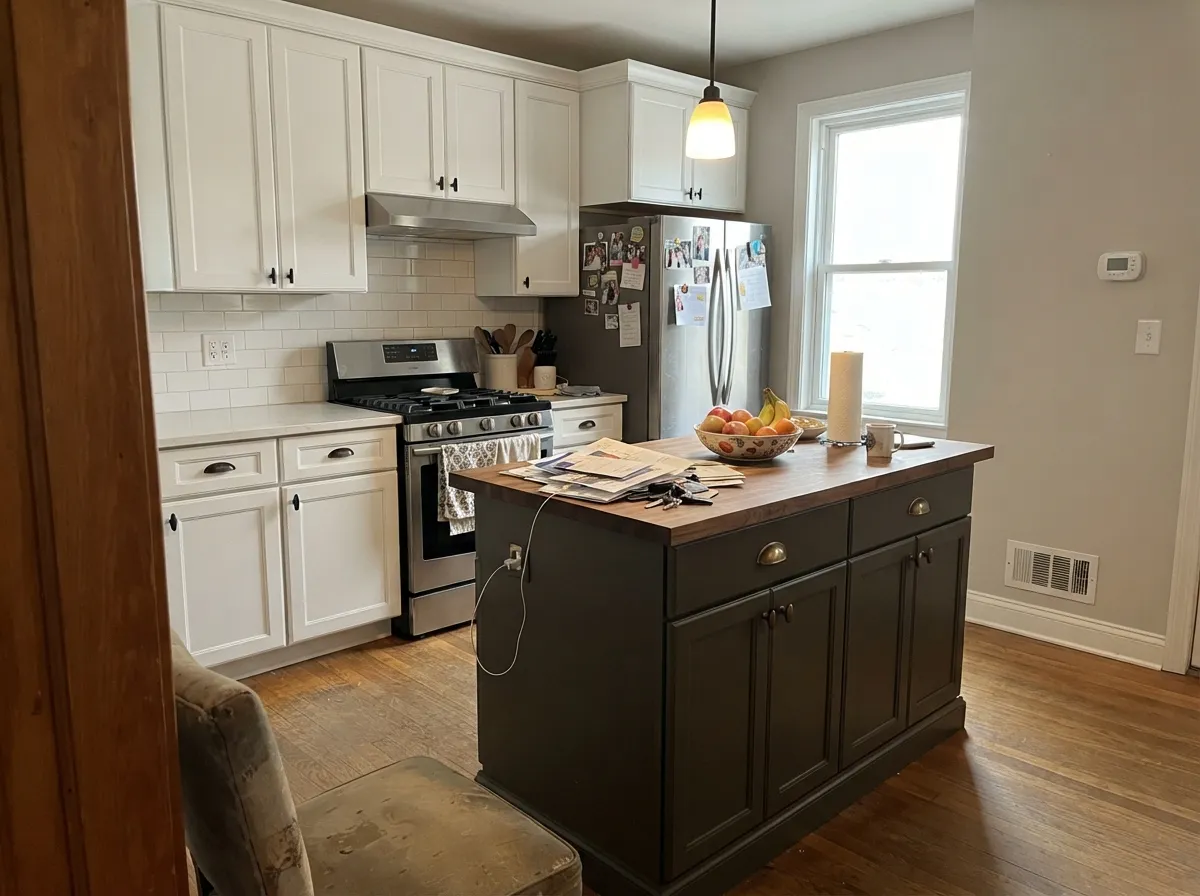
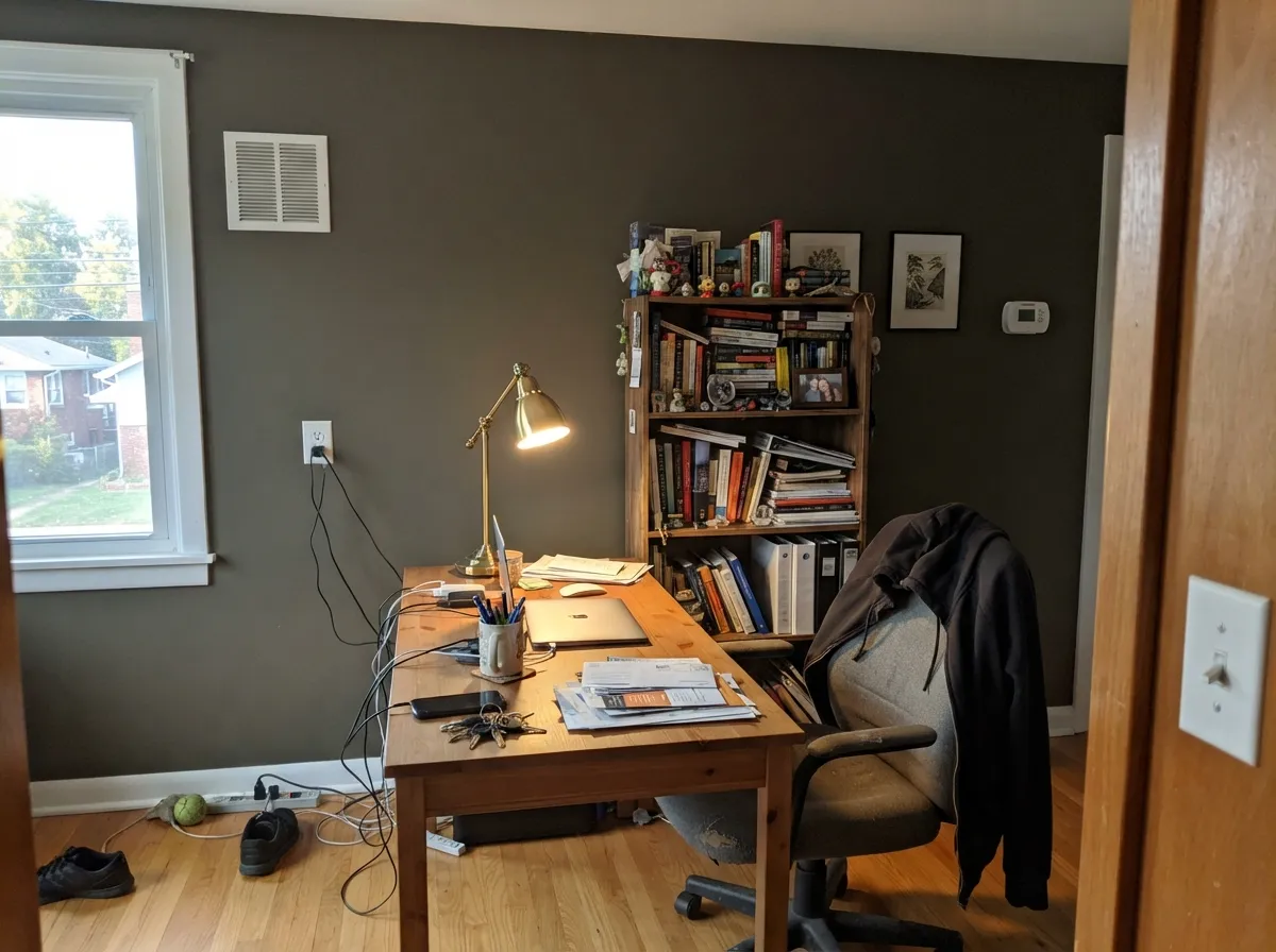
Give it real light and a job with edges — a door, an island, trim against a lighter body color — and Cast Iron looks considered rather than accidental. It is an exterior color first: on a front door or shutters against a white or light-greige house it reads like a custom-mixed black without the starkness, and full sun brings the warm undertone forward instead of washing it out. Indoors, its second home is the kitchen island or a set of built-ins, where the depth reads expensive next to brass hardware and a white or warm-neutral perimeter, and a home office or den wall with a real window turns genuinely rich instead of cave-like.
Where It Fails
The complaints about Cast Iron are not really about the color — they are about asking a dark neutral to do a job daylight or expectation didn't set it up for. All three are predictable before the first coat, and none of them need a repaint to fix; they need a different plan.
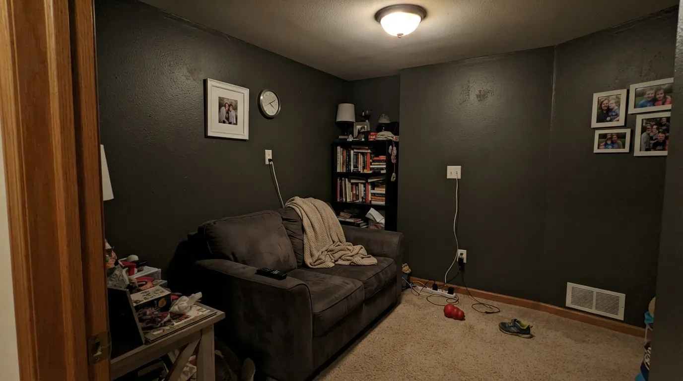
At LRV 12 this color needs daylight or a lamp to hold its warm-charcoal read. Windowless powder rooms, dim stairwells, and rooms painted with the overhead fixture off go flat, muddy, and stipple-y — closer to an unfinished primer coat than a finished wall. Add a real light source before you commit, or pick something with more LRV.
Next to Iron Ore or Tricorn Black, Cast Iron visibly warms up — the olive-brown shows the moment you set it beside a genuine black. If the brief is "black, no warmth, no argument," this is the wrong can; Iron Ore (LRV 6) or Tricorn Black (LRV 3) deliver that instead.
Warm dark neutrals and yellow-orange wood pull on each other — the floor reads more orange, the wall reads more muddy-olive, and neither side wins. Walnut, espresso, white oak, or a painted-white perimeter give Cast Iron the clean contrast it needs; a room wrapped in golden oak trim does not.
Room by Room
Full exterior sun brings the warm undertone forward and the depth reads custom, not stark. Semi-gloss for durability and to catch the light that keeps it from looking flat.
Against white or warm-neutral cabinets and brass hardware it reads expensive and deliberate. Satin urethane-fortified cabinet enamel; avoid pairing it with golden oak lowers.
One wall or all four, with real daylight, it turns rich and grounding rather than cave-like. Eggshell for durability where a desk chair scuffs the baseboard.
In a bright, south-facing room it is a genuinely striking accent wall. In a dim, north-facing living room with few lamps, it is the number-one regret story — test a large sample and watch it after sundown before deciding.
Beautiful under warm lamplight at night; flat and heavy in a north-facing bedroom that gets little daylight. If the room is already dim, a lighter dark like Chelsea Gray is the safer bet.
A vanity or a single wall works well and reads custom in a small space with good task lighting. A windowless powder room with only a dim overhead fixture is the one place this color regularly disappoints.
Your Light Is the Risk
Direct daylight brings the warm olive-brown undertone forward and the color reads rich, not flat. Where this paint was made to live.
Without a real light source LRV 12 collapses into flat, muddy near-black. Test with the lights off before you trust it.
Warmer and more olive at the sun hours, cooler and closer to charcoal the rest of the day. Sample on the actual wall, not just a chip.
2700K lamps push it warmer and richer; cool white LEDs flatten it toward gray-black. Fix the bulb before you blame the paint.
Most complaints about Cast Iron are a light mismatch. Upload a photo of your actual room and see it on your walls — then ask for the same wall in north light or evening lamps before you buy a single sample.
Need It From Another Brand?
Any paint counter can custom-tint Sherwin-Williams SW 6202 directly. If you would rather stay in one brand's own deck, these are the closest stock matches, measured as ΔE2000. Under 2 is a difference you will not see on the wall.
| Brand | Closest color | ΔE | LRV | |
|---|---|---|---|---|
| Behr | Patio StoneN360-6 · Behr | 3.6 | 13 | Color page → |
| Valspar | ArchitectT700 · Valspar | 1.5 | 12.3 | Color page → |
| PPG / Glidden | Plunge PoolPPG1029-7 · PPG / Glidden | 1.9 | 13 | Color page → |
| Glidden | Plunge PoolPPG1029-7 · Glidden | 1.4 | 13 | Color page → |
| Dutch Boy | Blackened Ore439-6DB · Dutch Boy | 4.5 | 13 | Color page → |
| HGTV Home by Sherwin-Williams | Battersea BronzeHGSW 3271 · HGTV Home by Sherwin-Williams | 0.0 | 12 | Color page → |
Similar Sherwin-Williams Colors
The nearest shades to Cast Iron within Sherwin-Williams's own range, ranked by perceptual color distance — useful when you want the same look a touch lighter, darker, or warmer.
WCAG 2.1: AA is 4.5 : 1 for normal text, 3 : 1 for large text, AAA is 7 : 1.
Cast Iron vs the Colors You're Also Considering
Every Cast Iron sample board has the same rivals on it. The numbers show the real lightness gap — then it comes down to which risk you would rather live with.
Pick this for the deeper, slightly darker version of the same warm-neutral idea.
Sherwin-Williams SW 7047 · LRV 13PorpoisePick this for almost the identical warm-neutral core, a point brighter — SW's own closest sibling to this color.
Pick this for warmth — Iron Ore is colder and considerably darker.
Sherwin-Williams SW 7069 · LRV 6Iron OrePick this if you want a true, cool-leaning black-gray with no olive warmth at all.
Within Sherwin-Williams the neighbors are very near. Braintree SW 9595 (#65635B, LRV 12) matches the depth with a hair more brown. Night Owl SW 7061 (#63655F, LRV 13) is a touch cooler and greener. Limestone SW 9599 (#6A655C, LRV 13) and Porpoise SW 7047 (#6B645B, LRV 13) both sit slightly lighter and browner, while Pewter Green SW 6208 (#5E6259, LRV 12) is the openly green one of the group.
Across brands, HGTV Home by Sherwin-Williams Battersea Bronze HGSW 3271 shares the same hex and LRV 12, an exact match. Diamond Vogel Serpentine 0443 (deltaE 1.09) and Valspar Architect T700 (deltaE 1.49) are visually identical in normal room light. Rodda Green Tea CA167 (deltaE 2.08) is very close, so sample first. Behr Woodland Moss PPF-45 (deltaE 4.12) and Farrow and Ball Down Pipe No. 26 (deltaE 4.49) are close but visibly different side by side, with Down Pipe reading cooler.
Cast Iron Coordinating Colors
The coordinating rule is simple: keep the whites and neutrals warm, and give the dark real contrast to sit against. It pairs cleanly with warm whites and warm-leaning greiges, with brass and matte black hardware, and it layers well with the deck's other warm darks when a room needs two depths instead of one. These are the partners that keep showing up in rooms that work:
Cast Iron on Exteriors
This is where Cast Iron does its best, least-argued-about work. Full outdoor sun brings the warm olive-brown undertone forward without washing it out the way it can wash out a true black, so a front door or set of shutters reads rich and custom rather than harsh. Against a white or light-greige body it delivers the modern-farmhouse contrast most homeowners are actually shopping for when they search for "black door" — just with a shade more warmth and a shade less starkness.
The one thing to plan for outside: shaded, north-facing elevations will read noticeably flatter and more muted than a sun-hit south wall on the same house, so walk the full exterior with a sample before committing to trim or a whole garage door in this color. Pair it with a warm white body, not a stark cool white — the two undertones argue with each other at close range.
Cast Iron With Wood Tones and Floors
Dark, cool-toned woods are this color's best company: walnut, espresso, and ebonized oak all deepen the warm-charcoal read and make it look intentional rather than heavy. Pale, gray-washed, or white oak floors are safe too — they give the room enough contrast that the dark surface reads as a deliberate anchor instead of a void.
Honey oak and other yellow-orange woods are the real risk. Yellow and this color's olive-brown undertone pull against each other, and the usual result is a muddier version of both — the floor looks more orange, the wall or cabinet looks less charcoal and more khaki. If the golden floor is staying, keep this color to a door, an island, or a single accent rather than four full walls, and let a white or light-neutral perimeter do the heavy lifting.
Three Ready Palettes Built on Cast Iron
A color is never alone on the wall. These are complete combinations in the 60-30-10 pattern, with the reason each one holds together. Every one opens in the visualizer.
A warm white body keeps the house from feeling severe, a crisper white trims the windows clean, and Cast Iron carries all the drama on the door and shutters — the classic modern-farmhouse formula, just with a warmer dark than the usual black.
Try this palette in your roomAlabaster keeps the room bright enough for the dark island to read as a deliberate choice, not a mistake, and Worldly Gray softens the transition to a pantry or hutch without introducing a second competing dark.
Try this palette in your roomAgreeable Gray keeps three walls light enough that the room still needs no extra lamps during the day, the fourth wall in Cast Iron gets the depth from whatever daylight the room has, and Extra White trim gives the dark wall a crisp edge instead of letting it bleed into the corners.
Try this palette in your roomCast Iron FAQ
Is Cast Iron black or gray?
Gray — a genuinely dark one, at LRV 12, but not a true black. It carries a warm olive-brown whisper that shows the moment you set it beside an actual black like Iron Ore or Tricorn Black. If you want zero warmth, pick one of those instead.
Is the undertone warm or cool?
Warm. The formula carries equal red and green with noticeably less blue, which reads as a soft olive-brown cast rather than a blue-black chill. It never goes cool, even in north light — it just goes darker and flatter.
Does it work on a front door?
Yes — this is its best use. Full exterior sun brings the warm undertone forward, and against a white or light-greige house it reads like a custom-mixed black without the starkness. Semi-gloss holds up best outdoors.
Is it good for a kitchen island?
Very good, against a lighter perimeter. It reads rich and deliberate next to white or warm-neutral cabinets and brass hardware. A full kitchen of Cast Iron cabinets over honey-oak floors is a much harder sell — sample big first.
Will it look right in a dim room?
Not reliably. At LRV 12 it needs a real window or a lamp to hold its warm-charcoal read; without one it goes flat and muddy, closer to an unfinished coat than a finished color. Test with the lights off before committing to a low-light room.
How is it different from Iron Ore or Porpoise?
Iron Ore (LRV 6) is cooler and considerably darker — a true black-gray with no olive warmth. Porpoise (SW 7047, LRV 13) is the closest sibling in the deck: nearly the same warm-neutral formula, about a point brighter. Cast Iron sits between the two — warmer than Iron Ore, a shade deeper than Porpoise.
Have you painted with Cast Iron?
Rate it — one tap helps the next reader decide.
Ask a Question