White Dove
The most-recommended warm white in America, reviewed honestly: where it glows, the exact rooms where it fails, and what to pick instead.

Jessica has spec'd whites and neutrals for more than 300 rooms and keeps a sample wall of painted drawdowns in her studio. Every color review is checked against real reader rooms in the comments and re-tested when a formula changes. About the testing process →
- 1First Star69
- 2Classic Gray74
- 3White Dove83
- 4Chantilly Lace91
- 5Ultra Pure White97
The Fast Verdict
White Dove is the white you pick when you want the room to feel finished, not painted. Soft, warm, quiet — creamy without ever slipping into yellow, thanks to a whisper of grey that keeps it grounded. It has earned its default status: on trim, on cabinets, on whole houses, it simply behaves.
Whole-house walls + trim in decent daylight · kitchens with warm wood and brass · cabinets · anyone scared of picking the wrong white
Your room faces north and is dim · your trim stays a brighter white · you want a crisp gallery look · your counters are cool grey marble
- Soft, finished white — warm but never yellow
- One-color rooms (walls + trim + ceiling) work beautifully
- Flatters oak, walnut, brass — every warm wood tone
- Cabinets and trim: hides scuffs better than brighter whites
- Trim-white for nearly any mid-tone wall color
- Goes flat and grey in dim north-facing rooms
- Reads dirty next to a brighter white
- Too soft for crisp, modern, high-contrast looks
- Clashes with cool blue-grey marble
What Color Is White Dove, Really?
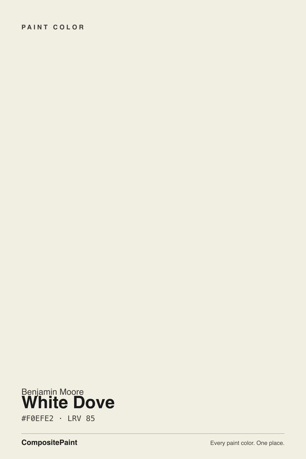
Off-white with a softly warm, slightly creamy character — but the yellow is grayed out, and that is the whole trick. Most creamy whites are built on a yellow oxide base that tips butter-yellow the moment afternoon sun hits it. White Dove carries the same warmth, then mutes it with a drop of grey, so the wall reads "calm and finished" instead of "cream." That balancing act is why it has been one of Benjamin Moore's best-selling colors for over two decades and the default answer designers give when a client says "just a nice white, nothing yellow, nothing cold."
At LRV 83 it reflects most of the light that hits it, but it is clearly not a bright white: put it next to Chantilly Lace (LRV 91) and White Dove suddenly shows its body. That gap is the useful part. On a wall it holds just enough color to soften shadows and flatter wood; on trim it reads as classic painted woodwork rather than plastic-bright. It is a white that behaves like a very quiet neutral.
Undertone in one line: warm, grayed-out yellow — never pink, never green. If your sample looks green or pink on the wall, that is reflection from your floor, your roof overhang, or the tree outside — not the paint.
Where It Shines
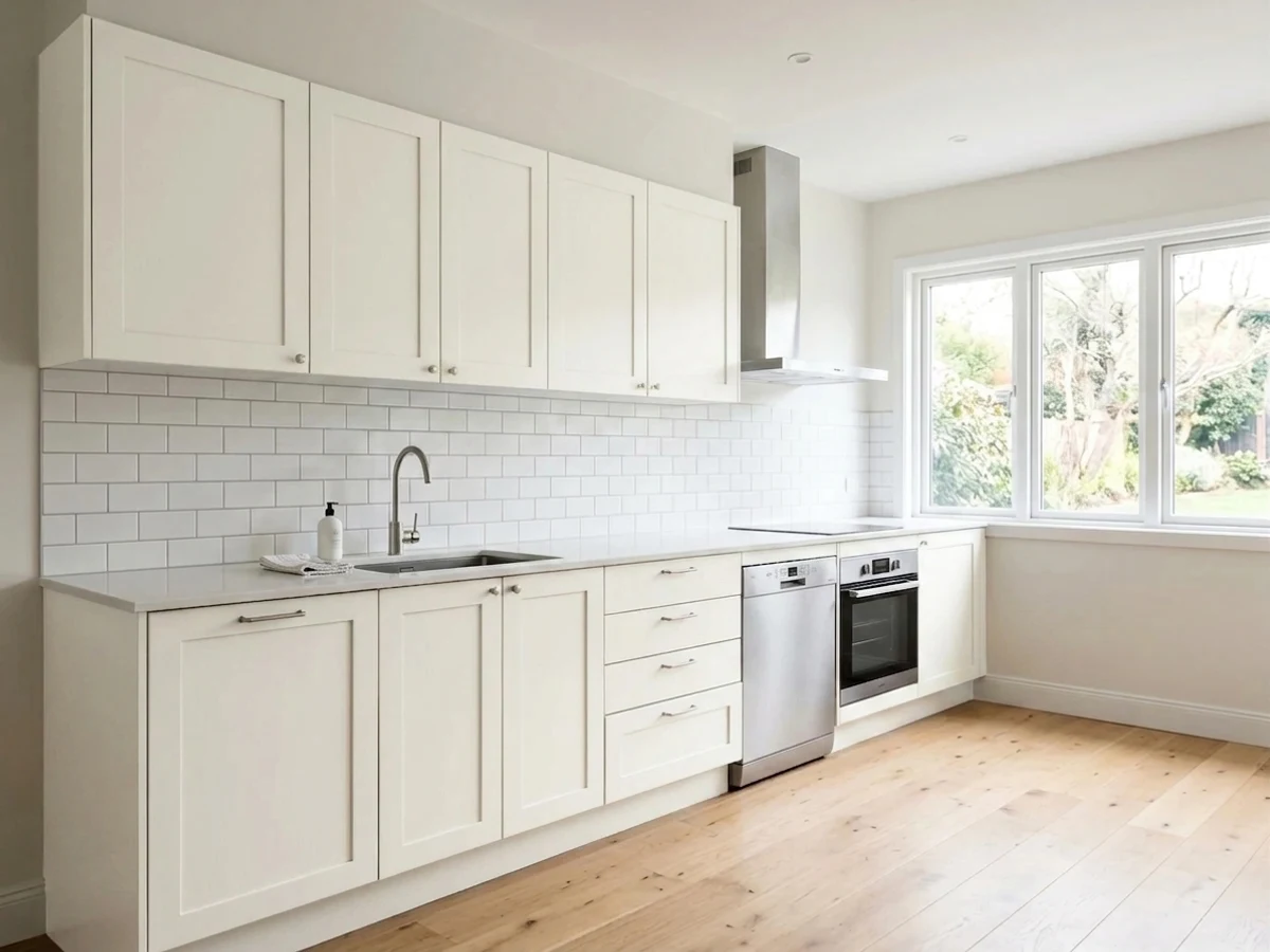
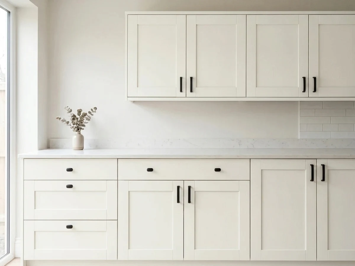
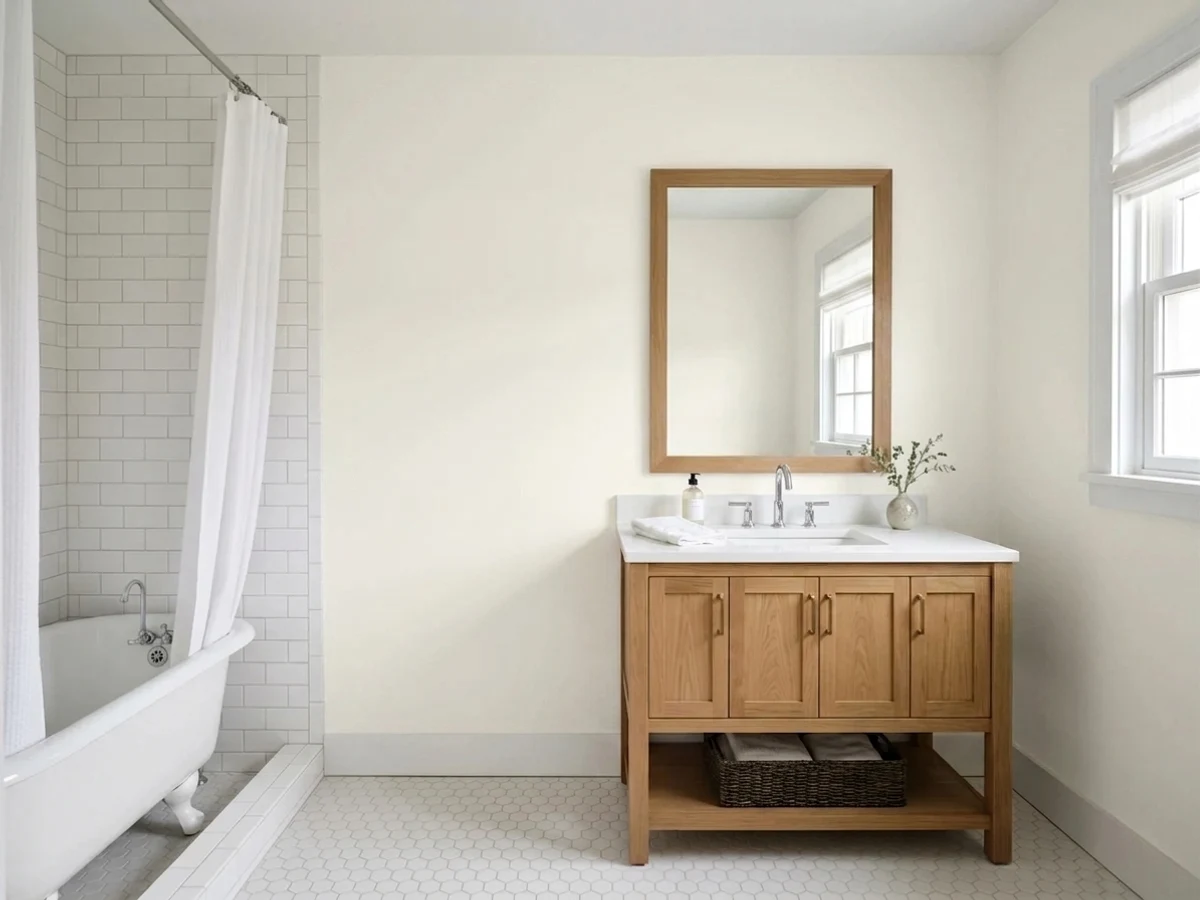
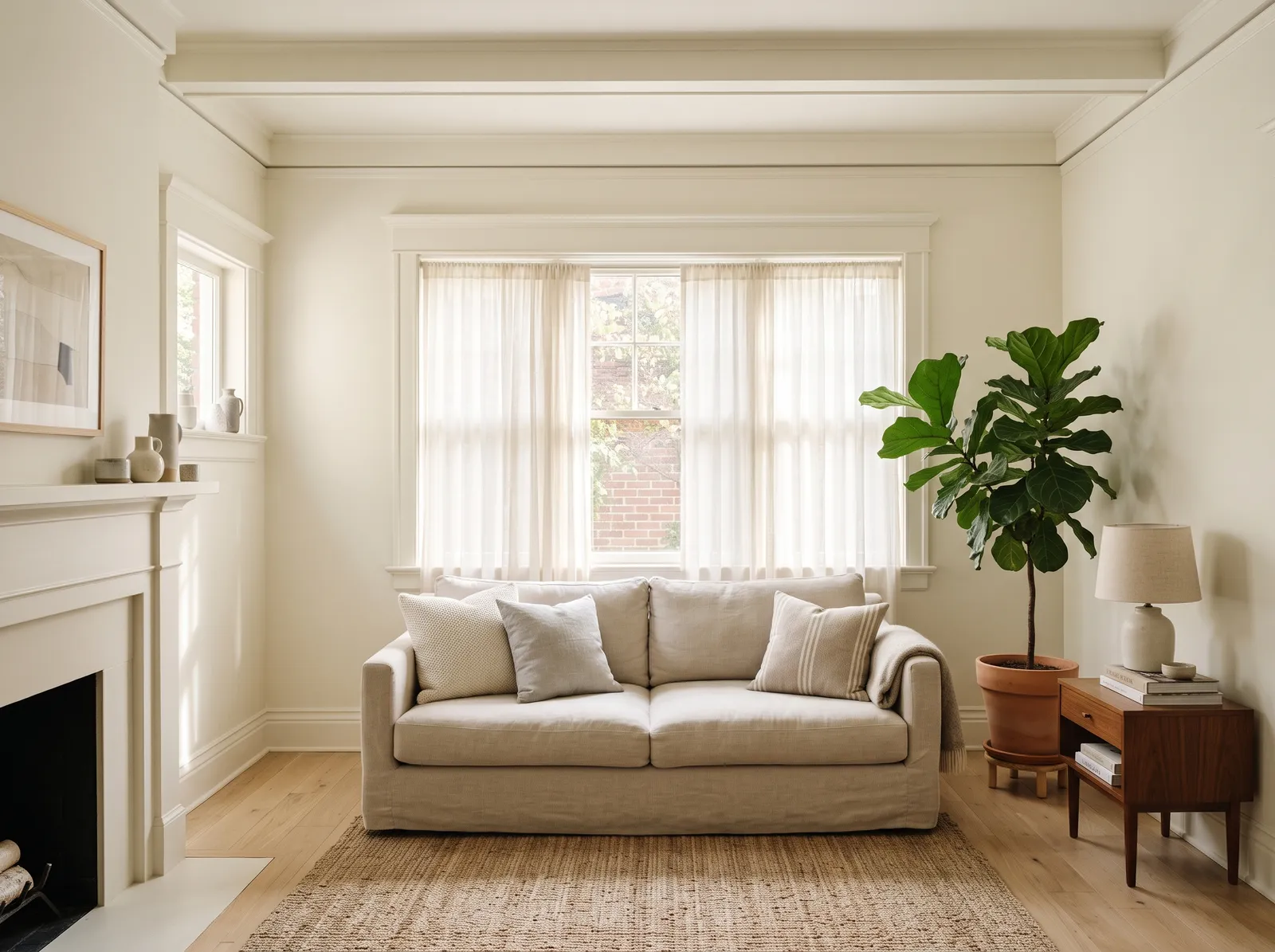
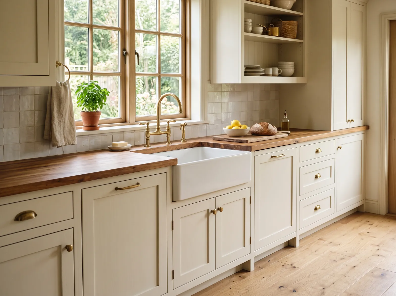
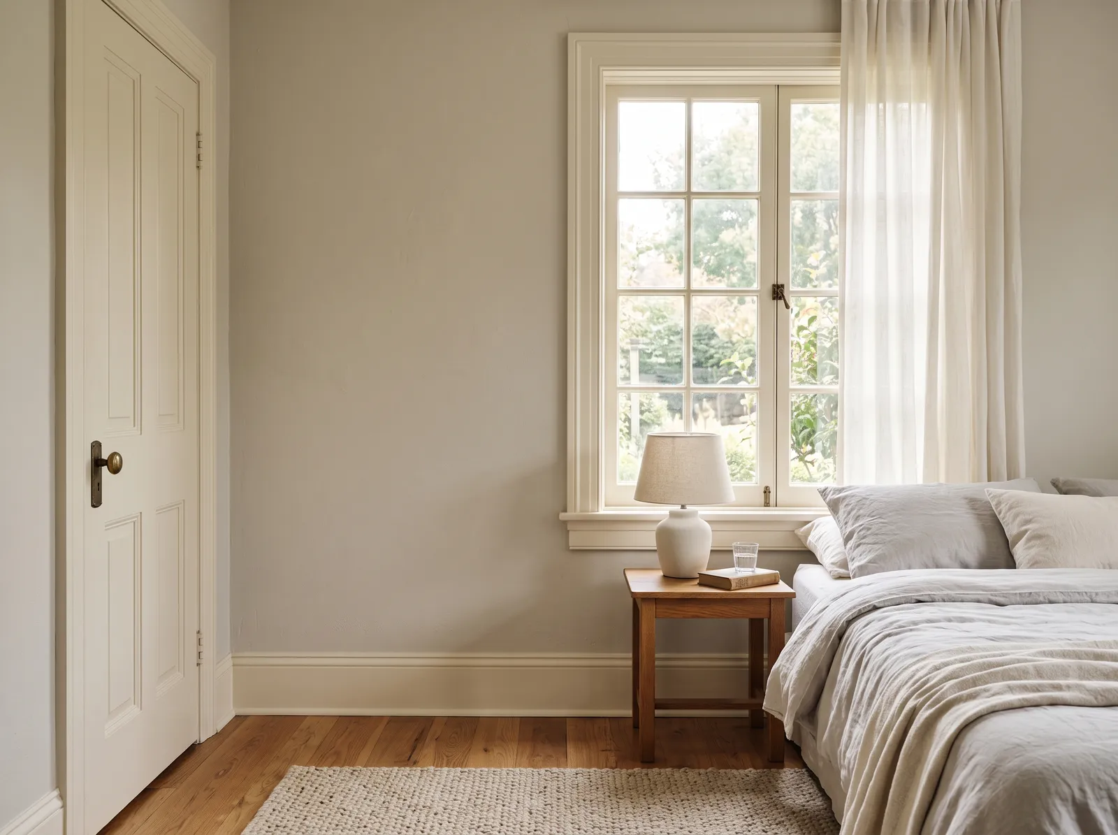
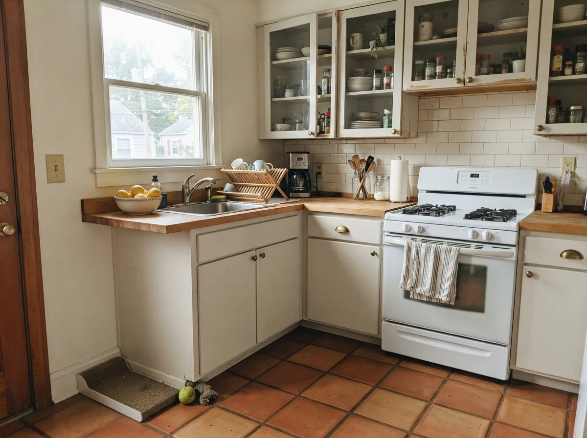
Give it real daylight and wood tones and it is nearly unbeatable. The one-color room — walls, trim, and ceiling all in White Dove with only sheen changes — is a designer standard because the color is interesting enough to carry it alone. Kitchens are its second home: on cabinets it flatters brass and butcher block, and at LRV 83 it hides scuffs and handprints a brighter white would broadcast.
Where It Fails
Almost every one-star story about White Dove comes from one of three situations, and all three are predictable. None of them are the paint's fault — but if your room matches one, this is not your white, and no amount of coats will fix it.
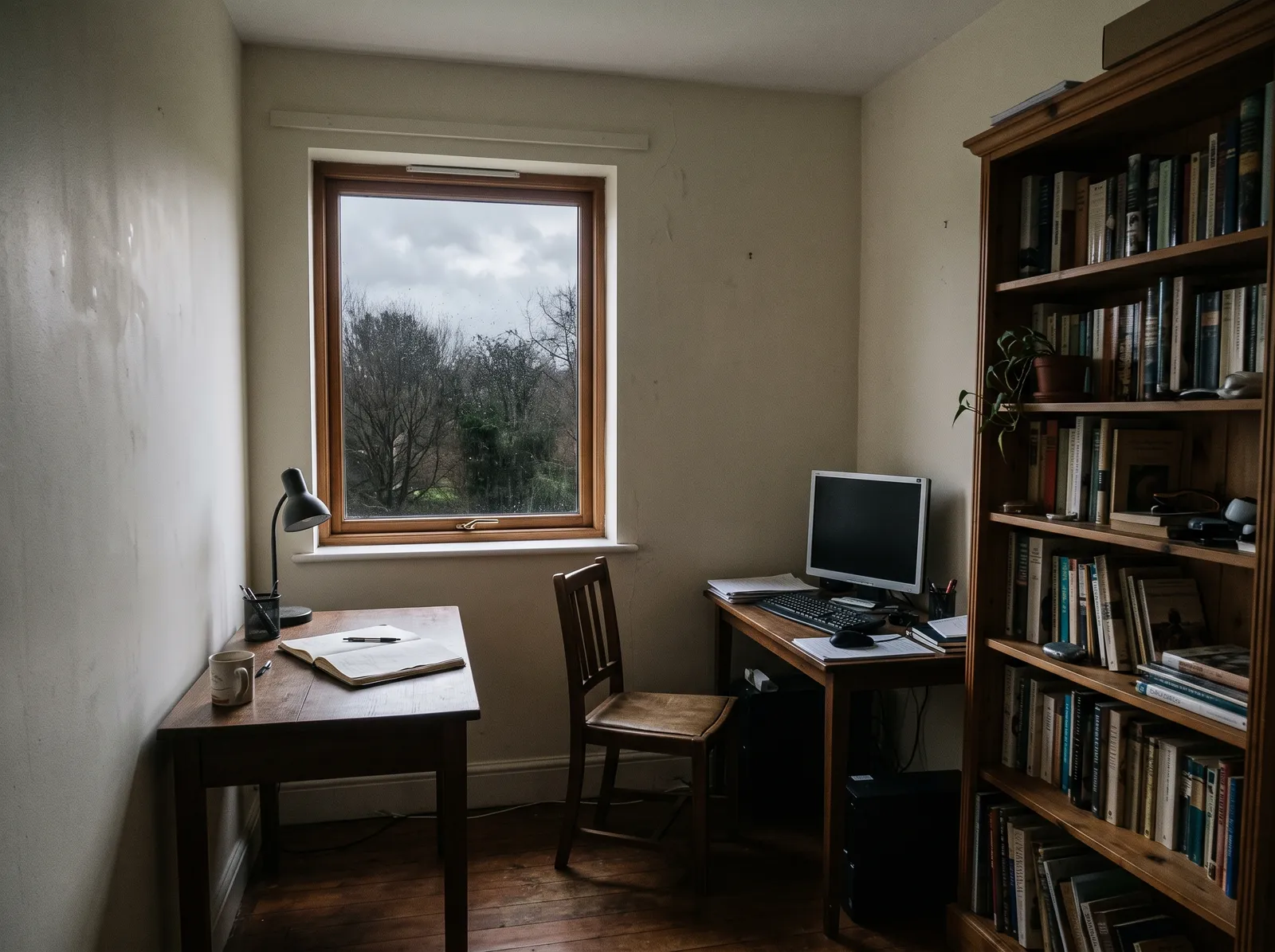
North light is cool and grey — it strips the warmth out and leaves the grey base exposed. Readers call it "blah" or "dingy." The color did not fail; the light did. Go warmer (BM Swiss Coffee) or commit to warm lamps.
The most common bad review is a pairing mistake: White Dove walls, brighter builder-white trim. The brighter white wins and White Dove looks unwashed. The fix is the one-color rule — walls, trim, and ceiling all White Dove; the sheen change separates them plenty.
Carrara-type stone sits at the opposite temperature and pushes White Dove toward yellow. With cool marble, pick a neutral white like Chantilly Lace.
Room by Room
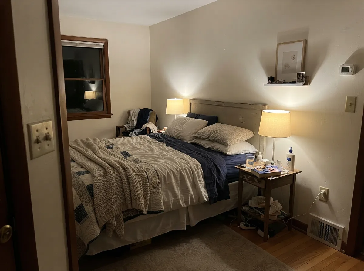
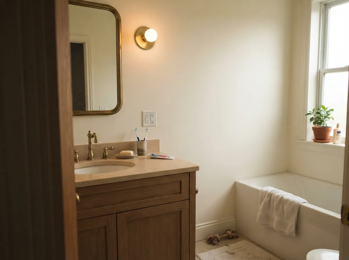
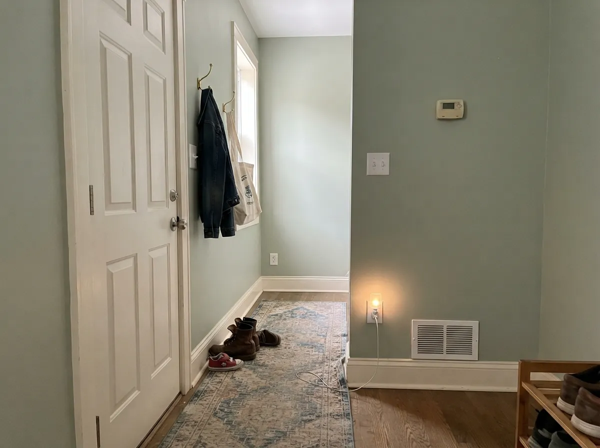
Your Light Is the Risk
The cream glows softly all day without tipping yellow. Whole-house safe.
Cool grey daylight exposes the grey base; the color goes flat. Test first.
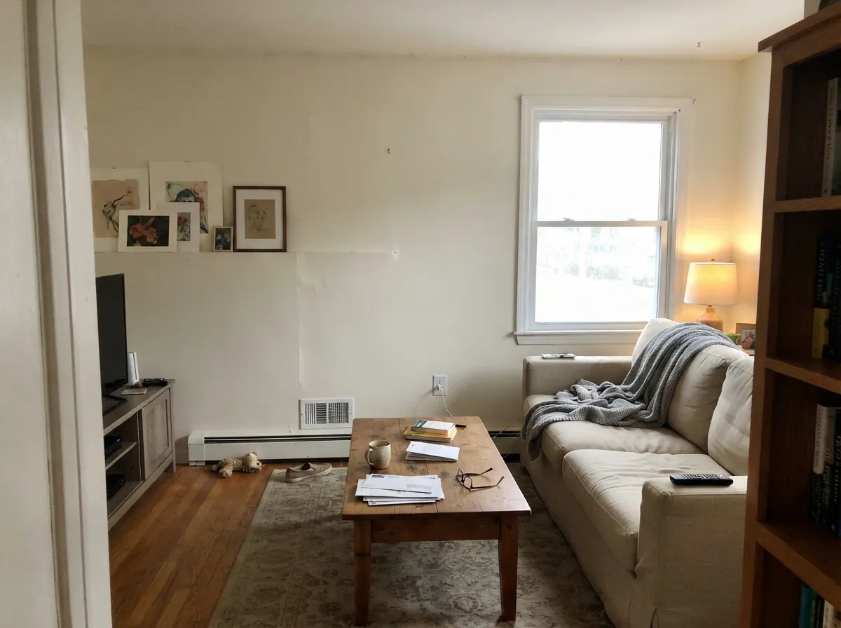
Warm at the sun hours, quiet neutral after. It changes — most people love it.
2700K lamps: creamier, cozier. Cool LEDs: dull — swap bulbs, not paint.
Most complaints about White Dove are a light mismatch. Upload a photo of your actual room and see it on your walls — then ask for the same wall in north light or evening lamps before you buy a single sample.
Need It From Another Brand?
Any paint counter can custom-tint Benjamin Moore OC-17 directly. If you would rather stay in one brand's own deck, these are the closest stock matches, measured as ΔE2000. Under 2 is a difference you will not see on the wall.
| Brand | Closest color | ΔE | LRV | |
|---|---|---|---|---|
| Sherwin-Williams | Cold FoamSW 9504 · Sherwin-Williams | 1.0 | 84 | Color page → |
| Behr | Snowy PinePPU10-13 · Behr | 0.5 | 85 | Color page → |
| Valspar | Soft WoolV155 · Valspar | 1.0 | 84.7 | Color page → |
| PPG / Glidden | Atrium WhitePPG1020-1 · PPG / Glidden | 1.0 | 85 | Color page → |
| Glidden | Atrium WhitePPG1020-1 · Glidden | 1.0 | 85 | Color page → |
| Dutch Boy | Simplified White020W · Dutch Boy | 1.2 | 86 | Color page → |
Similar Benjamin Moore Colors
The nearest shades to White Dove within Benjamin Moore's own range, ranked by perceptual color distance — useful when you want the same look a touch lighter, darker, or warmer.
WCAG 2.1: AA is 4.5 : 1 for normal text, 3 : 1 for large text, AAA is 7 : 1.
White Dove vs the Colors You're Also Considering
Every White Dove sample board has the same rivals on it. The numbers show the real lightness gap — then it comes down to which risk you would rather live with.
Pick this if you want the slightly more neutral, more "white" version of the same calm.
Sherwin-Williams SW 7008 · LRV 82AlabasterPick this if your painter works in Sherwin-Williams — it is the same idea, a touch warmer and softer.
Side-by-side comparison →Pick this when the room has real daylight and cream would read too sweet.
Benjamin Moore OC-45 · LRV 84Swiss CoffeePick this for dim, north-facing rooms — the extra cream keeps glowing where White Dove goes flat.
Side-by-side comparison →Simply White OC-117 at LRV 91 is brighter and a touch cleaner than White Dove. If you want your white to read closer to true white and reflect more light, Simply White does that, while White Dove stays softer and warmer. In a dim room, White Dove feels cozier; in a bright room, Simply White can feel fresher.
Swiss Coffee OC-45 at LRV 84 goes the other direction. It is creamier and more obviously off-white, so next to it White Dove looks like the more neutral, versatile pick. Choose Swiss Coffee when you want visible warmth, White Dove when you want warmth you barely notice.
Chantilly Lace OC-65 at LRV 92 is the crisp, near-pure benchmark. Use it when you need trim to pop against White Dove walls, or when the whole room should feel bright and modern rather than soft.
White Dove Coordinating Colors
The rule for coordinating with White Dove is simple: stay on the warm side of the fence. It flatters warm greiges, warm woods, deep navies, and earthy terracottas — and it argues with icy blues, cool greys, and blue-grey stone. These are the partners designers reach for again and again:
White Dove on Exteriors
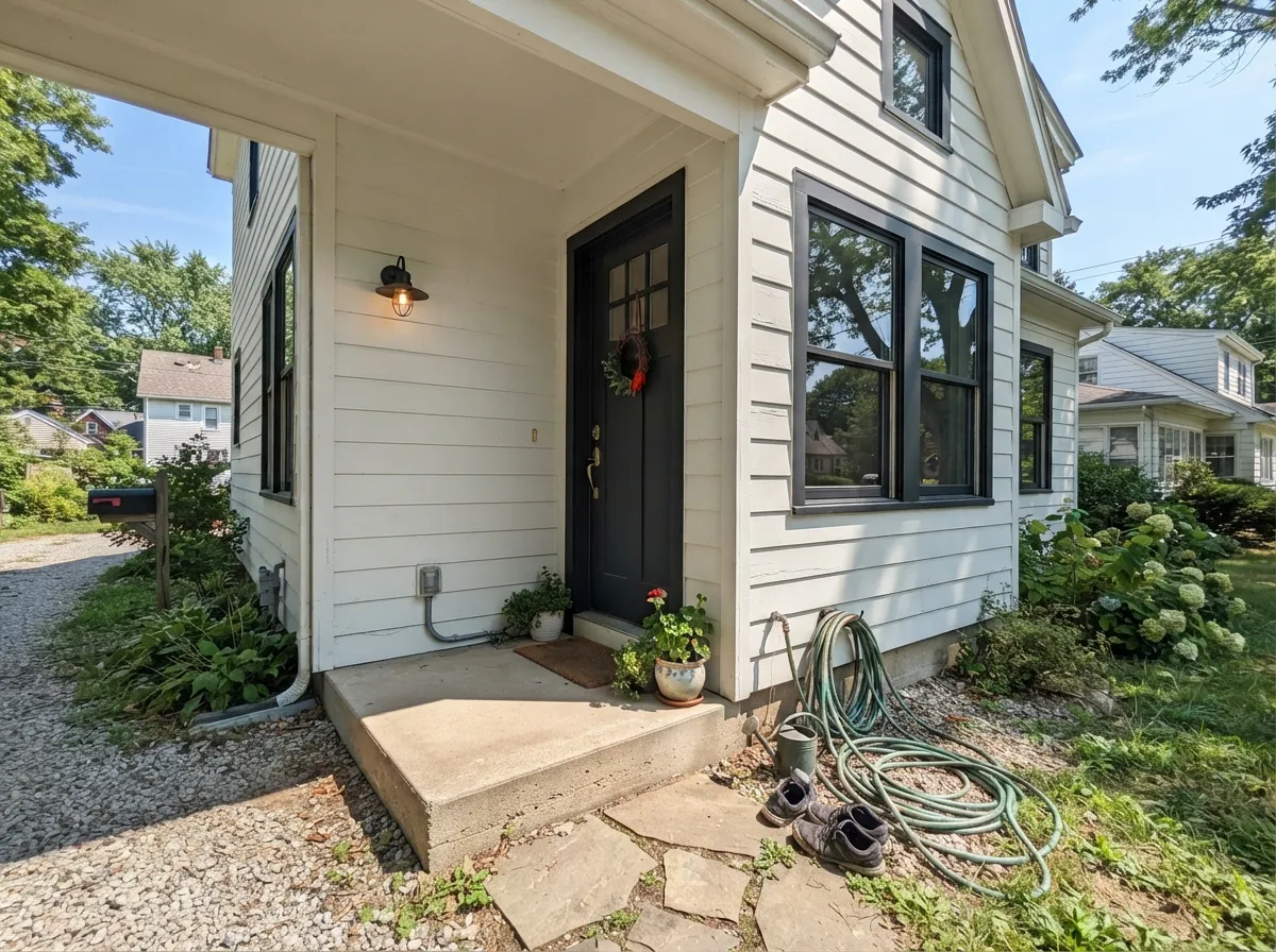
Outside, White Dove behaves differently than the interior sections above suggest — and better than its soft reputation implies. Full sun does wash it brighter, but that is true of every white, and White Dove keeps just enough warmth to avoid the blue-ish glare cheap bright whites give a facade. It is one of the most-used exterior whites in the Benjamin Moore deck for exactly that reason.
The pairing decides the result. With black or charcoal trim — Wrought Iron, Kendall Charcoal — you get the classic modern-farmhouse contrast, and the dark frame makes White Dove read crisp instead of creamy. With warm greige trim it goes softer and more traditional. What to avoid: cool blue-grey accents, which make its warmth look yellowed by comparison, and remember the shaded north side of the house will read a full step creamier than the sunny south side — walk around the house with the sample before committing.
White Dove With Wood Tones and Floors
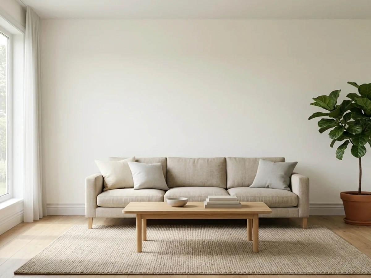
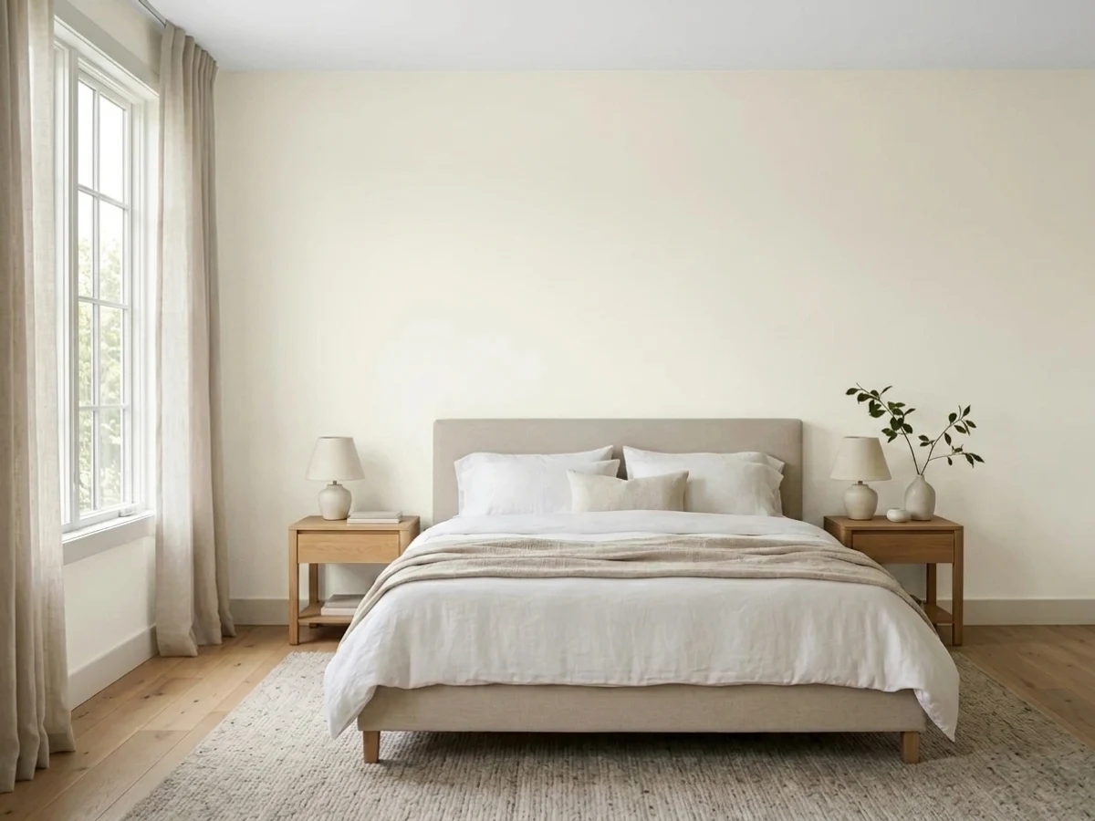
This is the pairing question readers ask most, and the short answer is: warm wood loves it. Oak — red, white, honey — walnut, butcher block, and cedar all sit comfortably against White Dove because the color's warmth meets theirs halfway. If your floors are orange-leaning builder oak, White Dove is one of the few whites that softens the orange instead of amplifying it.
The one flooring that needs a sample first is cool grey LVP or grey-washed wood. Grey floors pull White Dove's warmth into relief, and the wall can read slightly yellow against them. It is not always a dealbreaker — warm rugs and brass fix it in most rooms — but test a big sample above the actual floor before painting the whole room.
Three Ready Palettes Built on White Dove
A color is never alone on the wall. These are complete combinations in the 60-30-10 pattern, with the reason each one holds together. Every one opens in the visualizer.
One color at two sheens gives depth without contrast lines, so small houses read bigger and hallways flow. The navy door supplies the single dark note the scheme needs.
Try this palette in your roomAgreeable Gray and White Dove share the same warm-grey base, so the wall-to-cabinet handoff is seamless; the navy island grounds the room and loves brass hardware.
Try this palette in your roomRevere Pewter is the greige White Dove was practically designed to trim; Evergreen Fog adds one muted color note that reads restful, not decorated. All three quiet down together at night.
Try this palette in your roomWhite Dove FAQ
Is White Dove warm or cool?
Warm — but the quietest kind. A drop of grey keeps the cream from reading yellow, which is exactly why designers default to it. In cold light it drifts toward neutral; it never reads icy.
Is it good for kitchen cabinets?
One of the best. It flatters brass and wood, hides scuffs better than brighter whites, and does not fight granite or quartz with warm flecks. Only cool grey marble argues with it. Use a satin urethane-fortified cabinet paint.
What trim color goes with White Dove walls?
White Dove itself, in semi-gloss. A brighter trim white makes the walls look dirty — the most common mistake with this color. If you insist on contrast, go darker (greige trim), never brighter.
How many coats does it take?
Two over any light existing color. Going over a dark or saturated wall, prime first with a grey-tinted primer — three finish coats of a white over red or navy is the expensive way to learn this.
Does it work on exteriors?
Yes — it is one of the most-used exterior whites in the BM deck. Expect it to read brighter and crisper in full sun than indoors, pair it with black or charcoal trim for contrast (or warm greige for a softer look), and avoid cool blue-grey accents next to it. The exterior section above has the full pairings.
Should I paint the ceiling White Dove too?
If the walls are White Dove — yes, in flat sheen. One color overhead keeps the plane soft and warm instead of clinical bright white. Over a different wall color, White Dove works as a warmer alternative to stark ceiling white; use it when the room's palette is warm.
Have you painted with White Dove?
Rate it — one tap helps the next reader decide.
Ask a Question