Steam
The quietest near-white in the Benjamin Moore deck, reviewed honestly: why it's engineered to disappear, the light that turns it flat, and what to pick if you actually want a color with an opinion.

Jessica has spec'd whites and neutrals for more than 300 rooms and keeps a sample wall of painted drawdowns in her studio. Every color review is checked against real reader rooms in the comments and re-tested when a formula changes. About the testing process →
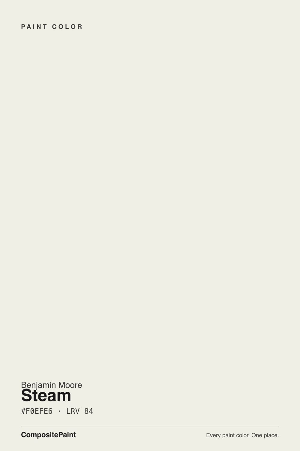
- 1First Star69
- 2Classic Gray74
- 3Steam84
- 4Chantilly Lace91
- 5Ultra Pure White97
The Fast Verdict
Steam is not trying to be White Dove. At LRV 84 it sits almost exactly where its more famous sibling does, but with the chroma turned down further — a whisper of warmth over what is otherwise a near-neutral. It was built as part of Benjamin Moore's Affinity collection, a 144-color line engineered so nothing clashes, and it shows: Steam is less a color with a personality than a color that gets out of the way. That is either exactly what you want or the reason it disappoints.
Whole-house backdrops where you want zero drama · kitchens and cabinets with wood or stone · nurseries and home offices that need a calm, un-themed neutral · anyone repainting a rental or resale who wants nobody to have an opinion
You want a white with a clear identity, warm or cool · your room is dim and north-facing with no lamps · you are pairing it directly against White Dove or Swiss Coffee expecting visible contrast · you want the room to feel decorated, not neutral
- Genuinely low-drama — pairs with almost anything without a clash
- Reads clean and calm against wood, stone, and natural fiber
- Close enough to White Dove and Pure White to be a safe substitute in a pinch
- Good spa-like calm for nurseries, offices, and bathrooms
- Hides as a backdrop rather than competing with furniture or art
- Goes flat, taupe-gray in shadow and north light — loses its warmth entirely
- Too quiet for anyone who wants a white with a defined character
- Barely distinguishable from White Dove or Swiss Coffee side by side
- Undertone is genuinely unstable — depends more on neighboring colors than most whites
What Color Is Steam, Really?
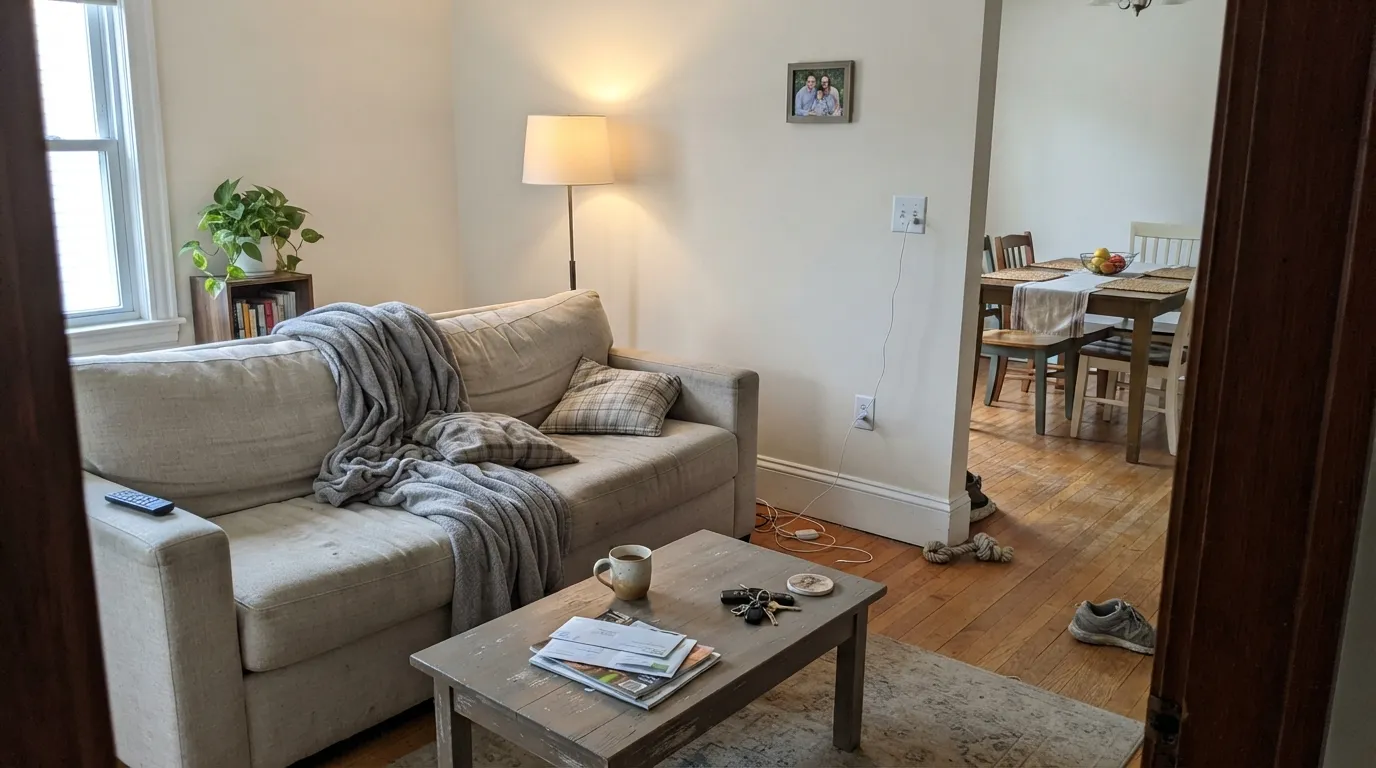
Steam is a very light, low-chroma warm near-white — a whisper of yellow-beige over what reads, at a glance, almost gray. Benjamin Moore built it as one of 144 colors in the Affinity collection, launched alongside the Aura paint line and curated so that every color in the set could sit next to any other without a clash. That is the honest story behind Steam: it was not designed to be memorable on its own. It was designed to cooperate, and the low-drama undertone is the mechanism that makes it work.
At LRV 84 it reflects nearly all the light that hits it — in the same band as Benjamin Moore's own White Dove (85) and Swiss Coffee (84), and Sherwin-Williams' Pure White (84). Steam is not a brighter or dimmer version of those colors; it is a quieter one. Where White Dove holds enough cream to read as a deliberate warm choice, Steam's warmth is so restrained that most people describe it as simply 'a soft, clean white' without registering an undertone at all.
Undertone in one line: a faint warm beige base that can read cooler-gray in shadow and warmer-cream under lamplight — never a strong yellow, never a strong pink or blue, but genuinely responsive to whatever light and color surround it. That responsiveness is the trait every source on this color agrees on, and it is the reason testing a real sample matters more here than with a color that has a fixed, obvious personality.
Where It Shines
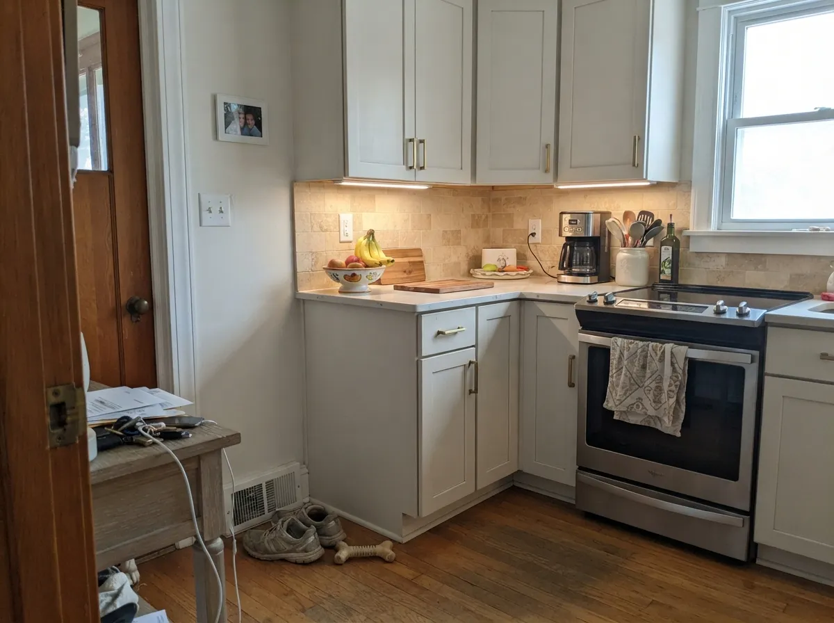
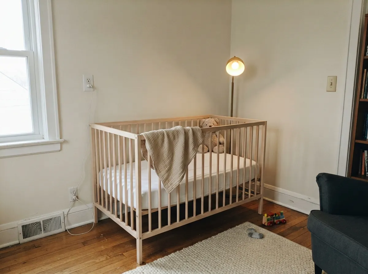
Give Steam a job that calls for a neutral, not a statement, and it does that job better than almost anything in the deck. It is the color for the room that should feel calm and finished without anyone clocking a color choice — a kitchen where the cabinets and counters do the talking, a nursery that needs to feel soft rather than themed, a whole-house backdrop ahead of a sale. With warm wood, travertine, limestone, or natural fiber it reads expensive and settled; it never fights for attention.
Where It Fails
Steam's complaints are not about it looking bad — they are about it disappearing when someone wanted it to show up. All three of the patterns below trace back to the same trait: this is a color engineered for restraint, and restraint reads as a flaw the moment you needed presence instead.
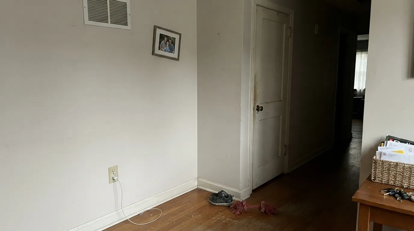
Steam's undertone is genuinely unstable in low, cool light — reviewers who have logged it across a full day describe it shifting toward a flat, slightly taupe-gray in shadowed corners and on overcast north exposures, with the warmth all but gone. It is not a bad wall color in that light; it is a forgettable one. Test a real sample in your dimmest corner before committing a whole room.
This is the most common regret, and it is not really a defect: Steam was built to be the easiest color in a 144-color harmonized collection to live with, which means it was built to have as little personality as possible. If you sampled it hoping for the cream warmth of White Dove or the crispness of a true white, Steam will feel wishy-washy by comparison. That flatness is the design working as intended, not a failure of the paint.
At LRV 84 versus White Dove's 85 and Swiss Coffee's 84, Steam is close enough to both that using it as a 'different' trim or accent wall next to either one barely reads as a change. If the goal is visible contrast between two whites, this pairing is the expensive way to learn they are near-twins — go for a real jump in LRV or undertone instead.
Room by Room
In any real daylight it is an easy, forgettable-in-a-good-way backdrop for furniture and art to lead. Eggshell on the walls, the same color in semi-gloss on trim if you want the one-color room look.
Against travertine, warm limestone, butcher block, and brass hardware it reads clean without going stark. Satin on cabinet doors wipes clean and keeps the low-key look intentional rather than plain.
The low chroma is an asset here: a room meant to feel calm rather than styled benefits from a color that stays out of the way. Works with pale wood furniture and soft natural-fiber rugs without pulling the room toward any one theme.
Under 2700K lamplight it turns gently cozy at night, similar to Benjamin Moore's other soft near-whites. In a north-facing bedroom with cool LEDs and no lamps, expect the flatter, taupe-leaning side of the color instead.
With warm-toned tile and wood vanities it is easy and calm. Cool grey or blue-grey stone will pull Steam toward its cooler, flatter register — sample against your actual counter before committing.
Very light, low-chroma near-whites like Steam typically read brighter and slightly starker in full outdoor sun than they do indoors. There is little documented real-world exterior use of this specific color to draw on, so treat any exterior application as a first attempt and sample a large board on the actual siding before ordering gallons.
Your Light Is the Risk
Even daylight keeps the faint warmth visible without pushing it toward cream or yellow. The most honest, most flattering read of the color.
Cool, low light strips the warmth and leaves a flat, slightly taupe-gray cast. This is the light behind most 'it just looks gray and boring' complaints.
Morning light on an east wall reads softly warm; by afternoon it settles back toward neutral. West rooms warm up again at sunset. The shift is gentle — most people won't notice it as a change.
2700K lamps bring out a cozier warmth after dark. Cool white LEDs flatten it back toward the gray side — swap bulbs before you consider repainting.
Most complaints about Steam are a light mismatch. Upload a photo of your actual room and see it on your walls — then ask for the same wall in north light or evening lamps before you buy a single sample.
Need It From Another Brand?
Any paint counter can custom-tint Benjamin Moore AF-15 directly. If you would rather stay in one brand's own deck, these are the closest stock matches, measured as ΔE2000. Under 2 is a difference you will not see on the wall.
| Brand | Closest color | ΔE | LRV | |
|---|---|---|---|---|
| Sherwin-Williams | Westhighland WhiteSW 7566 · Sherwin-Williams | 1.9 | 86 | Color page → |
| Behr | Snowy PinePPU10-13 · Behr | 0.5 | 85 | Color page → |
| Valspar | Swiss Coffee7002-16 · Valspar | 0.8 | 86.2 | Color page → |
| PPG / Glidden | Clear YellowPPG1215-1 · PPG / Glidden | 1.1 | 87 | Color page → |
| Glidden | Muslin White82YY 85/038 · Glidden | 0.8 | 85 | Color page → |
| Dutch Boy | Simplified White020W · Dutch Boy | 1.2 | 86 | Color page → |
Similar Benjamin Moore Colors
The nearest shades to Steam within Benjamin Moore's own range, ranked by perceptual color distance — useful when you want the same look a touch lighter, darker, or warmer.
WCAG 2.1: AA is 4.5 : 1 for normal text, 3 : 1 for large text, AAA is 7 : 1.
Steam vs the Colors You're Also Considering
Every Steam sample board has the same rivals on it. The numbers show the real lightness gap — then it comes down to which risk you would rather live with.
Pick this when you want the same near-white band with the volume turned all the way down.
Benjamin Moore OC-17 · LRV 85White DovePick this if you want a warm white with a clear, confident cream character instead of a quiet one.
Pick this if you're already committed to Benjamin Moore's Affinity palette or matching another AF color.
Sherwin-Williams SW 7005 · LRV 84Pure WhitePick this if your painter works in Sherwin-Williams — it is the closest cross-brand twin to Steam.
White Dove OC-17 at #EFEEE5 and LRV 83 is the closest match in the deck and is a common trim white. Against Steam at #F0EFE6 and LRV 84 the two are nearly indistinguishable on a wall, so choose either and stay consistent. Cloud Nine 2144-60 at #EEEFE5 and LRV 84 has slightly more green in the middle channel and reads a hair cooler. Benjamin Moore Alabaster 876 at #F2EFE8 and LRV 85 is the brightest and softest of the group.
Across brands, Behr Snowy Pine PPU10-13 at LRV 85 with a deltaE of 0.52, Backdrop Jane BD-JA at deltaE 0.7, and Valspar Swiss Coffee 7002-16 at LRV 86.2 with a deltaE of 0.76 are true matches. Farrow and Ball Pointing No. 2003 at LRV 86, deltaE 1.68, and Sherwin-Williams Westhighland White SW 7566 at LRV 86, deltaE 1.92, are visually identical in normal room light. Clare Wing It at LRV 88, deltaE 3.94, is close but visibly different side by side.
Steam Coordinating Colors
Steam was built inside a collection designed to coordinate, so almost nothing in the Benjamin Moore deck actively clashes with it. The pairings below are the ones that make the most of its restraint — either matching its quiet temperature or supplying the one note of contrast the room needs:
Why Steam Stays Quiet: The Affinity Collection Story
Steam has no Color of the Year moment and no famous room attached to its name, and that is by design rather than by accident. Benjamin Moore launched the Affinity collection — 144 colors carrying the AF-prefix, including Steam as AF-15 — alongside its premium Aura paint line, with the specific goal of removing the guesswork from color pairing. Every color in the set was evaluated for hue, value, and chroma so that professionals could combine any two Affinity colors with confidence.
That engineering-for-harmony approach is exactly why Steam reads as understated rather than distinctive: a color built to cooperate with 143 others cannot also be the loudest color in the room. It is an honestly unglamorous workhorse — not a hidden gem waiting for its viral moment, just a dependable near-white doing the job it was designed for.
Steam With Wood Tones and Floors
Steam's low chroma makes it genuinely easy with wood: medium and dark hardwoods, travertine, warm limestone, and natural fiber rugs all sit comfortably against it without fighting for attention. It does not amplify orange in builder-grade oak the way a starker white can, and it does not compete with a busy stone countertop.
The one flooring situation worth sampling first is cool gray-washed wood or gray LVP paired with a north-facing room — that combination pushes Steam toward its flattest, most taupe-leaning register. In a room with real daylight it is rarely an issue.
Three Ready Palettes Built on Steam
A color is never alone on the wall. These are complete combinations in the 60-30-10 pattern, with the reason each one holds together. Every one opens in the visualizer.
One quiet white at two sheens keeps the whole house calm and un-themed; the charcoal-greige door supplies the single dark note the scheme needs without pulling focus.
Try this palette in your roomRepose Gray's soft warmth and Steam's quiet near-white sit close enough in temperature to hand off cleanly from wall to cabinet, while the Chelsea Gray island grounds the room and wears brass hardware well.
Try this palette in your roomSteam and White Dove are close enough in temperature to layer without a visible seam, keeping the room soft; Beach Glass adds one gentle color note without turning the nursery into a themed room.
Try this palette in your roomSteam FAQ
Is Steam warm or cool?
Technically warm — a faint beige undertone over a near-neutral base — but it is one of the quietest warm whites in the deck. In good light it reads as a soft, clean white; in shadow or north light it can drift cooler and slightly taupe-gray.
How is Steam different from White Dove?
They sit almost exactly at the same LRV (84 vs. 85), but White Dove carries more visible cream warmth and has real name recognition as Benjamin Moore's signature warm white. Steam is quieter — less committed warmth, engineered as part of the coordinated 144-color Affinity collection rather than sold as a standalone star.
Is Steam good for kitchen cabinets?
Yes — it pairs easily with wood, travertine, and warm stone, and its restraint means it won't fight busy countertops or backsplash tile. Use a satin, urethane-fortified cabinet paint for durability.
Will Steam look gray in my room?
It can, especially in a north-facing room, an overcast day, or a shadowed corner with no lamps. That is the color's most consistent real-world complaint. Warm 2700K bulbs and any south or west daylight bring the warmth back.
What's the Affinity collection Steam belongs to?
Affinity is a 144-color Benjamin Moore collection (AF-prefix numbers) launched alongside the Aura paint line and curated so every color in the set coordinates with the others by hue, value, and chroma. Steam's job inside that system is to be an easy, low-conflict near-white — which explains both its usefulness and its lack of a strong individual identity.
What trim white goes with Steam walls?
Steam itself in semi-gloss keeps the one-color-room look. If you want a hair more brightness on trim without real contrast, White Dove or Sherwin-Williams Pure White work as close, safe companions.
Have you painted with Steam?
Rate it — one tap helps the next reader decide.
Ask a Question