Atrium White
The Benjamin Moore white with a pink streak, reviewed honestly: the rooms it warms, the light that exposes the peach, and what to pick instead.

Jessica has spec'd whites and neutrals for more than 300 rooms and keeps a sample wall of painted drawdowns in her studio. Every color review is checked against real reader rooms in the comments and re-tested when a formula changes. About the testing process →
- 1First Star69
- 2Classic Gray74
- 3Atrium White85
- 4Chantilly Lace91
- 5Ultra Pure White97
The Fast Verdict
Atrium White is the warm white for people who find cream too yellow and greige too gray. Its warmth comes from a red edge rather than a yellow one, so instead of going buttery it goes faintly peach — softer on skin, kinder to old wood trim, and unmistakably not a modern white. Benjamin Moore does not hide the pink, and neither should you: love it or pick something else, because two coats will not talk you out of it.
Family rooms and living rooms that should feel warm rather than bright · older houses with wood trim and traditional millwork · trim, doors and ceilings in a warm palette · hallways and entries that never get much daylight
You want a crisp modern white · your counters are cool grey quartz or Carrara marble · the trim will stay a brighter builder white · any amount of pink bothers you
- Warm without a trace of butter yellow — the anti-cream warm white
- LRV 87 keeps average-light rooms bright, not dim
- Flatters old wood trim, plaster and warm metals
- Works walls, trim, doors and ceilings in one color
- Softer and more forgiving on faces and skin than a cool white
- The pink is real and shows on four walls in bright rooms
- Reads dingy the moment a cooler white is next to it
- Fights cool quartz, Carrara marble and grey flooring
- Too traditional for a modern high-contrast look
What Color Is Atrium White, Really?
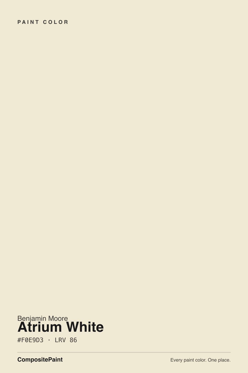
A high-reflectance off-white from Benjamin Moore's Off-White Collection, and one of the few whites the brand describes with the word pink instead of dancing around it. Technically it sits in the yellow-red part of the wheel with very little chroma — barely any color at all — but what color is there leans toward the red end. That single detail separates it from every cream in the deck. Swiss Coffee, Linen White and the rest are built on yellow oxide and go butter when the sun hits them. Atrium White goes peach instead, which is why people who hate yellow walls often like this one and cannot explain why.
At LRV 87 it is genuinely bright — brighter than White Dove (LRV 85), if only barely, and a long way short of Chantilly Lace (LRV 92). The useful comparison is White Dove, because the two are nearly the same brightness and completely different temperatures. Put them side by side and White Dove looks grayed and quiet, Atrium White looks slightly flushed and warm. On a wall the difference is small. In a room full of white cabinets, white trim and white tile, the difference is the entire conversation.
Undertone in one line: warm, low-chroma, with a red-to-peach edge — never yellow-butter, never gray. If your sample reads dead flat white, the room has strong south sun bleaching it; if it reads clearly pink, that is cool north light or a nearby cooler white doing the accusing.
Where It Shines
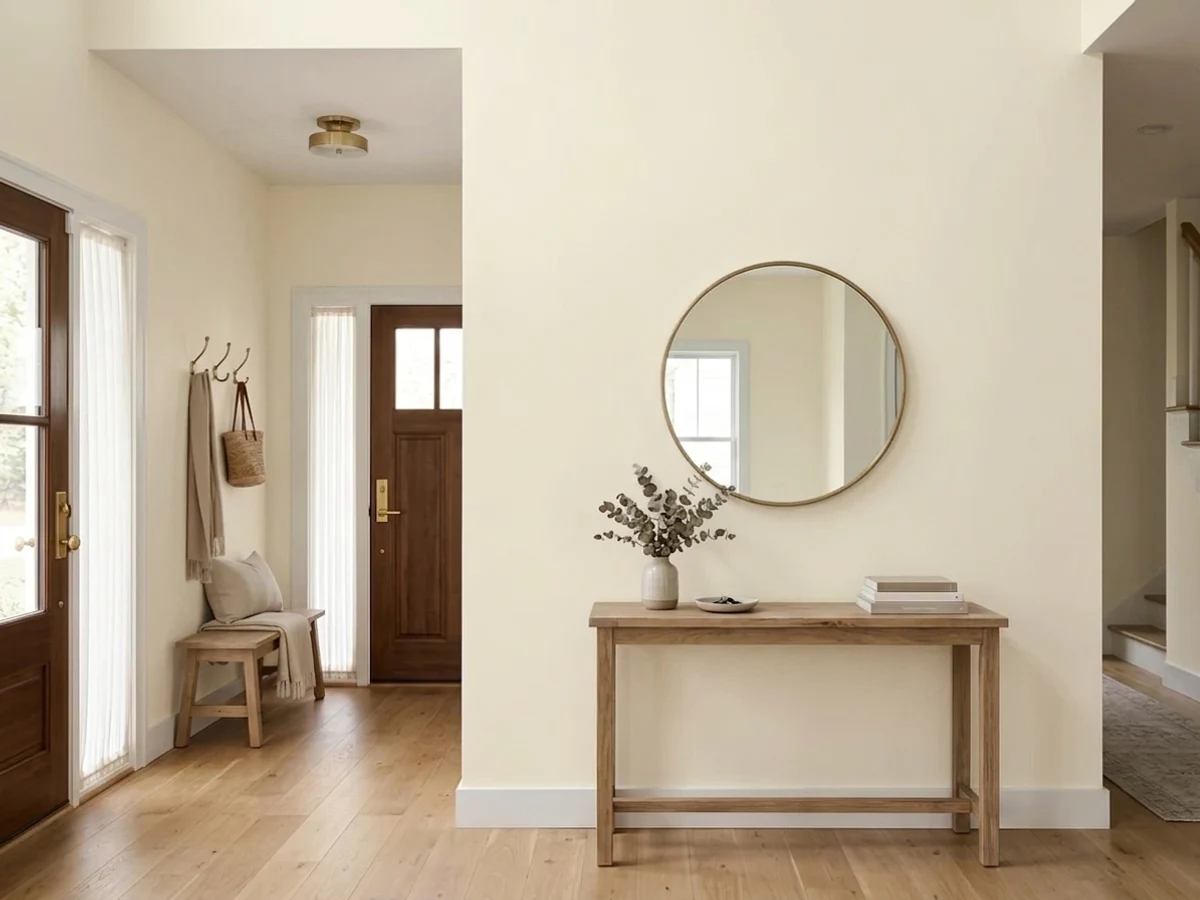
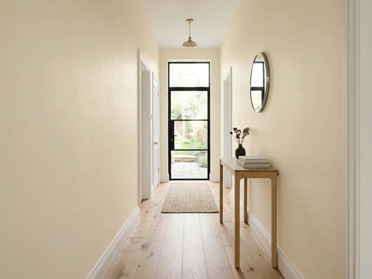
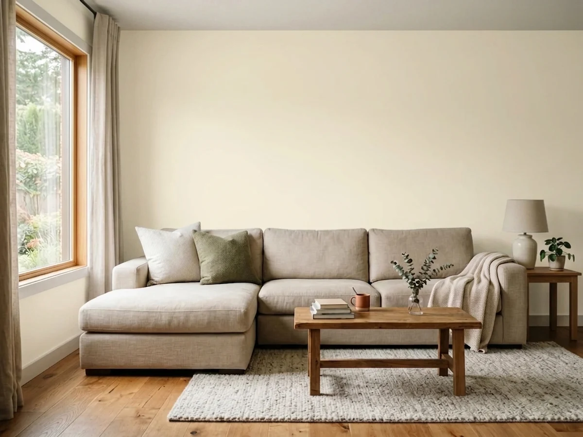
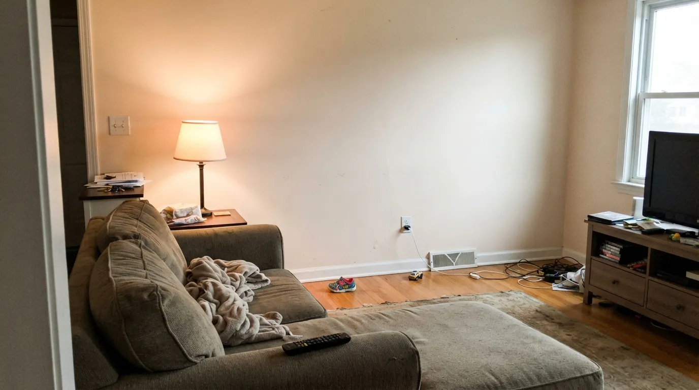
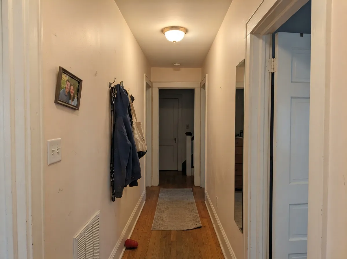
It is at its best in rooms people sit in rather than rooms people photograph. A family room with a sectional, warm wood and lamps on at five o'clock is exactly the brief: bright enough to keep the room open, warm enough that nobody calls it cold. Older houses are its second home — the peach-warm cast sits naturally against oak and fir trim, plaster, and the slightly yellowed light of a house with small windows. It also does the boring jobs well: trim, doors, ceilings and dim hallways, where a stark white would look blue and a cream would look dingy.
Where It Fails
Almost every bad Atrium White story comes down to a mismatch that was visible before the first coat. The paint is honest about what it is; the trouble starts when it is asked to be a modern white.
On a chip it passes for plain white. On four walls in a bright room it reads ivory with a flush — the wall equivalent of warm-toned foundation. If your reference photos are white-box kitchens and gallery walls, this is the wrong side of the deck; Chantilly Lace or Simply White is what those rooms actually are.
The classic setup is Atrium White walls with builder-white or Chantilly Lace trim still on the woodwork. The cooler white wins the comparison every time, and the walls suddenly look pink and slightly dirty. The fix costs nothing at the paint counter: run Atrium White on walls and trim both, and let the sheen change do the separating.
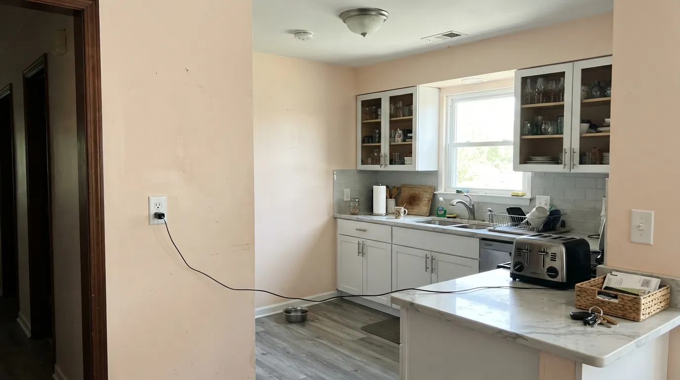
Carrara-look marble, blue-grey quartz and grey-washed LVP all sit at the opposite temperature, and they push Atrium White straight into visible peach. This is the number-one complaint from renovated kitchens and bathrooms. With cool stone, use a neutral white and keep the warmth in the wood instead.
Room by Room
Bright enough to keep an average-window room open, warm enough that the sofa, the wood and the lamplight all agree with it. Eggshell on the walls, the same color in semi-gloss on trim. This is the color that makes a family room read lived-in rather than staged.
Excellent in a traditional living room with real furniture and warm metals. In a very bright south-facing living room it can bleach toward plain white at midday and flush peach at five — sample on the wall that gets the most sun before committing.
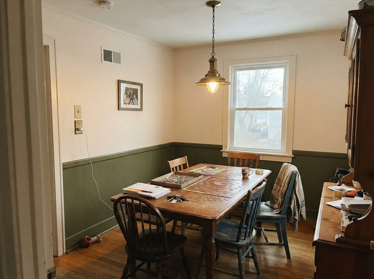
Dining rooms run on lamplight and candlelight, which is where the red edge earns its keep. Pairs naturally with an olive or teal wainscot and with the warm brown of an old table.
At LRV 87 it keeps a bedroom light without going clinical, and under 2700K lamps it turns soft and slightly rosy. Skip it if the bedroom runs on cool overhead LEDs — that light strips the warmth and leaves a flat putty.
A long-standing warm trim and ceiling white, and still a good one. On a ceiling in flat it keeps the plane soft instead of blue-bright. On trim it works under warm greige or greened walls; under cool grey walls it looks yellowed, so match the temperature.
On cabinets in satin it looks warm and old-house handsome next to butcher block, brass and warm granite. Against cool quartz, blue-grey subway tile or Carrara, it argues loudly. The stone decides this room, not the paint.
Your Light Is the Risk
Strong warm daylight settles it into a clean, glowing warm white — the read most owners fell in love with.
Cool grey light cancels the warmth and leaves the red edge exposed; this is where people ask why their white looks pink.
Honest and near-white in the morning, distinctly peach through golden hour. Test at five o'clock, not at noon.
2700K bulbs make it softer and rosier — its best hour. Cool 4000K LEDs flatten it to putty; change bulbs before you change paint.
Most complaints about Atrium White are a light mismatch. Upload a photo of your actual room and see it on your walls — then ask for the same wall in north light or evening lamps before you buy a single sample.
Need It From Another Brand?
Any paint counter can custom-tint Benjamin Moore OC-145 directly. If you would rather stay in one brand's own deck, these are the closest stock matches, measured as ΔE2000. Under 2 is a difference you will not see on the wall.
| Brand | Closest color | ΔE | LRV | |
|---|---|---|---|---|
| Sherwin-Williams | Arcade WhiteSW 7100 · Sherwin-Williams | 1.0 | 86 | Color page → |
| Behr | Fuji SnowT11-13 · Behr | 0.5 | 86 | Color page → |
| Valspar | Du Jour7002-6 · Valspar | 0.6 | 86 | Color page → |
| PPG / Glidden | Cotton TailPPG0998-1 · PPG / Glidden | 1.2 | 87 | Color page → |
| Glidden | Muslin White82YY 85/038 · Glidden | 0.8 | 85 | Color page → |
| Dutch Boy | Simplified White020W · Dutch Boy | 0.5 | 86 | Color page → |
Similar Benjamin Moore Colors
The nearest shades to Atrium White within Benjamin Moore's own range, ranked by perceptual color distance — useful when you want the same look a touch lighter, darker, or warmer.
WCAG 2.1: AA is 4.5 : 1 for normal text, 3 : 1 for large text, AAA is 7 : 1.
Atrium White vs the Colors You're Also Considering
Every Atrium White sample board has the same rivals on it. The numbers show the real lightness gap — then it comes down to which risk you would rather live with.
Pick this when White Dove keeps reading flat or slightly gray in your room and you want the wall to feel warmer.
Benjamin Moore OC-17 · LRV 85White DovePick this if you want warmth with no pink in it at all — the grayed-out version of the same brightness.
Pick this when cream feels heavy and you want the room brighter; six LRV points is a visible gap.
Benjamin Moore OC-146 · LRV 80Linen WhitePick this for a deeper, frankly creamy old-house white — it goes yellow where this one goes peach.
Atrium White Coordinating Colors
The rule with Atrium White is temperature discipline: everything next to it should be warm-based or genuinely muted. Muted greens and greyed teals are its best company because they have enough grey to meet a warm white halfway. Benjamin Moore's own coordinating list points at exactly that — a greyed teal, a historical olive and a warm off-white — which is a rare case of the brand's suggestions being the ones designers actually use.
What to keep away from it: clean cool greys, icy blues, and any white brighter and cooler than it is. Those are the pairings behind almost every complaint about this color.
Living With Atrium White Trim in an Older House
A lot of people meet this color the hard way: they buy a house whose woodwork is already Atrium White, and then discover that half the wall colors they like make the trim look pink. That is the correct diagnosis, and it is fixable without repainting every casing in the house. The trim is not the problem — the wall temperature is.
Warm greiges and warm off-whites are the reliable answers. Edgecomb Gray is the pairing that comes up again and again in real houses, because its warm base meets the trim instead of arguing with it. Elmira White works for the same reason and keeps the whole room in one soft key. Pale Oak is the option when you want the walls slightly cooler without going cold — sample it, because in a dim room its violet-taupe side can show. What consistently fails is any clean grey or blue-grey wall: put one next to this trim and the woodwork reads distinctly peach from across the room.
If you are repainting anyway, the simplest move is the whole-envelope one: Atrium White on walls in eggshell and on trim in semi-gloss. Nothing is left in the room to make the comparison.
Atrium White With Wood Tones and Floors
This is the color's easiest section, because red-warm whites and wood are natural allies. Honey oak — the floor that ruins half the paint colors on this site — is genuinely fine here; Atrium White meets its orange rather than exaggerating it, which is why the color survived decades of oak-floored American houses. Red oak, fir, pine, cherry and walnut are all comfortable. Unstained white oak works too and gives the whole thing a quieter, more current look.
The floor to sample against first is grey: grey-washed wood, cool grey LVP, grey stone tile. Grey pulls the warmth out into the open and the walls can read openly pink above it. Warm rugs and wood furniture fix this in a lot of rooms, but not in a big open floor where the grey plane dominates — there, choose a neutral white instead.
Metals are simple: brass, unlacquered brass, bronze and black all sit well against it. Polished chrome and brushed nickel are the cool ones, and in quantity they will make the walls look warmer than you intended.
Three Ready Palettes Built on Atrium White
A color is never alone on the wall. These are complete combinations in the 60-30-10 pattern, with the reason each one holds together. Every one opens in the visualizer.
One color on walls, trim and ceiling is not laziness here — it is the fix for this paint's only real weakness, since nothing cooler is left in the room to expose the pink. Aegean Teal is a muted blue-green with enough grey in it to sit next to a warm white without a fight, and it gives the room its single deep note.
Try this palette in your roomElmira White carries the same faint pink lean, so the wall-to-trim handoff is a change of value rather than a change of temperature — the mismatch that makes Atrium White look dirty never happens. Tate Olive is the historical green this era of house was actually painted, and olive next to a peach-warm white is the oldest good idea in the book.
Try this palette in your roomSoft Fern is quiet enough to read as a texture rather than a color, and its muted green is the natural partner for a warm white with red in it. Kendall Charcoal supplies the one dark edge the scheme needs so the whole room does not float; it is warm-based, so it never turns the walls pink by contrast.
Try this palette in your roomAtrium White FAQ
Is Atrium White actually pink?
Yes — faintly, and Benjamin Moore says so itself. There is very little color in it at all, but what is there leans red rather than yellow, so it reads peach-ivory instead of cream. In a dim hallway nobody will name it. On four bright walls next to white cabinets, most people will see it. Sample a large piece on the wall you look at most and check it at five in the afternoon.
What trim white goes with Atrium White walls?
Atrium White, in semi-gloss. This color punishes a brighter, cooler trim white more than most — the trim looks clean and the walls immediately look pink and tired next to it. If you want the trim to read separately, change the sheen, not the color.
Atrium White or White Dove?
They are almost the same brightness — LRV 87 against 85 — so this is purely a temperature decision. White Dove's warmth is greyed-down yellow and reads calm and neutral; Atrium White's warmth is red-leaning and reads soft and slightly flushed. If your room already feels cold and White Dove sample cards look flat there, Atrium White is the answer. If you want the safe whole-house default, take White Dove.
Is it a good family room or living room color?
It is one of the better ones. LRV 87 keeps an average-window room bright, and the warmth means the room still feels welcoming at night with lamps on rather than turning into a cold box. Give it wood, warm metals and 2700K bulbs and it does exactly what a family room white should do.
Can I use it on the ceiling?
Yes, in flat, and it is one of its best uses. Over Atrium White walls it makes the whole room read as one soft envelope. Over a warm greige or a green, it is a much better ceiling than stark white, which tends to look blue overhead. Do not put it over cool grey walls — there it just looks yellowed.
Does it work on kitchen cabinets?
It can be very good, but the counter decides. With butcher block, warm granite, soapstone or a warm quartz it looks like an old-house kitchen in the best sense, especially with brass. With cool grey quartz or Carrara-look marble the pink comes forward and reads as a mistake. Use a satin urethane-fortified cabinet enamel either way.
Have you painted with Atrium White?
Rate it — one tap helps the next reader decide.
Ask a Question