Pale Oak
The soft greige everyone recommends — reviewed honestly, including the purple flash that catches people out and the rooms where it disappears.

Jessica has spec'd whites and neutrals for more than 300 rooms and keeps a sample wall of painted drawdowns in her studio. Every color review is checked against real reader rooms in the comments and re-tested when a formula changes. About the testing process →
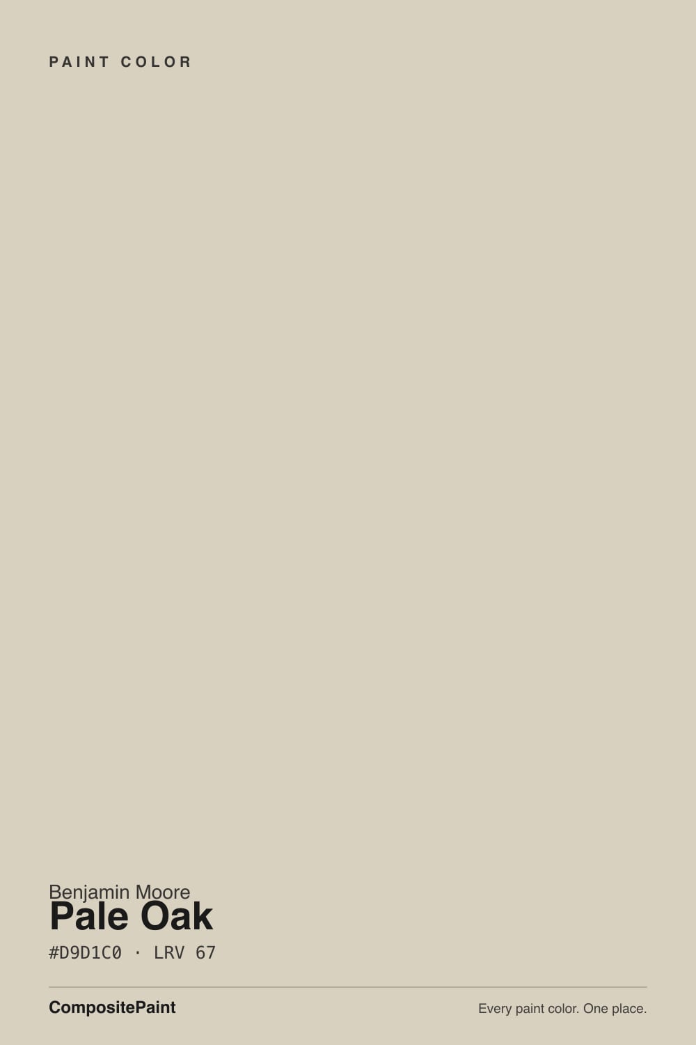
- 1Revere Pewter55
- 2Agreeable Gray60
- 3Pale Oak69
- 4Shoji White74
- 5Dover White83
The Fast Verdict
Pale Oak is the softest of Benjamin Moore's popular greiges — a pale, milky taupe that makes a room feel calm instead of decorated. In warm daylight it is close to perfect: warm without being beige, quiet without being gray.
But it is a low-saturation color in the warm-neutral zone, and those shift hard under cool light — in a north room at midday or under cool LEDs at night it can flash a soft pink-purple that people either do not see at all or cannot unsee. Sample it on three walls, not one.
Open-plan main floors that need one calm color · bedrooms with warm lamps · homes with oak and warm wood floors · anyone who finds Revere Pewter too heavy
Your room is north-facing and dim · your trim or cabinets are cream · you hate pink and purple undertones · you want a color you can actually see on the wall
- Warm without ever reading beige or yellow
- Genuinely whole-house: works across every exposure in one floor plan
- Flatters oak, walnut, and warm red-toned wood floors instead of fighting them
- Light enough (LRV 69) to brighten a dim hallway
- Reads current and calm without dating the way strong grays did
- Flashes pink-violet in north light and under cool LED bulbs
- Washes out to nothing in bright south or west sun
- Argues with cream trim and cream cabinets
- Too little pigment to carry a room on its own — it needs a dark accent
What Color Is Pale Oak, Really?
A greige built on the warm side of the fence — soft red-orange taupe, grayed way down. The important part is how little color is actually in it. At roughly a quarter saturation it barely commits to anything, which is exactly why it flatters furniture and floors instead of competing with them. It is the reason Pale Oak shows up in round-up after round-up as the safe warm neutral: it is a color that agrees with the room you already have.
At LRV 69 it reflects a lot of light without going blank. That number is the useful comparison point. Edgecomb Gray sits at 63 and reads visibly heavier and greener on the same wall; Classic Gray at 74 reads almost like a warm white with the color drained out. Pale Oak lands in the gap — light enough for a dim hallway, still colored enough that you can tell somebody chose it.
Undertone in one line: warm taupe with a pink-violet edge that only shows under cool light. That is the whole review. In sun it is beige-leaning greige; in cold north light or under a 4000K LED, the pink-violet steps forward, and that is not your primer, your monitor, or a bad can.
Where It Shines
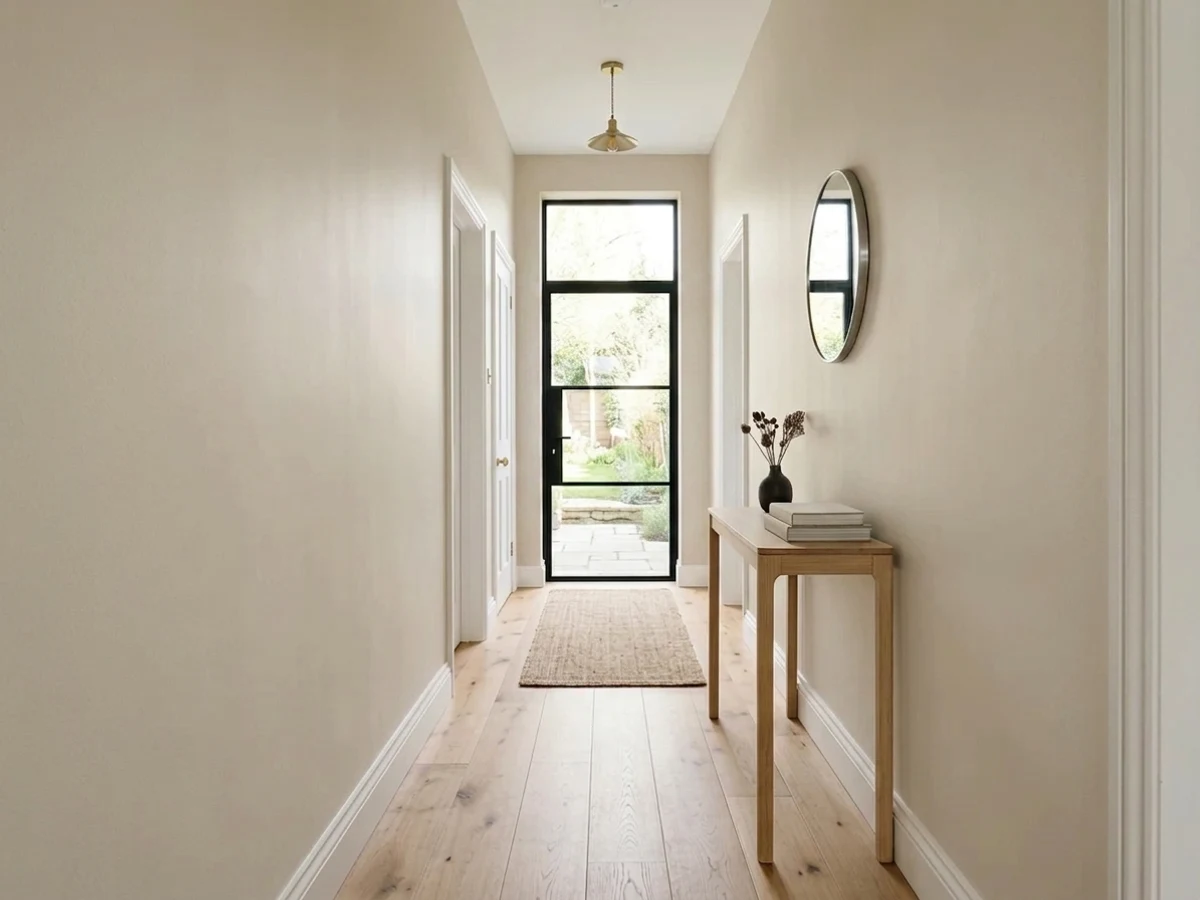
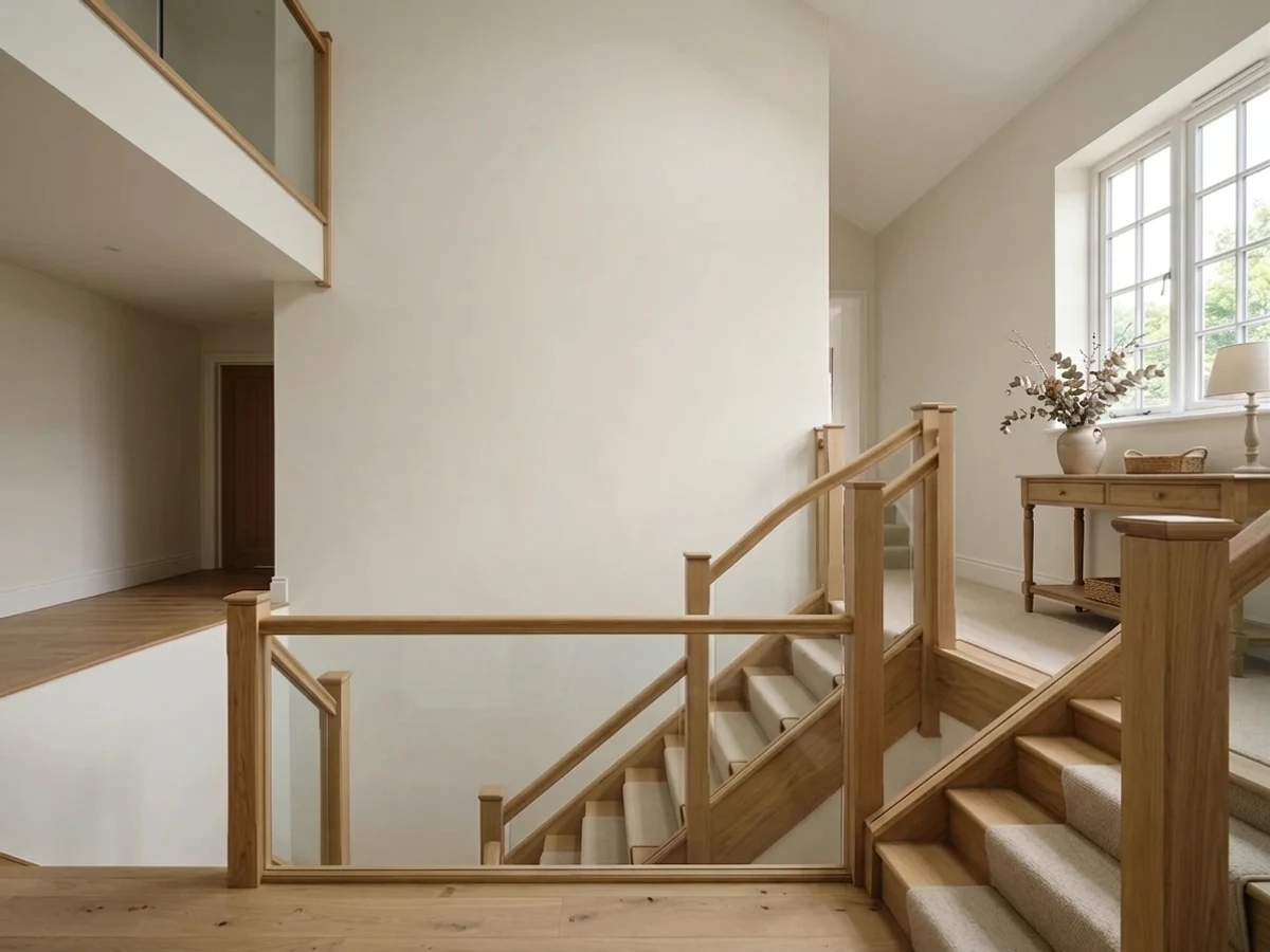
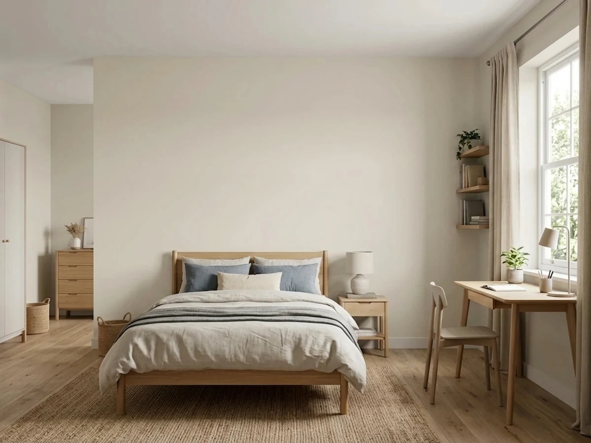
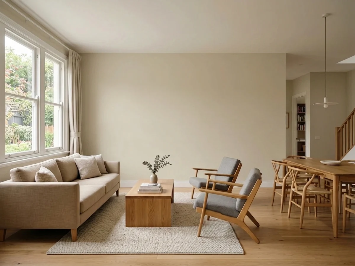
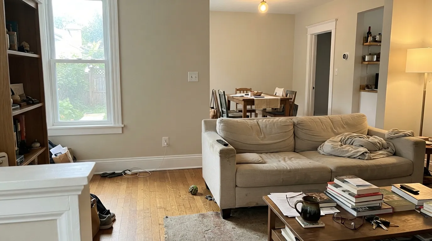
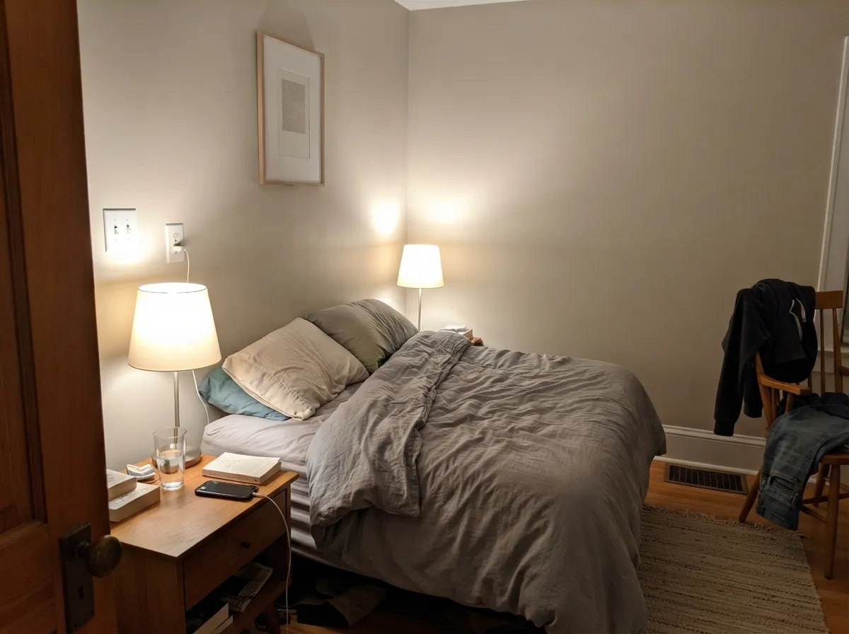
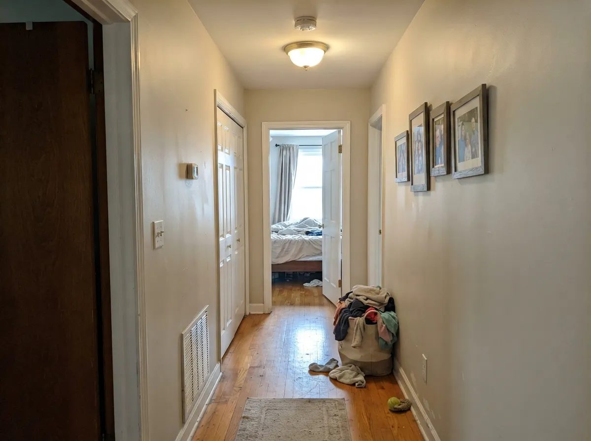
Give it daylight with any warmth in it and Pale Oak does the thing people buy it for: the walls stop being a decision. It is a whole-floor color first — living room into hall into bedroom without a single awkward handoff — and it is genuinely lovely in rooms with oak floors, linen, and warm lamps.
Where It Fails
The complaints about Pale Oak are remarkably consistent, and they fall into three buckets. Two are about light and one is about what you put next to it. If your room matches any of them, more coats will not help.
This is the number one story: someone samples in a sunny spot, loves it, paints the whole floor, and then sees a definite lavender-pink cast in the north room at midday or under cool bulbs at night. One homeowner described loving it on two walls and seeing purple on the third, then not being able to unsee it. Cool light strips the warm-orange side and leaves the violet edge exposed. If you want a light greige that will not do this, use Edgecomb Gray (BM HC-173) — its green-gray base flashes the opposite direction — or swap every bulb in the room to 2700K first.
Pale Oak's warmth is pink-warm, not yellow-warm, so a yellow-cream white beside it reads instantly dingy and the two colors fight. This is the pairing mistake that produces the "my walls look dirty" posts. If your trim and cabinets are staying cream, pick a beige with the same yellow base instead — Manchester Tan (BM HC-81) — and keep Pale Oak for houses with clean white trim.
In a bright, glassy room Pale Oak washes out and reads as plain off-white — people spend two weekends painting and then say the walls look like nothing. There is simply not enough pigment in it to hold a sun-blasted wall. In that situation step down to Revere Pewter (BM HC-172, LRV 56), which keeps its character in strong light.
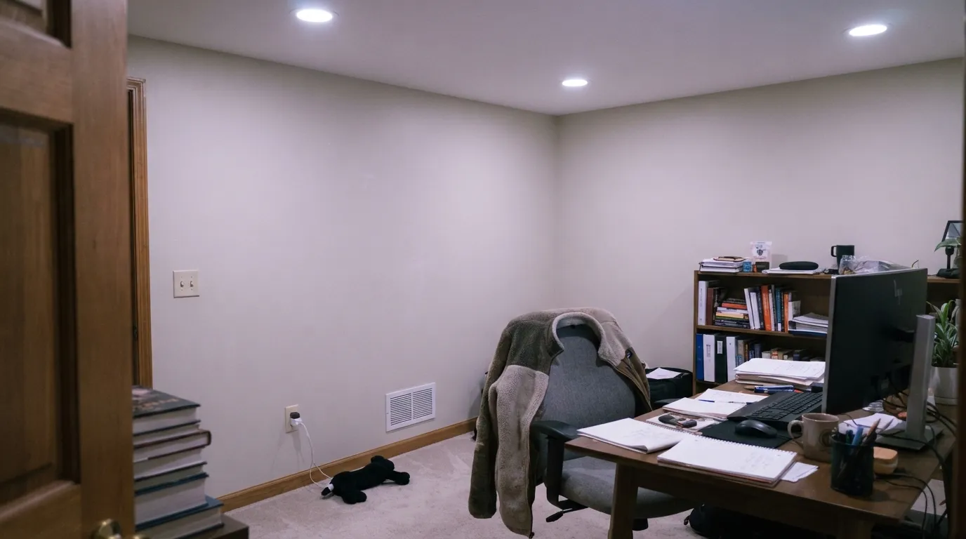
Room by Room
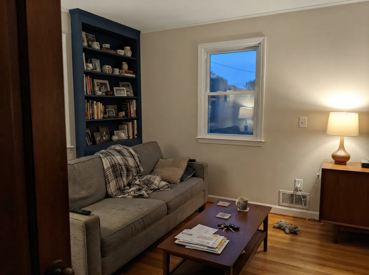
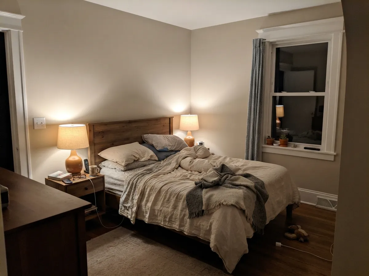
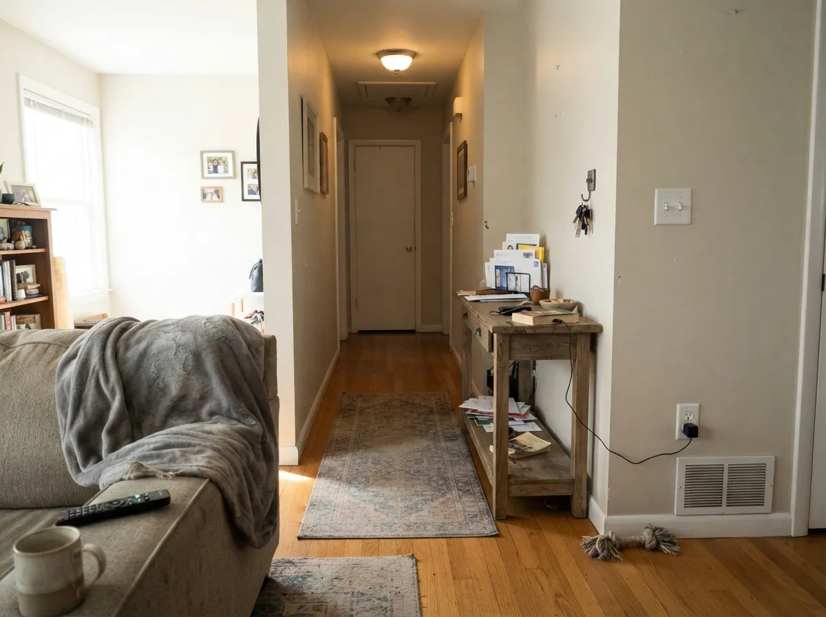
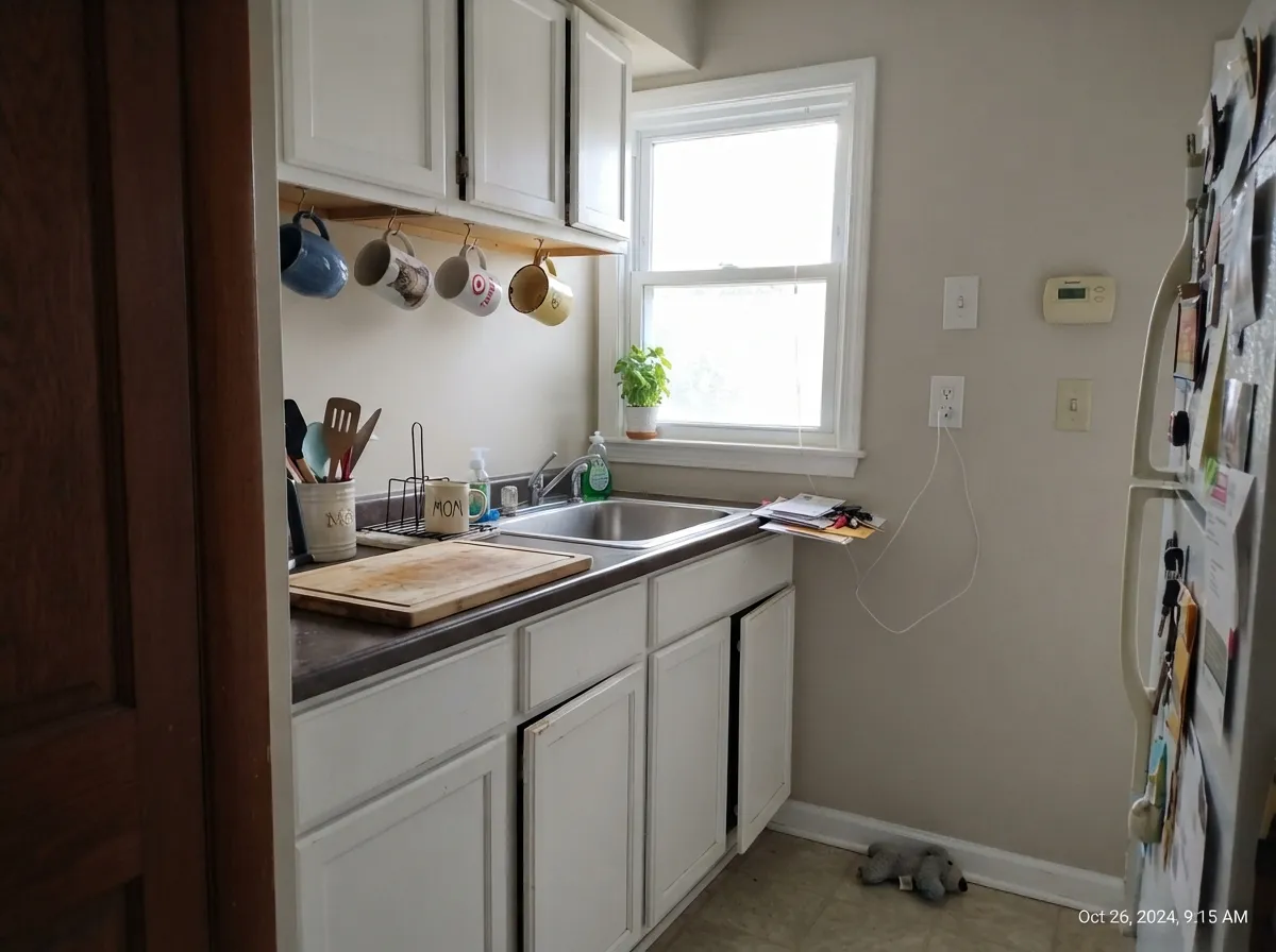
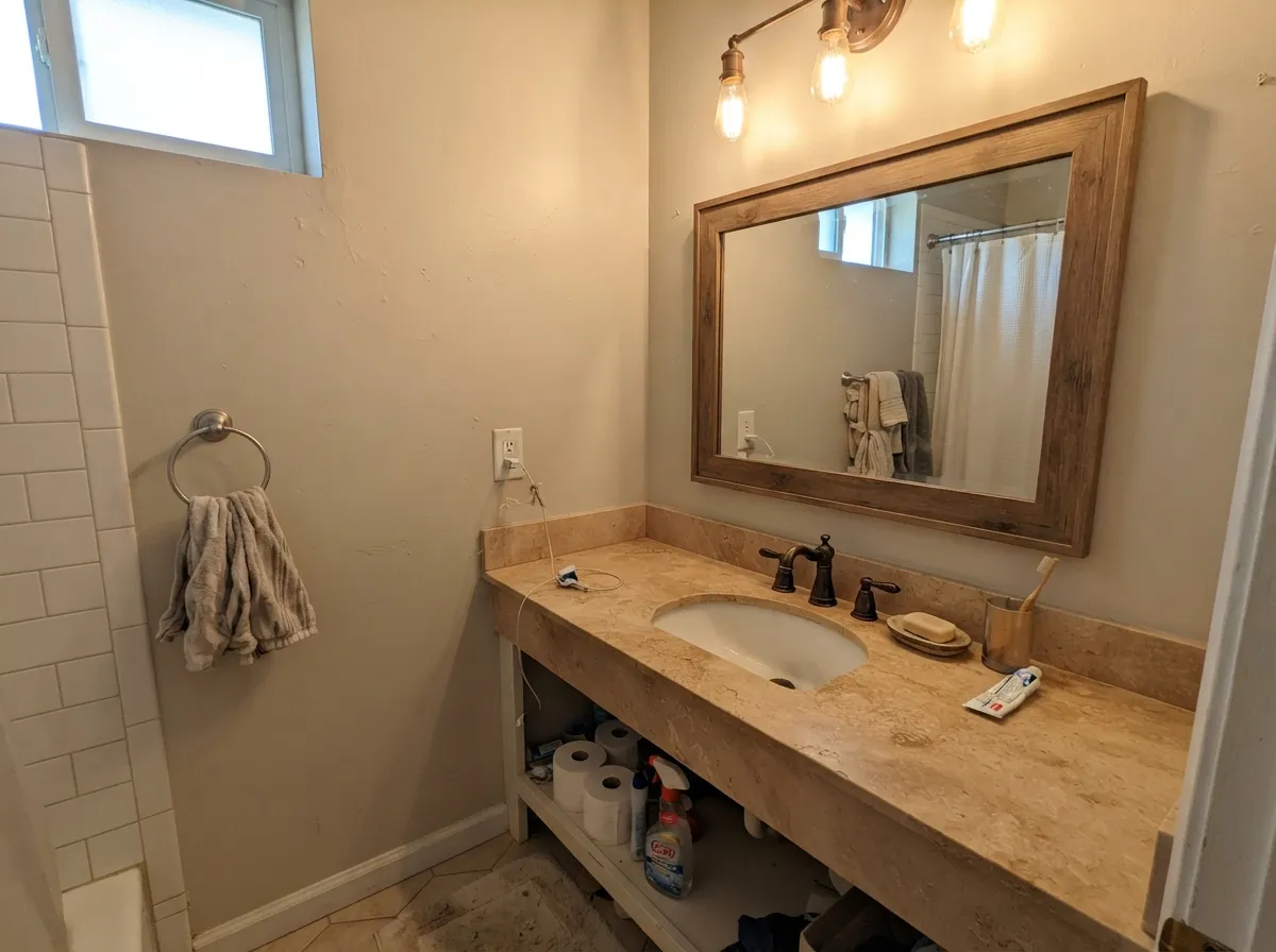
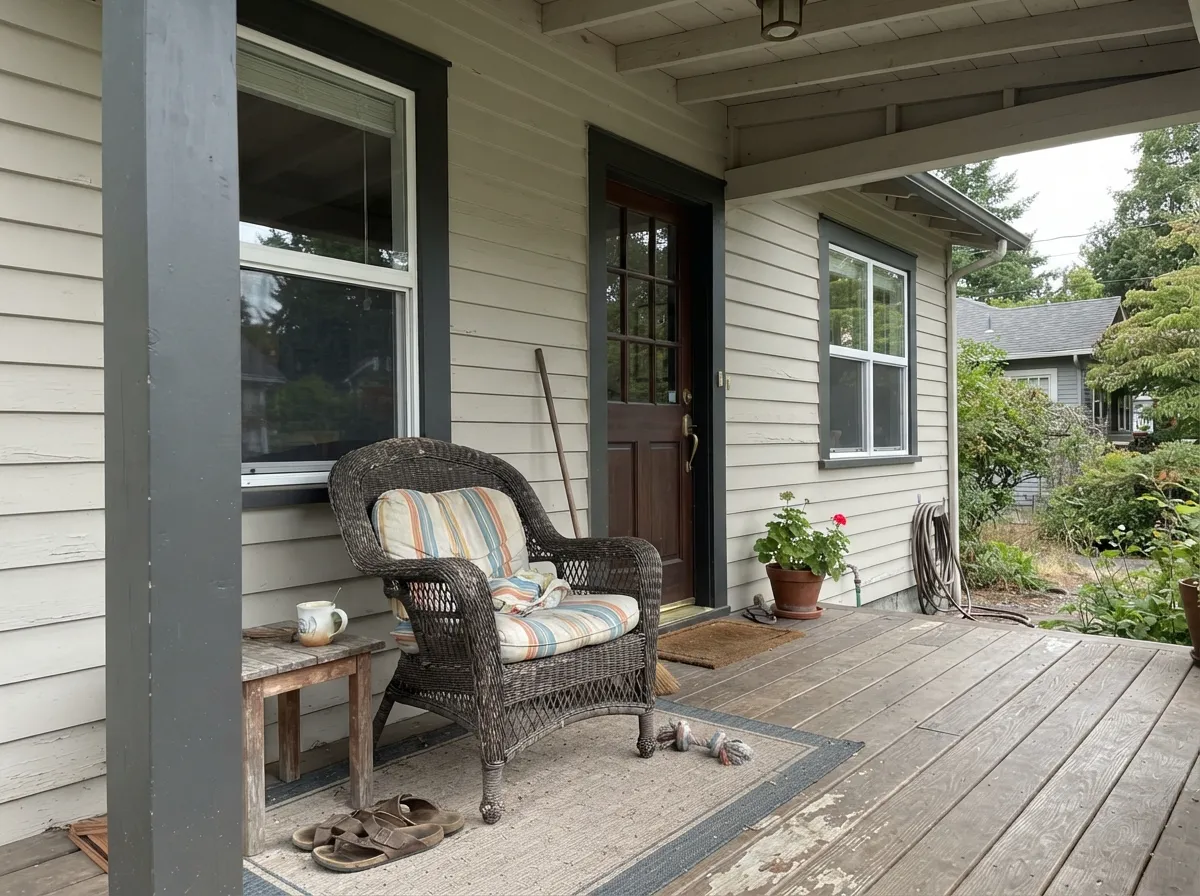
Your Light Is the Risk
Cool, indirect daylight pulls the violet forward. Sample here first, not in the sunny room.
Warm and creamy, but a sun-flooded room can wash it out to plain off-white.
2700K: warm taupe, cozy. 3500K and up: gray, then pink. Buy the bulbs before the paint.
Warm at the sun hours, grayer the rest of the day. Most people like the movement.
Most complaints about Pale Oak are a light mismatch. Upload a photo of your actual room and see it on your walls — then ask for the same wall in north light or evening lamps before you buy a single sample.
Need It From Another Brand?
Any paint counter can custom-tint Benjamin Moore OC-20 directly. If you would rather stay in one brand's own deck, these are the closest stock matches, measured as ΔE2000. Under 2 is a difference you will not see on the wall.
| Brand | Closest color | ΔE | LRV | |
|---|---|---|---|---|
| Sherwin-Williams | Egret WhiteSW 7570 · Sherwin-Williams | 1.3 | 70 | Color page → |
| Behr | Campfire AshN320-1 · Behr | 0.0 | 69 | Color page → |
| Valspar | Glass Pebble8004-26A · Valspar | 0.8 | 70 | Color page → |
| PPG / Glidden | CocoonPPG1027-1 · PPG / Glidden | 1.7 | 70 | Color page → |
| Glidden | Whitecliff Beige30YY 69/048 · Glidden | 2.4 | 69 | Color page → |
| Dutch Boy | Pearly Gray442-1DB · Dutch Boy | 2.5 | 70 | Color page → |
Similar Benjamin Moore Colors
The nearest shades to Pale Oak within Benjamin Moore's own range, ranked by perceptual color distance — useful when you want the same look a touch lighter, darker, or warmer.
WCAG 2.1: AA is 4.5 : 1 for normal text, 3 : 1 for large text, AAA is 7 : 1.
Pale Oak vs the Colors You're Also Considering
Every Pale Oak sample board has the same rivals on it. The numbers show the real lightness gap — then it comes down to which risk you would rather live with.
Pick this for the warmer, cozier read — Balboa Mist is cooler and more gray-mauve.
Benjamin Moore OC-27 · LRV 70Balboa MistPick this in a room that already runs warm, or if you want more visible gray.
Side-by-side comparison →Pick this for the lighter, airier wall with no green in it.
Benjamin Moore HC-173 · LRV 63Edgecomb GrayPick this in north rooms — its green-gray base will not flash purple.
Side-by-side comparison →Against Edgecomb Gray (HC-173, LRV 63), Pale Oak is lighter and a touch cleaner. Edgecomb carries more visible green-gray and reads slightly heavier, so choose Pale Oak when you want the airier, softer wall and Edgecomb when you want a bit more grounding.
Balboa Mist (OC-27, LRV 70) is close in lightness but cooler and more clearly gray-mauve. In a room that already runs warm, Balboa Mist keeps things calm; in a cooler room, Pale Oak's warmth is the safer pick.
Classic Gray (OC-23, LRV 74) is lighter still and reads almost as a warm off-white with the faintest gray. If Pale Oak feels too taupe for you, Classic Gray is the brighter, more neutral option; if it feels too pale, Pale Oak gives you more color to hold the wall.
Pale Oak Coordinating Colors
The rule with Pale Oak is to stay away from yellow-cream and stay near clean whites, warm woods, and one dark anchor. Because it is so pale, almost every scheme built on it needs something with real depth in the room or the whole floor drifts. These are the partners that actually work:
Pale Oak on Cabinets
Painted cabinets are where Pale Oak either looks expensive or looks unfinished, and the deciding factor is contrast, not the color. On its own it is a lovely, quiet cabinet tone — softer than white, no yellow, and it hides the fingerprints around handles that a bright white broadcasts. Use a satin urethane-fortified cabinet enamel; flat and eggshell do not survive a kitchen.
The failure mode is a kitchen with nothing dark in it. Pale Oak cabinets against a pale quartz counter and a pale backsplash gives you a room with no edges — everything melts together and reads washed out. Give it a defined counter, black or unlacquered brass hardware, and ideally one darker element: an island in Chelsea Gray (HC-168) or Wrought Iron (2124-10) fixes the problem in one move.
One more warning specific to this color: do not put Pale Oak cabinets next to existing cream cabinetry or cream trim. The pink-warm and yellow-cream bases clash badly and both sides end up looking wrong.
Pale Oak With Wood Floors and Wood Trim
This is the pairing question that decides whether Pale Oak was the right buy. Its warmth is red-orange based, which means it sits comfortably against red oak, cherry, and maple with a pink-toned stain — the tones agree rather than compete, and the wall stops making the floor look orange. Walnut and honey oak work too. If your floors are the builder-orange kind and you want that orange killed rather than accepted, Pale Oak is the wrong tool; a green-based neutral like Edgecomb Gray (HC-173) does that job.
Cool gray LVP and gray-washed wood are the risk. Against cool gray flooring the pink-violet side of Pale Oak gets thrown into relief and the walls can read mauve, especially in the same north rooms that already cause trouble. Sample a large board standing upright on the actual floor, in daylight and again at night.
Stained wood trim changes the read too: with wood trim and no white in the room, Pale Oak looks lighter and more washed-out than it does on a swatch. In a wood-trimmed room, most people are happier a step down with Edgecomb Gray (HC-173) or Revere Pewter (HC-172), which hold their own against the wood.
Three Ready Palettes Built on Pale Oak
A color is never alone on the wall. These are complete combinations in the 60-30-10 pattern, with the reason each one holds together. Every one opens in the visualizer.
Chantilly Lace is a clean white with no yellow in it, so it reads crisp against Pale Oak's pink-warmth instead of muddying it. The navy door supplies the one dark note a floor of soft greige needs to look intentional.
Try this palette in your roomWhite Dove is the softest trim white that still stays clearly lighter than the wall, so the room blends rather than cuts. Chelsea Gray at 30 percent gives the eye something solid to land on, which is exactly what Pale Oak alone cannot do.
Try this palette in your roomA soft blue-green accent is the practical fix for Pale Oak's pink edge — the cool note next to it makes the walls read gray-taupe rather than mauve. Keep the blue to one wall so the scheme stays 60-30-10 and the bedroom stays restful.
Try this palette in your roomPale Oak FAQ
Does Pale Oak really look pink or purple?
Sometimes, and it depends entirely on your light. In warm daylight and under 2700K bulbs it reads warm taupe. In north light at midday, or under cool 4000K LEDs at night, a soft pink-violet cast steps forward. Roughly half the people who paint it never notice; the other half cannot unsee it once they do.
Is Pale Oak warm or cool?
Warm, but the pink kind of warm, not the yellow kind. That distinction matters more than the warm-versus-cool question, because it decides which whites and woods work next to it. Cream and butter-toned whites clash; clean whites do not.
What trim white goes with Pale Oak?
Chantilly Lace (OC-65) for a crisp, clean edge — it has no yellow to fight the pink. White Dove (OC-17) if you want the trim softer and less contrasty, which suits rooms with little daylight. Avoid cream whites like Swiss Coffee; they make Pale Oak look dirty.
Pale Oak or Edgecomb Gray?
Pale Oak is lighter (67 versus 63), cleaner, and leans pink; Edgecomb Gray is heavier and leans green-gray. In a north-facing room, Edgecomb Gray is the safer buy. In a room with warm daylight where you want airy, Pale Oak wins.
Will Pale Oak work with my orange oak floors?
Better than most greiges, because its warmth meets the wood halfway instead of making the orange look louder. What it will not do is neutralize the orange — if that is the goal you need a green-based neutral like Edgecomb Gray (HC-173). Test a board standing on the actual floor.
Is Pale Oak good for kitchen cabinets?
It is a good soft alternative to stark white, in a satin cabinet enamel. The catch is contrast: pair it with a counter or backsplash that has real definition, and black or brass hardware, or the whole kitchen blurs into one soft haze. Pale Oak cabinets with pale beige counters is the mistake to avoid.
How many coats does it take?
Two over any existing light color. Over a dark or saturated wall, prime first — Pale Oak has very little pigment in it and will streak for three coats otherwise.
Have you painted with Pale Oak?
Rate it — one tap helps the next reader decide.
Ask a Question