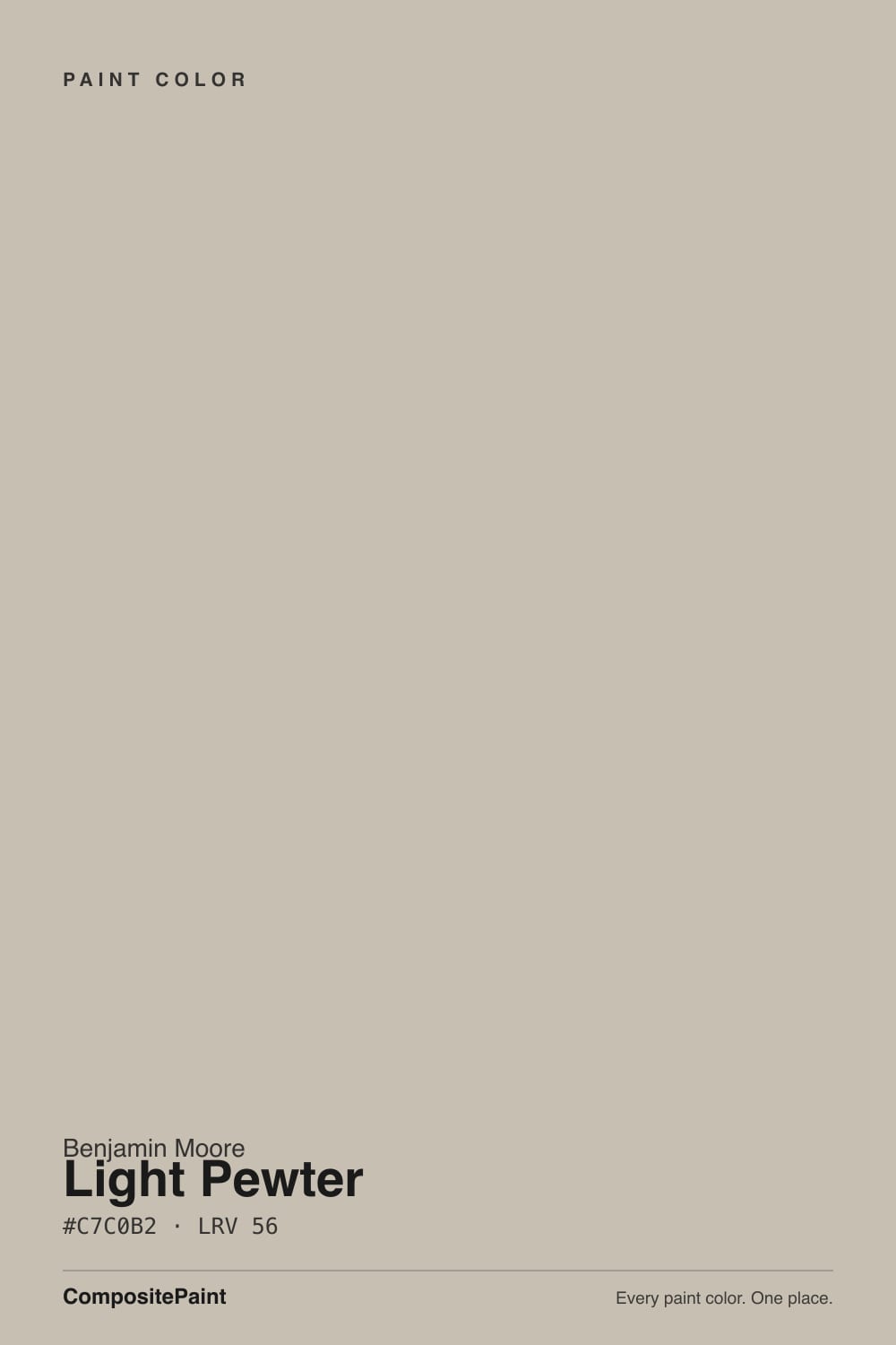
Light Pewter
Benjamin Moore's lighter Pewter, reviewed honestly: the rooms where it stays a true greige, the south walls that bleach it, and when to pick Revere instead.

Jessica has spec'd whites and neutrals for more than 300 rooms and keeps a sample wall of painted drawdowns in her studio. Every color review is checked against real reader rooms in the comments and re-tested when a formula changes. About the testing process →
- 1Revere Pewter55
- 2Agreeable Gray60
- 3Light Pewter69
- 4Shoji White74
- 5Dover White83
The Fast Verdict
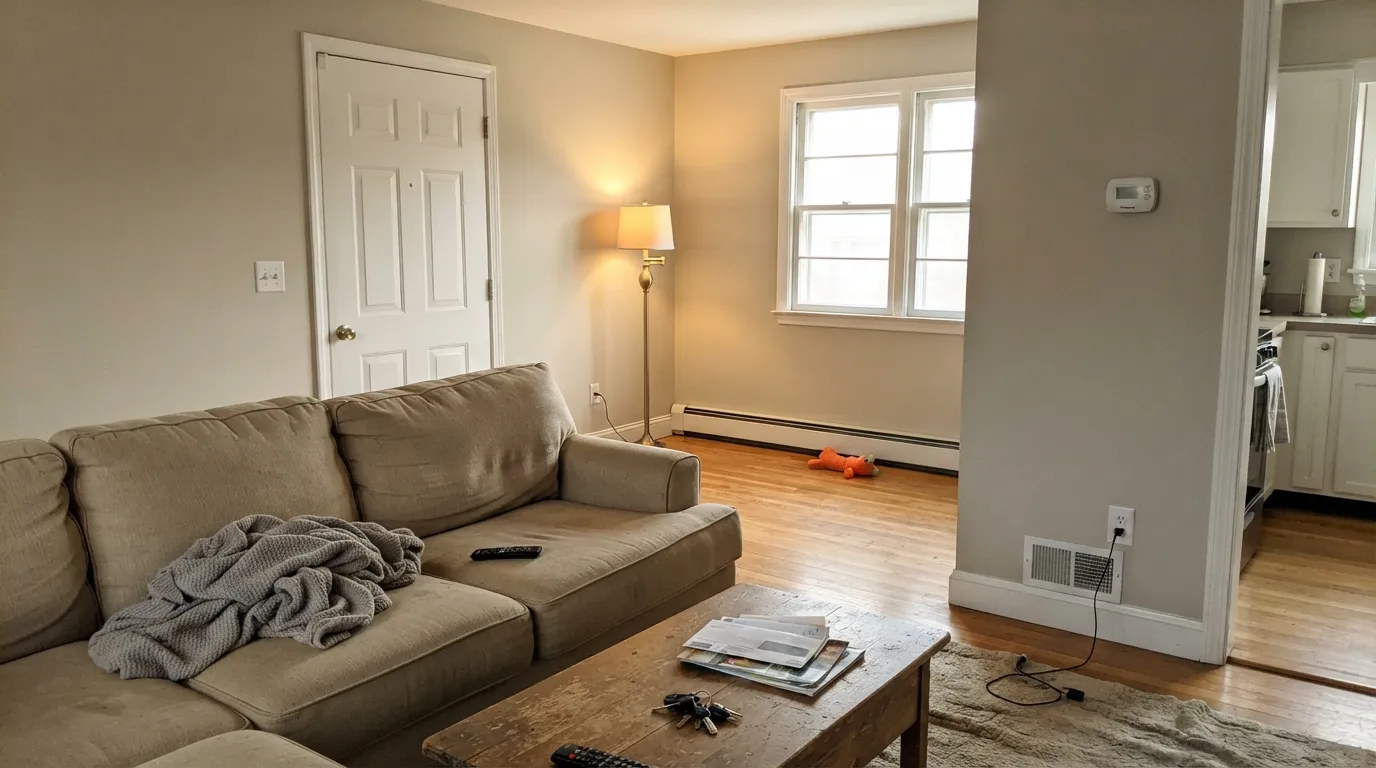
Light Pewter is the greige people land on after Revere Pewter feels too heavy. At LRV 69 it is a gray-leaning warm gray with a mild beige in it — not taupe, not violet, not green — and in mixed daylight it reads as a finished, quiet wall instead of a color.
The catch is how little pigment is actually in it. Give it a typical south or west room and it behaves; give it a glass-heavy south wall at noon and it washes toward off-white.
Whole-house walls in mixed daylight · living rooms and bedrooms that need a light greige · hallways where Revere Pewter went too dark · kitchens with white cabinets, oak, and brass
Your south room is a sun box with wall-to-wall glass · you actually want a true gray · you need more presence than a pale greige · your floors or counters are cool blue-gray stone
- Gray-leaning greige with no green, violet, or pink of its own
- Light enough (LRV 69) for halls and north rooms that swallow Revere Pewter
- Carries a whole main floor without a temperature fight
- Flatters oak, walnut, brass, and white cabinets without competing
- Shifts less than Pale Oak — gray in cool light, greige in warm, never a new color
- Washes toward off-white on a huge, blazing south wall
- Not gray — warm light brings the beige and disappoints gray-seekers
- Picks up green bounce from lawns and trees because it is so light
- Too quiet if you wanted the wall to have real presence
What Color Is Light Pewter, Really?
A light greige that leans gray first and beige second — and the missing undertones are the whole point. Most popular greiges carry a tell: Revere Pewter flashes green in cool light, Pale Oak flashes pink-violet, Balboa Mist drifts taupe-violet. Light Pewter sits in Benjamin Moore's Classics collection as the quieter Pewter: warm enough to keep a room from going cold, gray enough that it never turns tan, and without a blue, pink, purple, or green of its own. Designers keep calling it underrated because it does the boring job well — it looks like a wall, not a project.
At LRV 69 it is in Pale Oak territory, not Revere Pewter territory. Revere Pewter sits at 56 and reads as a real mid-tone; Edgecomb Gray at 63 is the half-step down people take when Revere feels heavy. Light Pewter is another six points lighter than Edgecomb Gray, which is why it keeps a hallway or a north bedroom open instead of closing in — and why a huge, bright south wall can bleach it. Classic Gray at 74 is the next stop if you want this idea even airier, closer to a warm white.
Undertone in one line: gray with a mild beige — never green, never violet, never blue. If your sample looks green, that is lawn or tree bounce reflecting off a low-saturation wall, not the paint. If it looks beige, you are in warm south or west sun. Both versions are the same color being honest about the room.
Where It Shines
Give it mixed daylight, white trim, and warm wood and it is nearly automatic. Whole-house is its actual job: it carries living room into hall into bedroom without a temperature fight, and at LRV 69 it is the Pewter you can put in a dimmer room without the murk Revere Pewter is famous for. Kitchens are the second home — on the walls, behind white cabinets, oak floors, and brass, it reads custom instead of builder beige.
Where It Fails
Almost every regret story about Light Pewter follows one of three scripts, and all three are visible on the sample wall if you look at the right hour. None of them are a bad batch — but if your room matches one, this is not your greige, and more coats will not add the color that is not in the can.
This is the number-one miss. LRV 69 with low saturation cannot hold a wall that is already flooded with noon sun. The greige thins out toward off-white, contrast with the trim disappears, and the room looks unfinished rather than airy. If you wanted the wall to register as a color, step down to Edgecomb Gray (LRV 63) or Revere Pewter (LRV 56).
On the chip it passes for a soft gray. In west afternoon light or under 2700K lamps the beige comes forward and it is unmistakably greige. People who wanted cool, modern gray call it dirty or beige. If gray is the point, Collingwood (LRV 62) is the true gray that refuses to turn greige; Light Pewter will not do that job.
Because there is so little color in it, Light Pewter is a mirror for whatever light hits it. Summer green bouncing through a big window lands on the wall and reads as a faint green cast — reflection, not an undertone, but still your wall. Sample on the window wall in July, not just on the interior wall in February.
Room by Room
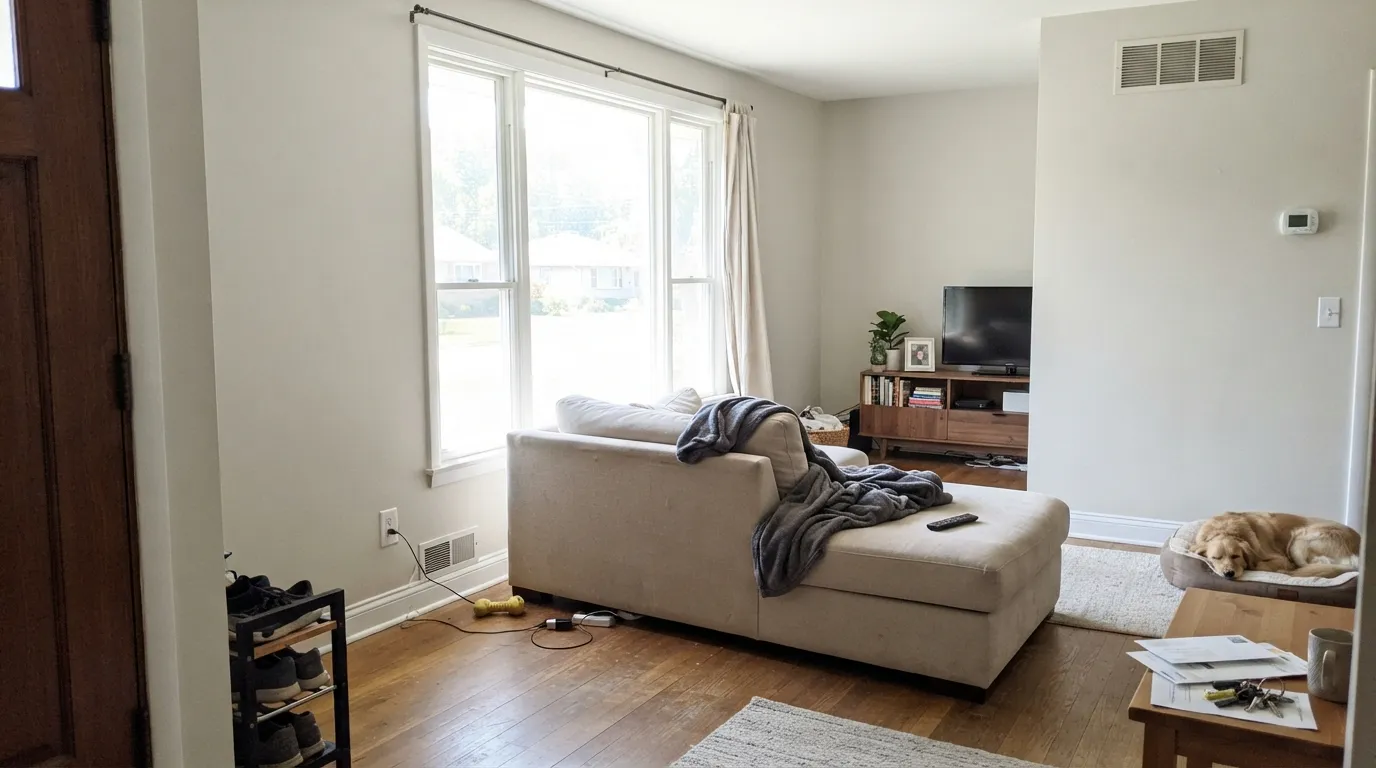
With ordinary south or west windows it is the calm backdrop that makes oak floors, a linen sofa, and art look chosen. Eggshell on the walls, White Dove on trim in semi-gloss. Floor-to-ceiling glass on the south side is the room to sample at noon before you commit.
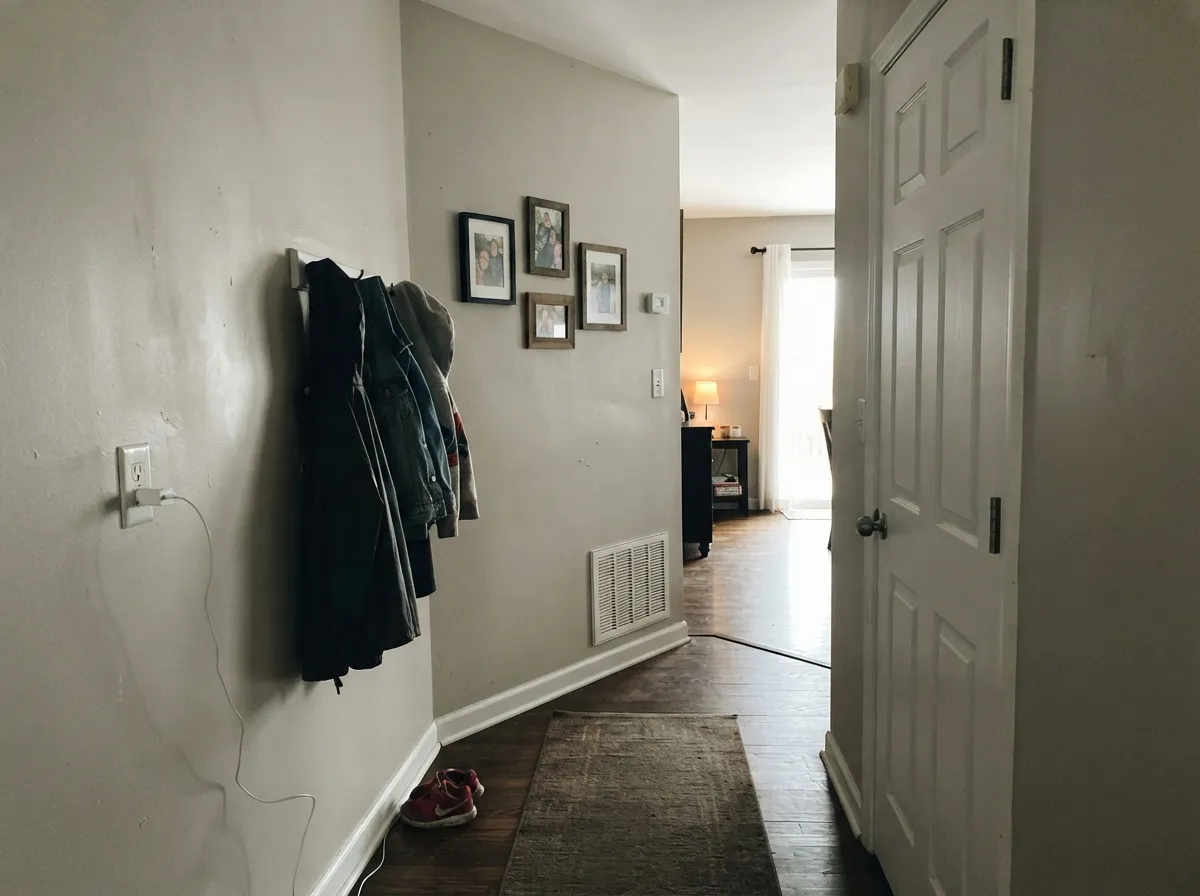
This is the use case designers actually reach for. Revere Pewter at LRV 56 goes murky in interior halls; Light Pewter stays open and still reads as a color next to White Dove doors. Carry it from the entry through the hall so the house does not change temperature at every doorway.
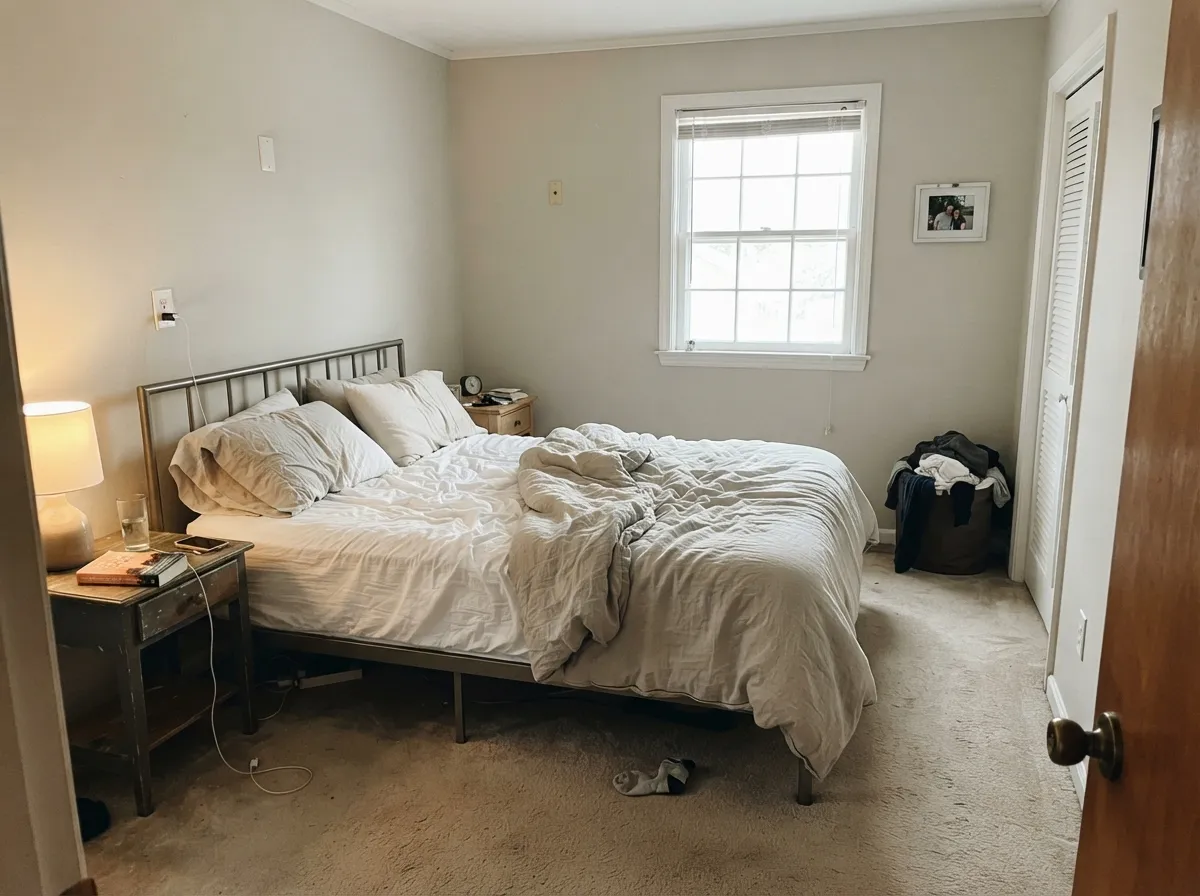
Soft, restful, and light enough for a north bedroom that would swallow a mid-tone greige. Under 2700K lamps at night it warms toward greige; 3000K keeps it grayer. Matte or eggshell; skip a stark bright trim white, which makes the walls look dusty.
On the walls behind White Dove or Simply White cabinets it is a warm, quiet field that loves oak, brass, and a navy island. Satin Light Pewter on the cabinets themselves is a bigger bet — at LRV 69 they can read like dingy white next to a cleaner cabinet white. Keep the greige on the wall.
Warm tile, wood vanities, and brass: easy. Cool gray marble or blue-gray subway tile pushes it beige and slightly dirty — that bath wants a true gray like Stonington Gray instead. Eggshell on walls; satin on a vanity only if the counters are warm.
One color across living, dining, hall, and bedrooms is why this color exists. It holds through mixed light better than moodier greiges, and the high LRV keeps interior rooms from closing in. Add one darker note — Hale Navy on a door or island — so the house is not one pale temperature from curb to closet.
Your Light Is the Risk
Warm side light pulls the beige forward without bleaching it. This is the greige version people sample for — soft, finished, still clearly a color.
A glass-heavy south room at noon thins it toward off-white. The wall loses contrast with the trim and looks unfinished. Sample at 1pm, not at dusk.
Gray and a touch cooler in east morning and on overcast north walls; creamier greige through west and golden hour. The move is gentle — same color, different emphasis.
2700K lamps: beige comes forward and it goes cozier. Cool 4000K LEDs: flatter, grayer, a little dusty. Swap bulbs before you blame the paint.
Most complaints about Light Pewter are a light mismatch. Upload a photo of your actual room and see it on your walls — then ask for the same wall in north light or evening lamps before you buy a single sample.
Need It From Another Brand?
Any paint counter can custom-tint Benjamin Moore 1464 directly. If you would rather stay in one brand's own deck, these are the closest stock matches, measured as ΔE2000. Under 2 is a difference you will not see on the wall.
| Brand | Closest color | ΔE | LRV | |
|---|---|---|---|---|
| Sherwin-Williams | Drift of MistSW 9166 · Sherwin-Williams | 1.2 | 69 | Color page → |
| Behr | Ginger SugarMQ3-18 · Behr | 0.5 | 68 | Color page → |
| Valspar | Stony Path5007-1B · Valspar | 1.5 | 68.2 | Color page → |
| PPG / Glidden | Silent SmokePPG1025-2 · PPG / Glidden | 0.5 | 68 | Color page → |
| Glidden | Silent SmokePPG1025-2 · Glidden | 0.8 | 68 | Color page → |
| Dutch Boy | Pearly Gray442-1DB · Dutch Boy | 2.5 | 70 | Color page → |
Similar Benjamin Moore Colors
The nearest shades to Light Pewter within Benjamin Moore's own range, ranked by perceptual color distance — useful when you want the same look a touch lighter, darker, or warmer.
WCAG 2.1: AA is 4.5 : 1 for normal text, 3 : 1 for large text, AAA is 7 : 1.
Light Pewter vs the Colors You're Also Considering
Every Light Pewter sample board has the same rivals on it. The numbers show the real lightness gap — then it comes down to which risk you would rather live with.
Pick this for halls, north rooms, and anyone who found Revere Pewter too dark or too murky.
Benjamin Moore HC-172 · LRV 56Revere PewterPick this when the room has real daylight and you want a greige with actual weight on the wall — just watch the green flash in cool light.
Pick this for a grayer, airier read that still works in a dimmer hall.
Benjamin Moore HC-173 · LRV 63Edgecomb GrayPick this when you want the same warm family a step deeper and more beige — it needs daylight, and it is not a dark-room color.
Inside the deck, Ashen Tan 996, Dufferin Terrace CC-456, and Annapolis Gray HC-176 all share #C9BEAF at LRV 51. They are five points darker than Light Pewter and clearly warmer, so they read more tan on a wall. Cumulus Cloud 1550 at #C5C1B8, LRV 52, goes the other way, greyer and slightly cooler. Paris Rain 1501 at #C4C2B0, LRV 53, brings a faint green edge.
Across brands the matches are tight. Sherwin-Williams High Sierra SW 9588 at deltaE 0.80 is an effective match. Valspar Feathers of a Dove M111 at 1.10, Behr Fortress Stone PPU8-17 at 1.24, PPG Ashen PPG1023-3 at 1.27, and HGTV Home Collonade Gray HGSW 7641 at 1.71 are all visually identical in normal room light.
Farrow and Ball Elephant's Breath No. 229 at deltaE 2.04 is very close but should be sampled first, and Annie Sloan Paris Grey at 4.44 is close in family but visibly greener side by side.
Light Pewter Coordinating Colors
Stay on the warm-neutral side and give this pale greige something darker to push against. Soft whites on trim, a deeper Pewter or navy on one object, and muted sage if you want a color note — icy blues and cool gray marble are the pairings that make Light Pewter look beige and slightly dirty. These are the partners that keep showing up in rooms that work:
The Other Pewter: Why Designers Reach For 1464 After Revere
Revere Pewter is the famous one — the greige that taught a generation of stagers a single SKU. Light Pewter never got that marketing, which is why it still sits in the Classics collection as the color people find after they sample Revere Pewter and watch it go heavy in a hallway. The names are the clue: same family, different weight. Thirteen LRV points is not a subtle gap. On adjoining walls it is obviously a lighter, grayer sibling, not a tint of the same paint.
The practical split is simple. Revere Pewter wants a room with real daylight and something warm to stand next to — oak, brass, cream. Light Pewter is the one you run through the rest of the house: the north bedroom, the interior hall, the living room that is only decently lit. Use them together as a two-depth scheme if you want, but do not expect Light Pewter to deliver Revere's presence on a big sunny wall. That absence of presence is also why it ages more quietly. It was never a trend color. It just looks like a finished house.
Light Pewter With Wood Tones And Floors
Warm wood is the easy yes. White oak, walnut, and even honey builder oak all sit comfortably against Light Pewter because the beige in the paint meets the yellow in the wood halfway instead of amplifying it. That is a real advantage over cooler grays, which can make orange oak look oranger. Brass, bronze, and matte black hardware all work; polished chrome is the one metal that leans a little cold against it.
The floors that need a sample first are cool gray LVP and blue-gray stone. Those pull the beige forward, and the wall can read slightly dirty next to a cold floor. A warm rug usually fixes it in a living room; in a kitchen with gray quartz and gray tile, test a big sample over the actual counter before you paint the whole room. Cream carpet is fine. True gray carpet is fine. Pink-toned tile is not a Revere-style disaster here — Light Pewter does not throw green — but it will not hide a salmon floor either.
Three Ready Palettes Built on Light Pewter
A color is never alone on the wall. These are complete combinations in the 60-30-10 pattern, with the reason each one holds together. Every one opens in the visualizer.
One pale greige across the house needs a warm white that shares its temperature — White Dove does that without going creamy-yellow — and a single dark navy note so the scheme does not flatten.
Try this palette in your roomWhite cabinets keep Light Pewter from reading dingy; the muted sage island adds the depth a pale greige kitchen is missing, and both sit comfortably against oak and brass.
Try this palette in your roomTwo depths of the same Pewter family keep the bedroom tonal instead of themed. Light Pewter on three walls stays airy; Revere Pewter on the headboard wall adds the weight this color otherwise lacks, as long as the room has a window.
Try this palette in your roomLight Pewter FAQ
Is Light Pewter warm or cool?
Warm-leaning, but quietly. It is a gray with mild beige in it, not a beige with gray in it. Cool north light pulls it toward true gray; south and west sun pull the beige forward. It does not go icy, and it does not go yellow.
What trim white goes with Light Pewter?
White Dove is the default — a soft warm white that shares the temperature so the walls do not look dirty. Chantilly Lace works if you want a crisper, cooler edge, but that contrast is sharper than most people expect. A builder bright white next to Light Pewter is the pairing that makes the greige look unwashed.
Light Pewter or Revere Pewter?
Same family, different depth. Revere Pewter (LRV 56) has real weight and a green-flash risk in cool light; it wants daylight. Light Pewter (LRV 69) is the airier sibling for halls, north rooms, and anyone who sampled Revere and thought it went too dark. If the room is large and sunny and you want the wall to hold, stay with Revere.
Does Light Pewter look green?
Not as an undertone — that is the difference from Revere Pewter. What you can get is reflected green: lawn, trees, or a big hedge bouncing through a window onto a low-saturation wall. Test the sample on the window wall in leaf-on season before you roll four walls.
Is it good as a whole-house color?
Yes — that is the job it was built for. It is light enough to keep interior halls open and gray-beige enough to hand off from a south living room to a north bedroom without a visible temperature change. Give the house one darker note (a navy door, a charcoal island) so it does not read as one pale wash.
Will it work in a north-facing room?
Better than most greiges at this depth. North light makes it its grayest, but LRV 69 keeps the room from closing in the way Revere Pewter does. Expect less beige, more quiet gray. If you wanted the cozy greige version, add 2700K lamps; if even that feels too gray, Edgecomb Gray is warmer but needs more daylight than a north room usually has.
Have you painted with Light Pewter?
Rate it — one tap helps the next reader decide.
Ask a Question