Room Colors · Bathroom
18 Best Bathroom Paint Colors for 2026
ideas, combinations, and real rooms
18 curated picks from real bathrooms — with the exact colors, honest reasons why, and the combinations that hold the room together.

Former interior stylist who can spot a green undertone from across a room. Jessica writes the color and mood pieces — what to choose, what pairs, and why your "white" looks pink.
The Fast Answer
Don't want to read 18 picks? These four are the safe answers.

Top Picks for the Bathroom
Pick a color family, tap a shade to see the bathroom in it, then try it on your own room.
Bathroom Color Trends 2026 — What's In, What's Out


- Cool gray-on-gray — The all-gray bathroom reads rental-flip now — designers call it cold, flat, and a decade past its peak.
- Stark blue-white — Crisp cool whites turned sterile; warm mineral whites took their place everywhere.
- Harsh black-and-white contrast — Maximum-contrast schemes feel overdesigned in a room meant to calm you — the classic survives softened, with warm whites and off-blacks.
- Bright-white trim on colored walls — Designers now run trim in the wall color; the stark white contrast band dates a small bathroom fast.
The 18 Best Bathroom Paint Colors
Every pick below is a real rendered bathroom, not a chip. The lead color first; the swatches are the full scheme in the photo — walls, furniture, textiles, accent.

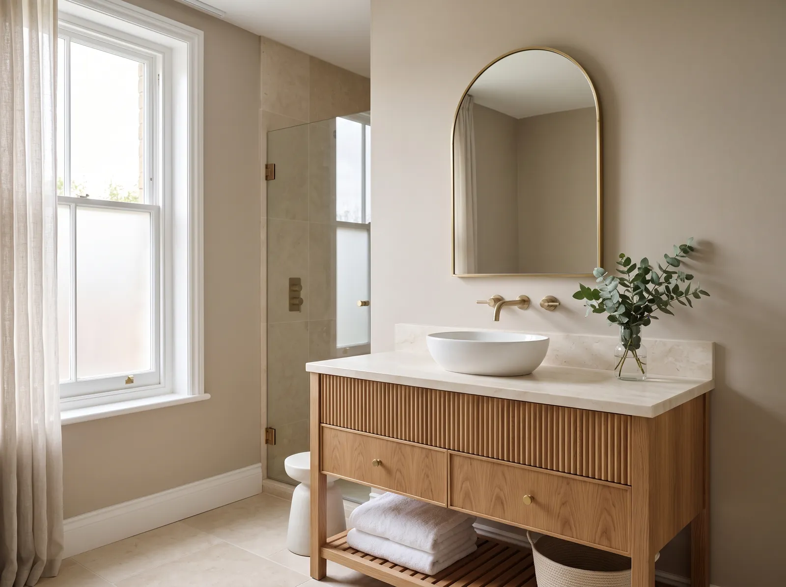
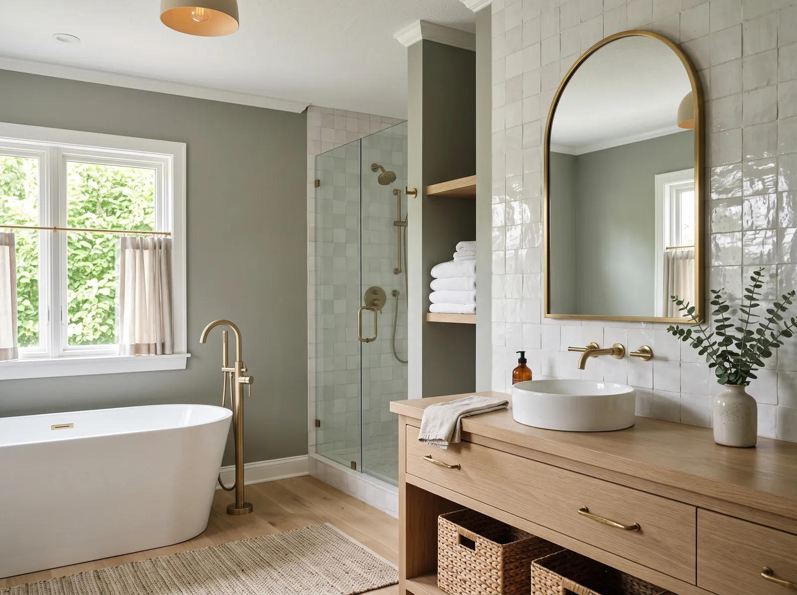
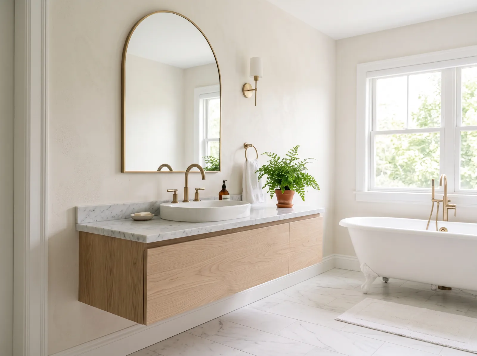
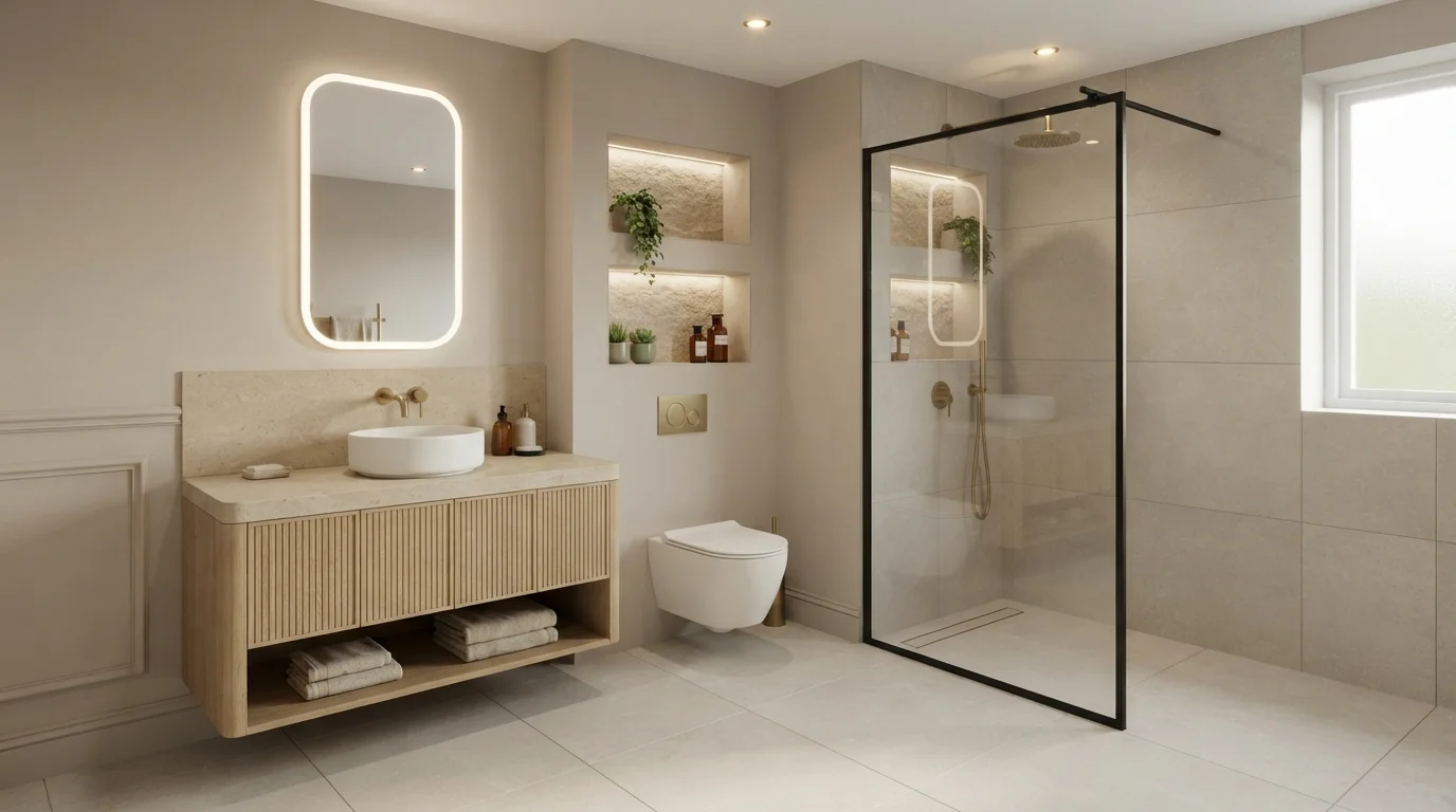
A soft greige that reads grounded in any light — the easy backdrop a spa bathroom is built on.
Beige is a classic, sandy neutral that instantly grounds a space. In this serene bathroom, that soft beige wraps the walls, pairing beautifully with a fluted oak vanity and a crisp white vessel sink. Brushed brass fixtures and an arched mirror add a touch of elegance, while light linen curtains soften the window. The entire room feels incredibly calm, clean, and spa-like. Natural wood and warm neutrals naturally belong together, creating a seamless flow that feels effortless. It is perfect for anyone wanting a peaceful morning retreat.
SEE PAVILION BEIGE ON YOUR WALLS →
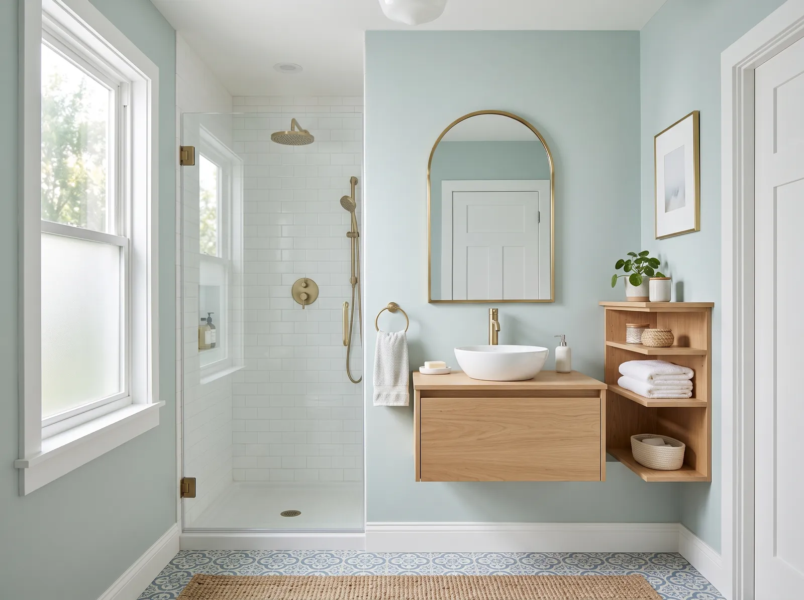
Barely-there blue-green that bounces daylight around a small room and makes the walls step back.
Pale seafoam is a breezy, watery blue-green that instantly brings a spa-like freshness to any space. Here, this soothing shade wraps the walls, beautifully framing the light oak floating vanity and matching open shelving. A natural jute rug anchors the floor, while crisp white trim and a white tiled shower keep the look clean and bright. The entire room feels incredibly calm, airy, and restorative. This combination works so well because the warm wood tones ground the cool, watery walls, preventing the space from feeling chilly. It is perfect for anyone wanting a peaceful morning sanctuary.
SEE QUIET BREEZE ON YOUR WALLS →
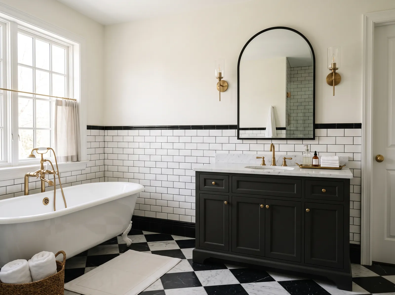
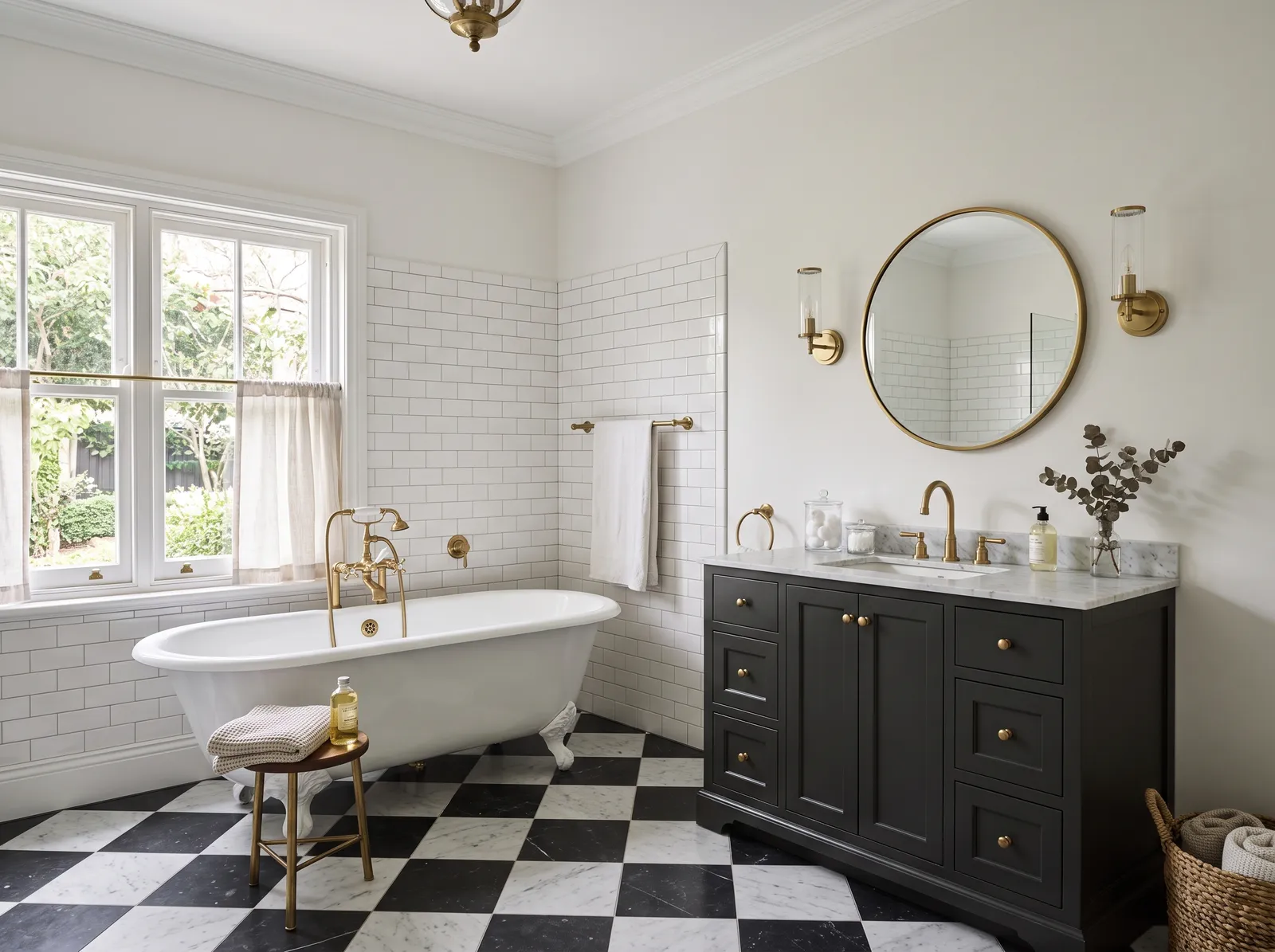
Near-black on the vanity against crisp white tile — high contrast that stays timeless, warmed by brass.
Cream is a gentle, buttery off-white that feels much friendlier than stark white. In this bathroom, it coats the upper walls, beautifully balancing the crisp white subway tile below. A deep charcoal cabinet anchors the space, while a matching cream bath mat rests on the bold checkerboard floor. Warm brass fixtures and sconces add a touch of metallic shine. The space feels incredibly classic, clean, and upscale. High-contrast black and white keeps things exciting, while the cream walls soften the sharp edges. It's perfect for anyone who loves vintage charm with a modern, polished twist.
SEE DOVE'S WING ON YOUR WALLS →
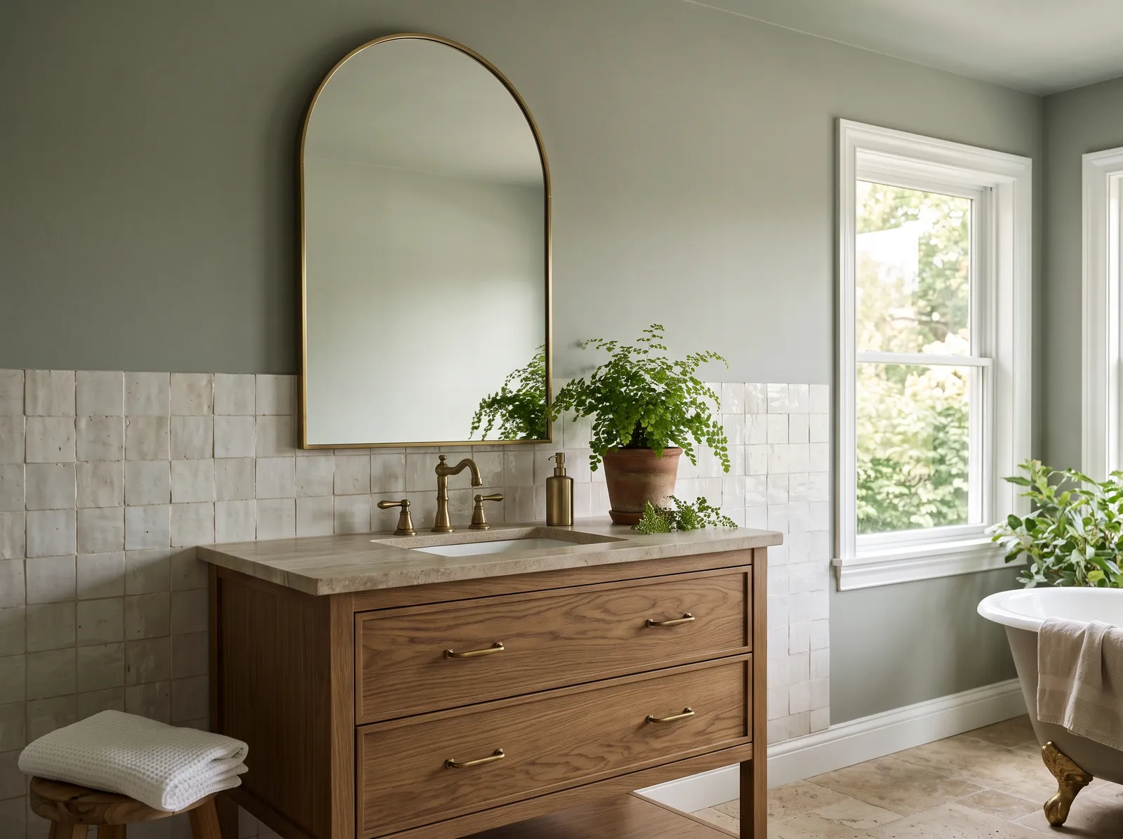
A muted grey-green that feels calm and a little earthy, especially next to oak and warm metal.
Sage green is a quiet, earthy gray-green that brings the peace of the outdoors inside. In this bathroom, you see that soothing sage on the upper walls, paired with a warm oak wood cabinet vanity and glossy off-white tiled wainscoting. A bright green potted fern sits on the stone countertop, while crisp white trim frames the window. The space feels incredibly calm, clean, and spa-like. This combination works beautifully because the organic wood grain grounds the cool green tones, keeping your room feeling natural. It is perfect for anyone wanting a serene morning retreat.
SEE RUSHING RIVER ON YOUR WALLS →
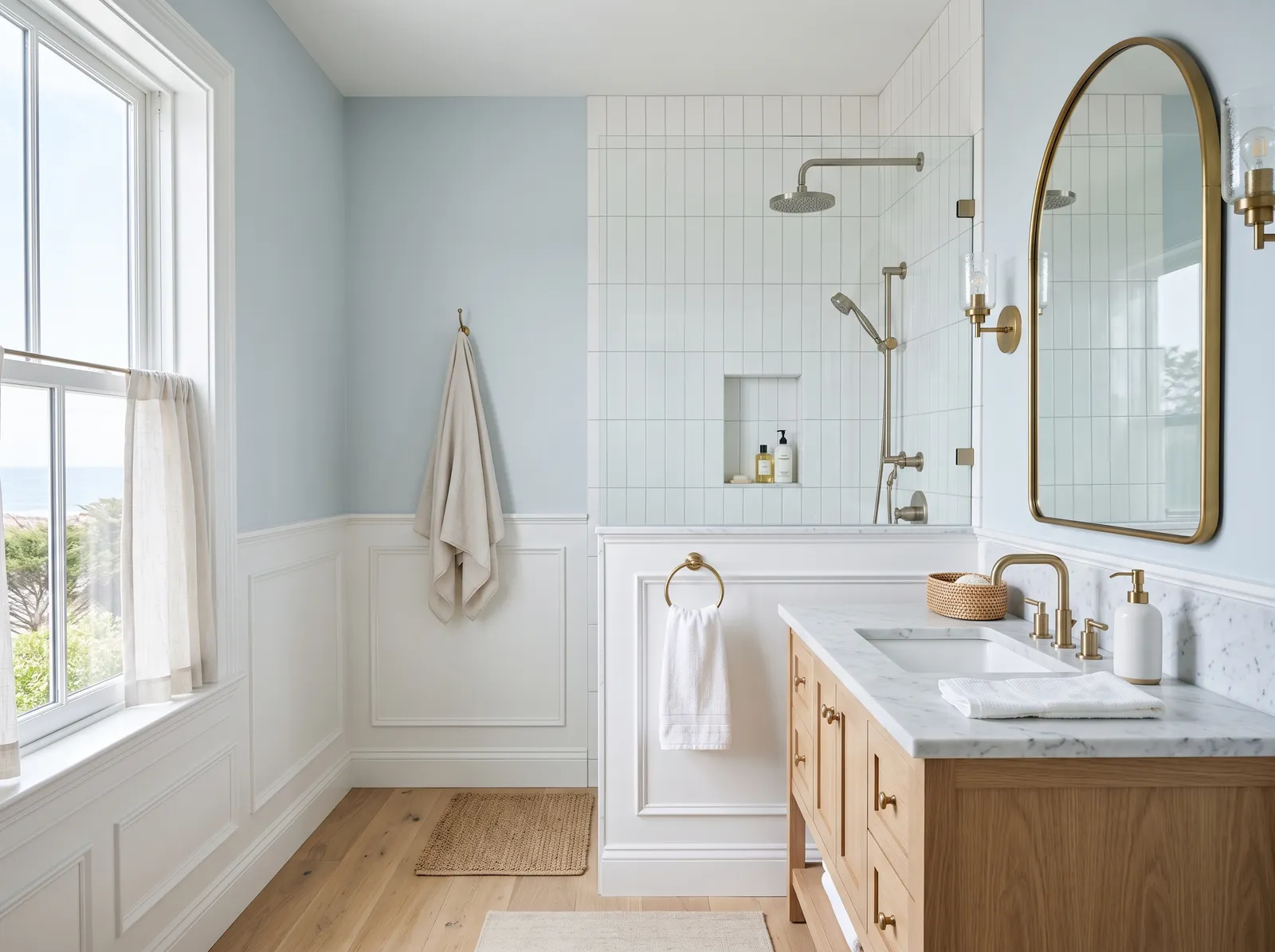
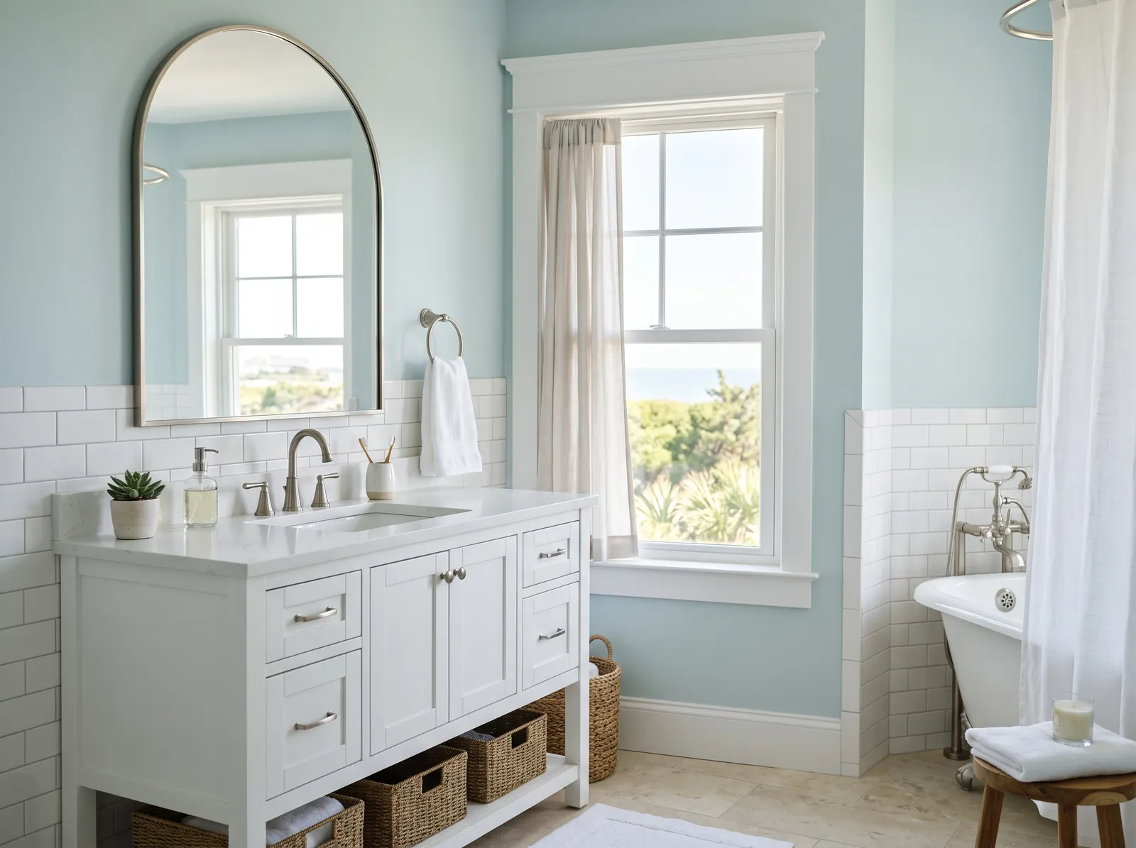
A clean, cool blue that keeps a bathroom feeling fresh and bright from morning to night.
Pale blue is a cool, breezy shade that instantly mimics the open sky. In this serene bathroom, that soft blue coats the upper walls, beautifully paired with crisp white wainscoting and matching shower tiles. A light oak vanity brings in natural wood grain, while a small woven jute rug adds texture underfoot. The entire space feels incredibly calm, airy, and spa-like. This combination works so well because the warm wood and brass accents keep the cool blue walls from feeling chilly. It is perfect for anyone wanting a peaceful morning retreat.
SEE SILVER DUSK ON YOUR WALLS →
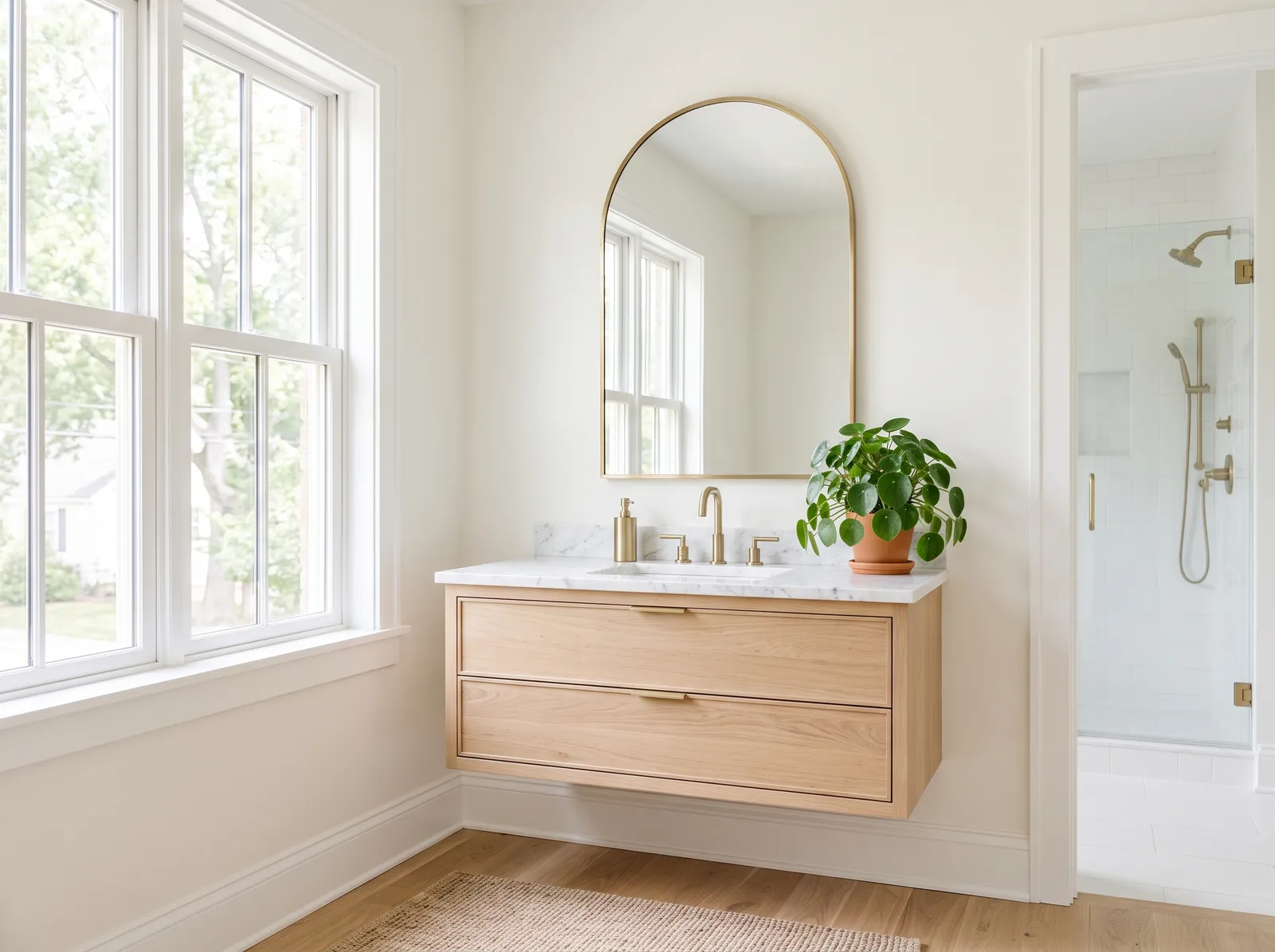
A soft white with just enough warmth to feel restful instead of clinical — the all-white bath done right.
Cream is a wonderfully soft, clean backdrop that feels much friendlier than a stark, clinical white. In this airy bathroom, that gentle cream coats the walls, letting the light oak floating cabinet take center stage. A textured beige rug grounds the floor, while a vibrant green potted plant and warm gold accents on the mirror and faucet add life. The entire space feels incredibly calm and fresh. This combination works beautifully because the natural wood and gold elements bring organic warmth to the bright backdrop. It's perfect for anyone wanting a spa-like retreat.
SEE DU JOUR ON YOUR WALLS →
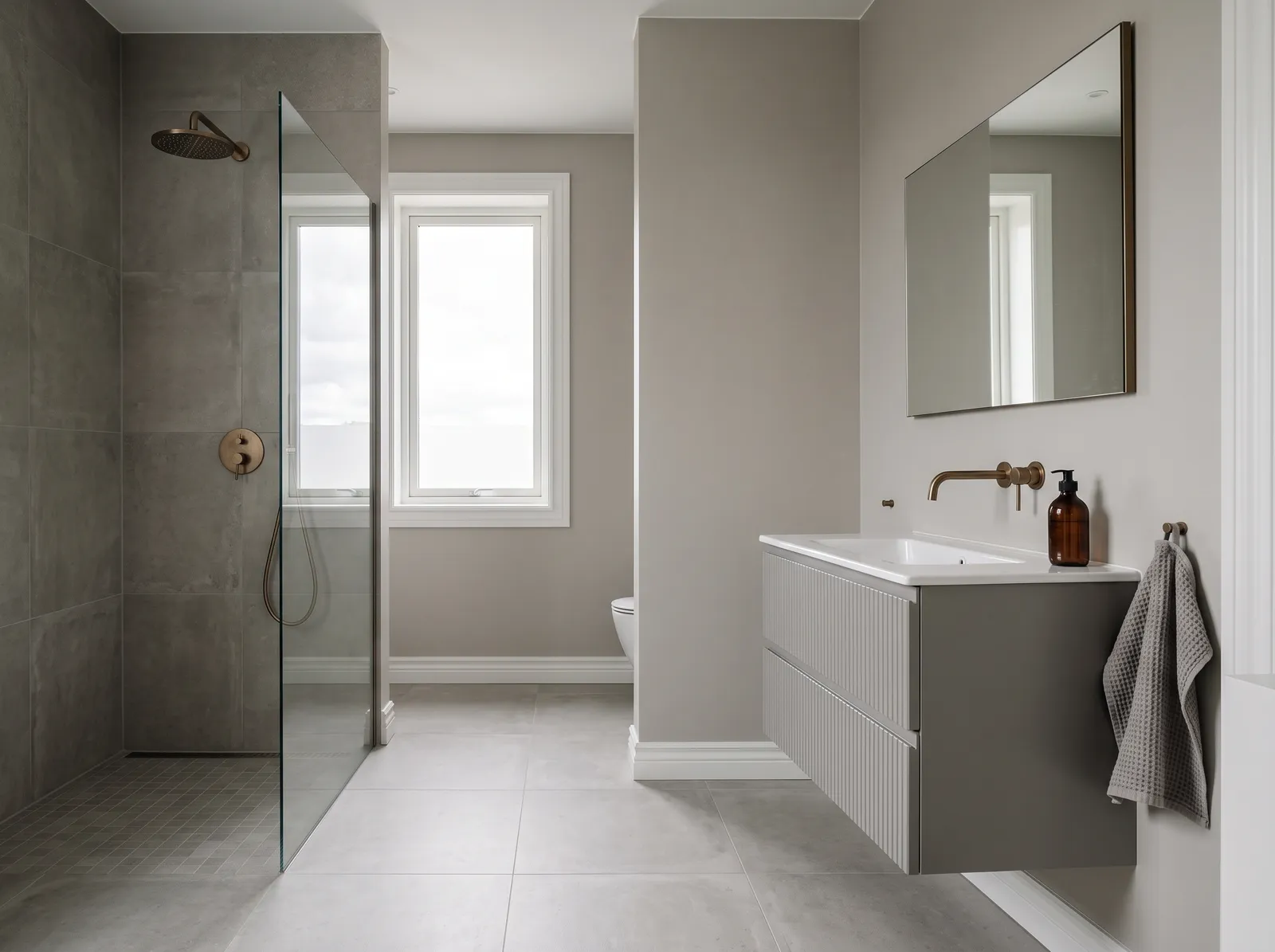
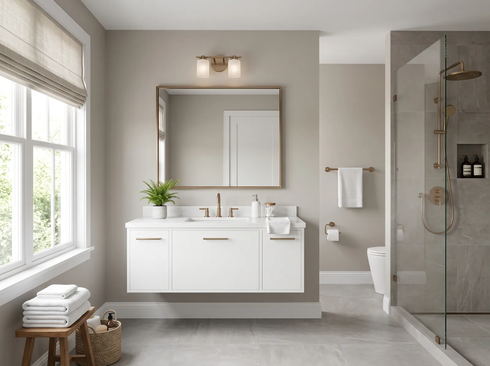
A balanced greige-gray that holds steady under cool bathroom light without turning blue.
Taupe brings a wonderfully grounded, earthy feel to any space. In this modern bathroom, this rich taupe covers the walls, while a slightly deeper gray-brown defines the fluted floating cabinet. Crisp white trim frames the window and baseboards, and warm bronze accents shine on the shower fixtures and faucet. The entire space feels incredibly calm and spa-like. This combination works beautifully because the subtle contrast between the warm walls and cool gray floor tiles keeps the monochrome look interesting. It is perfect for anyone wanting a minimalist sanctuary to unwind in at the end of the day.
SEE KALISPELL ON YOUR WALLS →
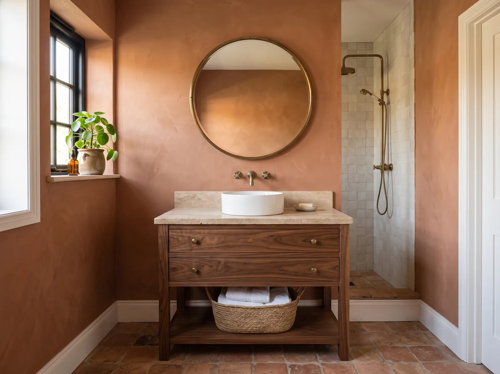
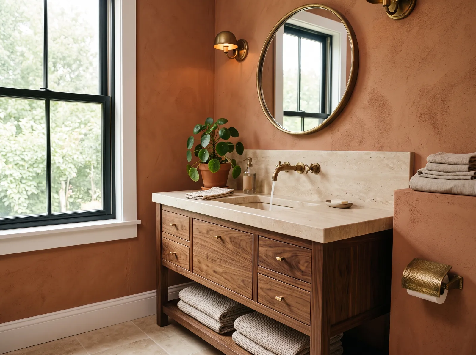
A warm clay that wraps the room in something cozy and organic — beautiful against travertine and aged brass.
Terracotta is a rich, earthy clay-orange that instantly grounds a space. In this bathroom, that textured terracotta covers the walls, paired beautifully with a dark walnut wood vanity cabinet and a white vessel sink. A round brass mirror and matching shower fixtures add metallic gleam, while crisp white trim frames the room. The space feels incredibly snug and spa-like. This combination works because the natural wood and clay textures complement each other perfectly, creating an organic connection. It is perfect for anyone wanting a cozy, Mediterranean-inspired sanctuary.
SEE WORK WORN WOOD ON YOUR WALLS →
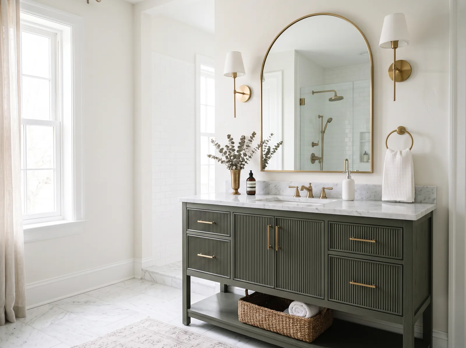
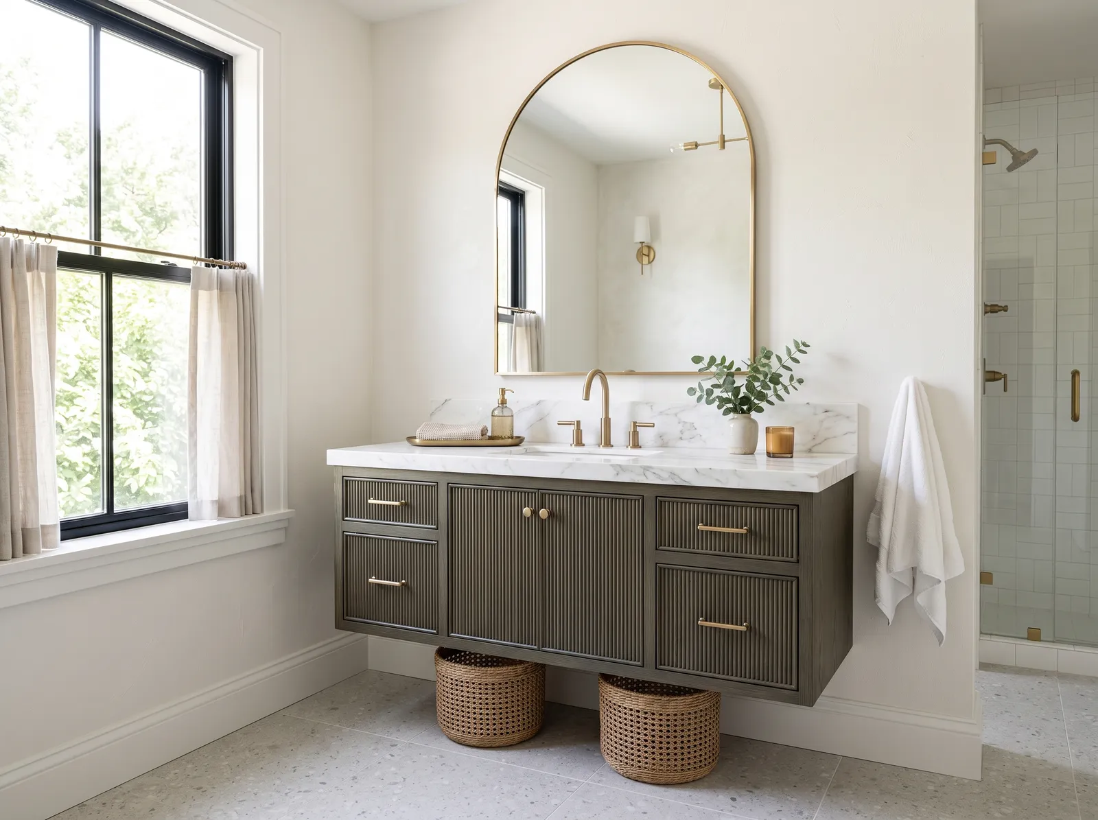
Keep the walls white and let a deep, dusky green vanity be the whole statement.
Soft alabaster white is a clean, gentle backdrop that feels instantly welcoming. In this serene bathroom, that airy white covers the walls, letting the deep olive green fluted cabinet take center stage. A muted cream rug rests on the marble floor, while oatmeal linen curtains frame the window, and brushed brass accents gleam on the mirror. The space feels incredibly calm, fresh, and sophisticated. This combination works beautifully because the rich green vanity grounds the bright room without making it feel dark. It is perfect for anyone wanting a spa-like retreat.
SEE SANTA'S BEARD ON YOUR WALLS →
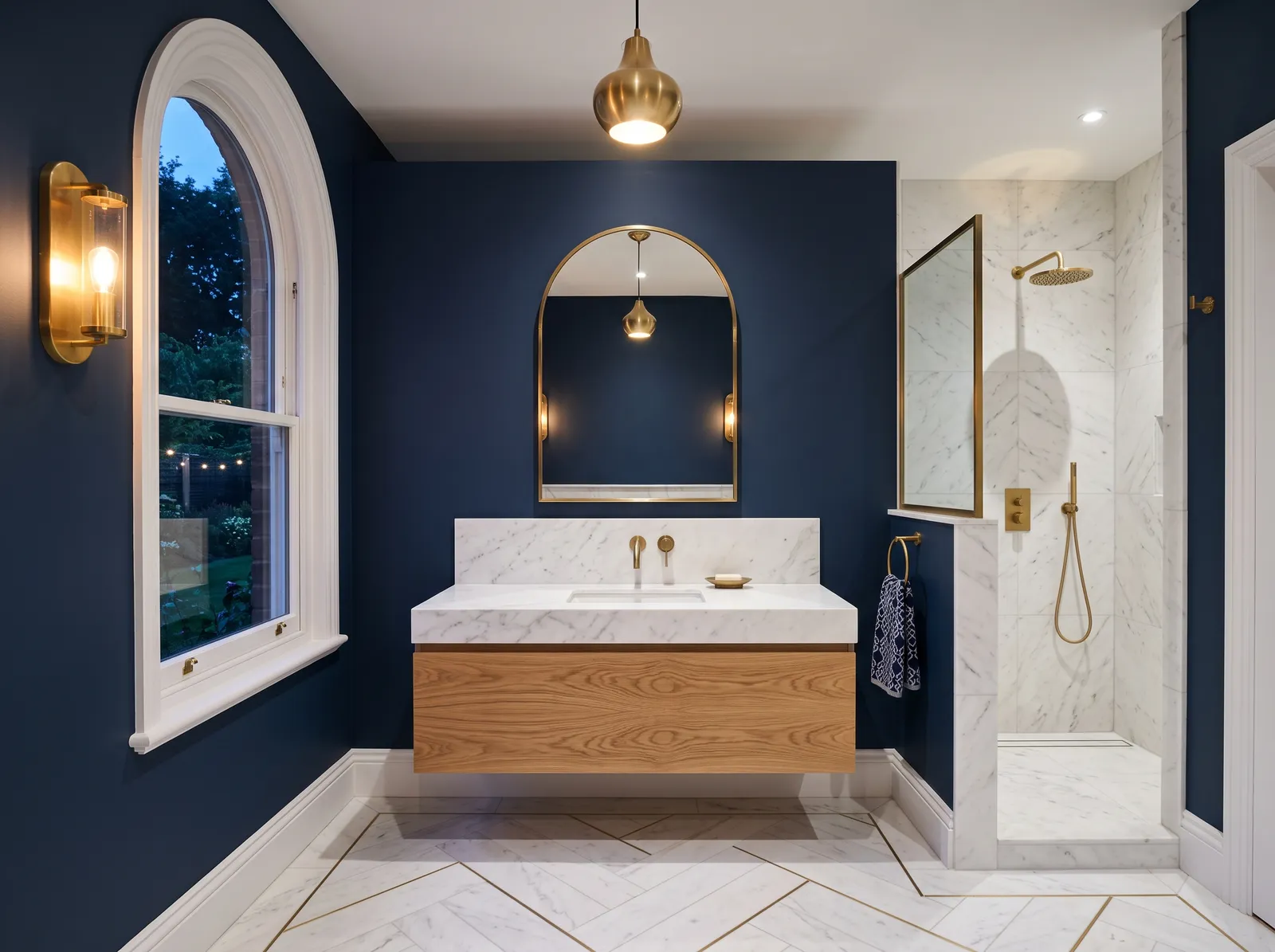
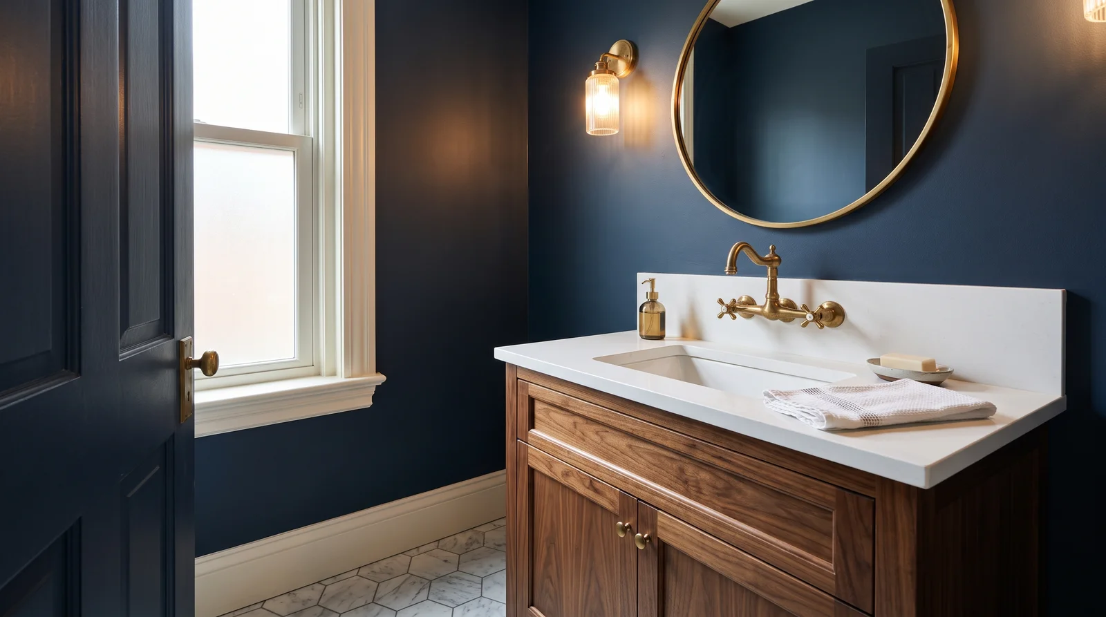
Deep navy turns a bathroom dramatic and cocoon-like — let brass fixtures do the sparkling.
Deep navy is a bold, sophisticated blue that instantly commands attention. In this stunning bathroom, that moody navy wraps the walls, contrasting beautifully with a floating light oak cabinet, crisp white trim, and elegant marble floors. The space feels incredibly luxurious, dramatic, and serene all at once. This combination works so well because the warm wood tones and gleaming gold accents break up the cool blue, adding instant warmth and balance. It is the perfect choice for anyone wanting a high-end, spa-like retreat with serious personality.
SEE IT ON YOUR WALLS →
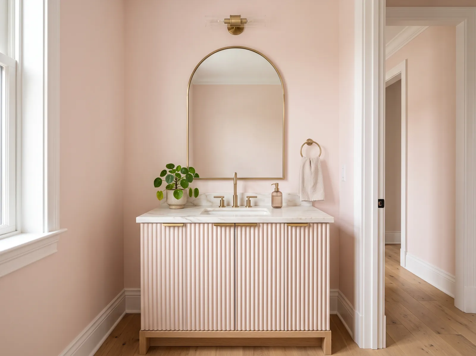
A warm blush that flatters everyone in the mirror — soft, a little unexpected, never sweet.
Blush pink is a sweet, delicate pastel that feels like a gentle hug. In this powder room, that soft pink wraps the walls and coats the ribbed vanity cabinet. Crisp white trim frames the doorway, while a gleaming gold arch mirror and matching brass fixtures add elegance. A small green plant sits on the marble countertop to bring in a splash of life. The entire space feels incredibly calm and serene. This combination works because the metallic gold accents elevate the soft pink from sweet to sophisticated. It is perfect for anyone wanting a spa-like retreat.
SEE SHELLED ON YOUR WALLS →
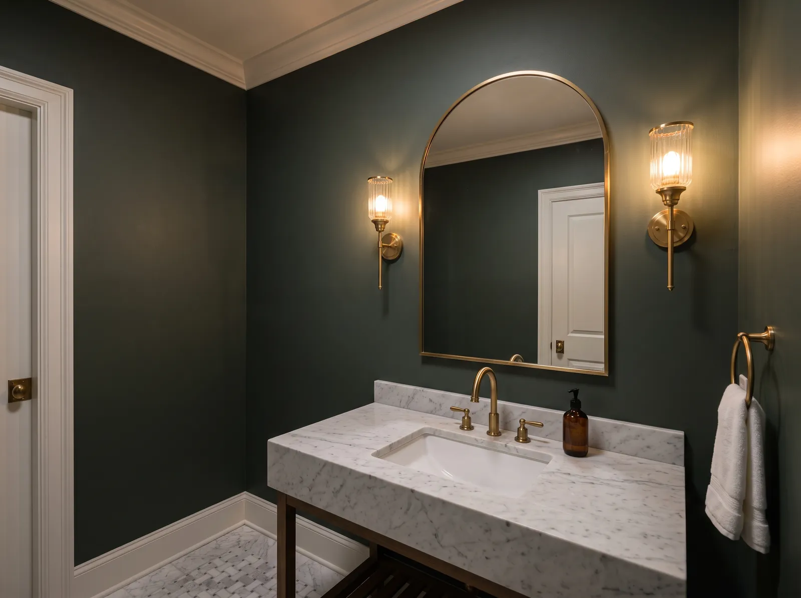
A deep, smoky green that makes a small powder room feel rich and enveloping.
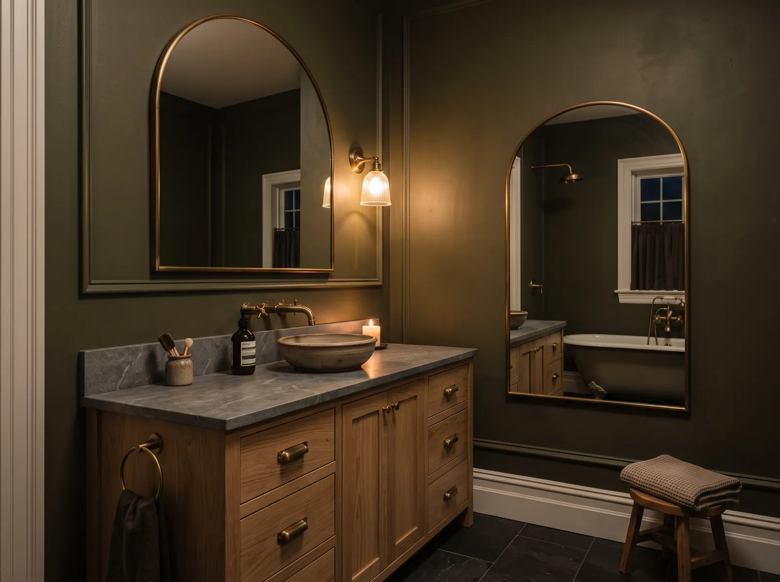
Forest green is a deep, dramatic shade that instantly brings the quiet mystery of nature indoors. In this elegant bathroom, that rich, dark green wraps the walls, contrasting beautifully with the white marble vanity table and crisp white door trim. The space feels incredibly snug, intimate, and high-end, like a secret boutique hotel retreat. This combination works so well because the gleaming brass accents and warm sconce lights pop brilliantly against the dark backdrop. It is perfect for anyone wanting to turn a small powder room into a bold, luxurious statement.
SEE ESSEX GREEN ON YOUR WALLS →
A rich, earthy olive that turns a bathroom into a snug little hideaway.
SEE ARTICHOKE ON YOUR WALLS →
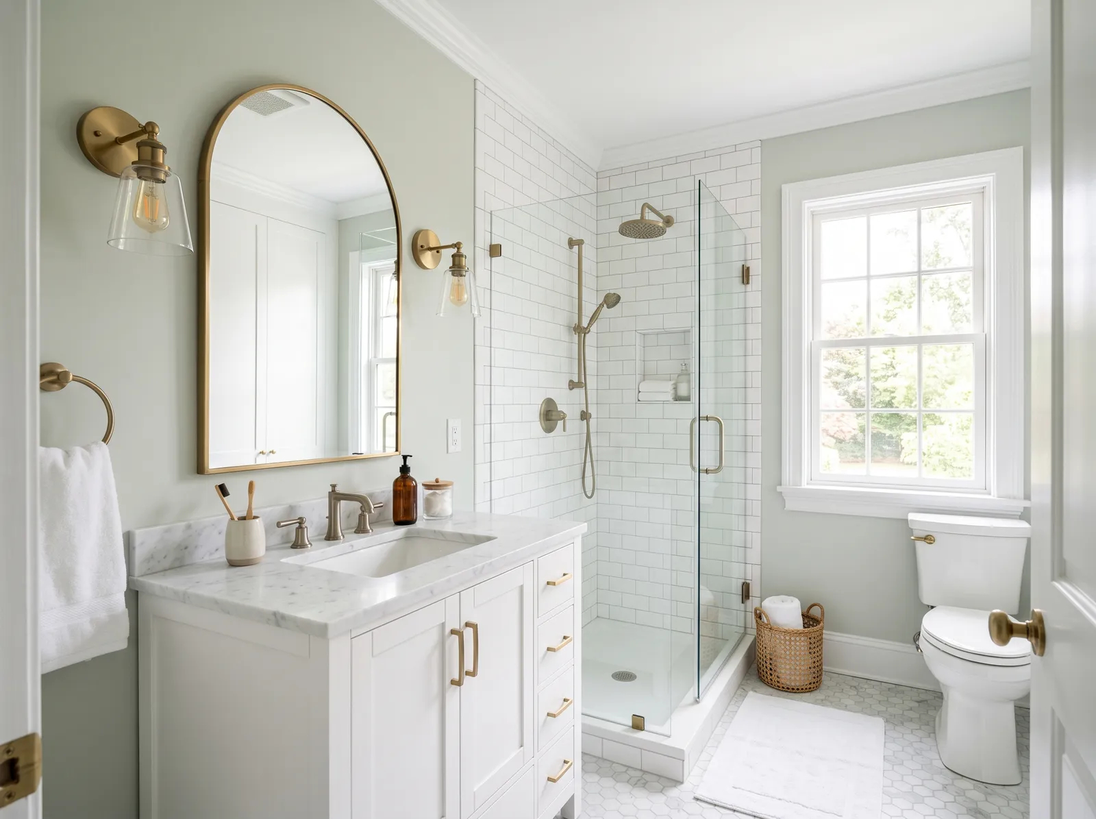
A pale green-gray that keeps a bathroom light, fresh, and open.
SEE SEA SALT ON YOUR WALLS →
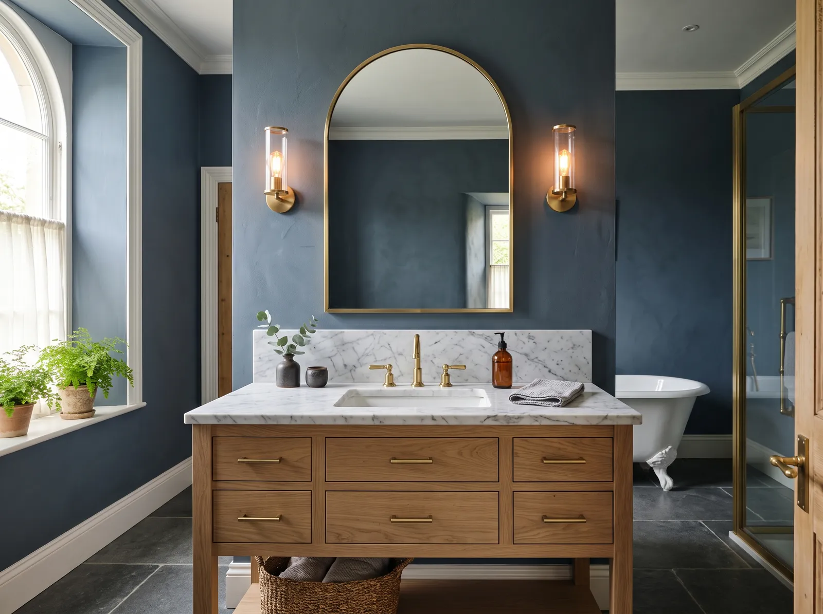
The steady, smoky depth of a sky just before evening.
SEE IT ON YOUR WALLS →
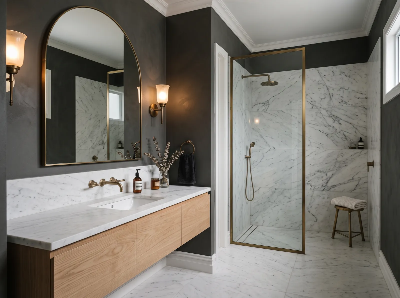
Moody and rich — a rainy afternoon you actually want to linger in.
SEE CHELSEA GRAY ON YOUR WALLS →
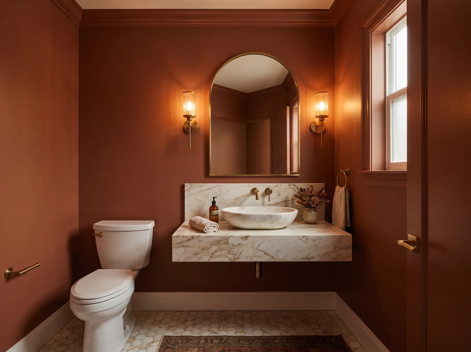
A spiced red-brown that makes a small powder room feel like a jewel box.
SEE CINNAMON ON YOUR WALLS →
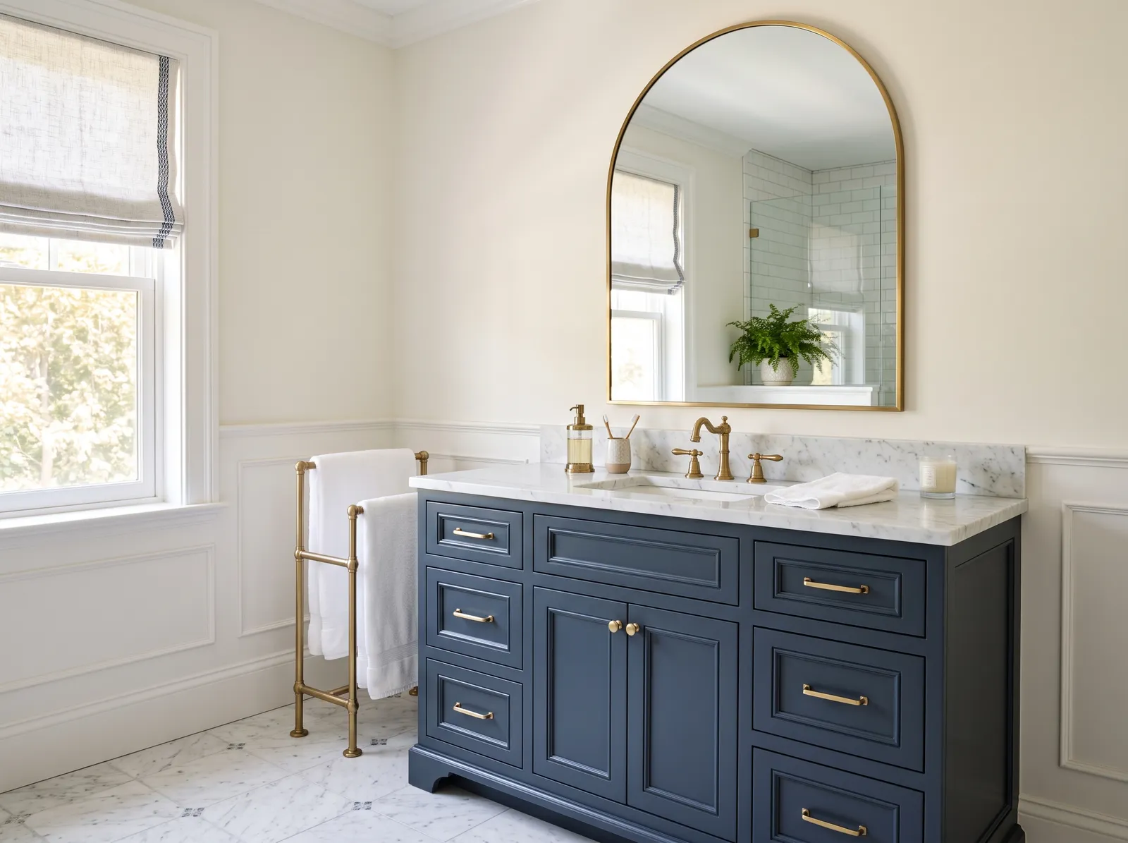
A deep, dressy navy vanity that reads crisp against soft white walls.
SEE WHITE DOVE ON YOUR WALLS →Bathroom Wall Color Combinations
A wall color never works alone. These are the full schemes from the rooms above — the lead color first, then the supporting colors that make the photo work.
A soft greige that reads grounded in any light — the easy backdrop a spa bathroom is built on.
TRY THIS PALETTE →Barely-there blue-green that bounces daylight around a small room and makes the walls step back.
TRY THIS PALETTE →Near-black on the vanity against crisp white tile — high contrast that stays timeless, warmed by brass.
TRY THIS PALETTE →A muted grey-green that feels calm and a little earthy, especially next to oak and warm metal.
TRY THIS PALETTE →A clean white trim and ceiling, like Alabaster, frames almost any wall color and keeps the room crisp. Cool wall colors such as Ice Blue, Aqua, or Aegean Teal sit naturally next to chrome and polished nickel fixtures, while greens like Eucalyptus and Seafoam look warm and grounded against brass, wood vanities, and warm-toned tile.
Look down at your floor before you finalize the wall. Gray or marble-look tile loves cool blues and grays, while warm wood or terracotta floors are happiest with green. If your vanity is staying, pick a wall color that flatters it rather than fighting it, since cabinetry is the hardest thing to change later.
Bathroom Color Ideas by Color
Set on a color family already? Each page has its own real rooms and picks.


Light or Dark Bathroom Colors?
Go Light (LRV 60+) If…
The room is small, faces north, or has to work at every hour. Light warm colors make it feel bigger and stay calm in evening light — the light you actually live in.
Go Dark (LRV Under 20) If…
You want the cocoon effect and the room has real daylight. Dark works best on one feature wall — or fully color-drenched in a large room with good windows.
Bathroom light is tricky because many bathrooms have one small window, or none at all, and the rest is artificial. North-facing windows throw cool, bluish light that can make cool colors look gray or chilly, so a green like Eucalyptus often warms up the room better than a stark blue. South- and west-facing windows give warm light that lets cool blues and teals like Aqua or Aegean Teal shine without going flat.
Night changes everything. Test your color under your actual vanity bulbs after dark, since warm bulbs push greens yellow and cool LED bulbs can make a soft blue look icy. Tape a large sample to the wall and look at it in the morning, midday, and at night before you commit.
LRV, or light reflectance value, tells you how much light a color bounces back on a scale from 0 (black) to 100 (pure white). In a small or windowless bathroom, a higher LRV keeps the space feeling open and bright, so light picks like Alabaster, Ice Blue, or Seafoam help the room breathe.
Lower LRV colors absorb light and pull the walls in, which is exactly what you want in a powder room you want to feel rich and intimate. A deep tone like Aegean Teal has a lower LRV, so it works best where you're leaning into cozy drama rather than fighting for brightness. Match the LRV to the feeling you want, not just the room's size.
Your Kind of Bathroom
Every variant has its own full guide with picks tuned to that room.
See It. Love It.
Paint It.
Upload one photo of your bathroom and try every color on this page on your own walls — in your own light, before you buy a drop of paint.

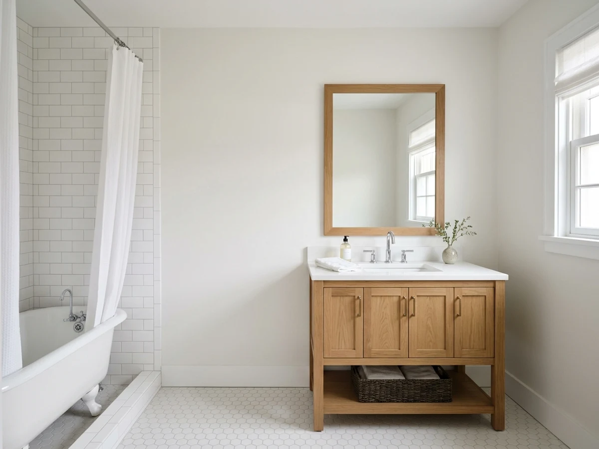
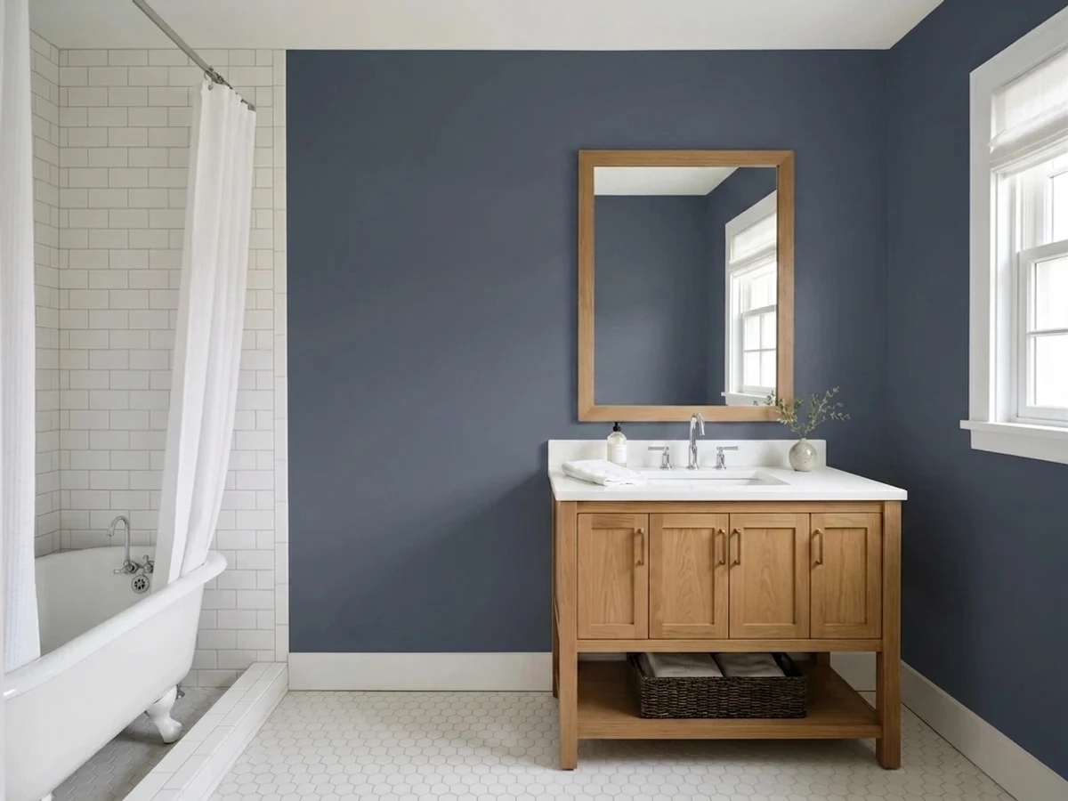
Hale NavyBeforeChoosing the Right Finish for Moisture
Bathrooms need a finish that shrugs off steam and wipes clean, so skip flat. A satin or eggshell finish is the everyday sweet spot: it resists moisture, cleans easily, and hides minor wall flaws without throwing harsh glare. For a bathroom that sees heavy steam from long showers, a satin or even semi-gloss holds up best.
Use semi-gloss on trim, doors, and any cabinetry for extra washability and a crisp edge. The ceiling is the one place to consider a moisture-resistant flat or matte, since glare overhead is unflattering, but in a small shower-heavy bathroom a scrubbable satin ceiling is the smarter, mildew-resistant pick.
Common Bathroom Paint Mistakes to Avoid
The biggest mistake is using flat paint that can't handle steam and starts to mildew or streak when you wipe it. The second is judging color from a tiny chip held up under bad lighting; small rooms intensify color, so a sample that looks soft on the card can read loud on all four walls.
People also forget to account for the room's mix of natural and bulb light, then wonder why a calm blue looks cold or a fresh green looks sickly at night. Finally, don't ignore prep: bathrooms need a clean, dry, well-primed surface and good ventilation, or even the best paint won't last.
Wall area, gallons, and a real price range for the bathroom — walls, trim, and ceiling.
About Bathroom Paint Colors
A bathroom is a small room that asks a lot of its paint. It deals with steam, splashes, and frequent wiping, and it often runs on a mix of one small window and bright overhead light. The good news is that small rooms are forgiving places to be a little braver with color, and the right shade can make a tight bathroom feel calm, fresh, and clean.
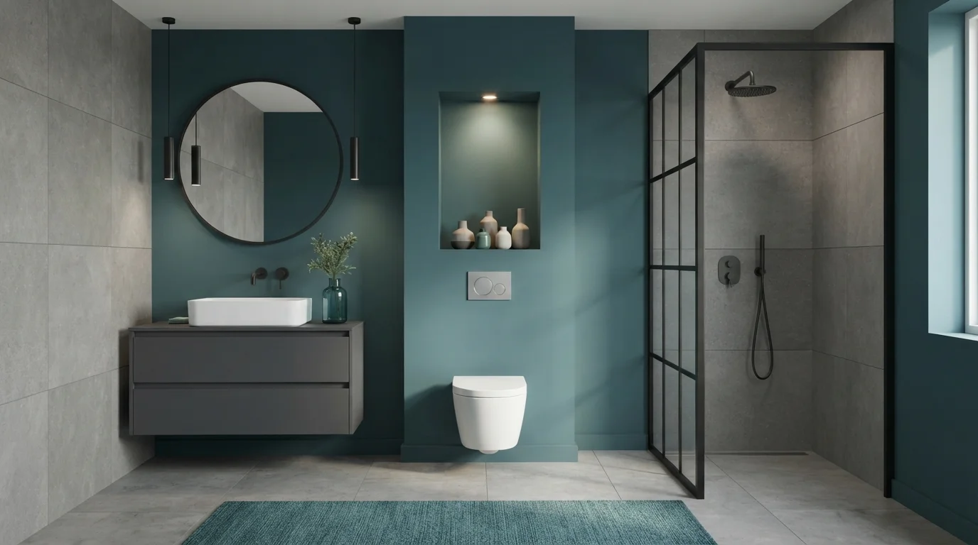
The colors that work best here lean cool and watery: soft blues, teals, greens, crisp whites, and quiet grays. Each one does something different. A pale blue like Ice Blue feels airy and spa-like, a deeper Aegean Teal adds drama on a single wall, and a clean white like Alabaster keeps a small room open and bright.
One thing to keep in mind: every color on this page is mixed to order at the paint counter, so you are not locked into one brand. If you love a shade but want it in a different brand's paint line, it can be cross-matched. That gives you freedom to pick the color you love first and sort out the brand second.
The Questions Everyone Asks
What color should I paint my bathroom?
If you want one answer, start with the safe picks above — Alabaster, Sea Salt, Palladian Blue, Aegean Teal. They read well in any light and survive furniture changes. Then check the light: strong afternoon sun wants a step cooler, a north-facing room wants a step warmer.
What are the best paint colors for a bathroom?
Cool, water-inspired colors work best: soft blues like Ice Blue and Aqua, fresh greens like Eucalyptus and Seafoam, deeper teals like Aegean Teal, and clean whites or grays like Alabaster. Blues and greens feel spa-like and calm, while whites keep a small bathroom bright and open.
What paint finish should I use in a bathroom?
Use satin or eggshell on the walls because it resists moisture and wipes clean without harsh glare. Choose semi-gloss for trim, doors, and cabinetry, and a scrubbable, mildew-resistant satin or matte on the ceiling, especially in a bathroom that gets a lot of steam.
How does bathroom lighting affect my color choice?
North-facing or windowless bathrooms get cool light that can make blues look gray, so a warmer green often reads better. South- and west-facing windows give warm light that lets blues and teals look their best. Always test the color under your actual vanity bulbs at night, since warm and cool bulbs shift the color a lot.
What color makes a small bathroom look bigger?
Light colors with a high LRV bounce the most light and make a small bathroom feel open, so clean whites like Alabaster and pale blues or greens like Ice Blue and Seafoam are good picks. Keeping the trim and ceiling a light color too helps the walls feel like they recede.
Can a dark color work in a small bathroom?
Yes. A small bathroom is a great place to go bold with a deep shade like Aegean Teal, which has a lower LRV and wraps the room in a cozy, jewel-box feel. It works best in a powder room where you want drama rather than maximum brightness.
What color trim and fixtures go with bathroom paint colors?
Clean white trim like Alabaster frames almost any wall color. Cool blues and teals like Ice Blue and Aqua pair naturally with chrome and nickel, while greens like Eucalyptus look warm and grounded next to brass, wood, and warm tile.
Are these bathroom colors available in different paint brands?
Yes. Every color shown here is mixed to order at the paint counter, so you can cross-match a shade you love into another brand's paint line. Pick the color first, then choose the brand and paint formula that fits your budget and finish needs.
What two-color combination works best in a bathroom?
The reliable pattern is a quiet main color plus one deep accent on a single wall. Keep trim and ceiling in one warm white so the two colors are the only event in the room — the combination cards above show complete schemes from real rooms.
What colors make a bathroom look bigger?
High-LRV, slightly warm colors — LRV 60–75 is the sweet spot. Paint the walls and trim close to the same light color so the corners blur, and keep the ceiling white. Stark cool white actually works against you; it creates hard shadows that show the room's edges.

Ask a Question