Artichoke
The muted olive-green built for cabinets and doors, reviewed honestly: where it earns its keep, where it goes almost black, and how it differs from its own near-twins in the Sherwin-Williams deck.

Jessica has spec'd whites and neutrals for more than 300 rooms and keeps a sample wall of painted drawdowns in her studio. Every color review is checked against real reader rooms in the comments and re-tested when a formula changes. About the testing process →
- 1Essex Green6
- 2Vintage Vogue12
- 3Artichoke21
- 4Evergreen Fog30
- 5Clary Sage41
The Fast Verdict
Artichoke is not a famous color and never tries to be — it is a quiet, grayed-down olive-green built at cabinet and door scale, not wall scale. Warm, muted, a little dusty, it reads as a genuine green in real daylight and sinks toward near-black the moment the light leaves the room. It does its job well in small doses; it has almost no story beyond that, and two other Sherwin-Williams greens sit close enough in the deck to make you double-check the chip in your hand.
Kitchen cabinets and islands · bathroom vanities · exterior front doors and shutters · furniture, built-ins, and other small-scale pieces that want a warm neutral green
You want a bright, saturated green · you're painting four walls of a windowless room · your trim or counters lean cool gray-blue · you already own a sample of Dried Thyme or Retreat and need this one to look clearly different
- Genuine warm olive-green, not a trendy neon and not a boring taupe wearing a green name
- Reads as an actual, identifiable green in real daylight without going costume-bright
- Built for the scale people actually use it at — cabinets, vanities, doors, furniture
- LRV 21 gives it enough depth to look intentional, not washed-out or wishy-washy
- Coordinates easily with warm white trim and brass or black hardware
- Goes very dark, almost black-green, in any room without real daylight
- Not built for whole-room walls — reads flat and heavy at that scale
- Nearly identical to two other Sherwin-Williams greens (Dried Thyme, Retreat) at the same LRV
- Cool-toned neighbors — blue-gray tile, cool white trim — push it toward muddy
What Color Is Artichoke, Really?
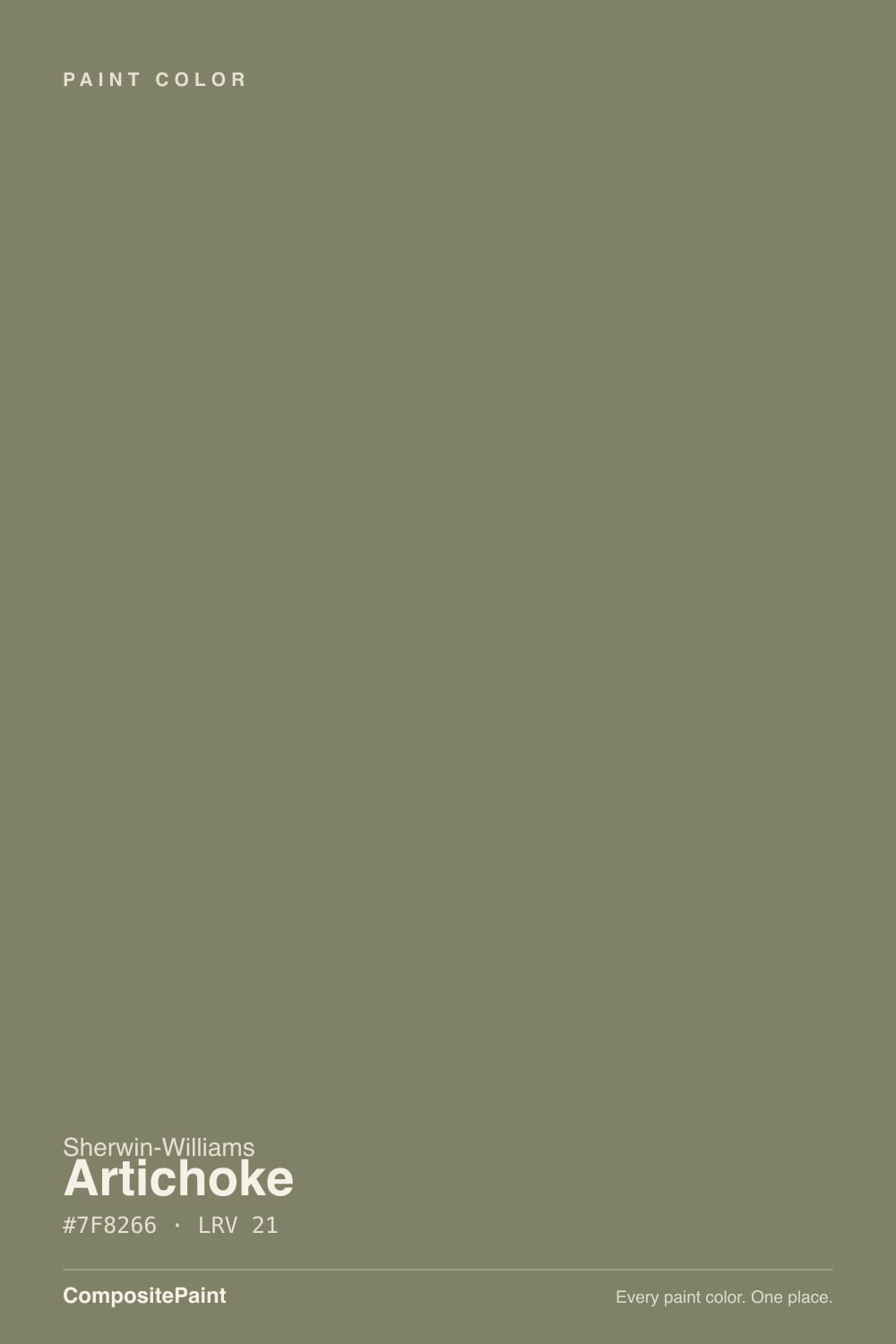
A muted, grayed-out olive-green with a warm yellow undertone — Sherwin-Williams files it under Green, and that is the honest read: not sage, not moss, not hunter, just a soft olive that leans warm rather than cool. There is no low-chroma trick here, just a genuinely toned-down green that never tries to be loud. It shows up most often on kitchen cabinets, bathroom vanities, furniture, and exterior doors — the scale it was actually built for, according to the designers who use it, not the scale of a full room.
At LRV 21 it sits in the medium-dark range, and that number does most of the work in how this color behaves. In a room with real daylight and light-colored walls nearby, it reads as a clear, identifiable olive-green. In a windowless room — a powder bath with no exterior wall, an interior hallway closet — the same paint reads almost black-green, losing its color identity entirely. One design blogger who painted it in both a sunlit bedroom cabinet and a windowless bathroom described the exact same can looking noticeably darker with no window to feed it. That is not a defect; it is what any color at LRV 21 does without light, and it is the single fact to plan around before you buy the can.
Undertone in one line: warm, grayed yellow-olive — never blue, never a clean minty green. If your sample reads nearly black or loses all its green, that is shadow talking, not the paint. Compared to its two closest siblings in the deck, Artichoke carries the least blue of the three, which is what makes it the warmest, most olive-leaning of the group.
Where It Shines
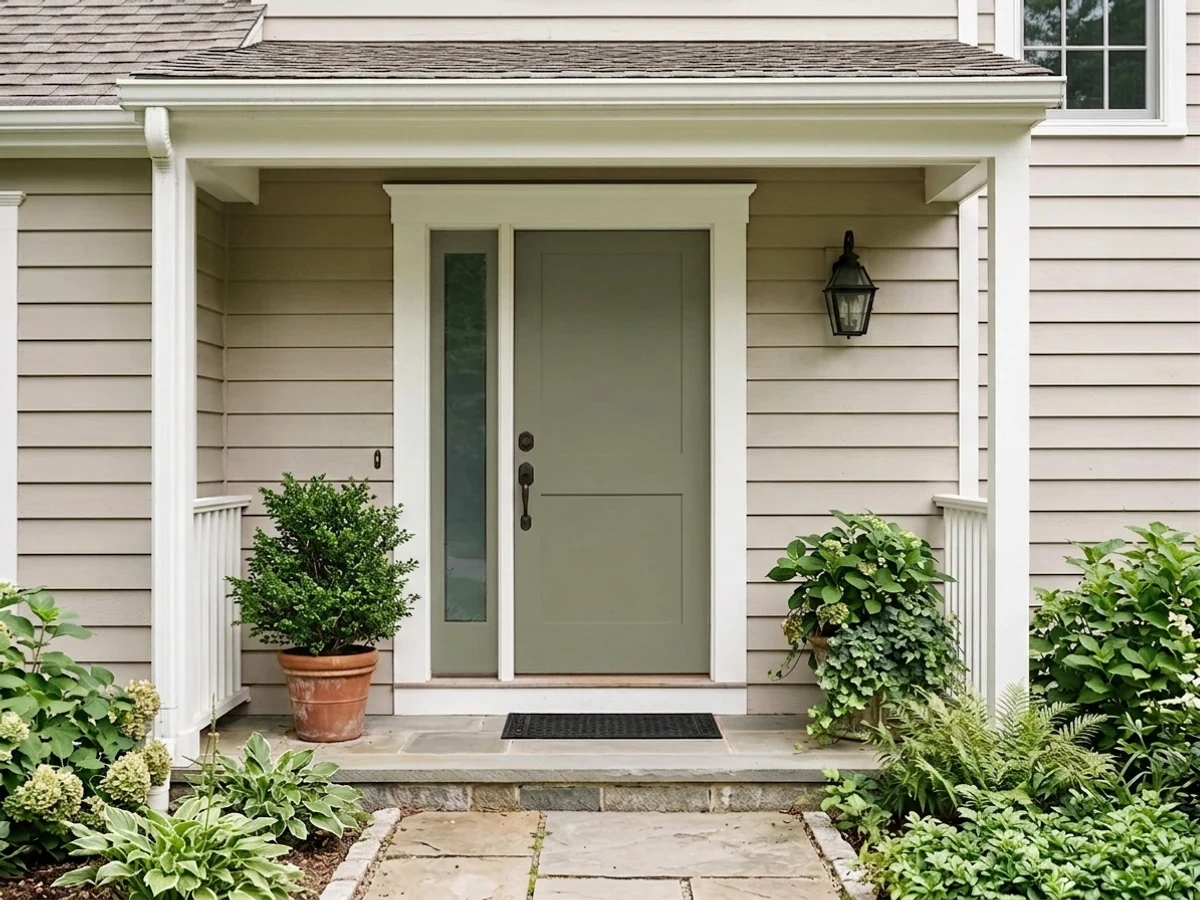
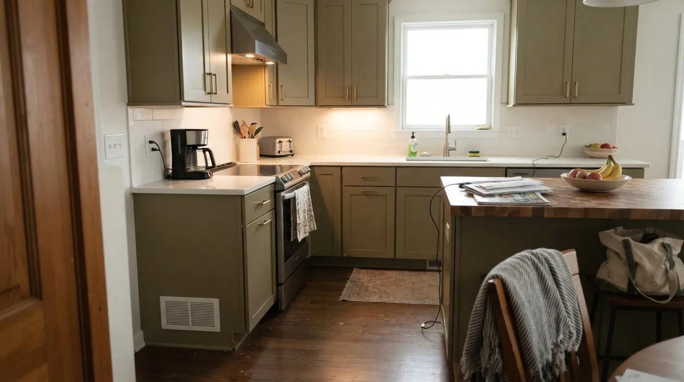
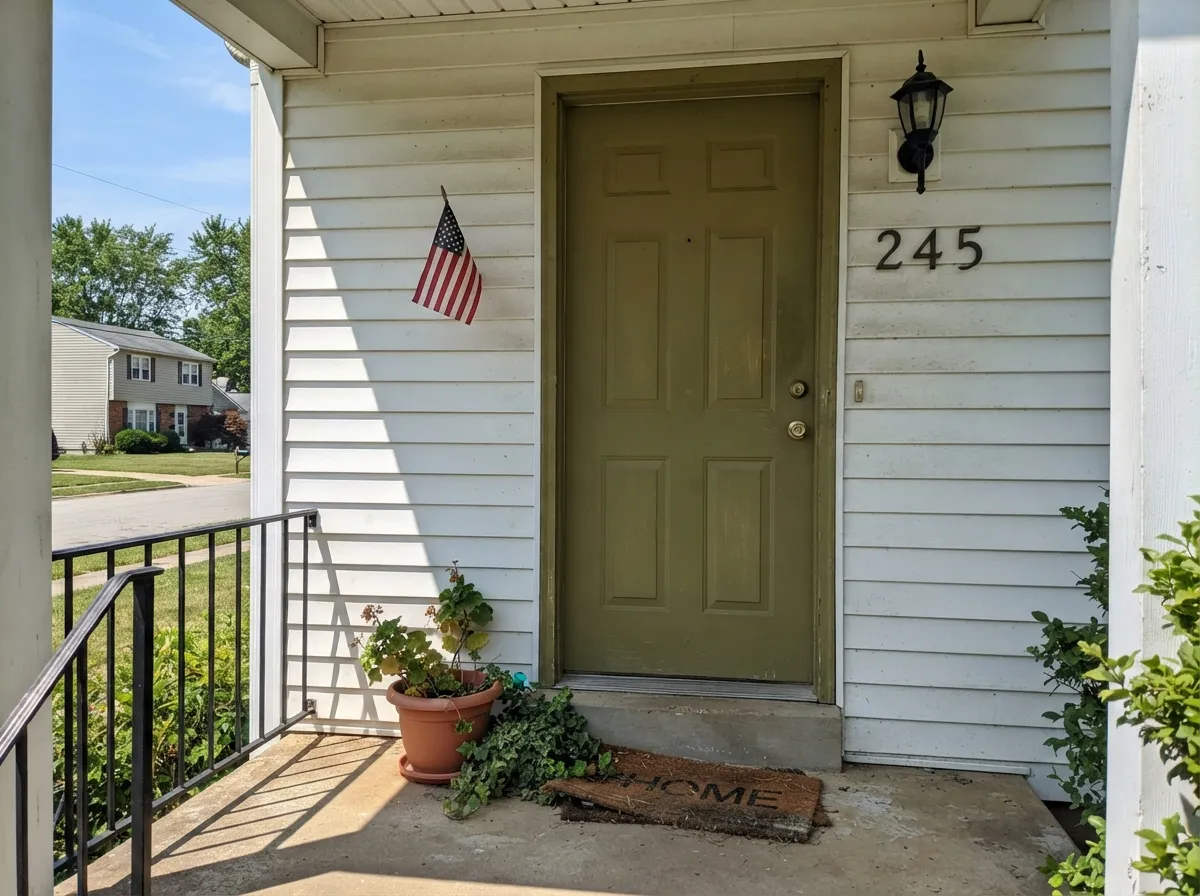
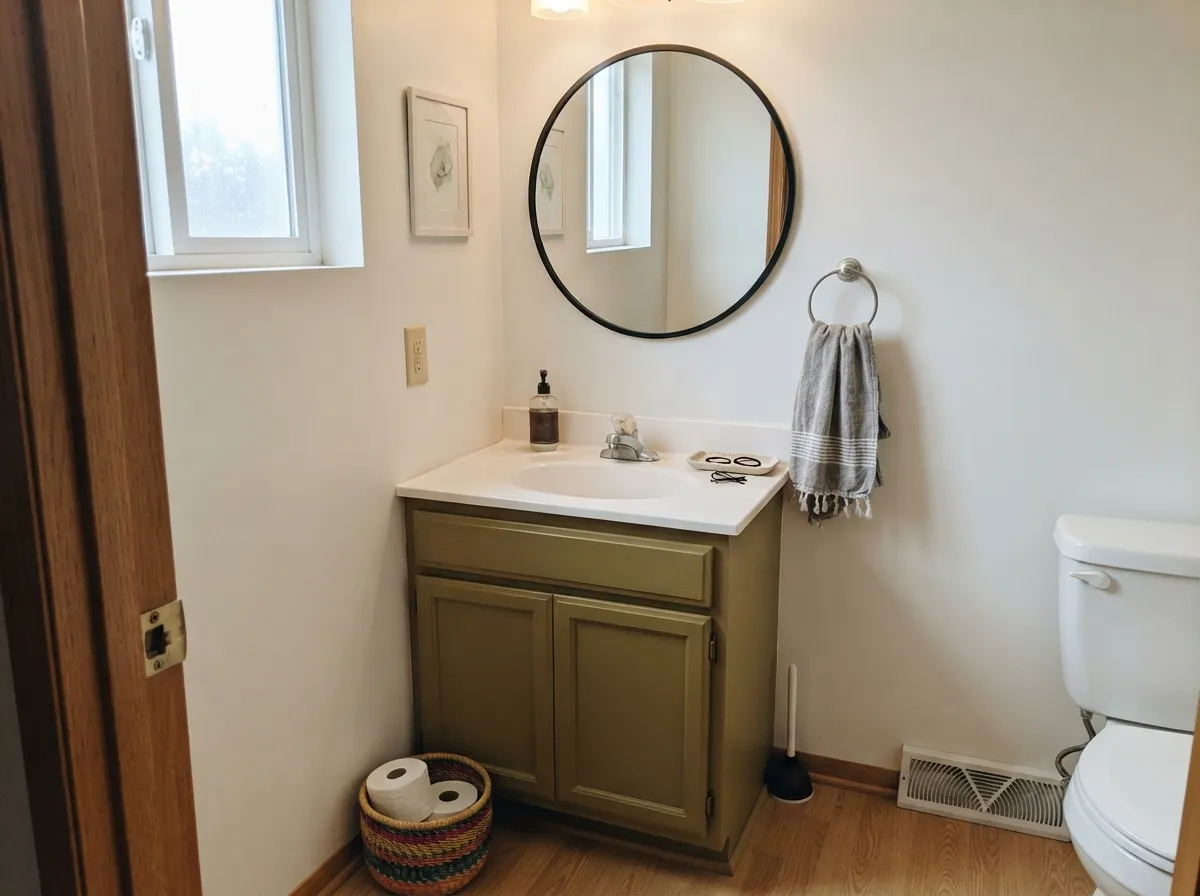
This is an accent-scale color, and at accent scale it is genuinely good. On kitchen cabinets and islands, with white counters or a light backsplash nearby to keep the room bright, it reads as a deliberate, sophisticated green that doesn't scream for attention. On an exterior front door against white or cream siding, it reads as a confident, grounded choice — warm enough to avoid the cold, flat look some dark greens get outdoors. Bathroom vanities and furniture pieces are its other natural home: small enough surfaces that the color commits without the room needing to argue back.
Where It Fails
Almost every disappointment with Artichoke comes from asking it to do a job it was never built for, and all three are predictable before the first coat goes on.
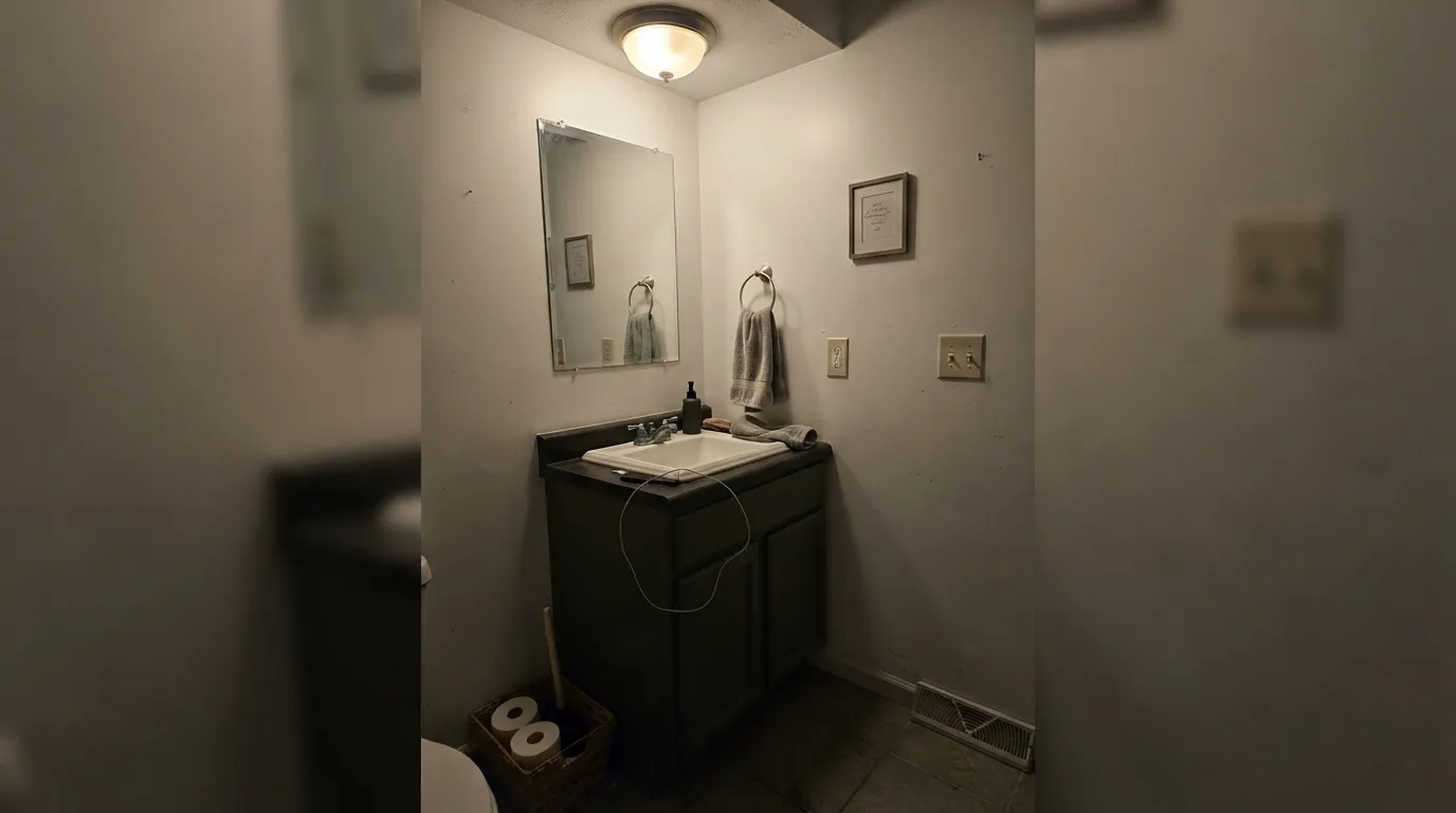
Without daylight to feed it, LRV 21 sinks toward near-black and the green identity disappears — the exact thing one designer found painting it into her own windowless bathroom versus a sunlit bedroom cabinet. If the room has no exterior window, sample it in that room specifically before committing, and add real fixture lighting either way.
This is a muted, low-chroma olive, not a saturated statement green — people who want a bold, clearly-green wall find it reads quiet and grayish at full-room scale instead. It was built for cabinets, vanities, and doors; asking four walls of it to feel dramatic is asking the wrong question of the right color.
Blue-gray tile, cool white trim, or chrome-cold countertops fight the warm yellow-olive undertone and can make Artichoke read muddy instead of rich. Keep the surrounding whites and metals warm — cream trim, brass or unlacquered hardware — and the color settles down.
Room by Room
Islands and full cabinet runs both work, as long as the counters or backsplash stay light enough to bounce daylight back at the cabinets. Satin or semi-gloss cabinet enamel; brass or unlacquered hardware is the classic pairing.
A genuinely good vanity color with a warm white wall behind it and real natural light. Skip it in a fully interior, windowless powder room unless you're deliberately chasing a near-black moody look — that is what you'll get.
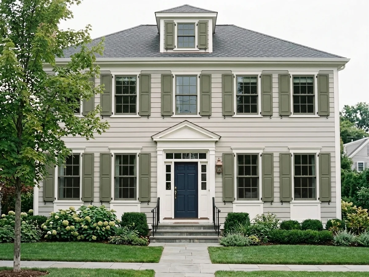
Full outdoor sun reads it as a confident, grounded olive rather than the flat drab some dark greens get outside. Pairs cleanly with white or cream siding and black shutters or light fixtures for contrast.
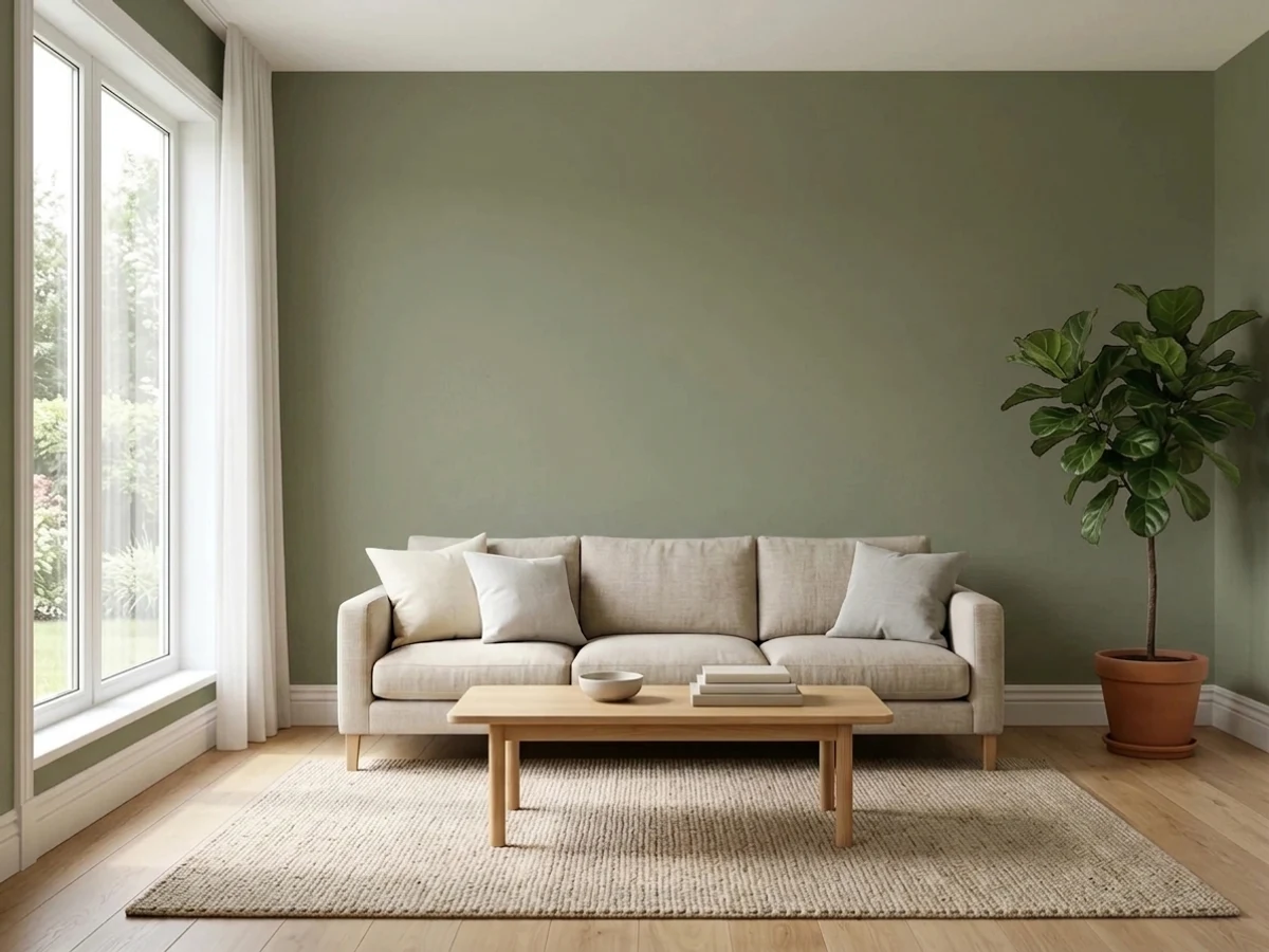
A single accent wall, a built-in bookcase, or a fireplace surround can carry it well. Covering all four walls is the move designers themselves hesitate to recommend — it tends to read heavier and grayer than the chip promised at that scale.
A single cabinet piece, a hutch, a bench — this is where the color was made to live. It reads as a deliberate, considered choice rather than a big commitment.
Nothing about this color's story or its real-world use points to whole-house walls. Treat it as a cabinet and accent color, and pick a lighter, more forgiving green (or a plain neutral) for the walls around it.
Your Light Is the Risk
A sunlit room with pale walls bouncing light back at it is where the olive-green reads clearest and most alive — the exact contrast one designer found between a sunlit bedroom cabinet and a dark bathroom.
No daylight source means LRV 21 sinks toward near-black and the color loses its identity. Sample it in the actual room — not a sunlit one — before you commit a whole vanity or door to it.
Midday sun keeps it a clear, warm olive; as the light drops toward evening it deepens toward a mossy charcoal-green. On cabinets and doors this shift reads as depth, not as a problem.
2700K warm bulbs pull it toward a cozy, brownish olive at night. Cool white LEDs flatten the warmth out and can leave it looking gray-green and a little muddy — swap the bulbs before you swap the paint.
Most complaints about Artichoke are a light mismatch. Upload a photo of your actual room and see it on your walls — then ask for the same wall in north light or evening lamps before you buy a single sample.
Need It From Another Brand?
Any paint counter can custom-tint Sherwin-Williams SW 6179 directly. If you would rather stay in one brand's own deck, these are the closest stock matches, measured as ΔE2000. Under 2 is a difference you will not see on the wall.
| Brand | Closest color | ΔE | LRV | |
|---|---|---|---|---|
| Behr | EcologicalS380-6 · Behr | 0.4 | 22 | Color page → |
| Benjamin Moore | Tate OliveHC-112 · Benjamin Moore | 2.0 | 22 | Color page → |
| Valspar | Native Henna6001-4B · Valspar | 1.5 | 21 | Color page → |
| PPG / Glidden | WildernessPPG11-26 · PPG / Glidden | 2.0 | 22 | Color page → |
| Glidden | WildernessPPG11-26 · Glidden | 2.0 | 22 | Color page → |
| Dutch Boy | Balsam Sprig325-4DB · Dutch Boy | 1.3 | 22 | Color page → |
Similar Sherwin-Williams Colors
The nearest shades to Artichoke within Sherwin-Williams's own range, ranked by perceptual color distance — useful when you want the same look a touch lighter, darker, or warmer.
WCAG 2.1: AA is 4.5 : 1 for normal text, 3 : 1 for large text, AAA is 7 : 1.
Artichoke vs the Colors You're Also Considering
Every Artichoke sample board has the same rivals on it. The numbers show the real lightness gap — then it comes down to which risk you would rather live with.
Pick this for the warmer, more olive-leaning of the two — Artichoke carries the most yellow of the group.
Sherwin-Williams SW 6186 · LRV 21Dried ThymePick this if you want the same idea with a touch more gray and a touch less yellow — set two chips side by side, because online they can look identical.
Pick this for the version with the least blue in it, if you're chasing a true warm olive rather than a gray-green.
Sherwin-Williams SW 6207 · LRV 21RetreatPick this if a cabinet maker or designer already speced Retreat — it reads as close to identical as two different chip names get.
Dried Thyme SW 6186 shares the same LRV of 21 but its hex of #7B8070 carries less yellow, so it reads as a grayer, softer sage. Choose Dried Thyme for a quieter green and Artichoke when you want the olive to be obvious. Olive Grove SW 7734 and Edamame SW 7729 at LRV 20 both sit at hex values with more yellow again, so they lean closer to true olive drab.
Across brands, HGTV Home by Sherwin-Williams Lichen and Liverwort HGSW 3243 shares the exact hex #7F8266 and LRV 21, so it is the same color. Dutch Boy Balsam Sprig 325-4DB at LRV 22, Valspar Native Henna 6001-4B at LRV 21, and Behr Mocha Accent 720D-5 at LRV 21 all fall under a deltaE of 1.8, which means they are visually identical in normal room light. Benjamin Moore Tate Olive HC-112 at LRV 22 and Dunn-Edwards Ivy Garden DE6258 at LRV 20 are very close, so sample before switching. Magnolia Home Olive Grove JG-09 at LRV 21 is close but visibly different side by side.
Artichoke Coordinating Colors
The rule for coordinating with Artichoke is simple: keep the whites and metals warm, save the cool tones for somewhere else in the house. It pairs cleanly with warm off-whites, near-blacks for contrast, and its own lighter, more famous green cousin when a room needs two shades of the same family:
Three Near-Identical Greens in One Deck
Artichoke's real story is not a Color of the Year moment or a viral room — it is that Sherwin-Williams sells three of these. Artichoke (SW 6179), Dried Thyme (SW 6186), and Retreat (SW 6207) all sit at LRV 21 in the same muted-olive green family, and their RGB values are within about fifteen points of each other on every channel. Pull all three fan deck chips into daylight and most people need a few seconds to tell them apart.
The honest distinction: Artichoke carries the least blue of the three, which makes it read as the warmest and most clearly olive-yellow. Dried Thyme and Retreat both lean a touch cooler and grayer by comparison. None of this makes Artichoke better or worse — it makes it a solid, unpretentious cabinet green that happens to have company. If a showroom sample, a cabinet maker's swatch, or an old paint can in the garage says one of the other two names, don't assume you're looking at something different.
Artichoke With Wood Tones and Metal Hardware
Warm woods are the easy pairing: walnut, white oak, and butcher block all sit comfortably next to the olive undertone without a fight. Honey oak is workable but worth testing in place — both the wood and the paint are competing for the room's "warm" attention, and in a small space that can read busier than expected rather than clashing outright.
Metals are forgiving here. Brass and unlacquered hardware are the classic match and lean into the warmth, but the color has enough gray in it that black iron, matte bronze, and even brushed nickel all read fine — this is not a color that fights cool metal the way a saturated warm color would. Pick the hardware finish for the room, not to protect the paint.
Three Ready Palettes Built on Artichoke
A color is never alone on the wall. These are complete combinations in the 60-30-10 pattern, with the reason each one holds together. Every one opens in the visualizer.
A crisp white keeps the olive cabinets from reading dark or muddy, feeding them the light Artichoke needs to look like a real green. Iron Ore on hardware or a single pantry door gives the kitchen one grounding dark note instead of two competing mid-tones.
Try this palette in your roomA true white body lets the olive door read as a deliberate color choice in full sun instead of disappearing into brown. Black shutters repeat the door's depth without fighting its warm undertone.
Try this palette in your roomWarm white walls keep a small room bright enough that Artichoke doesn't sink toward near-black, especially in a powder room that often has no window of its own. The near-black frame supplies the one dark note the room needs and nothing more.
Try this palette in your roomArtichoke FAQ
Is Artichoke a green or a gray?
Green — a warm, muted olive-green with a yellow undertone, not a gray with a green tint. It is low-chroma, so in weak light it can look drab or nearly black, but on the wall or cabinet it never reads as true gray.
What's the difference between Artichoke, Dried Thyme, and Retreat?
Very little on paper — all three sit at LRV 21 in the Sherwin-Williams green family and can look identical online. Artichoke carries the least blue of the three, making it the warmest and most clearly olive; Dried Thyme and Retreat lean a shade cooler and grayer. Get physical chips before you decide between them — a screen won't show the difference.
Is it good for a whole room, or just cabinets?
Cabinets, vanities, doors, and furniture is where this color earns its keep. At full-room scale it reads flatter and grayer than the small-scale version, and even designers who like the color hesitate to recommend it as a four-wall paint.
Will it work in a windowless bathroom?
Test it there specifically before committing. Without daylight, LRV 21 sinks toward near-black and the green mostly disappears — fine if that moody look is what you want, disappointing if you expected the color on the chip.
What white goes with Artichoke cabinets?
A warm white — Chantilly Lace or White Dove both work well — keeps the room bright and lets the olive read as intentional rather than dark. A cool, blue-based white fights the warm undertone and can push the green toward muddy.
Does it work as an exterior front door color?
Yes — it's one of its strongest uses. Full outdoor sun keeps it reading as a confident olive rather than flat drab, and it pairs cleanly with white or cream siding and black trim or fixtures.
Have you painted with Artichoke?
Rate it — one tap helps the next reader decide.
Ask a Question