Pewter Green
The moody green-gray behind a thousand kitchen islands, reviewed honestly: the surfaces it wins on, the rooms where it turns black, and what to pick instead.

Jessica has spec'd whites and neutrals for more than 300 rooms and keeps a sample wall of painted drawdowns in her studio. Every color review is checked against real reader rooms in the comments and re-tested when a formula changes. About the testing process →
The Fast Verdict
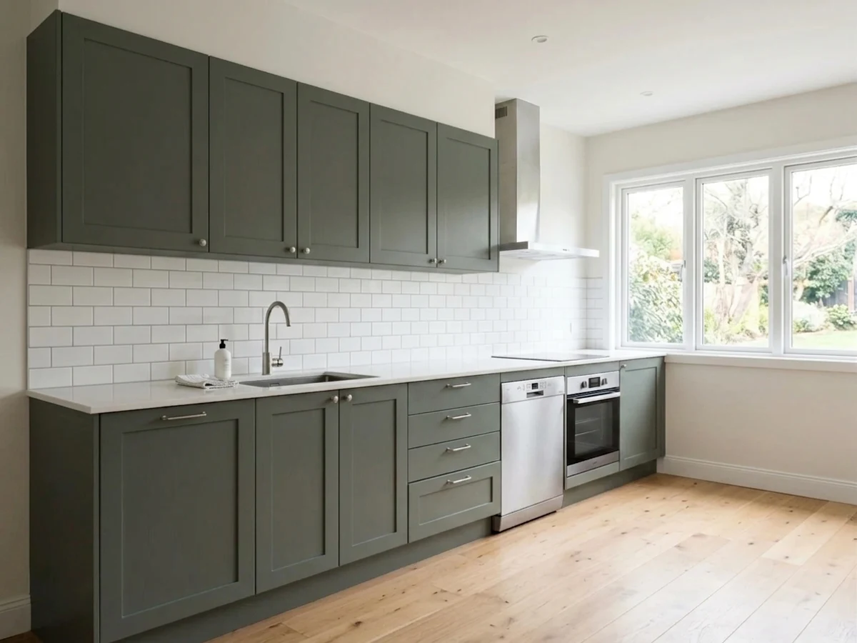
Pewter Green is the color people mean when they say "dark green, but not a green kitchen." The green is only a lean — most of what you see is a deep, smoky gray — and that restraint is exactly why it has survived five years of being everywhere. On an island, lower cabinets, built-ins, a powder room or siding it is close to unbeatable. Its one real weakness is light: give it too little and it stops being a color at all.
Kitchen islands and lower cabinets · powder rooms you are willing to light well · built-ins and library walls · exteriors and front doors
The room has no window · you want people to see an obvious green · your counters are dark granite or soapstone · you are painting every cabinet in a small kitchen
- Reads as depth, not as "a green kitchen" — easy to live with for years
- The safest dark color for cabinets: grounded, never cold, never trendy-loud
- Loves brass, oak, walnut and butcher block with no extra work
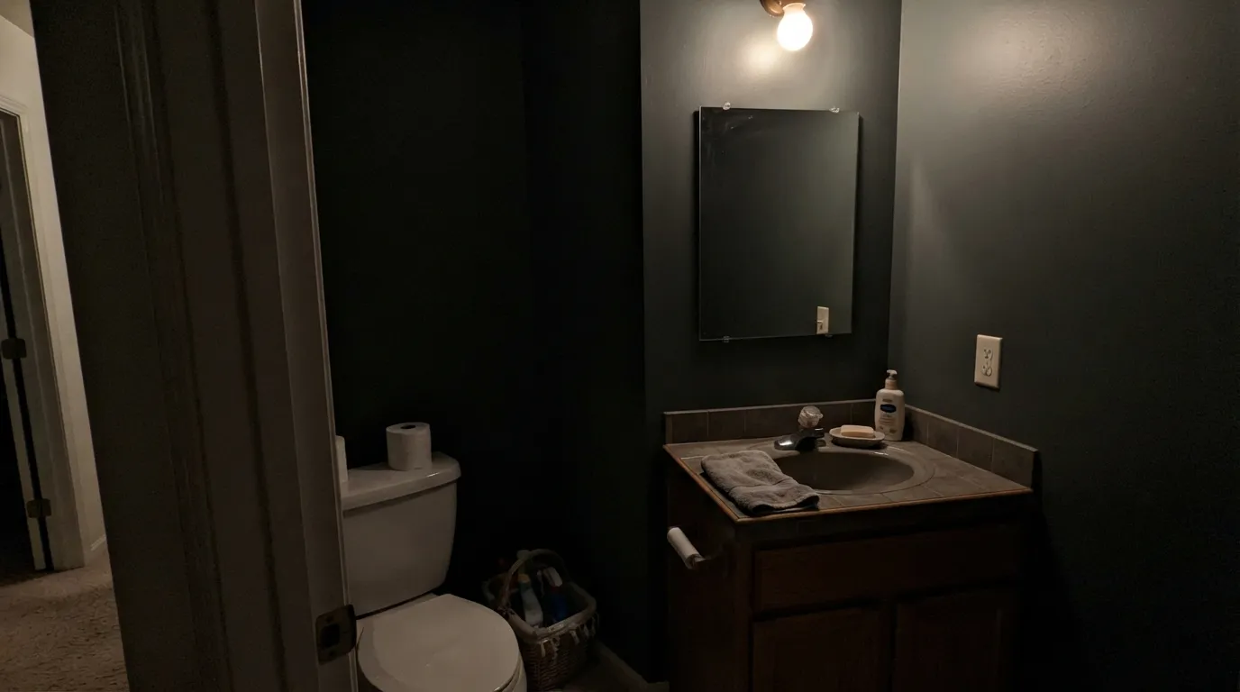
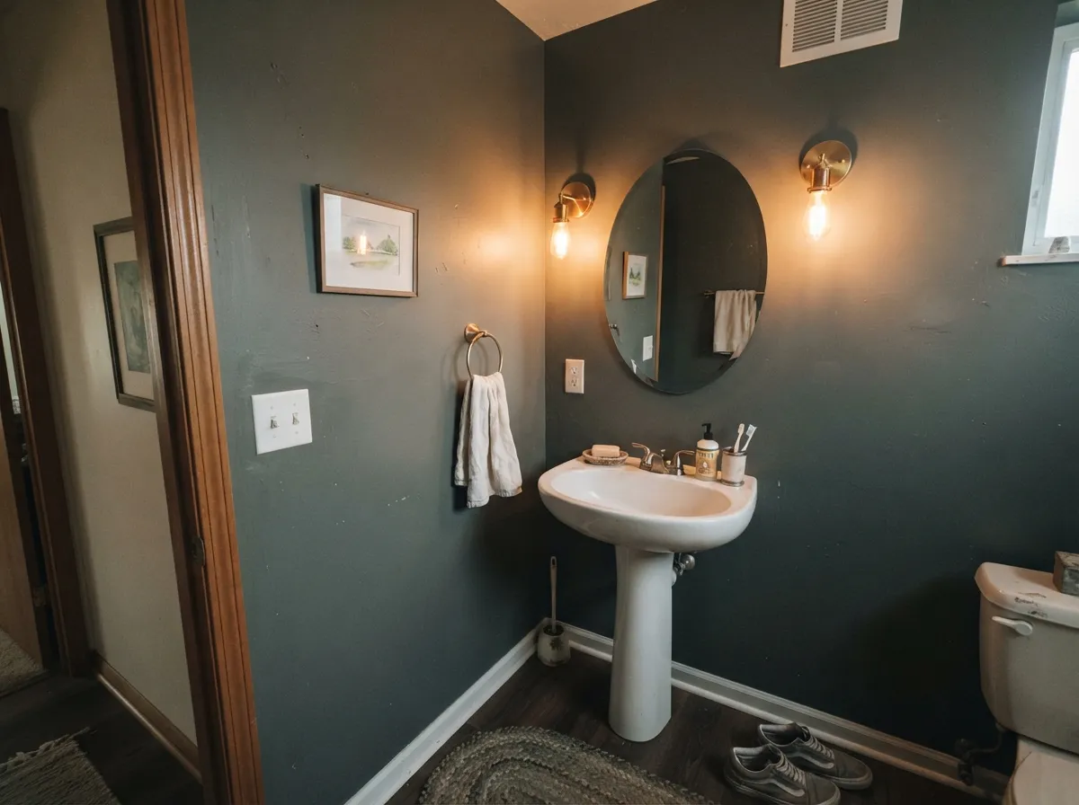
- Turns a small windowless-feeling powder room into a deliberate jewel box
- One of the strongest dark exteriors in the Sherwin-Williams deck
- Goes near-black in rooms with little or no daylight
- Swings cool blue-sage in bright north light next to white
- Overwhelming on full-height cabinetry in a small kitchen
- Dark satin shows dust and knuckle marks around handles; touch-ups flash
What Color Is Pewter Green, Really?
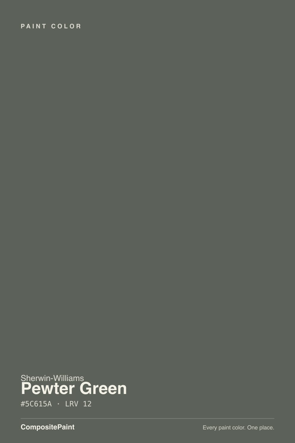
A dark gray-green where the gray does most of the talking. Saturation sits around four percent, which in plain terms means the green is a direction, not a statement — put a chip of Pewter Green next to a true charcoal and the green appears immediately; put it on a wall by itself and most visitors will call it gray. What surprises people is that it swings in two directions, not one. In bright rooms with white cabinets around it, it cools off and can read almost blue-sage. Under warm bulbs and next to oak, the same paint goes soft and olive. Both are the real color; neither is a mistake in the can.
At LRV 12 it returns about twelve percent of the light in the room, and that number decides everything about how it behaves. Set it beside Evergreen Fog (SW 9130) at LRV 30 and the difference is not "a bit darker" — Evergreen Fog is a paint you can put on four walls of an average room and still see the room. Pewter Green is a paint that eats light and gives back depth. That is a trade, and it is a good one on a cabinet run or a small bathroom, where the darkness reads as intentional. Across a big dim room it just reads as dark.
Undertone in one line: green-leaning gray with a faint blue swing in cool light and a faint olive swing in warm light — never brown, never true sage. If your sample looks flat black on the wall, that is your light level, not the paint.
Where It Shines
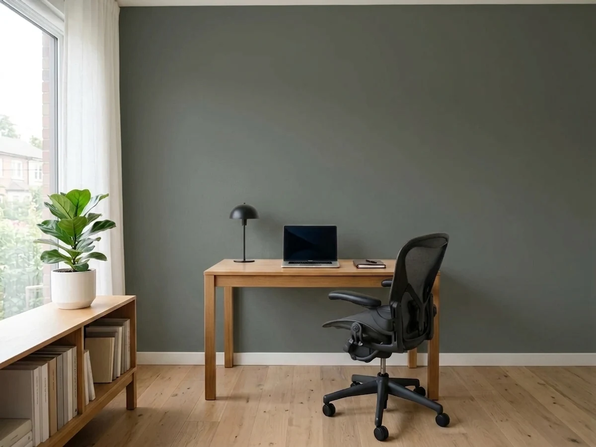
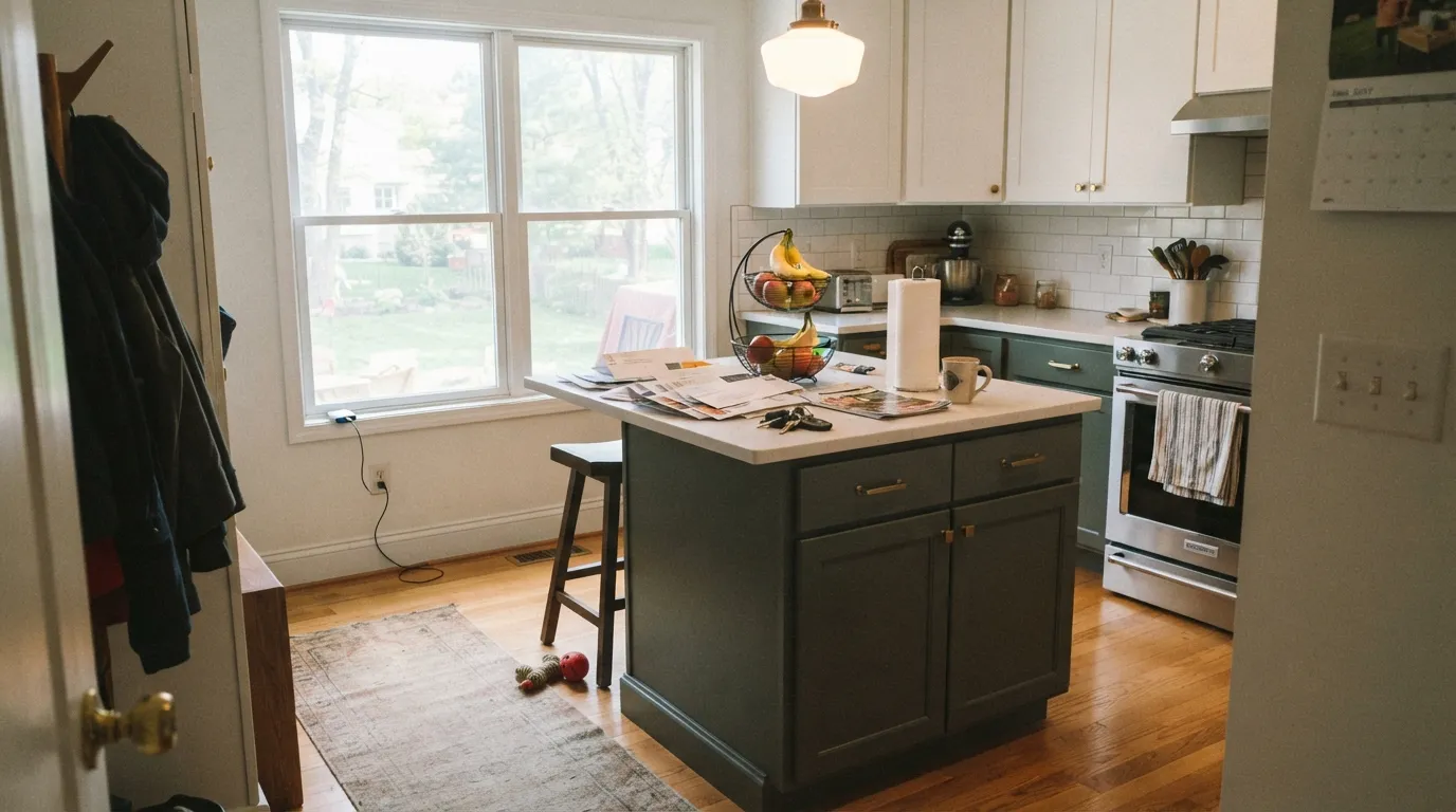
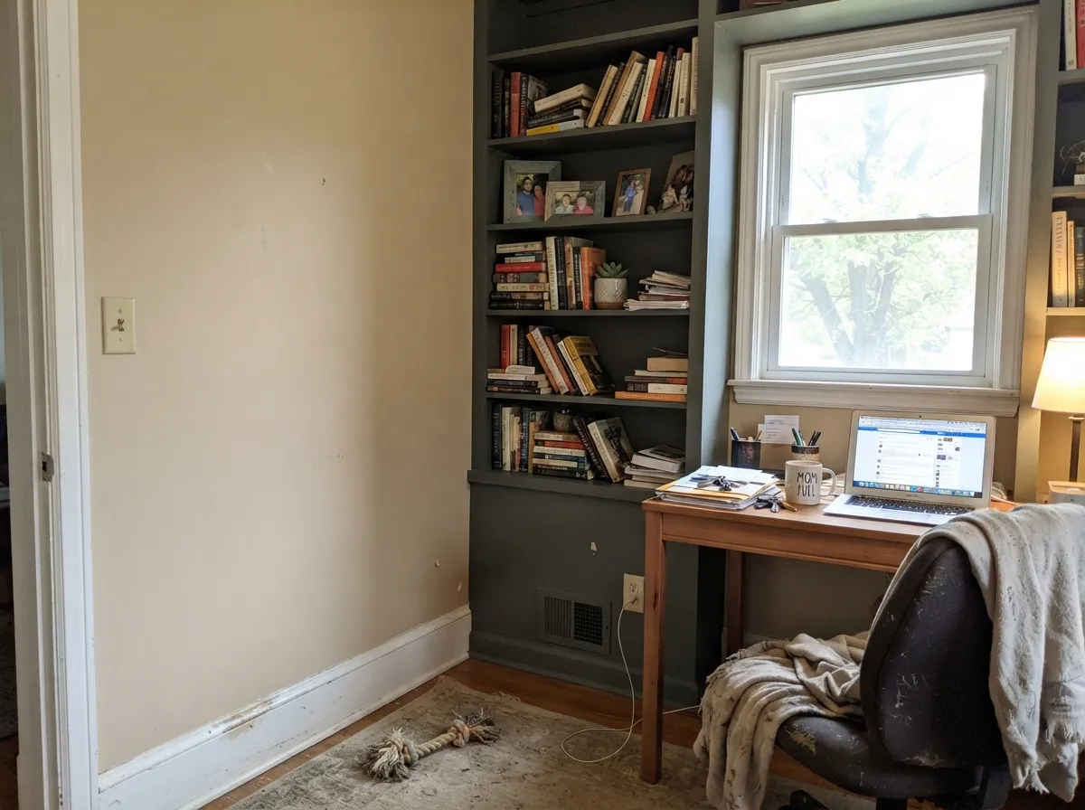
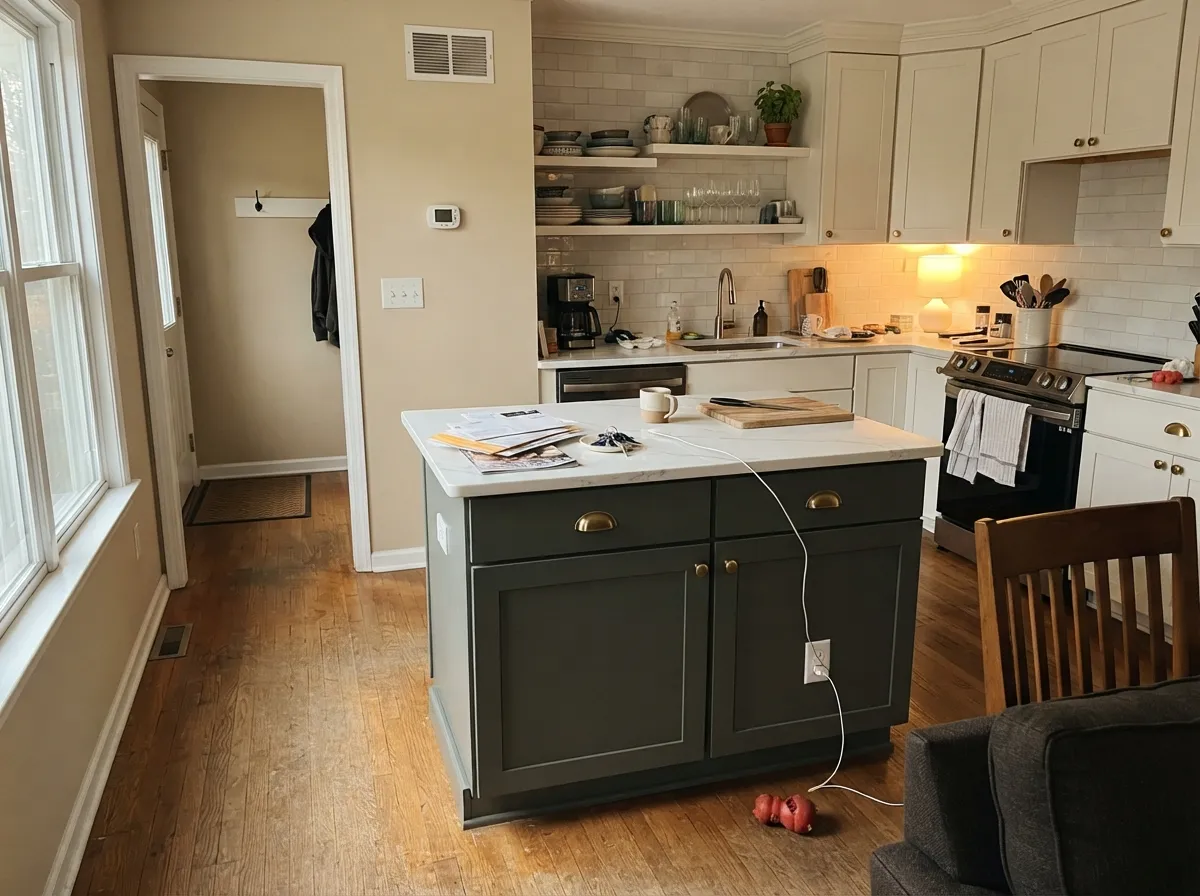
Its best work happens on furniture-like surfaces: an island, a bank of lower cabinets, a built-in bookcase, a small room you want to feel like a jewel box. Give it a light perimeter, warm wood, and brass, and the depth stops reading heavy and starts reading expensive.
Where It Fails
The bad Pewter Green stories are remarkably consistent, and every one of them traces back to a room or a surface that could not carry LRV 12. Here are the three that come up over and over, and what to use instead.
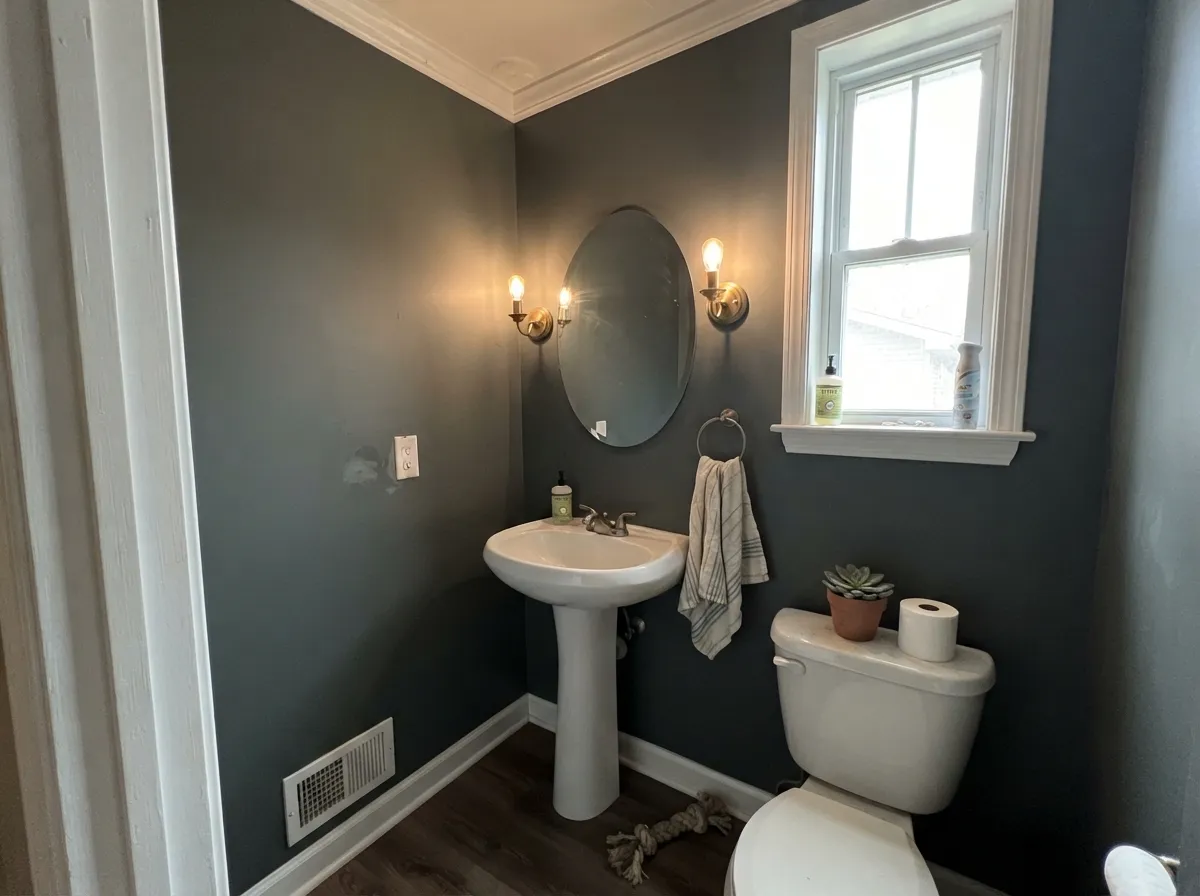
With no daylight, the green has nothing to reflect and the wall collapses toward black. People describe walking in and seeing "a dark box." If the room has no window and only one overhead fixture, step up to Retreat (SW 6207) at LRV 21 — same family, same mood, enough light left in it to still read as a color.
Uppers and lowers both in Pewter Green is the most common regret, especially for people coming from a white kitchen. The dark ring closes the room in and the wood tones stop showing. Keep it on the island and lowers, or if you want the whole run painted, go lighter with Acacia Haze (SW 9132) so the color still breathes.
Cool north daylight bouncing off white pushes the gray forward and the green toward blue — the "why does my green look like blue sage" complaint. If you wanted an earthy, warm green rather than a cool one, use Vintage Vogue (BM 462) instead; it sits at nearly the same depth but leans olive and holds its warmth in cool light.
Room by Room
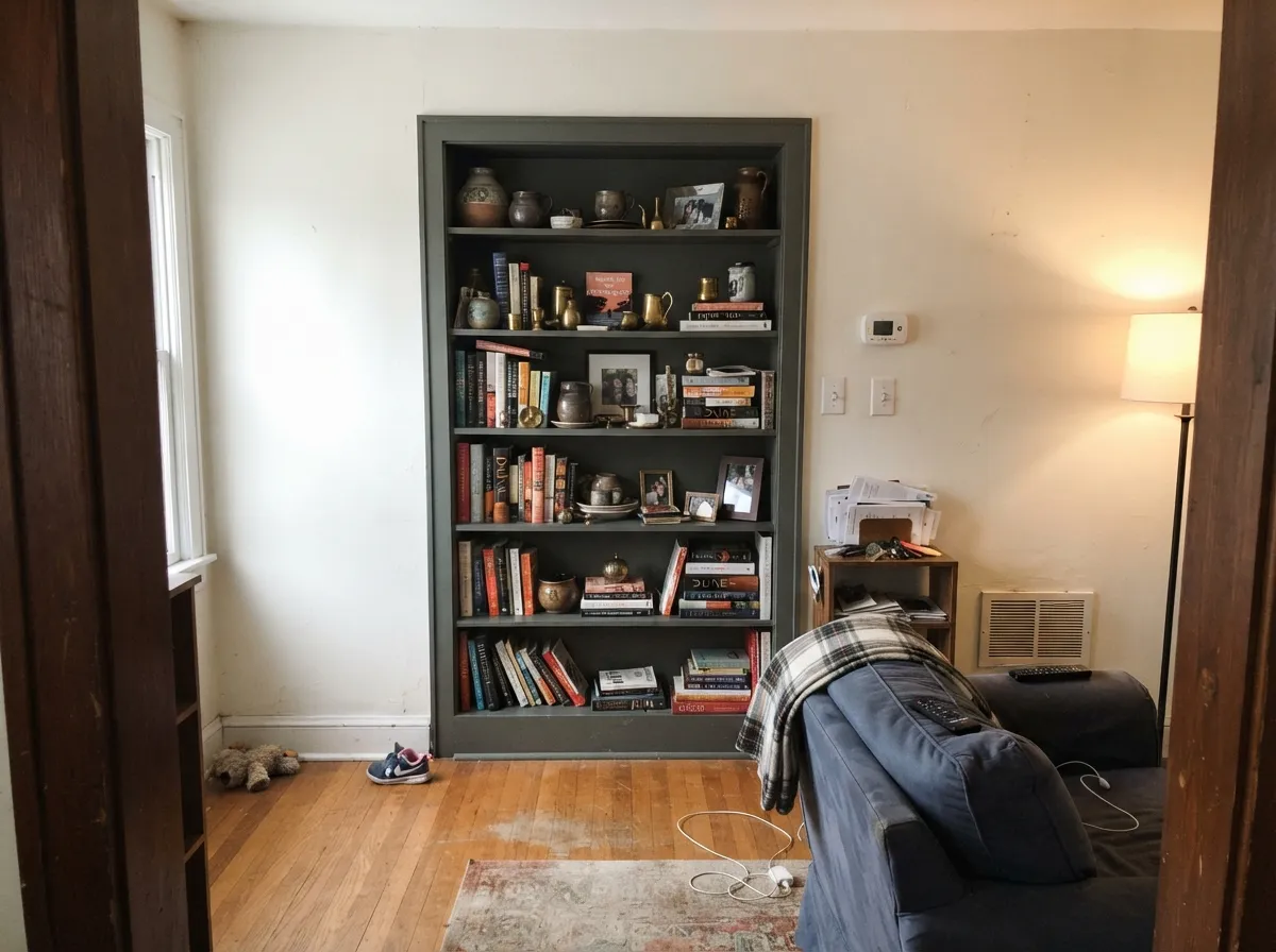
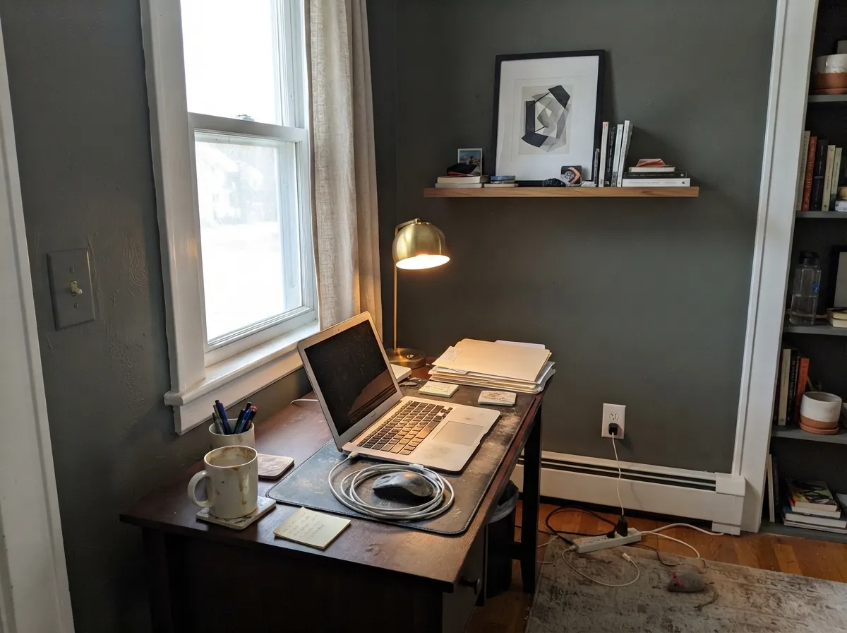
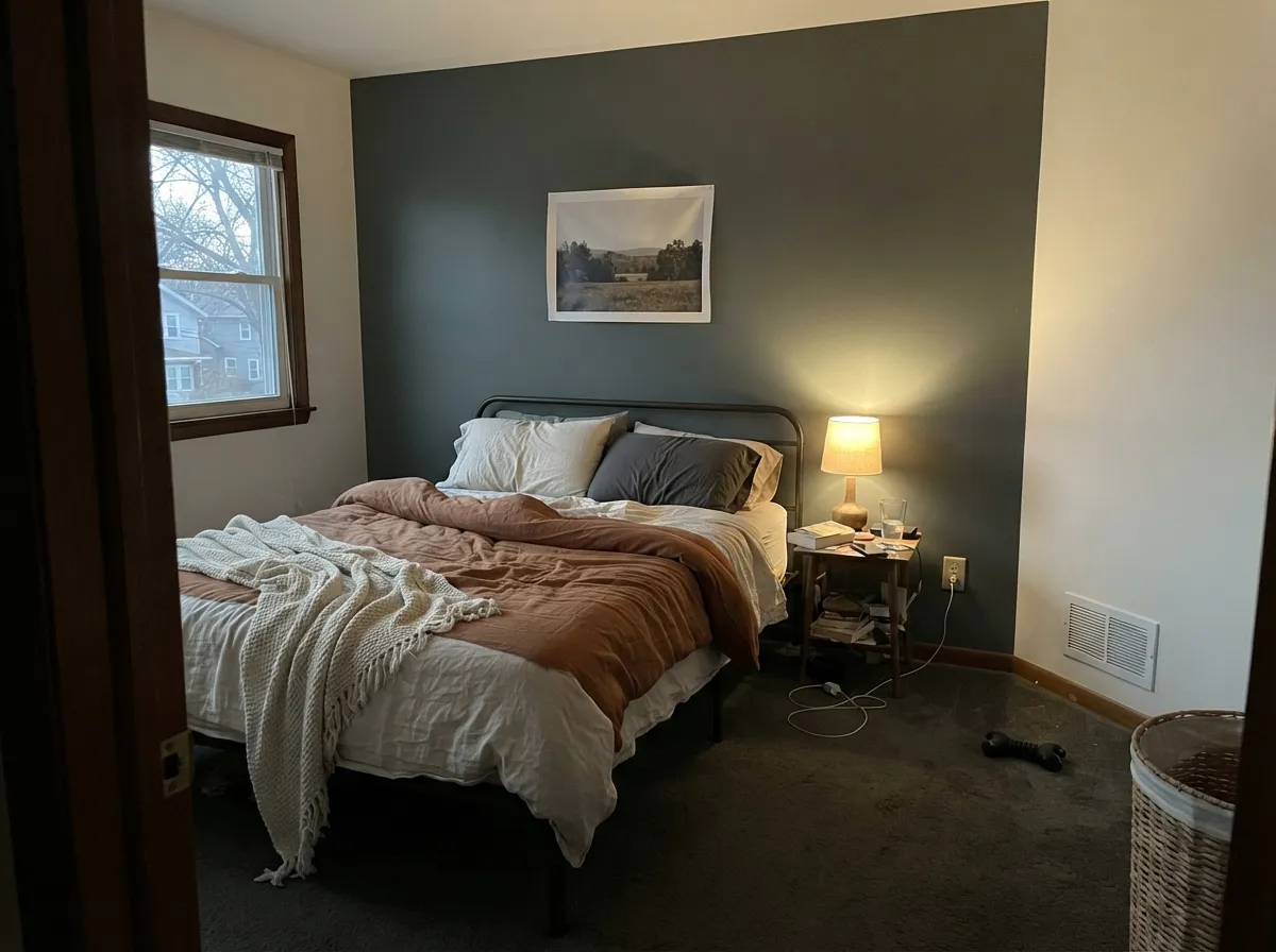
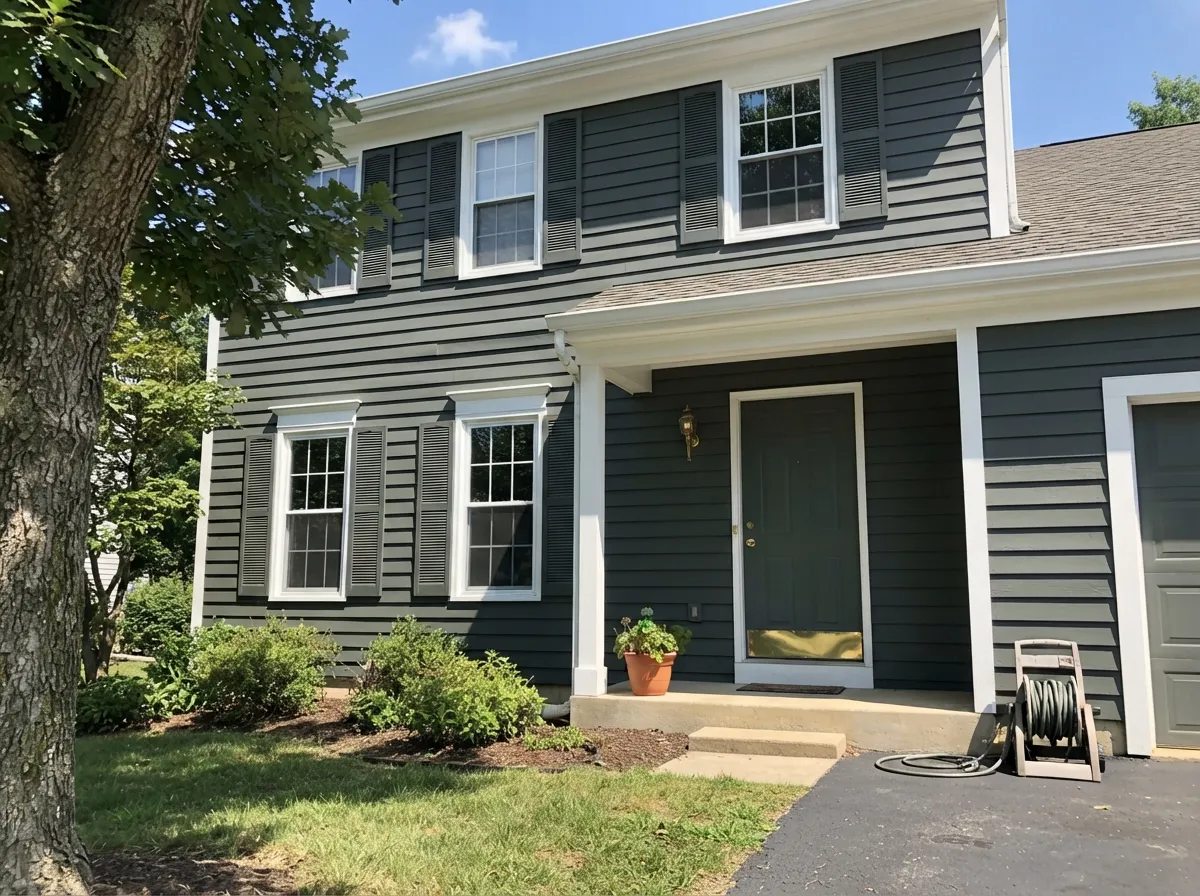
Your Light Is the Risk
The green finally shows and the color reads rich instead of gray. Its best case.
Grays down and drifts slightly blue. Fine on cabinets, tricky on four walls.
2700K bulbs push it warm and olive — flattering. Cool LEDs make it hard and flat.
With no daylight there is nothing to reflect. It stops reading as a color. Go lighter.
Most complaints about Pewter Green are a light mismatch. Upload a photo of your actual room and see it on your walls — then ask for the same wall in north light or evening lamps before you buy a single sample.
Need It From Another Brand?
Any paint counter can custom-tint Sherwin-Williams SW 6208 directly. If you would rather stay in one brand's own deck, these are the closest stock matches, measured as ΔE2000. Under 2 is a difference you will not see on the wall.
| Brand | Closest color | ΔE | LRV | |
|---|---|---|---|---|
| Behr | Woodland MossPPF-45 · Behr | 2.0 | 12 | Color page → |
| Benjamin Moore | Dark Olive2140-30 · Benjamin Moore | 3.0 | 14 | Color page → |
| Valspar | Quaking Bog5005-2C · Valspar | 1.1 | 11.2 | Color page → |
| HGTV Home by Sherwin-Williams | Woodland LichenHGSW 3282 · HGTV Home by Sherwin-Williams | 0.0 | 12 | Color page → |
| Dunn-Edwards | Charcoal BriquetteDET601 · Dunn-Edwards | 1.6 | 12 | Color page → |
| Magnolia Home | TrailheadJG-169 · Magnolia Home | 3.3 | 12 | Color page → |
Similar Sherwin-Williams Colors
The nearest shades to Pewter Green within Sherwin-Williams's own range, ranked by perceptual color distance — useful when you want the same look a touch lighter, darker, or warmer.
WCAG 2.1: AA is 4.5 : 1 for normal text, 3 : 1 for large text, AAA is 7 : 1.
Pewter Green vs the Colors You're Also Considering
Every Pewter Green sample board has the same rivals on it. The numbers show the real lightness gap — then it comes down to which risk you would rather live with.
Pick this for real depth on an island, cabinets or a small room.
Sherwin-Williams SW 9130 · LRV 30Evergreen FogPick this for soft sage you can run across a whole living room.
Side-by-side comparison →Pick this when the surface is small and the room has good light.
Sherwin-Williams SW 6207 · LRV 21RetreatPick this for dim rooms and full cabinet runs — nine LRV points lighter.
Rosemary (SW 6187) shares the same LRV of 12 but carries more obvious green, with a hex of #5F6B57. If you want people to clearly read the color as green, choose Rosemary; if you want a dark gray-green that stays subtle, Pewter Green is the safer call.
Evergreen Fog (SW 9130) is a different animal at LRV 30. It is much lighter and greener, a true sage you can run across a whole room. Reach for Evergreen Fog when you want soft, all-day green walls, and Pewter Green when you want depth and contrast on a smaller surface.
Cast Iron (SW 6202), also LRV 12 with hex #64645A, is grayer and more neutral. Next to it, Pewter Green looks slightly greener and a touch warmer, so pick Cast Iron if you want dark walls with no green cast at all.
Pewter Green Coordinating Colors
Pewter Green sits close enough to neutral that it partners easily, but the pairings split into two jobs: whites that soften the contrast, and warm neutrals that stop the color drifting cool. Skip cold grays and blue-grays next to it — they push the green toward blue, which is the one direction most people did not want.
Pewter Green on Cabinets
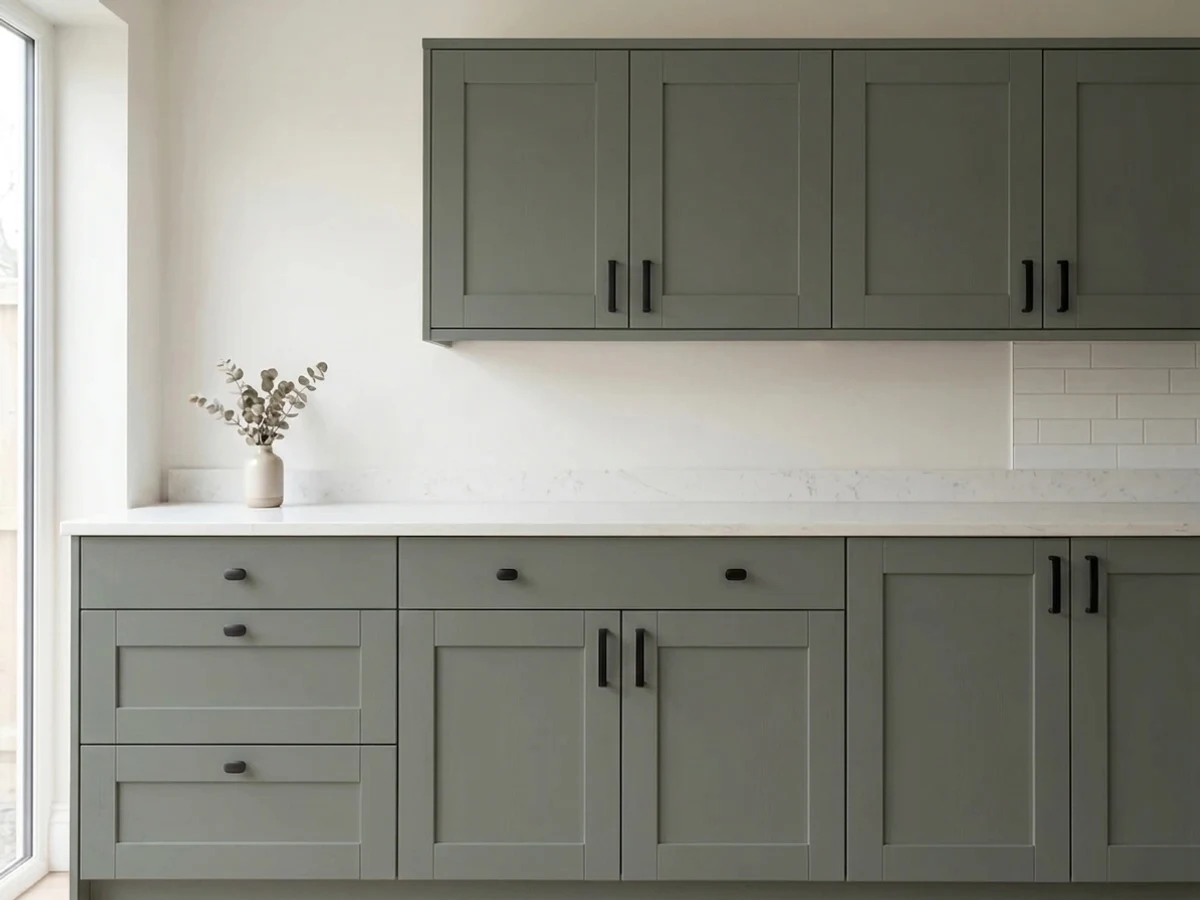
Cabinets are where this color earns its reputation, and the single decision that makes or breaks it is how much of the kitchen you paint. An island alone, or lowers with light uppers, is the version that keeps showing up in finished kitchens people still like three years later. Every cabinet in the room, in a kitchen under about 150 square feet, is the version people repaint.
Practical notes the pretty photos leave out: use a urethane-fortified cabinet enamel in satin, spray if you have the option, and buy an extra quart for touch-ups from the same batch — dark greens are unforgiving about color drift between mixes. Expect to wipe the doors around the handles more often than you did with white, and keep the countertop and backsplash light so the cabinets stay the contrast rather than becoming a dark mass.
Pewter Green Outside: Siding, Shutters and Front Doors
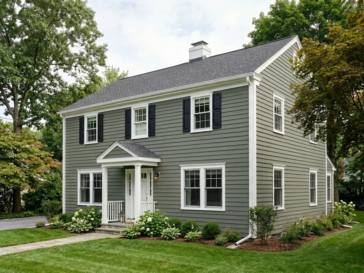
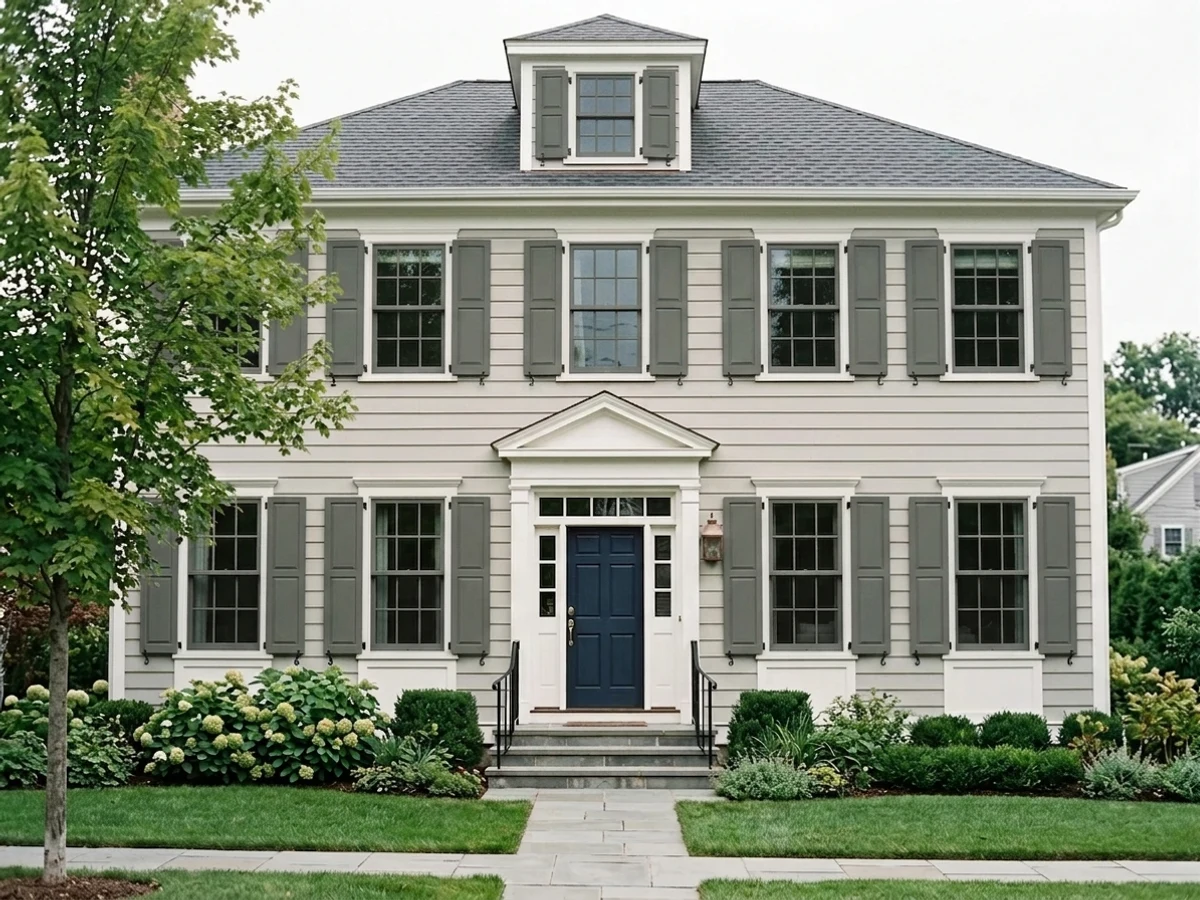
Outside it behaves better than its LRV suggests, because full sun supplies exactly what a dim interior cannot. On siding the green steps forward and the house reads deep and settled rather than black, and unlike a true navy or charcoal it never looks cold on a gray winter day. It suits cedar shakes, board and batten, and cabin-style houses especially well.
The one thing to check before you commit is your lot. On a heavily wooded property the house can disappear into the tree line — some people want exactly that, and others are unpleasantly surprised when the front of the house stops reading from the street. The fix is contrast, not a different color: bright Pure White (SW 7005) trim, a lighter roof, and pale hardscape. If you want the house to stand out from greenery, a warmer or lighter green is the safer call.
Three Ready Palettes Built on Pewter Green
A color is never alone on the wall. These are complete combinations in the 60-30-10 pattern, with the reason each one holds together. Every one opens in the visualizer.
The dark lowers do the heavy 60 percent of the visual weight while Alabaster keeps the top half of the room open, so the kitchen never feels closed in. Accessible Beige adds the warmth that stops Pewter Green from drifting blue against all that white.
Try this palette in your roomA small bath is the one room where LRV 12 on every wall is a feature, and Snowbound's soft white keeps the edges from cutting the way a bright white would. Urbane Bronze on the vanity adds a warm dark note so the room reads layered instead of one flat block of color.
Try this palette in your roomOutside, the siding is unquestionably the 60 percent and full sun lifts the green out where a dim interior would flatten it. Crisp Pure White trim gives the dark body the hard edge it needs, and Iron Ore on the door is dark enough to register without introducing a fourth color.
Try this palette in your roomPewter Green FAQ
Is Pewter Green warm or cool?
Neither, on purpose — it sits almost exactly in the middle, which is why it works in so many houses. Cool light and white surroundings pull it toward a cool blue-sage; warm bulbs and wood pull it toward olive. If you need it to stay warm no matter the light, Vintage Vogue (BM 462) is the warmer pick.
Will it look black in a room with no window?
Essentially, yes. At LRV 12 there is not enough reflected light for the green to appear, and windowless powder rooms and pantries are where the disappointed reviews come from. If you love the look but have no daylight, use Retreat (SW 6207) at LRV 21 and add warm 2700K bulbs.
Pewter Green or Evergreen Fog for kitchen cabinets?
Pewter Green for an island or lower cabinets where you want contrast against a light perimeter. Evergreen Fog (SW 9130) at LRV 30 for a full cabinet run, or for a small kitchen where a dark ring of cabinetry would close the room in. They are not interchangeable — Evergreen Fog is more than twice as light.
What countertop goes with Pewter Green cabinets?
Something light. White or lightly veined quartz, honed marble, or butcher block all give the contrast the color needs. Dark granite, soapstone or black quartz next to it is the pairing that makes kitchens look muddy in photos and worse in person.
Does it work with honey oak floors?
It is one of the better answers for orange-leaning oak. The gray in Pewter Green quiets the floor's orange instead of amplifying it, and the green sits on the opposite side of the wheel from the wood's warmth, so the two stop competing. Keep the walls in a warm neutral like Accessible Beige (SW 7036) rather than a cool gray.
What sheen should I use on cabinets?
Satin, in a urethane-fortified cabinet enamel. Dark colors show every knuckle mark and any sheen higher than satin doubles it. Spray if you can — dark paint makes brush marks obvious, and touch-ups on a dark satin surface flash unless you reroll or respray the full door.
Is there a Benjamin Moore match?
There is no exact one, which is the honest answer. The closest working substitutes are Vintage Vogue (BM 462), which is a touch warmer and more olive, and Backwoods (BM 469). If the match has to be precise, have Benjamin Moore color-match SW 6208 rather than choosing from their deck.
Have you painted with Pewter Green?
Rate it — one tap helps the next reader decide.
Ask a Question