Iron Ore
America's favorite soft black, reviewed honestly: where it looks incredible, the rooms and walls where it lets people down, and what to paint instead.

Jessica has spec'd whites and neutrals for more than 300 rooms and keeps a sample wall of painted drawdowns in her studio. Every color review is checked against real reader rooms in the comments and re-tested when a formula changes. About the testing process →
- 1Cordovan Brown0
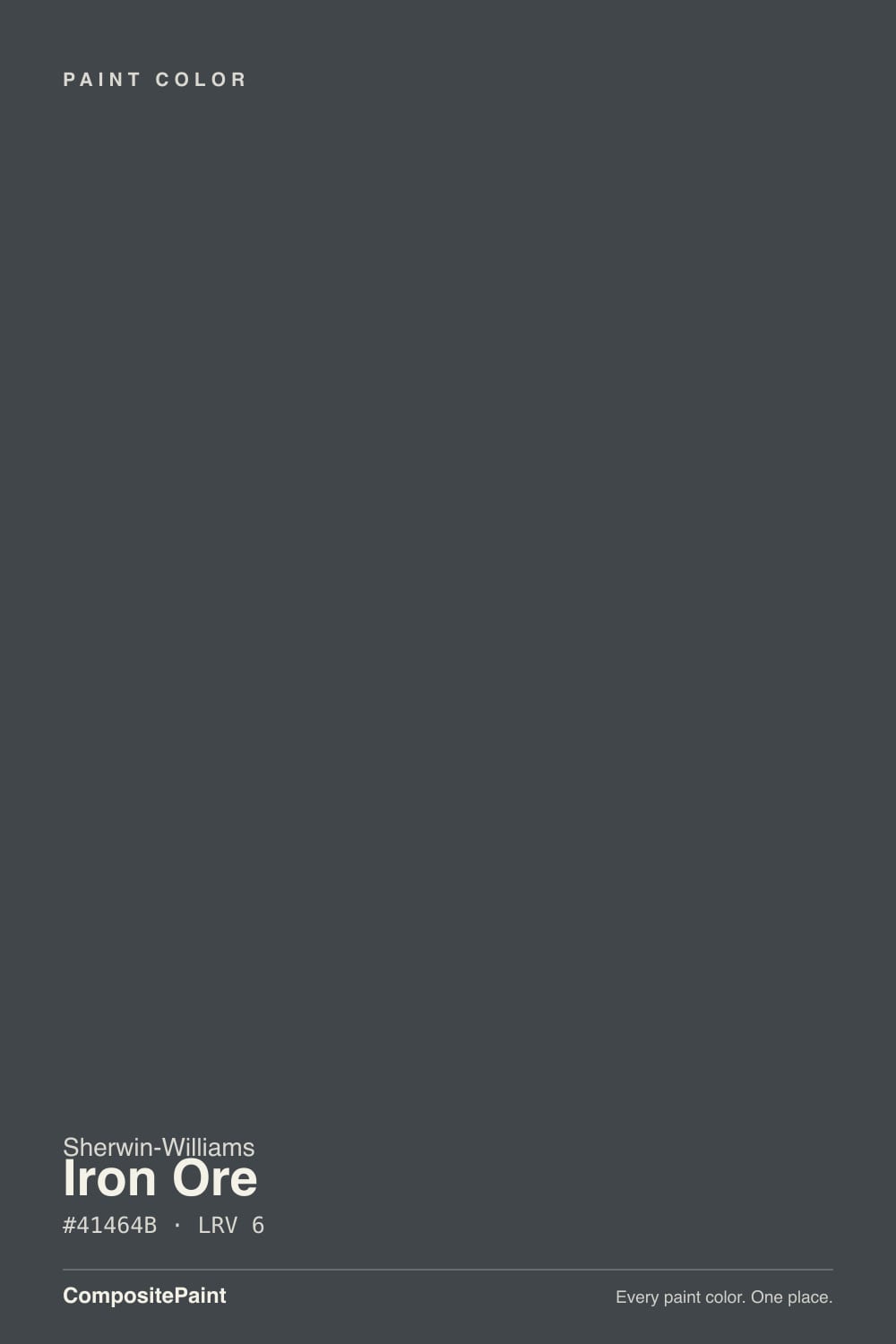
- 2Iron Ore6
The Fast Verdict
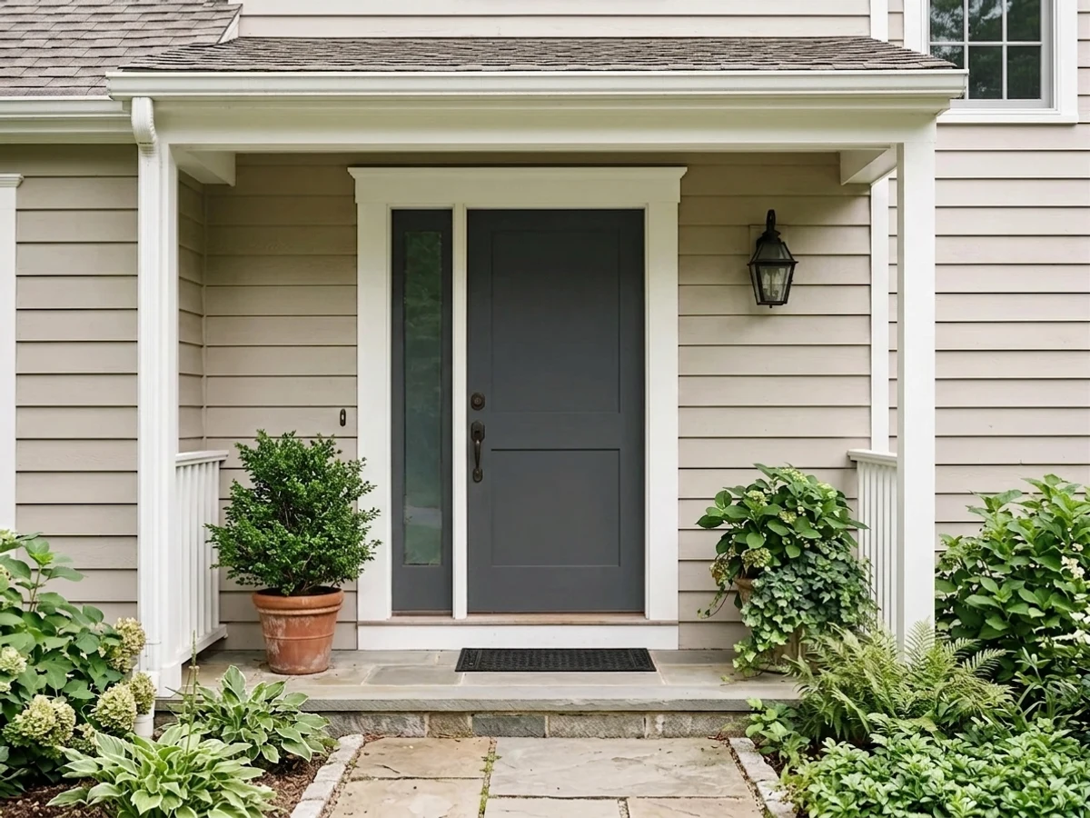
Iron Ore is the color people mean when they say "black, but not scary black." At LRV 6 it swallows almost all the light in the room, yet a trace of blue keeps it from going muddy, so it reads as a deep charcoal with a clean, slightly steely edge. Outside it is close to unbeatable — siding, shutters, gutters and door can all be this one color and the house looks designed. Inside it is a contrast color: brilliant on an island, a study or a front door, heavy and closed-in on four walls of a small dark room.
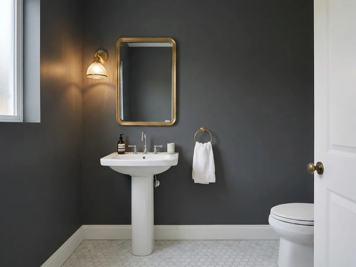
Whole exteriors, siding and shutters · front doors against light siding · kitchen islands, cabinets and built-ins · a study, library or powder room you want to feel enveloping
The room is small, dim and north-facing · your windows, gutters or roof are already true black · you are painting vinyl siding · you actually want a warm, cozy dark
- Reads black from the street but stays charcoal up close — panel and trim detail still shows
- The faint blue keeps it clean; it never turns muddy or brown like many soft blacks
- One color can carry an entire exterior: siding, shutters, gutters, garage and door
- Makes brass, warm oak and white trim look deliberate rather than accidental
- Proven on cabinets and doors — the depth hides edge wear better than a jet black
- LRV 6: on four walls in a dim room it closes the space down completely
- Too neutral to hold its own color outdoors — bronze-green on one side, navy on another
- Reads washed and grayish next to true-black windows, gutters or a metal roof
- Too dark for vinyl siding, and matte finishes flash at every future touch-up
What Color Is Iron Ore, Really?
It is a near-black charcoal that is only barely a color at all. Saturation sits at 7 percent — a hair away from pure gray — with the hue at 210 degrees, which is the blue part of the wheel. That means you will almost never look at an Iron Ore wall and think "blue." What you notice instead is what is missing: there is no brown in it. Put it beside a warm charcoal and Iron Ore looks scrubbed clean and a little steely. This is also why people argue about it online — one person swears theirs went green, the next swears theirs went navy. Both are right. A color this close to neutral has almost nothing of its own to show, so it borrows from whatever is bouncing into it: a lawn pushes it green, a bright sky pushes it navy, a warm bulb pushes it soft and inky.
LRV 6 means it reflects about six percent of the light that hits it and absorbs the rest. The useful comparison is Tricorn Black (SW 6258) at LRV 3. Three points sounds like nothing; on a wall it is the whole difference. Tricorn is a flat hole in the room — light goes in and nothing comes back. Iron Ore keeps just enough reflectance that in a sunbeam or under a picture light you can still see it is charcoal, with the edges of trim and panel molding readable instead of dissolved. It is black with dimension left in it, which is exactly why it beat every other black on cabinets and facades.
Undertone in one line: a near-neutral dark gray with a faint cool blue lean — never brown, never warm. If yours looks green, look at the grass, the roof shingles, or the cream trim next to it before you blame the paint.
Where It Shines
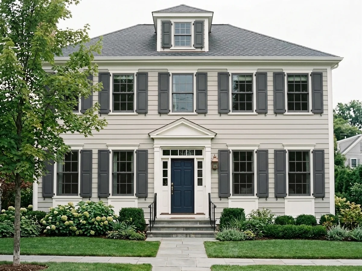
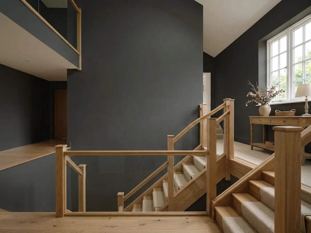
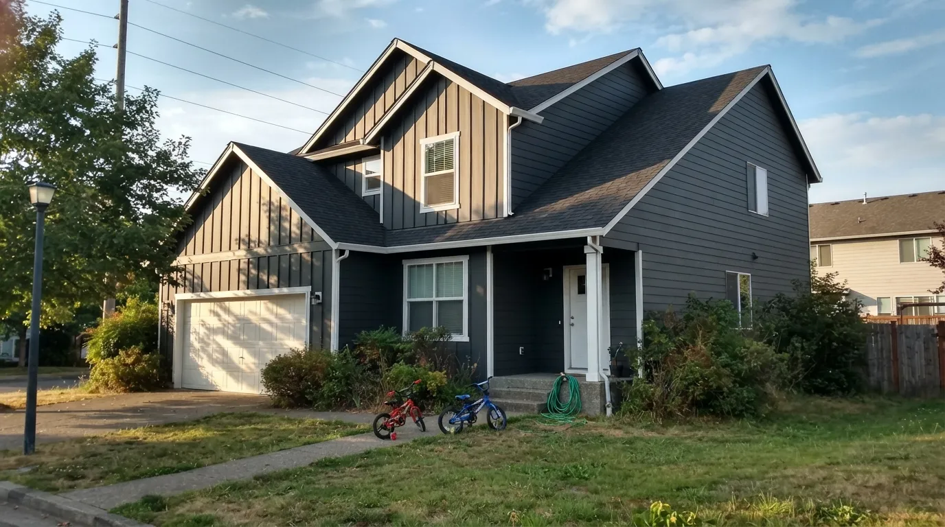
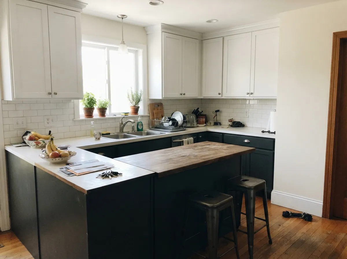
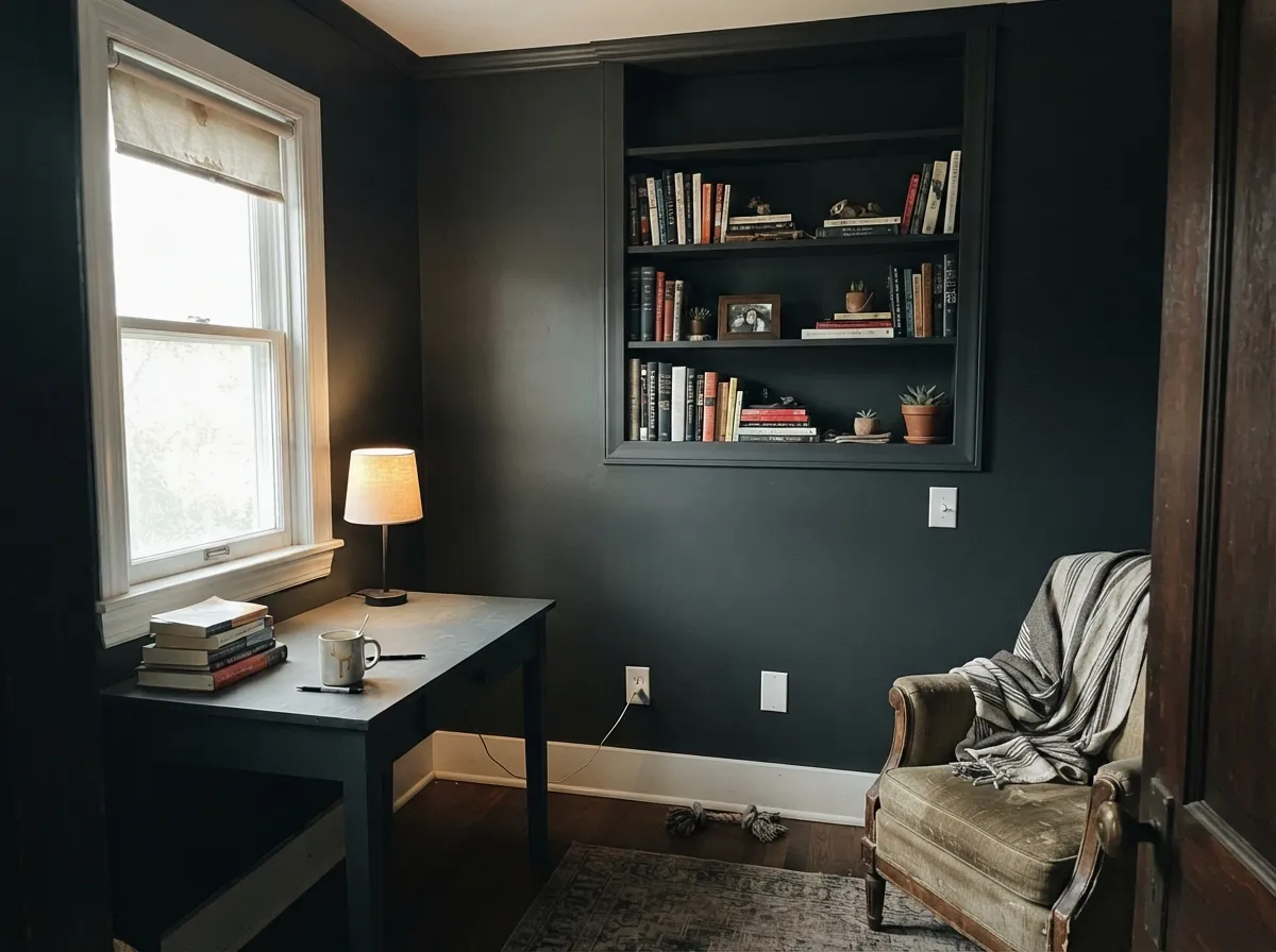
Give it a whole facade or one big built-in shape and it does something few colors can: it reads black from the street and charcoal up close. Exteriors are its home turf — siding, shutters, gutters, garage and door in the same color makes even a plain builder house look intentional. Inside, its best work is on cabinets, islands and a color-drenched study where the walls are supposed to disappear.
Where It Fails
The complaints about Iron Ore are remarkably consistent, and none of them are about quality — the paint is fine. They all come down to people asking a very dark, very neutral color to do something it cannot do. If your project matches one of these three, extra coats will not save it.
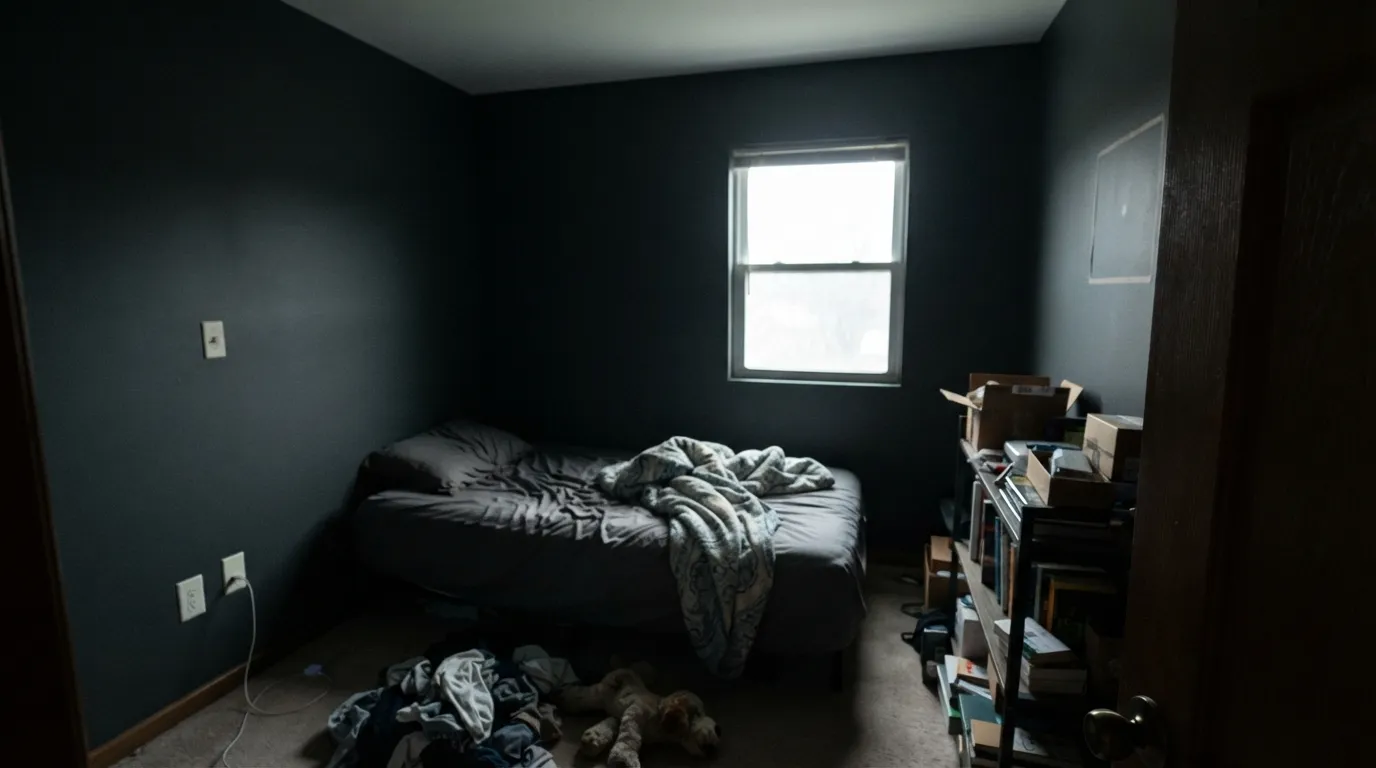
At LRV 6 there is no light coming back off the wall, so corners vanish, the ceiling drops, and everything else in the room looks dull because nothing is bouncing onto it. In a north-facing box room with one window this is the regret people post about most. If you want dark and moody but still want to see the room, use Peppercorn (SW 7674, LRV 10) — it stays a real dark gray instead of collapsing into black.
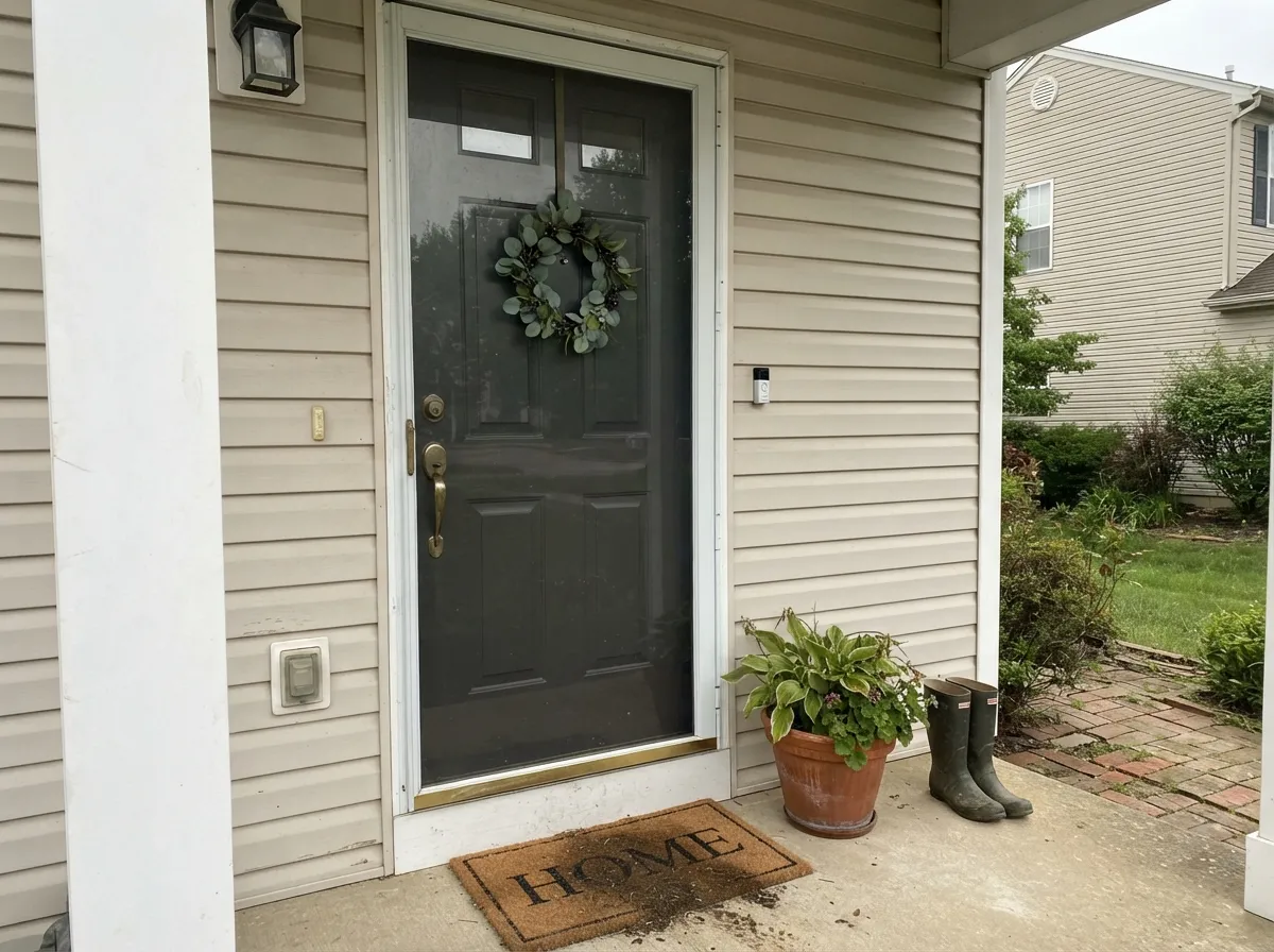
Factory-finish black window frames and standing-seam roofs are actual black. Beside them Iron Ore stops looking black and starts looking like faded gray siding, and the mismatch is worse in flat morning light. Either lean into the contrast on purpose, or paint the body Tricorn Black (SW 6258) so the whole envelope agrees.
Full sun lifts Iron Ore off black and exposes how little color it actually has, so it picks up its surroundings — bronze-green over grass on the west side, blue-navy on the side facing open sky. Same house, same gallon, two different colors. If you need it to hold still, Wrought Iron (Benjamin Moore 2124-10) commits to a blue-black on purpose, so there is no surprise to discover in July.
Room by Room
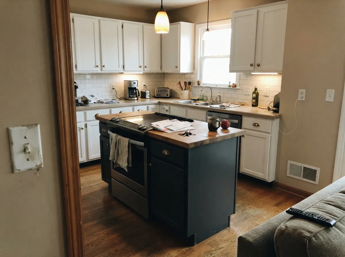
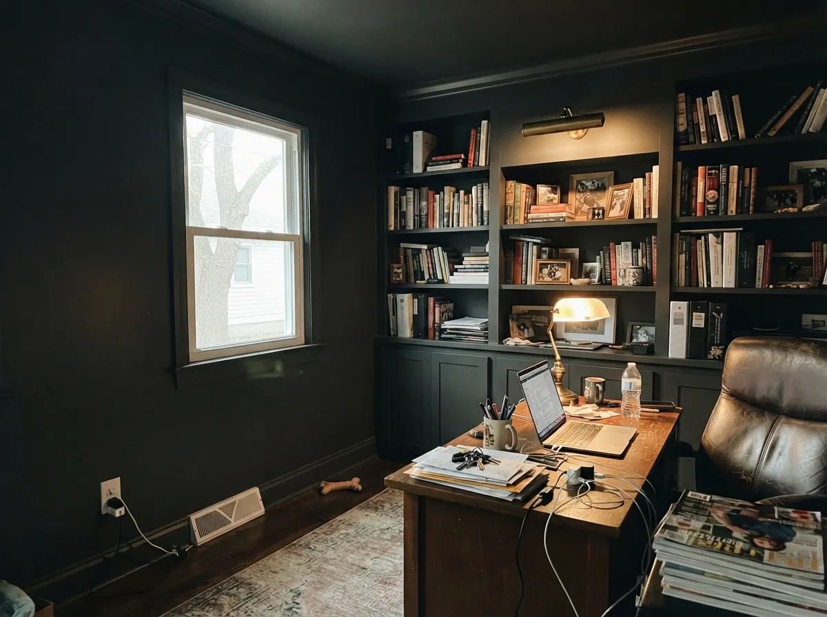
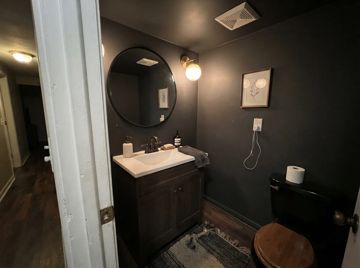
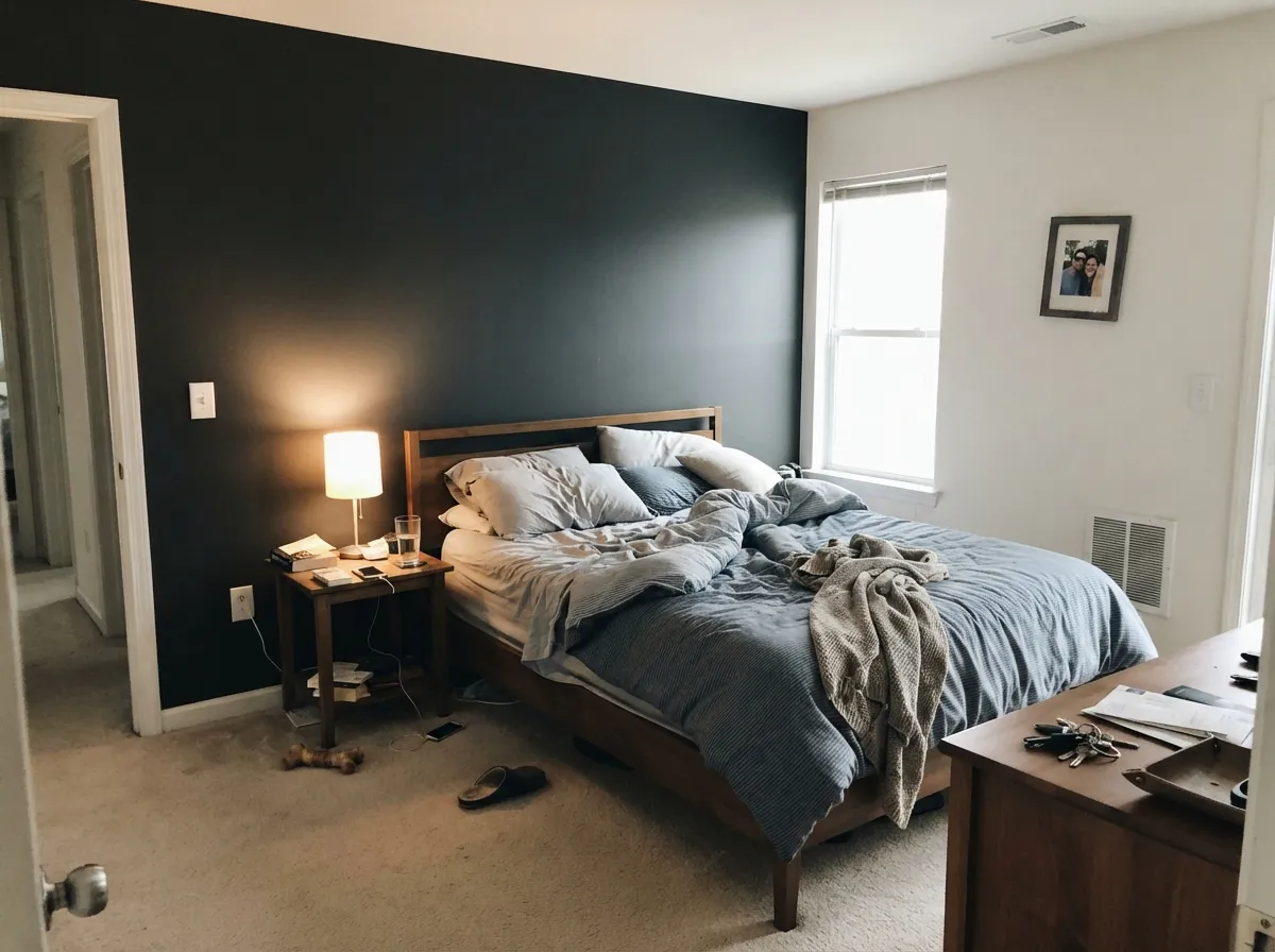
Your Light Is the Risk
Cool weak light kills the charcoal and it reads flat black. Fine on cabinets, heavy on walls.
Strong light lifts it to a real dark charcoal — this is where you see it as a color, not a void.
2700K bulbs soften it into an inky soft black. It genuinely looks better at night.
Sky and lawn bounce straight into it. Expect the shaded side and the sunny side to disagree.
Most complaints about Iron Ore are a light mismatch. Upload a photo of your actual room and see it on your walls — then ask for the same wall in north light or evening lamps before you buy a single sample.
Need It From Another Brand?
Any paint counter can custom-tint Sherwin-Williams SW 7069 directly. If you would rather stay in one brand's own deck, these are the closest stock matches, measured as ΔE2000. Under 2 is a difference you will not see on the wall.
| Brand | Closest color | ΔE | LRV | |
|---|---|---|---|---|
| Behr | Black SuedeS-H-790 · Behr | 0.7 | 6 | Color page → |
| Benjamin Moore | Notre DameCSP-570 · Benjamin Moore | 2.0 | 6 | Color page → |
| Valspar | Arrowhead8006-11F · Valspar | 2.3 | 5 | Color page → |
| PPG / Glidden | OnyxPPG1011-7 · PPG / Glidden | 1.8 | 6 | Color page → |
| Glidden | Deep Onyx00NN 07/000 · Glidden | 1.7 | 7 | Color page → |
| Dutch Boy | Cauldron437-7DB · Dutch Boy | 1.1 | 5 | Color page → |
Similar Sherwin-Williams Colors
The nearest shades to Iron Ore within Sherwin-Williams's own range, ranked by perceptual color distance — useful when you want the same look a touch lighter, darker, or warmer.
WCAG 2.1: AA is 4.5 : 1 for normal text, 3 : 1 for large text, AAA is 7 : 1.
Iron Ore vs the Colors You're Also Considering
Every Iron Ore sample board has the same rivals on it. The numbers show the real lightness gap — then it comes down to which risk you would rather live with.
Pick this when you want black that still shows detail and depth.
Sherwin-Williams SW 6258 · LRV 3Tricorn BlackPick this when you want real black — and to match black windows or a metal roof.
Side-by-side comparison →Pick this for cool, sharp, modern contrast against white trim.
Sherwin-Williams SW 7048 · LRV 8Urbane BronzePick this for a warm, cozy dark that works with wood, stone and rattan.
Side-by-side comparison →Iron Ore is often cross-shopped with Tricorn Black (SW 6258), which has a much lower LRV of 3 and almost no undertone. Tricorn is a true, flat black, while Iron Ore's LRV of 6 and faint cool blue let it read as a soft charcoal-black that shows a little more dimension in daylight. Choose Tricorn for a pure black; choose Iron Ore when you want black that still looks like a color.
Against Urbane Bronze (SW 7048), LRV 8, the difference is temperature. Urbane Bronze is a warm greige-brown that reads much softer and lighter, so it suits cozy interiors, while Iron Ore stays cooler and darker for bold contrast.
Cyberspace (SW 7076), LRV 6, sits at the same darkness but carries a clearer blue lean. Pick Cyberspace when you want a visible navy-charcoal; pick Iron Ore when you want the blue to stay subtle.
Iron Ore Coordinating Colors
Iron Ore's job in a palette is almost always the anchor, so the question is not what matches it — nearly everything does — but what keeps it from feeling cold. Two rules cover most projects. First, favor warm or stormy neutrals over crisp cool grays; a cool gray beside Iron Ore makes both look gray and dreary. Second, be careful with very yellow, cream-heavy whites, because that much yellow next to a near-neutral dark is what starts the green-cast complaints.
These are the partners that come up again and again on real projects:
Iron Ore on Exteriors
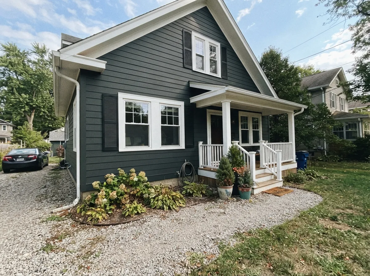
This is the use that made it famous, and it deserves the reputation. On fiber cement lap siding, board and batten, stucco or painted brick, Iron Ore gives a house the weight of black without the hard cutout look a true black produces in full sun. It also handles texture well: shadow lines on batten strips and shake read sharper because there is no glare bouncing off the field.
Two practical decisions matter more than the color. Sheen: flat gives the velvety, expensive look designers photograph, satin gives you something you can actually hose down — on a house you will own for ten years, satin is the safer call, with semi-gloss saved for trim and the door. Exposure: sample big boards and move them around the house. The north elevation will read almost solid black while the sunny west wall lifts and shows its cast, and no amount of arguing changes that. Finally, skip it on vinyl siding entirely — LRV 6 is far under the heat-warp line.
Iron Ore on Cabinets, Islands and Built-Ins
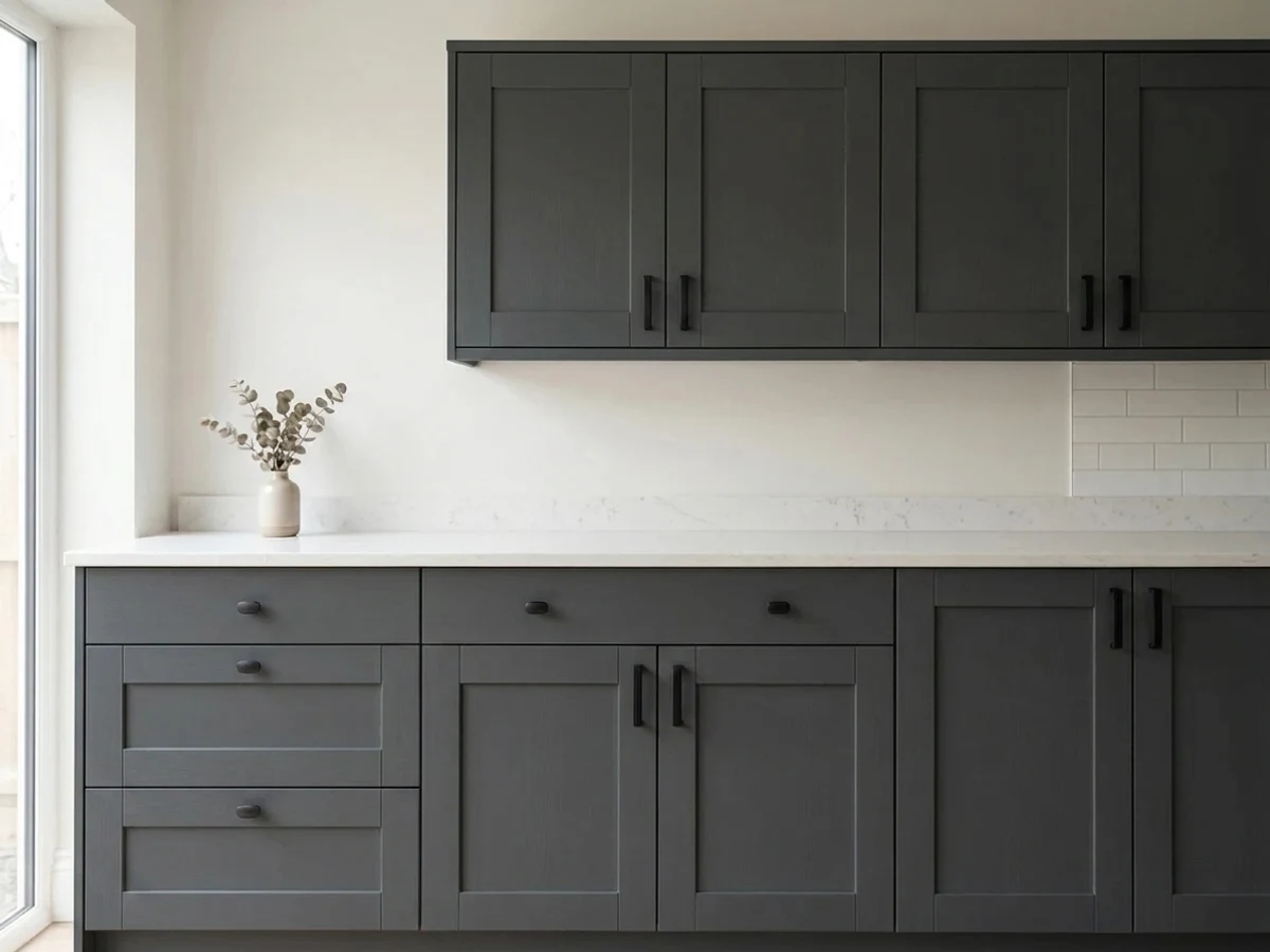
Indoors, Iron Ore earns its keep on shapes rather than walls. An island, a run of lower cabinets, a bathroom vanity, a wall of bookcases — anything with a defined edge that light can catch. Because it is not a true black, the profile of a shaker rail or a bead of molding still shows, which is what keeps painted dark cabinetry from looking like a black rectangle.
Prep decides the result more than the color does. Degrease, sand, and use a bonding primer tinted gray; a dark topcoat over white primer will need an extra coat and still look thin at the edges. Spray if the budget allows, and expect the finished color to look a step darker than the sample chip because cabinet doors sit vertical and shaded rather than flat under a light. Keep counters and walls lighter — a dark island against dark walls loses the whole point.
Three Ready Palettes Built on Iron Ore
A color is never alone on the wall. These are complete combinations in the 60-30-10 pattern, with the reason each one holds together. Every one opens in the visualizer.
Iron Ore takes the 60 percent as the body, Alabaster's warm off-white takes the 30 percent on trim and windows so the contrast softens instead of cutting, and the door is the 10 percent. Pewter Green is dark enough not to shout and earthy enough to warm up Iron Ore's cool side.
Try this palette in your roomThe heavy color sits low where it grounds the room, and Pure White up top keeps the ceiling line light so the kitchen never feels top-heavy. Accessible Beige at LRV 58 puts a warm, mid-tone buffer between the two extremes so the jump from island to upper cabinets is not a slap.
Try this palette in your roomPainting trim and bookcases the same Iron Ore removes every contrast line, so a small study reads as one deep envelope instead of a dark room with pale stripes in it. Alabaster overhead gives the eye somewhere to rest, and Sea Salt in the hall means the door opens onto light rather than another dark wall.
Try this palette in your roomIron Ore FAQ
Will Iron Ore actually look black in my room?
In most rooms, yes — especially at night and in dim or north-facing spaces, where it reads as a soft black. In direct sun or a bright south room you will see the charcoal gray underneath it. If you want it to stay obviously gray, Peppercorn (SW 7674) at LRV 10 is the safer pick.
Why does my Iron Ore look green, or navy?
Because it is only 7 percent saturated, it has almost no color of its own and reflects what is around it. Grass and warm afternoon sun push it toward bronze-green; open sky and cool daylight push it toward navy. Nothing is wrong with the paint — hold the sample against the actual wall, at the actual time of day, before you decide.
Can I paint vinyl siding Iron Ore?
No. Most vinyl siding warranties are void below LRV 25 because dark colors absorb heat and warp the panels, and Iron Ore sits at 6. Sherwin-Williams has a VinylSafe range built for this problem, but Iron Ore at full strength is not part of it. On fiber cement, wood, brick or stucco it is completely fine.
Iron Ore or Tricorn Black for interior doors?
Iron Ore, in almost every case. Interior doors sit in soft light where Tricorn Black (SW 6258) flattens into a silhouette and loses its panel detail. Iron Ore keeps enough reflectance that the molding still reads. Choose Tricorn only when other true blacks are already in the room.
What sheen should I use on Iron Ore cabinets?
Satin, in a urethane-fortified cabinet enamel. Semi-gloss on a near-black shows every dust speck and fingerprint under kitchen lights, and matte on cabinets is impossible to wipe clean. Spray it if you can — brush marks are far more visible in a dark color than a light one.
Can I have Iron Ore color-matched in another brand?
You can, but do not. Matches of very low-saturation darks drift, and people who have done it report the matched version coming out warmer and greener than the original. If you sampled Sherwin-Williams, buy Sherwin-Williams — and keep the same sheen from sample to final coat, because sheen changes how dark it reads.
Does Iron Ore work with black windows?
Only if you want a deliberate two-tone. Factory black frames are truly black, so Iron Ore siding beside them reads a shade lighter and slightly gray. Many people like that layered look; if you wanted one seamless black envelope, use Tricorn Black (SW 6258) on the body instead.
Have you painted with Iron Ore?
Rate it — one tap helps the next reader decide.
Ask a Question