Sherwin-Williams Iron OrevsSherwin-Williams Peppercorn
Why this comparison: Peppercorn is a dark gray, Iron Ore a near-black — depth is the whole decision. Iron Ore and Peppercorn are close but distinct (ΔE 7.37). Visible difference on the wall, especially in flat daylight.

Built from our full reviews of both colors — same measured data, same real-room photos. About the testing process →
The Numbers
Peppercorn is slightly lighter (LRV 10 vs 6, 4-point delta).
What Each Color Really Is
It is a near-black charcoal that is only barely a color at all. Saturation sits at 7 percent — a hair away from pure gray — with the hue at 210 degrees, which is the blue part of the wheel. That means you will almost never look at an Iron Ore wall and think "blue." What you notice instead is what is missing: there is no brown in it. Put it beside a warm charcoal and Iron Ore looks scrubbed clean and a little steely. This is also why people argue about it online — one person swears theirs went green, the next swears theirs went navy. Both are right. A color this close to neutral has almost nothing of its own to show, so it borrows from whatever is bouncing into it: a lawn pushes it green, a bright sky pushes it navy, a warm bulb pushes it soft and inky.
LRV 6 means it reflects about six percent of the light that hits it and absorbs the rest. The useful comparison is Tricorn Black (SW 6258) at LRV 3. Three points sounds like nothing; on a wall it is the whole difference. Tricorn is a flat hole in the room — light goes in and nothing comes back. Iron Ore keeps just enough reflectance that in a sunbeam or under a picture light you can still see it is charcoal, with the edges of trim and panel molding readable instead of dissolved. It is black with dimension left in it, which is exactly why it beat every other black on cabinets and facades.
On paper Peppercorn is a warm charcoal — the base is a soft red-orange — but the saturation is only about 6 percent, which is barely any color at all. That number is the whole story of this paint. There is not enough pigment in it to hold a position, so the room decides. Warm oak floors and 2700K bulbs pull the warmth forward and it looks like a soft, expensive charcoal. Cool tile, gray-washed floors or a creamy white trim next to it push the other way, and that is when people say it flashed purple or went blue-slate on them. It is the single most common complaint about this color, and it is not a mistint — it is a near-neutral doing what near-neutrals do.
At LRV 11 it absorbs most of the light that lands on it. Put it next to Iron Ore (SW 7069, LRV 6) and the difference is obvious and useful: Iron Ore reads as a soft black, Peppercorn still reads as a dark gray. That five-point gap is why people choose it. In a bright room you can see it is gray. In a dim room that gap disappears and both colors look the same — plain black. Daylight is not a nice-to-have with this one, it is the reason to buy it.
Specs Side by Side
| Spec | Iron Ore | Peppercorn |
|---|---|---|
| Brand | Sherwin-Williams | Sherwin-Williams |
| SKU | SW 7069 | SW 7674 |
| Hex | #434341 | #585858 |
| RGB | 67, 67, 65 | 88, 88, 88 |
| LRV | 6 | 10 |
| Undertone | true neutral | true neutral |
| Family | Black | Gray |
How Light Changes Them
Cool weak light kills the charcoal and it reads flat black. Fine on cabinets, heavy on walls.
Strong light lifts it to a real dark charcoal — this is where you see it as a color, not a void.
2700K bulbs soften it into an inky soft black. It genuinely looks better at night.
Sky and lawn bounce straight into it. Expect the shaded side and the sunny side to disagree.
Strong sun lifts the warm base and you actually see charcoal, not black. This is the room to buy it for.
Cool, steady light drains the little warmth it has. Fine in a big north room, heavy and dead in a small one.
2700K bulbs make it warm and cocooning. 4000K LEDs push it cold and slightly blue — change bulbs, not paint.
Backlit walls read near-black while the facing wall reads gray. On dark colors that split is normal, not a bad job.
Both Colors in Real Rooms
Photos from our full reviews — the same rooms and captions, so you can judge each color where it actually lives, not on a chip.
When to Pick Which
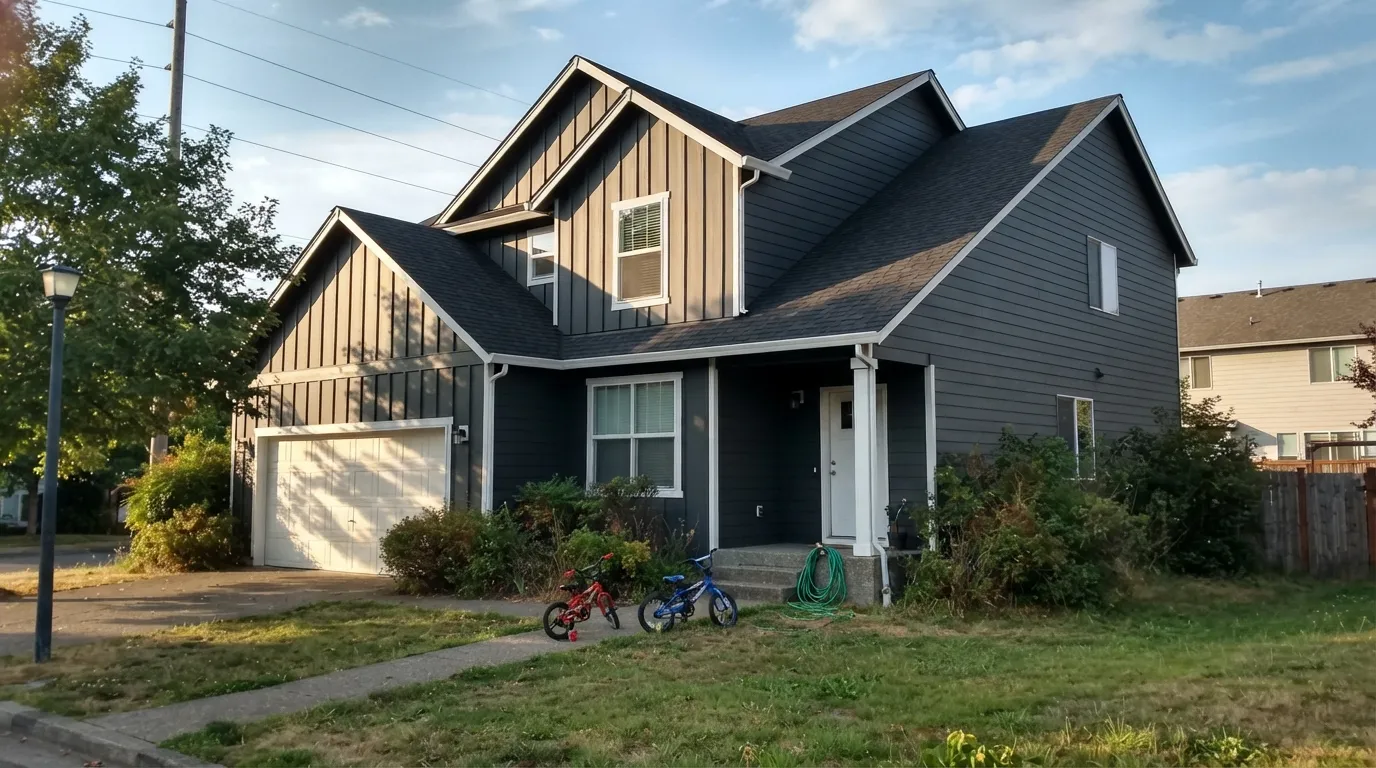
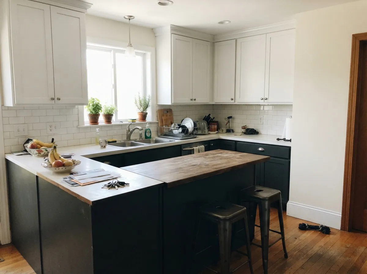
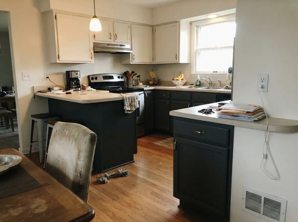
Whole exteriors, siding and shutters · front doors against light siding · kitchen islands, cabinets and built-ins · a study, library or powder room you want to feel enveloping
The room is small, dim and north-facing · your windows, gutters or roof are already true black · you are painting vinyl siding · you actually want a warm, cozy dark
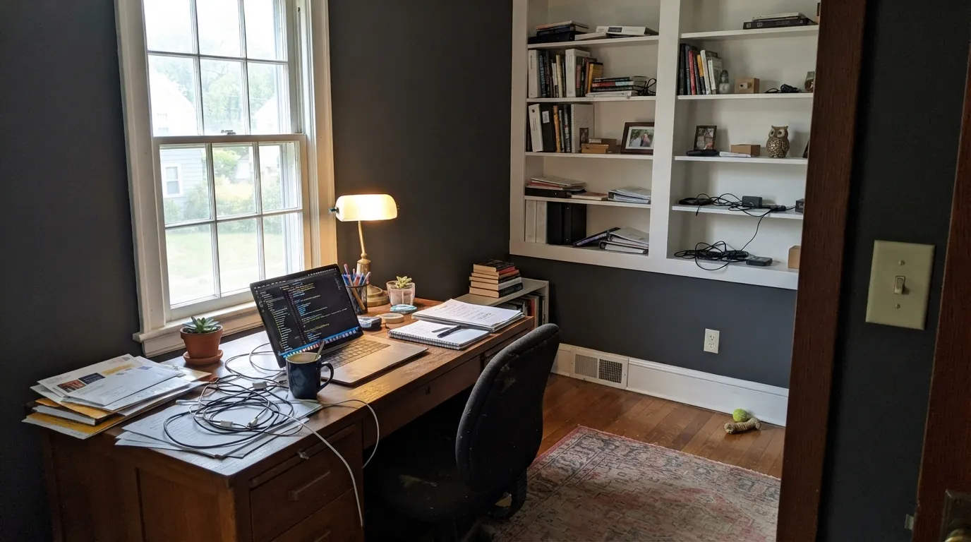
Home offices, studies and built-ins with real daylight · kitchen islands and lower cabinets · exterior body, shutters and front doors · anyone who wants dark without going black
Your room is small, north-facing and dim · your trim is a creamy warm white · your floors are cool gray LVP or blue-gray tile · you want a dark that stays obviously warm
No comparison page can see your light. Upload one photo of your room and try both colors on the same walls, seconds apart.
Iron Ore vs Peppercorn FAQ
Which is lighter, Iron Ore or Peppercorn?
Peppercorn is lighter: LRV 10 vs 6. Peppercorn is slightly lighter (LRV 10 vs 6, 4-point delta).
Which is warmer, Iron Ore or Peppercorn?
They share the same undertone family — both read true neutral. The difference between them is lightness and depth, not temperature.
How similar are Iron Ore and Peppercorn?
Iron Ore and Peppercorn are close but distinct (ΔE 7.37). Visible difference on the wall, especially in flat daylight. The only reliable test is seeing both in your own room and light — a side-by-side on a screen or chip flattens the difference.
Can I use Iron Ore and Peppercorn together in one house?
Yes, in separate rooms. They are close enough to feel related but different enough to notice, so give each its own room and connect them with a shared trim white. Avoid putting them on adjoining walls.
Ask a Question