Room Colors · Shutters
5 Best Shutters Paint Colors for 2026
ideas, combinations, and real rooms
5 curated picks from real shutterss — with the exact colors, honest reasons why, and the combinations that hold the room together.

Former interior stylist who can spot a green undertone from across a room. Jessica writes the color and mood pieces — what to choose, what pairs, and why your "white" looks pink.

Top Picks for the Shutters
Pick a color family, tap a shade to see the shutters in it, then try it on your own room.
Shutters Color Trends 2026 — What's In, What's Out


- Glossy Stock-Vinyl Black — Black shutters aren't going anywhere, but the shiny builder-grade vinyl version reads flat and plastic next to a painted matte or satin finish.
- Cool Mid-Grays — The all-gray exterior era is fading; a medium cool gray shutter now reads dated where a charcoal or warm bronze reads current.
- Undersized Decorative Shutters — Skinny shutters that could never actually cover the window are the most-mocked exterior detail online — size them to the window or skip them.
- White Shutters On White Siding — Without contrast the shutters disappear and the facade goes flat — if the siding is white, the shutters are where the color belongs.
The 5 Best Shutters Paint Colors
Every pick below is a real rendered shutters, not a chip. The lead color first; the swatches are the full scheme in the photo — walls, furniture, textiles, accent.

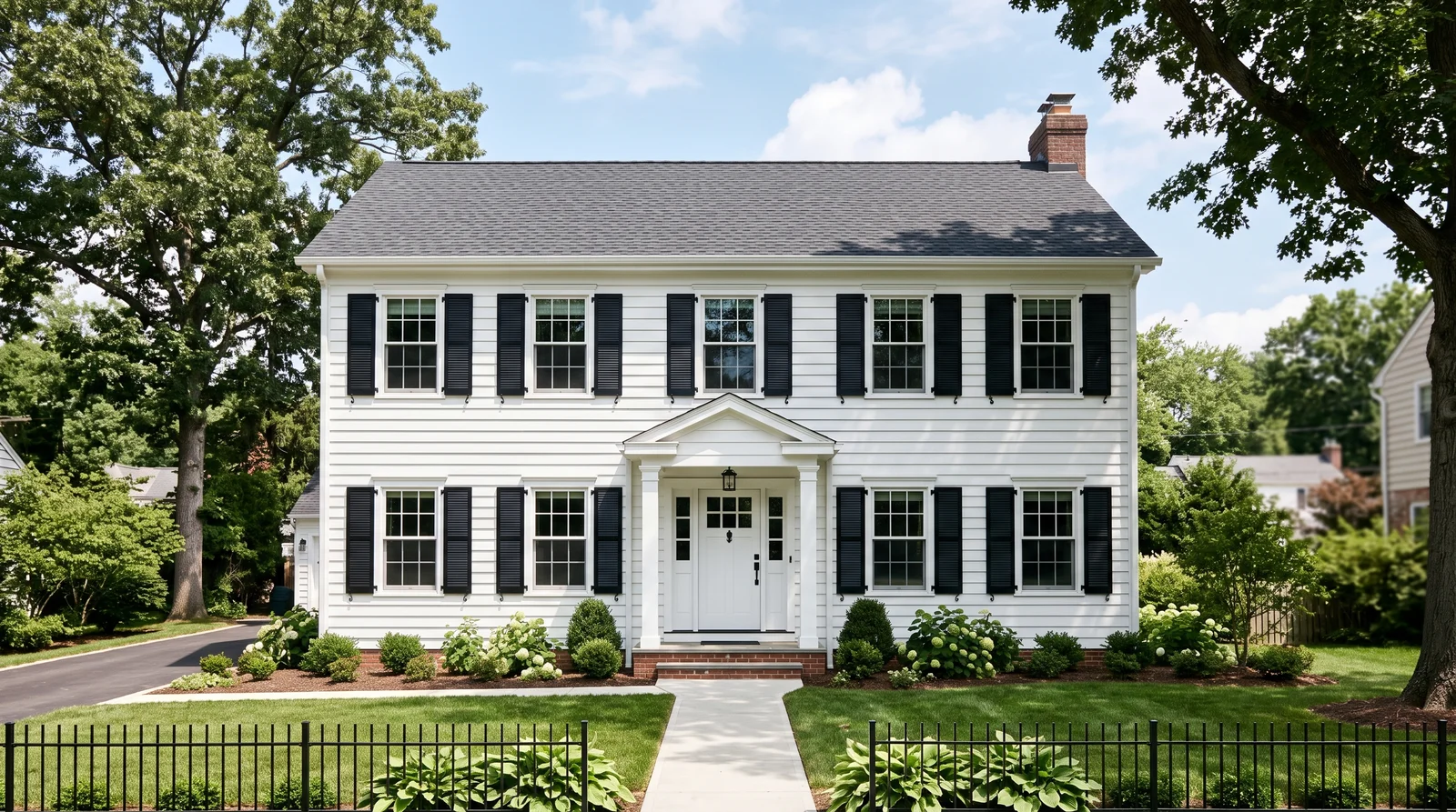
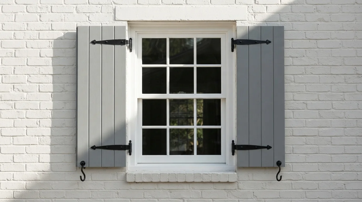
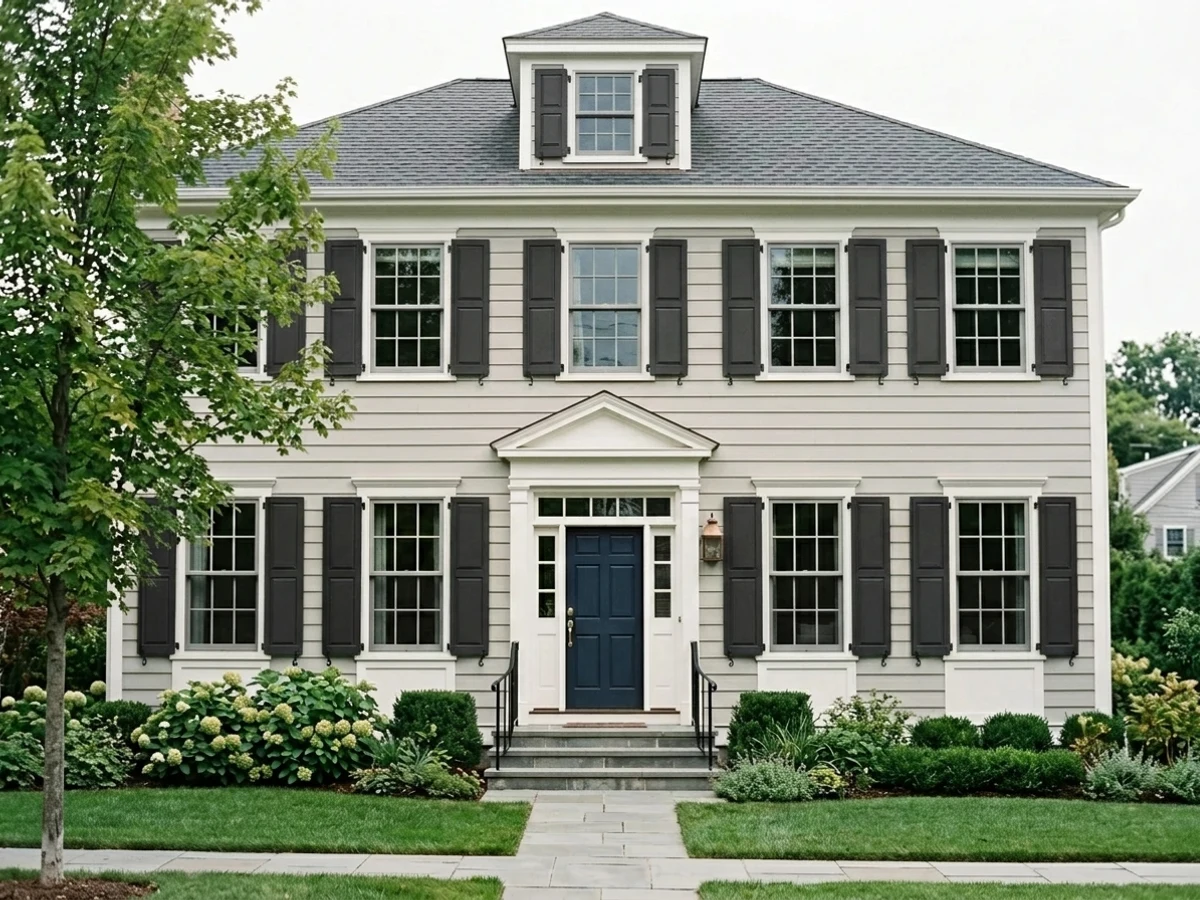
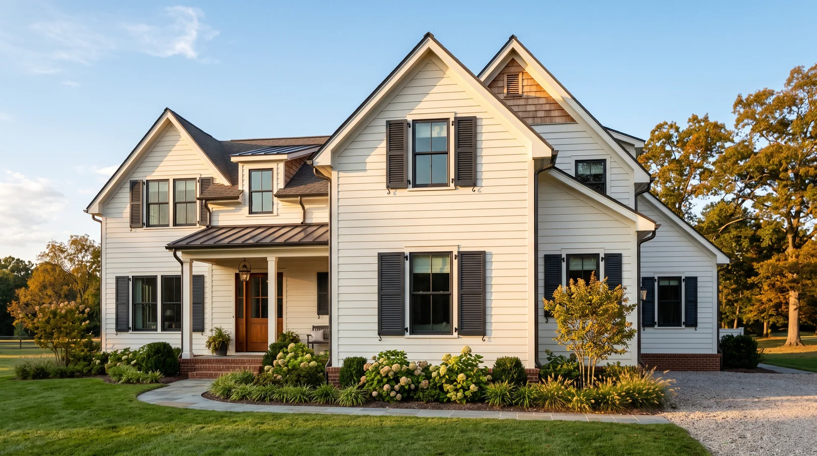
Crisp black shutters on bright white siding — the sharpest contrast a house front can wear, and it looks good in every hour of daylight.
Tricorn Black by Sherwin-Williams (SW 6258, LRV 3) is a true neutral black with no blue or brown drift, which is exactly why it never looks wrong against white siding. The near-zero LRV means the shutters read as clean silhouettes framing every window, so the house looks dressed even with nothing else changed. It pairs with any roof color and any door, which makes it the safe pick when you're not sure. If full sun makes true black feel too severe on your facade, step to Peppercorn (SW 7674) — the charcoal keeps the contrast but loses the ink.
SEE TRICORN BLACK ON YOUR WALLS →
An off-black with a whisper of green-gray that keeps the tailored look but goes easy on the eyes in strong afternoon sun.
Iron Ore by Sherwin-Williams (SW 7069, LRV 6) is black minus the harshness — in daylight it softens toward deep charcoal instead of staying ink-dark, so the shutters feel intentional rather than stamped on. Against a warm white like Alabaster it reads richer than true black does, because both colors carry a little warmth. This is the pick for south- and west-facing fronts where Tricorn Black can look hard and show dust. If your siding is a cool bright white, stay with Tricorn Black instead — Iron Ore's softness can read slightly faded there.
SEE IRON ORE ON YOUR WALLS →
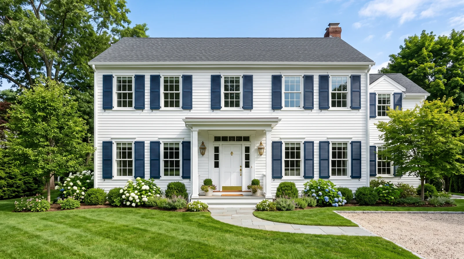
Deep navy shutters that read almost black from the street, then reveal their blue up close — polished, coastal, and friendlier than black.
Hale Navy by Benjamin Moore (HC-154, LRV 8) is the classic move on white siding: from the curb it delivers black-level contrast, but sunlight pulls out a muted navy that feels warmer and more personal. It pairs naturally with white or brass exterior lighting and gives you a built-in front door color — paint the door to match the shutters and the whole facade snaps together. It suits colonials, capes, and coastal-leaning houses best. On beige or tan siding, skip navy and go to Urbane Bronze — blue against beige tends to fight.
SEE HALE NAVY ON YOUR WALLS →
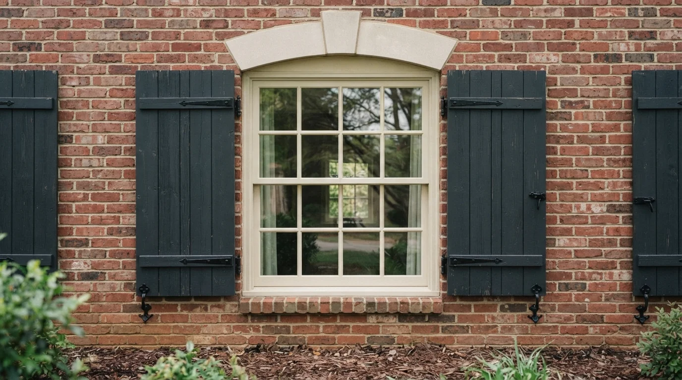
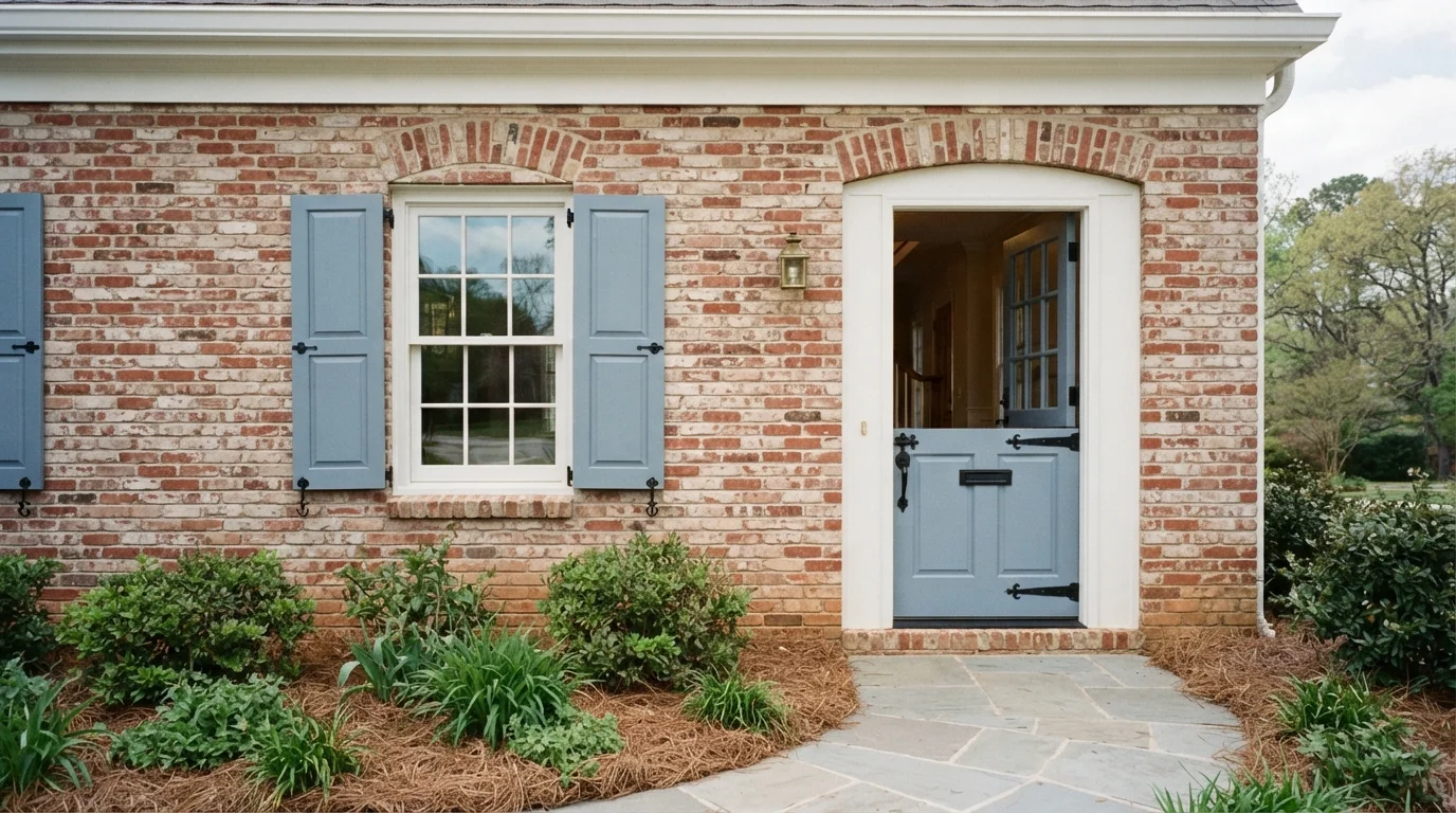
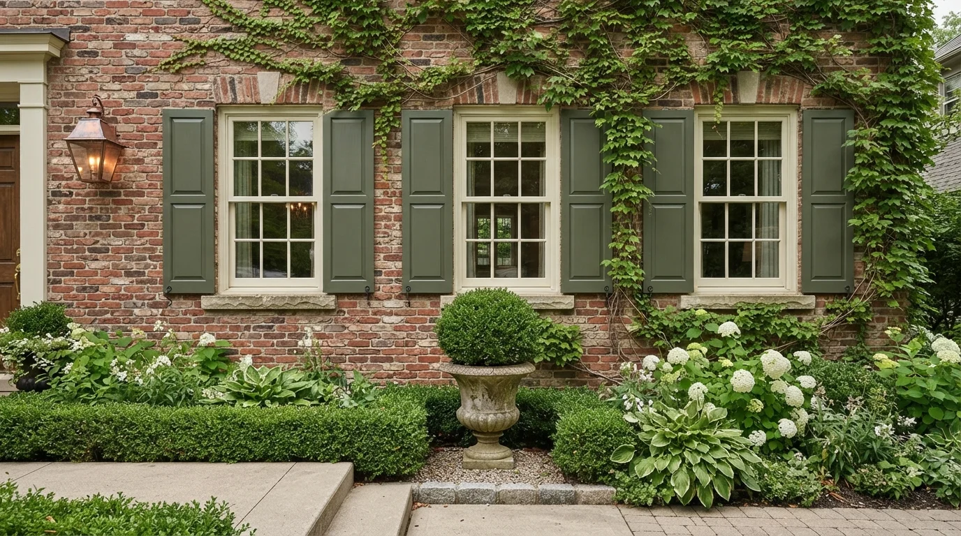
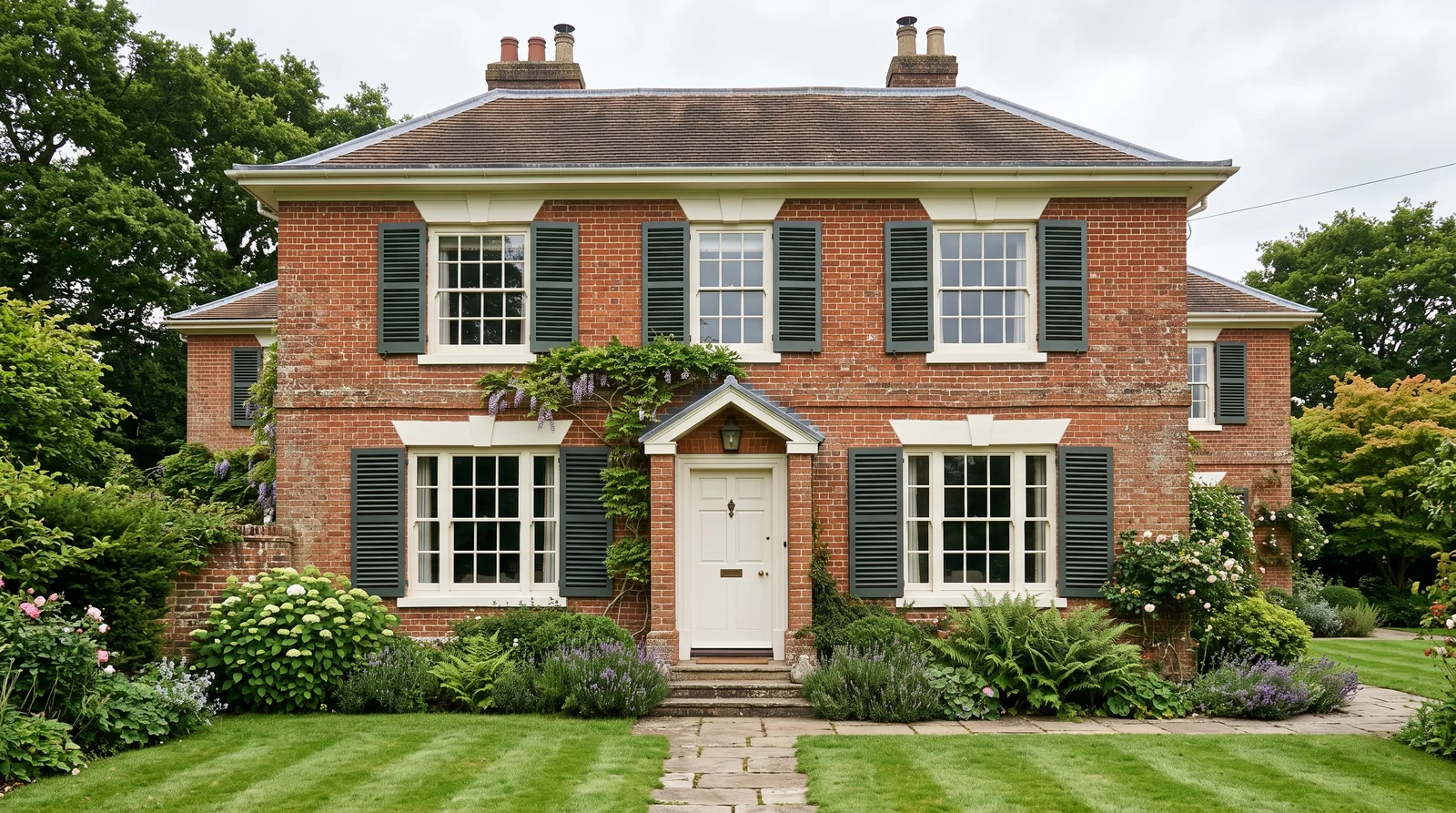
A muted gray-green with colonial roots that makes a brick or cream house look like it has always been there.
Pewter Green by Sherwin-Williams (SW 6208, LRV 12) is the heritage shutter move — deep greens have flanked American windows since colonial times, and this gray-softened version keeps the history without the shine of old hunter green. It is the strongest choice against red brick, where green's natural contrast with red makes both look richer, and it's just as good on cream siding with White Dove trim. At LRV 12 it holds real presence from the street but never goes black at dusk the way darker greens do. If you want more drama, the neighbor move is a near-black green rather than jumping to true black.
SEE PEWTER GREEN ON YOUR WALLS →
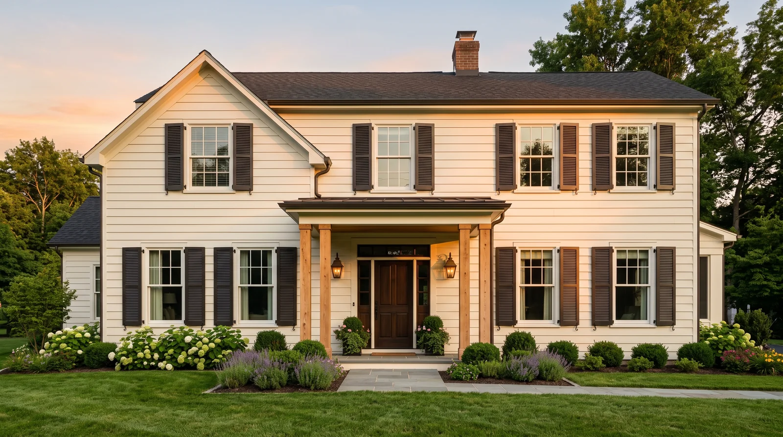
A warm brown-gray that glows like weathered metal in evening light — the modern answer when black feels too cold for a warm-toned house.
Urbane Bronze by Sherwin-Williams (SW 7048, LRV 8) is the shutter color for houses with warm bones — cream siding, tan stone, earth-toned roofs — where black and navy both read cold. Its brown-gray base ties into cedar posts, bronze fixtures, and natural wood doors, so the facade feels composed instead of contrasted. At LRV 8 it delivers the same weight as black from the street while staying friendlier up close. On a crisp cool-white house it loses that advantage; there, Iron Ore keeps the softness without the brown.
SEE URBANE BRONZE ON YOUR WALLS →Shutters Wall Color Combinations
A wall color never works alone. These are the full schemes from the rooms above — the lead color first, then the supporting colors that make the photo work.
Crisp black shutters on bright white siding — the sharpest contrast a house front can wear, and it looks good in every hour of daylight.
TRY THIS PALETTE →An off-black with a whisper of green-gray that keeps the tailored look but goes easy on the eyes in strong afternoon sun.
TRY THIS PALETTE →Deep navy shutters that read almost black from the street, then reveal their blue up close — polished, coastal, and friendlier than black.
TRY THIS PALETTE →A muted gray-green with colonial roots that makes a brick or cream house look like it has always been there.
TRY THIS PALETTE →Shutters do not live alone. They should talk to the front door, the trim, and the roof. The cleanest formula is dark shutters, white or off-white trim, and a door that either matches the shutters or sits one step bolder. Black shutters with a black door and white trim is a no-fail combo.
Do not forget the roof. A gray or charcoal roof loves Charcoal, Gunmetal, or Hale Navy shutters. A brown or weathered-wood roof pairs better with Hunter Green or Oxblood, which carry warmth. Hold your sample board up near the door and against a roof shingle, not just the wall, before you decide.
Shutters Color Ideas by Color
Set on a color family already? Each page has its own real rooms and picks.
Light or Dark Shutters Colors?
Go Light (LRV 60+) If…
The room is small, faces north, or has to work at every hour. Light warm colors make it feel bigger and stay calm in evening light — the light you actually live in.
Go Dark (LRV Under 20) If…
You want the cocoon effect and the room has real daylight. Dark works best on one feature wall — or fully color-drenched in a large room with good windows.
Shutters live in full daylight, so the surrounding wall color matters more than indoor lighting ever would. Against a white or light house, almost any dark shutter pops cleanly. Against brick, tan, or gray walls, you need more contrast or the shutters disappear into the background.
Direct sun also changes how a color reads through the day. Dark colors look richer in shade and can flatten out at midday, while a navy or green can shift cooler in bright noon light and warmer at dusk. Always test a sample board against your actual wall and look at it in morning, midday, and evening before you commit.
LRV, or Light Reflectance Value, runs from 0 (black) to 100 (white) and tells you how dark a color truly is. Almost every great shutter color sits low, usually under 15. Tricorn Black and Hunter Green are near the bottom, which is why they read as solid, grounding anchors against a lighter house.
The number also predicts how the color behaves in sun. Very low-LRV shutters (under 8) can look like flat black from across the street, hiding the navy or green undertone you paid for. If you want people to see that it is navy and not black, aim for a touch higher LRV, like a Hale Navy or Gunmetal, so the color stays readable in daylight.
See It. Love It.
Paint It.
Upload one photo of your shutters and try every color on this page on your own walls — in your own light, before you buy a drop of paint.

Tricorn BlackBeforeThe Best Color Directions for Shutters
Black is the safe, sharp choice. A true near-black like Tricorn Black gives clean contrast against light or brick walls and works on almost every house style. It looks intentional rather than loud, which is exactly what you want on a detail that repeats across the front.
For more personality, deep blue and deep green carry mood without shouting. Hale Navy reads soft and traditional and pairs beautifully with white trim. Hunter Green leans toward older, leafy, established homes. Charcoal and Gunmetal sit between black and gray for people who want depth that feels a little softer and more modern. Oxblood is the bold outlier, a deep brick-red that adds warmth and works well on white or cream houses where you want one rich accent.
Finish and Sheen for Exterior Shutters
Shutters take a beating from sun, rain, and temperature swings, so finish is about durability, not looks alone. Satin is the usual sweet spot. It sheds water, wipes clean, and resists fading better than a flat finish while staying easy on the eyes.
Semi-gloss is the other strong option, especially on smooth or vinyl shutters where you want a crisp, almost furniture-like finish that rinses off with a hose. Skip flat exterior paint here. It holds dirt, chalks faster in sun, and makes dark colors look dull and dusty within a season or two.
Common Mistakes People Make on Shutters
The biggest mistake is choosing a color that vanishes. Dark gray shutters on a gray house, or navy that reads black against a dark brick, kill the whole point of the contrast. Hold the sample against the actual wall, not against white primer or a paint chip in your hand.
The other common errors are practical. People use leftover interior paint, which fails fast outdoors, or they skip primer and proper prep on old wood and vinyl, so the new color peels within a year. And many forget that midday sun washes out very dark colors, so they pick something too dark and end up with shutters that look like black holes. Sample, prep, and use real exterior paint, and the color will hold.
About Shutters Paint Colors
Shutters are small, but they carry a lot of weight on a house. They frame the windows, set the tone of the whole front, and they are one of the cheapest exterior projects that makes a real difference. The right shutter color can make a plain facade look finished and a tired one look fresh.
The colors that almost always work for shutters fall into four directions: black, deep blue, deep green, and gray. These read as classic, not trendy, which matters on a feature you do not want to repaint every few years. Think Tricorn Black for the crisp, timeless look, Hale Navy for warmth with restraint, Hunter Green for an earthy traditional feel, or Charcoal and Gunmetal when you want depth without going fully black.
Every color here is mixed to order. You are not stuck with one brand's deck. If you like a shade from one company but buy from another, any paint store can cross-match it on a tinting machine, so pick the color you love first and sort out the brand second.
The Questions Everyone Asks
What color should I paint my shutters?
If you want one answer, start with the safe picks above — Tricorn Black, Hale Navy, Dark Night, Royal Orchard. They read well in any light and survive furniture changes. Then check the light: strong afternoon sun wants a step cooler, a north-facing room wants a step warmer.
What color should I paint my shutters?
For most houses, you cannot go wrong with black, deep navy, deep green, or charcoal. Black like Tricorn Black is the most universal, navy like Hale Navy adds warmth, Hunter Green suits traditional homes, and Charcoal or Gunmetal give a softer modern look. Match the color to your wall, roof, and door rather than picking in isolation.
Should shutters match the front door?
They can, and matching shutters to the door is a clean, classic look. If you want more interest, keep the shutters and door in the same family but let one be slightly bolder, like navy shutters with a slightly deeper navy door. Just avoid having both compete as loud accents at the same time.
What sheen is best for exterior shutters?
Satin is the go-to for most shutters because it sheds water, wipes clean, and resists fading. Semi-gloss works well on smooth or vinyl shutters if you want a crisper finish. Avoid flat exterior paint, since it holds dirt and dulls quickly in the sun.
Will dark shutters look like plain black from the street?
They can if the color is very dark, with an LRV under about 8. From a distance and in bright sun, a deep navy or green can read as black. If you want the actual color to show, choose one with a slightly higher LRV, like Hale Navy or Gunmetal, and view a sample in daylight first.
Can I match a shutter color from one brand using paint from another?
Yes. Every color shown here is mixed to order, so any paint store can cross-match a shade to their own exterior paint on a tinting machine. Pick the color you love first, then buy whichever brand you prefer or already trust outdoors.
Can I use leftover interior paint on shutters?
No. Interior paint is not built for sun, rain, and temperature swings, and it will fade, chalk, or peel within a season. Use a paint labeled for exterior use, prep and prime the surface properly, and the color will last for years.
What two-color combination works best in a shutters?
The reliable pattern is a quiet main color plus one deep accent on a single wall. Keep trim and ceiling in one warm white so the two colors are the only event in the room — the combination cards above show complete schemes from real rooms.
What colors make a shutters look bigger?
High-LRV, slightly warm colors — LRV 60–75 is the sweet spot. Paint the walls and trim close to the same light color so the corners blur, and keep the ceiling white. Stark cool white actually works against you; it creates hard shadows that show the room's edges.

Ask a Question