Dark Night
Sherwin-Williams' teal-leaning navy reviewed honestly: the kitchen islands and doors where it turns green-black gorgeous, the dim rooms where it just reads flat, and what to pick instead.

Jessica has spec'd whites and neutrals for more than 300 rooms and keeps a sample wall of painted drawdowns in her studio. Every color review is checked against real reader rooms in the comments and re-tested when a formula changes. About the testing process →
- 1Dark Night4
- 2Hidden Gem14
- 3Van Courtland Blue31
The Fast Verdict
Dark Night is Sherwin-Williams' teal-leaning navy — SW 6237, dark enough at LRV 5 to read almost black under a single ceiling fixture, but hand it real daylight or a gallery light and a genuine green-slate undertone comes forward that a straight navy like Naval doesn't have. It has become a default pick for kitchen islands, vanities, and front doors precisely because of that split personality: moody and near-black most of the day, quietly colorful the moment the light cooperates. Buy it for the depth, not for a guaranteed blue.
Kitchen islands and cabinets · powder rooms and vanities · front doors · accent walls with real daylight or accent lighting · anyone who wants more depth than a plain navy
You want a true, uncomplicated navy like Naval · your room has no real light source · you're painting all four walls with no white relief · you want the color to read identically morning and night
- Genuine depth: a navy with a real green-slate undertone, not just a darker blue
- Signature kitchen-island and cabinet color — brass hardware looks custom against it
- Front doors: a confident alternative to a plain navy
- Low LRV hides fingerprints and scuffs on cabinets and doors
- Works as a small-room powder-room or vanity color without feeling like a huge commitment
- Reads flat black in any room without real light — the green-blue nuance disappears
- Surprises buyers expecting a true, uncomplicated navy like Naval
- Needs a white or light partner nearby or a whole room feels like a cave
- Not a whole-house wall color — this is an accent, door, or cabinet color
What Color Is Dark Night, Really?
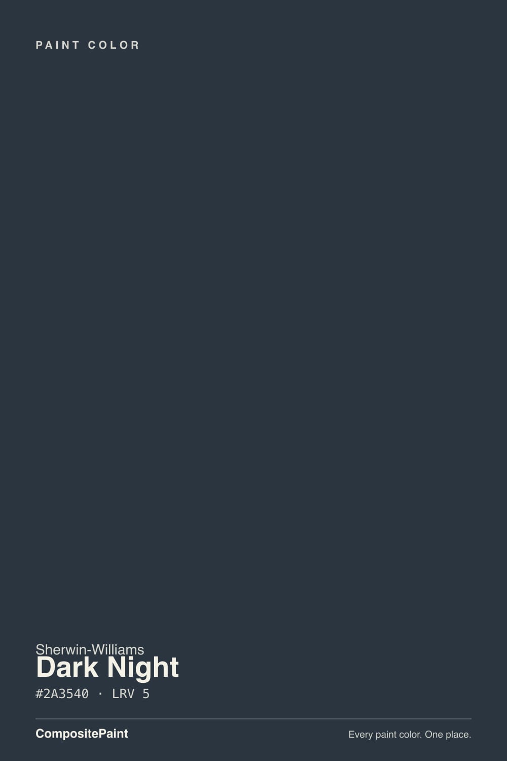
A near-black blue with a genuine green undertone — that's the whole identity, and it's what separates Dark Night from a straight navy. Most "navy" cabinet paints are built on a blue base and stay blue in almost any light; Dark Night carries enough green in the mix that real daylight pulls it toward a dusty teal-slate, and only tightens back up to blue-black once the light drops. Read enough owner photos and you'll see the same color called both "navy" and "teal-charcoal" — both are right, depending on the hour.
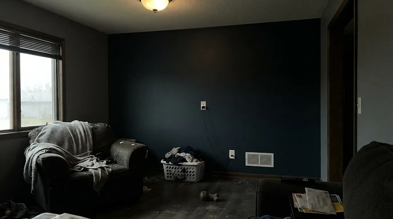
At LRV 5 it is genuinely dark — deeper than Benjamin Moore's Hale Navy (LRV 6), close to Sherwin-Williams' own Naval (LRV 4), noticeably darker than Cyberspace (LRV 7). That depth is why it hides fingerprints and handle marks so well on cabinets and doors, and why it needs deliberate light to do anything but read as near-black. Under one dim ceiling fixture it collapses into the same flat dark as a true black; put a window or a picture light on it and the green-versus-blue argument starts.
Undertone in one line: blue-black with a genuine green-slate undertone — never warm, never purely navy. If your sample looks flat black, that's low light, not a bad batch. If it looks teal or slate-green in a photo, that's honest daylight doing its job.
Where It Shines
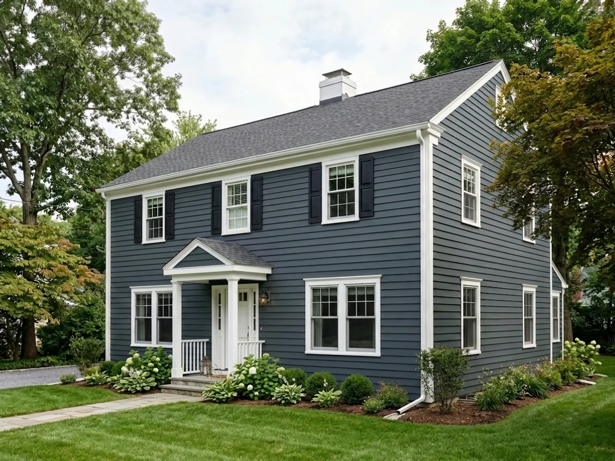
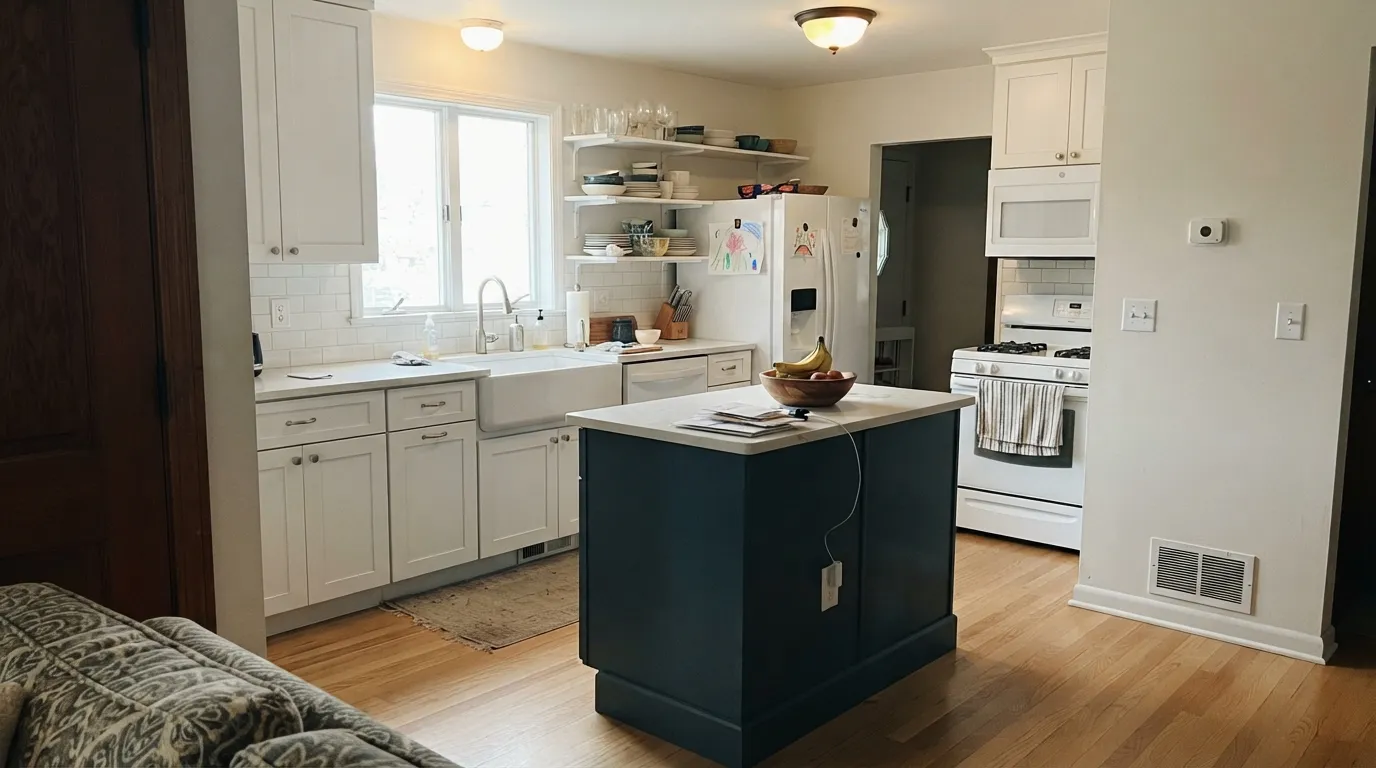
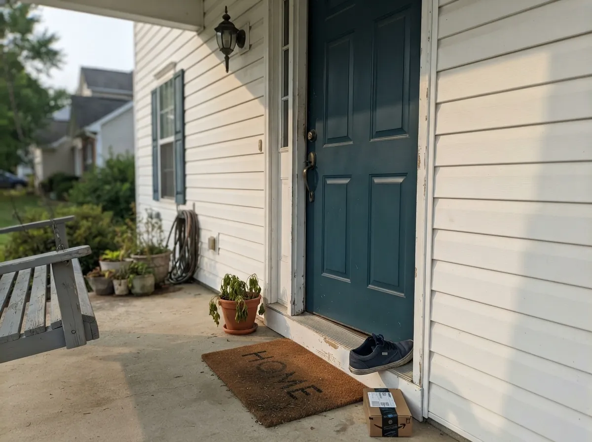
Give it a job with contrast and light and it earns its reputation. Kitchen islands and lower cabinets under white or off-white perimeter cabinets are its signature use — brass or unlacquered-gold hardware makes the green-blue read intentional instead of accidental. Front doors are its other home turf: against a white or warm-greige house it reads as a confident, slightly unusual navy that a plain navy door doesn't quite manage.
Where It Fails
Almost every regret story about Dark Night follows one of three scripts, and all three are predictable before the first coat. None of them are the paint's fault — but if your room matches one, this is not your color, and a bigger sample will only confirm it.
Buyers who pick Dark Night off a swatch expecting Naval's clean blue get a surprise on the wall: the green pulls it toward slate-teal in daylight. If a straight, no-argument navy is the goal, use Naval — Dark Night is for people who want the extra undertone, not people trying to avoid one.
Under one overhead fixture with the blinds closed, Dark Night just reads black — all the depth and green-blue nuance that makes it interesting disappears. It becomes an expensive way to buy a color you can't actually see. Add a lamp, a window, or a picture light, or the paint is wasted.
A whole room drenched in Dark Night without white trim, a white ceiling, or a big window reads more cave than cozy — the low LRV eats light instead of bouncing it back. It wants a partner: white cabinets around the island, white trim around the door, a lighter wall around the accent.
Room by Room
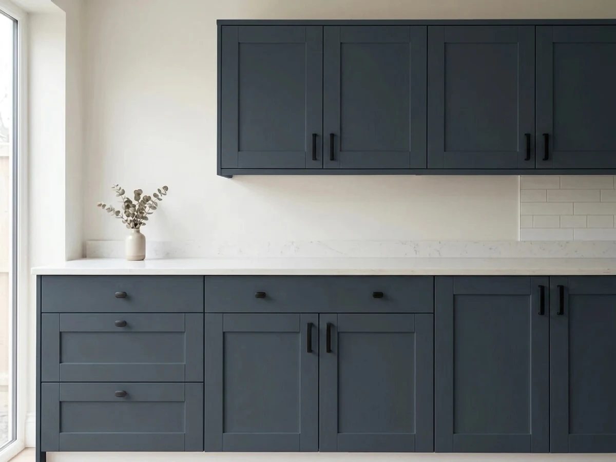
Lower cabinets or a single island in Dark Night under white or off-white uppers is the look people search for by name. Brass or matte-gold pulls read expensive against it; stainless is fine but flatter. Satin cabinet enamel hides handle marks better than a lighter color would.
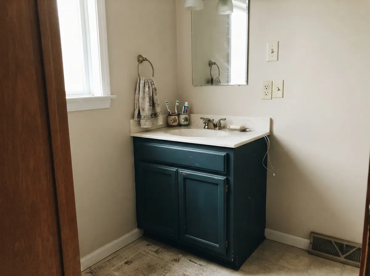
A vanity in Dark Night under a white or marble-look counter, or a fully drenched small powder room, is the other place this color shows up constantly in portfolios. Small rooms take the depth well; the low LRV isn't a problem when there's only one wall's worth of it.
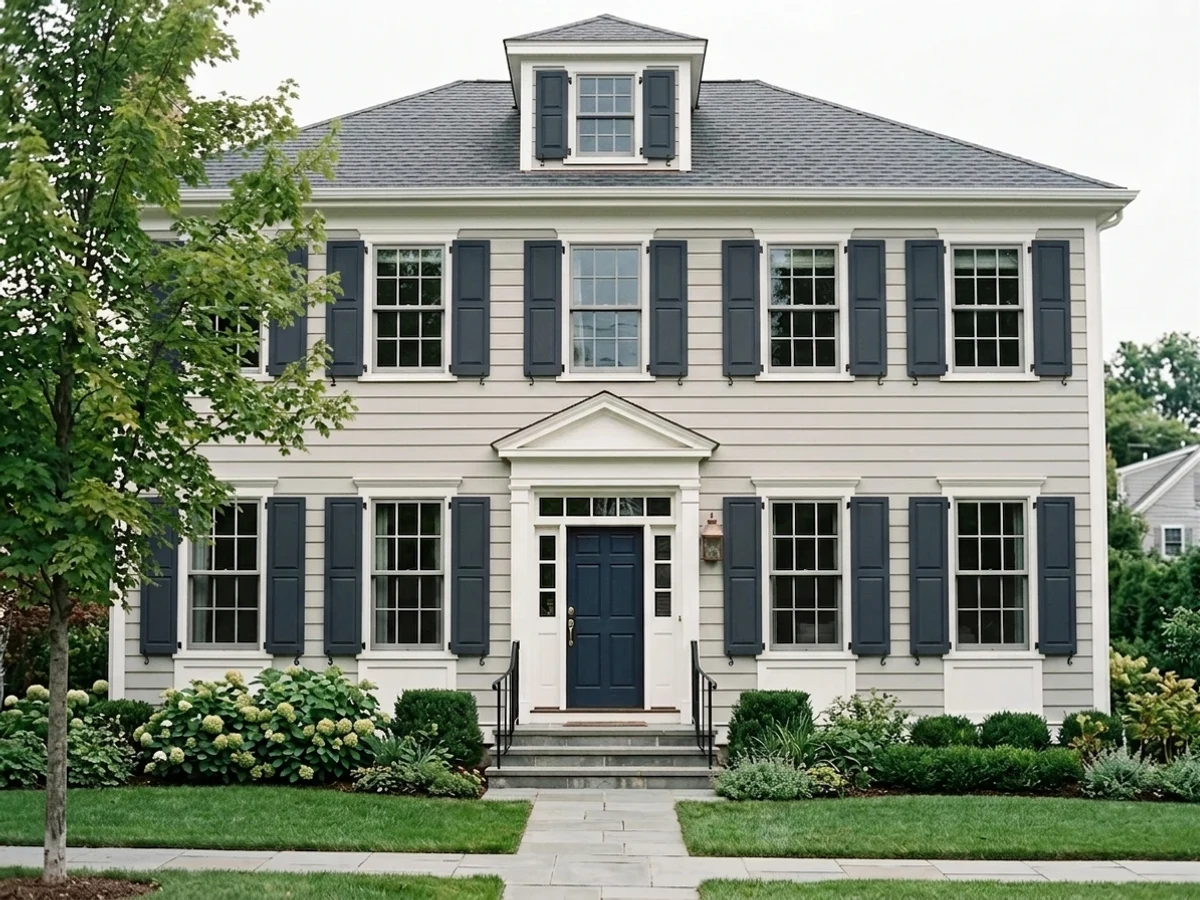
Against white, cream or warm-greige siding it reads as a smarter, slightly unusual navy — the green keeps it from looking like every other navy door on the block. Semi-gloss or gloss exterior enamel; brass or black hardware both work.
A single accent wall or a fireplace surround works if the room has a window nearby or planned accent lighting. Skip it as the only light source in a dim room — it will just look black, and the reason you picked this over a true black is wasted.
Task lighting and a lamp turn it moody and focused rather than gloomy; walnut shelving and leather chairs are its natural company, the same pairing that flatters most near-black colors.
This is an accent, cabinet, and door color, not a whole-house wall color. Four walls of Dark Night with no white relief reads heavy in almost any room; save it for the one surface that can carry it — an island, a door, a vanity, a single wall.
Your Light Is the Risk
Direct or strong indirect daylight is when the green-slate undertone actually shows — the color looks alive, not just dark.
Under one overhead fixture with the blinds shut it just reads flat black — the whole reason to pick this over a true black disappears.
Slightly more blue in cool morning light, sinks toward true black-navy as the sun goes down and the room dims.
2700K lamps keep it a soft midnight blue-black. Cool white LEDs flatten it toward gray-black — use warm bulbs if you want it to still read as color at night.
Most complaints about Dark Night are a light mismatch. Upload a photo of your actual room and see it on your walls — then ask for the same wall in north light or evening lamps before you buy a single sample.
Need It From Another Brand?
Any paint counter can custom-tint Sherwin-Williams SW 6237 directly. If you would rather stay in one brand's own deck, these are the closest stock matches, measured as ΔE2000. Under 2 is a difference you will not see on the wall.
| Brand | Closest color | ΔE | LRV | |
|---|---|---|---|---|
| Behr | Night Shade740F-7 · Behr | 0.7 | 4 | Color page → |
| Valspar | Pitch Cobalt5010-2 · Valspar | 3.8 | 3.8 | Color page → |
| Dutch Boy | Spirited Navy333-7DB · Dutch Boy | 0.0 | 4 | Color page → |
| HGTV Home by Sherwin-Williams | Dark NightHGSW 3331 · HGTV Home by Sherwin-Williams | 0.0 | 4 | Color page → |
| Portola Paints | Ghost TreeGHOST TREE · Portola Paints | 1.6 | 4 | Color page → |
Similar Sherwin-Williams Colors
The nearest shades to Dark Night within Sherwin-Williams's own range, ranked by perceptual color distance — useful when you want the same look a touch lighter, darker, or warmer.
WCAG 2.1: AA is 4.5 : 1 for normal text, 3 : 1 for large text, AAA is 7 : 1.
Dark Night vs the Colors You're Also Considering
Every Dark Night sample board has the same rivals on it. The numbers show the real lightness gap — then it comes down to which risk you would rather live with.
Pick this if you want more depth and a teal edge that a plain navy room doesn't get.
Sherwin-Williams SW 6244 · LRV 4NavalPick this if you want a true, saturated navy blue with no green pulling at it.
Pick this for more blue-green presence when the room actually has light to give it.
Sherwin-Williams SW 7964 · LRV 7CyberspacePick this if you want it grayer and flatter — Cyberspace reads charcoal-navy with almost no green.
Within the Sherwin-Williams deck the nearest relative is Anchors Aweigh (SW 9179), hex #2B3441 at LRV 3. It is almost the same color and slightly darker. In the Navy (SW 9178), #283849 at LRV 4, is more clearly blue and less gray, which is the one to pick if you want the navy to be obvious. Inkwell (SW 6992), #31363A at LRV 4, and Black of Night (SW 6993), #323639 at LRV 4, drop most of the blue and read as true near-blacks. After the Storm (SW 9685), #2A3037 at LRV 3, is darker and cooler still.
Across brands the closest options are Behr Sorcerer (760F-7) at LRV 4 and Valspar Pitch Cobalt (5010-2) at LRV 3.8, both with a deltaE of 2.39, which makes them very close but worth sampling first. Portola Paints Ghost Tree at 4.55 and Rodda Midnight (CA210) at 4.8 are close but visibly different side by side.
Dark Night Coordinating Colors
The rule for coordinating with Dark Night is contrast: it wants a clean or warm white nearby to bounce light back, and it wants brass or matte-gold hardware more than it wants chrome. These are the partners that keep showing up wherever this color works:
Dark Night on Kitchen Islands and Cabinets
This is the use that made the color's reputation. Two-tone kitchens — white or off-white perimeter cabinets, one dark island — need an island color with enough presence to anchor the room without going flat, and Dark Night's green-slate undertone gives it more life than a plain black or a plain navy would under the same pendant lights.
The finish matters as much as the color: a satin, urethane-fortified cabinet enamel is what keeps handle marks and daily fingerprints from showing on a color this dark. Brass, unlacquered brass, and matte gold hardware all read expensive against it; polished chrome is the one pairing that looks cold instead of warm.
Dark Night vs. Naval vs. Cyberspace
These three near-black Sherwin-Williams blues get confused constantly, and the difference is undertone, not just depth. Naval is the reference navy — saturated, clearly blue, and honest about it in almost any light. Cyberspace sits a step lighter (LRV 7) and reads gray-forward, closer to charcoal than to blue unless the room is genuinely bright.
Dark Night sits between them in a different direction: it's as dark as Naval but carries a real green-slate undertone Naval doesn't have, which is what gives it a teal cast in daylight instead of Naval's straight blue. If undertone-free navy is the goal, use Naval. If a little more gray and a little less commitment is the goal, use Cyberspace. Dark Night is for the room that can give it good light and wants the extra depth.
Three Ready Palettes Built on Dark Night
A color is never alone on the wall. These are complete combinations in the 60-30-10 pattern, with the reason each one holds together. Every one opens in the visualizer.
Pure White cabinets keep the kitchen bright while the island carries all the color; Alabaster walls stay warm enough not to fight the green in Dark Night's undertone. Brass hardware on the island is the finishing touch.
Try this palette in your roomAgreeable Gray keeps the rest of the room easy and warm-neutral, so the one Dark Night wall reads as a deliberate deep note rather than a whole dark room. Extra White trim gives the eye a bright edge to land on, which matters when the accent color sits this close to black.
Try this palette in your roomWhite Dove keeps the house warm and classic, Iron Ore shutters add one crisp near-black note, and the Dark Night door sits close enough in depth to Iron Ore that it reads intentional, not random — with just enough green to keep it from being a plain navy door like every other house on the street.
Try this palette in your roomDark Night FAQ
Is Dark Night blue or green?
Both, depending on the light. It's built as a blue-black with a genuine green-slate undertone — in real daylight the green comes forward and it reads teal-navy; under one dim bulb it just reads black. Nobody who has painted it argues it's a plain navy.
Is it good for kitchen cabinets?
One of its best jobs. Lower cabinets or an island in Dark Night under white or off-white uppers is one of the most-photographed uses of this color, and the low LRV hides fingerprints and handle marks that a lighter color would show. Use a satin cabinet enamel.
What's the difference between Dark Night and Naval?
Naval (SW 6244, LRV 4) is a straight, saturated navy that stays blue in almost any light. Dark Night carries a green undertone Naval doesn't have, so it drifts toward slate-teal in daylight and only tightens to blue-black in dim rooms. Pick Naval if you want zero undertone surprises; pick Dark Night if the extra depth is the point.
Does it work on a front door?
Yes — it's a popular front-door color against white, cream, or warm-greige siding, where the green keeps it from reading as just another navy door. Use a semi-gloss or gloss exterior enamel and expect it to look closer to black on an overcast day, more blue-teal in full sun.
Can I paint a whole room in it?
You can, but it isn't the color's best use. Without a real light source and a white trim or ceiling to bounce light back, four walls of Dark Night reads heavy and cave-like. It performs best as one wall, a door, cabinets, or a vanity — a surface with a light neighbor nearby.
What trim color goes with Dark Night?
A clean white — Extra White or Pure White — gives the strongest possible contrast and lets the green undertone read as intentional. A warmer white like White Dove softens the edge slightly and works well on an exterior door surround.
Have you painted with Dark Night?
Rate it — one tap helps the next reader decide.
Ask a Question