Night Watch
Sherwin-Williams' near-black door-and-cabinet color, reviewed honestly: the light that reveals its green, the rooms where it just reads flat black, and what to pick instead.

Jessica has spec'd whites and neutrals for more than 300 rooms and keeps a sample wall of painted drawdowns in her studio. Every color review is checked against real reader rooms in the comments and re-tested when a formula changes. About the testing process →
- 1Night Watch4
- 2Oyster Catch9
The Fast Verdict
Night Watch is Sherwin-Williams' proof that a near-black door doesn't have to be flatly black. At LRV 4 it reads as dark as anything in the deck, and in most everyday light it will pass for plain black — but let direct sun or a raking pendant light hit it and a cool green-teal undercurrent quietly shows itself. It is not a color for four windowless walls; it is a door, an island, a small drenched room, one accent wall — a dose, not a whole house.
Front doors and exterior shutters · kitchen islands and cabinets · powder rooms and other small drenched spaces · a home office or den with real light · a single accent wall
You want zero color ambiguity and just mean black · the room has no real light source · your kitchen runs all-white and stainless · you're covering four full walls of a windowless room
- Reads as a real color, not flat black, wherever direct light reaches it
- Genuinely excellent on doors, islands, and cabinets
- Hides scuffs and fingerprints on high-touch surfaces at LRV 4
- Pairs beautifully with brass hardware and warm wood tones
- More personality than a true black without losing black's crispness
- In most everyday light it simply reads as plain black
- Goes flat and oppressive across four walls with no real light source
- Can read cold next to all-white, stainless-heavy kitchens
- Dark saturated colors show lap marks and flashing if not rolled evenly
What Color Is Night Watch, Really?
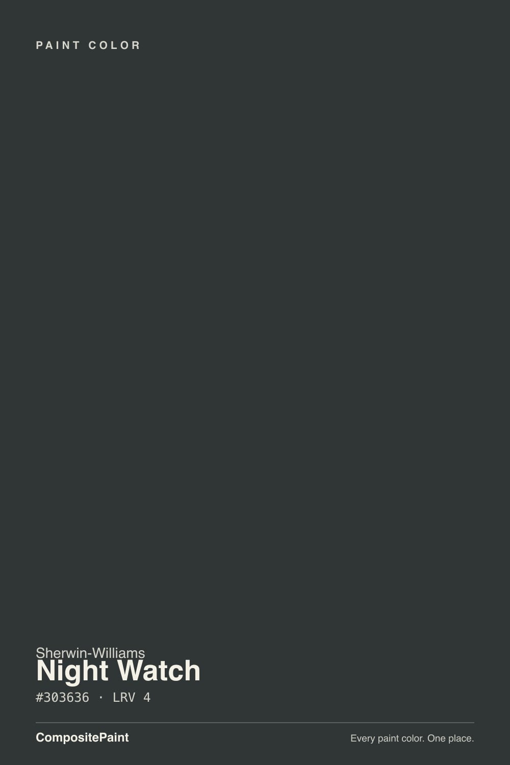
A near-black with a cool cast — RGB 48/54/54, which is a small but real gap between the red channel and the green/blue channels. That six-point difference is the whole story: it is not enough to read as an obvious color on a shaded wall, but it is enough that Sherwin-Williams itself files Night Watch under green paint colors rather than black or gray. The name fits — a deep, watchful color that sits between charcoal and forest at the same time.
At LRV 4 it is genuinely near-black, in the same depth range as Tricorn Black (LRV 3) and Black Magic (LRV 3). That low reflectance is why most rooms will simply read it as black: on a dim wall, in overcast light, from across a room, the green-teal undercurrent has nothing to bounce off and disappears. It only comes forward where light actually hits the surface directly — full sun on an exterior door, a pendant light raking across a lacquered island, a phone flash in a photo.
Undertone in one line: a cool green-teal base, grayed down until it reads almost neutral — never a true, flat black, never an obviously green-black like Essex Green. If your sample looks like plain black, that is the honest read in low light; if it shows green or teal, that is the correct read in strong direct light, and both are the same paint being consistent.
Where It Shines
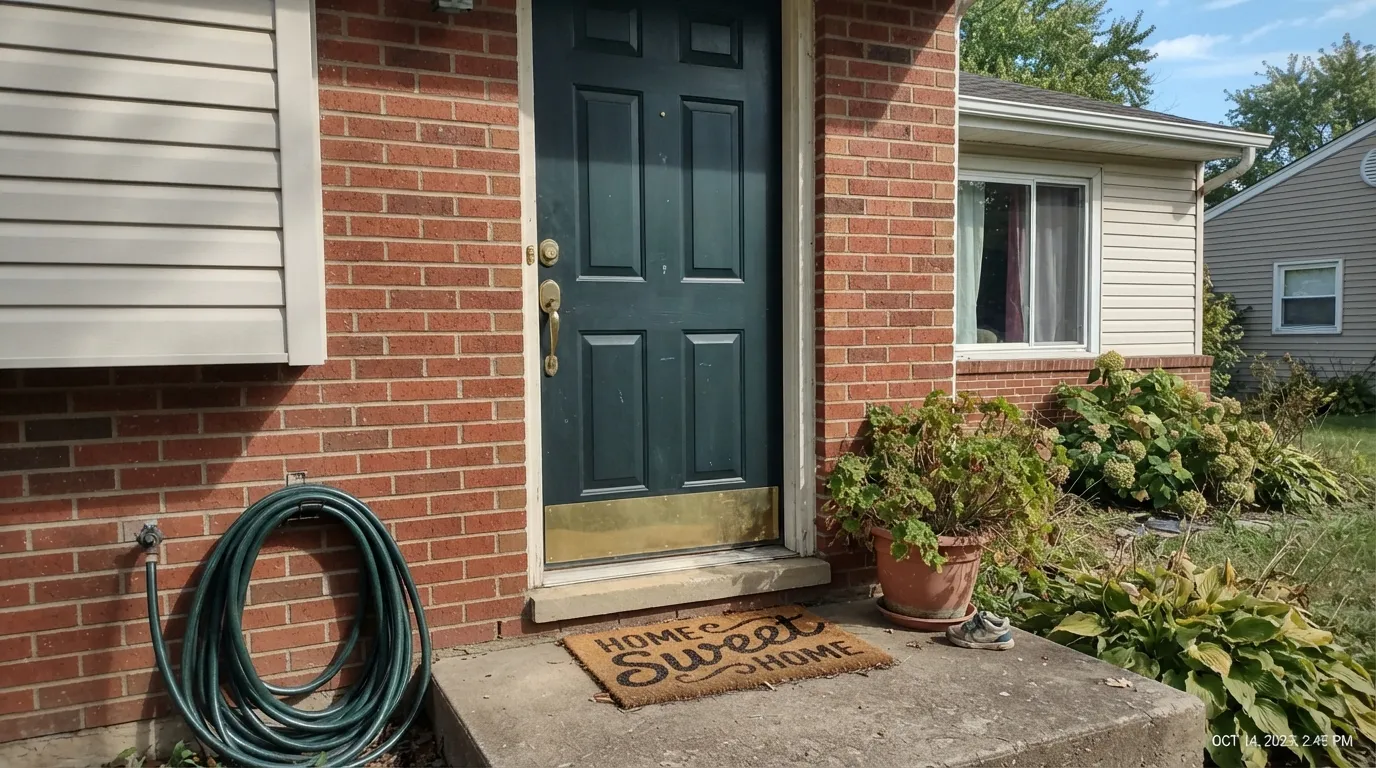
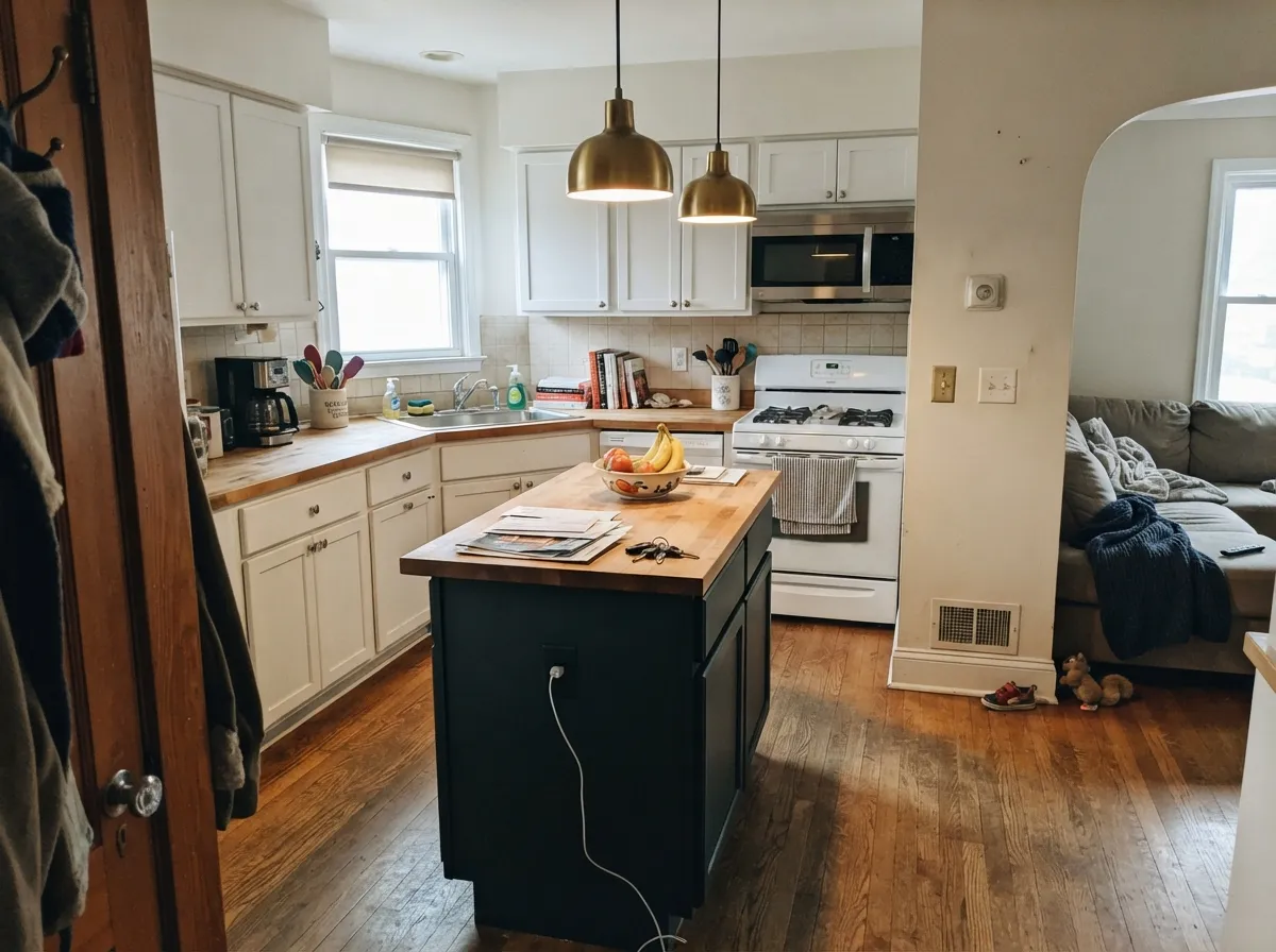
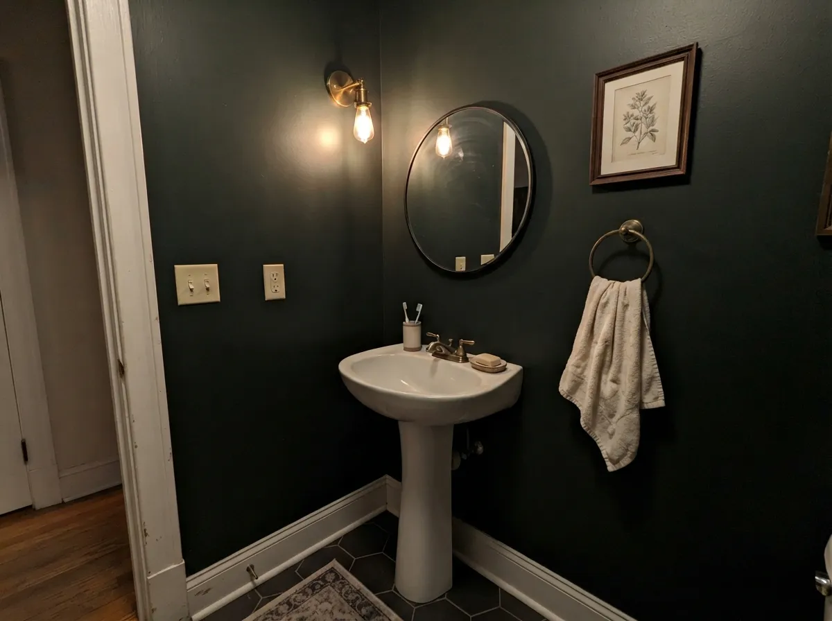
This color earns its keep in small, high-contrast doses, not full rooms. A front door in full sun, a kitchen island under warm pendant light, a powder room drenched floor to ceiling with brass fixtures — anywhere the light is direct and there's a lighter surface nearby for it to sit against. In those settings the green-teal reads as a deliberate, more interesting choice than plain black, without ever looking like a bold color decision from across the yard or across the kitchen.
Where It Fails
Almost every letdown with Night Watch traces back to one of three mismatches, and all three are predictable before the first coat. None of them are the paint's fault — but if your room or your expectations match one of these, this is not your color.
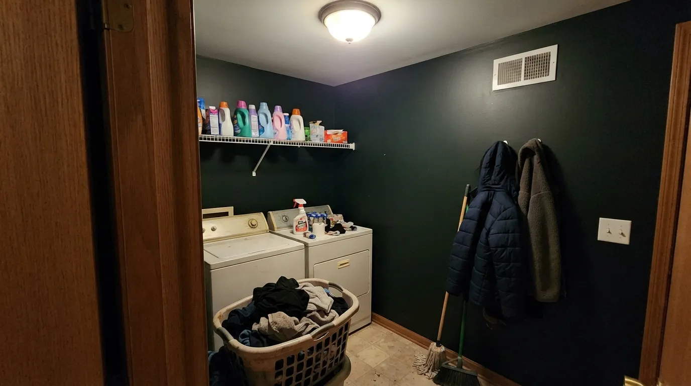
Put it on every wall of a windowless hallway, laundry room, or interior powder room with no fixture doing real work, and the green-teal has nothing to reflect off. It reads as plain, flat, oppressive black — which some buyers want and most don't expect. Give the room a real light source or keep this one to a door, an island, or one accent wall.
In most everyday light Night Watch is convincing black, which is exactly the problem for buyers who wanted zero ambiguity. Someone eventually points out the green in strong sun or a bright photo, and if that surprises you, you picked the wrong near-black. Tricorn Black or Black Magic won't do this to you.
Against icy white quartz, chrome hardware and cool white cabinetry, the cool teal in Night Watch can read heavy and a little cold rather than moody. It wants company: unlacquered brass or matte black hardware, and a warm wood tone nearby, to keep the contrast feeling deliberate instead of stark.
Room by Room
Full sun brings the green-teal forward against most siding colors, and it reads as a far more interesting choice than plain black without sacrificing any of black's crispness. Pair with brass hardware and a warm-toned body color; semi-gloss or gloss exterior enamel.
A near-black island under white or light-neutral perimeter cabinets is the classic move, and Night Watch's undertone keeps it from feeling like a plain black hole in the room. Satin or semi-gloss cabinet enamel; pendant lighting overhead does the work of showing off the color.
Small rooms take deep, saturated color well, and a powder room drenched in Night Watch with a crisp white trim and brass sconce reads custom and expensive. Give it a real light fixture — this is the one room where skipping natural light is fine, as long as the fixture is doing the job.
On one wall or as trim around built-ins, it grounds a room full of walnut shelving and leather without swallowing the space, provided the room has a window or a lamp doing real work. In a windowless interior office, it goes flat.
A single accent wall behind a sofa or media console, with the rest of the room in a lighter neutral, lets the color read as intentional. All four walls in this depth asks a lot of a living room's typical lighting.
As a body color across an entire house, this depth reads heavy and can look like unfinished primer from the street in flat light. It is built to be the door, the shutters, or the trim — not the siding.
Your Light Is the Risk
Full sun on an exterior door or a pendant light angled across a lacquered island is where the green-teal actually shows. This is the light the color depends on.
In a windowless room with a single flat overhead fixture, the color has nothing to reflect off and reads as plain, dense black. Fine if that's the goal; disappointing if you paid for the green.
On a gray day it is unremarkable near-black. Under harsh midday sun the teal-green comes through clearly — the biggest swing this color makes.
2700K warm bulbs push it toward a warm, brownish near-black. Cool LEDs bring the blue-green out more — closer to the color's true identity, but colder in feel.
Most complaints about Night Watch are a light mismatch. Upload a photo of your actual room and see it on your walls — then ask for the same wall in north light or evening lamps before you buy a single sample.
Need It From Another Brand?
Any paint counter can custom-tint Sherwin-Williams SW 9680 directly. If you would rather stay in one brand's own deck, these are the closest stock matches, measured as ΔE2000. Under 2 is a difference you will not see on the wall.
| Brand | Closest color | ΔE | LRV | |
|---|---|---|---|---|
| Behr | Spade BlackBNC-38 · Behr | 3.3 | 3 | Color page → |
| Benjamin Moore | Black Knight2136-10 · Benjamin Moore | 1.0 | 5 | Color page → |
| Valspar | Forest Canopy5010-1 · Valspar | 1.9 | 3.7 | Color page → |
| PPG / Glidden | Starless SkyPPG0995-7 · PPG / Glidden | 4.0 | 5 | Color page → |
| Dutch Boy | Graduation Cap429-7DB · Dutch Boy | 4.6 | 4 | Color page → |
| HGTV Home by Sherwin-Williams | JasperHGSW 3291 · HGTV Home by Sherwin-Williams | 3.6 | 4 | Color page → |
Similar Sherwin-Williams Colors
The nearest shades to Night Watch within Sherwin-Williams's own range, ranked by perceptual color distance — useful when you want the same look a touch lighter, darker, or warmer.
WCAG 2.1: AA is 4.5 : 1 for normal text, 3 : 1 for large text, AAA is 7 : 1.
Night Watch vs the Colors You're Also Considering
Every Night Watch sample board has the same rivals on it. The numbers show the real lightness gap — then it comes down to which risk you would rather live with.
Pick this when you want that same near-black weight with a quieter, cooler personality underneath.
Sherwin-Williams SW 7069 · LRV 6Iron OrePick this if you want a true black-gray with no green cast anywhere, in any light.
Pick this when you want the color to stay a secret until the light asks for it.
Benjamin Moore PM-22 · LRV 4Essex GreenPick this for an unmistakably, obviously green near-black — Essex Green shows its color far more readily.
Night Watch Coordinating Colors
Night Watch works as an accent, not a backdrop, so its best partners are lighter neutrals that give it somewhere to stand against and something to reflect for. Warm whites and soft greiges are the safest bet; other near-blacks make for a good tonal contrast when you want two dark surfaces (a door and shutters, say) that still read as slightly different colors up close.
The Near-Black-With-Personality Trend
Plain black doors and islands had their moment, and the next wave of dark colors is this one: near-blacks that carry a real undertone underneath, so they read as a deliberate color choice rather than an absence of one. Iron Ore, Tricorn Black and Black Fox are all part of that shelf at Sherwin-Williams; Night Watch is the deck's entry with a cool green-teal identity instead of a warm or neutral one.
That undertone is also why Sherwin-Williams classifies it as a green paint color rather than a black or a gray, even though most people describe it as black on sight. It is a useful reminder that a color family label describes the paint's chemistry more than its everyday appearance — at LRV 4, almost any hue reads black until the light says otherwise.
Night Watch With Wood Tones and Floors
Walnut, white oak and other cool-to-neutral wood tones are the easy partners — they don't fight the teal undercurrent, and the contrast between near-black paint and pale or mid-tone wood is exactly the look most people reach for this color to get. Brass and unlacquered metals warm the whole pairing up further, which is why it shows up so often on kitchen islands with brass hardware.
The one wood to be careful with is anything strongly red or cherry-toned. Green and red sit opposite each other on the color wheel, and a red-orange cabinet or floor next to Night Watch can make both sides look slightly off rather than intentional. It is not a hard no — a big rug or a neutral buffer between the two solves it in most rooms — but sample it against that specific wood before committing a whole kitchen or hallway to the pairing.
Three Ready Palettes Built on Night Watch
A color is never alone on the wall. These are complete combinations in the 60-30-10 pattern, with the reason each one holds together. Every one opens in the visualizer.
A warm earthy body color and a soft white trim give the near-black door somewhere to stand out from — full sun on the door brings the green-teal forward against both without a hint of it looking painted-primer flat.
Try this palette in your roomWhite perimeter cabinets and a warm greige wall give Night Watch's island the pendant-light exposure it needs to read as color instead of a plain black block in the middle of the room.
Try this palette in your roomSmall rooms take this much depth well, and a real sconce doing the lighting work is what keeps the walls from going flat. A crisp white vanity and trim frame the near-black-green so it reads as a design decision, not a dark hole.
Try this palette in your roomNight Watch FAQ
Is Night Watch black or green?
Both, depending on the light. At LRV 4 it reads as convincing black in most everyday indoor light, which is why plenty of owners describe it as black. Sherwin-Williams itself files it under green paint colors, and in direct sun or strong raking light a cool green-teal undercurrent shows clearly. Neither reading is wrong.
How dark is Night Watch?
LRV 4 — genuinely near-black, in the same depth range as Tricorn Black (LRV 3) and Iron Ore (LRV 6). Expect it to read almost as dark as true black in anything but direct light.
What trim color goes with Night Watch?
A soft warm white works best — Pearly White or Alabaster keep the contrast clean without looking stark. A very bright white trim will make the near-black read even blacker, which is fine if that's the effect you want.
Can I use it on kitchen cabinets or an island?
Yes — it's one of its best jobs. Under white or light perimeter cabinets, a Night Watch island reads as a deliberate near-black-green rather than a flat black block, especially with pendant lighting overhead. Use a satin or semi-gloss cabinet-grade enamel.
Does it work on a front door or exterior?
Yes, and it's arguably its strongest use. Full outdoor sun is exactly the direct light this color needs to show its green-teal side, and it pairs well with brass hardware and most siding colors. It is not built to cover a whole house — keep it to the door, shutters, or trim.
Will it look different under LED bulbs versus warm lamps?
Yes. Warm 2700K bulbs push it toward a warmer, brownish near-black; cool LEDs bring the blue-green out more clearly, which is closer to its true undertone but reads colder. Neither is wrong — pick based on the mood you want.
Have you painted with Night Watch?
Rate it — one tap helps the next reader decide.
Ask a Question