Anonymous
A color literally named to disappear, reviewed honestly: the exterior siding job it quietly wins, the dim room that flattens it, and the SW color it's really a cousin to.

Jessica has spec'd whites and neutrals for more than 300 rooms and keeps a sample wall of painted drawdowns in her studio. Every color review is checked against real reader rooms in the comments and re-tested when a formula changes. About the testing process →

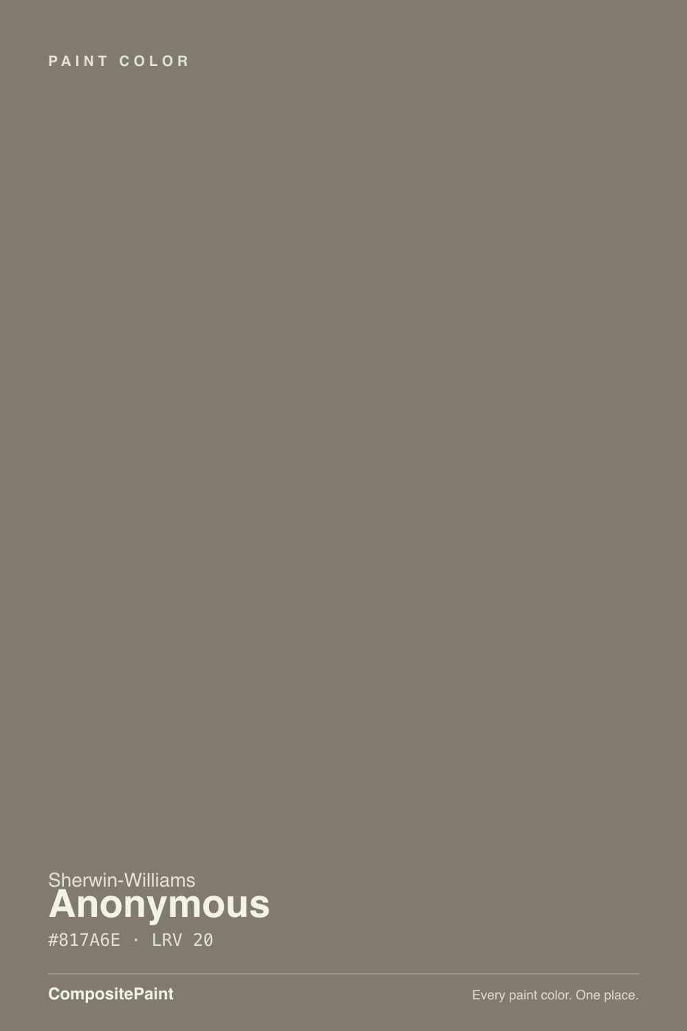
- 1Nocturne8
- 2Roycroft Brass15
- 3Anonymous20
- 4Dorian Gray39
- 5Mindful Gray48
The Fast Verdict
Anonymous earns its name — no Color of the Year run, no design-blog virality, barely a forum thread to its name. What it actually is: a medium-dark taupe-brown-green neutral built for the job Sherwin-Williams quietly sells it for — house siding, studies, kitchen islands — not for open, sunlit main-floor walls. Give it real light and a job with real edges (a facade, a den, an island) and it does exactly what a good neutral should: disappear into looking deliberate.
Exterior siding on modern, craftsman or transitional houses · studies and dens that want depth without going black · kitchen islands and lower cabinets under a lighter upper · dining rooms with warm wood and brass
You want a light, bright greige for open main-floor walls · your room runs dim with no real daylight · your countertops or floor are cool gray stone · you're hoping to research it against a pile of other people's rooms first
- A genuinely warm-earthy neutral — brown and green undertones that never tip cold or blue
- One of Sherwin-Williams' better exterior siding neutrals, especially on modern and craftsman builds
- Doubles as a kitchen island or lower-cabinet color without committing the whole kitchen
- Deep enough (LRV 20) to anchor a study or den without going full black
- So little-hyped that there's no trend to outgrow — it just quietly keeps working
- Genuinely medium-dark; sampled quickly it can read lighter than it actually is on four walls
- Needs real daylight or real fixtures — dim rooms flatten it into a featureless dark blob
- Cool LED bulbs and cool gray stone pull the green forward and can read swampy
- So under-documented online that you're mostly working from your own sample, not other people's rooms
What Color Is Anonymous, Really?
Sherwin-Williams calls its neutral collection "Off the Grid," and Anonymous is the color that took the theme literally — it's one of the least-written-about shades in the SW deck, with almost no design-blog coverage and barely a forum thread anywhere. That obscurity isn't a red flag. It's a genuinely useful complex neutral: a taupe-brown base with a real green undertone running under it, which keeps it from ever tipping cold or blue the way a straight gray would. Paint databases describe it as "earthy" for a reason — it reads closer to weathered wood or stone than to a fashion-forward gray.
At LRV 20 it's a real medium-dark color, not a light greige with a dark-sounding name — reflecting only about a fifth of the light that hits it, which means it needs genuine daylight or real fixtures to show its full range instead of collapsing into a flat, dim blob. That depth is exactly why Sherwin-Williams' own coordinating guidance points to it as a siding color first: full daylight is where a complex earthy neutral like this shows its layers, and a house-sized surface gives it the scale to read as grounded rather than muddy.
Undertone in one line: warm and earthy — brown and green working together, never blue. In brighter light it leans toward a warm gray-beige; in low light the green and brown pull it deeper and mossier. If your sample looks flatly gray-brown with no personality, that's a light problem, not a paint problem — give it a real window or a real bulb before judging it.
Where It Shines
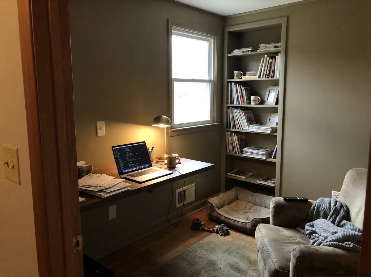
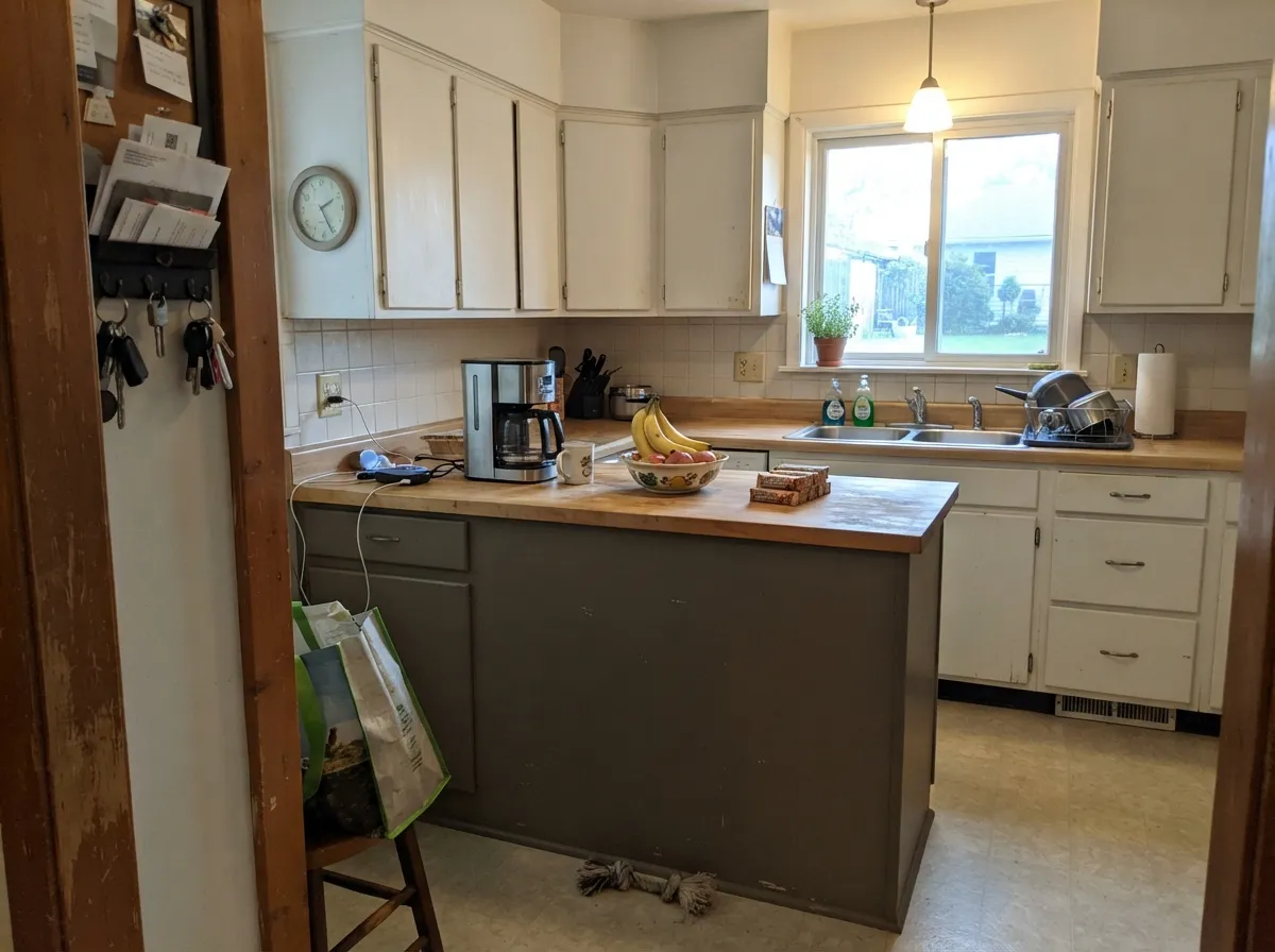
This is a color built for surfaces with edges, not open volumes of wall. On a house exterior — especially the modern-craftsman and transitional new builds it turns up on most in real listing photos — full daylight lets the brown and green trade off across the day without ever going cold, and it reads grounded next to white trim and black windows. Indoors, its best jobs are the small, enclosed ones: a study or den where depth is the point, or a kitchen island that needs to feel substantial under lighter upper cabinets. Give it real light, warm wood, aged brass or black metal, and it disappears into looking deliberate instead of decorated.
Where It Fails
There isn't a loud complaint thread following Anonymous around — it's too under-the-radar for that — but its real traits point straight at where it goes wrong, and all three are avoidable before you buy the gallon.
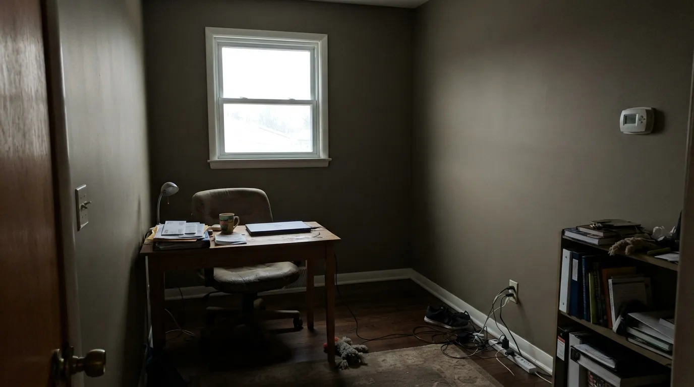
At LRV 20 it already reflects very little light, so a north-facing or low-window room pushes it further — the taupe-brown-green complexity flattens into a dull, featureless dark blob instead of the layered neutral it's supposed to be. This is a color that needs a real window or real fixtures, not a fix for the one dark room in the house.
The name gives away nothing, and on a small chip next to the popular light-mid greiges in the SW deck it can look like just another one of them. It isn't — LRV 20 is genuinely medium-dark. On four walls it reads noticeably deeper and moodier than a quick glance at the strip suggests, so sample it full-size before committing a whole room.
The undertone is a real warm brown-green, and cool light or cool blue-gray stone works against both halves of it at once — the warmth drains and the green comes forward alone, which can read swampy rather than earthy. Warm 2700K bulbs and any stone or countertop with beige or brown in it keep the two undertones working together instead of splitting apart.
Room by Room
This is where Sherwin-Williams itself points it, and real daylight is why: full sun lets the brown and green read as one grounded earthy color instead of splitting apart. Works on modern, craftsman and transitional siding, especially paired with crisp white trim and black windows or a black door.
A closed room that wants real depth without going full black. Walnut shelving, leather, brass reading-lamp light — this is the room where "moody" is a compliment, and the enclosed scale means it never has to fight for daylight the way a big open room would.
Sherwin-Williams' own color guidance points here specifically: a lower-cabinet or island color under lighter upper cabinets or walls. It holds up in a busy kitchen — hides marks better than a white without going full-dark — but a whole kitchen of it is a bigger, riskier bet than the island alone.
Enclosed, evening-lit dining rooms are exactly its speed. Pair it with a walnut or oak table and warm metal and it reads considered rather than dark for the sake of dark.
Works as a deep, grounded backdrop if the room gets genuine daylight or you commit to warm 2700K lamps at night. Skip it in a small, dim, north-facing bedroom — that's the combination that flattens it fastest.
Big volumes of wall need consistent daylight to keep a color this dark from reading like a shadow rather than a color. In a bright, south-facing open plan it can work as an accent wall or built-in; as the wall color for an entire sun-starved great room, it is not the easy choice.
Your Light Is the Risk
Direct sun is where the brown and green trade off cleanly across the day and the color reads grounded, not muddy — the reason it works best as an exterior.
At LRV 20 it already reflects little light; without a real window it collapses into a flat, featureless dark — the one interior situation to avoid.
Cooler and more gray-leaning at midday, warmer and more bronze as the light lowers toward evening — a gentle daily shift, not a different color.
2700K bulbs keep the brown-green warmth intact after dark; cool white LEDs flatten it and let the green edge forward alone.
Most complaints about Anonymous are a light mismatch. Upload a photo of your actual room and see it on your walls — then ask for the same wall in north light or evening lamps before you buy a single sample.
Need It From Another Brand?
Any paint counter can custom-tint Sherwin-Williams SW 7046 directly. If you would rather stay in one brand's own deck, these are the closest stock matches, measured as ΔE2000. Under 2 is a difference you will not see on the wall.
| Brand | Closest color | ΔE | LRV | |
|---|---|---|---|---|
| Behr | Winding PathPPF-53 · Behr | 1.7 | 21 | Color page → |
| Benjamin Moore | River SiltCSP-180 · Benjamin Moore | 1.0 | 21 | Color page → |
| Valspar | Mountain Smoke6004-2B · Valspar | 1.5 | 20.2 | Color page → |
| PPG / Glidden | On The EdgePPG0998-6 · PPG / Glidden | 3.1 | 20 | Color page → |
| Glidden | Cool CharcoalPPG1007-6 · Glidden | 3.5 | 20 | Color page → |
| Dutch Boy | Weathered Rock440-5DB · Dutch Boy | 0.0 | 20 | Color page → |
Similar Sherwin-Williams Colors
The nearest shades to Anonymous within Sherwin-Williams's own range, ranked by perceptual color distance — useful when you want the same look a touch lighter, darker, or warmer.
WCAG 2.1: AA is 4.5 : 1 for normal text, 3 : 1 for large text, AAA is 7 : 1.
Anonymous vs the Colors You're Also Considering
Every Anonymous sample board has the same rivals on it. The numbers show the real lightness gap — then it comes down to which risk you would rather live with.
Pick this for more warmth and earthiness in the same depth range — Anonymous leans browner and greener where Chelsea Gray stays a cleaner charcoal-greige.
Benjamin Moore HC-168 · LRV 22Chelsea GrayPick this if your painter works in Benjamin Moore — nearly the same charcoal-greige depth, with the same island-and-exterior resume and less green in the undertone.
Pick this for more daylight flexibility — Urbane Bronze needs real light or it reads black; Anonymous stays a legible warm neutral at LRV 20.
Sherwin-Williams SW 7048 · LRV 8Urbane BronzePick this when you want it noticeably darker — Sherwin-Williams' own coordinating rail pairs the two as the deeper step down from Anonymous.
Pick this for real depth on an exterior, a study, or an island — Dorian Gray this light can wash out outdoors or on a small accent.
Sherwin-Williams SW 7017 · LRV 39Dorian GrayPick this for the same warm-greige family two shades lighter — an easier sell for a full room of walls, not just an island or a den.
Pick this for the earthier, more complex version of the same green lean, with enough brown and depth to read as a neutral instead of a color.
Sherwin-Williams SW 7732 · LRV 32SagePick this if you want the green undertone out front instead of hiding under brown — Sage is a straightforward soft green at a lighter, easier depth.
Within the Sherwin-Williams deck the neighbors separate mainly by warmth. Solitary Slate SW 9598 at LRV 19 (#80796D) is almost the same color a shade deeper. Settlement SW 9594 at LRV 19 (#7E7970) is slightly cooler and grayer. Backdrop SW 7025 at LRV 20 (#867A6F) and Warm Stone SW 7032 at LRV 20 (#887B6C) both push redder and browner, while Link Gray SW 6200 at LRV 21 (#7F7E72) and Country Tweed SW 9519 at LRV 20 (#837B68) trade the red for green and olive.
Across brands, Dutch Boy Weathered Rock 440-5DB and Anonymous HGSW 3483 from HGTV Home by Sherwin-Williams share the same hex. Benjamin Moore River Silt CSP-180 at LRV 21 is a deltaE of 1.00, Behr Bridle Leather N180-5 is 1.40, and Valspar Mountain Smoke 6004-2B at LRV 20.2 is 1.46, all visually identical in normal room light. Farrow & Ball Broccoli Brown No. 198 at LRV 18 is 4.21 away, close but visibly different side by side.
Anonymous Coordinating Colors
The rule for coordinating with Anonymous is simple: stay warm and stay earthy. It pairs with warm woods, aged brass, black metal and stone in beige or charcoal tones — and it works badly against anything crisp-and-cool. These are the partners that keep showing up with it:
A Color Named to Be Forgotten
Sherwin-Williams named this one Anonymous, and the market has more or less taken it at its word. It has no Color of the Year run, no viral design-blog moment, barely a forum thread — searching for it turns up a handful of paint-database sites and a couple of Houzz threads from people who already own it, mostly asking about trim and door colors, not second-guessing the paint itself.
That's not a knock. It's the honest version of a real category: a genuinely well-built complex neutral that Sherwin-Williams sells quietly through its own coordinating tools and exterior-color guidance rather than through marketing. If you found this color by scrolling a full deck rather than a trending list, that's exactly how most people find it — and the lack of hype means what little is written about it is unusually undiluted.
Anonymous With Wood Tones and Floors
Warm wood is this color's best friend. Walnut, white oak and weathered cedar all sit comfortably against it because the brown half of its undertone meets them halfway — part of why it works so well as an exterior siding color next to natural wood accents, and as a kitchen island under a butcher-block or oak counter.
The floor or stone to be careful with is cool gray — polished concrete, blue-gray tile or cool-veined quartz pulls the green forward and can make the pairing read swampy rather than earthy. Warm-toned stone, beige-flecked granite, or anything with brown in it keeps both halves of the undertone working together. Metals are easy: aged brass, matte black and bronze all read right; polished chrome is the one metal that fights it.
Three Ready Palettes Built on Anonymous
A color is never alone on the wall. These are complete combinations in the 60-30-10 pattern, with the reason each one holds together. Every one opens in the visualizer.
Crisp white trim keeps the earthy body from reading muddy against the sky, and one near-black door is the single dark accent the scheme needs — the same three-color logic behind most of the modern-craftsman builds this color shows up on.
Try this palette in your roomAlabaster trim keeps the room from reading like a cave, while Urbane Bronze on the built-ins pushes the depth one step further for anyone who wants the den fully committed to dark. Warm brass lamp light finishes the look.
Try this palette in your roomAlabaster keeps the main run of cabinets light and easy to live with while the island carries the color; Chelsea Gray on a pantry door adds one more depth note from the same earthy-greige family without turning the kitchen into a study in brown.
Try this palette in your roomAnonymous FAQ
Is Anonymous warm or cool?
Warm — a genuine brown-and-green earthy undertone that never tips blue or cold. In bright light it leans toward a warm gray-beige; in low light the green comes forward and it reads deeper and mossier. It never reads icy the way a true gray can.
Is Anonymous too dark for interior walls?
At LRV 20 it's a real medium-dark color, not a light greige — it needs genuine daylight or real fixtures to show its full range. It works best on enclosed rooms (studies, dens) or as an island or accent rather than as the wall color for a big, dim open-plan space.
What trim white goes with Anonymous?
A clean, fairly bright white — Sherwin-Williams' own Extra White or Alabaster both work, keeping the earthy body from reading muddy. A very soft, warm off-white can blur into the wall color instead of framing it, so go crisper than you would with a lighter greige.
Does Anonymous work as an exterior color?
Yes — this is arguably its best job. Sherwin-Williams positions it as a siding neutral, and it shows up most often in real listing and Houzz photos on modern, craftsman and transitional new builds, usually with white trim and black windows or a black door.
Is Anonymous the same as Dovetail?
Close, not the same. The two sit in the same warm-greige family and read similarly on a chip, but Anonymous is the darker, earthier cousin — our deck lists Anonymous at LRV 20 against Dovetail's LRV 26 — and Dovetail is the far more widely used of the two, showing up on walls, cabinets and exteriors where Anonymous mostly shows up on siding and islands.
Can I use Anonymous on kitchen cabinets?
Yes, and it's one of the color's real strong suits — specifically as an island or lower-cabinet color under lighter upper cabinets, not for the whole kitchen. It hides marks better than a white without going full-dark, and it pairs well with light wood or white uppers for a fresh, grounded look.
Have you painted with Anonymous?
Rate it — one tap helps the next reader decide.
Ask a Question