Sage
The safe way into the green-room trend, reviewed honestly: the light that makes it sing, the light that turns it gray, and what to buy instead.

Jessica has spec'd whites and neutrals for more than 300 rooms and keeps a sample wall of painted drawdowns in her studio. Every color review is checked against real reader rooms in the comments and re-tested when a formula changes. About the testing process →
- 1Anonymous20
- 2Fawn Brindle36
- 3Sage42
- 4Agreeable Gray60
- 5Pale Oak69
The Fast Verdict
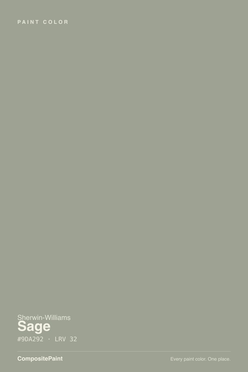
Sage is the beginner's green, and that is meant as a compliment. It is only about eight percent saturated, so it behaves like a mid-tone neutral that happens to lean green, which is why people who swear they hate green end up living with it happily.
The catch is the same low saturation: in a dim north room or under cool white bulbs the green quietly drains out and you are left with a flat gray-green wall. Give it decent light and warm bulbs and it is one of the easiest colors in the Sherwin-Williams deck.
Bedrooms and living rooms with real daylight · kitchen cabinets with wood and brass · homes with honey oak floors or trim · anyone who wants green without commitment
Your room faces north and stays dim · your ceiling lights are 4000K LEDs you cannot change · you want an obvious, leafy green · you are pairing it with saturated green tile
- Green that green-averse people actually live with
- Cancels the orange in honey oak floors and trim
- Mid-tone depth hides scuffs and roller marks
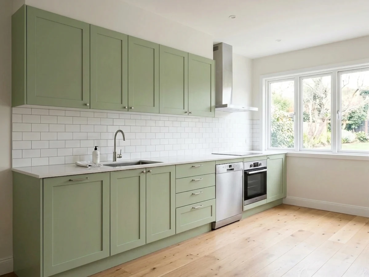
- Excellent on kitchen cabinets with brass and wood
- Works indoors and on siding without changing character
- Loses its green and reads flat gray in north light
- Goes sterile and minty under 4000K LED bulbs
- LRV 42 makes small windowless rooms feel smaller
- Looks dull and dirty beside saturated green tile
What Color Is Sage, Really?
A gray-green that is much closer to gray than most people expect from the name. Sage carries only a whisper of green over a mid-tone gray body, and that whisper is what makes it usable: it never reads mint, never reads olive, and never looks like a decorating decision you have to defend. It is the color people choose when they want a room to feel like being outside on an overcast morning, and it does that job with almost no risk — as long as the room has light to work with.
At LRV 42 it is a genuine mid-tone, not a soft neutral. Put it next to Agreeable Gray (SW 7029, LRV 60) and Sage reflects roughly half as much light — the wall will hold shadow in the corners where the greige stays even. That depth is the point. It is what stops Sage from looking washed and watery the way pale sages do, and it is also why a small windowless room will feel smaller after you paint it.
Undertone in one line: cool, dusty green over gray — never yellow-olive, never mint. If your sample looks blue-gray, that is north light; if it looks olive, that is the honey oak floor bouncing warmth back at it.
Where It Shines
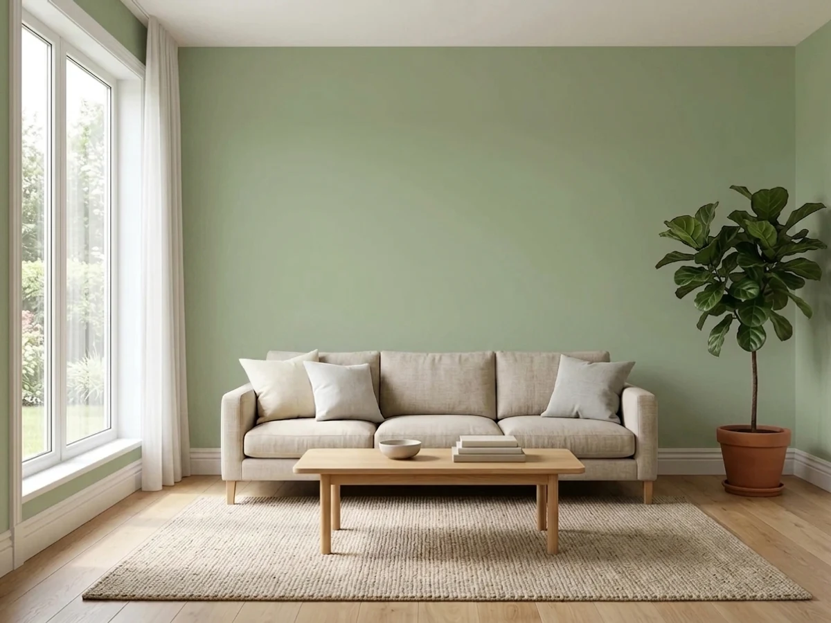
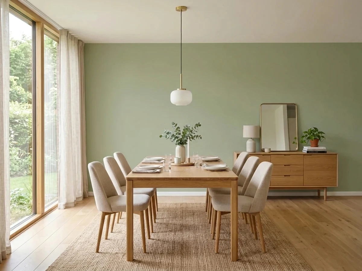
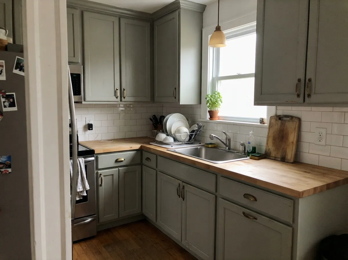
Sage does its best work in ordinary rooms with ordinary daylight — bedrooms, living rooms, and kitchen cabinets, where the green is just strong enough to notice and never strong enough to argue. It is especially good in houses with warm wood: green sits opposite orange on the color wheel, so it calms honey oak floors and trim instead of amplifying them.
Where It Fails
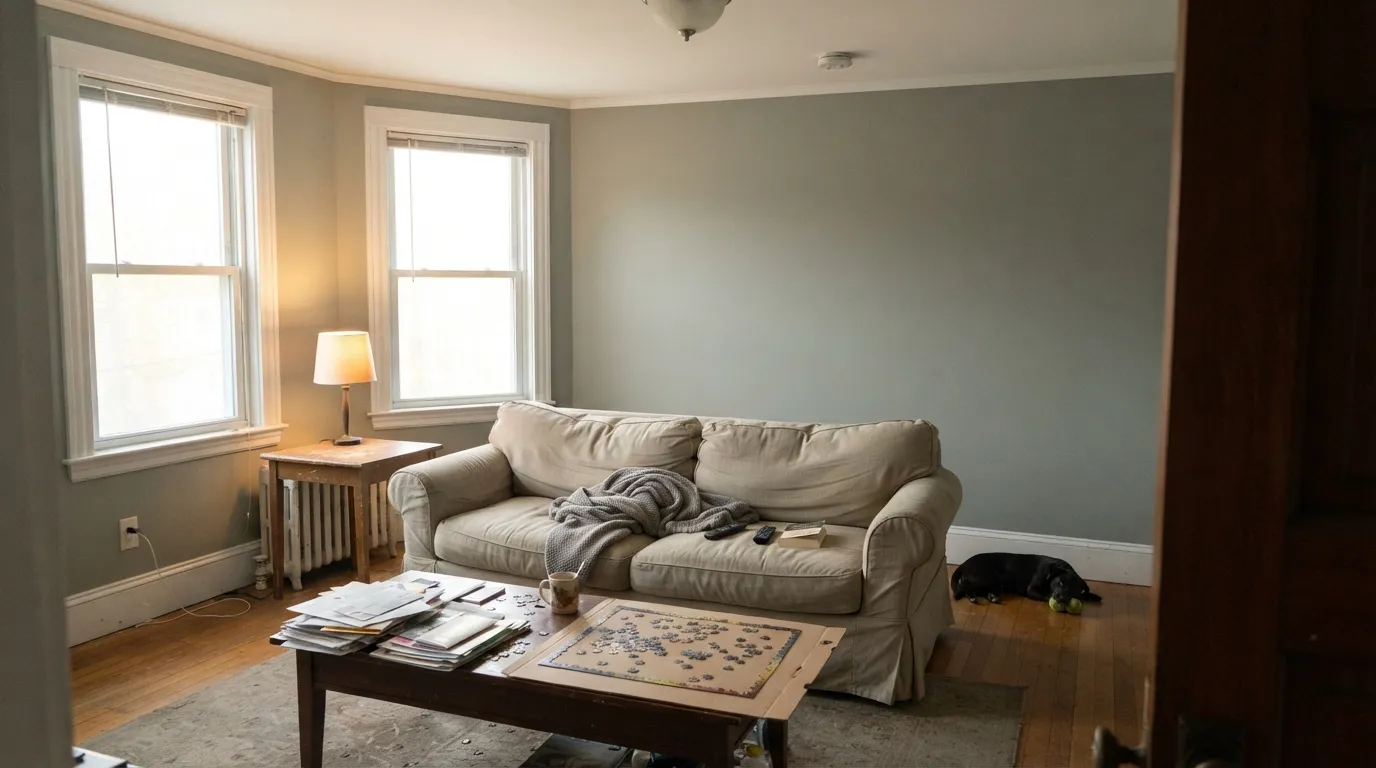
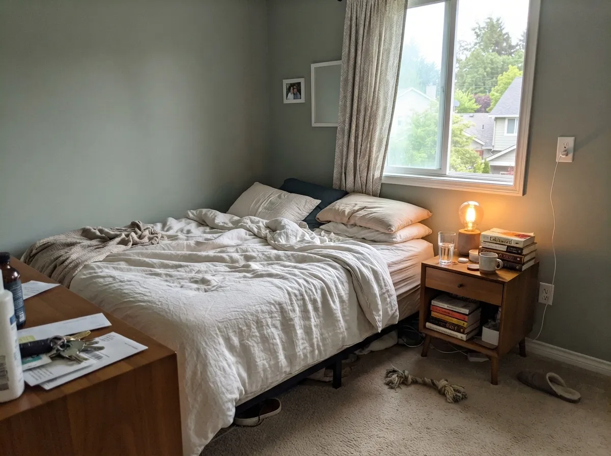
The complaints about Sage are remarkably consistent, and they are all about light, not about the paint. Three situations account for nearly every "I hate it" story — and if your room matches one, more coats will not save it.
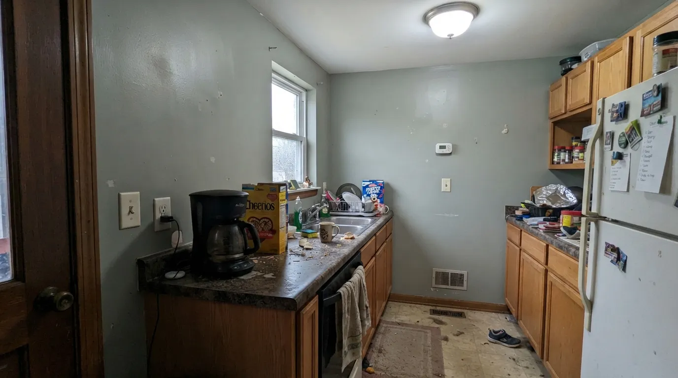
Cool north light strips out the small amount of green and leaves the gray body exposed. The recurring homeowner line is some version of "my north-facing kitchen makes the sage look gray, and I hate gray." If that is your room, go lighter and warmer: Clary Sage (SW 6178, LRV 41) keeps its green when the light does not help.
A 4000K or 5000K LED does to Sage what north light does, only worse — the wall goes sterile and faintly minty, the look people call hospital green. Swap to 2700K bulbs before you swap paint. If the fixtures are fixed and cool, pick Evergreen Fog (SW 9130, LRV 30), which has a gold note in the base that survives cold light.
This is the expectation gap, not a defect. Next to a green tile backsplash or a wall of houseplants, Sage retreats to plain gray and can look dirty by comparison. If you want the room to read green from the doorway, step up to Pewter Green (SW 6208, LRV 12) or Clary Sage (SW 6178).
Room by Room
At LRV 42 it darkens the room just enough to feel restful without going cave-like. Eggshell on walls, Alabaster (SW 7008) on trim and ceiling. Use 2700K lamps and skip the overhead cool LED.
It flatters oak, walnut, leather, and linen, and it makes art look deliberate the way a plain gray never does. Pair with Alabaster trim and one dark note — Urbane Bronze (SW 7048) on built-ins or a fireplace surround.
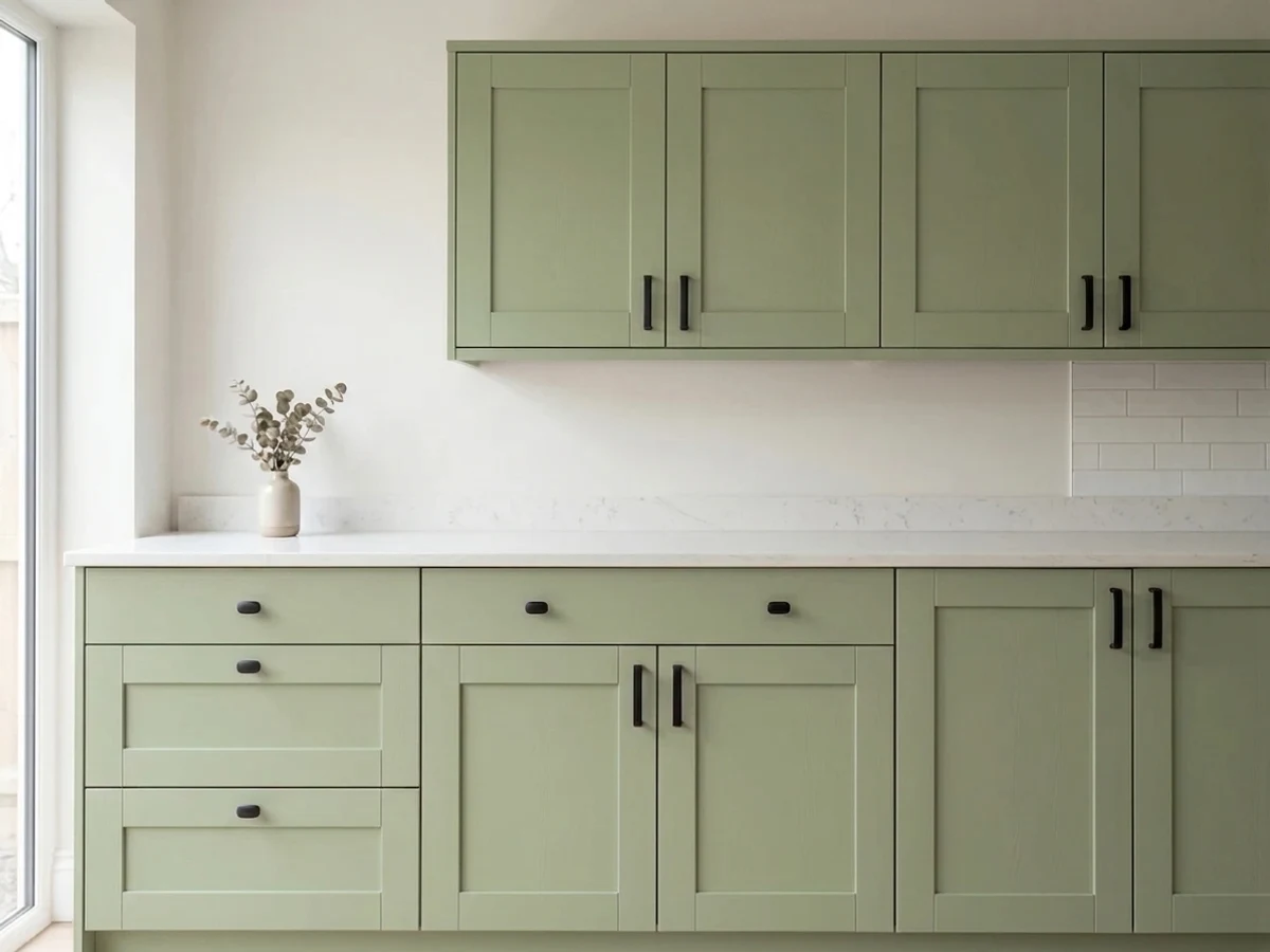
Satin on doors and drawers; it hides fingerprints better than white and reads far softer than gray. Warm counters, butcher block, and unlacquered brass all suit it. Keep walls light — Shoji White (SW 7042) — so the cabinets stay the color story.
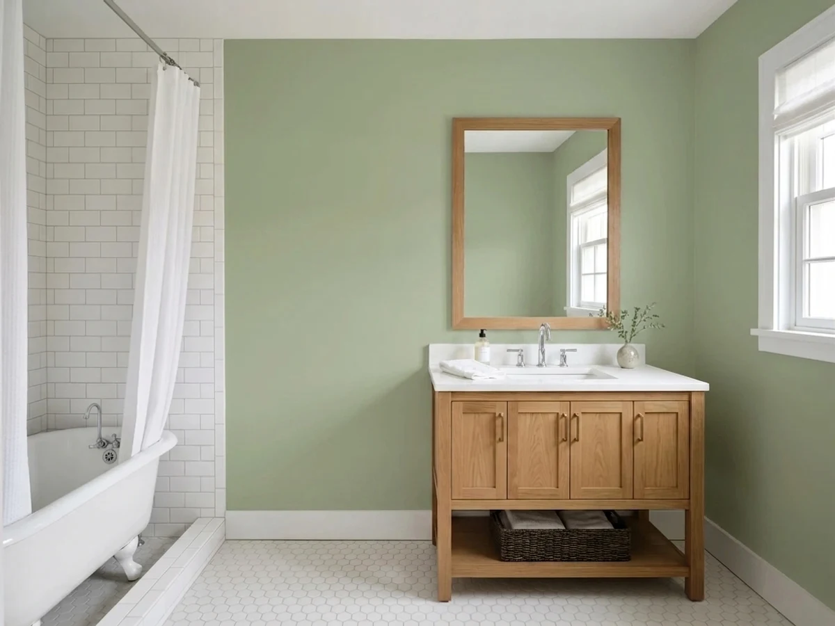
In a windowless bath under a cool vanity light it turns clinical fast. With a window or warm bulbs it is lovely, especially with white subway tile and brushed brass. Use satin or a scrubbable matte.
Screen glare is easier on a mid-tone wall than on white, and the green reads calm on camera. Eggshell walls, Pure White (SW 7005) trim if the room runs cool.
Full sun brings the green back up, so siding looks natural against grass and trees rather than gray. Alabaster trim, Iron Ore (SW 7069) door. Details in the exterior section below.
Your Light Is the Risk
Warm, strong daylight lifts the green all day. This is where Sage looks like the photos.
Cool light drains the green and leaves flat gray. The single most common complaint.
2700K lamps: soft and green. 4000K LEDs: sterile, faintly minty. Change bulbs, not paint.
Summer leaves push extra green onto the wall; in winter it reads a step grayer. Normal.
Most complaints about Sage are a light mismatch. Upload a photo of your actual room and see it on your walls — then ask for the same wall in north light or evening lamps before you buy a single sample.
Need It From Another Brand?
Any paint counter can custom-tint Sherwin-Williams SW 2860 directly. If you would rather stay in one brand's own deck, these are the closest stock matches, measured as ΔE2000. Under 2 is a difference you will not see on the wall.
| Brand | Closest color | ΔE | LRV | |
|---|---|---|---|---|
| Behr | Explorer KhakiN330-4 · Behr | 2.8 | 42 | Color page → |
| Benjamin Moore | Embassy Green1523 · Benjamin Moore | 2.5 | 42 | Color page → |
| Valspar | Soothing Sage8004-23C · Valspar | 1.8 | 41 | Color page → |
| PPG / Glidden | Photo GrayPPG1029-4 · PPG / Glidden | 2.4 | 41 | Color page → |
| Glidden | Photo GrayPPG1029-4 · Glidden | 1.9 | 41 | Color page → |
| Dutch Boy | Speckled Shell323-3DB · Dutch Boy | 2.8 | 42 | Color page → |
Similar Sherwin-Williams Colors
The nearest shades to Sage within Sherwin-Williams's own range, ranked by perceptual color distance — useful when you want the same look a touch lighter, darker, or warmer.
WCAG 2.1: AA is 4.5 : 1 for normal text, 3 : 1 for large text, AAA is 7 : 1.
Sage vs the Colors You're Also Considering
Every Sage sample board has the same rivals on it. The numbers show the real lightness gap — then it comes down to which risk you would rather live with.
Pick this for the cooler, dustier green with no gold in it.
Sherwin-Williams SW 9130 · LRV 30Evergreen FogPick this for a warmer green that survives dim rooms and cold bulbs.
Pick this when you want more depth and a quieter, grayer result.
Sherwin-Williams SW 6178 · LRV 41Clary SagePick this for a lighter, warmer sage in a low-light room.
Coastal Plain (SW 6192), LRV 37, is Sage's closest neighbor but a few steps lighter and a hair greener. In a darker room, Coastal Plain keeps more life, while Sage can drift grayer. Choose Coastal Plain when you want the green to stay visible in low light, and Sage when you want a slightly deeper, quieter result.
Stamped Concrete (SW 7655), LRV 35, is more of a true warm gray with far less green. Put them side by side and Sage looks clearly green next to it. Pick Stamped Concrete if you want the neutral without committing to a green cast.
Downing Stone (SW 2821), LRV 36, is a warmer greige-brown by comparison. It leans toward taupe where Sage leans toward green, so the two suit opposite goals: Downing Stone for a cozy warm neutral, Sage for a nature-tinted one.
Sage Coordinating Colors
The rule with Sage is to keep its partners warm. It is a cool green already, so cool whites and blue-grays double down on the one thing that can go wrong with it. Creamy whites, soft greiges, and warm woods pull it back toward comfortable; deep bronzes and near-blacks give it the contrast it needs to look designed instead of drab.
These are the partners that come up again and again with this color, and each one solves a specific problem — a trim white that will not turn it cold, a lighter wall color for adjoining rooms, and a dark note for doors and islands.
Sage on Kitchen Cabinets
Cabinets are where this color earns its money. A mid-tone that feels slightly heavy across four walls looks substantial on cabinet doors, and the gray in the base keeps it from going sweet next to warm wood. It also solves a practical problem: white cabinets show every knuckle mark around the handles, and Sage simply does not.
Two decisions make or break it. First, keep the walls and ceiling light — Shoji White (SW 7042) or Alabaster (SW 7008) — so the room does not close in. Second, sort the lighting before you spray a single door: under-cabinet strips are almost always the coldest light in the kitchen, and a 4000K strip will make Sage doors look minty at exactly the height you look at them most. Use a satin urethane-fortified cabinet enamel, and put Urbane Bronze (SW 7048) on the island if you want the two-tone look.
Sage on Exteriors and Front Doors
Outside, Sage is a different and better animal. Direct sun puts back the green that indoor light takes away, so siding reads as a soft, natural green against grass, hedges, and stone rather than the flat gray it can become in a north bedroom. It suits cottages, ranches, and shingled houses, and it ages gracefully because there is no strong pigment to fade out of balance.
Pair it with a warm white trim — Alabaster (SW 7008) — and one near-black for the door and shutters. Iron Ore (SW 7069) is the safe choice; Urbane Bronze (SW 7048) is the warmer one and looks better with brown roofs and copper gutters. Walk the sample around the house before committing: the shaded north elevation will read a full step grayer than the sunny side, and that side is usually the one facing the street.
Three Ready Palettes Built on Sage
A color is never alone on the wall. These are complete combinations in the 60-30-10 pattern, with the reason each one holds together. Every one opens in the visualizer.
Alabaster is creamy enough to keep Sage from turning cold, which is the whole trick with a cool green — a stark white would push it gray. Naval supplies the single deep note the scheme needs without introducing a second undertone.
Try this palette in your roomSage takes the 60 percent as cabinet fronts, so light Shoji White walls keep the room from feeling low even though the color is a mid-tone. Urbane Bronze grounds the island and makes brass hardware look intentional rather than accidental.
Try this palette in your roomOutdoors the sun restores the green Sage loses indoors, so the siding reads natural against planting instead of gray. Warm Alabaster trim and near-black Iron Ore give the facade its light and dark ends while the green sits comfortably in the middle.
Try this palette in your roomSage FAQ
Will Sage look gray in my north-facing room?
Probably, yes. North light is cool and indirect, and Sage only has about eight percent saturation to lose. Sample a large board on the wall you will look at most, at 4pm on a cloudy day — that is the worst case. If it reads gray there, choose Clary Sage (SW 6178) instead.
Sage or Evergreen Fog?
They sit at almost the same depth — LRV 42 against 30 — so this is an undertone choice, not a lightness one. Evergreen Fog has a gold thread in it that keeps it warm in weak light; Sage is cooler and dustier. Dim room or cold bulbs: Evergreen Fog. Good daylight and warm floors: Sage.
Is Sage good for kitchen cabinets?
It is one of the better uses for it. On cabinets you are looking at the color in short vertical runs rather than across a whole wall, so the mid-tone depth reads rich instead of heavy, and it hides handprints far better than white. Use a satin urethane cabinet enamel and keep the walls light.
Does Sage work with honey oak floors and trim?
Yes, and this is one of its real strengths. Green sits opposite orange on the color wheel, so it cancels the loud warmth of honey oak rather than echoing it. Expect Sage to look slightly warmer and more olive than the chip once the floor is bouncing light onto it — that is the wood, not the paint.
What trim white goes with Sage?
Alabaster (SW 7008, LRV 82) in semi-gloss. It is warm enough to stop Sage from tipping cold, and the 50-point LRV gap gives clean separation. Pure White (SW 7005) is the alternative if your room already skews warm and you want a crisper edge.
Will sage green look dated in a few years?
The saturated, trendy sages will. This one is low-saturation enough to behave like a neutral, which is exactly what has kept muted greens in rotation for decades. If you are nervous, put it on cabinets or one room rather than the whole house — repainting a kitchen is cheaper than repainting a floor plan.
Can I use Sage in a small windowless bathroom?
Only with warm bulbs. At LRV 42 it will not brighten anything, and under a cool vanity light it turns clinical. With 2700K lighting, white tile, and brass fixtures it looks like a deliberate jewel-box; with a 4000K builder fixture it looks like a waiting room.
Have you painted with Sage?
Rate it — one tap helps the next reader decide.
Ask a Question