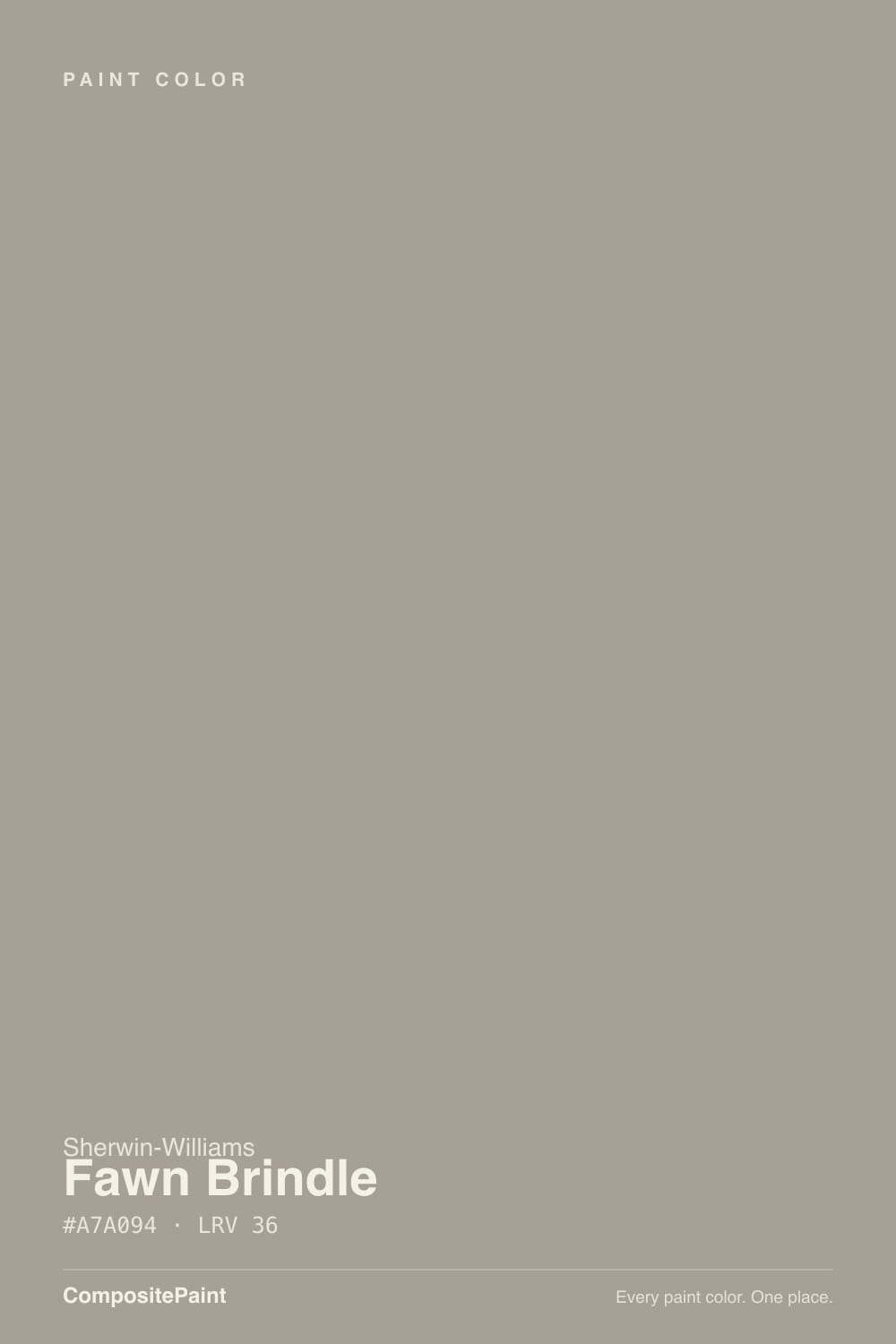
Fawn Brindle
Sherwin-Williams' favorite flip-house exterior greige, reviewed honestly: the light that keeps it sophisticated, the light that turns it plain brown, and what to pair it with instead.

Jessica has spec'd whites and neutrals for more than 300 rooms and keeps a sample wall of painted drawdowns in her studio. Every color review is checked against real reader rooms in the comments and re-tested when a formula changes. About the testing process →
- 1Anonymous20
- 2Felted Wool28
- 3Fawn Brindle36
- 4Agreeable Gray60
- 5Balboa Mist66
The Fast Verdict
Fawn Brindle is the color you paint a house when you want it to look updated without looking trendy — a warm greige with real brown in it, deep enough (LRV 36) to read as a deliberate choice instead of a builder default. It never won Color of the Year and no design blog has crowned it a star; its reputation is quieter than that. Ask a house-flipper or a listing photographer which Sherwin-Williams neutral photographs best on a spec home and this is one of the first names that comes up. Give it real sun and white trim and it looks expensive. Paint it under a flat gray sky and it just looks brown.
Exterior siding, stucco or brick-adjacent trim in real sun · House flips and spec builds that need broad buyer appeal · Homes with warm brick, stone or wood accents · Anyone who wants a greige with actual depth, not another pale one
You want a true, cool gray with zero brown in it · Your exterior stays shaded most of the day or your climate runs overcast · You're matching cool gray stone, slate or a blue-black roof · You picked it hoping "brindle" meant gray
- Holds its color across a full exterior elevation better than pale greiges
- Reads current and updated without looking like a passing trend
- Flatters warm brick, stone and wood — a genuinely easy match for older homes
- Deep enough (LRV 36) to hide dirt and mildew streaking better than a light color
- A dependable, broadly likeable choice for resale and spec-home exteriors
- Reads brown, not gray — the name oversells the gray side
- Goes flat and muddy under overcast sky or on a shaded elevation
- Fights cool gray stone, slate roofs and blue-black rooflines
- Not a design-blog darling — pick it for dependability, not for a story
What Color Is Fawn Brindle, Really?
Brindle is a real word before it is a paint name — it describes the streaked brown-and-gray coat of a dog or cow, and Sherwin-Williams' naming is honestly literal here. This is a warm, slightly muddied taupe-gray, not a true gray with a hint of warmth. The brown sits first; the gray is what keeps it from reading as tan or khaki. That is the whole personality of the color in one sentence, and it is worth taking the name at its word before you buy a gallon expecting something cooler.
At LRV 36 it is a genuine mid-depth color — deeper than the popular "safe" builder greiges like Agreeable Gray (LRV 60) or Repose Gray (LRV 58), and closer in weight to Sherwin-Williams' own Dorian Gray (LRV 39). That depth is why it works on a full exterior elevation: a pale greige can wash out and go chalky across forty feet of siding in strong sun, but Fawn Brindle holds its color and its shadow lines. The tradeoff is the same depth makes it lean on daylight to read as sophisticated rather than flat — more on that in Fails below.
Undertone in one line: warm brown-taupe first, a whisper of gray second — never blue, never truly neutral. If your sample reads plain khaki-tan, that is strong afternoon sun pulling the brown forward; if it reads flat and muddy, that is overcast light or deep shade, not a bad can of paint.
Where It Shines
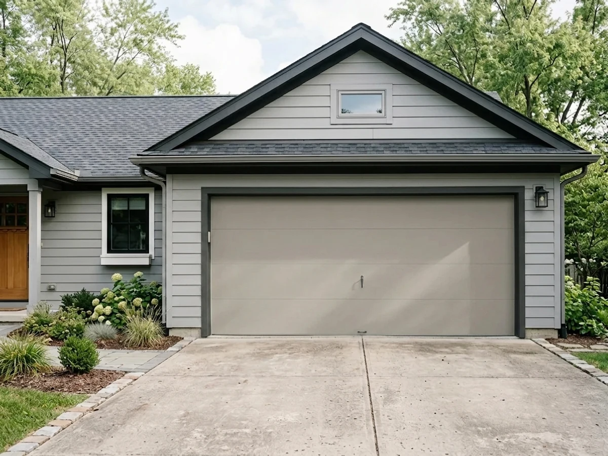
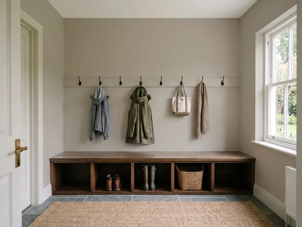
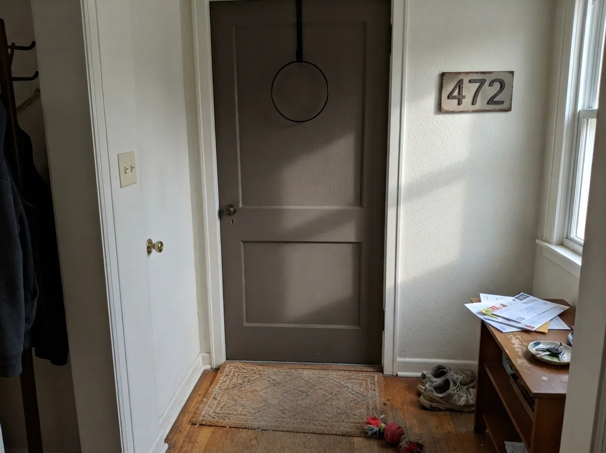
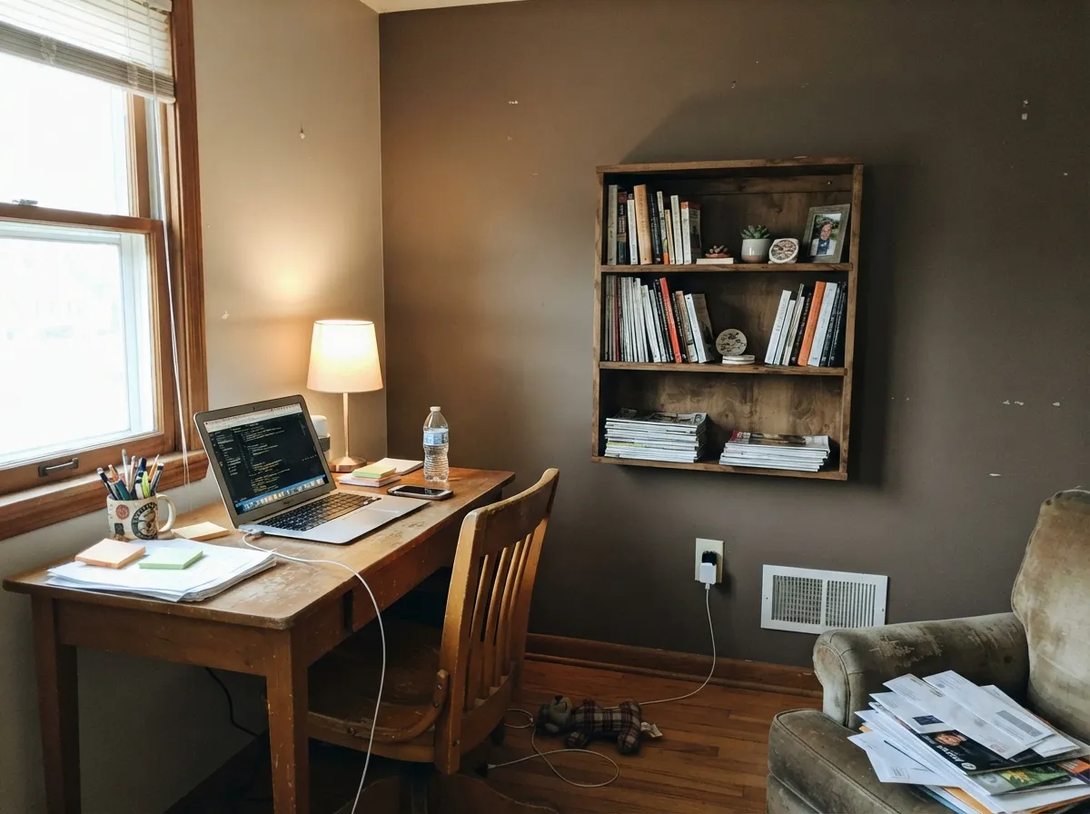
This is an exterior color first and an interior color second, and it shines hardest exactly where it is used most: full sun on siding, stucco or fiber cement, next to a white or dark trim. That is the classic flip-house palette — Fawn Brindle body, white trim, black or bronze door — and it earns its popularity there because it reads current without reading like a trend that will date the listing photos in five years. Indoors, in a home office, den or mudroom with warm wood and real daylight, it does a smaller version of the same job: a confident, grounded neutral that never tips into full brown.
Where It Fails
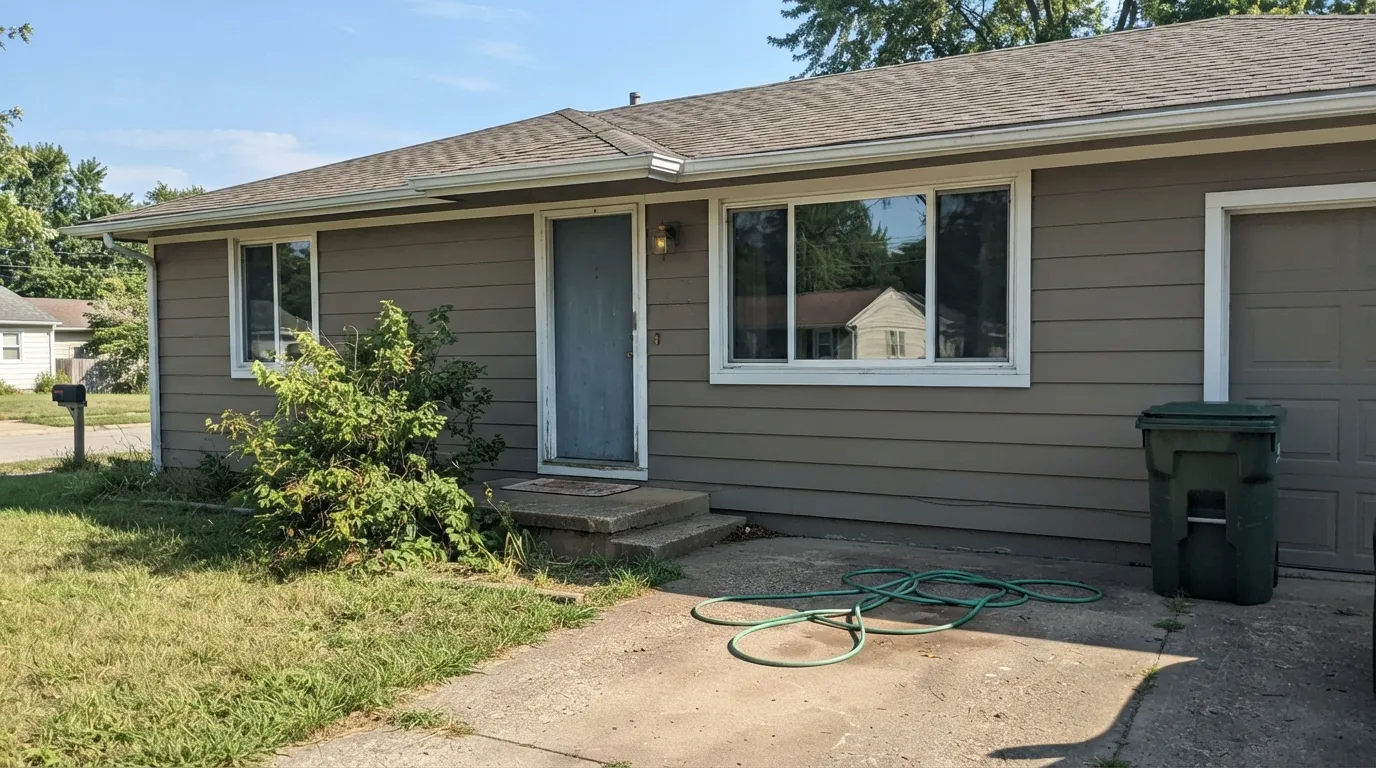
Almost every disappointed review of Fawn Brindle traces back to one of three predictable situations, and none of them are a bad batch of paint. If your house or room matches one of these, this is not your color — sampling a bigger swatch will only confirm it faster.
The name promises a streaked gray-and-brown coat, and buyers who skim past "brindle" often expect a cool, modern gray. On the house it reads unmistakably warm and brown-leaning. If a true gray is the goal, Dorian Gray or Iron Ore sit closer to it — Fawn Brindle is a taupe wearing a gray-adjacent name.
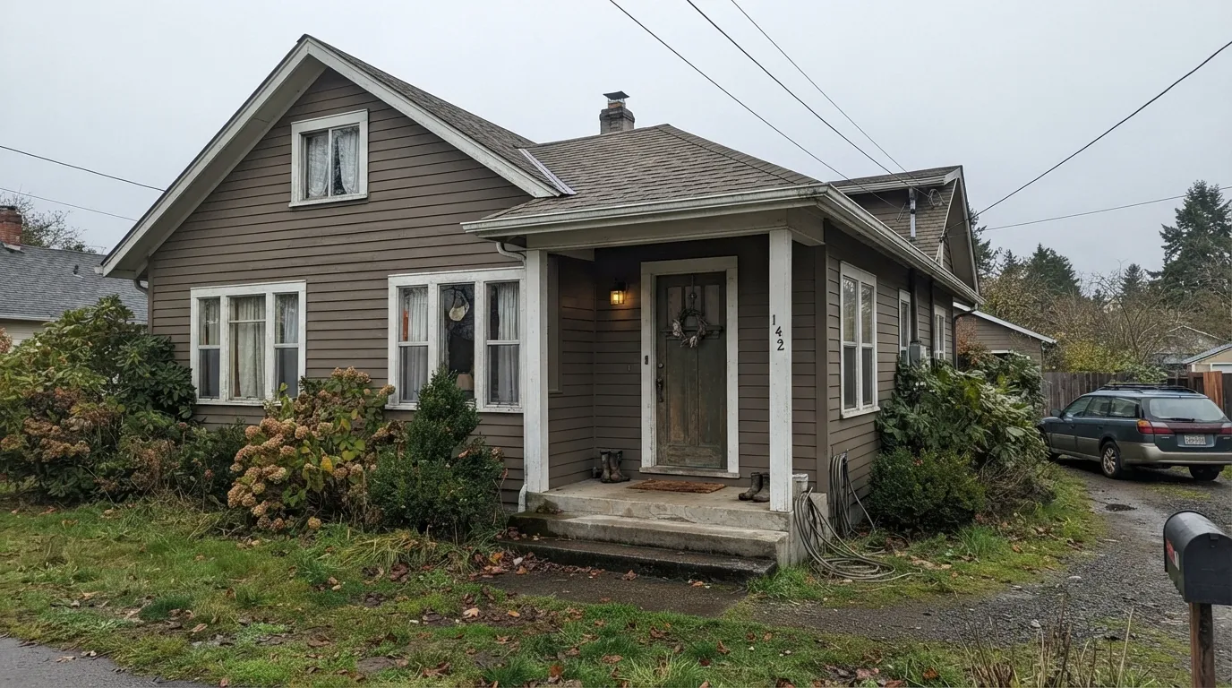
This is the color's real weakness: without real sun hitting it, the sophistication drains out and it reads as plain, flat brown — closer to a dated builder tan than a designer greige. Homes in the Pacific Northwest or a north-facing elevation that rarely sees direct light should sample a full board and view it at midday and at dusk before committing to the whole house.
Fawn Brindle's warmth fights cool-toned masonry and roofing the same way any warm greige does — the stone reads bluer by contrast and the siding reads more khaki than intended. It wants warm brick, warm stone, or a neutral roof; with cool gray materials already fixed, a cooler greige like Dorian Gray is the safer match.
Room by Room
Full or mostly-full sun is where this color earns its reputation: warm, grounded, and current without looking like a trend. Satin finish holds up to weather and doesn't flatten the color the way flat exterior paint can on a deep tone.
A near-black door (Iron Ore, Tricorn Black) or a warm dark bronze (Urbane Bronze) gives the classic modern-farmhouse contrast and reads far better than a bright accent color, which fights the siding's warmth instead of grounding it.
With warm stone, brick or a terracotta roof it looks intentional and expensive. With cool gray stone veneer it starts to look like a mismatch — sample against your actual stone before painting the whole facade.
Indoors, with a warm wood desk and real daylight, it works as a deep accent wall or a full small room. Eggshell finish; keep the trim white rather than another warm neutral, or the room loses its edges.
On a single island or mudroom bench under lighter walls it adds real weight without committing a whole kitchen to a brown-leaning color. Satin cabinet enamel; pairs naturally with brass and butcher block.
Painting the garage door the same color as the siding, rather than white or a contrast color, is the detail that makes a Fawn Brindle exterior look finished instead of half-renovated — the single most common upgrade flippers make after the main paint job.
Your Light Is the Risk
Direct daylight is what turns this from "brown" into a sophisticated warm greige-taupe. This is the light the color needs to look intentional.
Without sun hitting it, the color flattens toward plain tan-brown and loses the greige read entirely. Sample on an actual gray day before committing a whole house.
Cooler and quieter in early light, richer and browner by late afternoon sun. Exterior colors move more than interior ones — expect the shift, don't fight it.
Warm 2700K porch fixtures deepen it toward chocolate-brown after dark; cool white floodlights flatten it gray and a little lifeless. Warm bulbs are the better match.
Most complaints about Fawn Brindle are a light mismatch. Upload a photo of your actual room and see it on your walls — then ask for the same wall in north light or evening lamps before you buy a single sample.
Need It From Another Brand?
Any paint counter can custom-tint Sherwin-Williams SW 7640 directly. If you would rather stay in one brand's own deck, these are the closest stock matches, measured as ΔE2000. Under 2 is a difference you will not see on the wall.
| Brand | Closest color | ΔE | LRV | |
|---|---|---|---|---|
| Behr | True TaupewoodPPU24-09 · Behr | 0.8 | 36 | Color page → |
| Benjamin Moore | River Reflections1552 · Benjamin Moore | 0.3 | 35 | Color page → |
| Valspar | Gray Silt6002-1C · Valspar | 1.7 | 35.9 | Color page → |
| PPG / Glidden | Simmering SmokePPG1019-4 · PPG / Glidden | 2.5 | 35 | Color page → |
| Glidden | Simmering SmokePPG1019-4 · Glidden | 2.5 | 35 | Color page → |
| Dutch Boy | Poised Neutral440-4DB · Dutch Boy | 0.6 | 36 | Color page → |
Similar Sherwin-Williams Colors
The nearest shades to Fawn Brindle within Sherwin-Williams's own range, ranked by perceptual color distance — useful when you want the same look a touch lighter, darker, or warmer.
WCAG 2.1: AA is 4.5 : 1 for normal text, 3 : 1 for large text, AAA is 7 : 1.
Fawn Brindle vs the Colors You're Also Considering
Every Fawn Brindle sample board has the same rivals on it. The numbers show the real lightness gap — then it comes down to which risk you would rather live with.
Pick this for exteriors with warm brick or stone — Fawn Brindle's extra brown warmth flatters them where Dorian Gray's cooler cast argues.
Sherwin-Williams SW 7017 · LRV 39Dorian GrayPick this if you want nearly the same depth with less brown — Dorian Gray reads a truer gray in the same daylight.
Pick this when you want a color deep enough to actually change how the house reads, not just tint it.
Sherwin-Williams SW 7030 · LRV 47Anew GrayPick this for a lighter version of the same warm neutral — easier on a shaded or north-facing elevation.
Pick this for a full exterior elevation in strong sun — Revere Pewter's higher LRV can wash out where Fawn Brindle holds its color.
Benjamin Moore HC-172 · LRV 56Revere PewterPick this if you're working in the Benjamin Moore deck — the same warm-greige idea, lighter and far more famous.
Pick this outside — Agreeable Gray reads pale and a little flat across a full elevation; Fawn Brindle has the depth exteriors need.
Sherwin-Williams SW 7029 · LRV 60Agreeable GrayPick this for interior walls — it is the safest whole-house greige in the SW deck and far lighter.
The closest color in the same deck is Intellectual Gray SW 7045 at #A8A093 and LRV 36. On a wall these two are effectively interchangeable. Western Reserve SW 9597 at #A8A294 and Downing Stone SW 2821 at #A6A397 sit at the same LRV with slightly more green-gray. Palisade SW 7635 at LRV 35 is the deeper, softer option, and Smooth Stone SW 9568 at LRV 37 is the lightest of the group.
Across brands the matches are unusually tight. Benjamin Moore River Reflections 1552 and Dunn-Edwards Feldspar DEGR31 both land at a deltaE of 0.31, and Dutch Boy Poised Neutral 440-4DB and Behr True Taupewood PPU24-09 fall at 0.56 and 0.84. All four are the same color for practical purposes.
Kompozit and Hirshfield's Drifting Sand 0218 at 1.07 and Valspar Gray Silt 6002-1C at 1.7 are visually identical in normal room light. Farrow and Ball Worsted No. 284 at LRV 33 and a deltaE of 3.54 is close but visibly different side by side, reading cooler and slightly deeper.
Fawn Brindle Coordinating Colors
The rule for coordinating with Fawn Brindle: crisp whites for trim, dark warm neutrals for doors and shutters, and nothing cool-gray or blue nearby. It is built to anchor an exterior palette, not to blend into an interior one. These are the partners that keep showing up in the houses that work:
Fawn Brindle's Real Story: The Flip-House Favorite
Fawn Brindle isn't a Color of the Year and it doesn't have a viral design-blog moment attached to its name. Its actual reputation was built somewhere quieter: in the real-estate renovation and house-flipping world, where a small set of Sherwin-Williams neutrals get recommended over and over because they photograph consistently well for listing photos and appeal broadly across buyer tastes. Fawn Brindle is one of that short list — deep enough to look intentional in a driveway photo, warm enough to feel inviting rather than corporate, and neutral enough that almost no one actively dislikes it.
That is a different kind of fame than a splashy Color of the Year, but it is a real one: a color that keeps getting specified by people whose job depends on a house selling fast. If you're painting a spec home or a rental, that track record matters more than a trend cycle. If you're painting your forever house and want a color with a design story to tell dinner guests, this isn't it — and that is a completely fair reason to skip it.
Fawn Brindle With Stone, Brick and Roof Tones
This decision gets made by your fixed materials, not by the paint chip. Warm brick — red, orange-brown, or tumbled tan — and warm stone veneer are Fawn Brindle's best friends; the shared warmth makes the whole facade look coordinated instead of assembled from separate decisions. Terracotta and warm-brown roof tones work the same way.
The honest no is cool gray stone veneer, blue-black asphalt shingles, or a slate-toned roof. Against those, Fawn Brindle's brown pushes harder and the stone or roof starts to look mismatched rather than complementary — the visual argument runs both directions, same as any warm-versus-cool pairing. If your roof and stone are already fixed and cool-toned, Dorian Gray is the safer greige to sample instead of fighting the geometry.
Three Ready Palettes Built on Fawn Brindle
A color is never alone on the wall. These are complete combinations in the 60-30-10 pattern, with the reason each one holds together. Every one opens in the visualizer.
The classic flip-house combination: warm greige body, crisp white trim, near-black door. It photographs well online and reads updated to nearly every buyer, which is exactly why spec builders keep reaching for it.
Try this palette in your roomUrbane Bronze keeps the same warm temperature as Fawn Brindle instead of cutting against it with a stark black, which is the softer, more traditional choice next to warm stone or brick veneer.
Try this palette in your roomAn interior way to use the same warm-greige story from the exterior palette inside the house — Alabaster keeps the room bright, the accent wall carries the depth, and Kendall Charcoal built-ins ground the corner without a second bold color.
Try this palette in your roomFawn Brindle FAQ
Is Fawn Brindle gray or brown?
Brown-leaning taupe-greige — the name is honest about it. "Brindle" describes a streaked brown coat, and on the wall the brown comes first with a whisper of gray keeping it from reading as tan. If you want a cooler, truer gray at a similar depth, look at Dorian Gray instead.
What trim color goes with Fawn Brindle?
A crisp white — Pure White or Extra White — gives the classic contrast. For the door and shutters, go dark rather than bright: Iron Ore or Tricorn Black for a modern-farmhouse look, or Urbane Bronze for a softer, warmer dark that doesn't fight the siding's temperature.
Does it work in cloudy or overcast climates?
This is its real weak spot. Without direct sun, the color flattens toward plain brown and loses the sophisticated greige quality that makes it popular. If your home stays mostly shaded or your region runs overcast, view a large sample outdoors on a gray day before committing — don't judge it from a chip indoors.
Can I use Fawn Brindle indoors?
Yes, as an accent wall, den, home office or mudroom, with real daylight and warm wood tones. It is too deep and too brown for most whole-house interior schemes, but it works well as the one grounded neutral in a room, especially paired with a warm white like Alabaster.
How does it compare to other Sherwin-Williams greiges like Dorian Gray or Anew Gray?
Fawn Brindle sits at the deep, brown-leaning end of that family. Dorian Gray (LRV 39) is close in depth but reads truer gray; Anew Gray (LRV 47) is lighter and easier in shaded rooms. Fawn Brindle is the one to reach for when you specifically want the brown to show.
Does it work with brick or stone?
Very well with warm brick, warm stone and terracotta roofing — the shared warmth ties the whole facade together. With cool gray stone veneer or a blue-black roof, it starts to look mismatched; sample against your actual material first.
Have you painted with Fawn Brindle?
Rate it — one tap helps the next reader decide.
Ask a Question