Dorian Gray
The greige HGTV reaches for when Repose Gray looks too washed out — reviewed honestly, including the rooms where its weight turns against you.

Jessica has spec'd whites and neutrals for more than 300 rooms and keeps a sample wall of painted drawdowns in her studio. Every color review is checked against real reader rooms in the comments and re-tested when a formula changes. About the testing process →
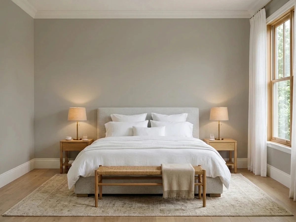
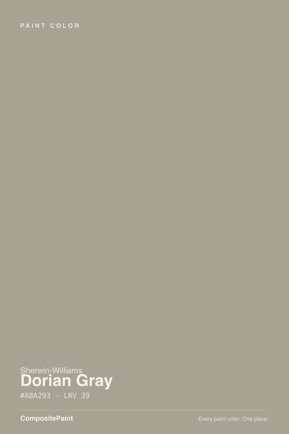
- 1Anonymous20
- 2Felted Wool28
- 3Dorian Gray39
- 4Agreeable Gray60
- 5Pale Oak69
The Fast Verdict
Dorian Gray is the color people land on after their first greige came out too pale. At LRV 39 it actually holds the wall: furniture reads against it, white trim snaps, and it never turns that blue-gray everyone complains about.
The catch is that same weight. Give it one small window and a gray day and it stops being a warm stone color and starts being a heavy, slightly muddy one.
Main rooms with real daylight · craftsman and farmhouse siding · kitchen cabinets and islands · anyone whose last gray kept reading blue
One small north window and no lamps · you want light and airy · your trim is builder cream · you love a crisp, cool gray
- Deep enough to actually furnish a room — trim and art read against it
- Never flips blue, which is the usual complaint about mid grays
- Best-in-class on kitchen cabinets: hides hands and scuffs
- Reads as warm natural stone on siding, with white or black trim
- Sits in the middle of a complete SW ladder — Repose, Mindful, Dorian, Dovetail
- LRV 39 goes heavy and muddy in dim, north-facing rooms
- Picks up green from lawns, trees, and green-toned flooring
- Shows a faint purple-mauve cast next to cream trim or yellow beige
- Too dark to double as a whole-house color in a low-light home
What Color Is Dorian Gray, Really?
A mid-tone greige built on a soft red-brown base — warm, but only just. Saturation sits near 11 percent, so the beige side never announces itself the way a true tan does; it reads as stone or wet sand rather than brown. That low saturation is also why people describe it three different ways in the same thread. Some see taupe, some see a faint purple flash, and outdoors plenty of people see green. All three are true, because there is barely enough color in it to commit to one story.
LRV 39 is the number that decides whether you like it. Repose Gray sits at 58 and Mindful Gray at 48, so Dorian Gray is a full step deeper than the greiges most people already know — closer to Intellectual Gray (36) than to anything in the pale range. On a wall that means real depth: shadows in corners, visible contrast against white trim, a room that feels furnished. In a dim room it means the walls close in, because a mid-tone with no light to reflect behaves like a dark color.
Undertone in one line: warm gray-brown with a faint purple lean — never blue, but it will borrow green from a lawn or a green-toned floor.
Where It Shines
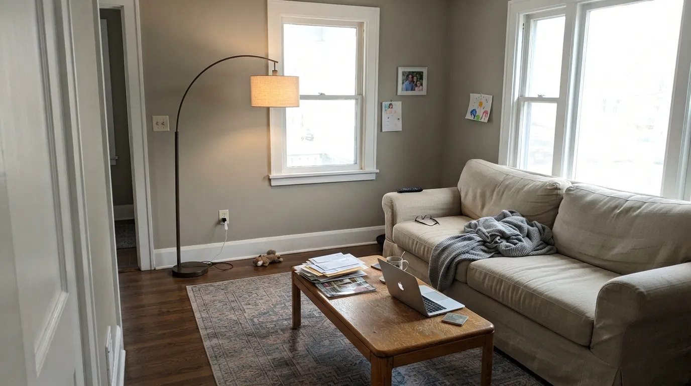
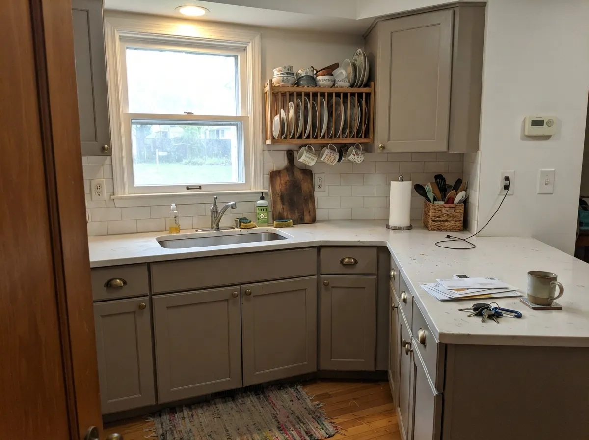
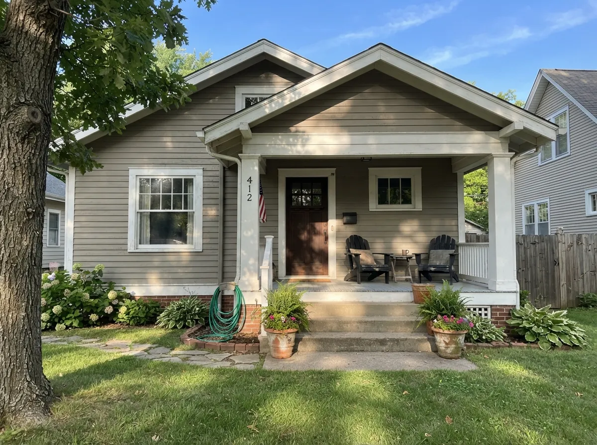
It earns its reputation in rooms with windows on more than one wall and on the front of a house. Main-floor living space, a kitchen where the cabinets carry the color instead of the walls, craftsman siding under white trim — those are the three places it is genuinely hard to beat.
Where It Fails
The bad Dorian Gray stories are boringly consistent, and none of them are about the paint being wrong. They are about light, greenery, and what is already in the room. If your project matches one of these, pick something else now instead of after two coats.
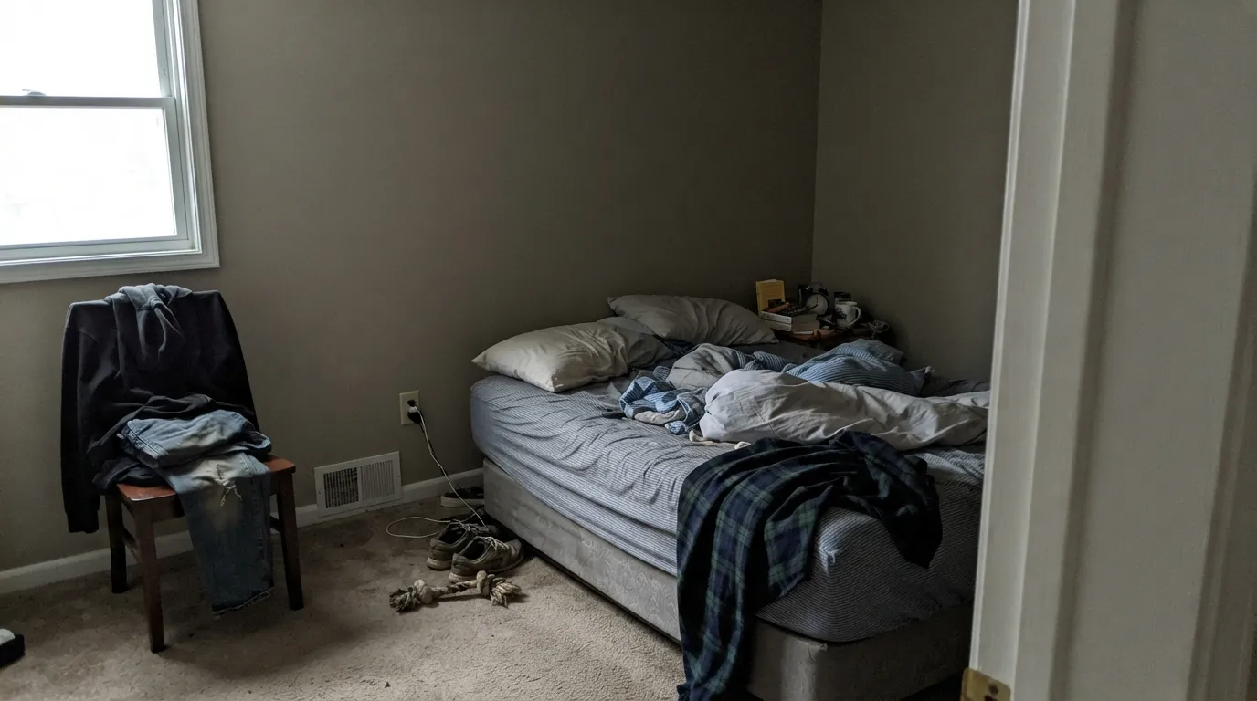
North light is cool and thin, and there is not enough of it here for LRV 39 to bounce back. The warmth drains out, the wall goes flat gray-brown, and people call it dingy or say the room feels smaller. Step up a level: Mindful Gray (SW 7016), LRV 48, is the same family with enough lift to survive.
Grass and leaves throw green light straight onto the wall, and a color this desaturated has nothing to resist it. Homeowners paint the siding, stand back in June, and see sage. If your yard is full of green, go browner: Fawn Brindle (SW 7640), LRV 36, holds its warmth against foliage.
Against yellow-cream the gray side wins and the faint purple in the base shows up — the wall reads cold and slightly mauve while the floor reads orange. Either change the trim to a cleaner white, or use a warmer greige: Anew Gray (SW 7030), LRV 47, sits with orange oak far more comfortably.
Room by Room
This is where it makes sense: enough depth to give art and furniture something to sit against, without going moody. Eggshell walls, Pure White (SW 7005) trim in semi-gloss. One window on a north wall and it gets heavy fast.
On cabinets it looks like a designer choice instead of a builder gray, and it hides hand marks around pulls better than any white. Satin, in a urethane-fortified cabinet enamel. Pair with Alabaster (SW 7008) or Shoji White (SW 7042) walls so the boxes stay the darkest thing in the room.
Under 2700K lamps it goes soft and warm at night, which most people want in a bedroom. Keep the ceiling and trim in Pure White (SW 7005) so the walls do not swallow the room. In a dark bedroom, use it on the headboard wall only.
A Dorian Gray vanity under a white or off-white wall is the safer split, especially in a windowless bathroom. Satin holds up to splashes. Full walls at LRV 39 in a small bath with vanity lighting only will read gloomy.
It flows beautifully out of a bright main room and keeps the whole floor consistent. A hallway with no window and a couple of ceiling cans is a different story — the walls go dull and the trim does all the work. Test it in the actual hall, not the living room.
In full sun it reads as warm natural stone and takes white trim, black windows, and wood tones easily. Satin on siding. Watch the shaded north elevation, which will look a clear step darker and cooler than the sunny side. Full pairings in the exterior section below.
Your Light Is the Risk
Warm sun brings the tan side forward and keeps it stone-colored all day. The room it was made for.
Cool, thin light with nothing to reflect. Warmth drains, the wall reads flat and heavy. Test a big sample.
2700K bulbs make it cozy and taupe. Cool 4000K LEDs push it gray and can expose the purple lean.
Lawn and leaf reflection tips it toward sage in summer. Sample on the shaded side too, not just the sunny wall.
Most complaints about Dorian Gray are a light mismatch. Upload a photo of your actual room and see it on your walls — then ask for the same wall in north light or evening lamps before you buy a single sample.
Need It From Another Brand?
Any paint counter can custom-tint Sherwin-Williams SW 7017 directly. If you would rather stay in one brand's own deck, these are the closest stock matches, measured as ΔE2000. Under 2 is a difference you will not see on the wall.
| Brand | Closest color | ΔE | LRV | |
|---|---|---|---|---|
| Behr | Still GrayN360-3 · Behr | 1.6 | 40 | Color page → |
| Benjamin Moore | Upper West SideCSP-70 · Benjamin Moore | 1.7 | 39 | Color page → |
| Valspar | Building BlockV145-3 · Valspar | 2.7 | 38.7 | Color page → |
| PPG / Glidden | Hot StonePPG1007-4 · PPG / Glidden | 1.6 | 39 | Color page → |
| Glidden | Hot StonePPG1007-4 · Glidden | 1.3 | 39 | Color page → |
| Dutch Boy | Hazy Gray440-3DB · Dutch Boy | 2.6 | 38 | Color page → |
Similar Sherwin-Williams Colors
The nearest shades to Dorian Gray within Sherwin-Williams's own range, ranked by perceptual color distance — useful when you want the same look a touch lighter, darker, or warmer.
WCAG 2.1: AA is 4.5 : 1 for normal text, 3 : 1 for large text, AAA is 7 : 1.
Dorian Gray vs the Colors You're Also Considering
Every Dorian Gray sample board has the same rivals on it. The numbers show the real lightness gap — then it comes down to which risk you would rather live with.
Pick this when the lighter greige looked washed out on your wall.
Sherwin-Williams SW 7016 · LRV 48Mindful GrayPick this for dim rooms — LRV 48 keeps breathing where Dorian sinks.
Side-by-side comparison →Pick this when you want depth but still want a neutral, not a statement.
Sherwin-Williams SW 7018 · LRV 26DovetailPick this for moody accent walls, dark siding, or high-contrast cabinets.
Side-by-side comparison →The most useful comparison is Mindful Gray (SW 7016), LRV 48. It comes from the same greige family but is noticeably lighter, so it reads softer and more forgiving on a full room. Choose Mindful Gray when you want the same undertone with an airier feel, and Dorian Gray, LRV 39, when you want more depth and weight on the wall.
Dovetail (SW 7018), LRV 26, goes the other direction. It is clearly darker and more dramatic, better for a moody accent wall, exterior body, or cabinets where you want real contrast.
Among close matches, Intellectual Gray (SW 7045), LRV 36, is a near sibling that sits slightly darker with a similar warm-neutral character. If Dorian Gray feels a touch light for your project, Intellectual Gray is the natural half-step down.
Dorian Gray Coordinating Colors
Dorian Gray is a mid-tone, which means it needs partners that are clearly lighter or clearly darker — anything within about ten LRV points of it will just look like a mistake. Stay on the warm-neutral side of the deck and give the trim a big gap. These are the pairings that come up again and again on real projects:
Dorian Gray on Exteriors
Outside is where this color has quietly become a default. In full sun it reads as warm natural stone, it does not glare the way pale grays do, and it hides dust and pollen better than anything lighter — which is why it turns up on so many craftsman, farmhouse, and transitional facades.
Two things decide whether you are happy with it. First, greenery: a house ringed by lawn and mature trees gets green light bounced onto the siding, and Dorian Gray has little enough color in it to take on a sage cast in summer. Second, elevation. The shaded north side will read a clear step darker and cooler than the sunny south side, so sample a two-foot board on both and look at them at 9am and 5pm. For trim, warm whites hold up better than cool ones; for accents, warm near-blacks keep the whole facade in the same family.
Dorian Gray on Cabinets and Islands
If you have been talked out of a gray kitchen, this is the color that changes the argument. Dorian Gray on cabinets does not read as the flat builder gray of ten years ago — the brown in the base keeps it soft and earthy, and at LRV 39 it holds enough depth that the doors look like furniture instead of filler.
The practical case is just as strong. Fingerprints, splashes, and the gray shadow that builds up around pulls all disappear on a mid-tone that a white door would broadcast. Use satin in a urethane-fortified cabinet enamel, and keep the walls at least 30 LRV points lighter so the boxes stay the darkest thing at eye level. On a two-tone kitchen it works either way: Dorian Gray on the lowers with a soft white above, or Dorian Gray on the perimeter with a near-black island.
Three Ready Palettes Built on Dorian Gray
A color is never alone on the wall. These are complete combinations in the 60-30-10 pattern, with the reason each one holds together. Every one opens in the visualizer.
Pure White at LRV 84 sits 45 points above the wall, so the trim reads crisp instead of muddy — the contrast Dorian Gray needs to look intentional. Naval supplies the one saturated note in an otherwise all-neutral floor.
Try this palette in your roomAlabaster is warm enough that the trim never looks blue-white against stone-colored siding, which is the usual exterior mistake. Black Fox is a warm near-black, so the dark accents stay in the same brown family instead of going cold.
Try this palette in your roomShoji White shares the same warm base, so the wall-to-cabinet handoff is smooth and nothing flashes purple. Urbane Bronze on the island gives the room a clear anchor and makes the cabinets read mid-tone rather than dark.
Try this palette in your roomDorian Gray FAQ
Is Dorian Gray warm or cool?
Warm, but quietly. The base is a soft red-brown and the saturation is only about 11 percent, so it reads as a balanced greige rather than a beige. It will never turn blue on you, which is the main reason people move to it from other mid grays.
Is Dorian Gray too dark for a small room?
It can be. LRV 39 needs light to work; in a small room with two good windows it looks rich, and in a small room with one north window it looks heavy. If you only have one window, use Mindful Gray (SW 7016) at LRV 48 instead, or keep Dorian Gray to a single accent wall.
Does Dorian Gray look purple?
Sometimes, in specific company. The base carries a trace of purple that stays invisible next to clean whites and warm wood, but shows up against cream trim, yellow-beige carpet, or under cool 4000K LEDs. Warm 2700K bulbs and a crisp white trim like Pure White (SW 7005) keep it out of the picture.
What white trim goes with Dorian Gray?
Pure White (SW 7005), LRV 84, is the safe answer — the 45-point gap makes the trim look deliberate. Alabaster (SW 7008), LRV 82, is the warmer option if you want a softer edge. Avoid builder cream; that is the pairing that brings out the mauve.
Dorian Gray or Mindful Gray?
Same family, one step apart. Mindful Gray (SW 7016) at LRV 48 is the forgiving whole-house choice; Dorian Gray at 39 is the one you pick when the lighter greige looked washed out and gutless on your wall. In a bright room Dorian Gray wins easily. In a dim one, Mindful Gray does.
Is Dorian Gray good for kitchen cabinets?
It is one of its best uses. Use satin in a urethane-fortified cabinet enamel. It reads as a soft, earthy gray rather than a builder gray, hides fingerprints around the pulls, and works with brass, matte black, and oil-rubbed bronze hardware. Keep the walls lighter — Alabaster (SW 7008) or Shoji White (SW 7042).
Will Dorian Gray look the same in every Sherwin-Williams paint line?
Not exactly, and this trips people up on touch-ups. Homeowners regularly report that Dorian Gray in Duration and Emerald do not match on the wall, because the base and sheen differ between lines. Buy the whole job in one product and one sheen, and keep a labeled cup for repairs.
Have you painted with Dorian Gray?
Rate it — one tap helps the next reader decide.
Ask a Question