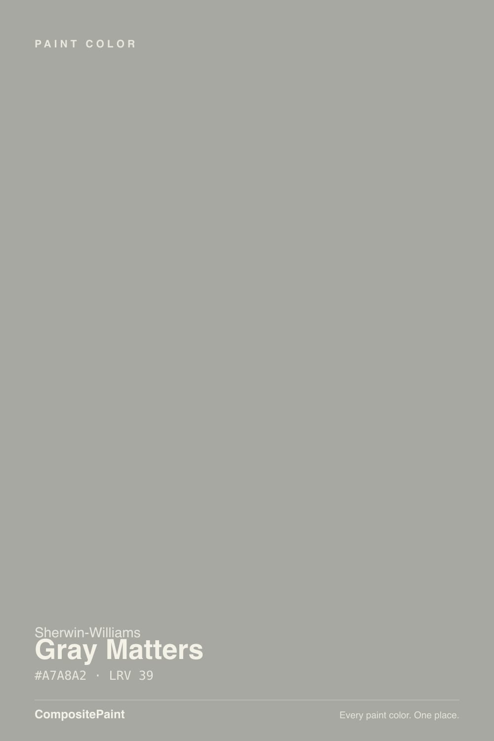
Gray Matters
SW 7066 · #A7A8A2 · LRV 39 — neutral with no strong undertone, mid-tone — versatile but shifts visibly with light.
- 1Pewter Green12
- 2Retreat21
- 3Gray Matters39
- 4Upward57
- 5Sea Salt63
What Color Is Gray Matters, Really?
Gray Matters SW 7066 is a true mid-tone gray. Its LRV of 39 sits right in the middle of the scale, so it reflects a moderate amount of light and reads as a real color on the wall rather than a pale wash. The hex is #A7A8A2, and the saturation is only about 3 percent, which means there is almost no undertone pulling it warm or cool. That is unusual. Most grays lean blue, green, or taupe.
People pick it for exactly that reason. When a room already has busy flooring, mixed metals, or a countertop with its own strong color, a neutral gray stays out of the argument. It gives depth without adding another undertone to manage, and at LRV 39 it is dark enough to read as intentional next to white trim.
The catch is that a color this neutral has no personality of its own to defend. It takes on the cast of whatever is next to it and whatever bulb is overhead. In a north room it can flatten into cold stone, and in a small space with little natural light it will look heavier than the chip suggests. Sample it against your fixed materials, not on bare drywall.
Gray Matters is about as close to a plain gray as this line gets. Its saturation is roughly 3 percent, so almost nothing is pulling it in any direction. The hue technically sits at 70 degrees, which is in the yellow-green part of the wheel, but at that saturation it shows up as a faint softness rather than a visible green or beige cast.
Because it carries so little color of its own, it borrows from its neighbors. Next to a warm beige it can look faintly cool. Next to a blue-gray it can look faintly warm. Against a green-leaning tile or a green stone counter, the trace of yellow-green in it will wake up and become noticeable.
So test it beside your fixed materials rather than on an empty wall. A neutral this quiet is defined almost entirely by what surrounds it, and a chip taped to bare drywall tells you very little about how it will behave in the finished room.
Best Rooms and Uses for Gray Matters
An LRV of 39 makes this a mid-tone. It has enough depth to look like a deliberate color, but it does not swallow light the way a deep charcoal would. That range suits living rooms, bedrooms, dining rooms, and home offices with reasonable natural light. In a small interior room with no window it will feel heavier than the chip suggests, so keep the ceiling and trim much lighter there.
Its neutrality earns its keep on cabinets and built-ins, where a gray with a strong undertone can fight a countertop. It also works as an island color under lighter perimeter doors.
Outside it makes a quiet body color with white or near-white trim, and it is an easy choice for garage doors and shutters. It is not a statement color. Let a dark front door or the landscaping carry the contrast instead.
How Lighting Changes Gray Matters
At LRV 39 Gray Matters reflects a middling amount of light, so the room does much of the work. In north-facing rooms the cool, flat daylight drains what little warmth it holds, and it reads darker, cooler, and more like plain stone. In south-facing rooms the extra light lifts it and the faint yellow-green side comes forward, which softens the whole wall.
East rooms look cooler and crisper in the morning, then settle down after midday. West rooms stay flat early and warm up through the late afternoon.
Bulbs move it just as much as windows do. Warm 2700K light nudges it toward greige. Cooler 3500K to 4000K light pushes it toward a clean, almost blue gray. Because a mid-tone at 39 goes dim once the sun drops, look at your sample at night under the fixtures you actually own, not only in daylight.
Most complaints about Gray Matters are a light mismatch. Upload a photo of your actual room and see it on your walls — then ask for the same wall in north light or evening lamps before you buy a single sample.
Need It From Another Brand?
Any paint counter can custom-tint Sherwin-Williams SW 7066 directly. If you would rather stay in one brand's own deck, these are the closest stock matches, measured as ΔE2000. Under 2 is a difference you will not see on the wall.
| Brand | Closest color | ΔE | LRV | |
|---|---|---|---|---|
| Behr | Silver Gray6694 · Behr | 1.3 | 39 | Color page → |
| Benjamin Moore | Platinum GrayHC-179 · Benjamin Moore | 0.3 | 40 | Color page → |
| Valspar | Classic GrayscaleV121-2 · Valspar | 0.8 | 38.4 | Color page → |
| PPG / Glidden | Statue GardenPPG0996-3 · PPG / Glidden | 1.8 | 39 | Color page → |
| Glidden | Statue GardenPPG0996-3 · Glidden | 1.8 | 39 | Color page → |
| Dutch Boy | Ironed Gray436-4DB · Dutch Boy | 2.6 | 38 | Color page → |
Similar Sherwin-Williams Colors
The nearest shades to Gray Matters within Sherwin-Williams's own range, ranked by perceptual color distance — useful when you want the same look a touch lighter, darker, or warmer.
WCAG 2.1: AA is 4.5 : 1 for normal text, 3 : 1 for large text, AAA is 7 : 1.
Gray Matters vs Similar Colors
Ellie Gray SW 7650 at LRV 40 is the closest neighbor in the line. Its hex, #AAA9A4, carries a little more red than Gray Matters at #A7A8A2, so it reads a touch warmer and a hair lighter. Dorian Gray SW 7017, also LRV 39, goes further at #ACA79E and clearly leans taupe, which is the line between a gray and a greige.
Breakwater SW 9638 at LRV 38 and Gris SW 7659 at LRV 39 both hold more blue and read cooler. Unusual Gray SW 7059 at LRV 38 tips the other way into green.
Across brands, Benjamin Moore Platinum Gray HC-179 at LRV 40 is only a deltaE of 0.29 away, effectively the same color. Behr Silver Gray 6694 at LRV 39 is 1.26 away, visually identical in normal room light. Farrow and Ball Vitty Green No. G3 at LRV 40 is 3.76 away, close but visibly different side by side.
Colors That Go With Gray Matters
Trim needs a clear jump in brightness. Pure White SW 7005 at LRV 84 and White Sand SW 9582 at LRV 84 both sit far enough above the walls to read as crisp trim, and White Sand's warm lean keeps the pairing from turning cold.
For a companion color in an open plan, Jogging Path SW 7638 at LRV 49 is lighter and clearly warmer, so the two read as related rather than repeated. Mega Greige SW 7031 at LRV 37 sits at nearly the same depth with warmth added, which works better in an adjoining room than on the same wall run.
For accent, Debonair SW 9139 at LRV 34 brings a cool blue-green that plays off the neutrality without clashing. Natural oak, walnut, black hardware, and brushed nickel all sit comfortably against it. Heavy polished brass can look very yellow next to a gray with this little warmth of its own.
Coordinated palette
Generated by hue-rotating #A7A8A2 in HSL space. Pair Gray Matters with one accent and one neutral — the swatches below are starting points, not final picks.
Gray Matters FAQ
Is Gray Matters warm or cool?
It is neither, which is the point. With roughly 3 percent saturation it has no strong undertone, so it does not lean blue, green, or taupe the way most grays do. In practice it takes on a small amount of whatever surrounds it, reading slightly warm next to cool colors and slightly cool next to warm ones.
What LRV is Gray Matters?
Gray Matters SW 7066 has an LRV of 39. LRV runs from 0 for black to 100 for pure white, so 39 is a genuine mid-tone. It reflects enough light to stay open on a full wall, but it will look clearly darker in a room without much natural light.
Does Gray Matters work in a dark room?
It can, but go in with your eyes open. At LRV 39 it needs light to stay lively, and in a north-facing or windowless room it flattens and reads colder and heavier. If that room is the plan, pair it with a much brighter trim white and warm 2700K bulbs, or step up to a lighter neutral instead.
What white trim goes with Gray Matters?
Any white far enough above LRV 39 to look crisp. Pure White SW 7005 at LRV 84 gives a clean, neutral edge, and White Sand SW 9582 at LRV 84 does the same job with a warm yellow lean that softens the contrast. Both are bright enough that the walls read as a chosen color rather than dirty white.
Is Gray Matters good for cabinets and exteriors?
Yes on both counts. Because it has almost no undertone, it is unlikely to fight a countertop or a stone surround, which makes it a safe cabinet and island color. Outside, its LRV of 39 gives a mid-depth body color that reads as a quiet gray against white trim, shutters, and garage doors.
Does Gray Matters have a green undertone?
Only in the faintest sense. Its hue sits at 70 degrees, which is in the yellow-green range, but at about 3 percent saturation that lean is almost invisible on a wall. It becomes noticeable mainly next to another green, such as a green tile or a green-veined stone, which can pull the trace of green forward.
Have you painted with Gray Matters?
Rate it — one tap helps the next reader decide.
Ask a Question