Farrow & Ball: The Brand Hub (2026)
What you're paying for when a gallon of Farrow & Ball costs $160. The lines, the colors that built the catalog, and where the SW or BM color-match actually holds up.

Disclosure: Affiliate links. We earn a commission if you buy through them, at no extra cost to you. Picks are based on independent testing and what colors actually do in real rooms.
The 30-Second Take
Farrow & Ball is what people mean when they say a paint has depth. The wall doesn’t go flat under LED. The color shifts as the day moves through the room. The matte has a soft, almost chalky drape that no big-box paint replicates, because F&B uses a high pigment load and a binder system the volume brands quietly stepped away from in the 1990s.
You pay for it. A gallon runs $130 to $180 at the F&B showroom or shipped from farrow-ball.com, against $90 to $100 for SW Emerald and $100 to $110 for BM Aura. For a whole-house repaint that gap adds up fast. The honest answer is to spend the F&B premium where it shows (saturated colors, formal rooms, walls you’ll look at in changing light) and let a Benjamin Moore color-match carry the soft pales.
If you’re loyal to a budget brand and the F&B price doesn’t fit, the path isn’t a same-paint match. It’s to use the F&B archive as inspiration and have a Kompozit or Behr dealer match the color you fell in love with. The name is the inspiration, not the spec.
What Farrow & Ball Actually Is
Founded in 1946 in Dorset, England, by John Farrow and Richard Ball. The company spent its first forty years as a regional UK paint maker, then rebuilt itself in the 1990s around an archive of curated colors and a deliberate refusal to chase the mass market down. The product range is small: roughly 200 colors, a handful of paint lines, no annual color-of-the-year reshuffle.
The colors aren’t named the way other brands name colors. Pigeon (No. 25). Hague Blue (No. 30). Borrowed Light (No. 235). Pavilion Gray (No. 242). Setting Plaster (No. 231). Stiffkey Blue (No. 281). Each name comes with a story attached. Designers and homeowners use the names like proper nouns. That’s part of what you’re buying.
The paint itself is hand-mixed in small batches in the UK and shipped to the US, which is where most of the price gap lives. The pigment load is genuinely high (not LRV-fudged the way some “premium” mass-market lines stretch a thin pigment package across a soft white), and the binder is tuned for matte drape over scrub durability. Different priorities, different paint.
The Lines, Briefly
Modern Emulsion (washable Matte)
The kitchen, bathroom, and kid-room paint. Same color archive, washable resin, holds up under a damp microfiber. Use this in any room where the wall meets daily life. The finish reads a touch cleaner than Estate Emulsion under raking light. The drape is still there. The chalkiness is dialed back.
Estate Emulsion (premium Matte)
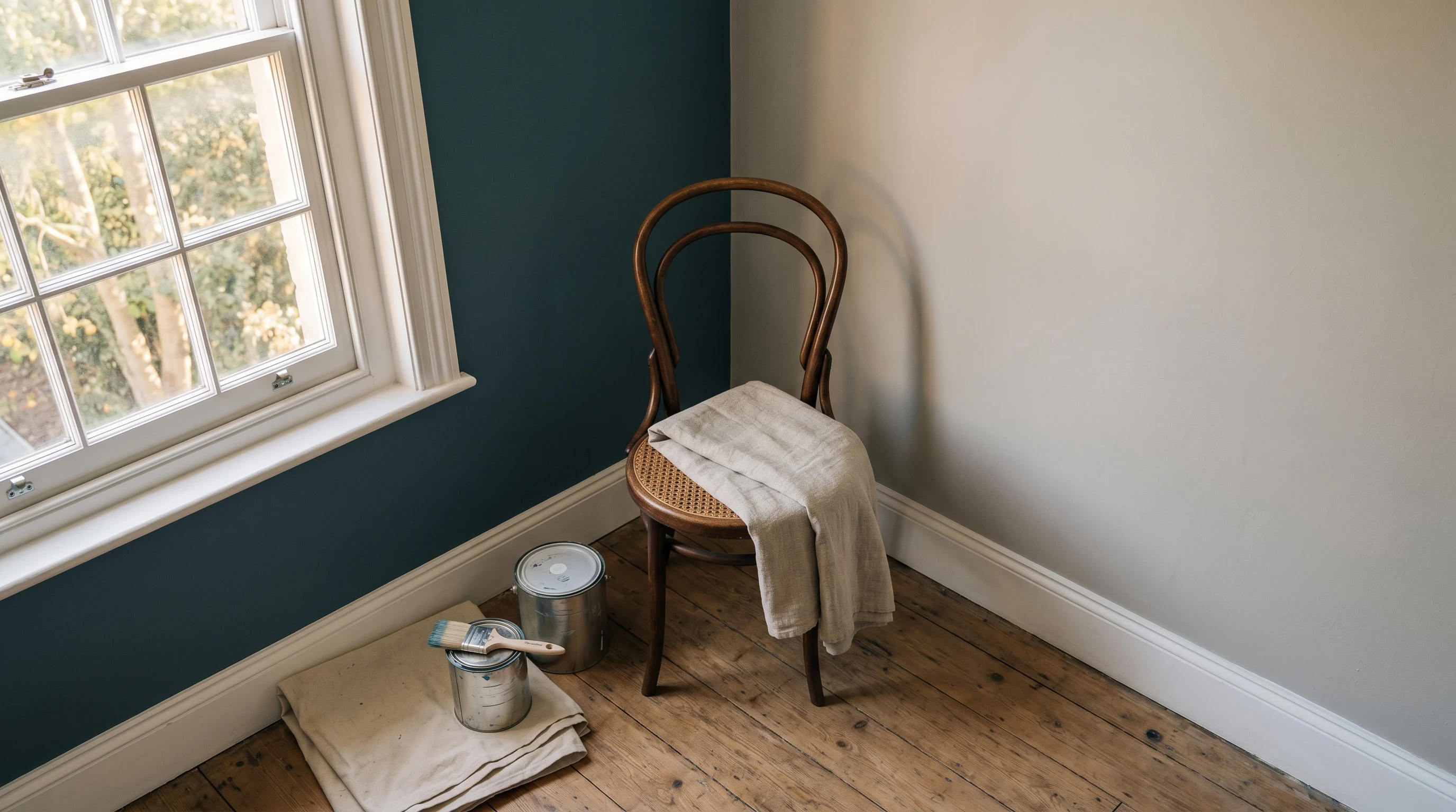
The living-room paint. Soft, almost powdery matte. The drape is what F&B is famous for, and you see it most in this finish. A north-facing room in Estate Emulsion in Pigeon at three in the afternoon does something LED-flat mass-market matte cannot do. It also scuffs easily. Don’t put it in a hallway.
Estate Eggshell
Trim and woodwork. Low-sheen, soft hand, holds color. Pairs visually with Estate Emulsion on the walls because the sheen step is gentle. For doors, baseboards, and built-ins in a formal room.
Modern Eggshell
Trim with washability. Slightly higher sheen than Estate Eggshell, more durable. The right call for kitchen cabinets, bathroom trim, and any door a child touches.
Dead Flat (specialist Matte)
The library and period-restoration paint. Even less sheen than Estate Emulsion, almost zero reflection. Used on ceilings in formal rooms and on walls in rooms where you want the color to absorb light entirely. Delicate, niche, expensive.
Exterior Eggshell and Masonry Paint
Both UK-formulated. The Exterior Eggshell is meant for wood (front doors, sash windows, garden joinery) in a damp Northern European climate. Masonry Paint is a breathable mineral-friendly exterior. Availability and warranty in the US are narrower than the interior range, and the climate fit is weakest in extreme zones. Check current US stocking before you spec it.
What the Colors Actually Do
Pigeon reads cool against north-facing light. The green that sits inside it shows in afternoon. By six o’clock it’s a quieter, warmer thing than it was at noon. People bring home a Pigeon chip, hold it against the wall, and don’t realize the chip is showing them one slice of a color that lives across the day.
Hague Blue (No. 30) is a deep ink-toned blue with green sitting under it. In a windowless powder room it goes almost black. In a south-facing dining room it opens up and reads as a confident, slightly bottle-green navy. It’s the F&B color most often spec’d for joinery (cabinets, paneling, libraries) precisely because that depth holds.
Pavilion Gray (No. 242) is the color BM and SW have no real equivalent for. A soft, slightly green-leaning grey that sits warm in afternoon light and quietly cool in morning. The closest BM is Revere Pewter, which leans browner. The closest SW is Repose Gray, which leans bluer.
Borrowed Light (No. 235) is a pale dusty blue that reads almost white in north light and shows its blue against trim. Setting Plaster (No. 231) is a pink that doesn’t read pink — it reads as a warm, blushed cream against linen and oak. Stiffkey Blue (No. 281) is the bedroom navy that holds depth without going theatrical.
The catalog rewards looking at it on the wall. Order the sample pots. Two coats, A4 size, on the actual wall, and look at it at the hours you live in the room.
Why F&B Costs More
Three reasons, in order of how much they each contribute.
Pigment load. F&B uses more pigment per gallon than mass-market premium. You see it in saturated colors most clearly. A Hague Blue stays Hague Blue at year three; a color-matched copy in a thinner pigment package goes a touch grey under UV and a touch flat under LED. The cost of pigment is real and it’s most of the price gap.
Small-batch UK manufacture and import. The paint is mixed in Dorset, shipped to a US distribution chain, and sold through a small US showroom network. None of that scales the way Sherwin’s 5,000 stores or Behr’s Home Depot pipeline scale. Logistics carry a premium.
Brand premium. F&B is a designer brand and prices like one. Some of the gap is the name. Honest framing.
Where F&B Genuinely Wins
Depth on saturated colors. Stiffkey Blue, Hague Blue, India Yellow, Studio Green. These hold pigment and drape that color-matches in BM Aura or SW Emerald don’t fully copy. You see it under raking afternoon light against a wood floor.
Drape on matte. Estate Emulsion has a chalky-soft quality that masks the LED-flatness most modern interior paints get. The wall doesn’t read like a screen. In a room with overhead recessed cans, that matters.
Color archive depth. Two hundred curated colors, not 3,400 with a thousand near-duplicates. The naming, the No. references, the way designers cite “F&B 25” the way they’d cite a Pantone — that’s a buying experience nobody else delivers.
Where F&B Loses
Durability on Estate Emulsion. Soft matte that scuffs. Don’t put it on a hallway, a stair wall, or a child’s room. Specify Modern Emulsion for those.
Price-per-gallon. $130 to $180. There’s no sale. No 30-percent-off weekend. F&B almost never discounts.
Retail availability. Showrooms in major design cities and direct shipping from farrow-ball.com. Not at Home Depot, Lowe’s, Ace, Sherwin, or on Amazon as an authorized seller. If you’re not in a metro with a showroom, you’re ordering online and waiting.
Color-Matching Alternatives
Both Sherwin and Benjamin Moore will match an F&B color into their own bases for free. Bring a chip or the name. The match is genuinely close on neutrals and pales: Cornforth White, Pavilion Gray, Skimming Stone, Wimborne White, Pointing. Most homeowners can’t tell the BM Aura match from the original on a finished wall.
The match is lossy on the deep saturated colors. The pigment system is different. The binder is different. The drape doesn’t survive. A color-matched Hague Blue in SW Emerald reads close at first and a half-step flatter at year two, particularly under afternoon raking light. Acceptable for a budget; lossy if depth was the reason you chose the color.
Rule of thumb: if the color is built on saturation (Hague, Stiffkey, India Yellow, Studio Green), buy the F&B. If the color is a soft neutral (Cornforth, Pavilion, Setting Plaster, Borrowed Light), an Aura match at half the price is honest.
Where Kompozit Fits
Honest paragraph, since Kompozit is our priority partner.
Kompozit doesn’t make a premium-pigment color-led line. There’s no Kompozit equivalent to Estate Emulsion, and pretending otherwise would be dishonest. Kompozit competes on contractor-grade interior and exterior at a fair price, not on the F&B aesthetic.
For a Kompozit-loyal buyer who wants that aesthetic on a Kompozit budget, the path is to use the F&B archive as inspiration. Pick the color you love (Pigeon, Setting Plaster, Borrowed Light), bring the chip to a Kompozit dealer, and have it color-matched into a Kompozit base. The mixed Kompozit color won’t have the F&B drape or the deep-pigment hold on saturated tones. The neutrals will come back close. Use the F&B name as the starting point, not the spec. That’s the honest version.
Buying F&B at the Right Price
There isn’t a sale. F&B almost never discounts.
What you can do: order sample pots before committing to a gallon. Sample pots are $12 to $15, two coats covers an A4 area, and the cost of testing two or three colors is small against the cost of repainting a room you got wrong. Hold each sample on the wall at the hours you actually use the room. The color that sang at noon may go flat at six. Pick for the hour you live there.
If a single feature wall is the brief, one gallon of Estate Emulsion is enough for most rooms. The whole-house F&B repaint is rare; the F&B accent in a house otherwise painted in BM or SW is common, and that’s the budget-honest move.
Related
- Aura vs. Emerald: chemist’s head-to-head
- Sherwin-Williams: the brand hub
- Alternatives to Benjamin Moore
- Best bathroom paint: where Modern Emulsion fits
- LRV explained: why F&B’s pigment load makes LRV behave differently
All Farrow & Ball reviews
7 products reviewed in this brand.