CP

Room Colors · Kitchen

12 Best Kitchen Paint Colors for 2026
ideas, combinations, and real rooms

12 curated picks from real kitchens — with the exact colors, honest reasons why, and the combinations that hold the room together.

Jessica Williams
Jessica Williams· Color Stylist & Interior Editor

Former interior stylist who can spot a green undertone from across a room. Jessica writes the color and mood pieces — what to choose, what pairs, and why your "white" looks pink.

The Fast Answer

Don't want to read 12 picks? These four are the safe answers.

BM OC-17 · LRV 85 · LRV 86
The classic creamy off-white for cabinets when you want bright and timeless, not stark.
SW 7008 · LRV 82 · LRV 82
The most-spec'd warm white for kitchen walls — a clean backdrop behind painted cabinets.
SW 7036 · LRV 58 · LRV 58
Warm wall neutral for kitchens with cool granite or marble countertops.
BM HC-154 · LRV 6 · LRV 8
The navy that defined kitchen cabinets and islands this decade — pairs with brass and white quartz.
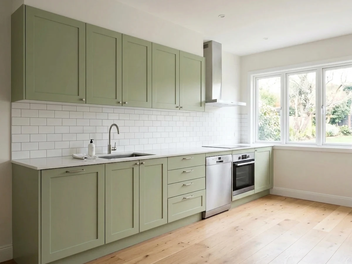
Room painted in Back to Nature
Back to Nature
Try it in your room →
Top picks · see them in a room

Top Picks for the Kitchen

Pick a color family, tap a shade to see the kitchen in it, then try it on your own room.

Back to Nature
#A6B188

The cabinet color that defined kitchen renovations 2022-2026 — works on uppers, lowers, or an island.

SEE IT IN YOUR ROOM →

Kitchen Color Trends 2026 — What's In, What's Out

On the Way Out
  • Stark bright whiteDesigner demand for white finishes fell for the first time in nine years — creamy off-whites do the job warmer.
  • Cool gray cabinetsThe 2015 default; gray cabinets with chrome hardware now read cold and industrial, and the slide isn't stopping.
  • High-gloss finishesGlossy doors faded with the cool palette — matte and satin textures replaced them.
  • All-black kitchensSolid black on every cabinet reads as sterile as stark white; black survives on the island or lowers only.

The 12 Best Kitchen Paint Colors

Every pick below is a real rendered kitchen, not a chip. The lead color first; the swatches are the full scheme in the photo — walls, furniture, textiles, accent.

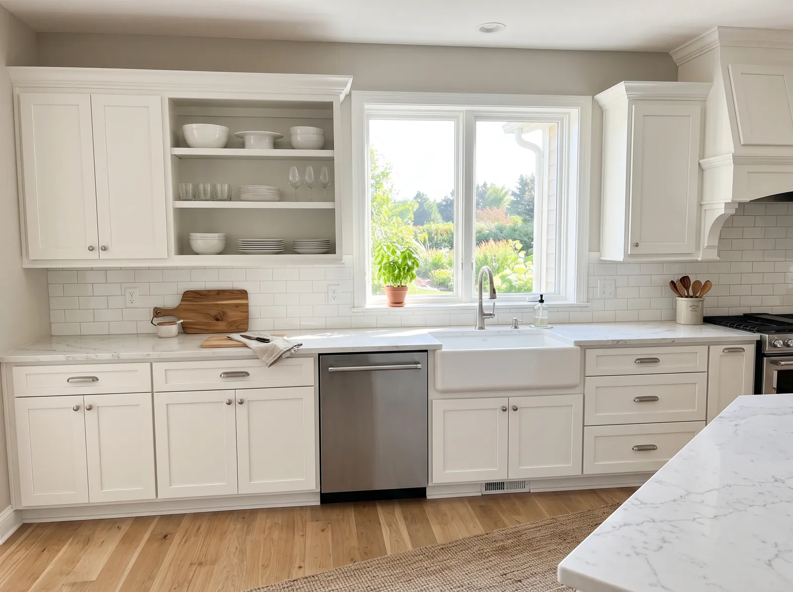
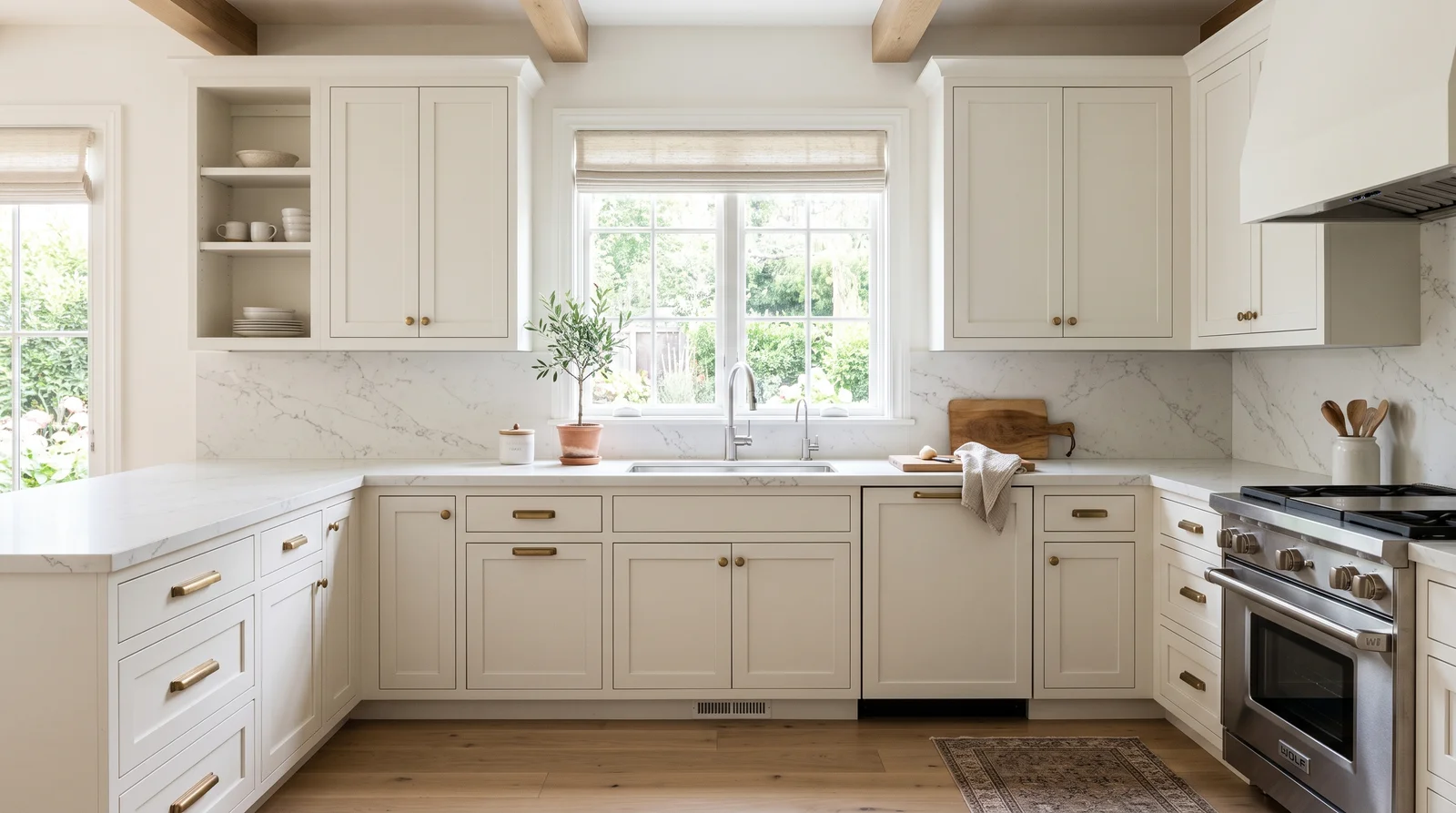
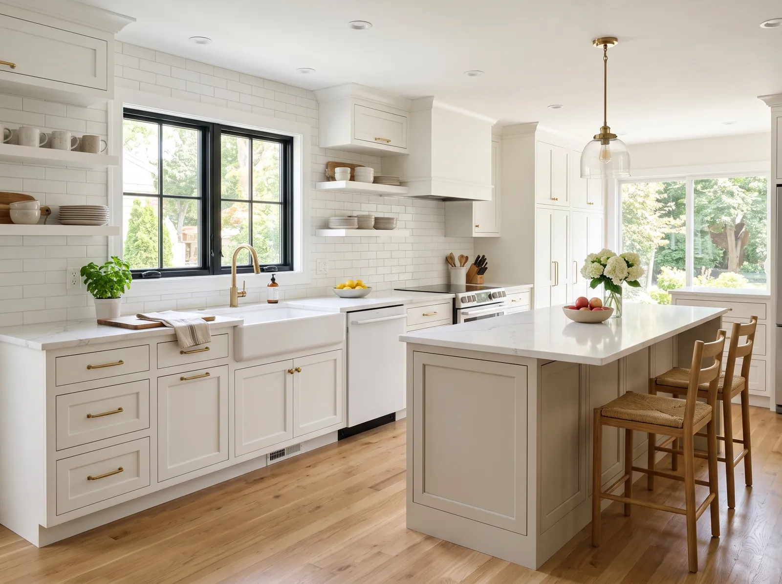
Crisp White Kitchen — kitchen painted in New House White
1New House WhiteBehr · Crisp White Kitchen

Bright, clean, and timeless, this is the kitchen that always feels fresh and never goes out of style.

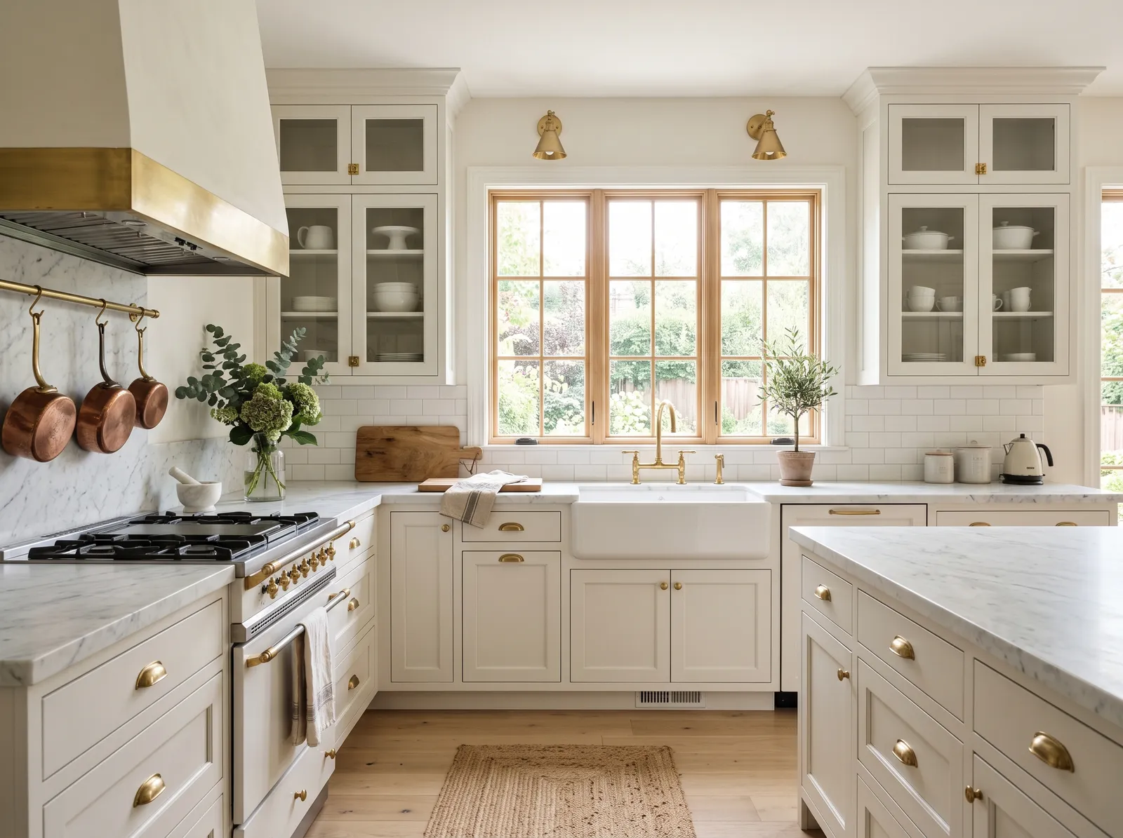
Soft white is a clean, bright neutral that makes any space feel instantly larger. In this kitchen, it covers the walls and perimeter cabinets, while a gentle greige anchors the central island. Warm oak barstools with woven seats pull up to the marble countertop, matching the beautiful light wood floors below. The entire room feels incredibly bright, airy, and calm. This combination works beautifully because the natural wood tones prevent the white-on-white scheme from feeling too sterile or cold. It is perfect for busy families who want a serene, welcoming hub.
Walls · Behr
Cabinet · Benjamin Moore
Chairs · Dunn-Edwards
Accent · Valspar
SEE IT ON YOUR WALLS →
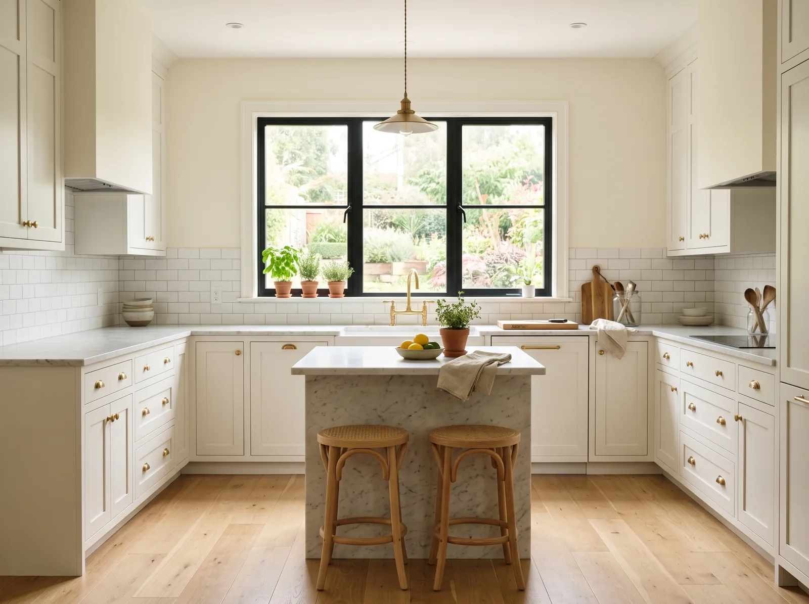
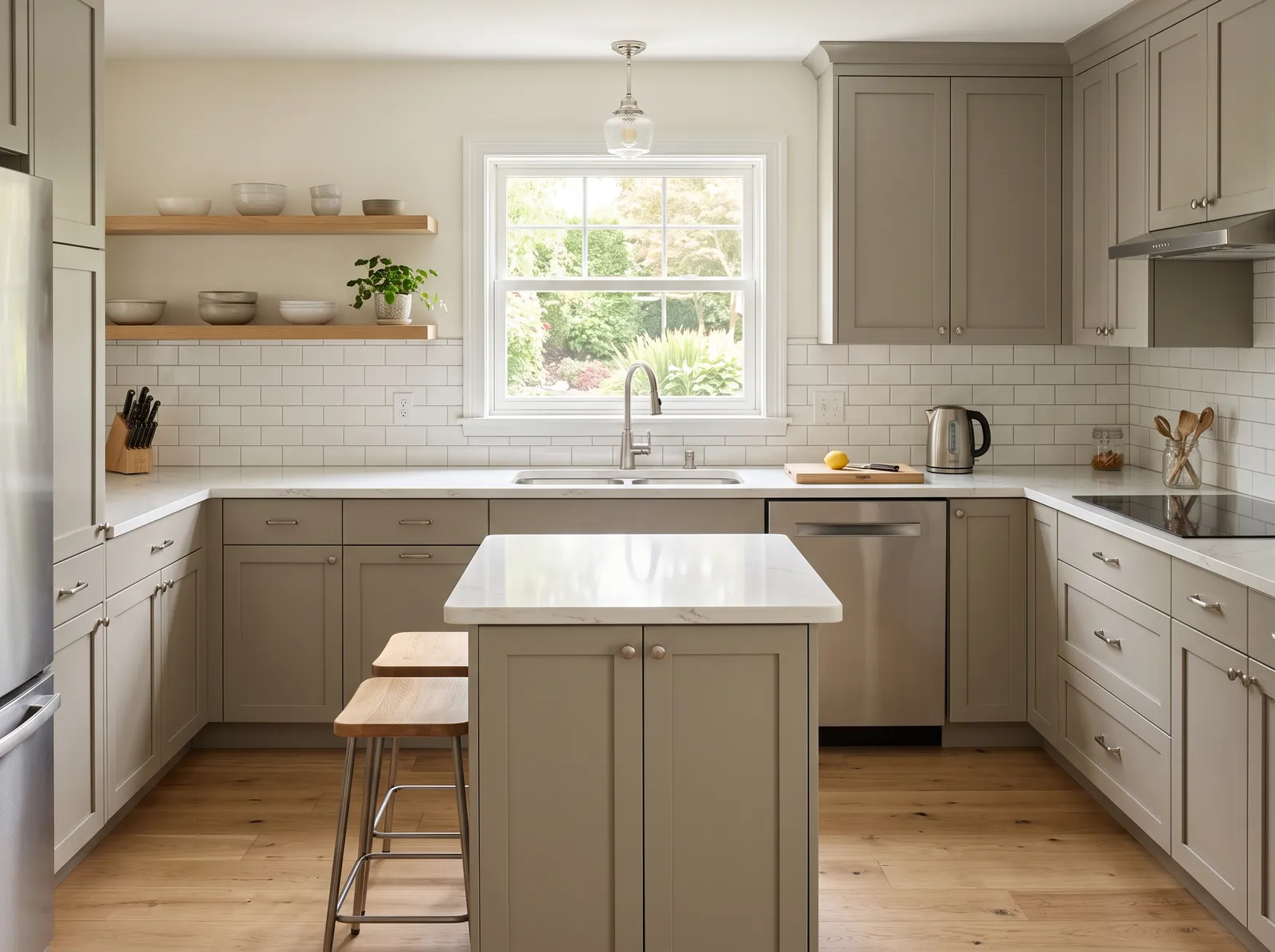
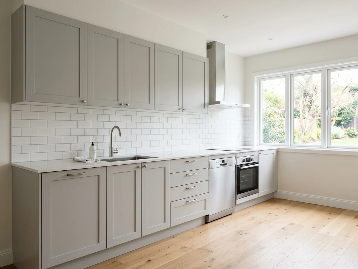
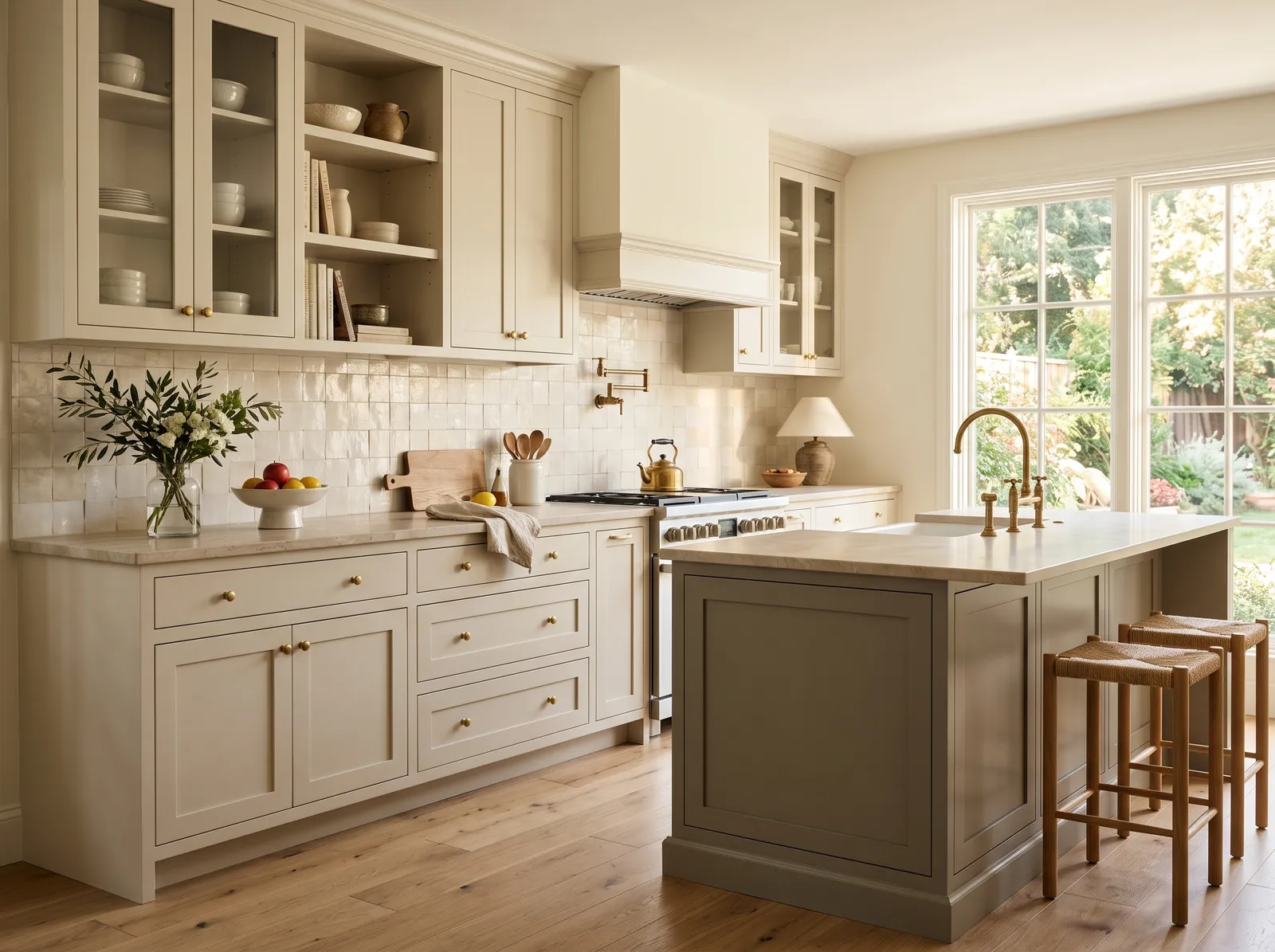
Warm Greige Kitchen — kitchen painted in Washed Cotton
2Washed CottonDutch Boy · Warm Greige Kitchen

Soft, creamy cabinets that feel cozy and welcoming, like sunlight on a quiet weekend morning.

Cream is a soft, buttery off-white that instantly brings sunshine indoors. In this kitchen, that gentle cream coats the walls and ceiling, while the perimeter cabinets wear a slightly deeper beige. The central island anchors the space in a muted olive-gray, paired beautifully with warm oak barstools and light wood floors. The entire room feels incredibly calm, airy, and grounded. This combination works because layering closely related neutrals creates depth without visual clutter. It is perfect for anyone who loves a serene, timeless kitchen that feels like a permanent Sunday morning.

Walls · Dutch Boy
Cabinet · Behr
Cabinet · Sherwin-Williams
Chairs · Benjamin Moore
Ceiling · Behr
SEE WASHED COTTON ON YOUR WALLS →
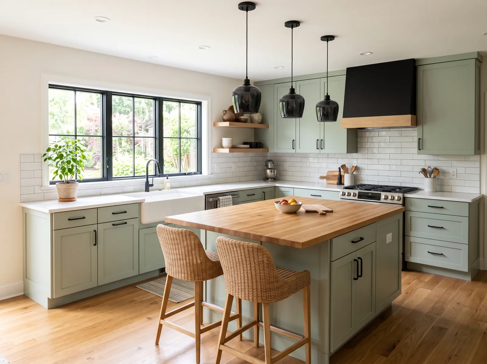
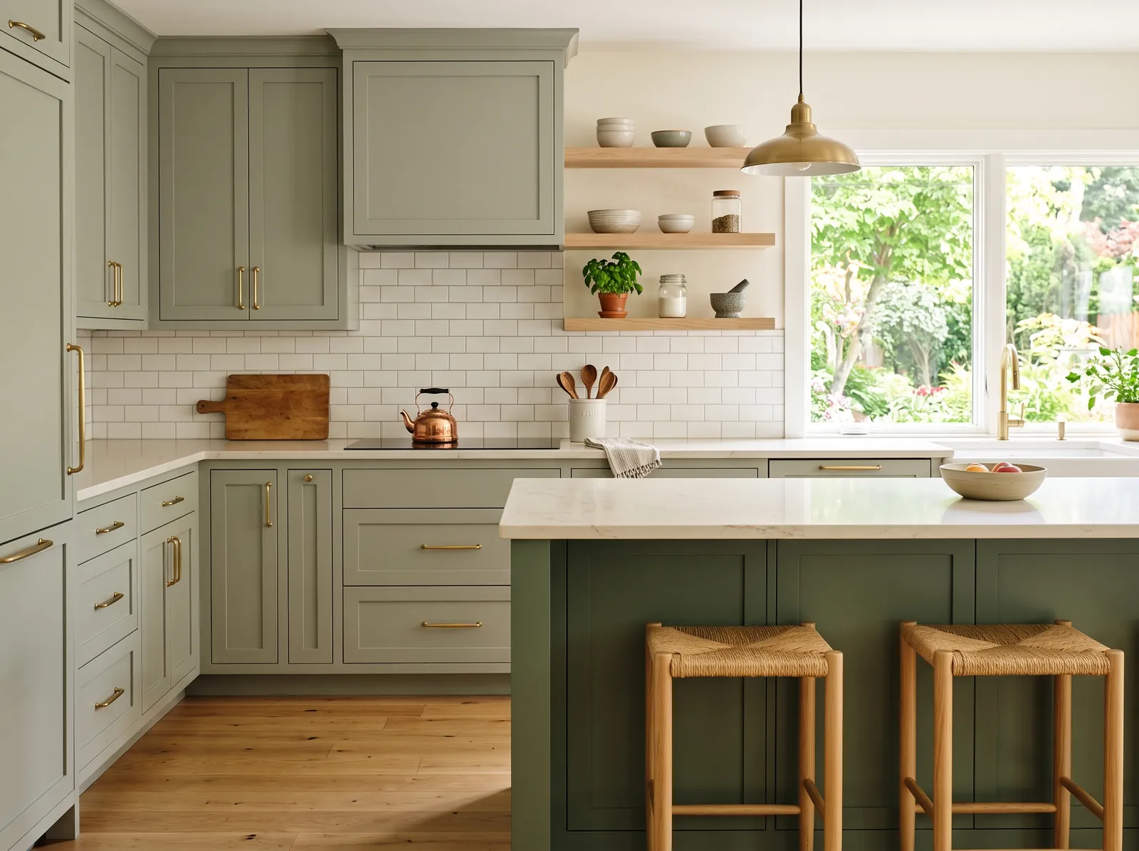
Soft Sage Cabinets — kitchen painted in Abstract White
3Abstract WhiteDunn-Edwards · Soft Sage Cabinets

Gentle gray-green cabinets that bring a little calm and garden freshness into the heart of the home.

Cream is a wonderfully soft, warm off-white that feels much friendlier than stark white. In this kitchen, it coats the upper walls, letting the gentle sage green perimeter cabinets and the deeper forest green island take center stage. Woven wooden barstools and light oak floors ground the space in natural textures. The entire room feels incredibly calm, fresh, and welcoming. This combination works beautifully because the earthy greens and warm wood tones naturally complement each other like a forest canopy. It is perfect for anyone who wants a serene, nature-inspired cooking space.

Walls · Dunn-Edwards
Cabinet · Dunn-Edwards
Cabinet · Benjamin Moore
Chairs · Benjamin Moore
Accent · Dutch Boy
SEE ABSTRACT WHITE ON YOUR WALLS →
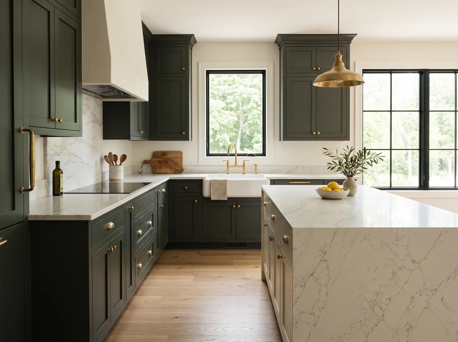
Deep Green Cabinets — kitchen painted in Arcade White
4Arcade WhiteSherwin-Williams · Deep Green Cabinets

Rich, grounded green that feels both classic and a little daring, perfect with warm metal and stone.

Cream is a wonderfully soft, clean backdrop that instantly makes a room feel welcoming. Here, those creamy walls pair beautifully with deep forest green cabinets and a massive white marble island. The space feels incredibly calm, grounded, and high-end. This combination works so well because the dark green grounds the kitchen while the bright marble and light walls keep the entire room feeling airy and bright. It is perfect for anyone who wants a classic kitchen with a rich, natural twist.

Walls · Sherwin-Williams
Cabinet · Valspar
Table · Benjamin Moore
Accent · Dunn-Edwards
SEE ARCADE WHITE ON YOUR WALLS →
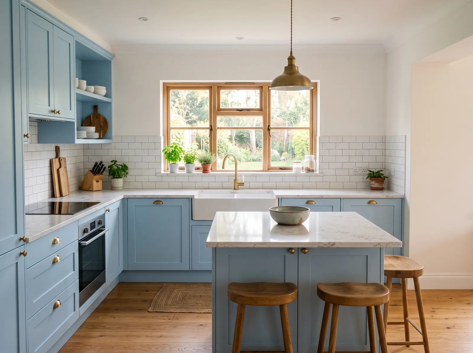
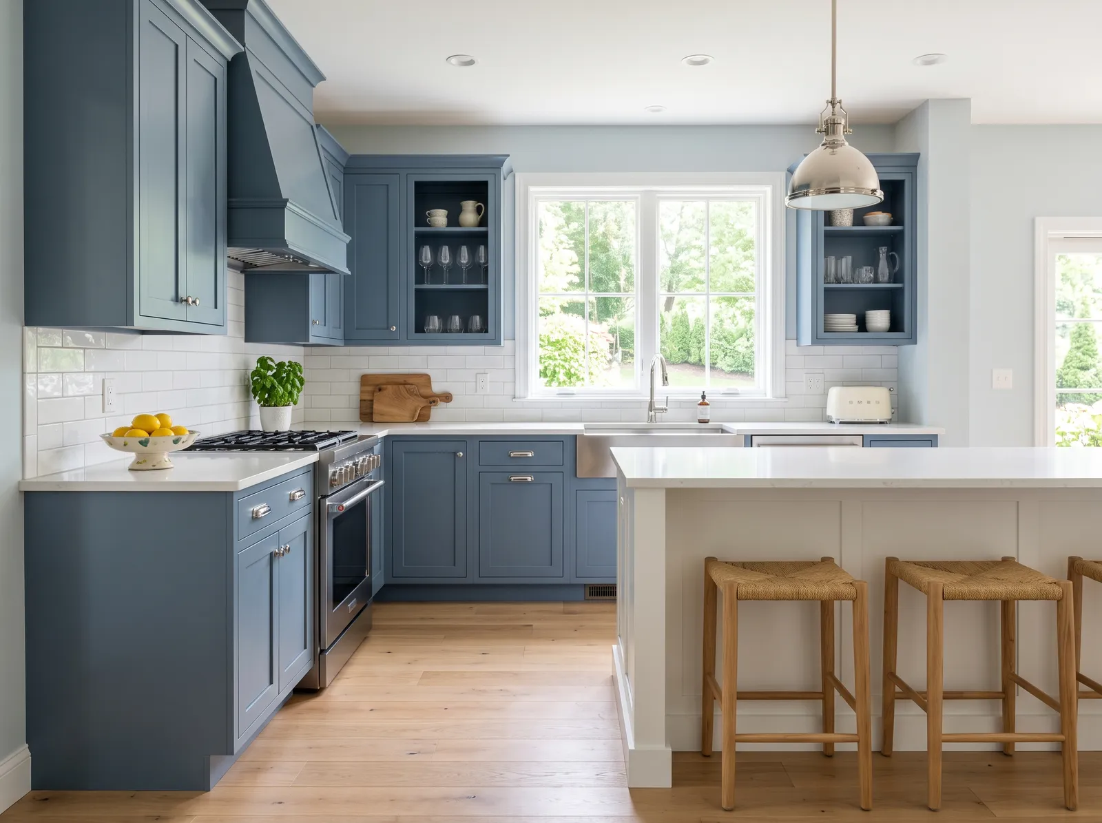
Slate Blue Cabinets — kitchen painted in Silver Cloud
5Silver CloudBenjamin Moore · Slate Blue Cabinets

A calm, dusty blue that feels relaxed and easygoing, like a clear sky just before evening.

Pale blue is a cool, breezy pastel that brings the sky indoors. In this kitchen, that soft blue coats the walls, while the cabinets stand out in a deeper slate blue. The central island and ceiling are a clean, bright white, and the woven bar stools add a touch of natural wood warmth. The space feels incredibly fresh, calm, and airy. This combination works beautifully because the warm wood stools and floor ground the cool blue tones, keeping the room from feeling chilly. It is perfect for anyone wanting a serene, coastal-inspired cooking space.

Walls · Benjamin Moore
Cabinet · PPG / Glidden
Chairs · Valspar
Trim · Rust-Oleum
SEE SILVER CLOUD ON YOUR WALLS →
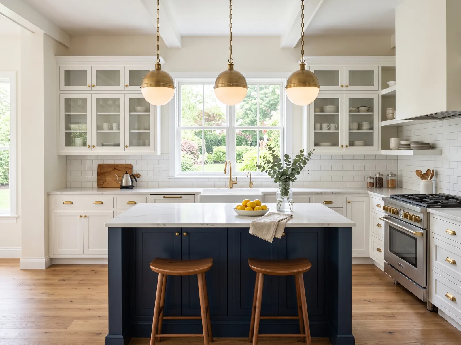
Navy Island Look — kitchen painted in Santa's Beard
6Santa's BeardValspar · Navy Island Look

White cabinets up top and a deep navy island anchoring the room, classic with a little drama.

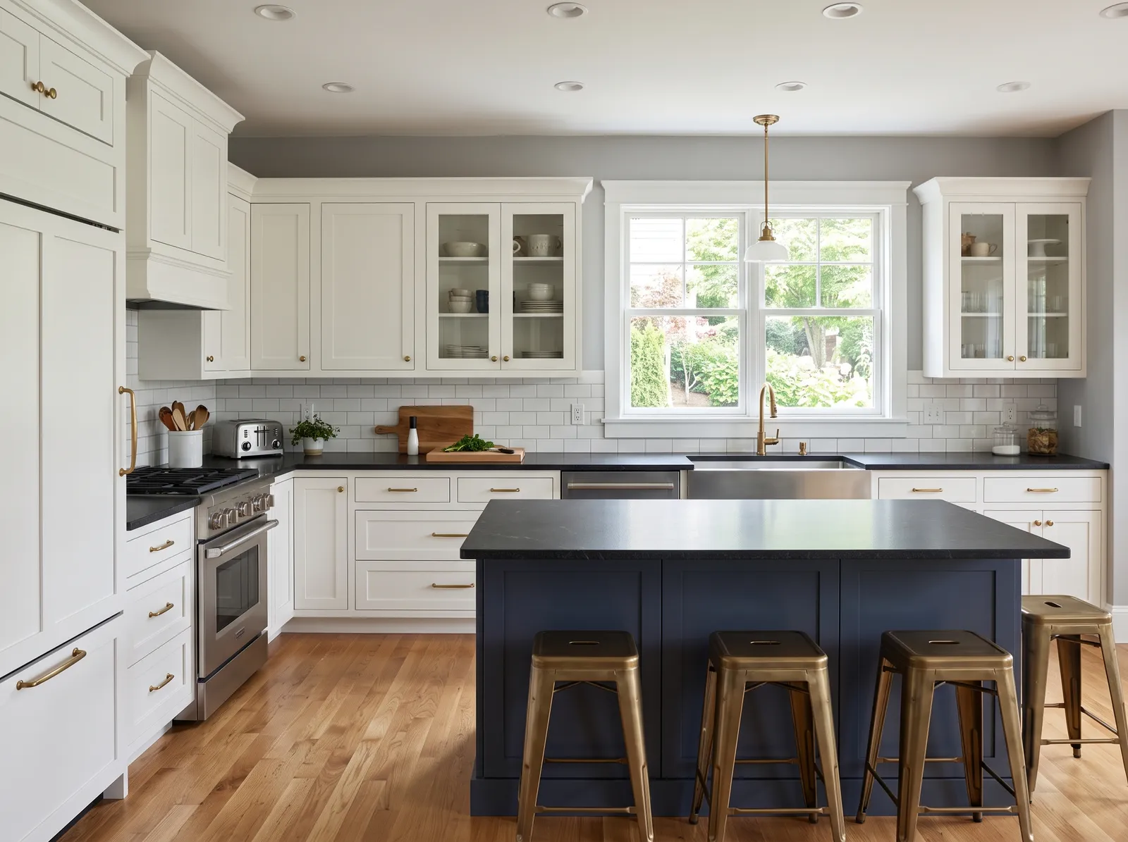
Soft off-white is a clean, bright neutral that makes any space feel instantly larger. In this kitchen, it covers the walls, while crisp white cabinets line the back. A deep navy blue island anchors the center of the room, paired with warm wooden barstools and gleaming brass pendant lights. The space feels incredibly fresh, airy, and classic. The high-contrast navy island grounds the room, while the warm wood and brass accents keep the bright white from feeling cold. It is perfect for anyone who loves a timeless, coastal-inspired look with a modern edge.

Walls · Valspar
Cabinet · Valspar
Cabinet · Rodda
Chairs · Sherwin-Williams
Accent · Kompozit
SEE SANTA'S BEARD ON YOUR WALLS →
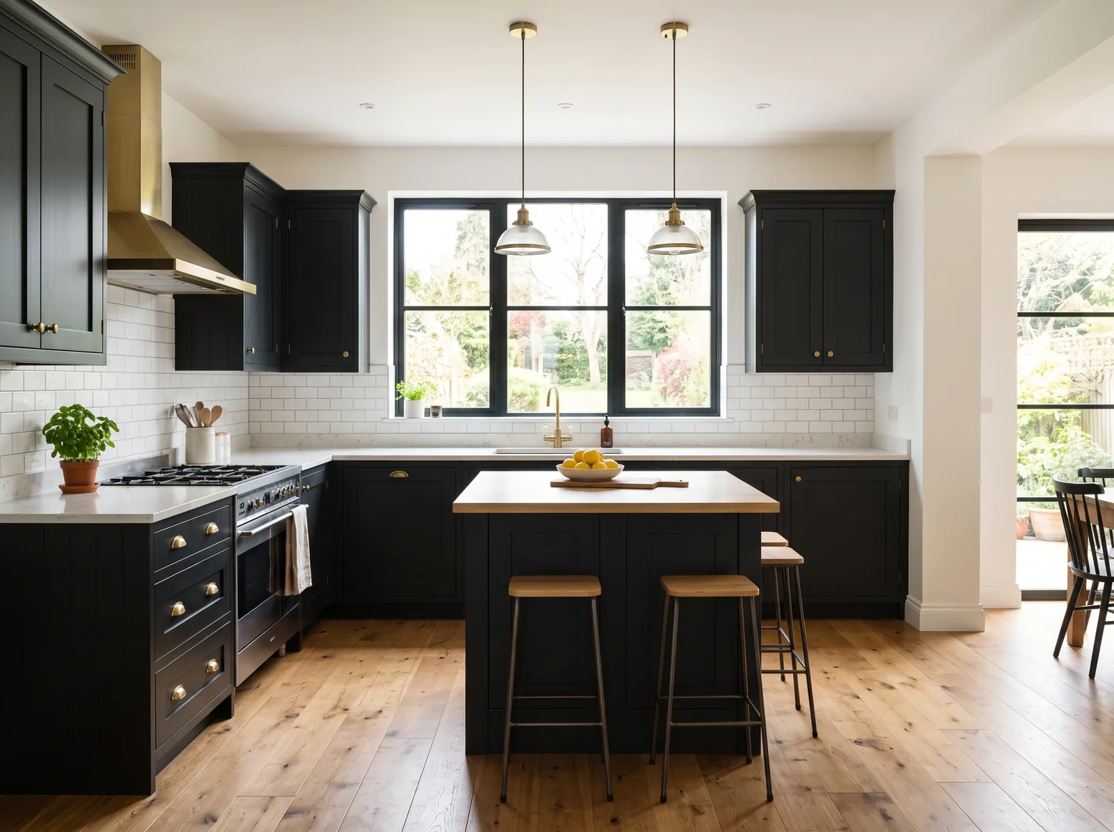
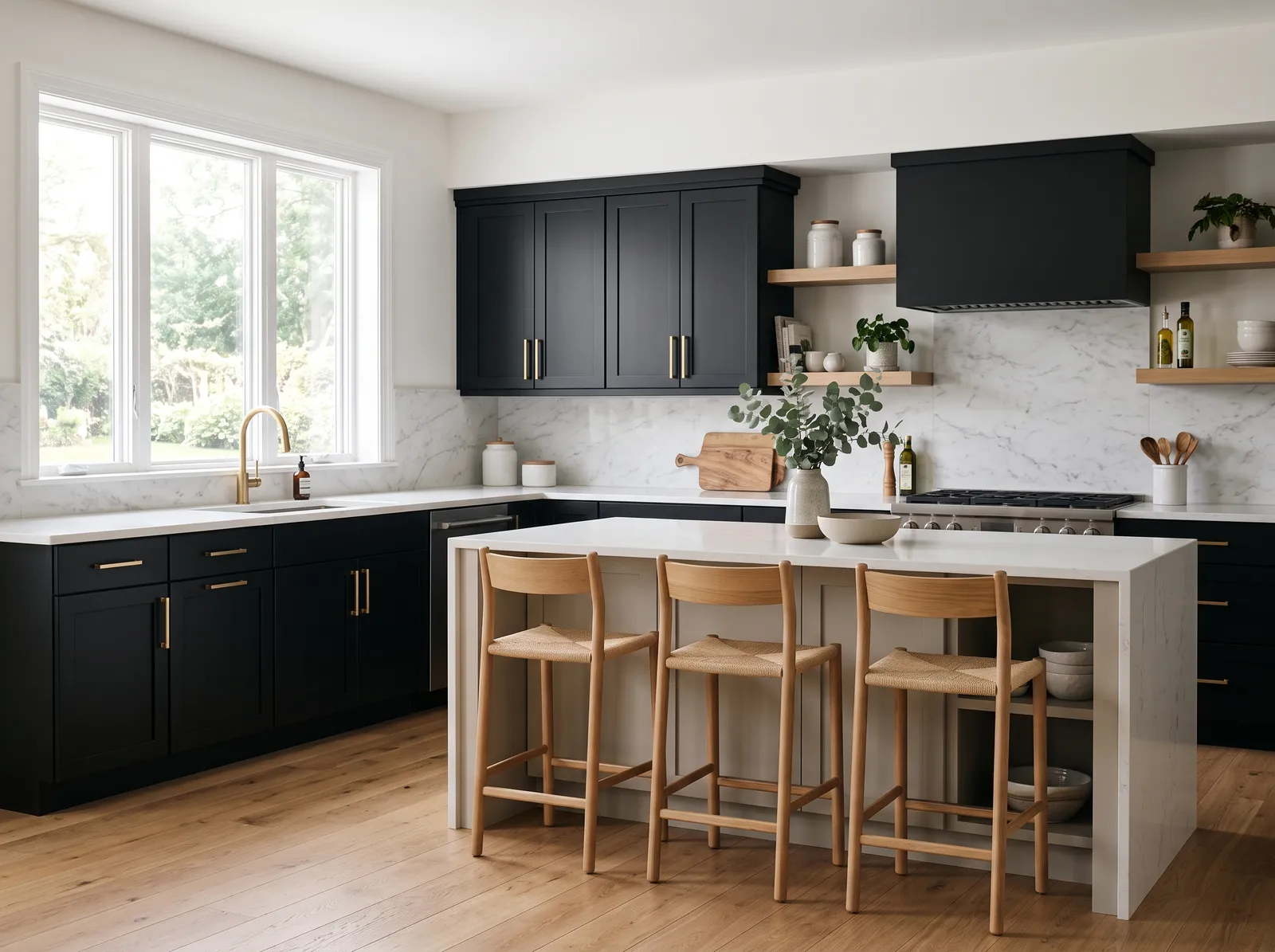
Bold Black Cabinets — kitchen painted in Cameo White
7Cameo WhiteBehr · Bold Black Cabinets

Dramatic and modern, black cabinets feel sleek and confident, especially next to white walls and brass.

Soft white is a clean, bright neutral that makes any space feel instantly larger. In this kitchen, it covers the walls, letting the dramatic matte black cabinets take center stage. The central island features a matching white marble top, while the light oak bar stools and open shelving inject a dose of natural warmth. The room feels incredibly balanced, airy, and sophisticated. This combination works beautifully because the high-contrast black and white is softened by the organic wood textures. It is perfect for anyone who loves a modern look with a welcoming touch.

Walls · Behr
Cabinet · Valspar
Chairs · Behr
Table · Behr
SEE CAMEO WHITE ON YOUR WALLS →
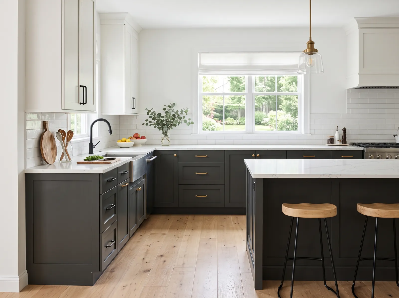
Charcoal Two-Tone — kitchen painted in Tinted or Not?
8Tinted or Not?Rodda · Charcoal Two-Tone

Deep charcoal on the bottom, soft white up top, a balanced two-tone look that feels modern and warm.

Crisp white is a clean, bright backdrop that instantly opens up any room. In this kitchen, it covers the walls and upper cabinets, while a deep charcoal gray grounds the lower cabinets and island. Light oak floors and matching wooden bar stools bring in a lovely natural warmth, accented by gleaming brass hardware. The space feels incredibly fresh, balanced, and calm. This combination works because the dark lower cabinets add sophistication without making the room feel small, thanks to the bright walls. It is perfect for anyone who loves a modern classic look.

Walls · Rodda
Cabinet · Kompozit
Cabinet · Behr
Chairs · Rodda
Accent · Behr
SEE TINTED OR NOT? ON YOUR WALLS →
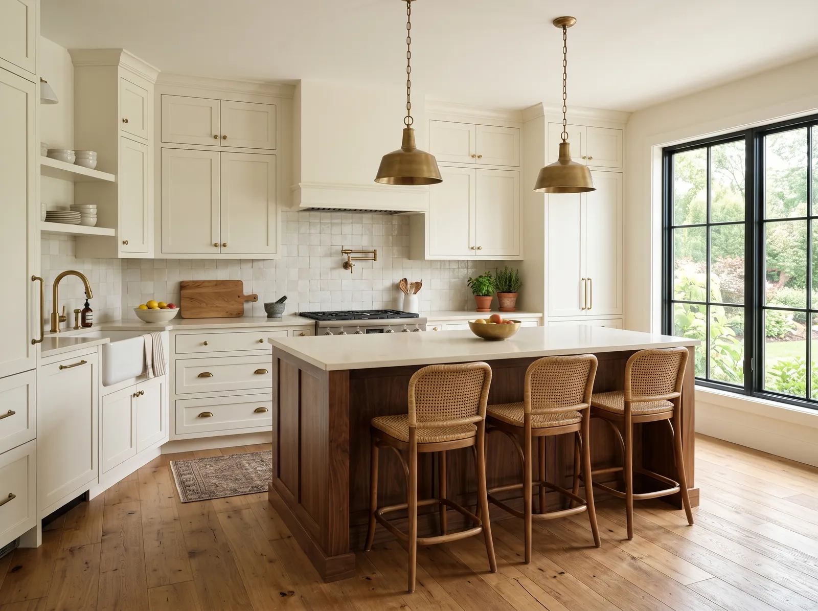
White & Wood Kitchen — kitchen painted in Soft Wool
9Soft WoolValspar · White & Wood Kitchen

Warm white cabinets paired with natural wood tones, a soft, organic look that feels calm and inviting.

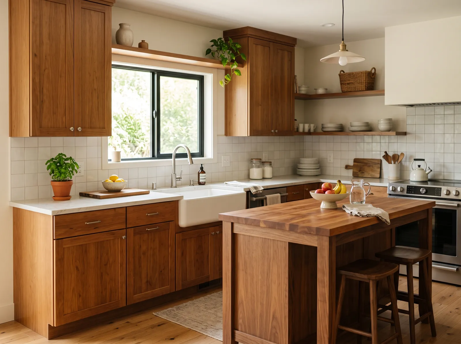
Cream is a soft, buttery off-white that feels instantly welcoming. In this kitchen, that gentle cream covers the walls and shaker cabinets, while a rich walnut island grounds the center of the room. Three woven rattan barstools add texture, and brass pendant lights hang overhead. A small patterned rug sits by the sink. The space feels incredibly calm, bright, and grounded. This combination works because the deep wood tones and natural woven textures keep the light-colored cabinets from looking too sterile. It is perfect for anyone who loves a timeless, organic modern look.

Walls · Valspar
Cabinet · Diamond Vogel
Table · Sherwin-Williams
Chairs · Behr
Accent · Benjamin Moore
SEE SOFT WOOL ON YOUR WALLS →
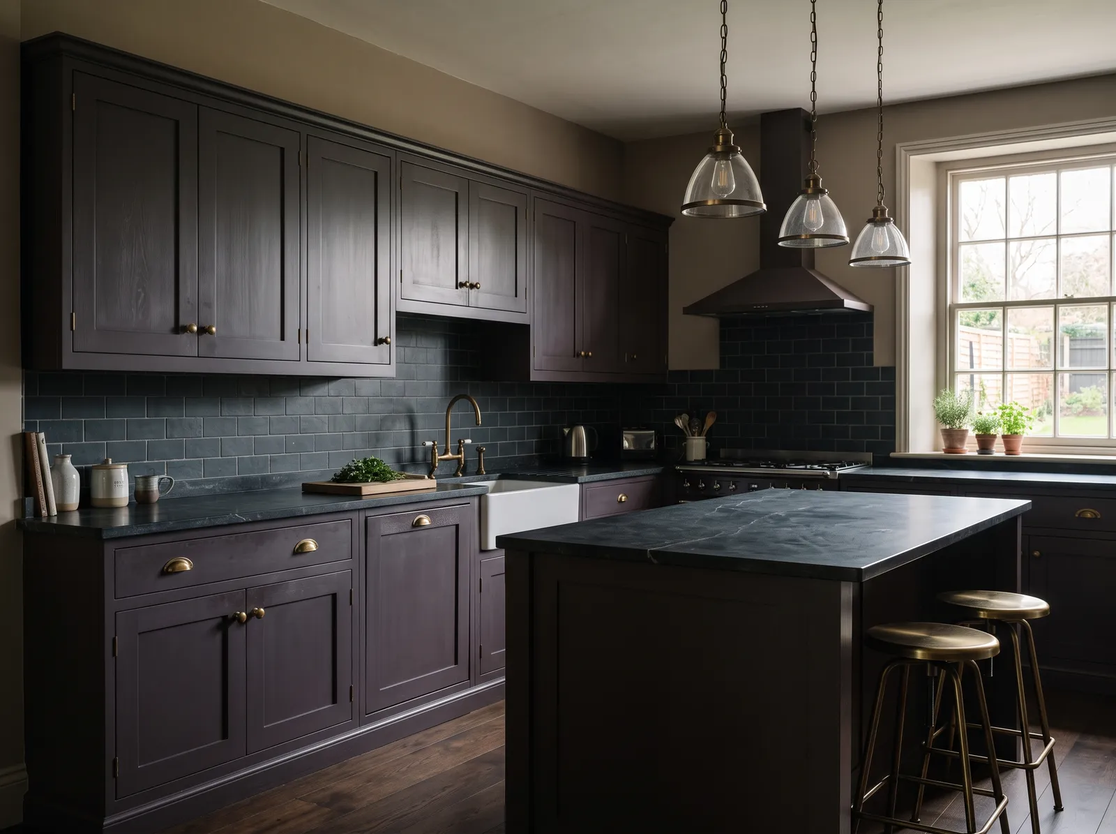
Moody Dark Kitchen — kitchen painted in Cathedral Gray
10Cathedral GrayBenjamin Moore · Moody Dark Kitchen

Deep, smoky cabinets that wrap the room in warmth, made for slow dinners and a glass of wine.

Taupe is a quiet, earthy gray-brown that grounds a room instantly. In this kitchen, that warm taupe covers the upper walls, while the cabinets wear a rich, moody deep plum. The central island features a dark slate countertop, and antique brass barstools add a metallic gleam. The space feels incredibly dramatic, cozy, and sophisticated. This combination works beautifully because the warm walls soften the dark, heavy cabinetry, keeping the deep colors from feeling too cold. It is perfect for anyone who loves bold, historic-feeling spaces with a modern edge.

Walls · Benjamin Moore
Cabinet · Behr
Table · Valspar
Accent · Kompozit
Ceiling · Sherwin-Williams
SEE CATHEDRAL GRAY ON YOUR WALLS →
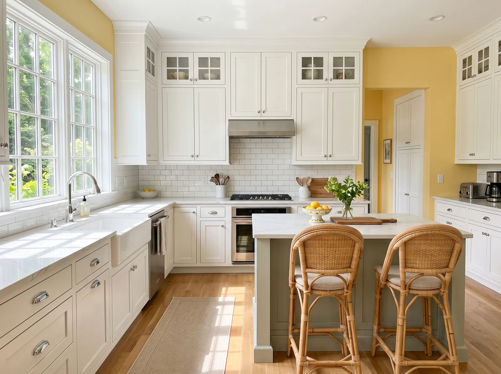
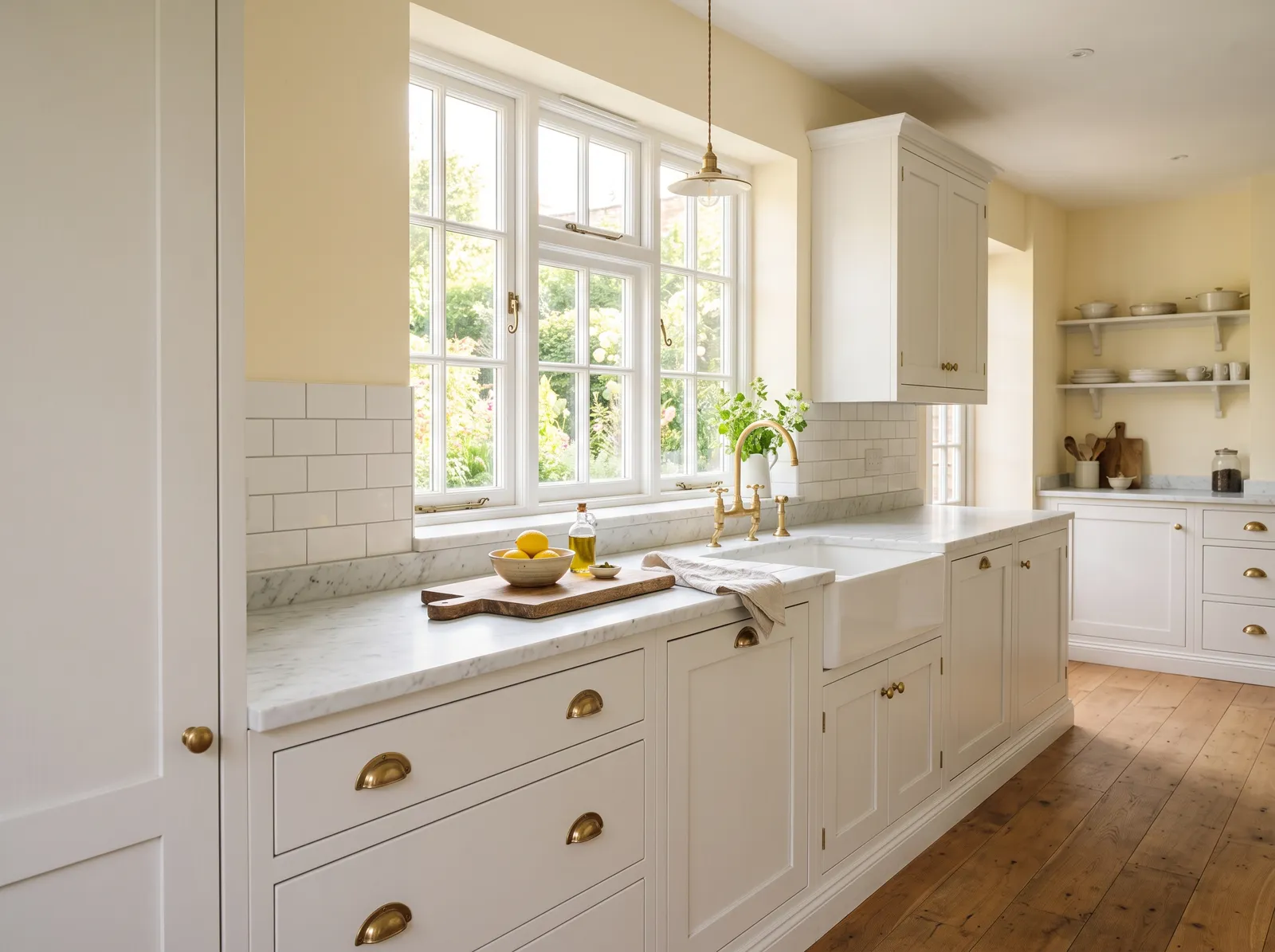
Sunny Yellow Walls — kitchen painted in Goldfield
11GoldfieldBenjamin Moore · Sunny Yellow Walls

Cheerful butter-yellow walls that make the whole kitchen feel warm and happy, even on gray days.

Butter yellow is a cheerful, sunny shade that instantly boosts your mood. In this bright kitchen, it wraps the walls, beautifully framing the crisp white cabinetry and a soft sage green island. Wicker bar stools pull up to the counter, while a simple beige runner lines the light wood floor. The space feels incredibly airy, welcoming, and full of morning light. This combination works because the clean white cabinets balance the yellow's energy, keeping the room feeling fresh rather than overwhelming. It is perfect for anyone who wants a happy, classic kitchen.

Walls · Benjamin Moore
Cabinet · Rodda
Accent · Behr
Chairs · Kompozit
Rug · C2 Paint
SEE GOLDFIELD ON YOUR WALLS →
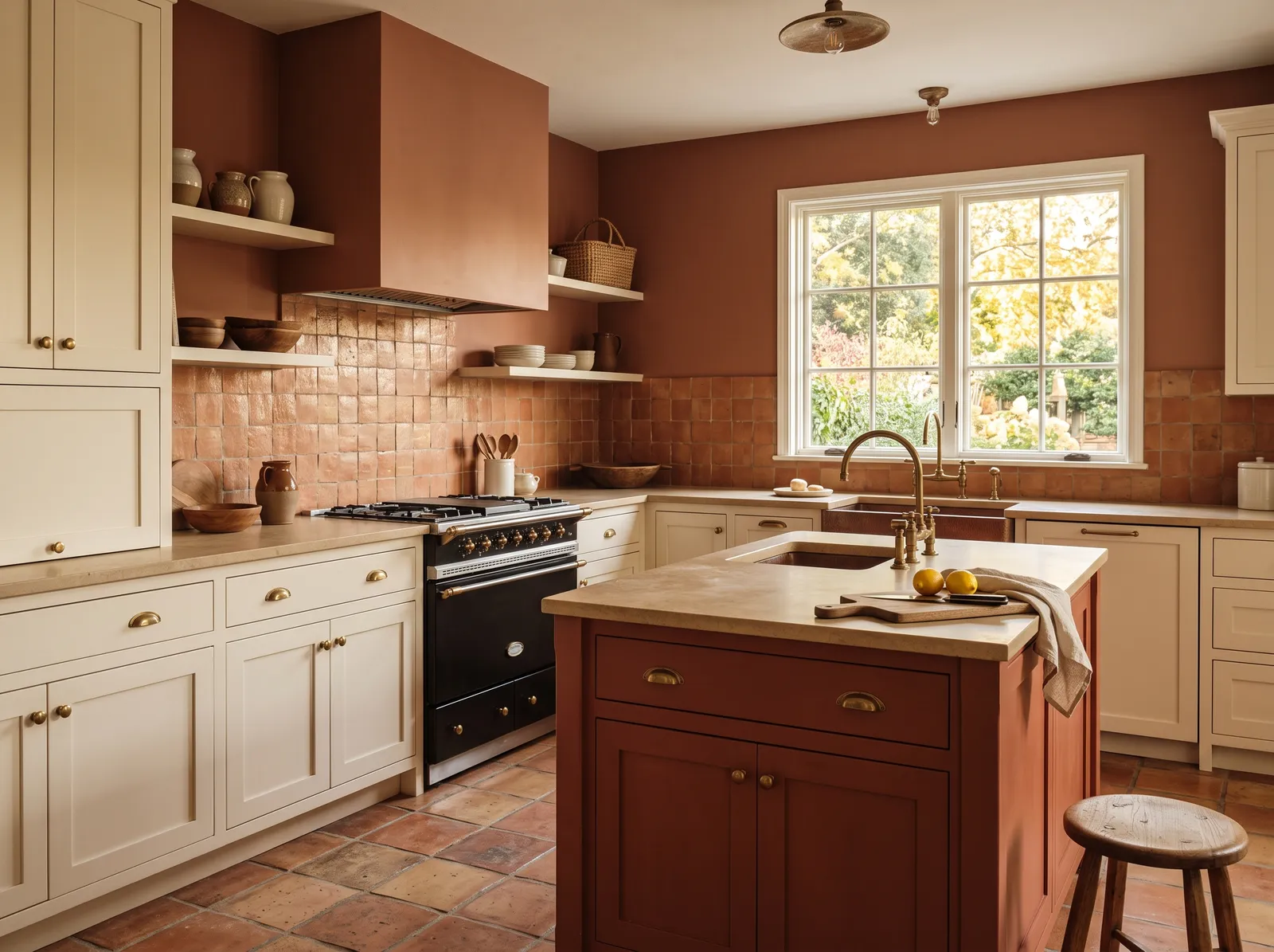
Warm Clay Walls — kitchen painted in Smoked Salmon
12Smoked SalmonRodda · Warm Clay Walls

Earthy terracotta walls that feel sun-baked and cozy, beautiful against creamy cabinets and warm wood.

Terracotta is a rich, earthy clay-orange that instantly grounds a space. In this kitchen, that deep terracotta wraps the walls, range hood, and central island, while cream cabinets and a light beige ceiling soften the look. Warm tiled floors and a simple wooden stool complete the rustic setup. The room feels incredibly snug, cozy, and full of old-world charm. This combination works beautifully because the creamy cabinets prevent the heavy clay tones from making the kitchen feel too dark or enclosed. It is perfect for anyone who loves a rustic, Mediterranean-inspired cooking space.

Walls · Rodda
Cabinet · Behr
Accent · Sherwin-Williams
Ceiling · Benjamin Moore
Chairs · Behr
SEE SMOKED SALMON ON YOUR WALLS →

Kitchen Wall Color Combinations

A wall color never works alone. These are the full schemes from the rooms above — the lead color first, then the supporting colors that make the photo work.

Crisp White Kitchen
WallsNew House WhiteCabinetSea SaltChairsMaple View
Walls
New House White · Behr · LRV 90
Cabinet
Sea Salt · Benjamin Moore · LRV 63
Chairs
Maple View · Dunn-Edwards · LRV 31

Bright, clean, and timeless, this is the kitchen that always feels fresh and never goes out of style.

TRY THIS PALETTE →
Warm Greige Kitchen
WallsWashed CottonCabinetStonewashedCabinetHoned Soapstone
Walls
Washed Cotton · Dutch Boy · LRV 76
Cabinet
Stonewashed · Behr · LRV 67
Cabinet
Honed Soapstone · Sherwin-Williams · LRV 31

Soft, creamy cabinets that feel cozy and welcoming, like sunlight on a quiet weekend morning.

TRY THIS PALETTE →
Soft Sage Cabinets
WallsAbstract WhiteCabinetLichen GreenCabinetBoreal Forest
Walls
Abstract White · Dunn-Edwards · LRV 82
Cabinet
Lichen Green · Dunn-Edwards · LRV 37
Cabinet
Boreal Forest · Benjamin Moore · LRV 11

Gentle gray-green cabinets that bring a little calm and garden freshness into the heart of the home.

TRY THIS PALETTE →
Deep Green Cabinets
WallsArcade WhiteCabinetAged PineTableLacey Pearl
Walls
Arcade White · Sherwin-Williams · LRV 86
Cabinet
Aged Pine · Valspar · LRV 4
Table
Lacey Pearl · Benjamin Moore · LRV 79

Rich, grounded green that feels both classic and a little daring, perfect with warm metal and stone.

TRY THIS PALETTE →

Start with the things you are not changing — your counters, flooring, and cabinet wood usually have an undertone the wall color has to live with. Warm wood floors and cream counters love warm whites and neutrals like Accessible Beige; cool gray tile and stone sit better with Pigeon or a green like Sage. Match the undertone, not just the lightness.

A reliable layout is a soft white on the walls, the same family or a clean white on the trim and ceiling, and a deeper color on the lower cabinets or island. White Dove on cabinets with Hale Navy on the island is a proven pairing, and brushed or black hardware reads sharp against both.

Kitchen Color Ideas by Color

Set on a color family already? Each page has its own real rooms and picks.

Light or Dark Kitchen Colors?

Go Light (LRV 60+) If…

The room is small, faces north, or has to work at every hour. Light warm colors make it feel bigger and stay calm in evening light — the light you actually live in.

Go Dark (LRV Under 20) If…

You want the cocoon effect and the room has real daylight. Dark works best on one feature wall — or fully color-drenched in a large room with good windows.

Kitchen light changes everything, so check which way your windows face before you commit. North-facing kitchens get cool, flat light that can make grays and blues look gloomy, so lean toward warmer whites and neutrals like White Dove or Accessible Beige to push back. South-facing kitchens get warm, generous light all day and can carry cooler greens, blues, and grays like Sage, Hale Navy, or Pigeon without feeling cold.

Night matters too. Most cooking and gathering happens after dark under warm bulbs, which pull color toward yellow and can make a beige look orange or a green look muddy. Always tape a real sample to the wall and look at it in daylight and at night with your actual kitchen lights on before you buy a full can.

LRV, or light reflectance value, tells you how much light a color bounces back, on a scale from 0 (black) to 100 (pure white). A small or dim kitchen stays brighter with high-LRV colors like Alabaster and White Dove, which reflect light around the room and make tight spaces feel open. This is the easiest way to keep a galley kitchen from feeling like a tunnel.

If your kitchen is large or floods with light, you have room to go cozier and richer. Lower-LRV choices like Hale Navy on an island or Sage on the walls absorb some light and wrap the room in warmth without making it feel dark.

Your Kind of Kitchen

Every variant has its own full guide with picks tuned to that room.

VISUALIZE YOUR SPACE

See It. Love It.
Paint It.

Upload one photo of your kitchen and try every color on this page on your own walls — in your own light, before you buy a drop of paint.

Drag the slider to compare
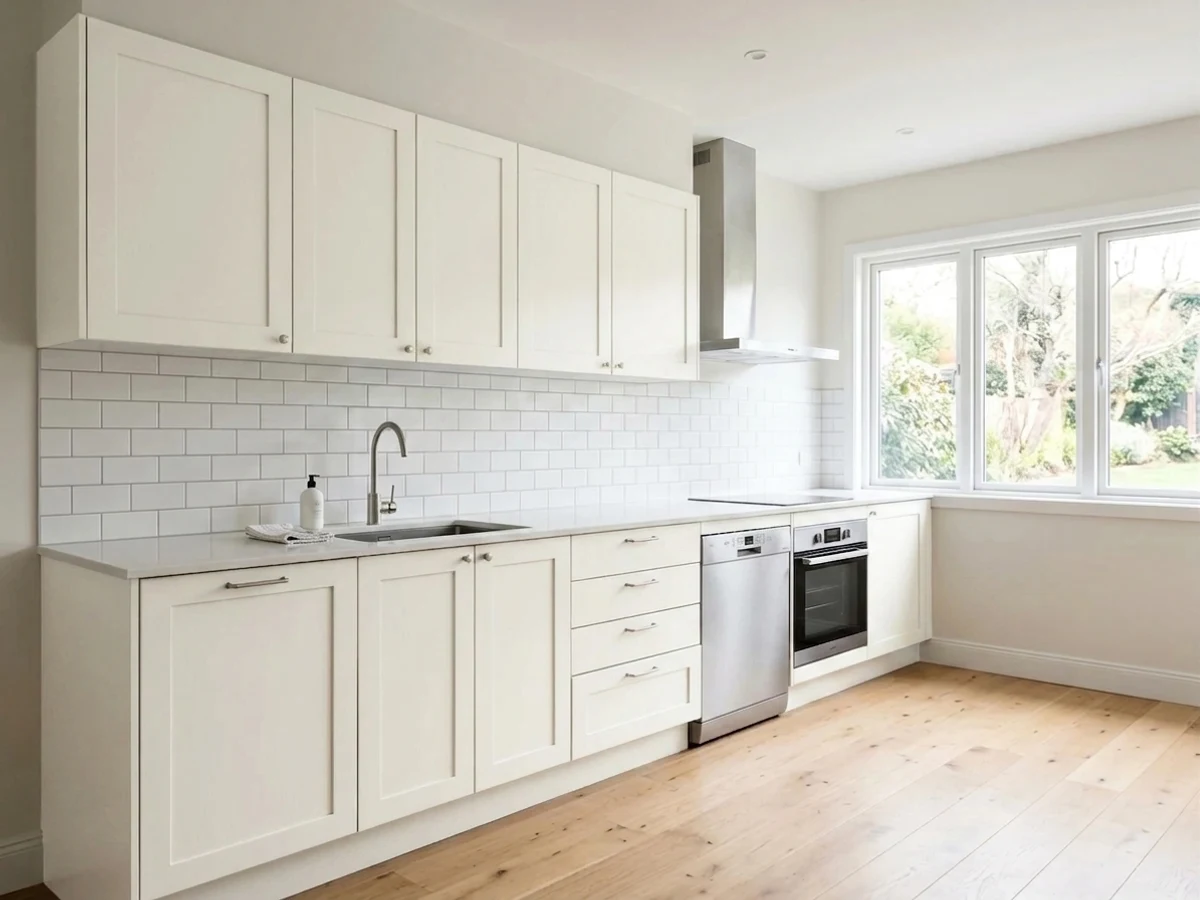
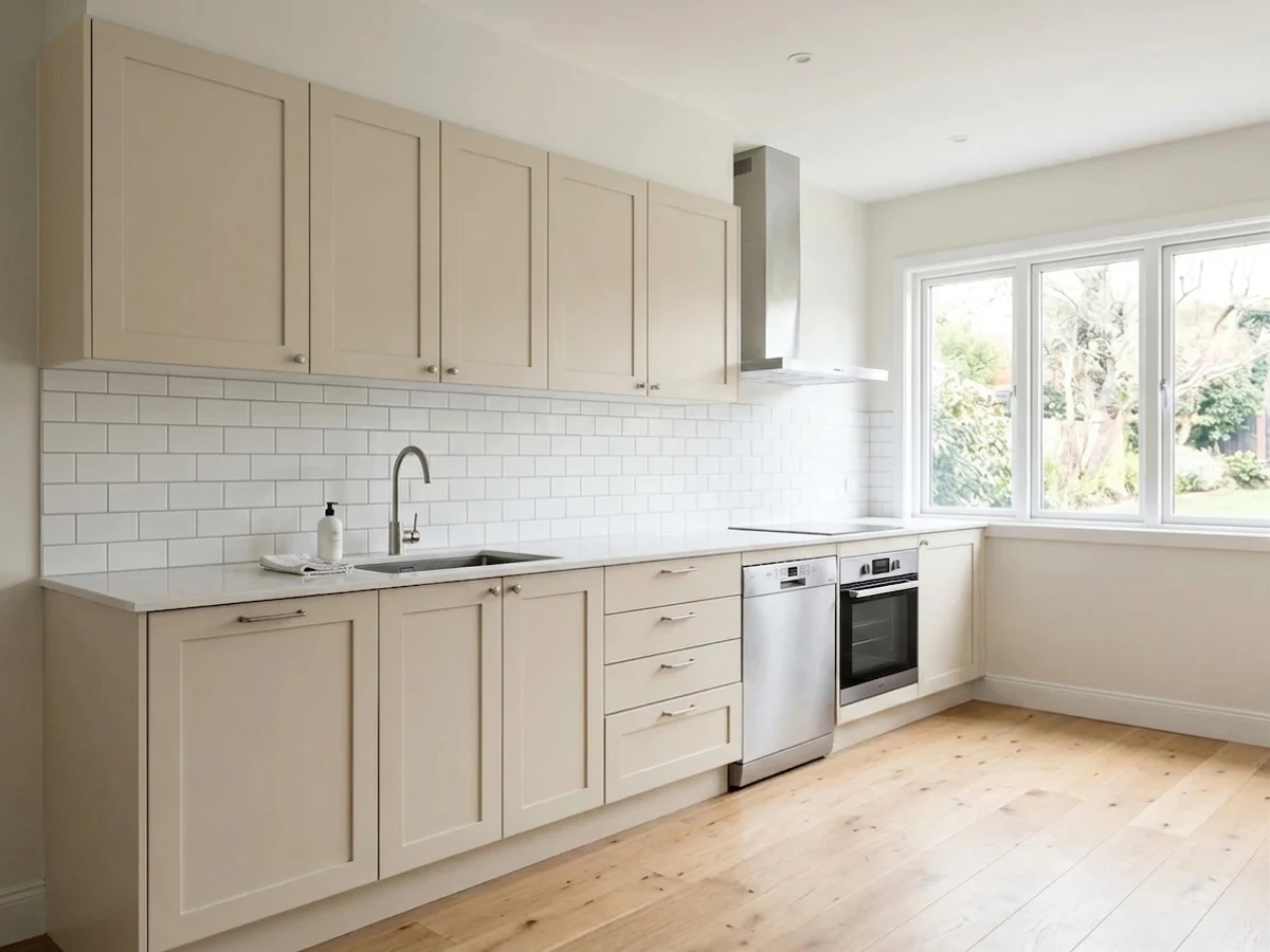
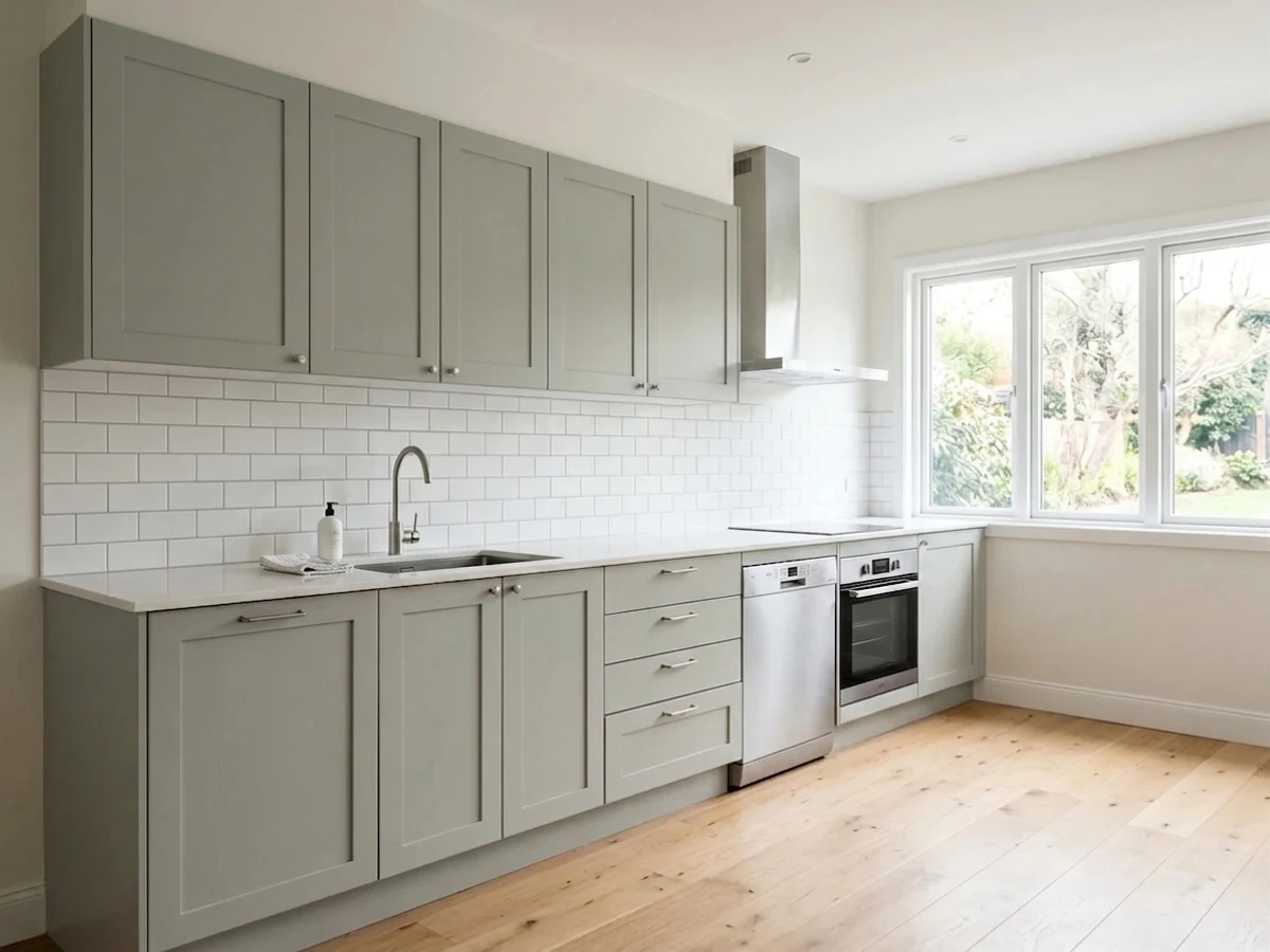
kitchen before paintingkitchen painted in Back to NatureBack to NatureBefore

The Right Finish for Grease and Splashes

Kitchens need a finish you can wipe down, so flat and matte are usually the wrong call here. Most people are happiest with eggshell or satin on the walls — both clean up well, resist moisture, and hide minor wall flaws better than glossier sheens. Satin leans a touch more wipeable, which is handy near the stove and sink.

For trim, doors, and cabinets, step up to semi-gloss. It takes scrubbing, shrugs off splatter, and gives crisp edges a little polish. Just avoid high-gloss on big wall areas, since it throws glare and shows every bump under direct light.

Common Kitchen Painting Mistakes

The biggest mistake is ignoring undertones. A beige that fights warm cabinets or a gray that turns blue under kitchen bulbs can make an expensive renovation feel off, and no finish fixes a clashing undertone. Test against your real surfaces, not a screen.

The other common slips are practical: using flat paint where grease lands, skipping samples on more than one wall, and judging color only in daytime. Paint a poster-sized sample, move it around the room, and live with it for a couple of days before you buy. And remember any color shown here is mixed to order, so you can cross-match a favorite between brands instead of settling.

Planning the Job
How Much Paint — and What Will It Cost? Use the Kitchen Paint Calculator →

Wall area, gallons, and a real price range for the kitchen — walls, trim, and ceiling.

About Kitchen Paint Colors

The kitchen is the hardest-working room in the house, and the paint has to keep up. It takes steam, grease, splashes, and fingerprints, all while sitting next to your cabinets, counters, and whatever light pours in through the window. So the right kitchen color does two jobs at once: it sets the mood you want, and it survives the daily mess without looking tired.

Most kitchens land in five color families that just work here — soft whites, calm greens, easy blues, warm neutrals, and quiet grays. Names like Alabaster, White Dove, Sage, Hale Navy, Accessible Beige, and Pigeon show up again and again because they flatter food, wood, and metal at the same time. Below we walk through how to pick a direction, read your light, choose a finish that lasts, and avoid the mistakes that make a fresh kitchen feel off.

One thing worth knowing up front: every color here is mixed to order at the paint counter. You are not locked into one brand. If you love a shade from one company but buy paint from another, the store can cross-match it closely, so pick the color you love first and sort out the can second.

The Questions Everyone Asks

What color should I paint my kitchen?

If you want one answer, start with the safe picks above — White Dove, Alabaster, Accessible Beige, Hale Navy. They read well in any light and survive furniture changes. Then check the light: strong afternoon sun wants a step cooler, a north-facing room wants a step warmer.

What is the most popular kitchen paint color?

Soft whites lead the pack because they keep kitchens bright and let cabinets and counters shine. Alabaster and White Dove are two of the most-used because they read clean without feeling cold. After white, calm greens like Sage and deep blues like Hale Navy are the next most popular for adding personality.

What sheen should I use on kitchen walls?

Eggshell or satin is the sweet spot for kitchen walls. Both wipe clean, handle steam and splashes, and hide small wall flaws. Save semi-gloss for trim, doors, and cabinets, and skip flat paint, which stains and is hard to scrub near a stove or sink.

Is a dark color like Hale Navy a bad idea in a small kitchen?

Not necessarily. A deep color like Hale Navy works great on lower cabinets or an island even in a small kitchen, where it grounds the room without darkening the whole space. Keep the walls and uppers light so the room still reflects plenty of light.

How do I pick a color for a north-facing kitchen?

North light is cool and flat, so it can make grays and blues look dull or gray-green colors look muddy. Lean toward warmer whites and neutrals like White Dove or Accessible Beige to balance that cool light. Always test the sample at night under your kitchen bulbs too.

What color goes with white cabinets?

White cabinets are flexible and pair with almost any wall color. For a calm look, try Sage or a soft neutral like Accessible Beige; for contrast, a deeper blue like Hale Navy on an island looks sharp. Match the undertone of your counters and flooring so everything feels intentional.

Can I get a color from one brand in another brand's paint?

Yes. Every color shown here is mixed to order at the paint counter, and stores can cross-match a shade from one brand into another brand's paint closely. Pick the color you love first, then choose whichever paint line fits your budget and finish needs.

How many samples should I test before painting?

Test at least two or three options, and put each on more than one wall. Light changes across the room, so a color can look great by the window and off in a corner. View every sample in daylight and at night before you commit to a full can.

What two-color combination works best in a kitchen?

The reliable pattern is a quiet main color plus one deep accent on a single wall. Keep trim and ceiling in one warm white so the two colors are the only event in the room — the combination cards above show complete schemes from real rooms.

What colors make a kitchen look bigger?

High-LRV, slightly warm colors — LRV 60–75 is the sweet spot. Paint the walls and trim close to the same light color so the corners blur, and keep the ceiling white. Stark cool white actually works against you; it creates hard shadows that show the room's edges.

Ask a Question

Jessica Williams

Not sure what's right for your kitchen?

Ask Jessica below — every question gets a real reply, usually within a day.