Gossamer Veil
The greige every design blog says to try instead of Agreeable Gray, reviewed honestly: where it stays clean, the light that turns it flat, and what to pick instead.

Jessica has spec'd whites and neutrals for more than 300 rooms and keeps a sample wall of painted drawdowns in her studio. Every color review is checked against real reader rooms in the comments and re-tested when a formula changes. About the testing process →
- 1Mindful Gray48
- 2Revere Pewter55
- 3Gossamer Veil62
- 4Pale Oak69
- 5Shoji White74
The Fast Verdict
Gossamer Veil is the greige a designer reaches for when a client is tired of Agreeable Gray but not ready for a real color. Lighter (LRV 62 against Agreeable Gray's 60) and built on a green undertone instead of pink, it reads calm, clean and a little more modern in real daylight — quieter than Agreeable Gray's coziness, without Repose Gray's violet flash. It has become the internet's most-repeated "try this instead" pick since roughly 2023, and on the wall it mostly earns that reputation.
Open-plan main floors that want a lighter, cleaner greige · exterior siding — a genuine design-blog favorite · kitchens with white or warm-wood cabinets · anyone who found Agreeable Gray too pink or too dark
You actually want the cozy, warm-pink lean of Agreeable Gray · your room is dim, north-facing, and low on warm light · you're pairing it with red brick or terracotta · you want a color with zero undertone, ever
- Lighter and cleaner than Agreeable Gray — less pink, less dark
- A genuine exterior-design favorite, not just an interior pick
- Green undertone is subtle enough to read as simple, clean neutral in good light
- Pairs easily with both white and warm-wood cabinets
- Crosses an open floor plan's different light exposures without a strong shift
- Goes flat, cool gray-green in dim north light
- Can read sterile or office-like next to a warmer neutral like Agreeable Gray
- Fights red brick and terracotta on exteriors
- Less cozy than Agreeable Gray if warmth is the whole point
What Color Is Gossamer Veil, Really?
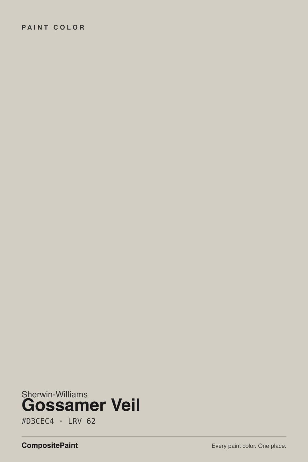
A light, low-saturation greige built on a green undertone rather than the pink most popular greiges lean on. Sherwin-Williams files it in the Neutral collection with no Color of the Year fanfare, but it has built a real following anyway: since roughly 2023, exterior-design sites like brick&batten and colorists like Kylie M Interiors have repeatedly recommended it as the answer to a specific, common request — a client who has seen Agreeable Gray on every third house in the neighborhood and wants the same easy neutral with a fresher, cleaner read.
At LRV 62 it sits two points lighter than Agreeable Gray's 60, which is a small number that reads as a real difference on the wall: rooms feel a touch more open and less weighted than an Agreeable Gray room in the same light. The green undertone is what keeps it from tipping pink or gold — most reviewers describe the color as simply "clean" or "modern" without naming a color family at all, which is exactly the effect a well-built greige is supposed to have.
Undertone in one line: green first, a faint violet flash in cool light, never pink and never true beige. If your sample reads flat and gray, that's cool north light pulling the green forward, not the paint changing formula on you.
Where It Shines
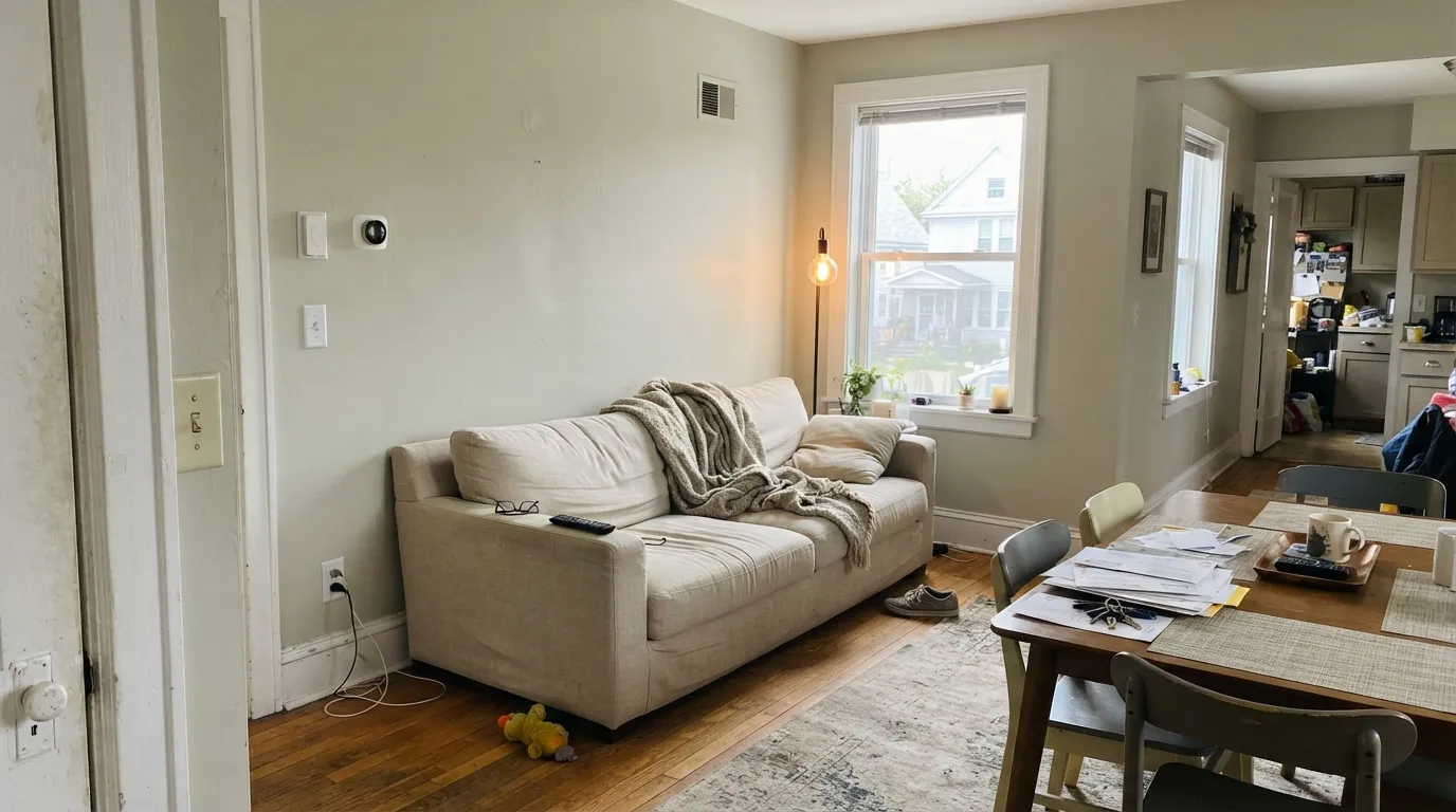
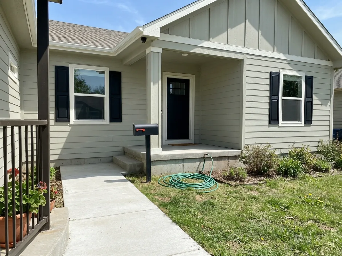
It is at its best in real daylight across an open floor plan, which is exactly the job it was recommended for: south or west light keeps it reading as a clean, quiet gray-taupe that doesn't fight whatever room it flows into next. Its second home is outdoors — full sun reads it as a soft, clean not-quite-white rather than a heavy gray, and it holds that read across fiber cement, stucco and most siding materials, which is the whole reason the exterior-design blogs keep reaching for it.
Where It Fails
Almost every lukewarm review of Gossamer Veil comes from one of three situations, and all three are predictable before the first coat. None of them are the paint's fault — but if your room or your house matches one, sample bigger before you commit the gallon.
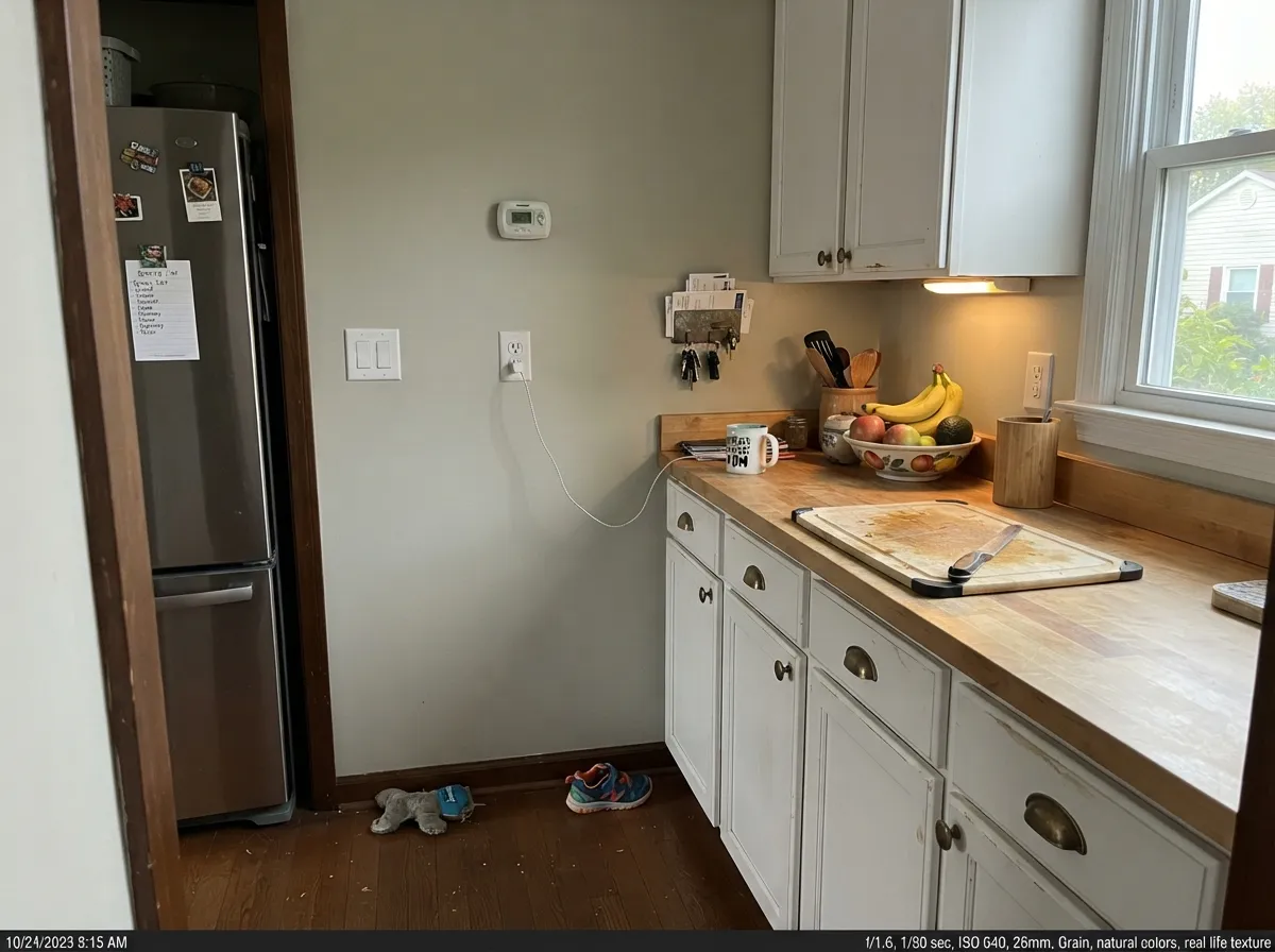
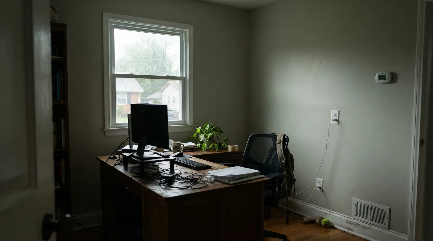
Cool overcast daylight pulls the green undertone forward and drains the little warmth the color has, leaving a flat gray-green that some owners call "blah" or "too grey." The color didn't fail; the light did. Add warm 2700K lamps or step up to a warmer greige like Agreeable Gray.
Side by side, the comparison that made Gossamer Veil famous can also work against it — its cooler, greener lean can read sterile or office-like next to Agreeable Gray's cozier pink. Judge it alone in your own room, not against a swatch of the color it's supposed to replace.
The green undertone sits in direct conflict with warm red masonry, and on a full elevation that conflict is hard to miss — the brick can look muddier and the siding can look colder than either does alone. Get a poster-board-size exterior sample against the actual brick before buying the gallon.
Room by Room
Crosses living, dining and kitchen light without picking up a strong pink or gold cast anywhere along the way. Eggshell on the walls, the same color at semi-gloss on trim if you want the one-color-house look.
Reads as a soft, clean not-quite-white in full sun and holds that read on fiber cement and stucco. Pair with a true white trim and black or charcoal shutters for the modern-farmhouse look it gets shot in most often. Avoid red brick and terracotta.
Genuinely good as a wall color behind white cabinets (Alabaster, Pure White) or warm wood — the green stays quiet and lets the cabinets do the talking. Less tested as the cabinet color itself; most real-home photos use it on walls.
Calm and clean under daylight; add warm bulbs at night so the green doesn't read cool once the sun goes down. Matte or eggshell either way.
With warm-white or beige stone and brass fixtures it stays quiet and clean. With cool blue-grey tile the green and the cool tile can both read colder than intended — sample first.
This is the room the fails photo shows. Without real daylight or warm lamps, the green comes forward and the color goes flat. If the room stays dim most of the day, pick a warmer greige instead.
Your Light Is the Risk
Clean, quiet gray-taupe with the green undertone muted to almost nothing. The light it was recommended for.
Cool daylight pulls the green forward and flattens the color. Test here first if your room is dim.
Greener and cooler at midday, softer and warmer through golden hour. The shift is gentle, not dramatic.
2700K lamps soften the green into a warmer taupe-gray. Cool white LEDs sharpen the green-gray cast — swap bulbs before you repaint.
Most complaints about Gossamer Veil are a light mismatch. Upload a photo of your actual room and see it on your walls — then ask for the same wall in north light or evening lamps before you buy a single sample.
Need It From Another Brand?
Any paint counter can custom-tint Sherwin-Williams SW 9165 directly. If you would rather stay in one brand's own deck, these are the closest stock matches, measured as ΔE2000. Under 2 is a difference you will not see on the wall.
| Brand | Closest color | ΔE | LRV | |
|---|---|---|---|---|
| Behr | Granite DustMQ3-06 · Behr | 2.0 | 63 | Color page → |
| Benjamin Moore | Collingwood859 · Benjamin Moore | 0.0 | 62 | Color page → |
| Valspar | Secluded BeachV146-1 · Valspar | 1.6 | 62.4 | Color page → |
| PPG / Glidden | River RockPPG18-02 · PPG / Glidden | 3.5 | 62 | Color page → |
| Glidden | WhiskersPPG1025-3 · Glidden | 0.5 | 61 | Color page → |
| Dutch Boy | Shimmering Silver406-2DB · Dutch Boy | 1.8 | 61 | Color page → |
Similar Sherwin-Williams Colors
The nearest shades to Gossamer Veil within Sherwin-Williams's own range, ranked by perceptual color distance — useful when you want the same look a touch lighter, darker, or warmer.
WCAG 2.1: AA is 4.5 : 1 for normal text, 3 : 1 for large text, AAA is 7 : 1.
Gossamer Veil vs the Colors You're Also Considering
Every Gossamer Veil sample board has the same rivals on it. The numbers show the real lightness gap — then it comes down to which risk you would rather live with.
Pick this for the cleaner, lighter, more modern read with less pink risk.
Sherwin-Williams SW 7029 · LRV 60Agreeable GrayPick this for the warmer, cozier, slightly pinker greige — still the more forgiving pick in a dim room.
Pick this for the safer, greener alternative with far less violet risk.
Sherwin-Williams SW 7015 · LRV 58Repose GrayPick this for a truer gray with more violet in it — striking in bright rooms, risky (lavender-blue) in dim ones.
Within the line, Modern Gray SW 7632 (#D6CEC3, LRV 62) is the near twin and carries slightly more red, so it can lean a touch pink in warm light. Popular Gray SW 6071 (#D4CCC3, LRV 61) and Pediment SW 7634 (#D3CCC4, LRV 61) sit one point darker and are close enough that the choice rarely matters on a wall. Conservative Gray SW 6183 (#D1D0C6, LRV 63) and Lattice SW 7654 (#CECEC6, LRV 61) drop most of the warmth and read cooler and greener.
Across brands the headline match is Benjamin Moore Collingwood 859 (LRV 62), which measures a deltaE of 0. Glidden Whiskers PPG1025-3 (LRV 61, deltaE 0.48) and Behr Toasty Gray N320-2 (LRV 61, deltaE 0.91) are matches you would not separate on a wall. Valspar Secluded Beach V146-1 (LRV 62.4, deltaE 1.59) is visually identical in normal room light, and Farrow and Ball Shaded White No. 201 (LRV 63, deltaE 2.1) is very close but worth sampling first.
Gossamer Veil Coordinating Colors
The rule for coordinating with Gossamer Veil is temperature discipline: stay with true whites and other grayed-down neutrals, and be careful with anything warm-gold or red-brick nearby. It pairs easily with white or warm-wood cabinetry and layers well with darker members of the same low-saturation family. These are the partners that keep showing up in rooms and exteriors that work:
Gossamer Veil vs Agreeable Gray: The Successor Story
Agreeable Gray spent most of the 2010s as the internet's default greige, and by the early 2020s design blogs started publishing a specific genre of post: "tired of Agreeable Gray? try this instead." Gossamer Veil is the color that keeps winning that comparison. It's not a Sherwin-Williams Color of the Year and has no award behind it — its reputation is built entirely on exterior-design sites like brick&batten and interior colorists like Kylie M Interiors recommending it, repeatedly, as the cleaner, lighter, less-pink alternative once a client has already seen Agreeable Gray on every third house on the block.
The mechanics back up the reputation: at LRV 62 it sits two points lighter than Agreeable Gray's 60, and its undertone runs green rather than Agreeable Gray's pink — exactly the kind of small, real difference that makes a repainted room feel fresh instead of identical. It hasn't replaced Agreeable Gray as the default; Agreeable Gray is still the safer, cozier pick in a dim room. But it has earned a permanent seat next to it on every greige shortlist since roughly 2023.
Gossamer Veil on Exteriors
Outside is arguably where Gossamer Veil built its reputation. In full sun it reads as a soft, clean not-quite-white rather than a heavy gray, and it holds that read across most siding materials — fiber cement, stucco, brick that isn't red. Pair it with a true white trim (Extra White, not a cream) and black or charcoal shutters and doors for the modern-farmhouse look it gets photographed in most often.
The one real caution is masonry: red brick, terracotta roof tile and warm-orange stone all sit in direct conflict with the green undertone, and on a full elevation that conflict is hard to miss. If your house has any of those fixed materials, get a large exterior sample — poster-board size, moved around the house at different times of day — before committing to the gallon.
Three Ready Palettes Built on Gossamer Veil
A color is never alone on the wall. These are complete combinations in the 60-30-10 pattern, with the reason each one holds together. Every one opens in the visualizer.
A true white trim keeps the green undertone reading clean and modern instead of muddy — a cream trim drags it warmer than it wants to go. Iron Ore on the door supplies the one dark note the scheme needs without competing with the wall's quiet green.
Try this palette in your roomThis is the combination the exterior-design blogs keep reaching for: a lighter, cleaner greige holds its own in full sun, Extra White keeps the trim crisp rather than cream, and Tricorn Black shutters and door give the modern-farmhouse contrast — with no red brick or terracotta anywhere near it.
Try this palette in your roomAlabaster's soft warmth keeps the cabinets from looking stark against Gossamer Veil's cooler green lean, and Evergreen Fog on the island adds one muted color note from the same grayed-down, low-saturation family — nothing here fights the wall's undertone.
Try this palette in your roomGossamer Veil FAQ
Is Gossamer Veil warm or cool?
Neither, cleanly — that's the point. The base undertone is green, with a faint violet flash in cool light, which keeps it from tipping pink like Agreeable Gray or gold like a true beige. In real daylight most people call it simply "clean" or "modern" without naming a color family; in dim north light the green comes forward and it can read flatter and cooler than expected.
Gossamer Veil or Agreeable Gray?
Gossamer Veil if you want lighter (LRV 62 versus 60) and cleaner, with less of the pink Agreeable Gray shows in some light. Agreeable Gray if you want the cozier, warmer, slightly darker read — it's still the more forgiving color in a dim room. Neither is objectively better; the choice is temperature, and side-by-side samples in your own room settle it fastest.
Does it work on exteriors?
Yes — it's one of the more design-blog-recommended exterior greiges going, holding up as a soft, clean not-quite-white in full sun. The one real caution: red brick or terracotta roofing and accents fight the green undertone, so test a large sample against your actual masonry before committing.
Does it work with oak floors?
With most oak, yes — the green undertone is muted enough that it doesn't fight golden or honey floors the way a true blue-gray would. Very orange, heavily red-toned oak is the one combination worth sampling first; pale white oak and walnut both sit comfortably against it.
What trim white goes with Gossamer Veil?
A true white, not a cream — Pure White or Extra White keep the pairing clean and let the wall's green undertone read as intentional. A yellow-leaning trim white pulls the wall warmer than it wants to be and can make the pairing look muddy.
Is the green undertone a problem?
For most rooms, no — it's subtle enough that most owners describe the color as a simple, clean gray-greige and never mention green at all. It shows up mainly in two situations: side by side with a warmer neutral like Agreeable Gray, and in dim, cool, north-facing light with no warm bulbs to counter it.
Have you painted with Gossamer Veil?
Rate it — one tap helps the next reader decide.
Ask a Question